Fall 2026 gives the crochet fringe stole unusually good fashion context. Recent runway coverage has highlighted the return of stoles and shrug-like wraps, while fringed scarves have appeared as statement accessories that can be draped, wrapped, or worn more creatively. Crochet and heavily fringed knitwear also appeared in Fall 2026 collections, making texture part of the season’s visual story rather than a background detail.
Color is equally important. Fall 2026 fashion coverage points to electric blue, red, butter yellow, purple, burgundy, turquoise, peach, and olive among the season’s noticeable directions. The 17 palettes below translate that broader fashion energy into crochet without treating runway looks as patterns to copy.
Each tutorial supports the shawl, wrap, or stole construction concept. The color schemes, fringe placement, and styling suggestions here are independent adaptations unless the source itself clearly demonstrates them.
Quick List
- Burgundy And Charcoal Crochet Fringe Stole
- Electric Blue And Graphite Crochet Fringe Stole
- Royal Purple And Cherry Red Crochet Fringe Stole
- Olive Green And Camel Crochet Fringe Stole
- Butter Yellow And Chocolate Brown Crochet Fringe Stole
- Turquoise And Deep Navy Crochet Fringe Stole
- Juicy Peach And Oxblood Crochet Fringe Stole
- Black And Silver Crochet Fringe Stole
- Poppy Red And Cream Crochet Fringe Stole
- Chestnut And Plum Crochet Fringe Stole
- Moss Green And Ivory Crochet Fringe Stole
- Aubergine And Blush Crochet Fringe Stole
- Rust And Deep Teal Crochet Fringe Stole
- Espresso And Copper Crochet Fringe Stole
- Stone Gray And Cobalt Blue Crochet Fringe Stole
- Ruby Red And Inky Navy Crochet Fringe Stole
- Saffron And Burgundy Crochet Fringe Stole
Use Fall 2026 Color as Structure on a Crochet Fringe Stole
A stole gives color more uninterrupted surface than a narrow scarf, so dominant and accent roles matter. When two saturated shades cover equal areas, the result can become visually restless before the fringe is even added. A useful approach is to let one color occupy most of the crocheted fabric and reserve the second for edging, stripes, motif details, or fringe.
Value contrast deserves separate attention from hue. Burgundy and plum are visibly different colors, for example, but certain yarn selections can still appear close in lightness. Place candidate yarns side by side or view them in grayscale before committing if you need a border, lace opening, or textured stitch to remain clearly defined.
Let Fringe Extend the Palette Instead of Competing With It
Fringe occupies less area than the stole body, but movement gives it disproportionate visual attention. That makes it a useful place for the darkest shade, a sharper accent, or a controlled mixture of two colors.
If the body already contains several strong colors, quieter fringe often gives the design a cleaner finish. If the stole itself is mostly neutral, the fringe can carry more contrast. Repeating a fringe color once somewhere on the body or edge also helps it look intentional rather than attached as an unrelated final detail.
1. Burgundy And Charcoal Crochet Fringe Stole
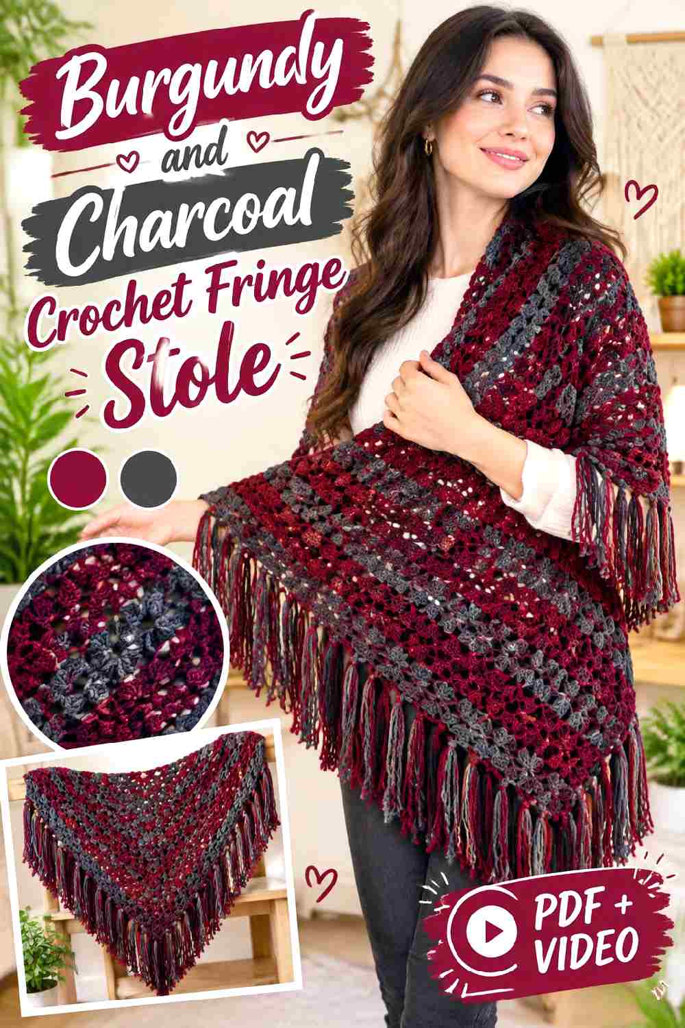
Burgundy gives a long crochet stole the rich, dark field associated with fall dressing without taking the piece all the way to black. Use it across most of the body, then bring charcoal into a narrow edge, occasional stripe, or fringe. Because both colors have visual weight, the important checkpoint is value separation: the charcoal needs to be dark enough or neutral enough to remain distinguishable rather than disappearing into the burgundy.
Burgundy Should Carry Most of the Crochet Stole Surface
Keeping burgundy dominant makes the stole read as one strong color statement when it is draped over a coat or dress. If the crochet fabric has raised texture, avoid breaking every section with charcoal; too many dark interruptions can make a continuous stitch pattern appear fragmented.
Charcoal Fringe Gives Burgundy a Sharper Outer Frame
Charcoal works especially well at the ends because the moving fringe creates definition without dividing the main burgundy field. Repeat a narrow charcoal edge before the fringe if the transition feels abrupt. That small repetition visually connects the trim to the body.
Creator Credit: Le Crochet de Plume
2. Electric Blue And Graphite Crochet Fringe Stole
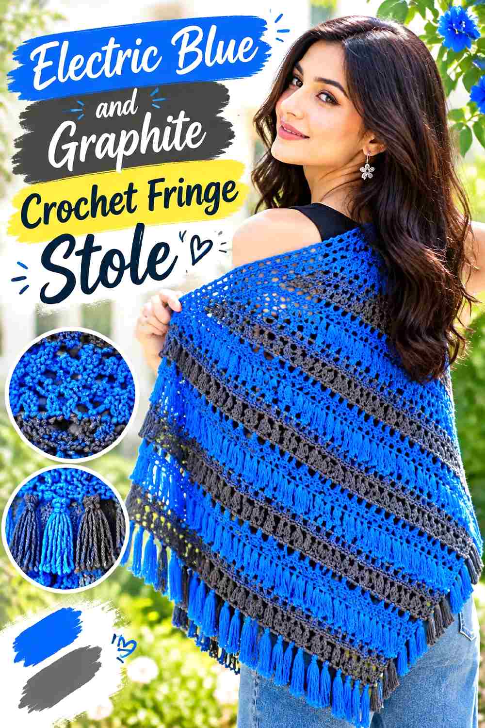
Electric blue can turn the stole itself into the focal accessory, so graphite is useful as a controlling neutral rather than a competing statement. Let blue cover the largest area and place graphite where the fabric needs visual definition: the outer edge, a restrained stripe, or the fringe. Against black outerwear, graphite may recede while electric blue remains visible, giving the stole a layered rather than sharply outlined appearance.
Electric Blue Benefits From a Broad Uninterrupted Crochet Field
A saturated blue becomes more dramatic when readers can see enough of it at once. On a stole with lace or openwork, keep the larger sections blue so the negative space and color work together instead of creating numerous small blocks.
Graphite Fringe Can Ground Electric Blue Without Turning the Stole Black
Use graphite when you want the ends to feel heavier than the center without adding another vivid hue. If blue and graphite are also striped through the body, keep the fringe simpler so movement does not make an already graphic palette overly busy.
Creator Credit: One Dog Woof
3. Royal Purple And Cherry Red Crochet Fringe Stole
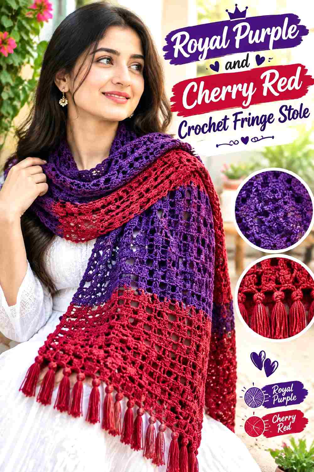
Purple and red are one of the more assertive directions in current Fall 2026 fashion coverage, making this a natural palette for a stole intended to be noticed rather than quietly blended into an outfit. Give royal purple the larger area and use cherry red in controlled placements so the two saturated colors have a hierarchy.
Royal Purple Needs Enough Space to Anchor Cherry Red
Use royal purple through the center or majority of the stole. The deeper field gives bright red details somewhere to land visually. Alternating equal purple and red bands can work, but it produces a much more graphic result than a purple-dominant arrangement.
Cherry Red Fringe Turns Royal Purple Into a Stronger Statement
Red fringe creates movement at the outer edge and allows a smaller quantity of red to have noticeable impact. If the jump between purple and red feels too abrupt, introduce a narrow red line elsewhere on the stole rather than adding a third color immediately.
Creator Credit: Rich Textures Crochet
4. Olive Green And Camel Crochet Fringe Stole
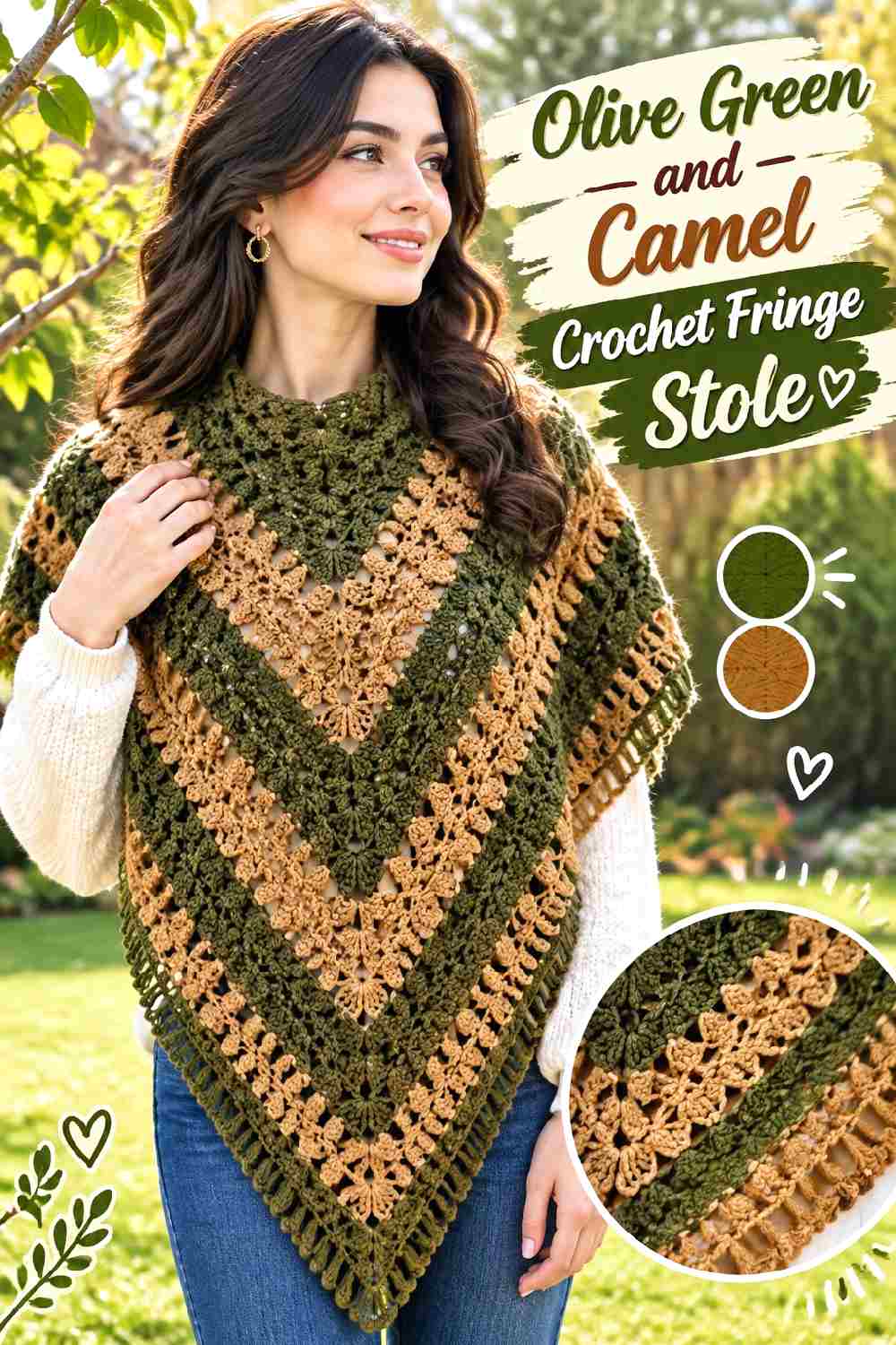
Olive has strong Fall 2026 relevance, while camel gives it a warm neutral partner that can make crochet texture easier to read. Use olive as the main field for an earthy stole and concentrate camel around edges or repeated details. This is lower contrast than electric blue with graphite, so the appeal comes from tonal depth rather than a sharp color break.
Olive Green Makes a Strong Main Color for a Textured Crochet Stole
Olive can cover broad stitch areas without making every ridge or opening compete for attention. If the chosen olive is particularly dark, compare it against the intended coat or top so the stole does not visually merge with the layer underneath.
Camel Fringe Gives Olive Green a Warmer, Lighter Finish
Camel at the ends lifts the palette and makes the fringe easier to see against dark trousers or outerwear. A slim camel border before the fringe can also keep the lighter trim from looking disconnected from the olive body.
Creator Credit: Bag-O-Day Crochet
5. Butter Yellow And Chocolate Brown Crochet Fringe Stole
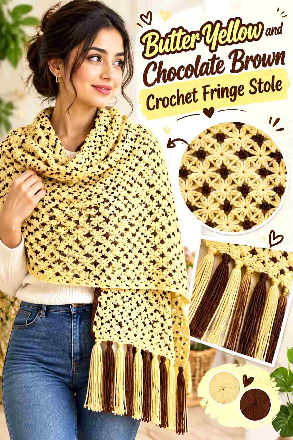
Butter yellow offers a much lighter Fall 2026 direction than the expected wine and forest shades. Pairing it with chocolate brown keeps the result grounded for colder-weather styling. Let the pale yellow reveal openwork or lace across most of the stole, then use chocolate in places where the outline needs stronger definition.
Butter Yellow Can Make Crochet Lace Easier to Read
A lighter body color allows shadows within open stitches to contribute to the pattern. If the chosen yellow is extremely pale, compare it with the intended fringe yarn so the border does not overwhelm the entire surface.
Chocolate Brown Fringe Gives Butter Yellow More Fall Weight
Chocolate works well at the ends because a relatively small dark area can frame a large pale field. Keep the brown controlled if the goal is lightness; broad brown bands plus dark fringe will shift the balance away from butter yellow quickly.
Creator Credit: Handmade by Appy
6. Turquoise And Deep Navy Crochet Fringe Stole
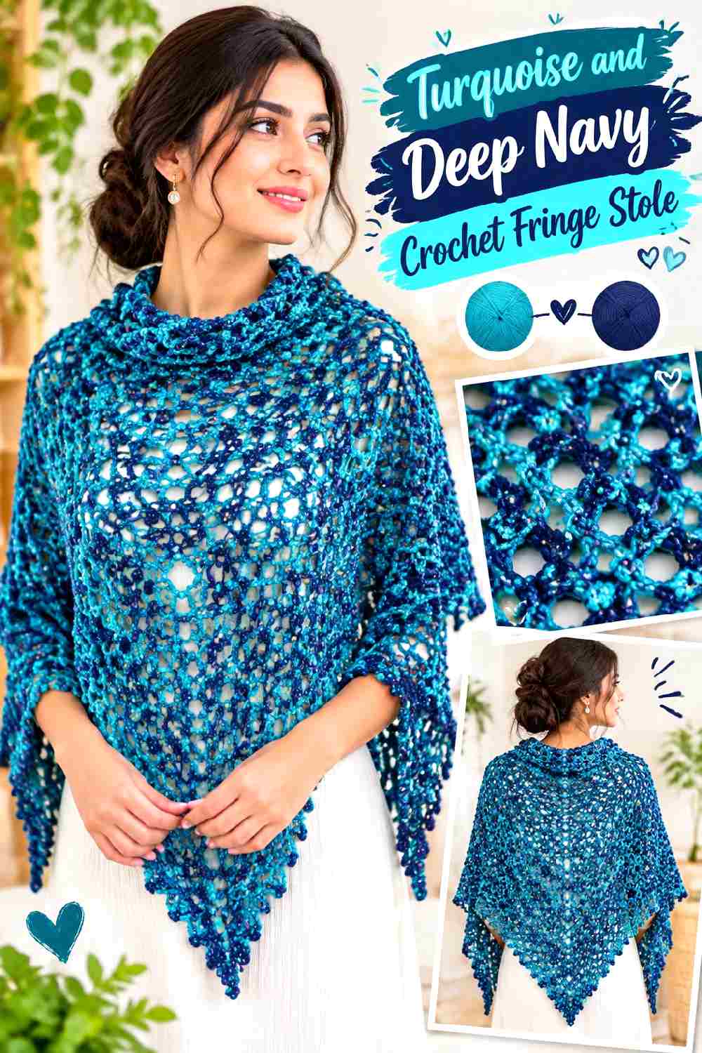
Turquoise moving into fall is one of the more unexpected 2026 color directions, and deep navy makes it easier to translate into a substantial crochet accessory. Turquoise can dominate the stole while navy appears at the edge and fringe, or the relationship can be reversed for a darker overall result.
Turquoise Looks Strongest When the Crochet Stole Gives It Visual Room
Rather than scattering turquoise into tiny details, use it in wide areas where its clarity can register from a distance. This is particularly useful when the stole has a simple silhouette and the color is expected to provide most of the visual drama.
Deep Navy Fringe Gives Turquoise a Darker Fall Finish
Navy creates less severe contrast than black while still defining the edge. For a more connected palette, repeat navy once near each end of the turquoise body before beginning the fringe.
Creator Credit: Sirin’s Crochet
7. Juicy Peach And Oxblood Crochet Fringe Stole
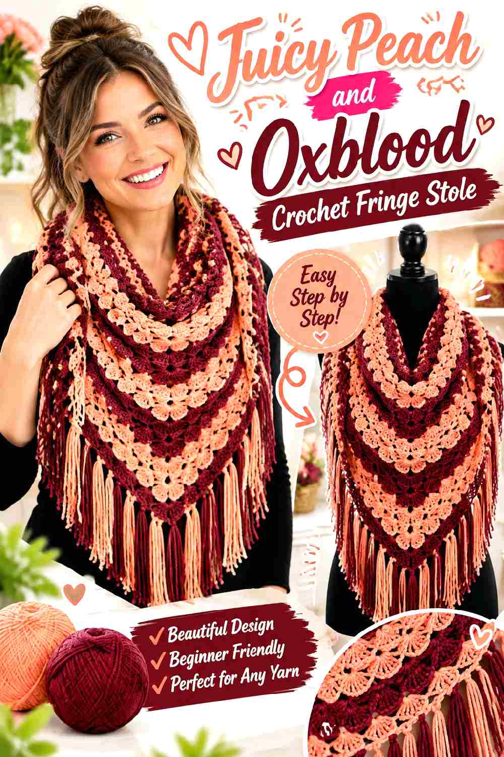
Peach is another unexpected Fall 2026 shade, and oxblood pushes it away from spring sweetness. The light-dark difference also gives the crochet surface useful definition. Use peach as the larger field when you want a brighter stole, or reverse the relationship and treat peach as a narrow highlight on an oxblood body.
Juicy Peach Keeps a Crochet Fringe Stole From Becoming Too Dark
A peach-dominant center gives the stole lightness even when the ends are deep and dramatic. It is especially useful around open stitchwork, where the lighter color can keep the pattern from visually closing up.
Oxblood Fringe Gives Juicy Peach a Deliberate Dark Edge
Place oxblood at the outermost section and fringe if you want maximum value contrast. If the difference looks too severe, add a narrow oxblood stripe close to each end so the fringe feels like the final part of an established color sequence.
Creator Credit: Crochet with Susie
8. Black And Silver Crochet Fringe Stole
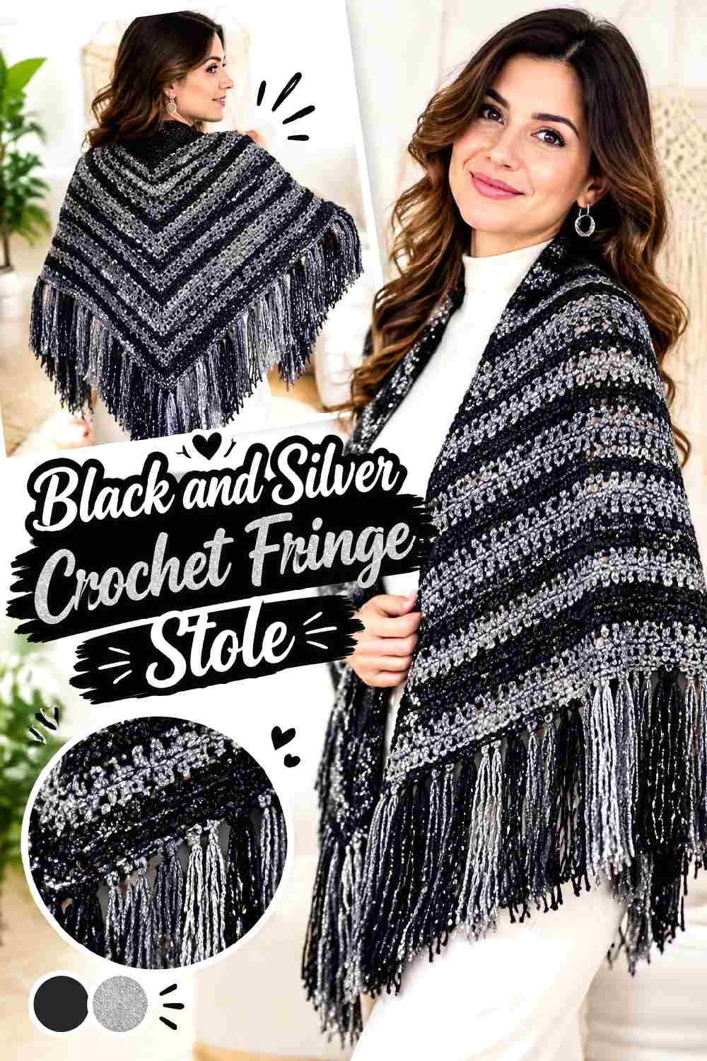
Black and silver move the stole toward eveningwear and make texture more important because the palette itself is so restricted. Fall 2026 runway coverage has included black-and-silver fringe treatments in sculptural knitwear, giving this combination a particularly direct link to the season’s textural drama. Keep the crochet body mostly black and let a soft silver-gray create highlights rather than trying to imitate metallic materials.
Black Makes Crochet Texture the Main Feature of the Stole
With very little hue variation, stitch relief, lace openings, and the silhouette become more noticeable. Check the fabric under ordinary indoor lighting before committing; very dark yarn can conceal subtler stitch texture.
Silver Gray Fringe Can Lift a Black Crochet Stole at the Ends
A soft silver-gray fringe gives movement more visibility than black-on-black fringe. Repeat silver sparingly along an edge or in a narrow terminal stripe if the pale ends otherwise appear detached from the main body.
Creator Credit: ANITAWN
9. Poppy Red And Cream Crochet Fringe Stole
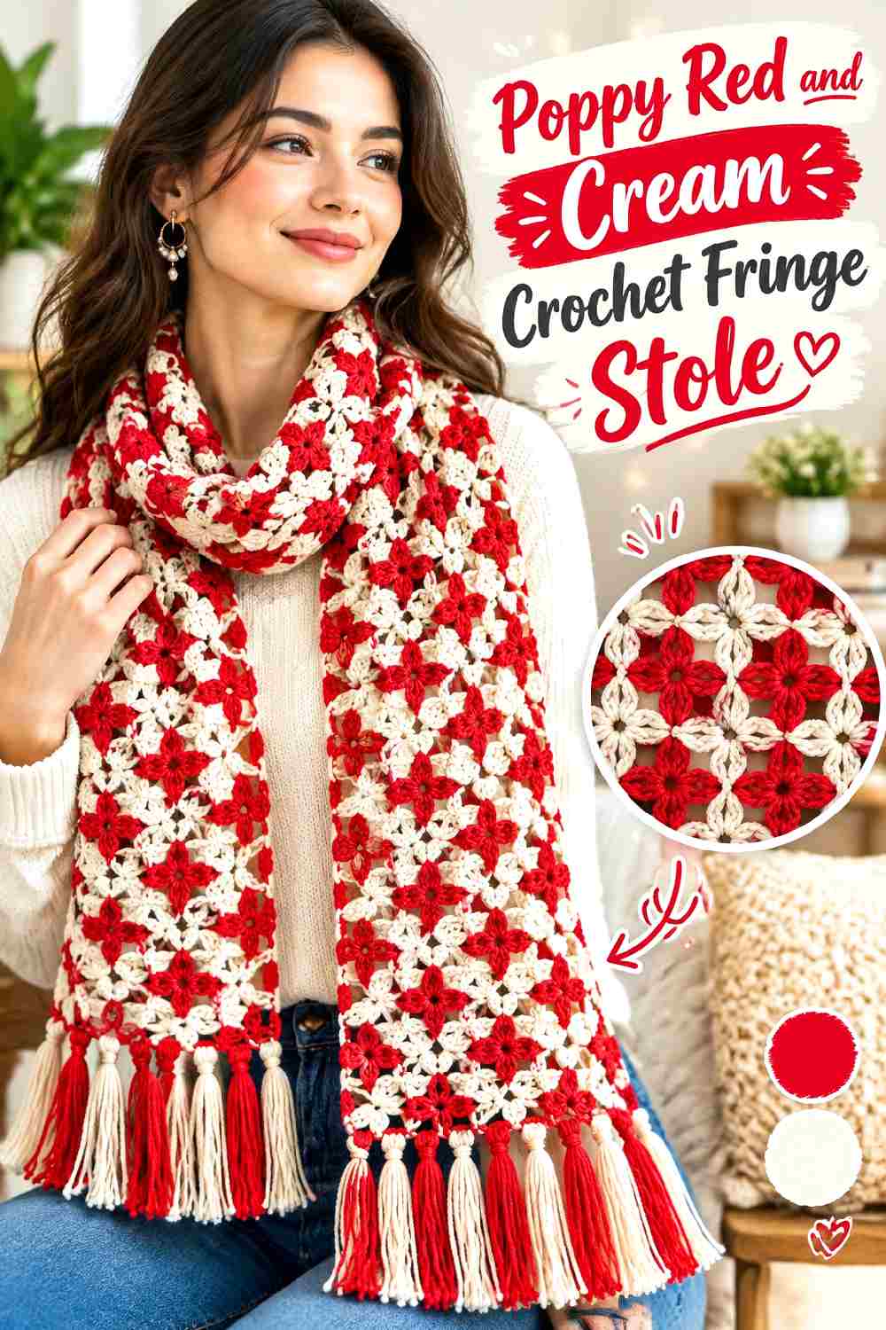
Poppy red gives the stole an immediate focal color, while cream creates enough value contrast to separate edging or textural details. This palette works especially well when the garment underneath is simple because the red can carry the outfit visually without several additional accent colors.
Poppy Red Should Remain the Dominant Crochet Color
Use red over most of the stole if you want it to read as a statement accessory. Cream can outline stitch changes or the ends, but broad equal bands will turn the design into a two-color graphic rather than a red-led piece.
Cream Fringe Makes Poppy Red Feel Lighter in Motion
Cream fringe can create a sharp finish without introducing another saturated hue. To prevent it from appearing added at the last minute, repeat cream in a narrow border or small terminal section immediately above the fringe.
Creator Credit: Fiber Spider
10. Chestnut And Plum Crochet Fringe Stole
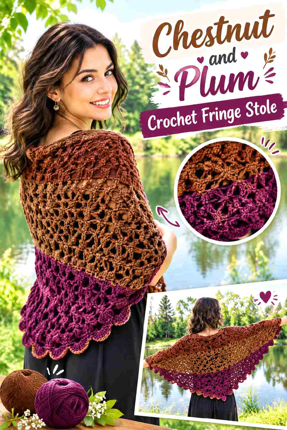
Chestnut and plum create a darker tonal palette with less obvious contrast than red with cream or turquoise with navy. The success of the combination depends on keeping the two yarn colors visually distinct. A warm medium chestnut can occupy most of the surface while plum defines the ends, or plum can lead for a moodier result.
Chestnut Gives Plum a Warm Crochet Background
Chestnut works well across broad sections because its brown base creates an autumn foundation without competing strongly with the purple accent. Compare the yarns from a few feet away; if they merge, choose a lighter chestnut or deeper plum.
Plum Fringe Adds Depth Without Overpowering Chestnut
Plum at the fringe gives the stole a cooler edge and introduces color through movement. A small amount is usually enough, particularly when both shades are dark or muted.
Creator Credit: Jayda InStitches
11. Moss Green And Ivory Crochet Fringe Stole
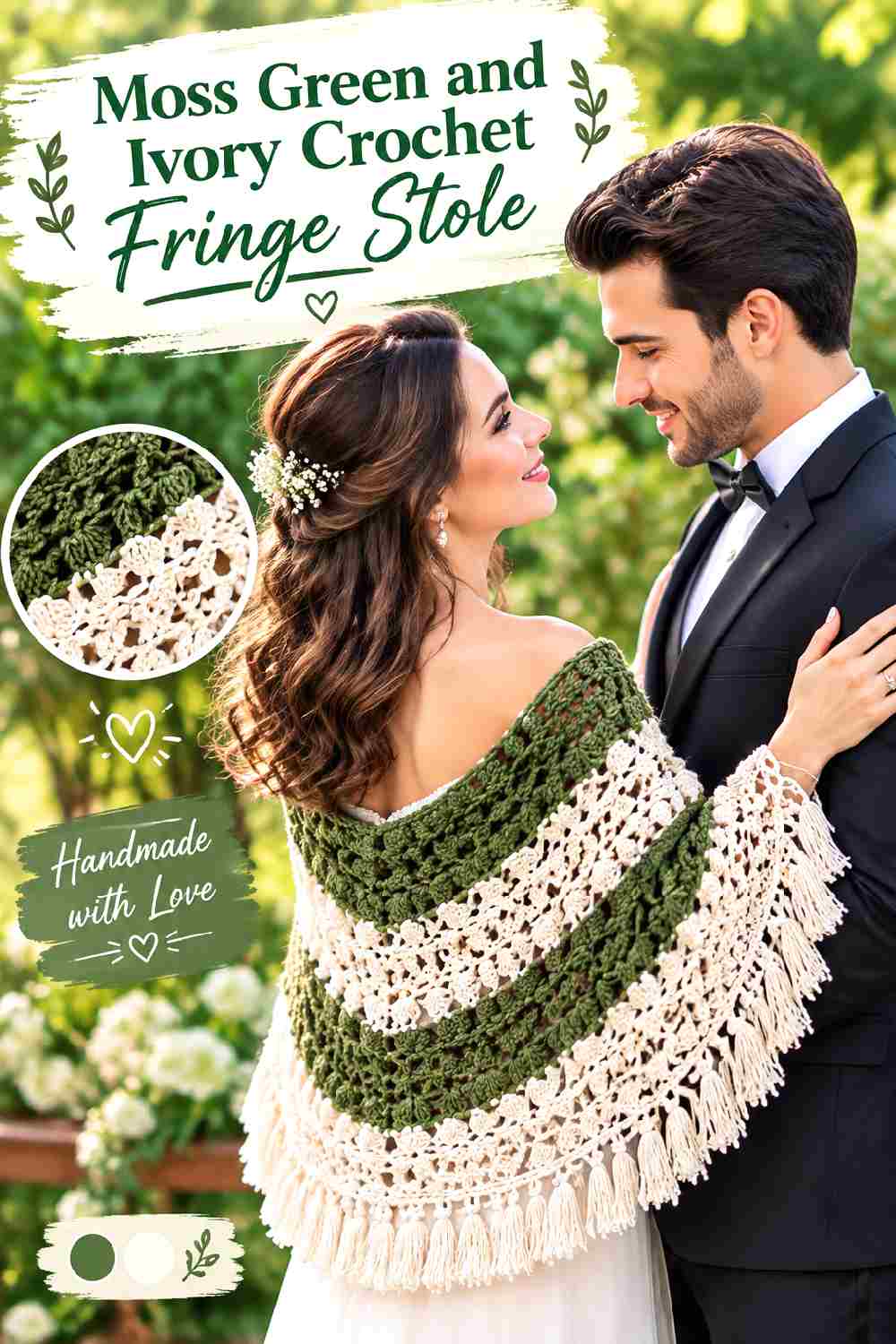
Moss and ivory offer a quieter alternative to electric blue or cherry red while still giving the crochet fabric useful value contrast. Let moss cover most of the stole and use ivory wherever a border, openwork detail, or fringe needs to remain easy to see.
Moss Green Keeps a Crochet Fringe Stole Earthy Without Going Flat
Choose an ivory that is clearly lighter than the moss rather than another similar mid-value neutral. The separation is especially helpful when the body contains repeated textured sections that could disappear in an all-moss version.
Ivory Fringe Brightens Moss Green at the Outer Edge
Ivory fringe is visually active because it catches light against a darker body. If you want a more restrained finish, mix only a limited amount of ivory into moss fringe rather than changing the entire end section to the lighter shade.
Creator Credit: The Crochet Crowd
12. Aubergine And Blush Crochet Fringe Stole
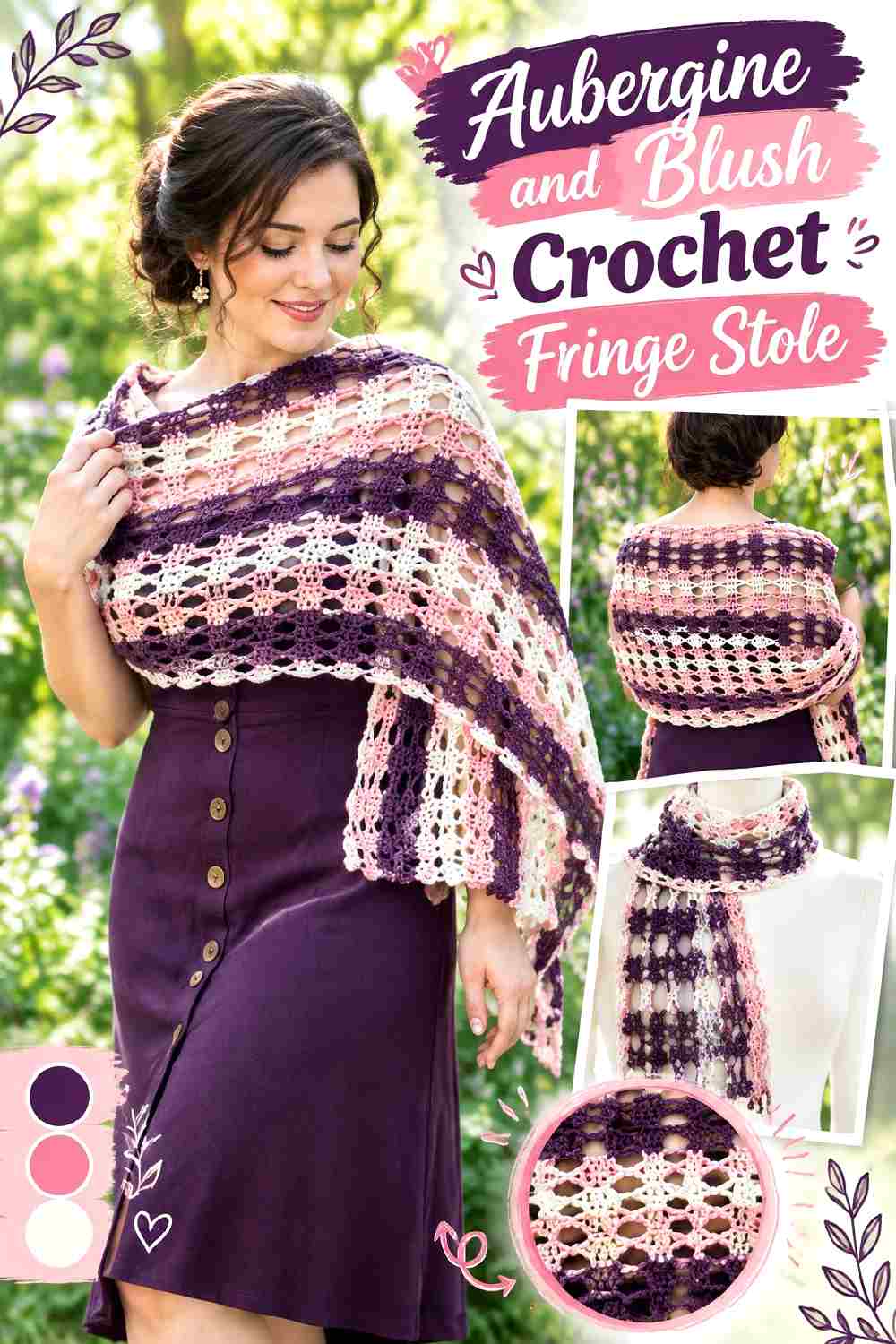
Aubergine gives the stole a dark purple base, while blush softens it without relying on beige or cream. The palette has enough contrast for visible details but stays within a red-purple family, making it more tonal than purple paired with cherry red.
Aubergine Can Carry the Main Crochet Stole Without Losing Drama
Use the deeper purple across the broad center and reserve blush for selected edges or details. If the texture appears too subdued in aubergine, blush can be placed around a stitch transition or border to make the structure clearer.
Blush Fringe Softens an Aubergine Crochet Edge
Blush creates a lighter finish and makes the fringe more obvious in motion. Repeat blush close to the ends so the shift from dark body to pale fringe appears planned rather than abrupt.
Creator Credit: Winding Road Crochet
13. Rust And Deep Teal Crochet Fringe Stole
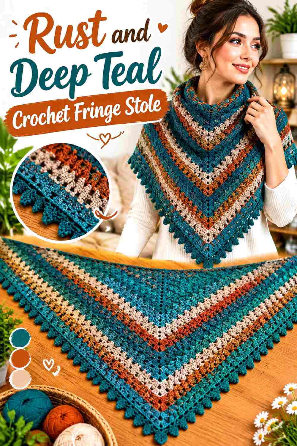
Rust and deep teal bring warm and cool color into the same accessory without requiring a neutral separator. Because both can become visually strong, one should clearly lead. A rust-dominant body with teal edging gives the warm tone more area; the reverse creates a darker, cooler stole with flashes of autumn orange.
Rust Works Better as a Broad Crochet Field Than a Tiny Accent Here
Giving rust most of the surface lets its warmth read clearly and prevents teal from taking over. Use teal in fewer, deliberate places rather than alternating every section in equal proportions.
Deep Teal Fringe Gives Rust a Cooler Counterweight
Teal fringe creates clear hue contrast even when the two yarns have similar lightness. If that contrast feels too abrupt, introduce a thin teal line before the fringe instead of adding a third bridging color.
Creator Credit: Creative Grandma
14. Espresso And Copper Crochet Fringe Stole
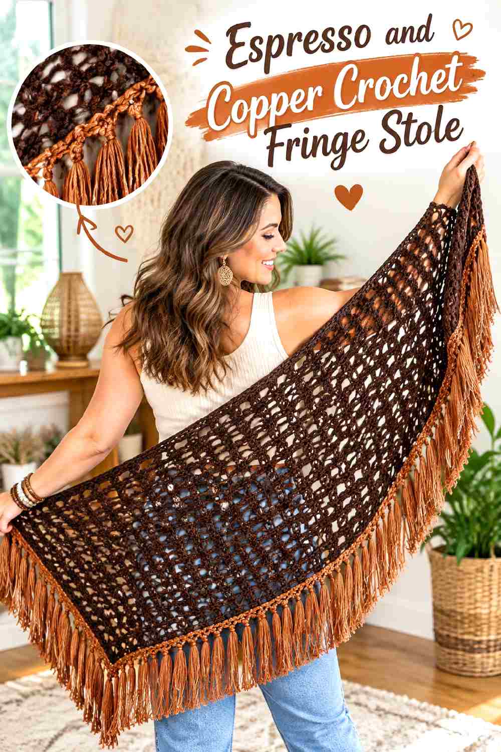
Espresso brown makes a strong dark base for a fall stole, while copper introduces warmth and visibility without the sharpness of bright orange. The palette is particularly effective when the stole relies on texture because the lighter copper can be placed where stitch changes deserve extra definition.
Espresso Gives a Crochet Stole a Dark, Continuous Base
Use espresso through most of the central fabric if the goal is a substantial, coat-friendly accessory. Before continuing through the whole piece, check whether the dark yarn hides details that you want visible; not every texture needs a high-contrast treatment.
Copper Fringe Brings Movement to Espresso Without Adding a Bright Color
Copper can appear in the end sections and fringe, where a smaller quantity still has impact. If an all-copper fringe feels too strong, alternate copper selectively with espresso so the trim remains connected to the body.
Creator Credit: Bella Coco
15. Stone Gray And Cobalt Blue Crochet Fringe Stole
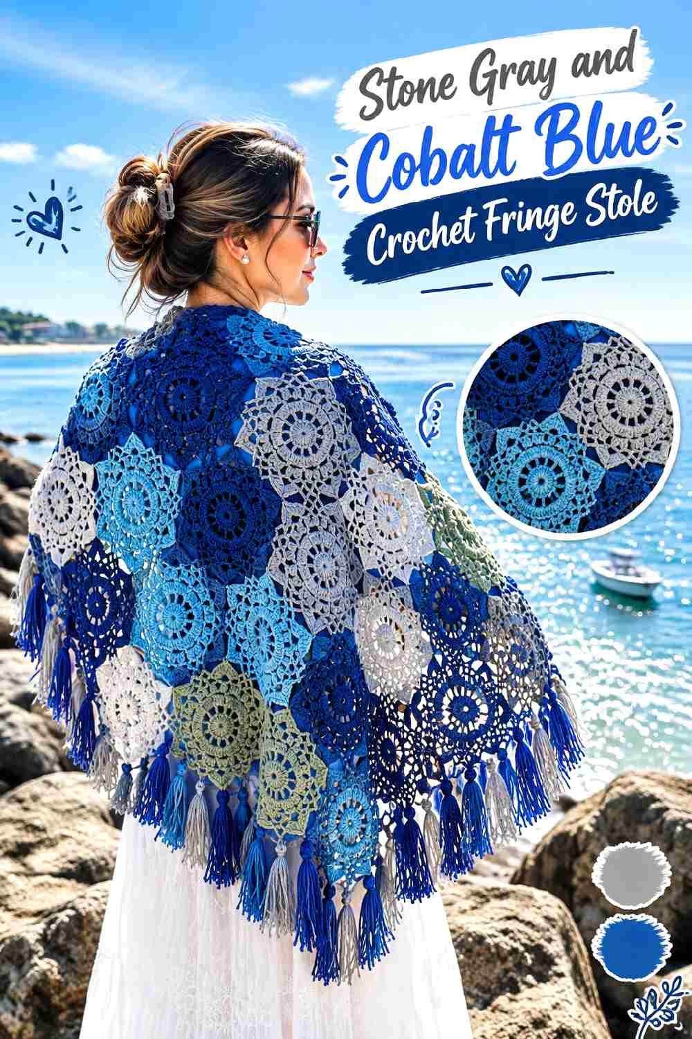
Cobalt or electric blue is one of Fall 2026’s clearest saturated color directions, and stone gray gives it a neutral surface where it can stand out. Unlike an all-blue stole, a gray-dominant version lets cobalt function almost like graphic punctuation.
Stone Gray Gives Cobalt Blue a Neutral Crochet Ground
Covering most of the stole in gray makes even small cobalt sections noticeable. This approach works well when you want a dramatic accent but do not want the entire wrap to be saturated blue.
Cobalt Blue Fringe Can Become the Main Statement Against Stone Gray
Because fringe moves, cobalt does not need to occupy much of the body to remain important. Repeat a thin cobalt border or motif detail before the ends so the blue belongs to the complete composition.
Creator Credit: Ophelia Talks Crochet
16. Ruby Red And Inky Navy Crochet Fringe Stole
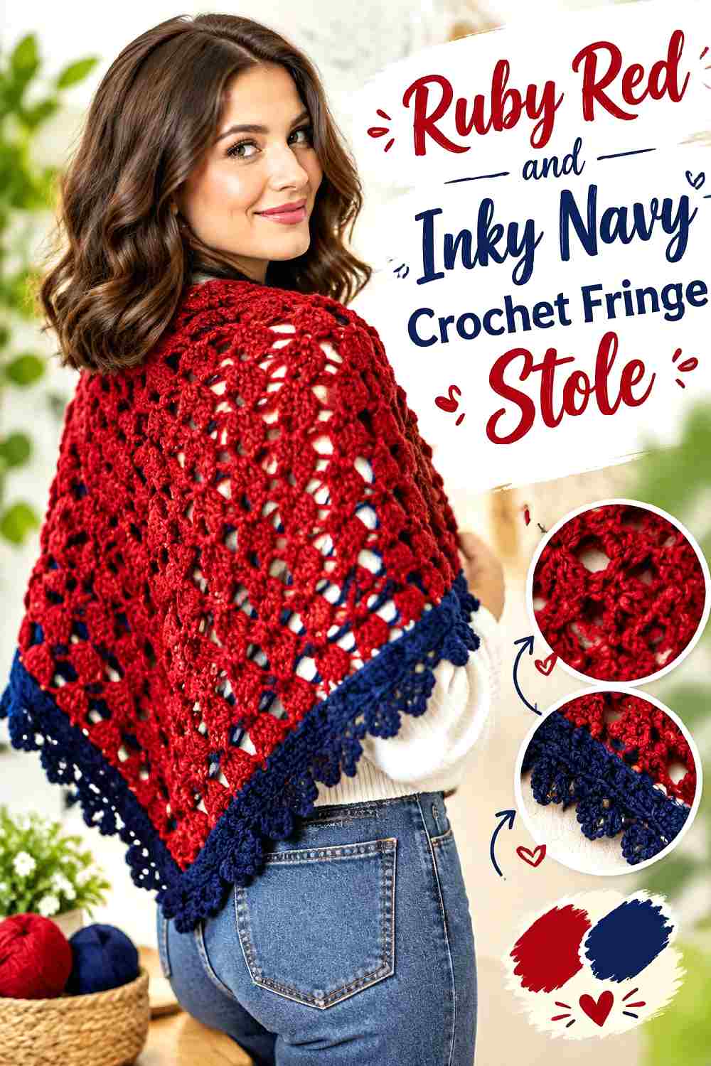
Ruby and inky navy create a jewel-toned palette with strong depth but less light-dark separation than red with cream. Use red where you want attention and navy where the stole needs visual stability. Checking the actual yarn values is important because particularly deep ruby can merge with navy in low light.
Ruby Red Needs Clear Placement Against Inky Navy
Broad ruby sections or a ruby central field will read more clearly than scattered small details. If navy dominates the entire body, reserve enough ruby near the face or ends for the second color to remain intentional.
Inky Navy Fringe Can Ground Ruby Red Without Using Black
Navy gives red a dark boundary while preserving some color in the shadowed areas of the stole. If both shades are very dark, consider keeping the upper edge ruby or adding a narrow red repetition before the navy fringe.
Creator Credit: Yarnspirations
17. Saffron And Burgundy Crochet Fringe Stole
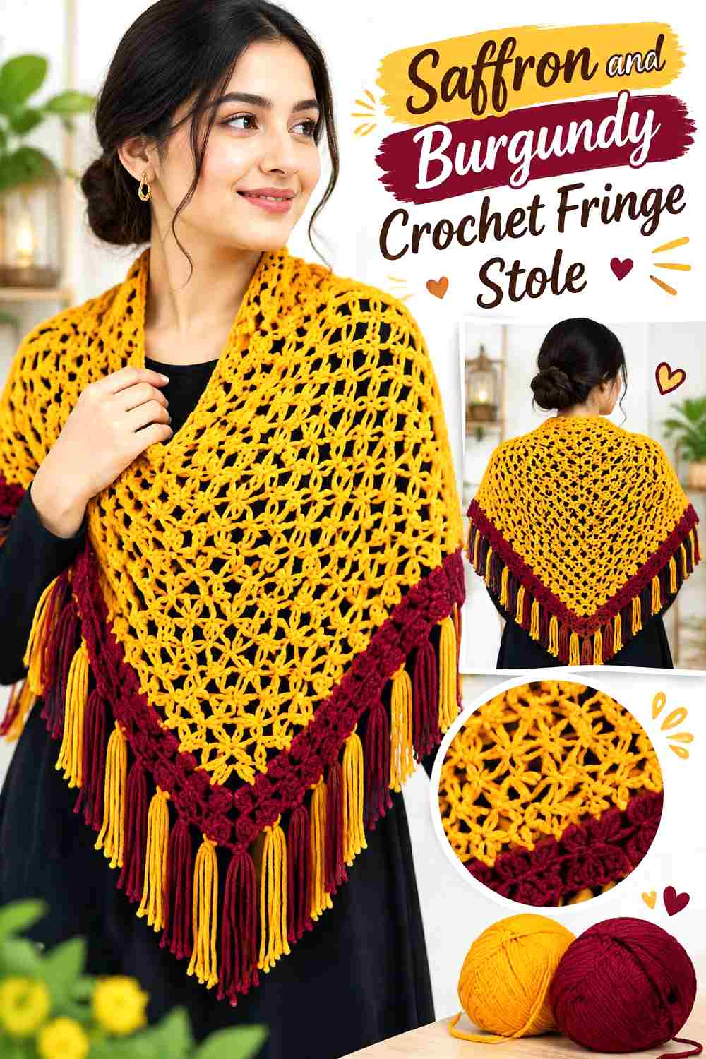
Saffron and burgundy close the collection with one of the warmest, most visibly autumnal palettes. Saffron has enough brightness to lift a large crochet surface, while burgundy supplies the depth needed to keep the stole from becoming overwhelmingly golden.
Saffron Should Have More Crochet Surface Than Burgundy for a Lighter Result
Use saffron over the main body and keep burgundy closer to the ends if you want the texture to remain bright and visible. Reversing that balance produces a much darker piece in which saffron behaves as a concentrated accent.
Burgundy Fringe Gives Saffron a Richer Fall Boundary
Burgundy fringe frames the warmer center and makes the stole feel visually heavier at the ends. A narrow burgundy terminal stripe can smooth the transition and gives the fringe an obvious connection to the crocheted body.
Creator Credit: Crochet with Clare
Conclusion
For the strongest runway-style color impact, electric blue with graphite, royal purple with cherry red, turquoise with navy, and stone gray with cobalt put saturated color at the center of the stole. Black with silver and ruby with navy move in a darker evening direction, while burgundy with charcoal, chestnut with plum, espresso with copper, and saffron with burgundy stay closer to deep fall tones.
If you prefer a lighter stole, butter yellow with chocolate, peach with oxblood, moss with ivory, and aubergine with blush use pale supporting colors to expose more of the crochet texture.
Whichever palette you choose, decide the dominant color before adding the fringe. A stole has enough surface for the main shade to establish the look first; edging and fringe should strengthen that decision rather than compete with it. Use the credited tutorials for their original construction details, then treat color placement as a separate planning step.
Frequently Asked Questions
What Fall 2026 colors work especially well for a crochet fringe stole?
Current fashion coverage includes electric blue, red, butter yellow, purple, burgundy, turquoise, peach, and olive among noticeable Fall 2026 directions. For crochet, the more useful question is how those shades interact with stitch texture and fringe. A saturated color such as cobalt may need only a neutral partner, while a softer butter yellow can benefit from a darker brown edge.
Should the fringe be the same color as the crochet stole?
It does not have to be. Matching fringe creates a continuous, quieter look, while contrasting fringe can make the ends a focal point. If the fringe uses a second color, repeating that color once in an edge or small body detail can make the palette feel more connected.
How can I tell whether two stole colors have enough contrast?
Compare the yarns side by side and look at them from a short distance. A grayscale photo can help reveal whether they differ in lightness as well as hue. If small crochet details disappear, consider making one color lighter or darker rather than simply switching to another hue with a similar value.
Can I use three colors in a crochet fringe stole?
Yes, but give them different jobs. One can dominate the body, another can support the border or repeated sections, and the third can appear in smaller accents or fringe. Using three saturated colors in similar amounts can make the long surface and moving fringe compete for attention.
Should the darkest color always go in the fringe?
No. Dark fringe can frame a light stole effectively, but a pale fringe can also lighten a dark body and make movement easier to see. Choose according to the overall balance you want rather than treating dark edging as a fixed rule.
How do I substitute one of these crochet stole colors?
Preserve the color’s role instead of chasing an exact shade name. If replacing burgundy, for example, choose another dark red that remains clearly deeper than its supporting color. If replacing blush or butter yellow, keep enough lightness that the original contrast relationship still works.
How can I keep a dramatic Fall 2026 crochet stole from looking too busy?
Reduce the number of areas competing for attention. If the fringe is multicolored, keep the stole body simpler. If the body contains strong color blocking, use a single fringe color. Giving one shade a clear majority usually does more for visual organization than adding another neutral after the palette already feels crowded.