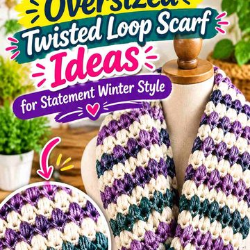
Royal purple has enough visual strength to turn a fuzzy crochet crescent bag into a winter statement accessory, but the fuzzy surface changes how that color reads. Long pile, chenille-like plushness, or a soft halo can blur stitch lines and soften the bag’s curved outline, so color placement needs to help the crescent remain recognizable rather than making the entire piece look like one undifferentiated patch of purple.
The strongest palettes give royal purple a clear role. It can cover the fuzzy body while black defines the curved edge, winter white separates the silhouette from a dark coat, silver cools the strap and hardware area, or emerald adds a second jewel tone in carefully controlled amounts. The crescent shape also gives you natural placement points: the outer curve, top opening, side tabs, strap, closure area, and any smoother edging around the plush body.
The tutorials below support crescent, half-moon, shoulder-bag, or fuzzy-bag construction. Where a tutorial uses smooth yarn rather than a fuzzy material, treat the plush royal-purple surface as an adaptation and test the fabric first rather than assuming a direct yarn substitution will reproduce the creator’s exact bag.
Quick List
- Royal Purple and Black Crochet Fuzzy Crescent Bag
- Royal Purple and Icy Silver Crochet Fuzzy Crescent Bag
- Royal Purple and Ivory Crochet Fuzzy Crescent Bag
- Royal Purple and Fuchsia Crochet Fuzzy Crescent Bag
- Royal Purple and Deep Teal Crochet Fuzzy Crescent Bag
- Royal Purple and Charcoal Crochet Fuzzy Crescent Bag
- Royal Purple and Lavender Crochet Fuzzy Crescent Bag
- Royal Purple and Midnight Navy Crochet Fuzzy Crescent Bag
- Royal Purple and Winter White Crochet Fuzzy Crescent Bag
- Royal Purple, Magenta, and Black Crochet Fuzzy Crescent Bag
- Royal Purple and Emerald Crochet Fuzzy Crescent Bag
- Royal Purple, Plum, and Soft Gray Crochet Fuzzy Crescent Bag
- Royal Purple and Pale Gold Crochet Fuzzy Crescent Bag
Keep Royal Purple Visible Through a Fuzzy Crochet Surface
Fuzzy yarn reduces the amount of crisp stitch definition you can rely on, particularly along the curved lower edge of a crescent bag. If royal purple covers the entire body, inspect the silhouette from a few feet away rather than judging only individual stitches. The outside curve, opening, and strap transitions should still be easy to identify.
A smoother contrasting edge can help when the pile visually spreads beyond the actual crochet fabric. Black, ivory, gray, or another supporting shade can create a cleaner boundary, but it does not need to surround the entire bag. Sometimes a contrasting top opening or strap connection is enough to keep the royal-purple body visually controlled.
Use Royal Purple Differently on the Crescent Body and Strap
The bag body and strap do not need identical color treatment. A fully royal-purple fuzzy body can look stronger with a smoother black, gray, or cream strap because the change in both color and texture creates a clear carrying line.
If you want the bag to look more continuous, repeat royal purple on the strap while reserving the supporting color for edging, attachment tabs, or the closure area. Whatever approach you choose, check the bag while it hangs. A crescent that looks balanced flat on a table can read differently once the body curves downward from the strap.
Check Royal Purple Against Winter Coats Before Finishing the Bag
Royal purple usually remains distinct from camel, cream, and pale-gray outerwear, but it can have less separation from black, navy, plum, or other dark winter layers. Hold the fuzzy fabric against the actual coat before deciding how much secondary color to add.
If the crescent edge disappears, move the lighter shade toward the perimeter or strap. If the purple already has plenty of separation, use the secondary shade more sparingly so the bag stays unmistakably royal purple.
1. Royal Purple and Black Crochet Fuzzy Crescent Bag
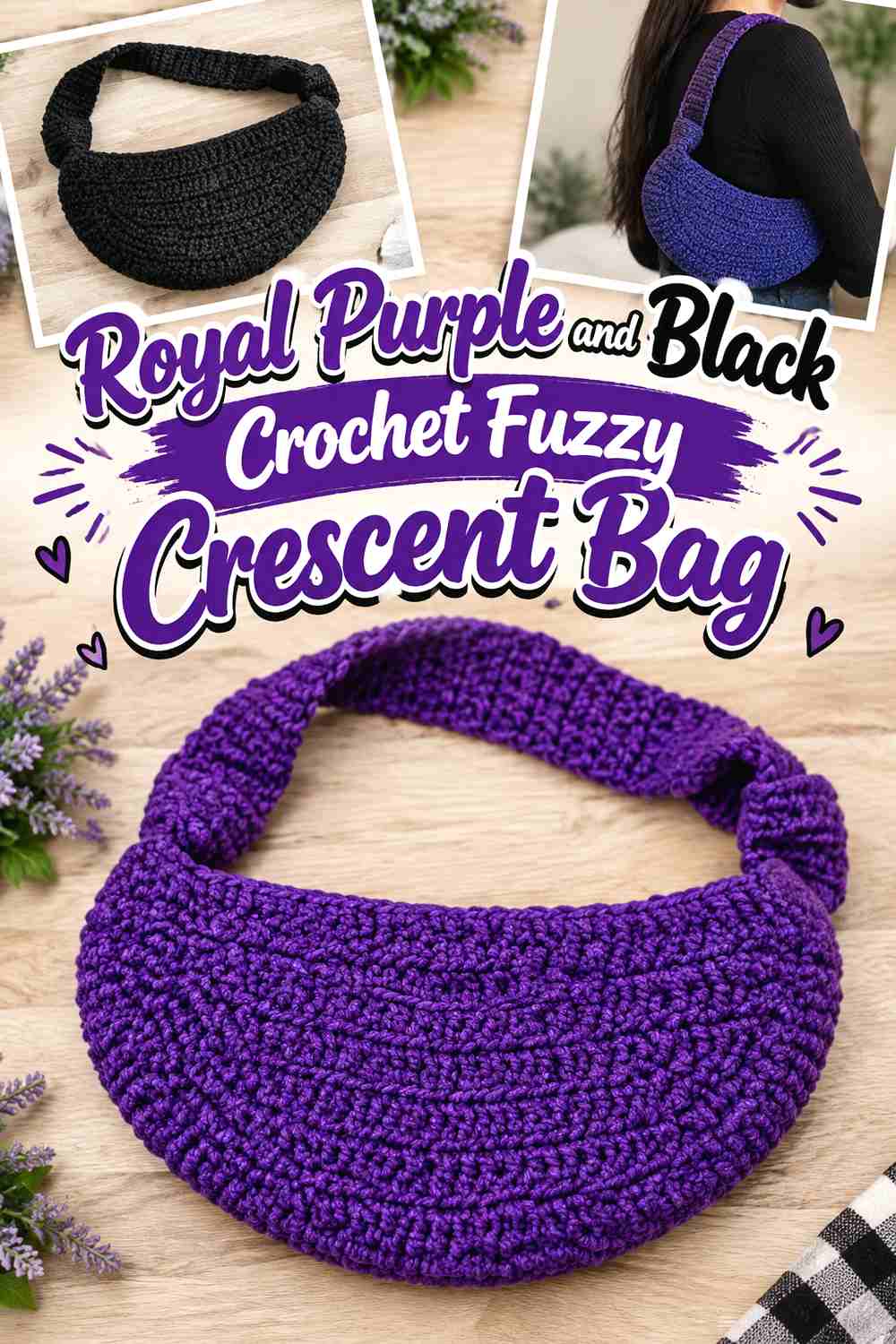
Royal purple can cover most of the fuzzy crescent body while black defines the top opening, strap, or narrow outer edge. This is one of the darkest palettes in the collection, so it works best when you want the plush purple surface to supply the color and black to control the silhouette rather than compete for equal space.
Royal Purple Needs Black at the Crescent Opening, Not Across Every Fuzzy Section
Keep most of the fuzzy body royal purple and introduce black where a crisp boundary is useful. A black top edge can separate the opening from the pile without breaking the purple surface into too many sections.
If your purple yarn already has a very deep value, place the two shades side by side before committing. Black and dark royal purple can merge from a distance, especially when fuzz softens the boundary.
Royal Purple Should Continue Into the Strap if the Black Edge Is Strong
A broad black strap combined with black edging can begin to visually frame the bag too heavily. Repeating royal purple through part of the strap or attachment area keeps the main color connected from body to carry point.
Creator Credit: VivCrochets
2. Royal Purple and Icy Silver Crochet Fuzzy Crescent Bag
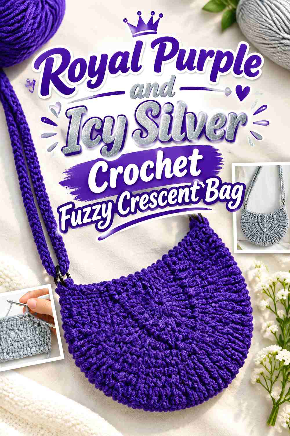
Icy silver gives royal purple a cooler winter direction and can create a useful light break around a plush crescent silhouette. Let royal purple dominate the fuzzy body, then use silver on the opening, strap details, or a narrow curve where the pile needs extra definition.
Royal Purple Gains Clearer Crescent Definition From Icy Silver
A slim silver-colored edge can make the purple curve easier to read without turning the whole bag two-toned. This is particularly useful on the lower or outer crescent edge if fuzzy fibers make the silhouette appear softer than the underlying fabric.
Avoid scattering silver throughout the body unless the design intentionally calls for a mottled surface. A concentrated accent keeps royal purple visually stronger.
Royal Purple Should Stay Dominant When Icy Silver Moves Onto the Strap
If the strap is mostly silver, repeat royal purple at the attachment tabs or another connecting area. That transition prevents the light strap from appearing unrelated to the fuzzy purple bag beneath it.
Creator Credit: tinycrochet
3. Royal Purple and Ivory Crochet Fuzzy Crescent Bag

Ivory creates the strongest light-dark contrast in this group without the starkness of pure black-and-white placement. A royal-purple fuzzy body with ivory edging or strap details can remain highly visible against dark winter coats.
Royal Purple Needs Ivory Near the Outer Crescent Curve on Dark Coats
When the bag will sit against black, charcoal, or navy outerwear, an ivory boundary along selected parts of the curve can stop royal purple from visually sinking into the background. Concentrate the light shade where the bag touches the coat rather than outlining every possible seam.
Royal Purple Should Return Near an Ivory Strap to Keep the Bag Connected
An entirely ivory strap can become the brightest part of the accessory. Repeat royal purple at the strap ends, tabs, or top edge so the eye moves naturally from the carrying section into the fuzzy body.
Creator Credit: Kane Crochet
4. Royal Purple and Fuchsia Crochet Fuzzy Crescent Bag
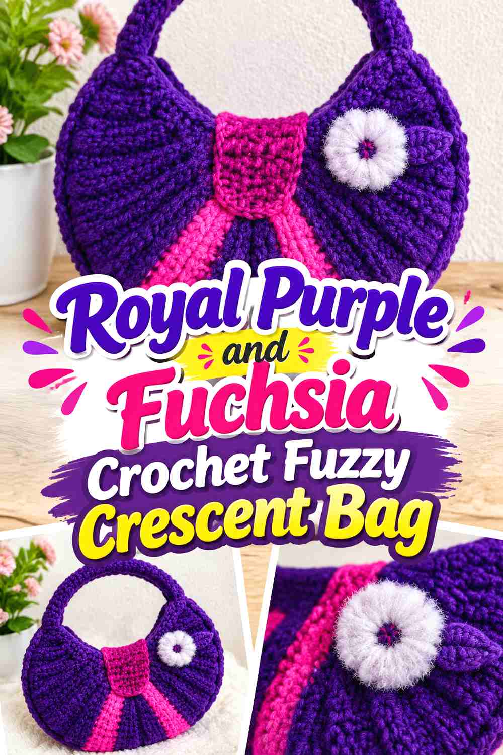
Fuchsia keeps the palette saturated and energetic rather than neutral. Because royal purple and fuchsia can be closer in value than purple and ivory, use fuchsia in specific areas such as the top curve, strap attachment, or a controlled side accent rather than mixing both colors evenly through the fuzz.
Royal Purple Needs a Clear Value Difference From Fuchsia
Place the two yarns together and view them at a distance. If fuchsia does not remain visibly lighter or brighter than royal purple, small color changes may disappear within a fuzzy surface.
A stronger separation is more useful around the opening or curve than simply adding more fuchsia.
Royal Purple Should Occupy More of the Fuzzy Crescent Than Fuchsia
Keep the largest uninterrupted area royal purple. Use fuchsia to punctuate the bag at one or two points, allowing it to energize the purple rather than turn the body into equal color blocks.
Creator Credit: Manualidades La Manita Felíz
5. Royal Purple and Deep Teal Crochet Fuzzy Crescent Bag
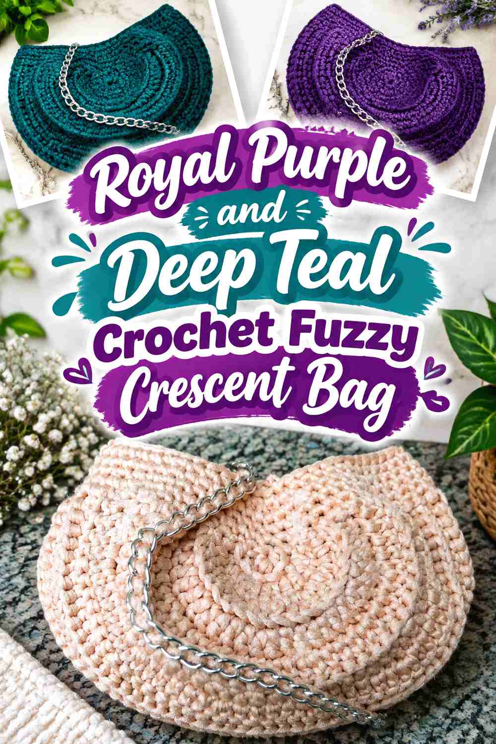
Royal purple with deep teal creates a saturated jewel-tone palette with relatively low value contrast. That makes placement important. Purple should control the fuzzy crescent body while teal appears on a strap, top band, or another clearly separated area.
Royal Purple Needs Deep Teal in Larger, Simpler Areas
Tiny teal details can disappear into royal-purple fuzz because both shades are visually strong and dark. A more useful approach is to give teal one recognizable area, such as the strap or top opening, rather than breaking it into many small accents.
Royal Purple and Deep Teal Need a Distance Check Before Finishing the Crescent
View the bag from several feet away. If the teal boundary vanishes, either reduce the teal role or insert a lighter neutral at a key transition. The goal is not to force maximum contrast, but to prevent the two jewel tones from becoming one dark block.
Creator Credit: Pontos e Peças Marly Thibes
6. Royal Purple and Charcoal Crochet Fuzzy Crescent Bag

Charcoal creates a quieter dark neutral than black. It can define a royal-purple crescent without creating such a sharp edge, making this palette useful when you want a bold bag color but restrained supporting details.
Royal Purple Should Carry the Fuzzy Body While Charcoal Controls the Edge
Keep charcoal near the top opening, strap, or attachment areas where a smoother dark boundary is useful. Letting charcoal spread across large parts of the body can make the palette heavier without adding much extra definition.
Royal Purple Needs Enough Contrast From Charcoal on a Dark Winter Coat
A charcoal accent that looks obvious on a worktable may disappear against charcoal outerwear. Test the bag beside the intended coat. If both the edge and coat are similar, move royal purple or a lighter detail toward the perimeter instead.
Creator Credit: NATESSA | Sacred Crochet Art
7. Royal Purple and Lavender Crochet Fuzzy Crescent Bag
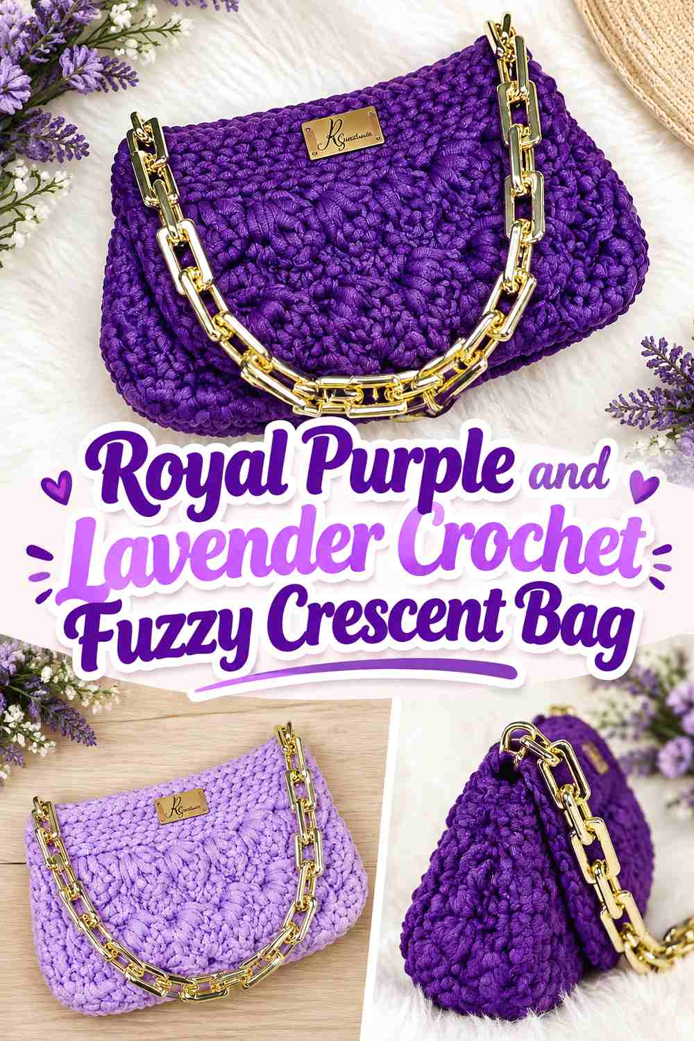
Lavender provides a tonal purple scheme while giving the fuzzy surface a lighter break. Use royal purple through the central body and lavender around the opening, outer curve, or strap when you want a softer transition rather than a high-contrast neutral.
Royal Purple Needs Lavender to Stay Noticeably Lighter
The success of this tonal palette depends on value difference. If the lavender is too dark, the fuzzy surface can erase the distinction and make the whole crescent look like one purple shade.
Choose a lavender that remains clearly lighter beside the royal purple you actually plan to use.
Royal Purple Should Anchor the Lower Crescent While Lavender Lifts the Top
Placing the darker royal purple lower on the body gives the crescent visual weight, while lavender near the opening can make the top easier to identify. This distribution also keeps the pale shade away from the largest fuzzy area, preserving the bold royal-purple identity.
Creator Credit: Rosangela Santana Handmade
8. Royal Purple and Midnight Navy Crochet Fuzzy Crescent Bag
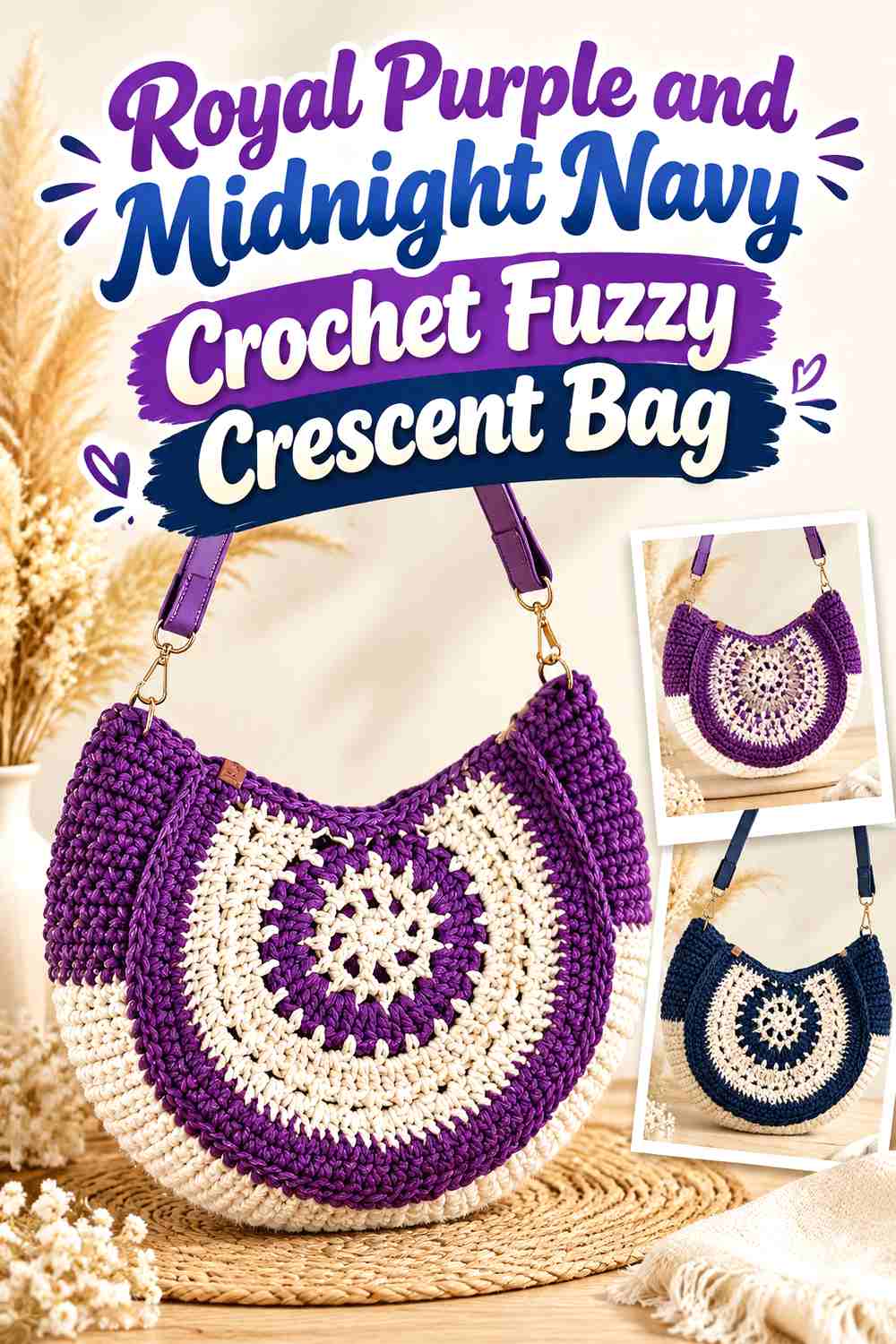
Royal purple and midnight navy create one of the deepest winter palettes here. The colors are useful when you want a saturated bag without light trim, but they need deliberate separation because fuzzy yarn can blur their boundary.
Royal Purple Should Stay on the Fuzzy Crescent Body Rather Than Compete With Midnight Navy
Give navy a specific job, such as the strap or opening. Using alternating royal-purple and navy sections across the body can make the two dark shades visually muddy unless their values differ strongly.
Royal Purple Needs a Clean Boundary Where Midnight Navy Meets the Crescent
A smoother seam, narrow edge, or clearly defined transition becomes more important when the colors themselves offer limited contrast. Check the bag while hanging rather than relying only on flat placement, because the curved profile determines where the two shades actually meet visually.
Creator Credit: Dazz Crochê
9. Royal Purple and Winter White Crochet Fuzzy Crescent Bag
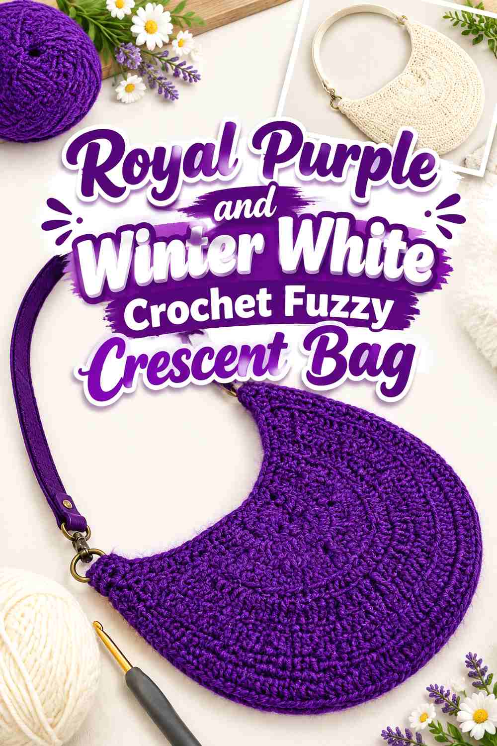
Winter white creates the brightest supporting shade in the collection. It can sharpen the royal-purple silhouette dramatically, especially when the bag will be carried with a dark winter coat.
Royal Purple Looks Stronger When Winter White Is Kept Around the Crescent Edge
Use winter white as a controlled frame rather than allowing it to cover half of the fuzzy body. The pale boundary can reveal the curved profile while royal purple remains the dominant fashion color.
Royal Purple Should Repeat on a Winter White Strap
If you choose a mostly white strap, bring royal purple into the attachment tabs or another small section. That repetition stops the strap from appearing visually separate from the bag and gives the palette a more intentional top-to-bottom connection.
Creator Credit: Tamara Kelly – Moogly
10. Royal Purple, Magenta, and Black Crochet Fuzzy Crescent Bag
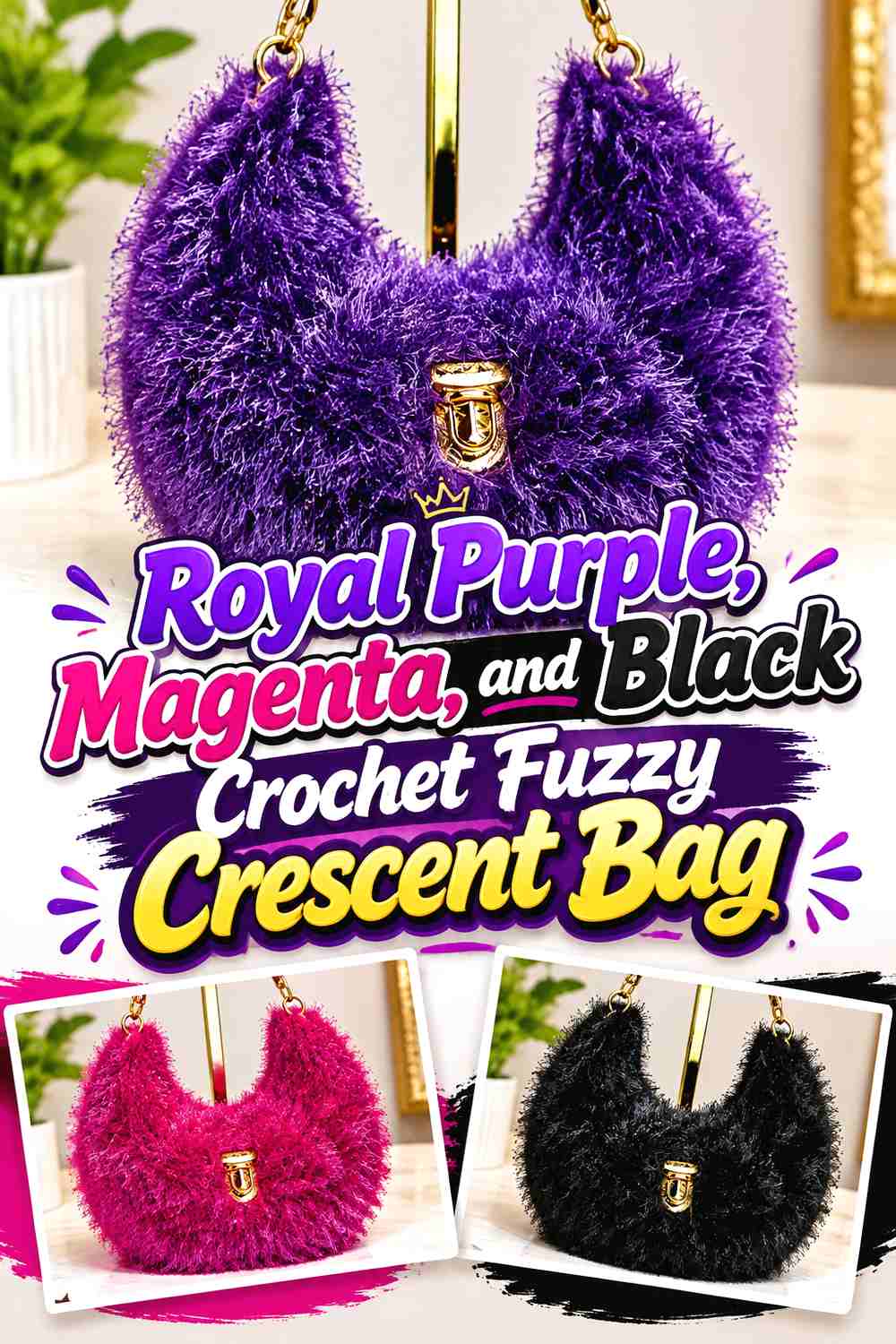
This three-color palette is the most overtly bold option. Royal purple should control the fuzzy body, black can define structure, and magenta can provide the smallest high-energy accent. Giving each color a separate role prevents the small crescent surface from becoming overcrowded.
Royal Purple Needs Black to Organize Magenta Accents
Use black around an opening, side tab, or strap connection and keep magenta concentrated in one smaller zone. The neutral creates a visual pause between two saturated purple-pink shades.
Royal Purple Should Remain the Largest Color Even With Magenta Fuzz
If magenta is introduced into the fuzzy body, keep it noticeably secondary. Equal amounts of royal purple and magenta can shift the design toward broad color blocking and weaken the single royal-purple focal point.
Creator Credit: Katy Handmade
11. Royal Purple and Emerald Crochet Fuzzy Crescent Bag
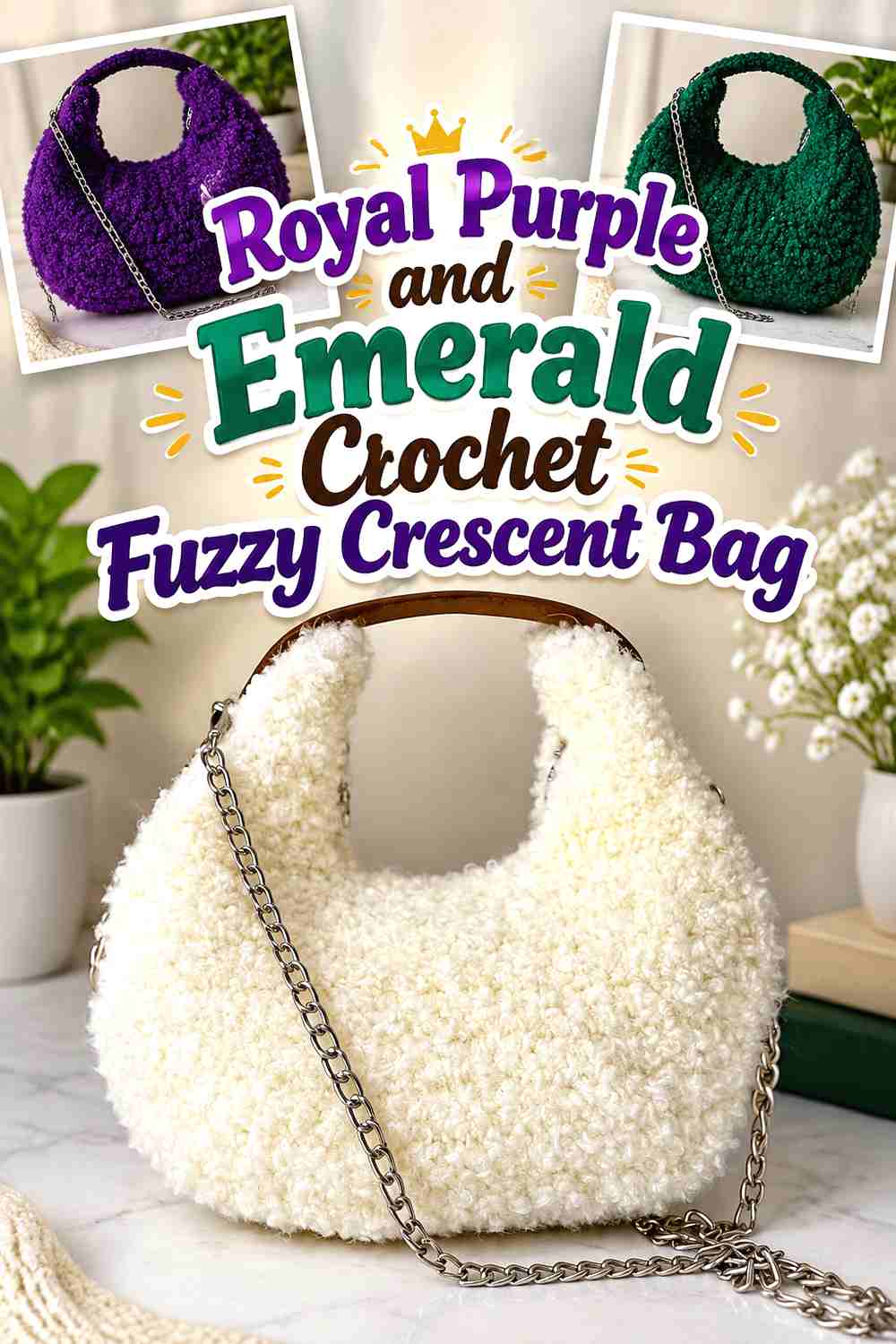
Emerald creates a rich green contrast while keeping the palette firmly in jewel-tone territory. Use royal purple for most of the plush body and emerald for a strap, top edge, or small side area where the second saturated shade can remain distinct.
Royal Purple Should Dominate the Fuzzy Crescent Over Emerald
Two jewel tones in equal amounts can compete strongly. Give royal purple the largest continuous area and let emerald support the silhouette rather than divide it in half.
Royal Purple and Emerald Need Extra Attention Around Fuzzy Joins
The color boundary may look softer than expected when plush fibers cross over the join. Check the actual crochet edge beneath the pile before deciding that the colors are uneven. A controlled smooth trim can help if you want the transition to appear sharper.
Creator Credit: Örgülere Yolculuk
12. Royal Purple, Plum, and Soft Gray Crochet Fuzzy Crescent Bag
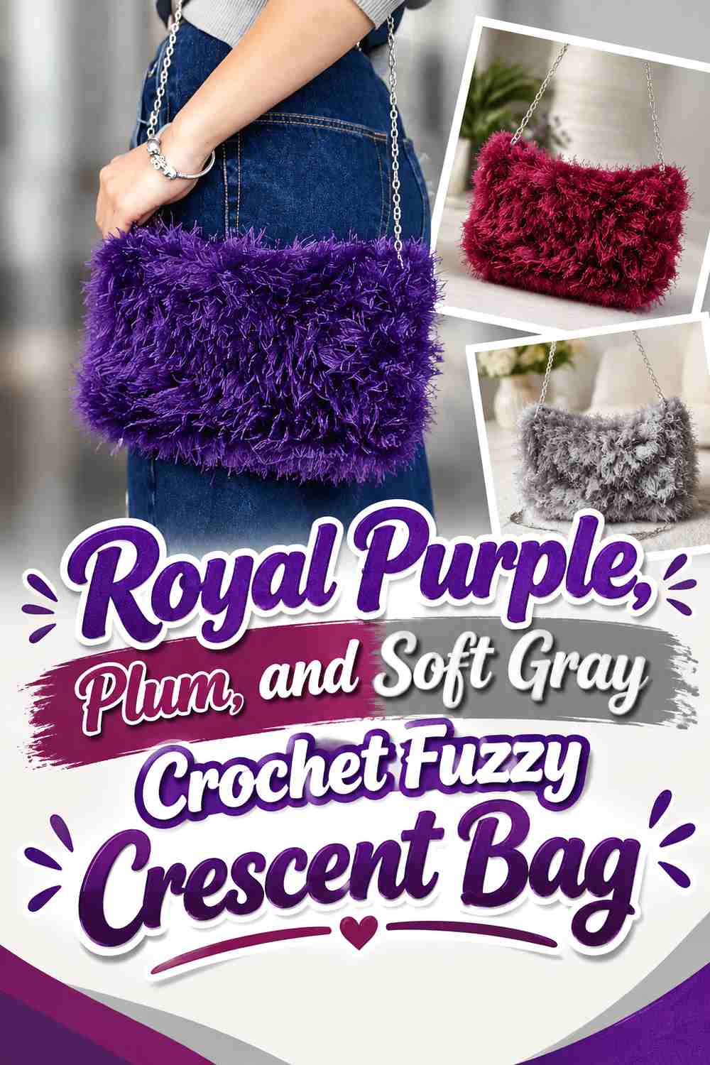
Plum creates a deep tonal companion to royal purple, while soft gray supplies the value separation the two purple shades may lack. This palette works well when you want tonal richness without sacrificing the visibility of the crescent outline.
Royal Purple Needs Soft Gray Between Plum and the Main Fuzzy Body
If plum and royal purple are close in darkness, place soft gray at a key transition such as the opening, narrow border, or strap connection. The gray prevents the two dark colors from merging into a single block.
Royal Purple Should Lead While Plum Stays Secondary on the Crescent
Use plum in one contained region rather than alternating it repeatedly with royal purple. A clear hierarchy keeps the bag bold and readable while allowing the second purple family shade to add depth.
Creator Credit: Paraligo
13. Royal Purple and Pale Gold Crochet Fuzzy Crescent Bag
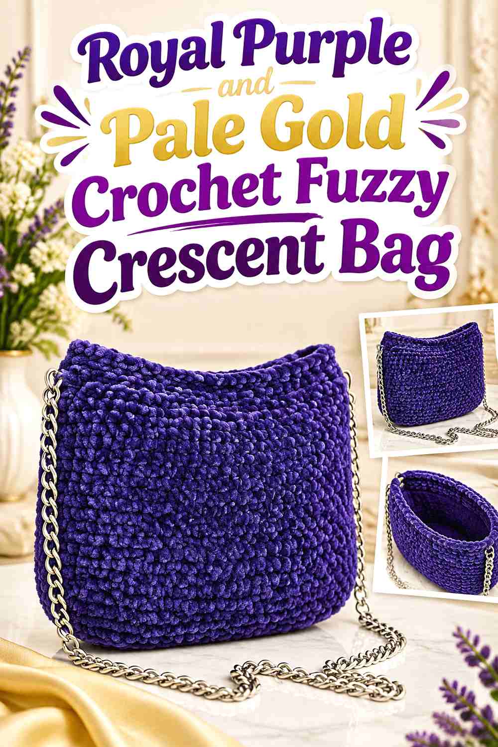
Pale gold gives royal purple a warmer party-ready accent without requiring a third color. Use the purple through most of the fuzzy crescent and keep the gold-colored yarn or detail concentrated around the opening, strap hardware area, or another small focal point.
Royal Purple Should Occupy Most of the Fuzzy Crescent Beside Pale Gold
The lighter accent is visually powerful against saturated purple, so it needs less surface area. A narrow gold-colored edge or small top detail can be enough to change the direction of the whole bag.
Royal Purple Needs Pale Gold Repeated Carefully Around the Strap
If pale gold appears near the opening, repeat a small amount around the strap or attachment point rather than introducing an entirely new color there. Repetition makes the accent look deliberate while royal purple remains dominant.
Creator Credit: Momì’s Crochet
Which Royal Purple Fuzzy Crescent Palette Fits Your Winter Look?
For maximum contrast against black or navy coats, royal purple with ivory or winter white makes the crescent outline easiest to separate visually. Icy silver and soft gray offer lighter contrast without becoming as bright.
For a darker winter direction, royal purple with black, charcoal, or midnight navy keeps the accessory dramatic. These combinations need more careful value checking because the supporting shades can merge with both royal purple and dark outerwear.
If you want color rather than neutrals, fuchsia, emerald, deep teal, lavender, plum, and magenta each change the mood without replacing royal purple as the main shade. Keep those supporting colors in controlled areas so the fuzzy surface does not become visually crowded.
Conclusion
Royal purple is strong enough to carry most of a fuzzy crescent bag, so the supporting shade should solve a specific visual problem rather than simply add more color. Ivory and winter white can clarify the curved edge, black and charcoal can define openings and straps, while emerald, teal, fuchsia, and magenta create more saturated winter combinations.
The fuzzy surface deserves as much attention as the palette. Plush fibers can soften edges, cover small color transitions, and make the bag appear visually fuller than the underlying crochet fabric. Check the crescent while it hangs, compare the opening and outer curve, and make sure the strap still looks proportionate to the fuzzy body.
When adapting one of the credited tutorials with a different yarn, treat the creator’s construction as the reference and test your chosen fuzzy material before assuming it will produce the same structure. That is especially important when the original project uses a smoother cord, cotton, or fabric yarn.
Frequently Asked Questions
How can I keep royal purple visible on a fuzzy crochet crescent bag?
Give royal purple a large uninterrupted area and avoid dividing the fuzzy body into too many small color sections. If the pile makes the curved silhouette difficult to read, place a contrasting shade near the outer edge, opening, or strap attachment.
Which color gives royal purple the strongest contrast on a winter bag?
Ivory and winter white generally create much lighter visual values beside royal purple, making them useful when strong separation is the goal. The exact result still depends on the yarns you choose, so compare them side by side before starting.
Can I use fuzzy yarn with a crescent bag tutorial that uses smooth yarn?
You can treat the tutorial as a construction reference, but do not assume a direct substitution will behave identically. Make a fabric sample and check thickness, flexibility, pile, and how well it holds the curved shape before committing to the full bag.
Should the strap of a royal purple fuzzy crescent bag also be fuzzy?
It does not have to be. A smoother strap can create a useful visual break and may make the carrying line easier to distinguish from the plush body. If you prefer a continuous fuzzy look, check how the strap behaves under gentle tension before finishing it.
How do I stop royal purple and another dark color from blending together?
Compare the colors from a distance and consider viewing them in grayscale. If their light-dark values are very similar, use the second color in a larger, clearly separated area or introduce a lighter boundary where important parts of the crescent meet.
Where should a contrast color go on a royal purple crescent bag?
The most useful locations are usually the top opening, outer curve, strap, attachment tabs, closure area, or a controlled border. These placements can help explain the bag’s structure without breaking up the royal-purple fuzzy body.
What should I check before using a royal purple fuzzy bag with a winter coat?
Hold the finished fabric or yarn combination against the actual coat. Check whether the crescent edge remains visible, whether the strap disappears against the garment, and whether the supporting color is helping rather than competing with the royal-purple body.