Citrine brings a brighter direction to fall decorating than the usual deep rust, brown, and burgundy palette. Its warm yellow-gold character can add energy to a room while still feeling seasonal when it is surrounded by grounded materials such as walnut, leather, linen, cream upholstery, olive green, and darker woods. Crochet makes the color especially noticeable because its visible texture catches light and gives even a small accent more presence.
The key is deciding how much citrine your room actually needs. A large throw or bed runner can create a clear focal point, while a basket, cushion, or mantel accent introduces the color more quietly. The 16 ideas below focus on placement, proportion, furniture pairing, texture balance, and practical use so you can bring citrine into fall 2026 without making the room feel overly bright or visually crowded.
Balancing Citrine With a Fall Interior
Citrine usually looks strongest when it has something calmer to push against. Warm white and oatmeal can soften it, dark walnut or charcoal can sharpen the contrast, while olive green and camel create a more layered autumn palette. In a small room, consider limiting the color to one noticeable crochet accent and perhaps one smaller repeat elsewhere; several equally bright pieces can make limited space feel busy.
Scale matters too. A broad sectional can visually support a substantial throw or cushion grouping, whereas a compact chair may only need one smaller accent. Pay attention to light as well: strong daylight can make citrine feel especially vivid, so brighter rooms often benefit from neutral surroundings. In dimmer spaces, pairing it with warm wood and cream can keep the color feeling rich rather than harsh.
Quick List
- Citrine Crochet Throw Across A Camel Sofa
- Citrine Crochet Cushion Pair On A Charcoal Armchair
- Citrine Crochet Basket Beside A Walnut Console
- Citrine Crochet Table Runner On A Dark Wood Dining Table
- Citrine Crochet Wall Accent Above A Cream Bench
- Citrine Crochet Pouf In A Neutral Reading Corner
- Citrine Crochet Bed Runner Against Warm White Bedding
- Citrine Crochet Lumbar Cushion On An Olive Green Sofa
- Citrine Crochet Plant Basket In A Sunlit Window Corner
- Citrine Crochet Mantel Accent With Rust Ceramics
- Citrine Crochet Shelf Basket In A Small Entryway
- Citrine Crochet Blanket Folded On A Window Seat
- Citrine Crochet Accent On A Leather Lounge Chair
- Citrine Crochet Chair Cushions In A Light Oak Dining Nook
- Citrine Crochet Storage Basket In A Cozy Home Office
- Citrine Crochet Accent Trio For A Covered Fall Porch
1. Citrine Crochet Throw Across A Camel Sofa
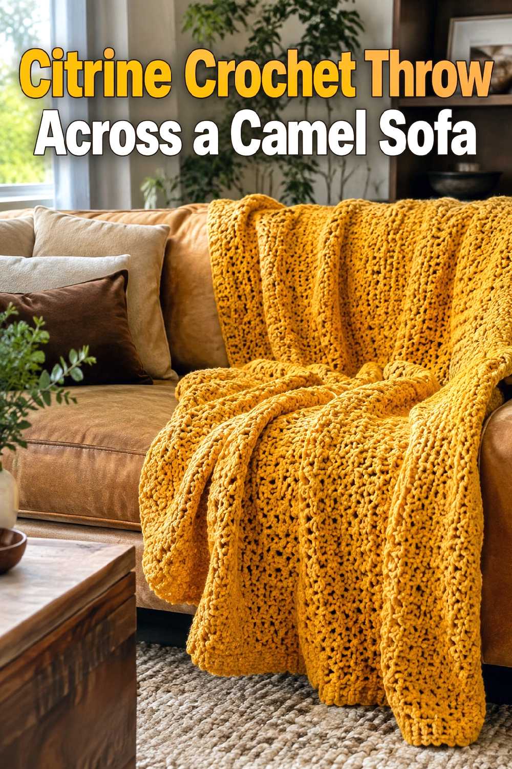
A camel sofa already carries a warm autumn undertone, so a citrine throw can brighten the seating area without feeling disconnected from the furniture. The combination works especially well when darker wood, cream, or muted brown appears elsewhere in the room.
Because both camel and citrine are visually warm, leave some quieter surfaces nearby. A plain rug, simple cushions, or an uncluttered coffee table can prevent the seating area from becoming overly saturated. On a large sofa, a generously scaled throw has enough presence to look intentional; on a compact loveseat, a neater fold may create better proportion.
2. Citrine Crochet Cushion Pair On A Charcoal Armchair
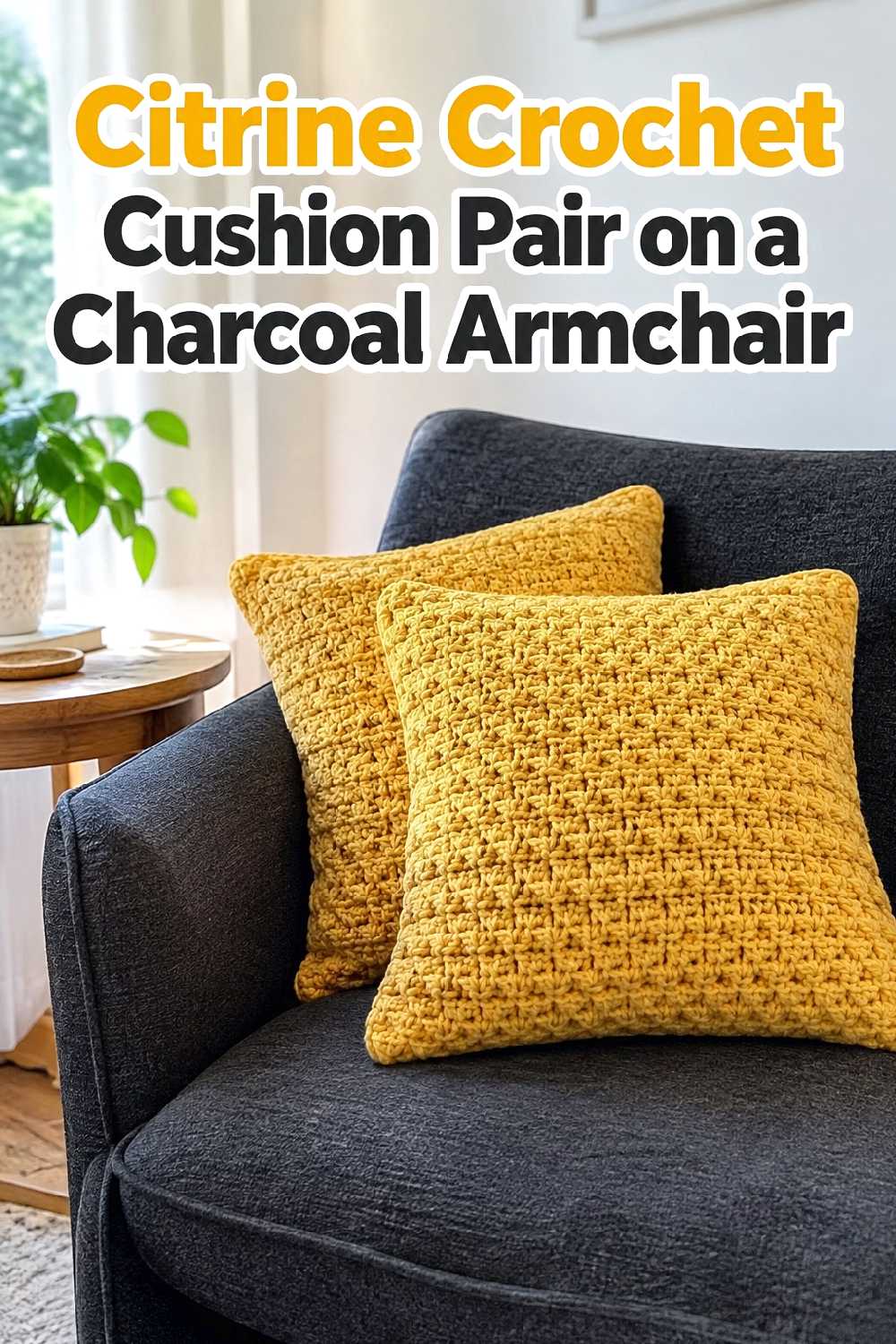
Charcoal gives citrine a strong dark background, making this combination useful when you want the crochet color to read as a distinct focal point. Two cushions can add enough repetition to feel deliberate without spreading the bright color throughout the entire room.
This pairing suits modern or transitional spaces where the larger furniture is relatively simple. If the chair already has tufting, patterned upholstery, or other pronounced details, one citrine cushion may be visually cleaner than two. Keeping nearby accessories in warm wood, cream, or matte black can connect the accent to the rest of the room.
3. Citrine Crochet Basket Beside A Walnut Console
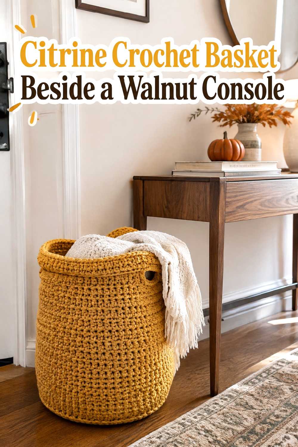
A citrine basket can introduce fall color at floor level while giving a console arrangement more visual weight. Walnut is particularly useful here because its darker warmth grounds the brighter yellow-gold accent.
Scale the basket to the console rather than treating it as an isolated object. A very small basket can look incidental beneath or beside a broad piece of furniture, while an oversized one may crowd a narrow entry. This idea works best when the basket sits outside the main walking path and contributes practical storage for lightweight household items or extra textiles.
4. Citrine Crochet Table Runner On A Dark Wood Dining Table
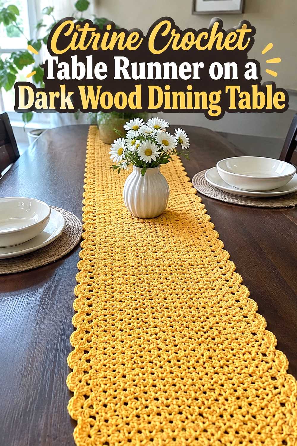
Dark wood provides enough contrast for a citrine runner to become the main color statement in a dining area. Keeping the rest of the table simple allows the crochet texture to remain visible instead of competing with layers of seasonal decorations.
Cream ceramics, clear glassware, or restrained rust accents can support the fall palette without overpowering it. On a long table, let the runner establish a clear central line; on a smaller table, use less surrounding decor so the surface still feels usable. This approach is especially effective when you want seasonal impact without adding more furniture or floor accessories.
5. Citrine Crochet Wall Accent Above A Cream Bench
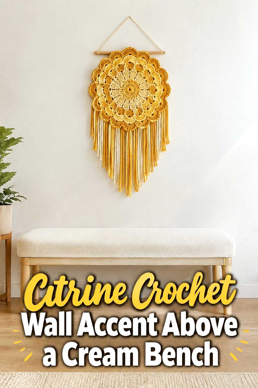
Using citrine on the wall brings the color upward, which can help balance rooms where most warm tones sit near the floor or furniture. A cream bench creates a calm base and gives the crochet accent enough contrast to be noticed.
The wall piece should relate to the width of the furniture below it. Something too narrow can appear lost above a substantial bench, while an oversized accent may visually press down on a compact seating area. Leave negative space around the crochet feature and keep nearby wall decor limited so the texture reads as the intentional focal point.
6. Citrine Crochet Pouf In A Neutral Reading Corner
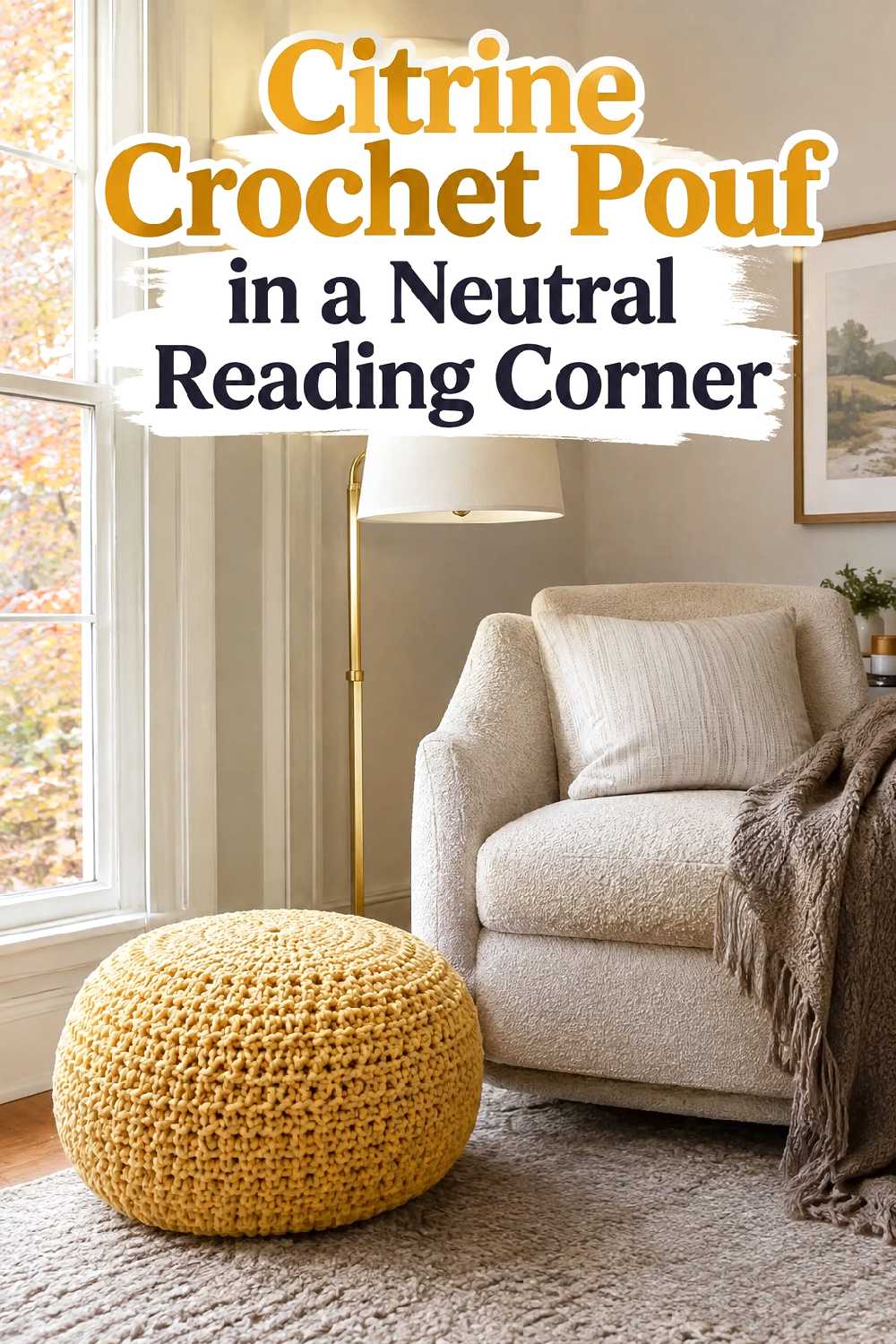
A citrine pouf can energize a reading corner that otherwise relies on oatmeal, beige, or warm white. Since it sits low in the room, the bright color feels grounded rather than dominating the entire visual field.
This idea works best where there is enough clearance around the chair for the pouf to feel useful rather than obstructive. In a narrow corner, choose a smaller visual footprint and keep side tables slim. A plain upholstered chair is an especially good partner because it gives the crochet texture room to stand out without creating too many competing tactile surfaces.
7. Citrine Crochet Bed Runner Against Warm White Bedding
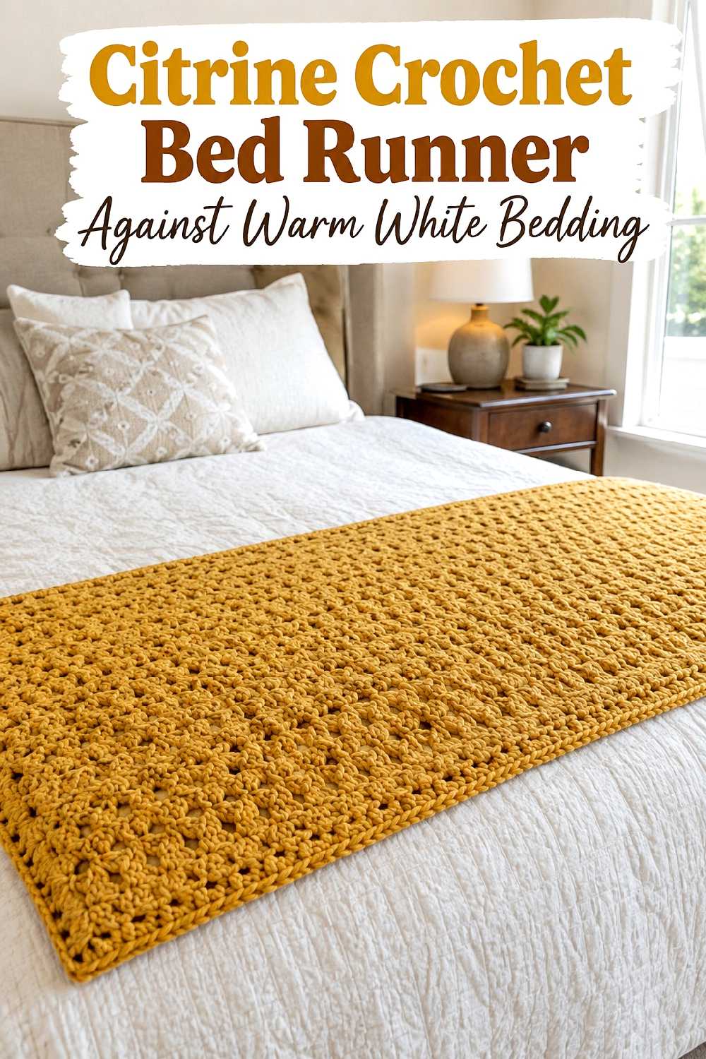
Warm white bedding gives citrine a bright but softened background, making the bed runner a strong seasonal color layer without changing the entire bedroom palette. The contrast can feel fresh in fall, particularly when walnut or medium-tone wood furniture adds depth.
Keep patterned pillows restrained if the runner already has strong visible texture. In smaller bedrooms, placing the color mainly at the foot of the bed keeps it from visually surrounding the room. The approach also makes seasonal changes easier because the major furniture and bedding can remain neutral throughout the year.
8. Citrine Crochet Lumbar Cushion On An Olive Green Sofa
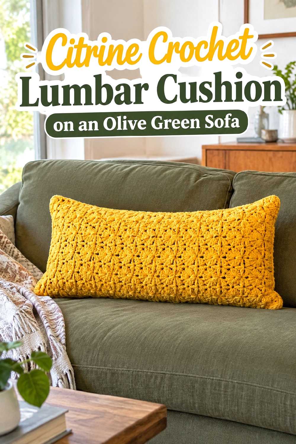
Olive green and citrine create a distinctly autumnal relationship without relying entirely on orange or brown. The green cools the brighter yellow-gold slightly, while citrine keeps the sofa from feeling too subdued.
A single lumbar cushion can be enough on a smaller sofa because its contrasting color naturally attracts attention. If the seating area already includes patterned rugs or curtains, avoid adding several more citrine pieces nearby. Let the cushion act as the connecting point between the olive upholstery and smaller warm details such as wood, brass-toned finishes, or beige textiles.
9. Citrine Crochet Plant Basket In A Sunlit Window Corner
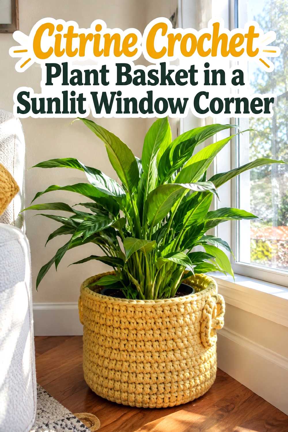
A plant corner already contains strong organic color, so citrine can create a lively bridge between green foliage and warmer fall tones. Used as a decorative outer basket around a separate plant container, it adds texture without turning the area into a large seasonal display.
Natural light will make the citrine especially noticeable. If the corner is very bright, keep surrounding planters and furniture simple in cream, terracotta, or natural wood. Avoid clustering several strongly colored baskets together; one focused crochet accent usually gives the greenery enough warmth while preserving the relaxed character of the window area.
10. Citrine Crochet Mantel Accent With Rust Ceramics
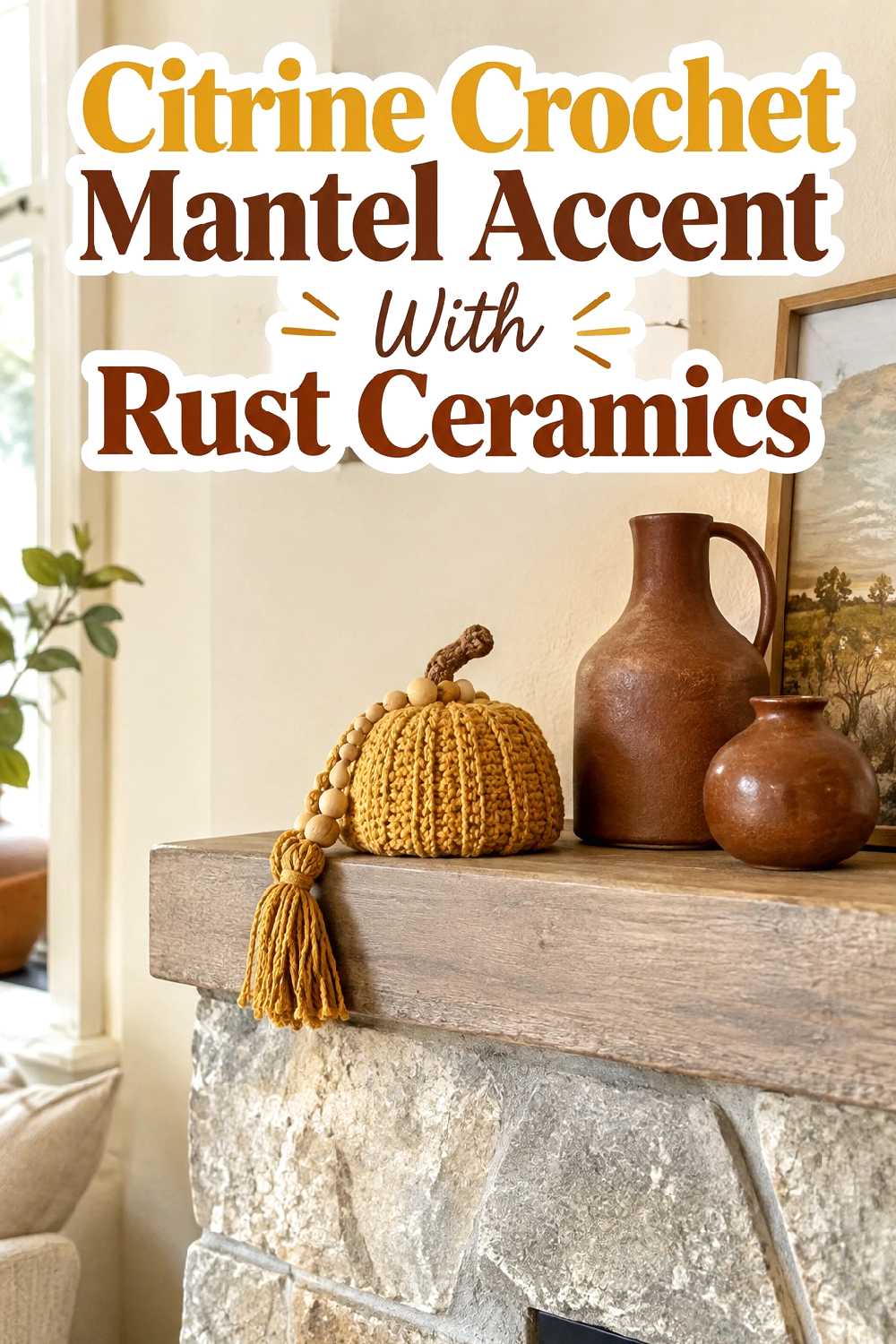
A smaller citrine element on a mantel can brighten a fall arrangement dominated by rust, stone, and warm neutral colors. The key is using the crochet piece as one part of the composition rather than filling the entire mantel with equally textured objects.
Rust ceramics add deeper seasonal color, while a pale wall or stone background keeps the combination readable. Give each object breathing room instead of creating a continuous row. This works particularly well in rooms where the fireplace is already a strong architectural focal point and only needs a modest color update for fall.
11. Citrine Crochet Shelf Basket In A Small Entryway
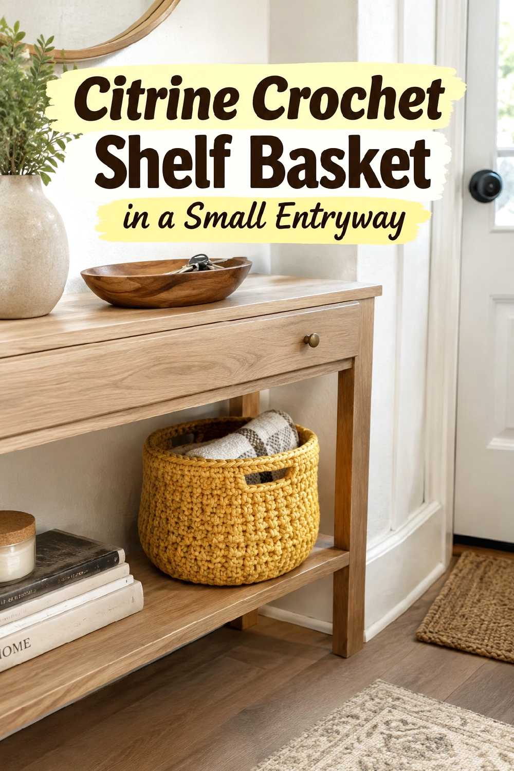
Small entryways benefit from decor that serves a practical role, and a compact crochet basket can add both storage and color without occupying extra floor space. Placing citrine on a shelf also brings the brighter hue into the room at a controlled scale.
Keep the surrounding shelf styling restrained. One basket, a simple tray, and perhaps a small neutral object can look calmer than several decorative pieces competing for attention. If the entry is dim, citrine can help lift the palette, especially against pale walls or light wood. Make sure the basket does not project so far forward that it interferes with normal movement.
12. Citrine Crochet Blanket Folded On A Window Seat
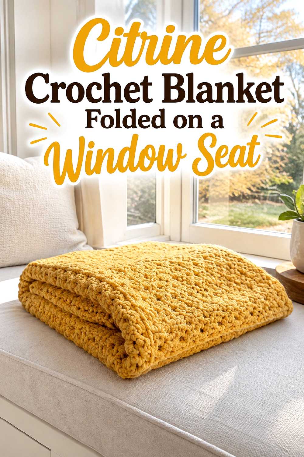
A folded blanket gives a window seat a strong seasonal accent while keeping most of the upholstery visible. This is useful when you want citrine to feel present but not permanent.
Because window seats often receive substantial daylight, the bright color can become more intense during the day. Cream or beige seat cushions and simple wood trim help soften that effect. Rather than adding multiple bold pillows, consider letting the blanket provide the main color and using one muted supporting accent. The result keeps the nook welcoming without making a small architectural feature feel overloaded.
13. Citrine Crochet Accent On A Leather Lounge Chair
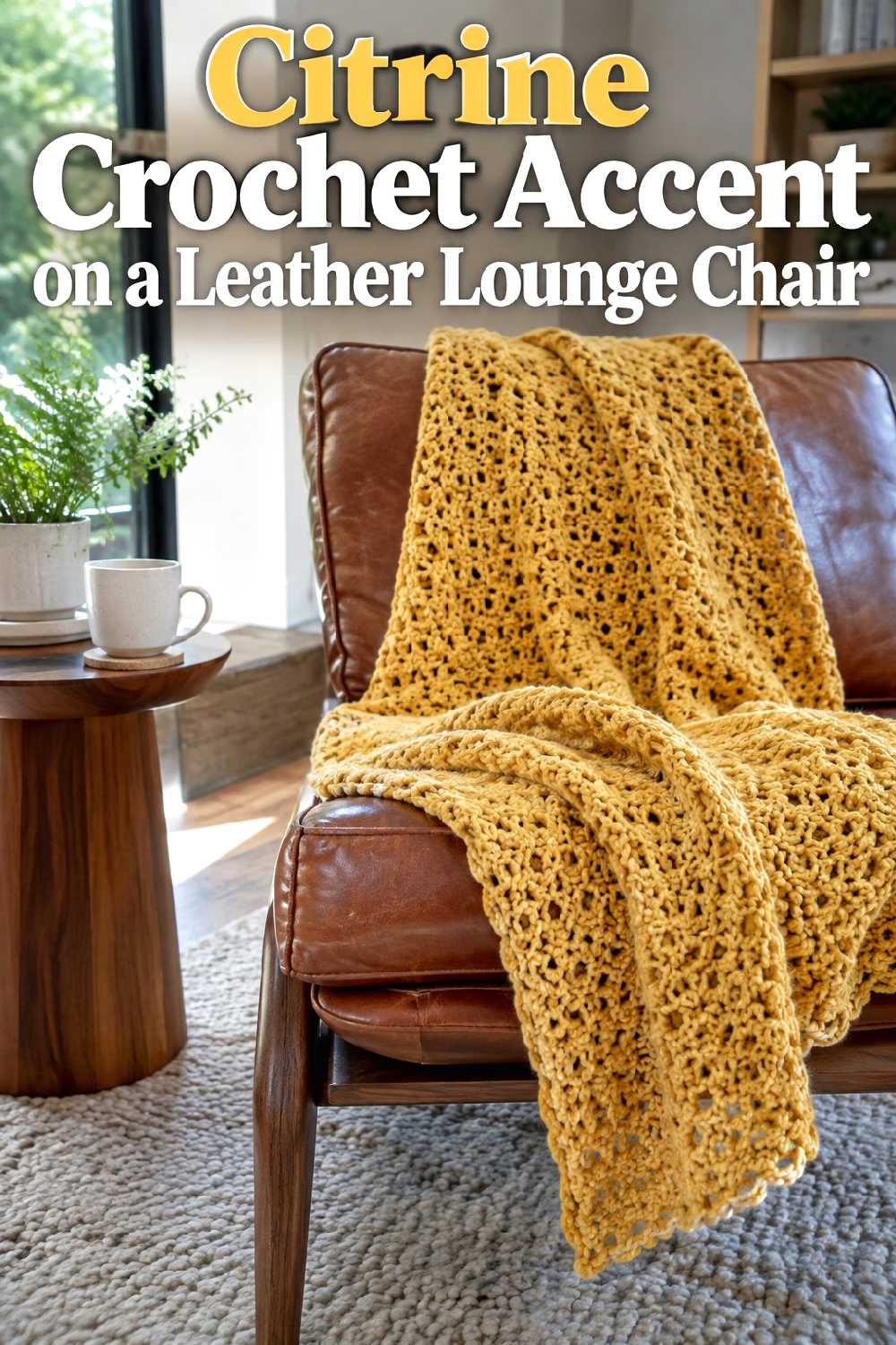
Brown leather and citrine share enough warmth to feel cohesive while still creating clear color contrast. A crochet textile draped across part of a leather chair also softens the visual hardness of the material and makes the seating area feel more layered.
This idea is particularly effective in rooms that already contain walnut, stone, wool, or other substantial fall textures. Avoid covering too much of the chair; allowing plenty of leather to remain visible creates a more balanced material contrast. If the surrounding room is dark, a citrine accent can also provide a useful point of brightness without requiring a larger decor change.
14. Citrine Crochet Chair Cushions In A Light Oak Dining Nook
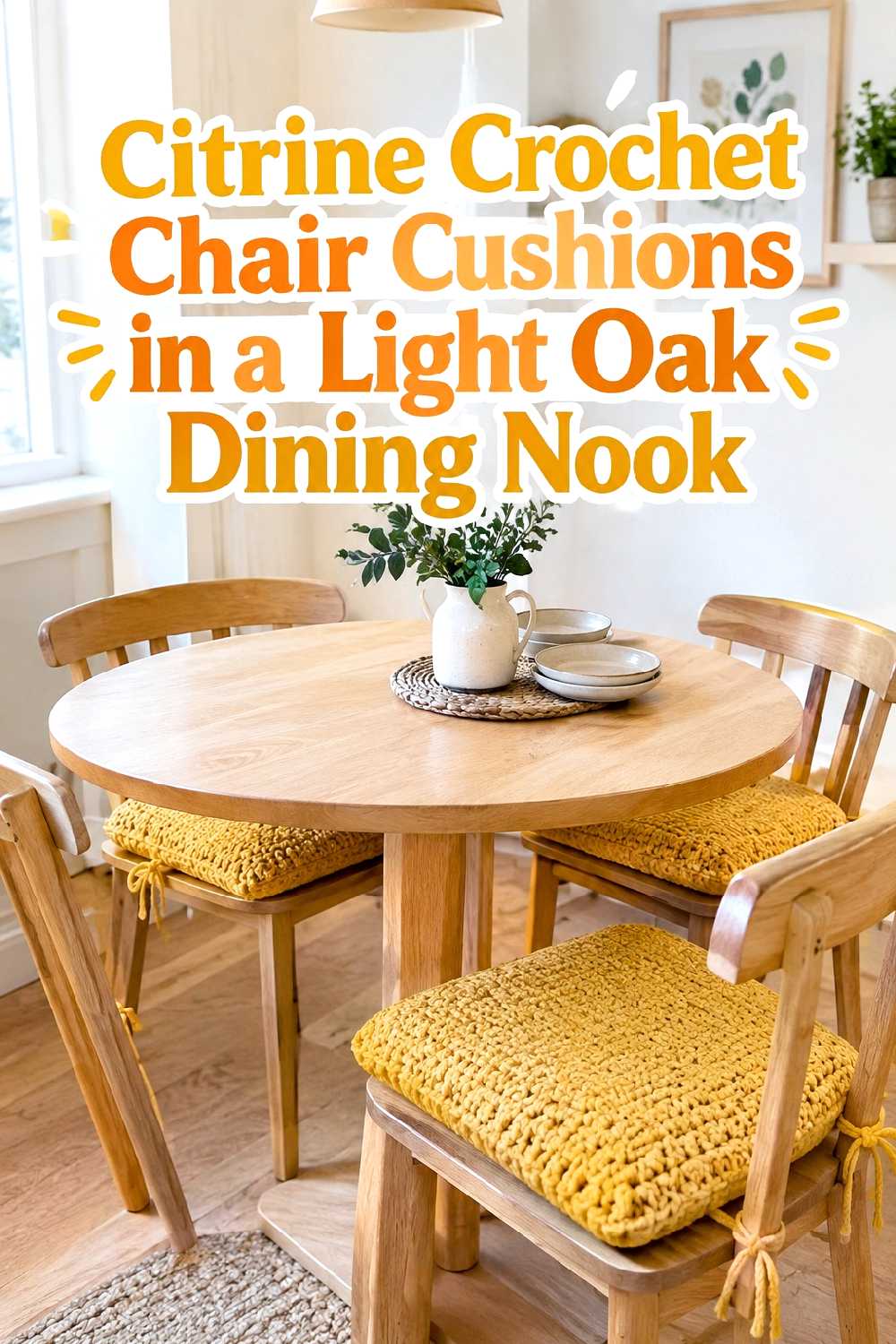
Light oak gives citrine a softer, more casual setting than dark dining furniture. Crochet chair cushions can repeat the color around the table while keeping the central tabletop comparatively calm.
Because repetition increases visual impact, this works best when the rest of the nook uses a restrained palette. Cream walls, simple tableware, and minimal window treatments keep several citrine accents from becoming overwhelming. In a compact breakfast area, the cushions can supply enough fall color on their own, reducing the need for extra floor baskets, elaborate centerpieces, or additional bright accessories.
15. Citrine Crochet Storage Basket In A Cozy Home Office
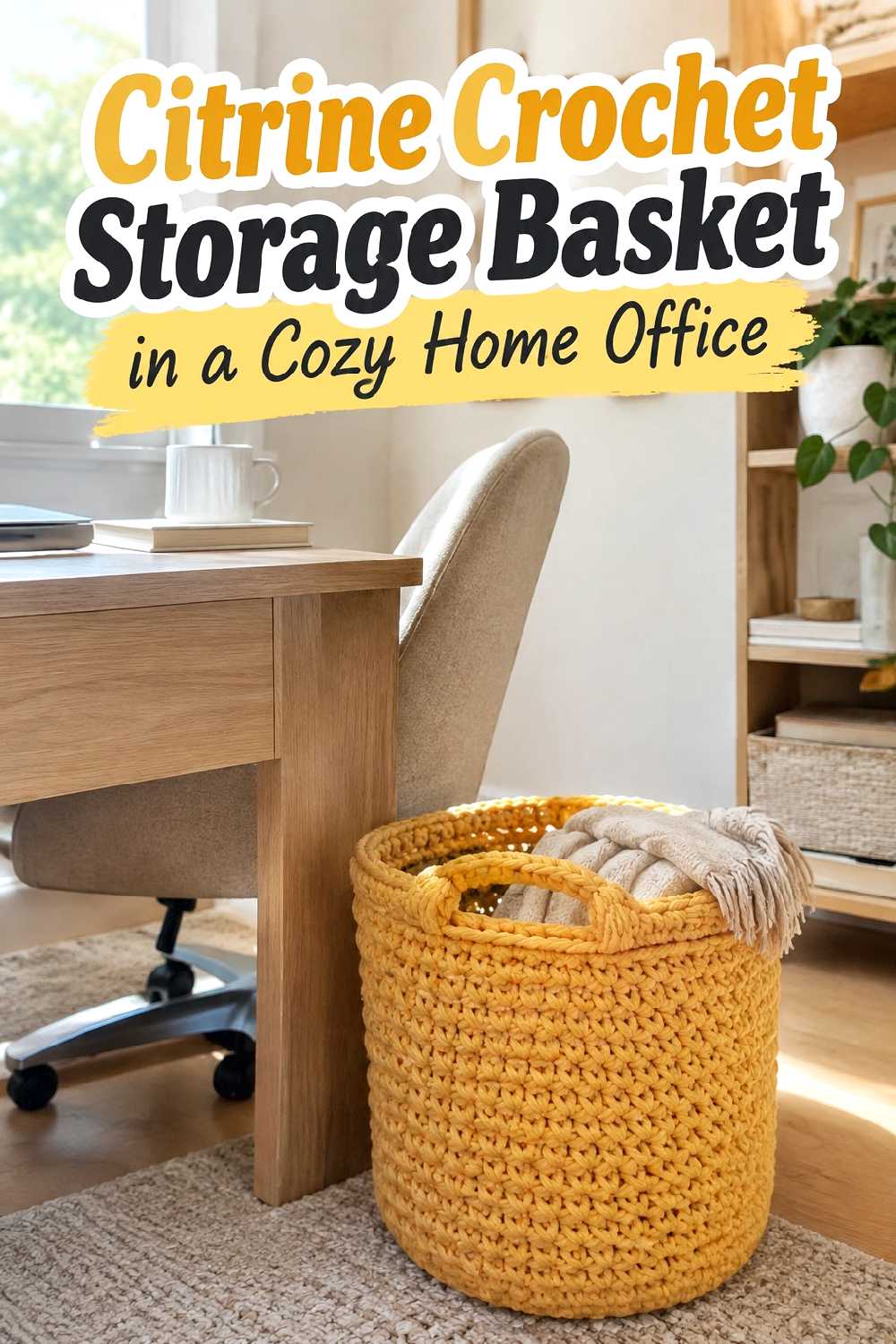
A citrine basket can keep an office from becoming visually flat when the desk, shelving, and upholstery are mostly neutral. It also makes sense in a workspace because the decorative accent can contribute useful storage rather than taking up surface space purely for display.
Place it where it remains accessible without interfering with the desk chair or walking route. Against walnut or medium wood, citrine feels warm and grounded; against pale furniture, it becomes more energetic. If documents, books, and equipment already create plenty of visual detail, keeping the crochet color concentrated in one basket can make the room feel more controlled.
16. Citrine Crochet Accent Trio For A Covered Fall Porch
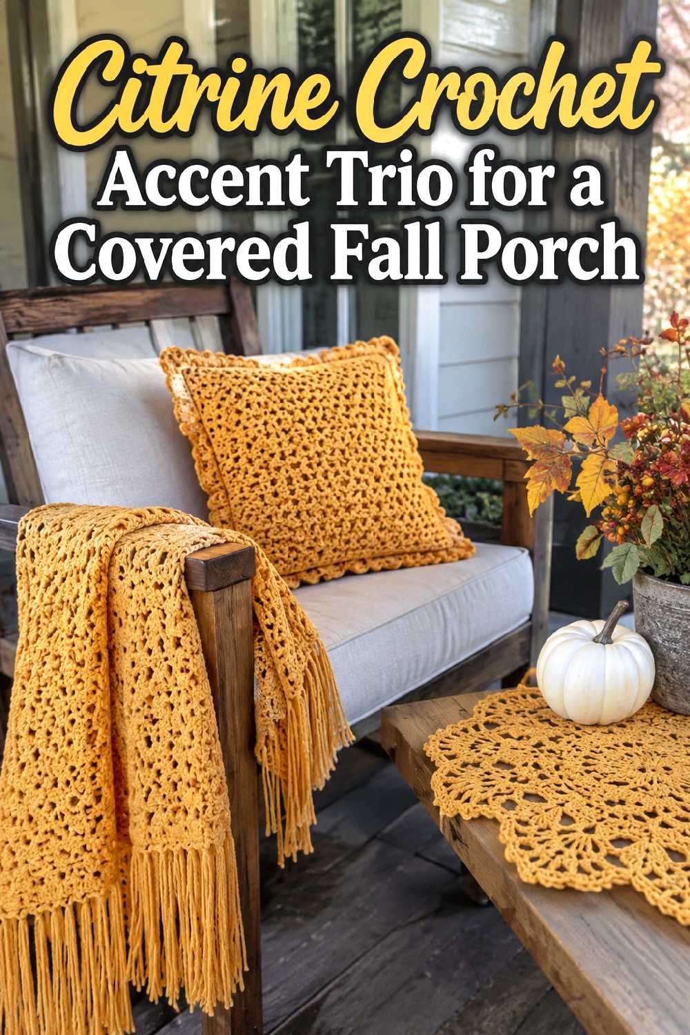
A covered porch can support more color repetition than a small indoor corner, especially when the surrounding furniture is wood, black metal, beige, or another grounded neutral. Three coordinated citrine accents can connect separate seating areas without requiring every textile to match.
Vary the placement rather than grouping all three pieces together. For example, one accent can sit on seating, another near a side table, and a third farther across the porch to carry the color through the space. Keep the rest of the seasonal palette restrained so the citrine remains intentional. In a narrow porch, reduce the scale of the accents rather than adding more pieces.
Choosing the Right Look for Your Room
Start by deciding whether citrine should be the focal point or a supporting accent. Large neutral rooms can usually carry a stronger element such as a sofa throw, bed runner, or pouf, while small spaces often benefit from a cushion, shelf basket, or mantel accent that introduces the color without adding too much visual weight. Look at the undertones already present: camel, walnut, leather, cream, and olive can make citrine feel warmer, while charcoal creates sharper contrast. Also consider how much texture your room already contains. If the furniture, rug, or curtains are patterned, choose one quieter crochet feature. If the room feels visually plain, a larger textured accent can provide the missing focal point. Practical needs should guide placement too—storage baskets make more sense where they remain easy to reach and do not interrupt movement.
FAQs
1. Does citrine work with traditional fall colors?
Yes. Citrine can sit comfortably beside rust, brown, olive, camel, and warm cream. Using one or two deeper tones nearby helps ground its brighter yellow-gold character.
2. Can citrine crochet decor work in a small room?
It can. In compact rooms, one concentrated accent such as a cushion, shelf basket, or folded blanket usually gives the color enough presence without making the space feel crowded.
3. What furniture colors pair well with citrine?
Warm white, cream, camel, charcoal, olive, brown leather, light oak, and walnut can all create useful contrasts. The best choice depends on whether you want the citrine to blend warmly or stand out more strongly.
4. How can I keep citrine from looking too bright?
Surround it with calm surfaces and deeper materials. Dark wood, muted green, beige upholstery, stone, and simple cream fabrics can reduce the sense of visual intensity.
5. Should I repeat citrine around the room?
A small amount of repetition can make the color feel intentional, especially in a larger room. In a compact space, one main citrine feature may be enough. If you repeat it, vary the scale so every accent does not compete equally for attention.
Conclusion
A practical place to begin is with one citrine crochet accent in a room that already contains warm neutrals or wood. A cushion, throw, basket, or bed runner lets you judge how the brighter color interacts with your existing furniture before repeating it elsewhere, creating a fall 2026 look that feels fresh without overwhelming the room.