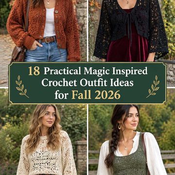
A crochet bag strap gives you a surprisingly concentrated place to use color. Because the strap sits against clothing and often crosses the body, even a narrow strip of oxblood, moss, rust, plum, or teal can change the character of an otherwise simple bag.
For fall 2026, these ideas focus on color schemes rather than claiming that one construction or palette is right for every bag. Some use dark neutrals with controlled warm accents; others pair earthy shades with cooler colors so the strap becomes the visual focus. The linked tutorials teach compatible strap, handle, or bag constructions, but the palettes below are independent color adaptations and do not necessarily match the colors used by the creators.
Quick List
- Oxblood Camel And Cream Crochet Romanian Cord Bag Strap
- Espresso And Burnt Orange Crochet Romanian Cord Bag Strap
- Olive Mustard And Oatmeal Crochet Low Stretch Bag Strap
- Plum Dusty Rose And Charcoal Crochet Crossbody Bag Strap
- Rust And Deep Teal Crochet Flat Bag Handles
- Forest Green Copper And Cream Crochet Purse Strap
- Navy Cognac And Ecru Crochet Cord Bag Strap
- Burgundy Sage And Mushroom Crochet Bag Strap
- Chocolate Sky Blue And Cream Crochet Tote Strap
- Black Camel And Ivory Crochet Thermal Stitch Bag Handle
- Aubergine Moss And Golden Ochre Crochet Tote Strap
- Terracotta Deep Teal And Oatmeal Crochet Tote Handles
- Brick Red Denim Blue And Sand Crochet Crossbody Bag Strap
- Charcoal Pumpkin And Taupe Crochet Phone Bag Strap
- Wine Blush And Espresso Crochet Reversible Bag Handle
- Chestnut Pine And Natural Cream Crochet Tote Handle
- Graphite Cranberry And Soft Gray Crochet Statement Bag Strap
Choose Fall Crochet Bag Strap Colors by Role
A statement strap usually reads more clearly when the colors do not compete for equal space. Start by choosing a dominant shade that can carry most of the strap, then decide whether a second color should create visible contrast or simply support the main shade.
Dark colors such as espresso, oxblood, charcoal, and navy can give a strap more visual weight. Lighter cream, oatmeal, sand, and blush shades can break up that density around borders, narrow stripes, or attachment areas. Stronger colors such as rust, teal, pumpkin, and cranberry usually have more impact when their placement looks intentional rather than scattered.
Check Contrast Where a Crochet Strap Meets the Bag
The strap and bag body do not need to match, but their values should be considered together. A dark burgundy strap can disappear against an equally dark brown bag even though the hues are different. A light edging or repeated accent near the attachment point can create clearer separation.
View the yarns beside the actual bag rather than judging the strap colors alone. If two shades appear too similar, checking a quick grayscale photo can help reveal whether there is enough light-and-dark separation for the color pattern to remain visible.
Let Crochet Strap Texture Influence Color Placement
Dense cords and thermal-style handles concentrate color differently from wider flat straps. Small color changes can look fragmented on a narrow cord, while a broader handle gives stripes, blocks, or edging more room to register.
Texture also creates shadow. Very dark yarn can conceal some stitch definition, especially when several dark shades sit together. If the construction itself is part of the statement, a lighter supporting color can make the texture easier to read.
1. Oxblood Camel And Cream Crochet Romanian Cord Bag Strap
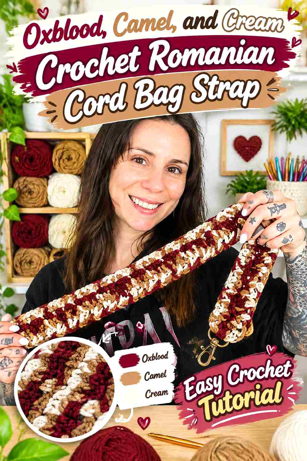
Oxblood can dominate this narrow crochet strap, giving the bag a deep autumn anchor without requiring a multicolor bag body. Camel works well as the secondary shade because it creates a noticeable warm shift without the starkness of white. Use cream sparingly at the ends, hardware zones, or a short repeated detail so the lightest shade sharpens the palette instead of breaking the strap into too many pieces.
Oxblood Keeps the Crochet Cord Visually Strong
Let oxblood occupy most of the length when you want the strap to read as one continuous statement. On a narrow cord, frequent color changes can interrupt the braided appearance, so larger stretches of oxblood preserve both the dark color and the texture. If the bag body is already burgundy or brown, move more camel toward the strap ends so the attachment area remains visible.
Camel and Cream Keep Oxblood From Becoming Too Dense
Camel can provide the main contrast, while cream should remain the smallest component. Try camel near both ends or as one centralized section rather than scattering tiny patches throughout the cord. Cream is most useful where you want a crisp separator between camel and oxblood, particularly when the two warmer shades appear closer in value than expected.
Creator Credit: YarnballHandmadeGoods
2. Espresso And Burnt Orange Crochet Romanian Cord Bag Strap
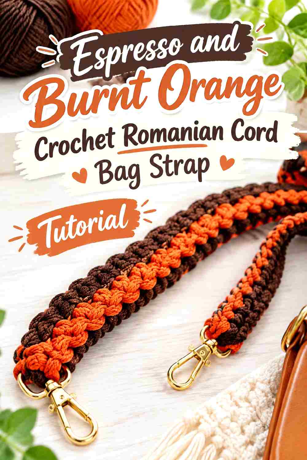
Espresso and burnt orange create a simpler two-color direction with stronger light-dark separation. Keep espresso as the grounding color and let burnt orange become the section the eye notices first. Because Romanian cord already has visible surface movement, broad color areas generally give the texture more room than frequent narrow alternation.
Espresso Gives Burnt Orange a Dark Crochet Frame
Use espresso at both ends of the strap if the hardware or bag body is dark. Repeating the same dark shade on each end creates a visual frame and keeps burnt orange from looking like a disconnected insert. On a lighter tan or cream bag, espresso can take up even more of the strap because the bag itself supplies contrast.
Burnt Orange Works Better as a Controlled Strap Accent
A centered burnt orange section can create a distinct statement without requiring the whole strap to be bright. If you prefer several orange areas, repeat them with a consistent rhythm rather than changing their widths randomly. That repetition matters on a long strap because uneven accent blocks can make the color arrangement look accidental once the bag is worn.
Creator Credit: KnitcroAddict
3. Olive Mustard And Oatmeal Crochet Low Stretch Bag Strap
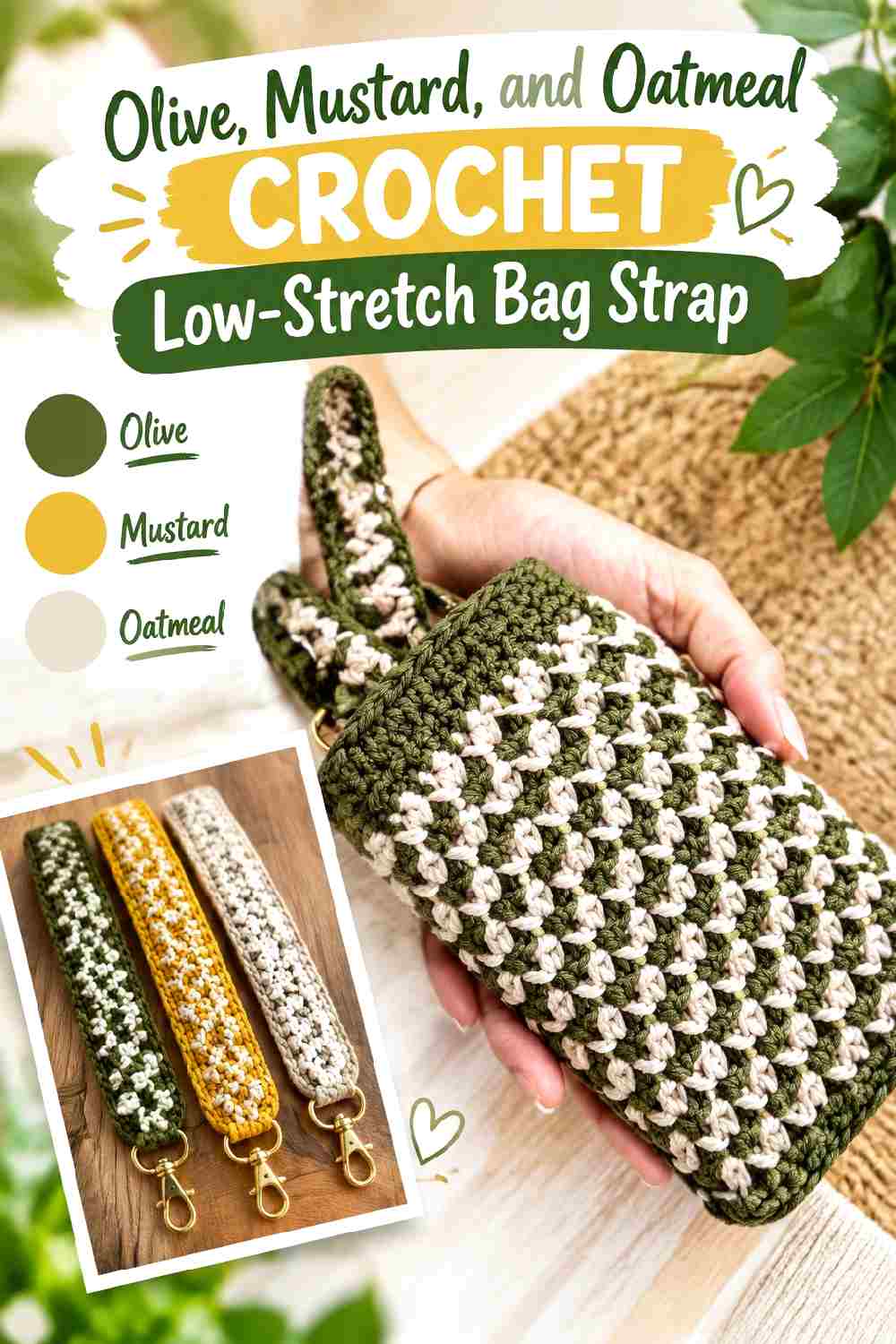
Olive gives this strap an earthy base, mustard adds the strongest warm note, and oatmeal provides a quiet neutral break. This palette is especially useful when the bag body is tan, brown, cream, or another subdued neutral because the strap can introduce autumn color without turning the whole bag into a multicolor project.
Olive Should Carry Most of the Crochet Strap
Olive works well over the largest visual area because it can connect naturally with both mustard and oatmeal. Keep it around the attachment zones if you want the strap to feel grounded against a darker bag. If your olive is quite light, compare it directly with oatmeal before committing; the two need enough difference for the color divisions to remain clear.
Mustard and Oatmeal Need Different Jobs Beside Olive
Use mustard as the accent and oatmeal as the separator. When both occupy the same amount of space, the three colors can compete instead of forming a hierarchy. A small oatmeal boundary beside mustard can make the yellow-toned accent easier to see, while olive continues to hold the strap together from one end to the other.
Creator Credit: Live. Chill. Life.
4. Plum Dusty Rose And Charcoal Crochet Crossbody Bag Strap
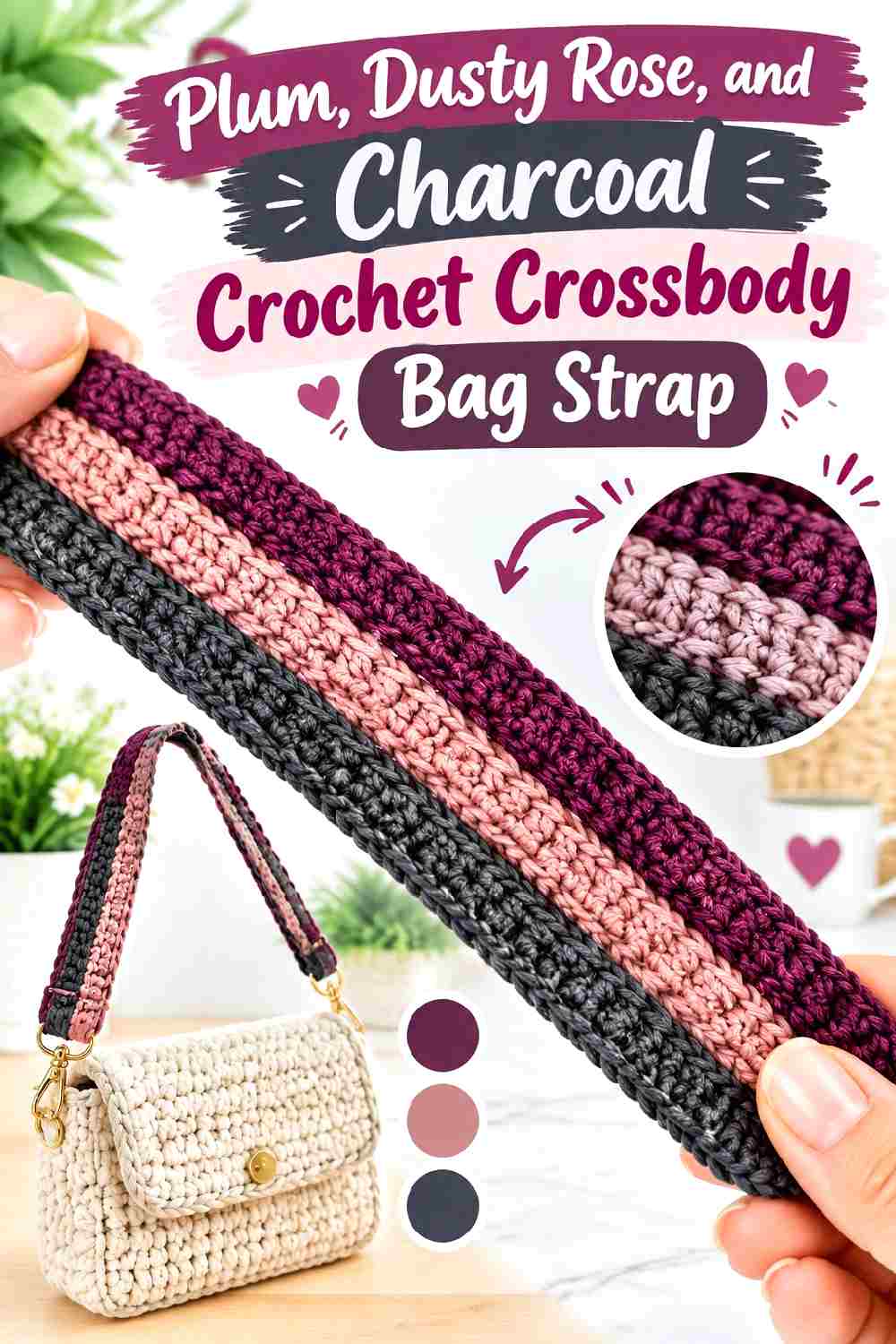
This palette moves away from the usual orange-and-brown fall direction. Plum supplies the rich main color, dusty rose lightens it, and charcoal gives the strap a cooler dark edge. It works particularly well when you want a crossbody strap to remain noticeable against black, gray, cream, or denim clothing.
Plum Gives the Crochet Crossbody Strap Its Main Color Block
Use plum through the central or longest portion so it remains identifiable when the strap is worn diagonally. A statement crossbody strap can disappear visually when every color section is too short, especially beneath a coat or cardigan. Keeping plum continuous over a larger area protects the palette even when only part of the strap is visible.
Dusty Rose Separates Plum From Charcoal
Dusty rose is useful between the two darker shades because plum and charcoal can merge at a distance. A lighter pink section creates value separation while staying related to plum. If the dusty rose you have is nearly as dark as the plum, choose a softer, visibly lighter pink rather than relying on the hue difference alone.
Creator Credit: Crochet Musings
5. Rust And Deep Teal Crochet Flat Bag Handles
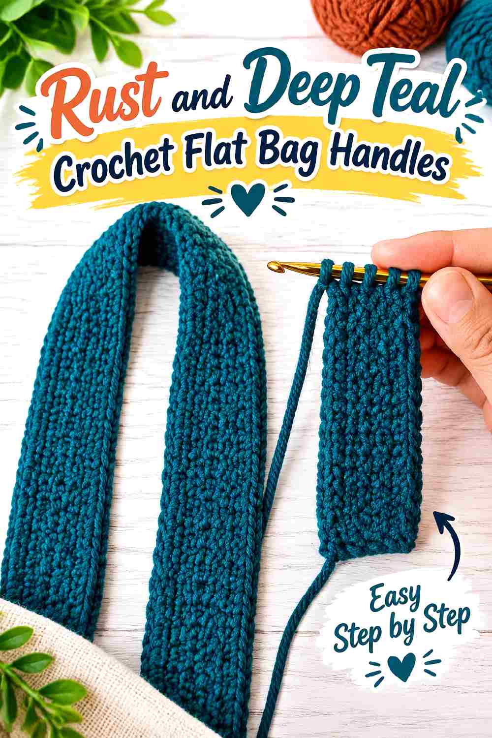
Rust and deep teal create a strong warm-cool contrast that suits broad crochet handles particularly well. A flat handle gives each shade enough surface area to read clearly, so this combination does not need a third color unless the bag body requires a transition shade.
Deep Teal Can Ground the Rust Crochet Handle
Use deep teal near the sections that meet the bag if the bag body is rust, terracotta, tan, or cream. The cooler dark shade creates a defined attachment area and stops the strap from visually blending into a warm bag. On a navy or teal bag, reverse the balance and let rust occupy more of the handle.
Rust Needs Enough Width to Register Beside Deep Teal
Avoid reducing rust to a very thin edge if you want it to be a genuine part of the palette. Broad handles can support a center panel, half-and-half division, or substantial stripe much better than a tiny accent. Before finishing both handles, place the first one against the bag and confirm that neither color disappears into the body.
Creator Credit: Chompu Handicrafts
6. Forest Green Copper And Cream Crochet Purse Strap
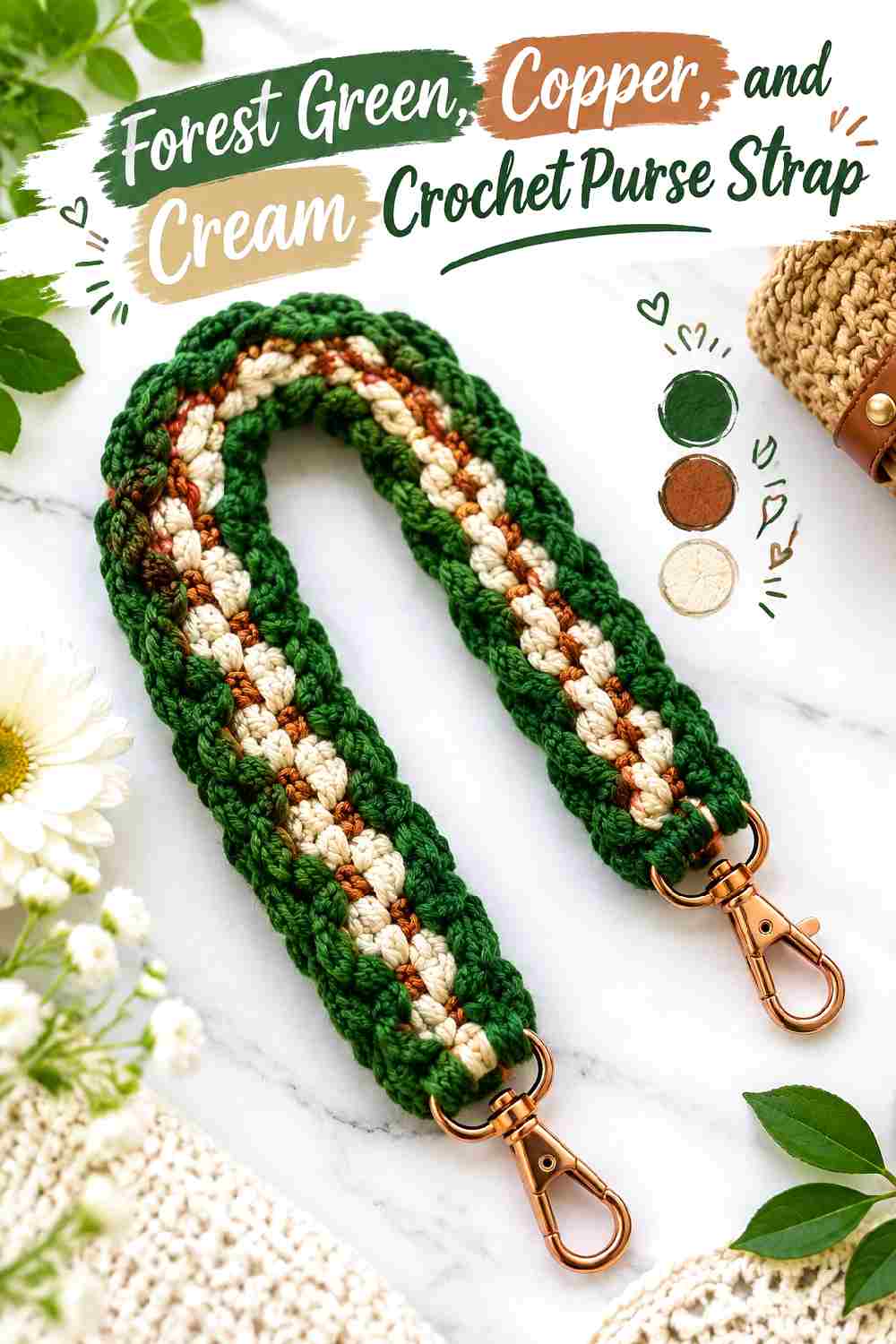
Forest green gives this purse strap a dark botanical base, while copper introduces autumn warmth and cream keeps the two stronger shades separated. Because a purse strap is relatively narrow compared with the bag body, cream should usually act as a small structural accent rather than the dominant color.
Forest Green Creates a Stable Crochet Strap Base
Keep forest green around most of the length when the bag itself contains copper, rust, tan, or cream. The darker green gives those warmer colors something to contrast with and prevents the entire accessory from becoming one warm block. If the bag is already dark green, shift more copper into the strap so it remains distinguishable.
Copper and Cream Can Highlight Forest Green Attachment Points
A copper section close to the bag can intentionally draw attention to the strap connection, while a narrow cream break can separate copper from forest green. This is especially useful when hardware creates another visual element near the same area. Keep the cream repetition consistent on both ends so the light accents feel planned.
Creator Credit: Crochet With Saim
7. Navy Cognac And Ecru Crochet Cord Bag Strap
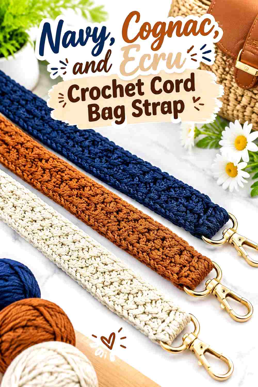
Navy offers a cooler alternative to black or espresso, while cognac supplies a warm leather-like color direction without requiring actual leather. Ecru softens the transition between them. The combination works well on a compact shoulder or crossbody bag when you want the strap to coordinate easily with denim, camel outerwear, or neutral layers.
Navy Should Dominate the Crochet Cord for Continuity
Use navy through most of the cord to keep the narrow construction visually cohesive. Cognac can then appear in one or two larger sections instead of many short interruptions. If the bag is also navy, move the cognac closer to each end so the strap does not visually disappear where it meets the body.
Cognac and Ecru Give Navy More Definition
Cognac contributes the main warm contrast, while ecru can be limited to short separating sections. Bright white may create a sharper break than you want for this muted palette, so preserve the softer relationship by choosing a warm light neutral rather than a brilliant white substitute.
Creator Credit: Soft Decor – Tatyana Chakur. We crochet !!!
8. Burgundy Sage And Mushroom Crochet Bag Strap
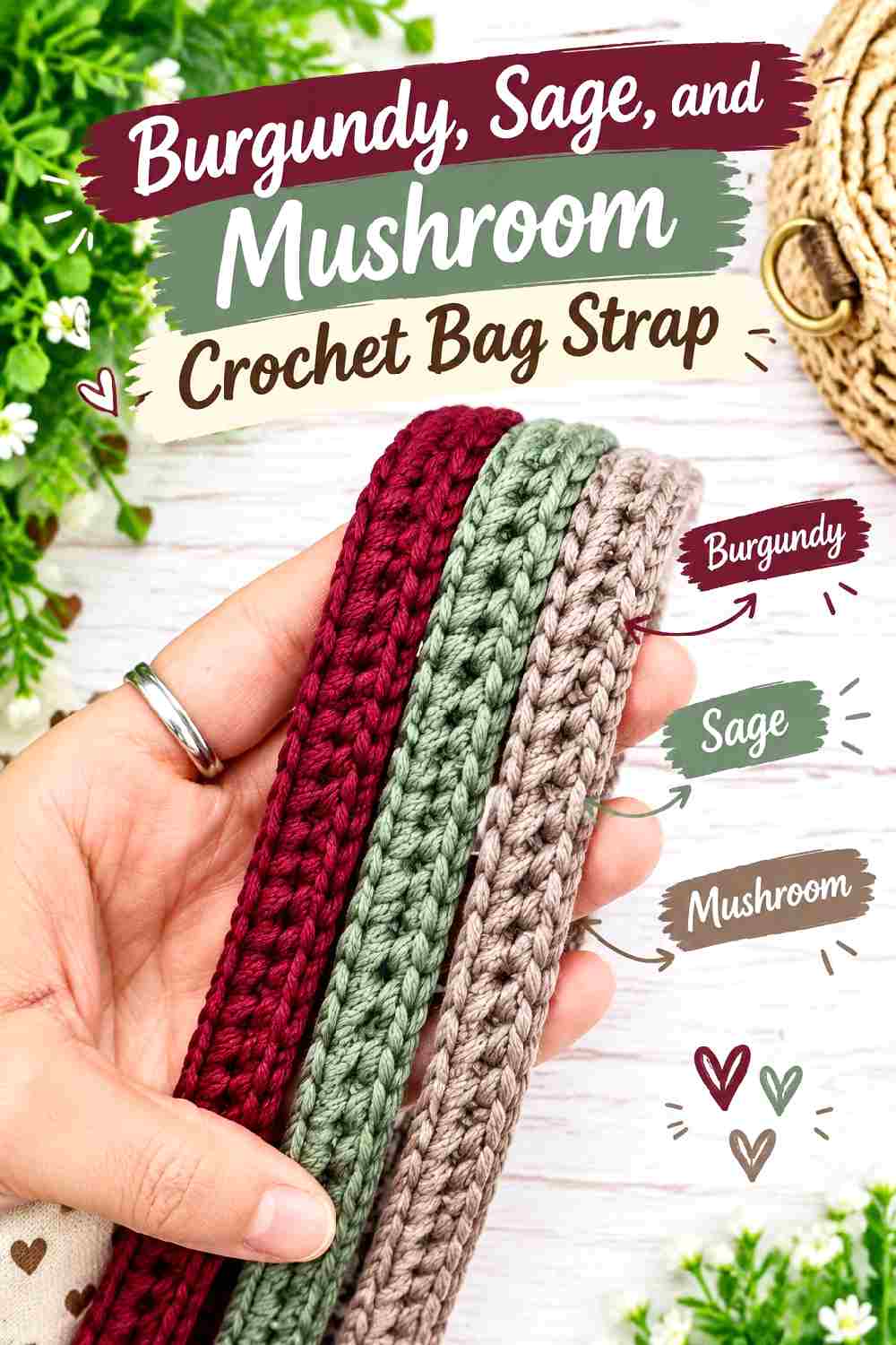
Burgundy and sage offer a muted red-green relationship, while mushroom keeps the palette from becoming too strongly contrasted. This strap works especially well when the bag body is beige, taupe, brown, or cream because each color can remain visible without requiring a saturated background.
Burgundy Gives the Crochet Strap Its Darkest Anchor
Place burgundy where the strap needs visual definition, such as along the longest uninterrupted stretch or close to hardware. Sage should remain noticeably lighter if you want the two hues to remain distinct at a distance. If both yarns have similar value, mushroom can help create separation between them.
Sage and Mushroom Keep Burgundy From Taking Over
Use sage as the secondary color and mushroom as the quietest shade. Mushroom can appear as narrow transition sections, edging, or attachment details rather than occupying the same visual area as burgundy. That hierarchy helps the strap look intentionally multicolor instead of divided into three unrelated blocks.
Creator Credit: Handmade By Mei
9. Chocolate Sky Blue And Cream Crochet Tote Strap
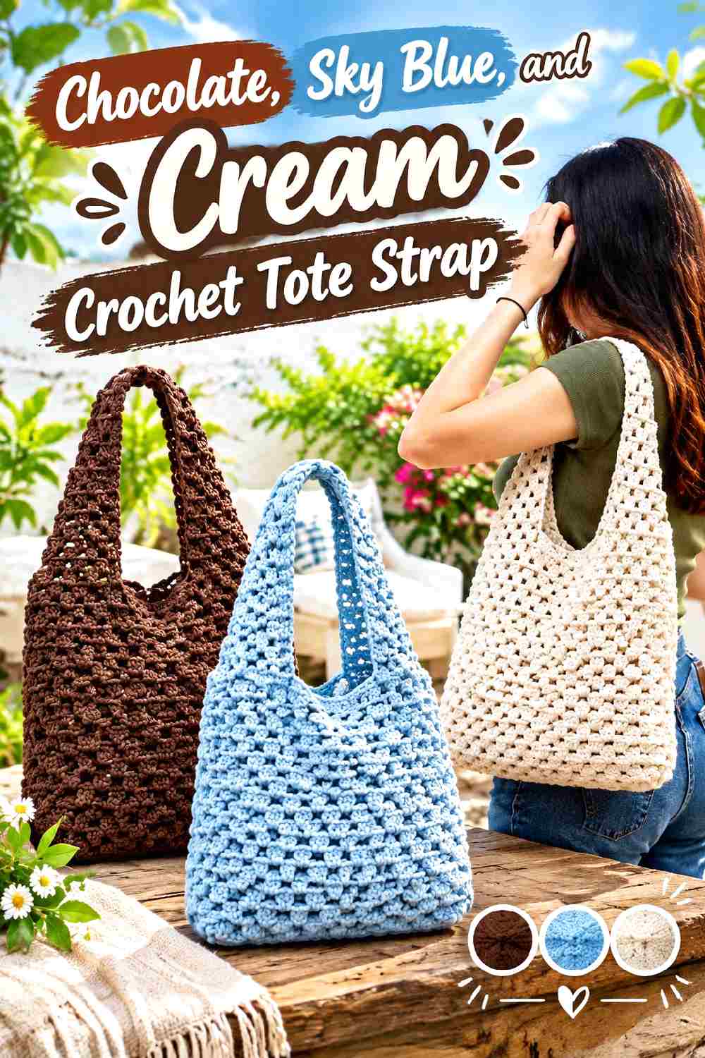
Chocolate keeps this palette grounded in fall, while sky blue introduces a cooler, lighter contrast. Cream connects the two and gives the strap a softer transition. On a wider tote strap, the lighter blue has enough room to look deliberate rather than like an isolated scrap-yarn accent.
Chocolate Should Frame the Sky Blue Crochet Strap Sections
Chocolate works well near the bag body and along the edges of a wider strap. It provides a dark outline that keeps sky blue visible against cream or beige clothing. If the tote body is dark brown, place more sky blue toward the ends so the handle remains visually separate from the bag.
Sky Blue and Cream Need Clear Separation From Each Other
These two colors may be closer in value than expected. Place the yarns together before crocheting the full strap and make sure the sky blue is sufficiently deeper or more saturated than the cream. If they merge, choose a clearer medium blue or a warmer, deeper cream instead of relying only on hue difference.
Creator Credit: VivCrochets
10. Black Camel And Ivory Crochet Thermal Stitch Bag Handle
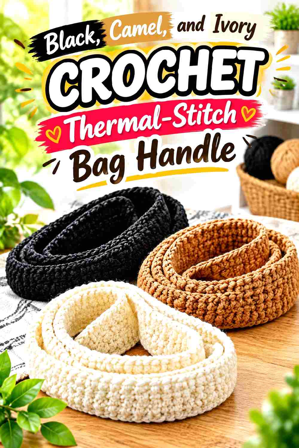
A thermal-style handle gives this classic palette enough density to make color blocking especially visible. Black creates the firmest visual anchor, camel warms the center of the palette, and ivory adds controlled light contrast. This combination can turn a plain neutral tote into a more graphic accessory without requiring a bright color.
Black Gives the Crochet Thermal Handle a Strong Outer Frame
Use black at both ends or along the outermost color sections when you want the strap to feel connected to dark hardware or a black bag border. Because thermal-style fabric is visually dense, large black areas can become heavy; camel prevents the whole handle from reading as one dark band.
Camel and Ivory Should Break Up Black Without Fragmenting It
Camel can take the second-largest share, while ivory works better as a smaller highlight. Repeating ivory in measured intervals creates a cleaner result than inserting many tiny light sections. If the bag body is ivory or cream, reduce the ivory in the strap and let camel handle more of the transition.
Creator Credit: The Crochet Crowd
11. Aubergine Moss And Golden Ochre Crochet Tote Strap
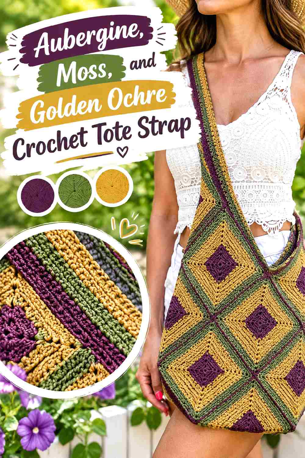
Aubergine brings a dark violet direction to autumn crochet, moss adds an earthy green, and golden ochre provides the warmest accent. The palette suits a granny-square or motif-based tote especially well because the strap can repeat colors already present in the bag without copying the exact motif arrangement.
Aubergine Can Connect the Crochet Strap to Dark Motif Edges
If the tote has dark joins or borders, repeat aubergine in the strap to make the handle feel connected to the body. Keep it dominant when the bag motifs are colorful; a stable dark strap gives the eye somewhere to rest instead of introducing another equally busy color pattern.
Moss and Golden Ochre Should Repeat Purposefully Beside Aubergine
Use moss as the supporting shade and golden ochre as the smaller highlight. If the bag already contains ochre motifs, even a modest repeat in the strap can create visual continuity. Avoid adding a fourth unrelated strap color unless it already has a clear role elsewhere on the bag.
Creator Credit: Leelee Knits
12. Terracotta Deep Teal And Oatmeal Crochet Tote Handles
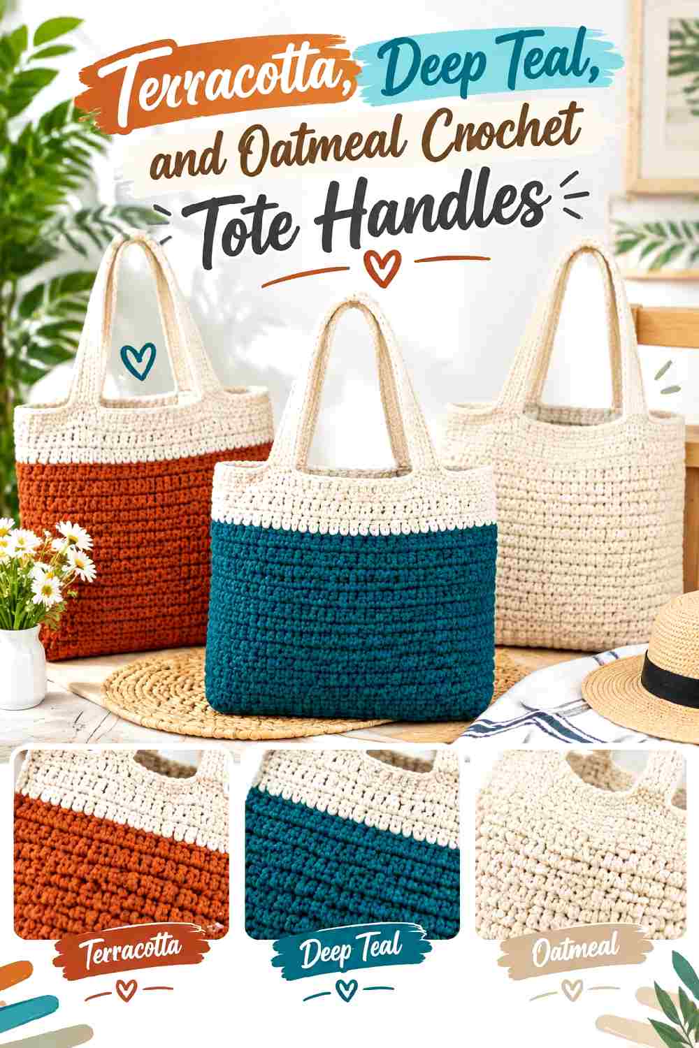
Terracotta and deep teal create one of the stronger color contrasts in this collection, while oatmeal reduces the jump between them. On tote handles that grow directly from or visually connect with the bag body, the color transition at the top edge deserves as much attention as the handle itself.
Terracotta Can Carry the Main Crochet Tote Handle Color
Choose terracotta as the larger share when the tote body is oatmeal, cream, or tan. The warm shade gives the handles enough visual presence to function as part of the design rather than disappearing into the body. If the tote itself is terracotta, reverse the balance and let deep teal become more prominent above the opening.
Deep Teal and Oatmeal Clarify Terracotta at the Bag Opening
Deep teal can define the handle against a warm body, while oatmeal can repeat the bag’s neutral background. Check both handles side by side before finishing: mismatched color placement is much more noticeable when a pair of handles is viewed together than when each one is judged separately.
Creator Credit: Hopeful Turns
13. Brick Red Denim Blue And Sand Crochet Crossbody Bag Strap
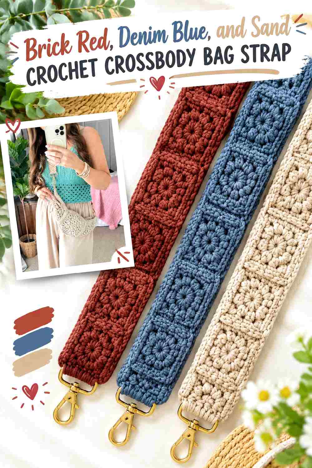
Brick red gives this crossbody palette warmth without being as bright as true red. Denim blue cools it down, and sand offers a light neutral that can connect the strap to beige, cream, brown, or denim-heavy outfits. The three colors are especially useful on a detachable strap because the strap can become the interchangeable statement component.
Brick Red Should Remain Visible Across the Crochet Crossbody Strap
Give brick red enough length to remain recognizable when part of the strap is hidden under a coat or cardigan. A tiny red accent may disappear once the bag is worn. One broad section or repeated substantial blocks will usually communicate the palette more clearly than many narrow stripes.
Denim Blue and Sand Can Soften Brick Red Transitions
Sand works well between brick red and denim blue if the two stronger shades feel abrupt together. Keep the sand sections relatively narrow so they act as transitions rather than taking over the strap. If you substitute the blue, preserve its medium or dark value so it still balances the visual weight of brick red.
Creator Credit: MJ’s Off The Hook Designs
14. Charcoal Pumpkin And Taupe Crochet Phone Bag Strap
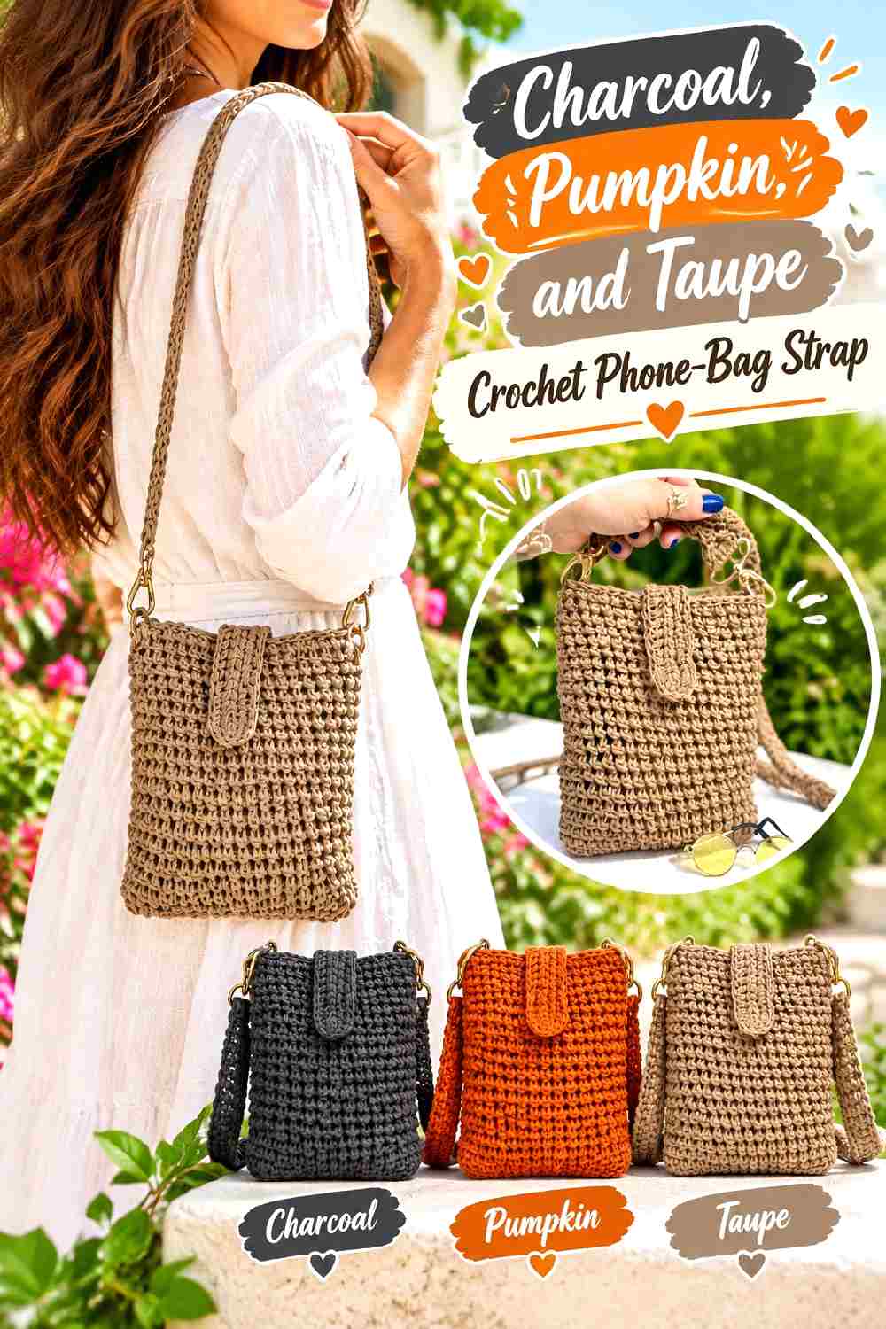
A compact phone bag gives the strap a larger visual role because the body itself is small. Charcoal provides a dark foundation, pumpkin supplies an unmistakable autumn accent, and taupe keeps the combination wearable beyond a highly themed orange-and-black palette.
Charcoal Keeps the Pumpkin Crochet Strap From Feeling Costume-Like
Use charcoal over the largest share rather than dividing charcoal and pumpkin equally. The darker neutral lets pumpkin act as a controlled accent, which makes the strap easier to pair with a wider range of bag-body colors. Taupe can further soften the contrast if the orange feels too abrupt beside charcoal.
Pumpkin Should Repeat Where the Crochet Strap Meets Taupe
Try repeating pumpkin near both ends or around a central section rather than using a single isolated patch. Taupe can sit beside it to reduce the jump into charcoal. If your pumpkin yarn is very bright, reduce its total area instead of trying to mute the palette by adding more unrelated colors.
Creator Credit: atolye_masal
15. Wine Blush And Espresso Crochet Reversible Bag Handle
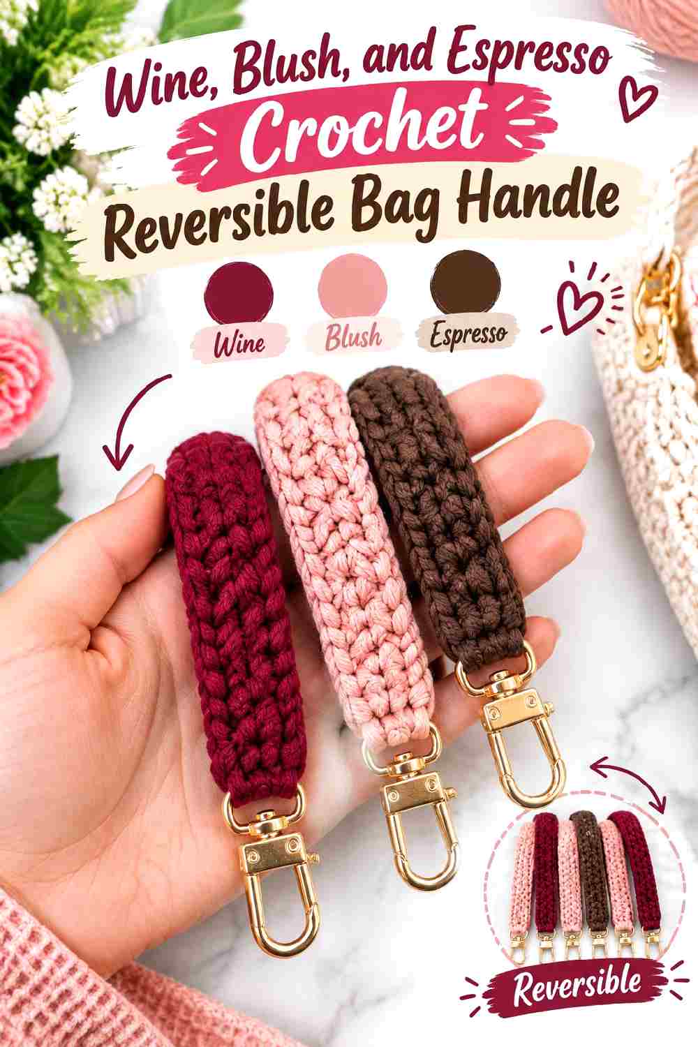
Wine and espresso give this handle two deep anchors, while blush supplies the light contrast needed to stop them from visually merging. A reversible or two-sided handle gives you an extra opportunity to distribute these shades differently without adding more colors.
Wine Needs Blush Separation From Espresso
Place blush wherever wine and espresso would otherwise meet over a large area. Both dark shades may look distinct in the skein yet collapse into one dark strip from a distance. A lighter pink transition keeps the color relationship readable and also connects naturally to wine.
Espresso Can Ground the Crochet Handle Near the Bag Body
Use espresso near attachment points if the bag body is brown, tan, or another neutral. Wine can then become the more visible outer color. If the bag itself is burgundy or wine, swap those roles so espresso creates the definition the strap needs against the body.
Creator Credit: Crochet Bits
16. Chestnut Pine And Natural Cream Crochet Tote Handle
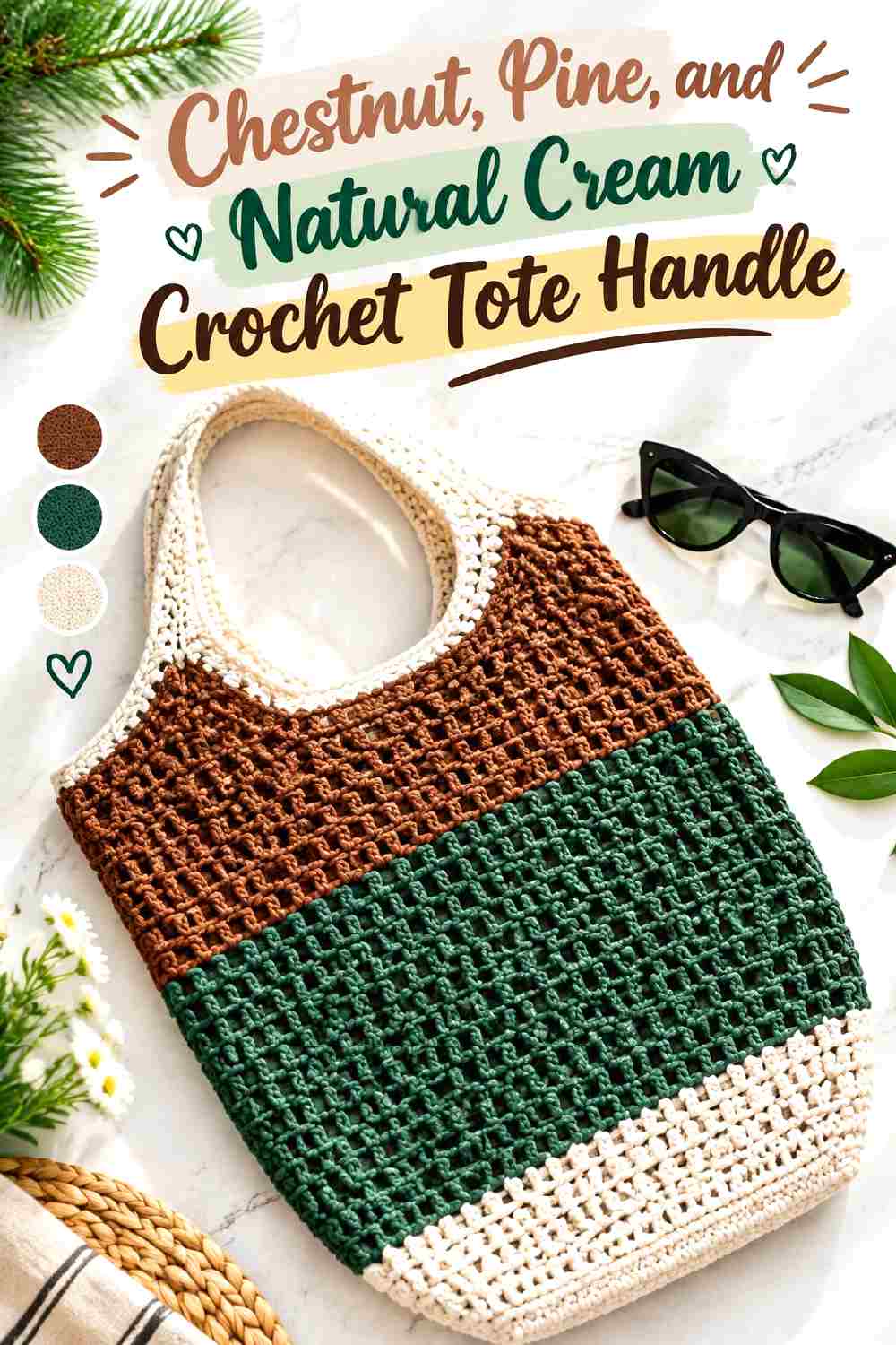
Chestnut and pine create an earthy dark pairing, while natural cream opens the palette and prevents the handle from becoming too visually heavy. This color scheme works particularly well with a structured tote silhouette because the strap can echo the bag’s clean outline instead of introducing a highly fragmented pattern.
Chestnut Gives the Crochet Tote Handle Warm Visual Weight
Let chestnut cover the largest area if the tote body is cream, tan, or green. The warm brown keeps the handle distinct while remaining quieter than orange or red. Against a brown bag body, increase the pine sections so the handle does not merge into the top edge.
Pine and Natural Cream Keep Chestnut Defined
Pine should function as the dark supporting color, while natural cream is most useful as a separator or narrow highlight. If pine and chestnut are similar in value, place natural cream between them instead of assuming their different hues will provide enough contrast.
Creator Credit: Trendy Mami
17. Graphite Cranberry And Soft Gray Crochet Statement Bag Strap
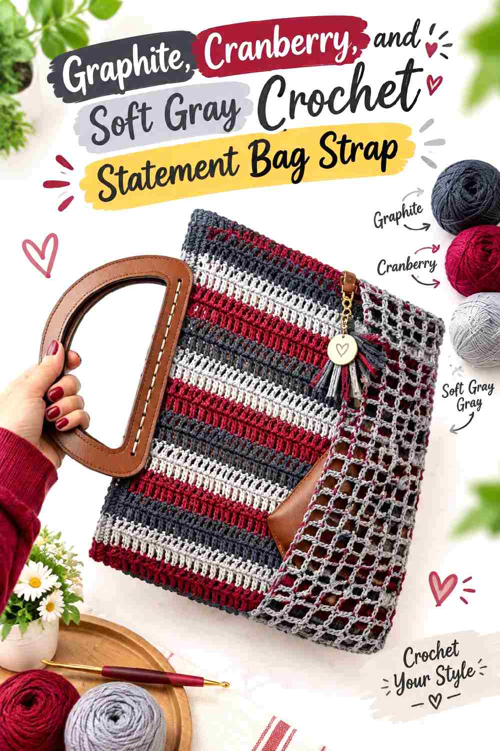
Graphite and soft gray create a tonal neutral base, while cranberry delivers the focal color. This is a useful direction when you want a fall statement strap without relying on brown, orange, or mustard. Because the red accent is surrounded by related grays, small changes in cranberry placement have a strong visual effect.
Graphite Should Anchor the Cranberry Crochet Strap
Use graphite around the attachment zones or across the longest uninterrupted section. Cranberry will appear stronger against the darker neutral, especially if the bag body is soft gray or cream. If the bag itself is black or graphite, shift the cranberry closer to the ends so the strap remains clearly visible.
Soft Gray Gives Cranberry More Breathing Room
Soft gray can separate cranberry from graphite and prevent the strap from becoming too dark overall. Keep the gray light enough to create a real value change. A medium gray that is too close to graphite may add another yarn color without adding meaningful separation.
Creator Credit: Sirin’s Crochet
Conclusion
For a darker fall strap, the oxblood-and-camel, black-and-camel, wine-and-espresso, and graphite-and-cranberry ideas keep most of the visual weight in deep colors. If you want more contrast, rust with teal, terracotta with deep teal, or brick red with denim blue gives the strap a clearer warm-cool split.
For a softer result, look at burgundy with sage and mushroom, navy with cognac and ecru, or chocolate with sky blue and cream. In each case, treat the lightest shade as a tool for separation rather than automatically dividing all colors equally.
Before committing to a long strap, place the selected yarns against the actual bag body and the clothing colors you expect to wear with it. The original tutorials linked in each project can then supply the construction details while you adapt the color distribution to your own bag.
Frequently Asked Questions
What colors work well for a crochet statement bag strap in fall?
Deep reds, browns, greens, purples, blues, oranges, and softened neutrals can all create a fall direction. The more important decision is how they relate. One dominant shade, one supporting shade, and an optional lighter or stronger accent usually gives you more control than simply collecting several autumn-colored yarns.
How can I tell whether two crochet strap colors have enough contrast?
Place the yarns next to each other under the same lighting you will use while planning the project. Then step back or view a photo in grayscale. If two colors merge into nearly the same value, consider lightening one, darkening the other, or placing a contrasting separator between them.
Should my crochet bag strap match the bag body?
It can, but it does not have to. A matching dominant color creates continuity, while a contrasting strap makes the carrying feature more visible. If you use a contrasting palette, repeating at least one bag-body color in the strap can help connect the two visually.
How many colors should I use in a statement crochet strap?
Two colors are enough for a strong statement when their roles are clear. Three colors give you more flexibility because one can dominate, one can support, and one can separate or accent. More colors can work, but narrow straps can become visually fragmented when every shade receives only a small section.
What should I do if my fall crochet strap colors look too dark together?
Increase the visual share of a lighter supporting shade or place it between the darkest colors. Cream, oatmeal, sand, blush, ecru, mushroom, or soft gray can create separation without changing the basic palette. Choose the neutral according to the warmth or coolness of the other colors rather than adding it automatically.
Can I substitute different yarn colors and keep the same crochet strap palette?
Yes. Preserve the relationships instead of searching for identical shade names. If a palette uses dark burgundy, muted medium green, and light mushroom, choose replacements that maintain those approximate dark, medium, and light roles. Keeping the value contrast and dominant-supporting-accent hierarchy usually matters more than matching an exact commercial shade.