Chocolate brown and grape purple make an unusually rich crochet pairing. Both colors have depth, but they behave differently: chocolate can act almost like a warm neutral, while grape brings stronger contrast and draws attention to texture, edges, motifs, and shaped details.
The trick is not necessarily using the colors in equal amounts. Many of the most polished combinations give one shade a structural role and reserve the other for borders, motifs, ribbing, handles, closures, or other intentional details. That approach can make a simple crochet construction look much more considered.
The 18 ideas below use different project shapes and constructions rather than repeating the same item in different colors. The linked tutorials provide the exact construction methods; the notes here focus on how to adapt each concept to a chocolate-and-grape palette, what details affect the finished appearance, and what to check before committing your yarn.
Quick List
- Chocolate Body Grape Trim Crochet Frame Clutch
- Two Tone Structured Crochet Storage Basket
- Grape Crowned Chocolate Crochet Bucket Hat
- Chocolate And Grape Floral Crochet Evening Shawl
- Color Blocked Chocolate And Grape Crochet Sweater Vest
- Chocolate Framed Grape Crochet Granny Square Tote
- Deep Tone Crochet Market Bag
- Chocolate And Grape Crochet Table Runner
- Draped Two Tone Crochet Poncho
- Chocolate Crochet Cardigan With Grape Ribbing
- Woven Texture Chocolate And Grape Crochet Throw
- Compact Chocolate And Grape Crochet Crossbody Bag
- Two Tone Crochet Plant Pot Cover
- Grape Crochet Beret With Chocolate Band
- Textured Chocolate And Grape Crochet Scarf
- Botanical Chocolate And Grape Crochet Wall Hanging
- Two Tone Textured Crochet Cushion Cover
- Chocolate And Grape Crochet Coaster Set With Holder
Why Chocolate and Grape Can Look So Polished Together
Chocolate works especially well as the larger background color because its warmth gives a project visual weight without the harshness of black. Grape can then define smaller areas such as borders, motifs, pocket sections, stripes, or hardware-adjacent details.
The reverse can also work. A grape-dominant garment or accessory can feel dramatic, while chocolate ribbing or trim gives it a quieter edge. What usually matters more than the exact percentage of each color is creating an obvious hierarchy rather than switching colors randomly.
For projects with strong texture, consider using yarns with reasonably clear stitch definition. Extremely fuzzy fibers can blur raised stitches, mosaic effects, crossed stitches, or narrow color changes. If you deliberately want a soft blended effect, however, a halo can make the boundary between chocolate and grape less graphic.
Use Color Placement to Emphasize Construction
Before starting, identify the parts of the project that already create visual structure. On a bag, that might be the base, handles, and opening. On a cardigan, it could be the cuffs, hem, neckline, and front bands. On home decor, borders and geometric motifs are natural places for the contrast color.
You do not need to alternate chocolate and grape constantly. A mostly chocolate piece with a narrow grape frame can look more deliberate than dozens of small stripes. Conversely, motif-based projects can handle more frequent color changes because the repetition gives those changes an organizing system.
If you are replacing the colors used in a tutorial, compare yarn weight and behavior rather than matching color alone. Two yarns labeled the same weight can still produce noticeably different fabric if one is much denser, smoother, or more elastic.
1. Chocolate Body Grape Trim Crochet Frame Clutch
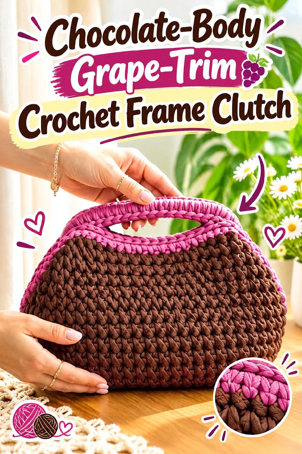
A frame clasp immediately gives a crochet bag a more tailored outline, making this an especially good project for a dark, restrained palette. The supporting tutorial demonstrates a structured clutch worked with a defined stitch texture and a rigid frame closure.
For a chocolate-and-grape version, consider letting chocolate cover most of the bag and placing grape close to the opening. Keeping the brighter color near the hardware gives the contrast a clear visual purpose instead of making it look like an arbitrary stripe.
Let the Frame Do Some of the Design Work
A structured closure already provides a strong horizontal line. Echoing that line with a grape section just below the clasp can make the top of the bag feel intentionally framed.
If your clasp differs from the one used by the creator, verify the required finished opening before assuming the original bag proportions will transfer directly.
Dense Fabric Makes the Color Pairing Feel Cleaner
A clutch benefits visually from defined edges and a fabric that does not collapse excessively. Chocolate is particularly useful on the main body because shadows within a dense stitch pattern create subtle tonal variation.
If your chosen yarn creates softer fabric than the tutorial material, decide whether you are comfortable with a relaxed clutch or whether additional structure would be appropriate for your intended use.
Creator Credit: Bobilon
2. Two Tone Structured Crochet Storage Basket
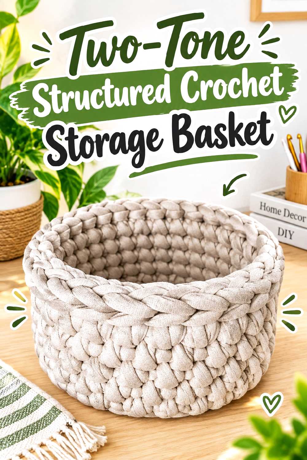
A crochet basket gives these dark colors enough surface area to look sophisticated without becoming overly busy. The supporting tutorial demonstrates a customizable basket with a substantial, upright form.
Instead of striping the entire basket, try a chocolate lower section with a grape upper band, or reverse the placement so grape appears as a narrower base accent.
Put the Darker-Looking Shade Where Wear Is Most Visible
Depending on the actual yarn shades you choose, chocolate may visually disguise everyday handling around the base better than a brighter purple. That makes it a practical candidate for the lower part of a frequently moved basket.
For decorative shelf storage, you can make the opposite choice and place grape where it will be most visible from across the room.
Check Shape Retention Before Adding More Height
A tall basket amplifies any tendency for the sides to bow or slump. If you adapt the tutorial with a different fiber or yarn construction, make a small fabric test and compare its firmness before extending the walls.
A two-color border can sharpen the top edge, but it cannot compensate for a body fabric that is too loose for the shape you want.
Creator Credit: Lallaulab
3. Grape Crowned Chocolate Crochet Bucket Hat
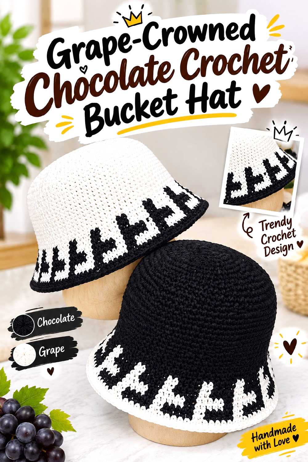
This bucket hat tutorial uses a pronounced textured brim, giving the silhouette more detail than a plain flat edge. That texture creates a natural opportunity to separate the two colors.
One option is a grape crown and chocolate brim. Another is an all-chocolate hat with a narrow grape transition immediately before the textured section.
Keep the Strongest Contrast Away From the Widest Area
A high-contrast stripe through the middle of a bucket hat can visually divide the head section. Moving grape either upward toward the crown or downward into the brim usually gives the design a clearer destination.
If you want an understated result, keep the crown and sides chocolate and let grape appear only within the brim texture.
Brim Behavior Depends on More Than Color
Changing yarn can change how firmly the brim projects from the hat. Before substituting a dramatically different fiber, consider whether you want the brim to stand away from the face or fall more softly.
Also verify the tutorial’s sizing method against the intended wearer’s measurements rather than assuming the sample will fit unchanged.
Creator Credit: anxin_crochet
4. Chocolate And Grape Floral Crochet Evening Shawl
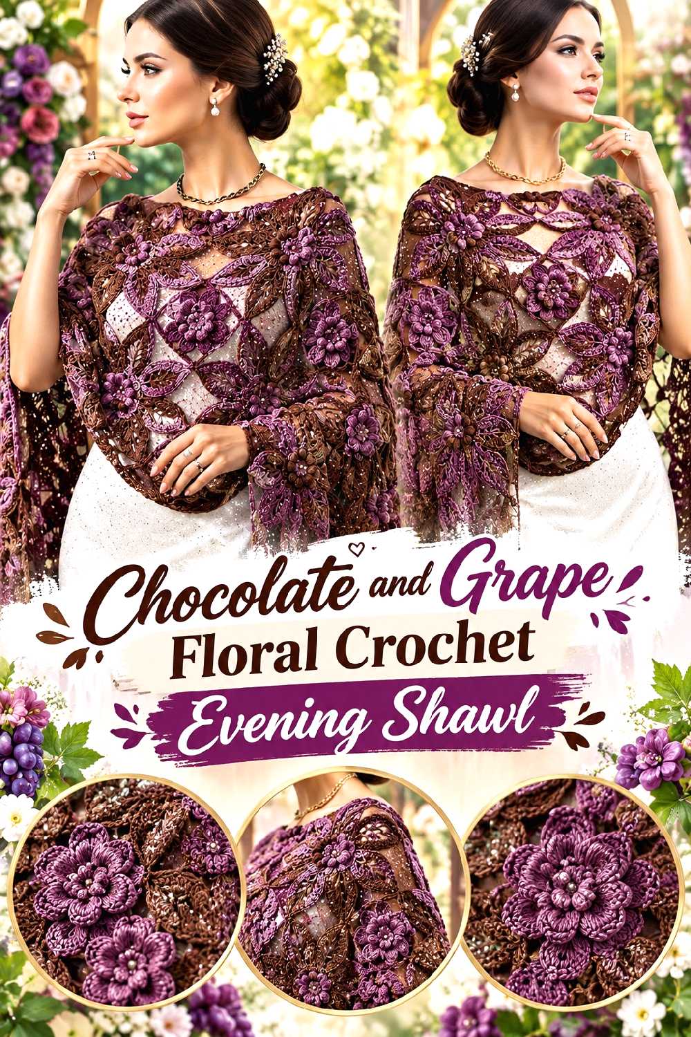
The supporting tutorial creates a crochet wrap with dimensional floral detailing, making it one of the more decorative options in this collection. Chocolate and grape can make those flowers feel considerably more dramatic than a pastel palette.
A chocolate main fabric with grape flowers emphasizes the dimensional details. Reversing the colors creates a stronger overall statement with quieter brown floral accents.
Decide Whether the Flowers or the Draped Fabric Should Lead
If the flowers are the feature you want people to notice first, use grape selectively on those elements against chocolate. Repeating grape everywhere can reduce the contrast between the ornament and the background.
For a more unified look, use closely related deep shades rather than a very dark brown with an extremely vivid purple.
Test Drape Before Committing to a Heavier Yarn
A shawl needs enough flexibility to sit naturally around the shoulders. Substituting a much thicker or stiffer yarn simply because the color is right can change the way the piece hangs.
Make a swatch large enough to bend and fold, not merely a tiny square, before deciding whether the yarn produces the fluidity you want.
Creator Credit: tallermanualperu
5. Color Blocked Chocolate And Grape Crochet Sweater Vest
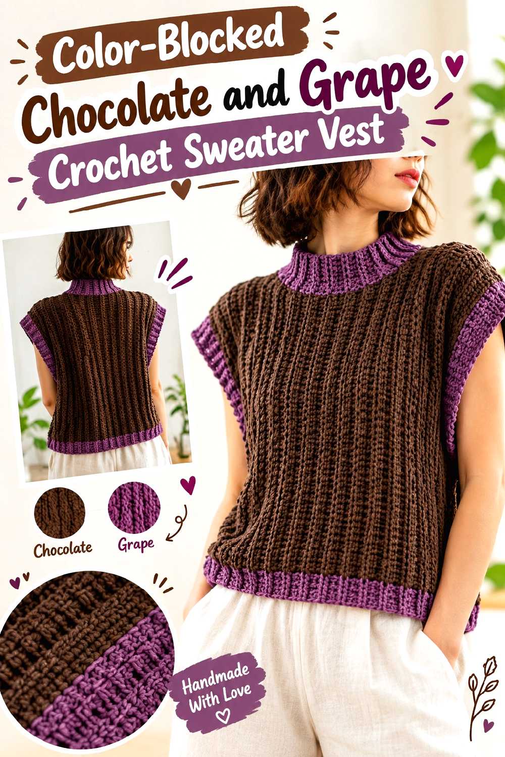
A sweater vest has large uninterrupted areas that make color blocking easier to control than tiny repeated stripes. The supporting tutorial demonstrates a panel-based vest with measurement and shaping considerations.
Try chocolate across the body with grape around the neckline and armholes, or divide the front and back into broad tonal sections.
Use the Neckline to Make the Accent Color Look Intentional
Contrast around a neckline creates a natural frame and requires less grape yarn than making an entire front panel purple. The same approach can be repeated at the armhole or lower edge for continuity.
Avoid changing color at an arbitrary point unless that line corresponds to something else in the garment, such as ribbing or panel geometry.
Recheck Measurements After Changing Yarn
Garments are less forgiving of yarn substitution than coasters or baskets. A difference in stitch size, stretch, or drape can alter panel width and armhole behavior.
Follow the creator’s construction framework, but base your fit decisions on actual measurements and your own fabric rather than treating the sample proportions as universal.
Creator Credit: passtschon
6. Chocolate Framed Grape Crochet Granny Square Tote
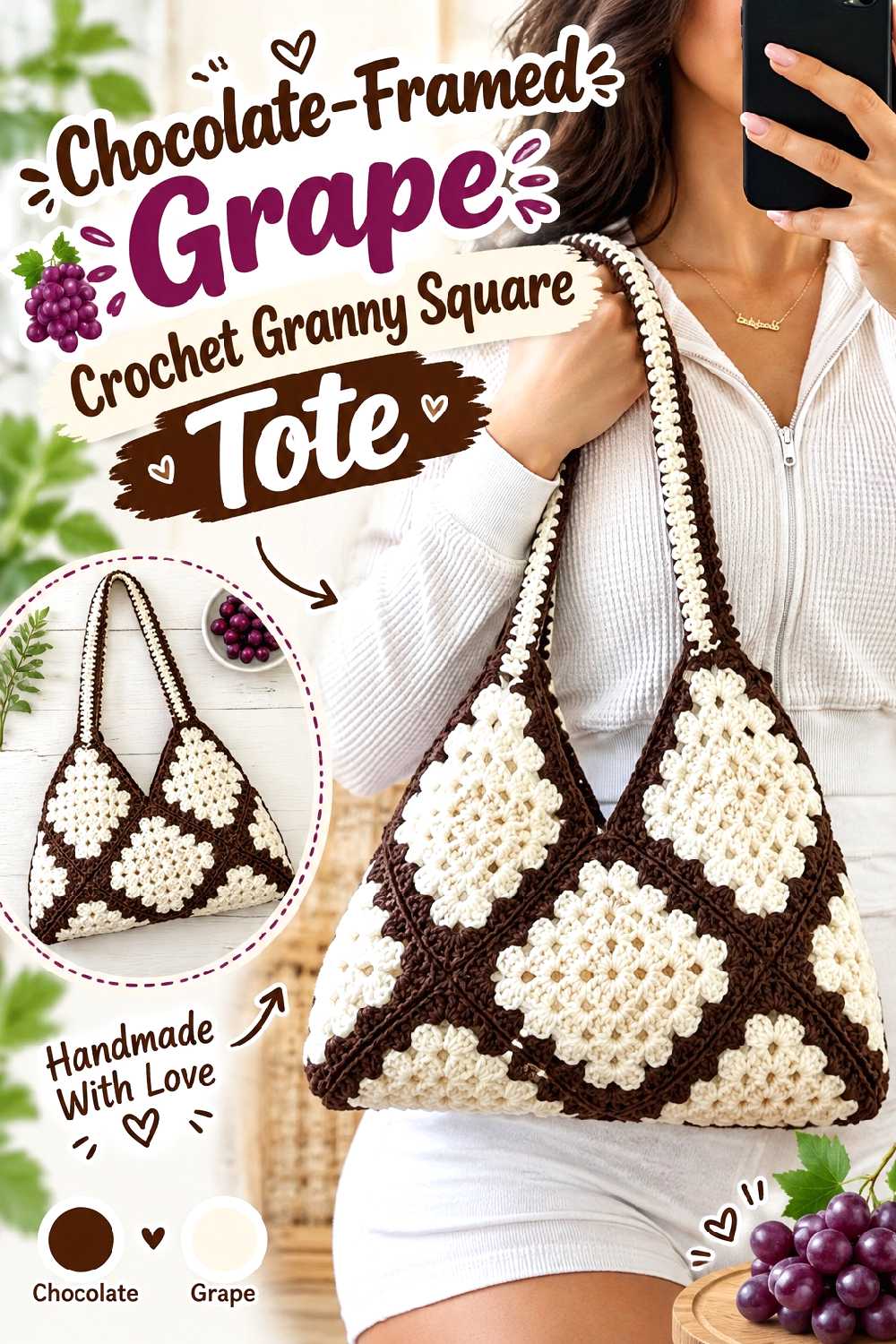
Granny squares offer an obvious way to distribute chocolate and grape systematically. The tutorial used for this idea demonstrates a minimalist granny-square tote construction.
For a richer version, make grape the center of each motif and use chocolate for the outer rounds and joins. This creates purple focal points while allowing the darker brown to visually connect the individual squares.
Let One Color Unite the Motifs
Using chocolate consistently on the outer portion of every square can make several multicolor motifs read as one bag rather than unrelated patches.
If you change motif size or add additional rounds, block and compare the squares before assembly so small differences do not accumulate across the finished bag.
Handles Should Relate to the Outer Framework
Chocolate handles can continue the visual line created by chocolate joins and borders. Grape handles create more contrast but will attract considerably more attention.
Whichever color you choose, consider handle stretch and the weight you realistically expect the bag to carry before modifying their dimensions.
Creator Credit: crochet daniela
7. Deep Tone Crochet Market Bag
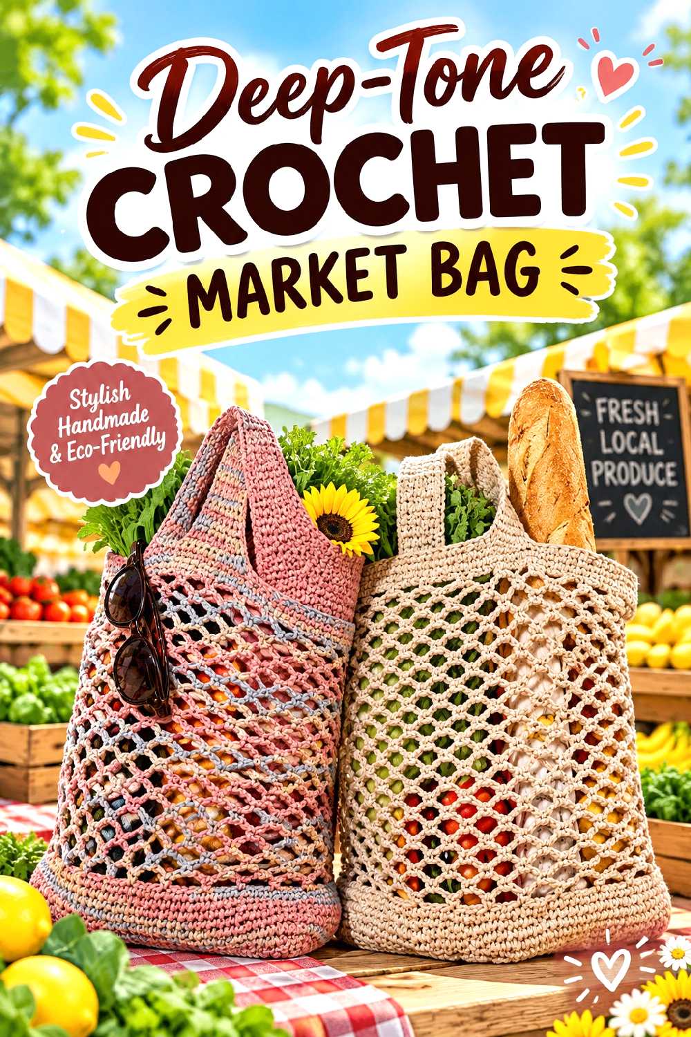
The Crochet Crowd’s supporting tutorial demonstrates an expandable market-bag style rather than a rigid purse. That looser construction gives the chocolate-and-grape palette a completely different character from the structured clutch.
Broad bands work better here than many narrow stripes because the open fabric already contributes visual activity.
Open Fabric Changes How Dark Colors Read
Mesh and open stitches allow the background to show through, so chocolate will not appear as visually solid as it does in a dense clutch or basket. Grape may also shift noticeably depending on what is carried inside the bag.
If color consistency matters, view a swatch against both light and dark backgrounds before settling on the placement.
Treat the Handles as a Functional Area First
It can be tempting to make grape handles simply for contrast, but first confirm how the tutorial constructs and supports them.
If you alter their width or length, remember that a market bag’s contents can pull on the upper edge differently than light decorative contents would.
Creator Credit: The Crochet Crowd
8. Chocolate And Grape Crochet Table Runner
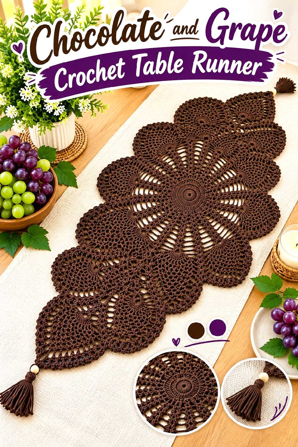
A long table runner provides room for chocolate and grape without forcing them into tiny repeated blocks. The tutorial selected for this idea creates an elongated decorative runner finished with tassel details.
Chocolate can anchor the central field while grape appears around the ends or decorative edge. Alternatively, a grape center with chocolate finishing can make the runner feel darker and more dramatic.
Keep the Center Calmer if Tableware Will Sit on Top
Highly contrasting color changes directly under plates, candles, or centerpieces can compete with whatever is displayed on the runner.
For a more composed table setting, use the strongest grape accents toward the ends where they remain visible.
Flatness Matters More Than Decorative Complexity
A beautiful color combination will not compensate for a runner that ripples or pulls inward. When changing yarn, monitor the fabric as it grows and block according to the needs of the chosen fiber.
Also consider the actual table dimensions before changing the tutorial’s length. A runner that works on one table may look undersized or overly long on another.
Creator Credit: Crochet by Glau
9. Draped Two Tone Crochet Poncho
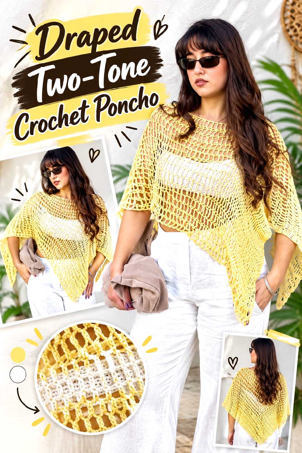
A poncho gives chocolate and grape a larger fashion scale than a scarf or hat. The supporting tutorial demonstrates a wearable built around panel shaping and customizable measurements.
For a restrained version, work most of the poncho in chocolate and reserve grape for the neck area and lower finishing. For more contrast, use broad diagonal or panel-based color blocking that follows the construction.
Color Lines Can Change the Apparent Proportions
Horizontal bands emphasize width, while vertical or construction-led sections can guide the eye downward. That matters on a poncho because the silhouette is already broad and draped.
Before adding a large grape band, consider where it will fall when the garment is actually worn rather than judging the panel only while it lies flat.
Check the Neck Opening After Any Structural Changes
If you modify panel proportions, do not assume the original opening will remain appropriate automatically.
The neck area affects both comfort and how the poncho settles on the shoulders, so keep the creator’s construction logic in mind while making color or length adaptations.
Creator Credit: Lorena
10. Chocolate Crochet Cardigan With Grape Ribbing
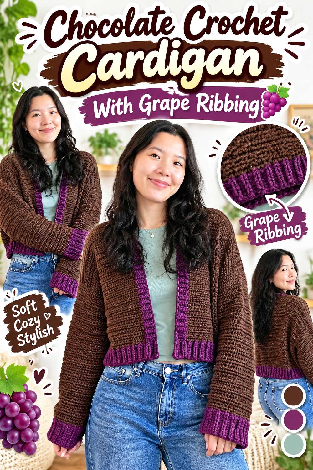
The supporting tutorial demonstrates a simple drop-shoulder cardigan with ribbed finishing, which makes it particularly suitable for a main-color-plus-trim treatment.
A chocolate body paired with grape cuffs, hem ribbing, and front edging creates a strong border without interrupting the main fabric.
Ribbing Is an Efficient Place for a Luxury-Looking Accent
Because ribbing already changes texture and direction, switching color there looks purposeful. It also avoids breaking up the larger body panels with unrelated stripes.
For a quieter result, choose a muted grape. For stronger contrast, use a deeper jewel-toned purple while keeping the brown warm rather than nearly black.
Swatch Both Colors Together
If the two yarns differ in elasticity or thickness, the grape ribbing may pull the chocolate fabric inward or flare away from it.
Even when both yarns carry the same weight label, test them in the actual stitch structures you intend to combine before starting a full garment.
Creator Credit: VivCrochets
11. Woven Texture Chocolate And Grape Crochet Throw
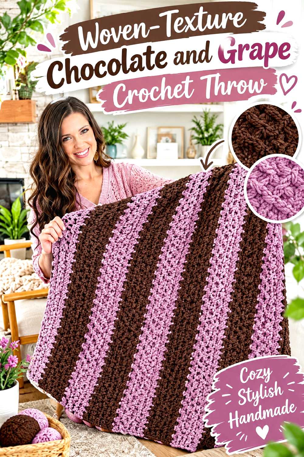
The Honey Weave throw tutorial demonstrates a textured fabric with a woven appearance and a defined border. Those structural changes make it easy to introduce a second color without turning the blanket into a conventional striped throw.
Chocolate can dominate the central field while grape frames the outside, or the main stitch pattern can alternate broader tonal sections.
Texture May Be More Effective Than Frequent Color Changes
With a strong stitch pattern, two or three large color zones can provide enough variation. Constant switching risks competing with the woven effect rather than enhancing it.
If the texture is the feature you want to emphasize, choose chocolate and grape yarns with similar surface finishes so one section does not unexpectedly look much fuzzier or shinier than the other.
Plan the Border Before Choosing the Main Color Ratio
A wide grape border around a chocolate field has more visual impact than the same amount of grape scattered throughout the blanket.
Estimate how prominent you want that frame to appear, then reserve yarn accordingly rather than deciding on the border only after completing the center.
Creator Credit: MJ’s Off The Hook Designs
12. Compact Chocolate And Grape Crochet Crossbody Bag
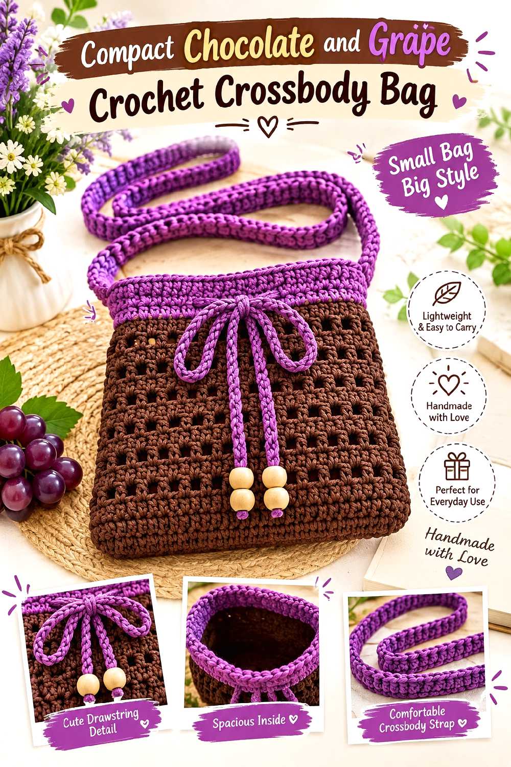
A crossbody bag has a different visual balance from a tote because the strap becomes part of the overall design. The supporting tutorial demonstrates a compact sling-style bag with a long carrying strap.
A chocolate body with a grape strap can be striking, but repeating grape somewhere on the bag itself helps the strap feel connected rather than added afterward.
Repeat the Strap Color Once on the Bag
A narrow grape border around the opening, a grape flap detail, or a small color block can visually connect the strap to the main body.
For a more understated piece, keep the strap chocolate and use grape only on the front panel.
Check Strap Stretch Before Increasing Its Length
Crochet straps can behave differently depending on stitch choice and fiber. Making a strap substantially longer than the tutorial’s version may increase how much stretch you notice in use.
If carrying heavier contents is important, consider reinforcement or lining as a separate planning decision rather than assuming decorative crochet fabric will behave like a commercial bag strap.
Creator Credit: Chompu Handicrafts
13. Two Tone Crochet Plant Pot Cover
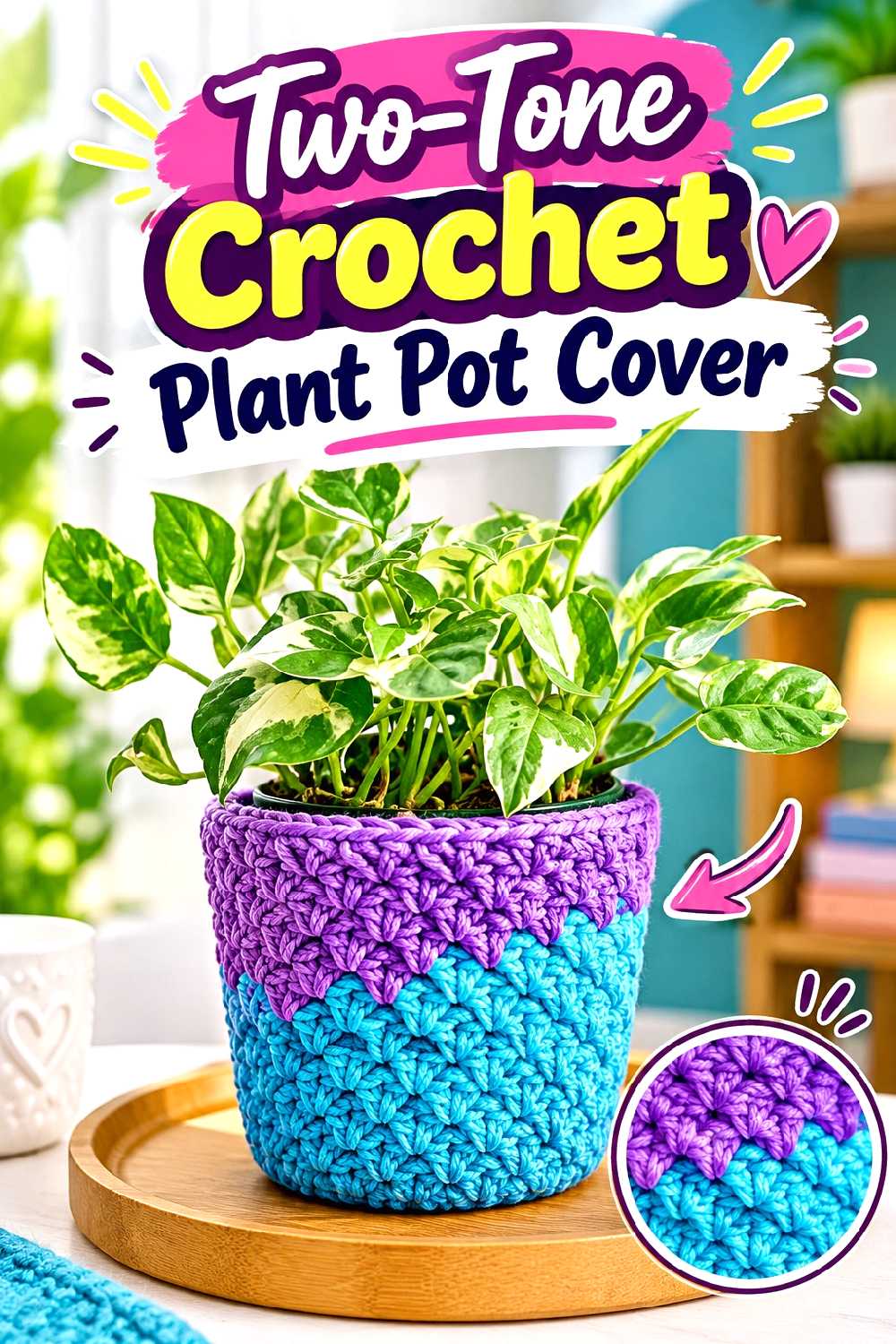
A plant pot cover is a small way to bring this palette into a room without committing to a large blanket or cushion. The selected tutorial demonstrates a removable crochet cover for a plant pot.
Chocolate works naturally near soil tones and wood furniture, while grape can create a strong upper band around foliage.
Match the Cover to the Widest Part of the Pot
Plant pots are not always straight-sided. If your pot narrows toward the base or has a substantial rim, check the fit as you work rather than relying only on one circumference measurement.
A cover that looks neat on a cylindrical sample may behave differently on a tapered planter.
Keep Water Management Separate From the Crochet
Treat the crochet piece as an outer decorative cover rather than the drainage system itself. The plant should still have an appropriate pot and water-management setup inside.
This also makes the cover easier to remove when it needs cleaning.
Creator Credit: Crojo Corner
14. Grape Crochet Beret With Chocolate Band
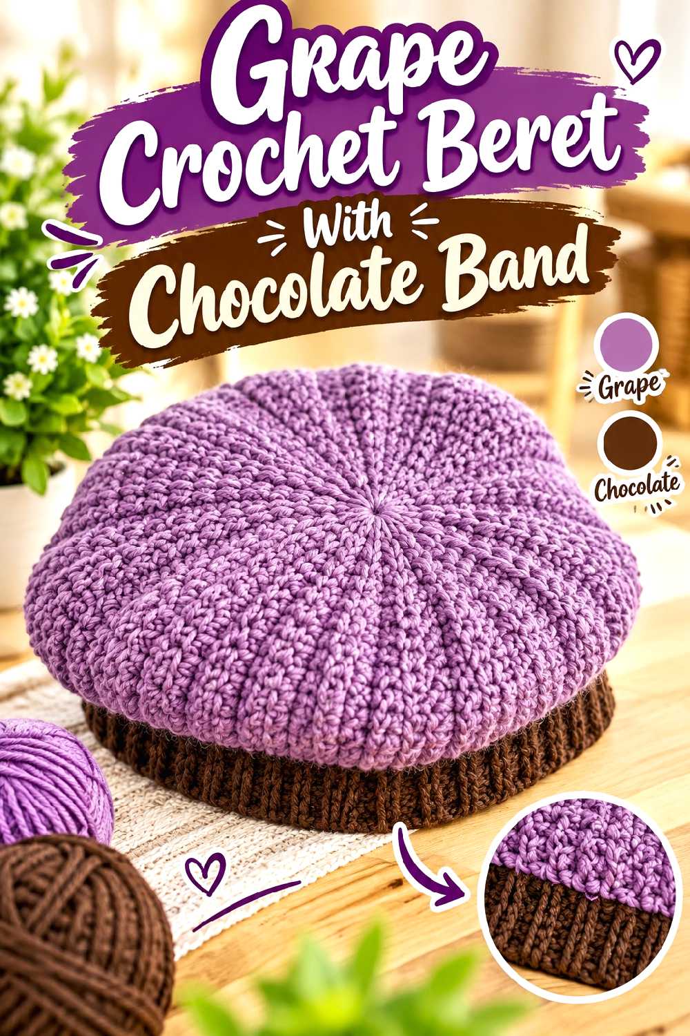
A classic beret gives grape a large, uninterrupted area where the richness of the color can carry the design. The selected Crochet Bits tutorial demonstrates the characteristic shaped beret silhouette and contrasting textural areas.
Use chocolate only at the band for an understated two-tone treatment, or work a small amount of chocolate near the crown as a second accent.
A Dark Band Visually Grounds the Brighter Crown
Because the band sits against the head, chocolate can function almost like a frame around the grape body.
This is especially useful if you want to incorporate both colors without creating obvious striping across the beret’s widest section.
Fit Depends on More Than the Finished Crown Diameter
The lower band needs to relate to the wearer’s actual head measurement and to the stretch of your chosen yarn.
If you change fiber, hook, or yarn thickness, verify the resulting fabric rather than assuming the tutorial’s sample dimensions will reproduce themselves automatically.
Creator Credit: Crochet Bits
15. Textured Chocolate And Grape Crochet Scarf
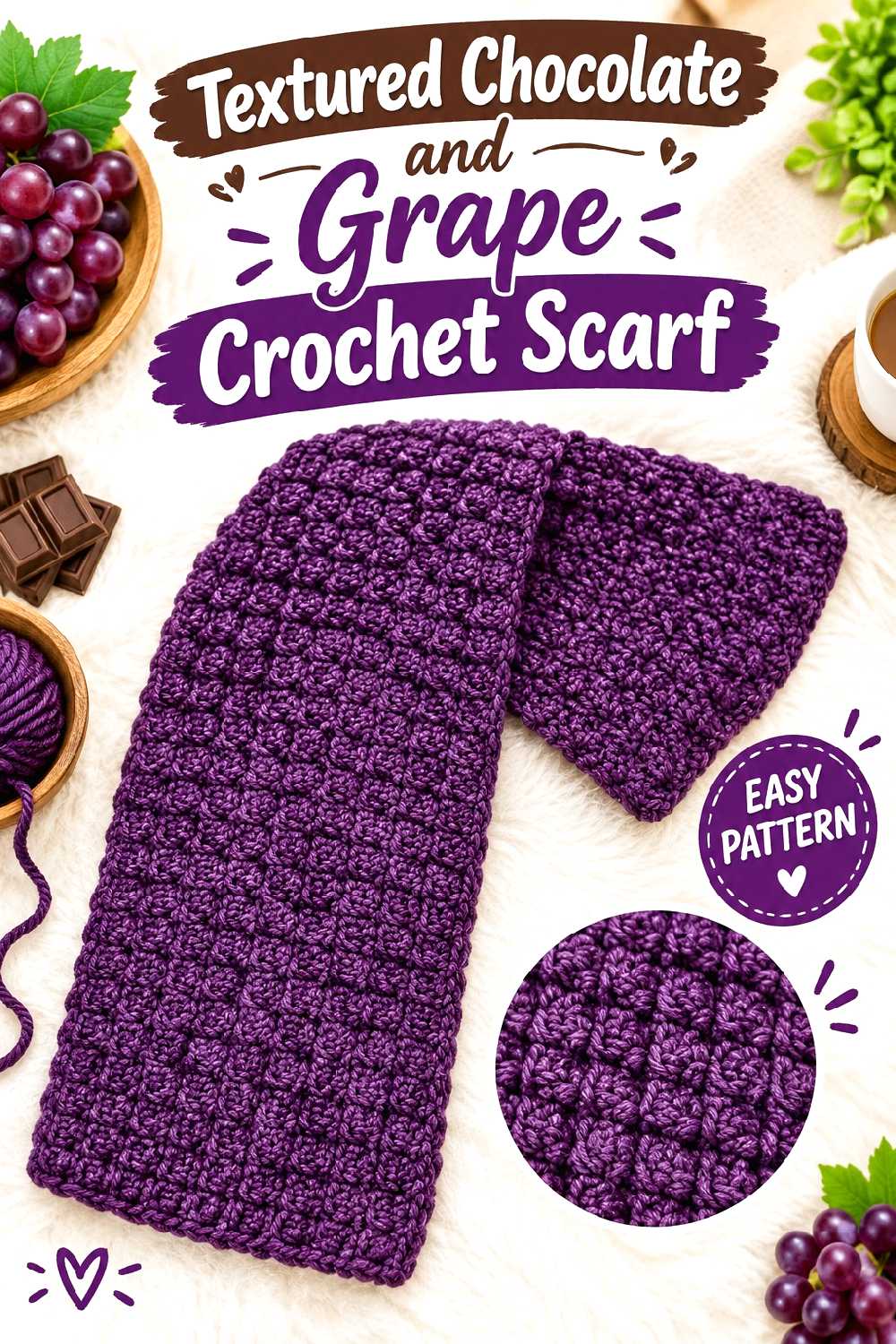
A scarf is one of the easiest places to experiment with the palette because fit is less complicated than it is with a cardigan or vest. The supporting tutorial demonstrates a straightforward textured scarf made from a repeating fabric.
Chocolate and grape can alternate in generous blocks, or one shade can cover almost the entire scarf with the second used only at the ends.
Wide Blocks Usually Look More Refined Than Tiny Stripes
Because both colors are already deep, narrow alternating stripes can create a visually busy surface once texture is added.
Broader sections give the stitch pattern more room to show and make each color change feel deliberate.
Decide on Fringe Only After Seeing the Finished Fabric
Fringe can add movement, but it can also make a heavily textured scarf feel busier. A clean chocolate edge may suit a grape-dominant scarf better than mixed fringe.
If you do add tassels or fringe, consider using one color rather than alternating every strand.
Creator Credit: Raji’s Craft Hobby
16. Botanical Chocolate And Grape Crochet Wall Hanging
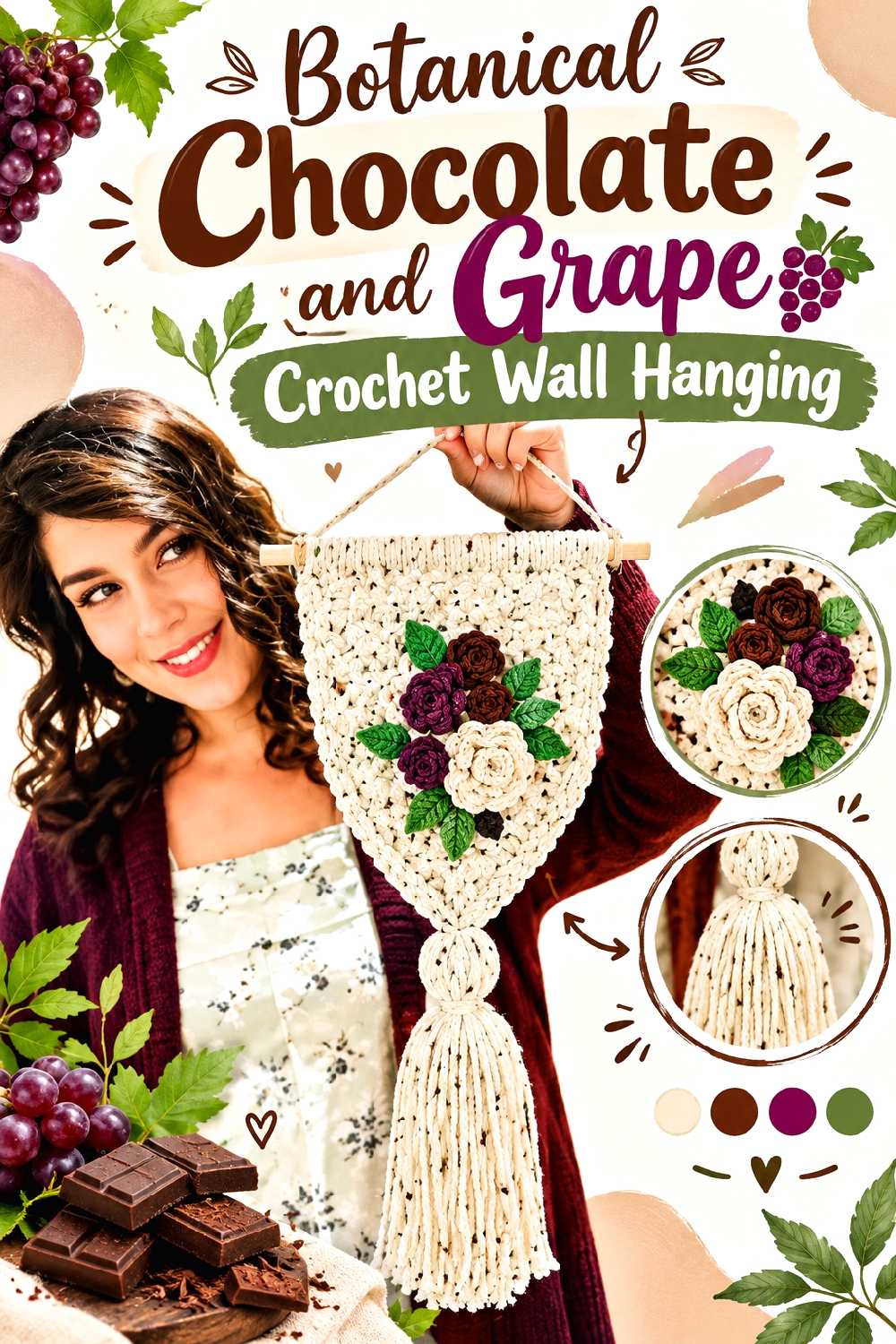
The supporting tutorial demonstrates a floral crochet wall hanging mounted for display. That format gives chocolate and grape a chance to behave more like an interior color scheme than a wearable palette.
Chocolate can form the background or supporting elements while grape appears in flowers, or the arrangement can be reversed for a moodier statement piece.
Build Contrast Around the Motifs
If every component uses an equal mix of both colors, the flower shapes may lose definition from a distance.
Keeping the background more uniform and concentrating grape in the raised floral elements helps preserve their silhouette.
Judge the Piece From Across the Room
A wall hanging is usually viewed farther away than a coaster or handbag. Small color details that look important in your hands may disappear once mounted.
Pause before final assembly and temporarily arrange the elements on the intended background. Step back several feet to see whether the color hierarchy still works.
Creator Credit: Woodland Stitchcraft
17. Two Tone Textured Crochet Cushion Cover
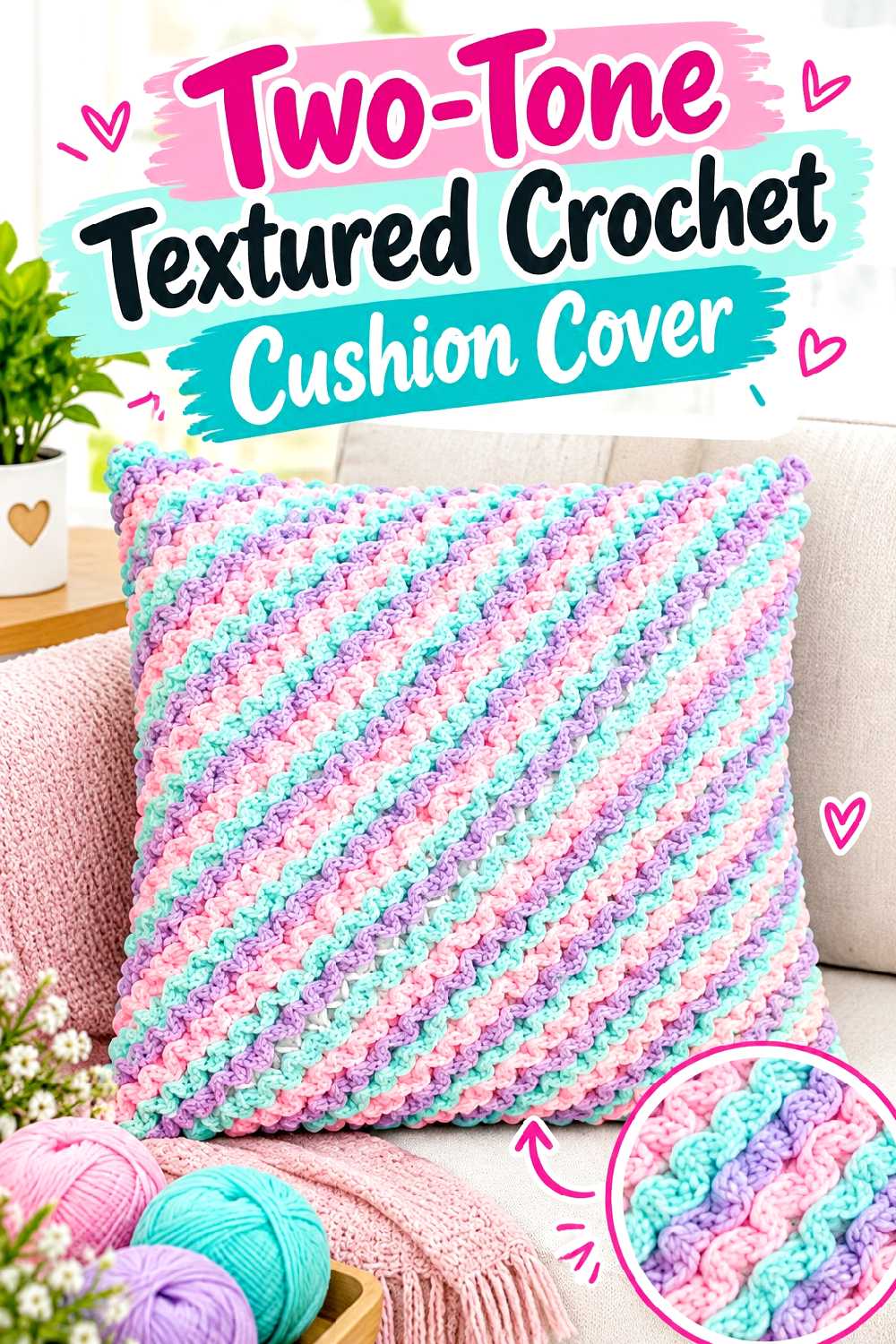
A cushion is large enough for the color pairing to make an impact but small enough to experiment with stronger contrast. The selected tutorial demonstrates an adaptable crochet cushion-cover construction.
A grape front with chocolate sides or edging gives you a bold focal piece, while a chocolate-dominant cover is easier to mix with neutral furnishings.
Match the Crochet to the Insert, Not a Generic Size Label
Pillow inserts with the same nominal size can have different fullness. Before finalizing the cover dimensions, compare your fabric directly with the insert you intend to use.
A cover that is too loose can obscure texture, while one that is excessively tight can distort the stitches and corners.
Use Color to Control Which Texture Dominates
If the cover contains a pronounced stitch pattern, choose the color with the clearer stitch definition for the area you want to feature.
Chocolate may emphasize shadow; grape may emphasize contrast. Make a small sample in both colors because the same stitch can look surprisingly different between them.
Creator Credit: Crochet MC
18. Chocolate And Grape Crochet Coaster Set With Holder
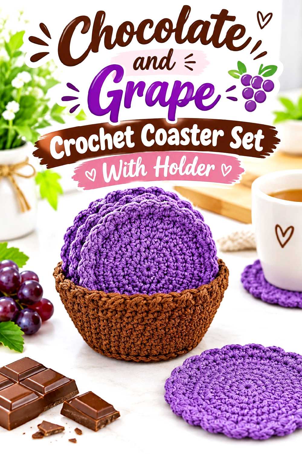
A coaster set is the smallest project here, but the matching holder gives it enough structure to feel like a coordinated home accessory rather than a handful of scrap-yarn circles. The supporting tutorial demonstrates circular coasters together with their storage holder.
Try chocolate coasters with grape borders inside a chocolate holder, or divide the set so some coasters reverse the palette.
Repeating the Same Border Creates a Cohesive Set
If individual coaster centers vary, use one consistent outer color to tie them together. A chocolate border around every coaster can visually organize alternating grape and brown centers.
The holder can then repeat that same chocolate framework with one narrow grape accent.
Fiber Choice Matters for Table Use
Before choosing yarn solely for its color, consider the intended use of the coasters and the care instructions for that fiber.
Also check that the finished pieces lie flat. Strong blocking cannot always correct a circle whose stitch tension or shaping causes persistent cupping or rippling.
Creator Credit: Jo to the World Creations
Comparing the 18 Chocolate and Grape Crochet Ideas
If you want the palette to look clean and tailored, the frame clutch, crossbody bag, cardigan, sweater vest, and beret provide clear places for controlled accent color.
For texture-heavy home decor, the throw, cushion, basket, table runner, and wall hanging let chocolate create shadow while grape marks borders or focal details.
If you want to test the pairing before buying yarn for a large project, start with the coaster set, plant pot cover, bucket hat, or scarf. They give you enough surface area to judge the relationship between the colors without committing to a blanket or full garment.
Motif lovers may prefer the granny square tote, where the chocolate can unify repeated grape centers. For softer drape and movement, the shawl and poncho give the palette an entirely different character.
Conclusion
Chocolate and grape work particularly well when each color has a job. Chocolate can frame, ground, and connect sections, while grape can highlight texture, motifs, edges, and shaped details. Reversing those roles gives a bolder result without requiring a completely different construction.
For a first experiment, a coaster set, beret, scarf, or plant pot cover keeps the color decision manageable. If you already know you like the pairing, a structured clutch, tailored cardigan, textured throw, or floral shawl gives the combination enough scale to become the main design feature.
Before changing a tutorial’s yarn, size, strap, fit, or structural proportions, check the original creator’s instructions for the exact construction details. Color is usually the easiest element to adapt; fit and structure deserve more careful comparison.
Frequently Asked Questions
Do chocolate brown and grape purple work together in crochet?
Yes. Both are deep colors, but chocolate behaves more like a warm neutral while grape adds a stronger color note. The combination is easiest to control when one shade dominates and the other is used intentionally for borders, motifs, ribbing, handles, or other structural details.
Which color should dominate a chocolate-and-grape crochet project?
That depends on the effect you want. Chocolate-dominant projects tend to look quieter and warmer, while grape-dominant projects make a stronger color statement. If you are unsure, begin with chocolate as the main shade and add grape to areas that already have a clear design function.
Will chocolate and grape look too dark together?
They can if both yarns are extremely deep and the stitch pattern has little texture. You can create more separation by choosing a slightly warmer brown, a clearer grape purple, or a stitch pattern that produces highlights and shadows. A small amount of cream, taupe, or another neutral can also separate the colors, although a third color is not necessary.
Should both colors be the same yarn brand and fiber?
They do not have to be, but their behavior should be compatible with the project. Significant differences in thickness, elasticity, surface texture, or washing behavior can be especially troublesome in garments, joined motifs, and fitted covers. Swatch the two yarns together before using them in areas that must align precisely.
How can I make chocolate and grape stripes look less busy?
Use fewer, wider bands and connect each color change to the construction. For example, place grape at a hem, border, yoke, bag opening, or end section instead of switching colors every few rows. Texture already adds visual information, so heavily textured projects often need fewer color changes.
Can I replace grape with a lighter purple?
Yes. Plum, aubergine, berry, mauve, and muted lavender can all shift the mood of the pairing. A light purple creates much stronger contrast against chocolate, while aubergine or dark plum produces a more tonal result. Make a small sample first because the amount of contrast can look different in yarn than it does on a screen.