Split pea green sits between earthy olive and yellow-green, which makes it especially useful for fall crochet. It has enough color to stand apart from beige and brown, but it can still behave almost like a neutral when paired with cream, camel, charcoal, espresso, burgundy, or muted pink.
The polished look comes from controlling where the green appears. On a cardigan, split pea green can cover broad panels while cream stays around ribbing. On a tote, espresso can define joins and handles. On textured hats and cowls, keeping the main surface green allows ribbing and raised stitches to create the detail instead of relying on constant color changes.
These 13 ideas use public YouTube tutorials as construction references. The split pea green palettes below are independent color adaptations, so the linked creators do not necessarily use these exact color combinations in their original projects.
Quick List
- Split Pea Green And Cream Crochet Oversized Cardigan
- Split Pea Green And Espresso Crochet Granny Square Tote
- Split Pea Green And Oatmeal Crochet Ribbed Beanie
- Split Pea Green And Charcoal Crochet Textured Cowl
- Split Pea Green And Camel Crochet Modern Blanket
- Split Pea Green And Burgundy Crochet Tunisian Scarf
- Split Pea Green And Chocolate Crochet Bucket Hat
- Split Pea Green And Ivory Crochet Leg Warmers
- Split Pea Green And Dusty Rose Crochet Lace Shawl
- Split Pea Green And Rust Crochet Skirt
- Split Pea Green And Black Crochet Handbag
- Split Pea Green And Oxblood Crochet Floral Poncho
- Split Pea Green And Taupe Crochet Balaclava
How to Make Split Pea Green Crochet Look More Refined
Split pea green becomes easier to control when it has one clear supporting color rather than several accents competing for space. Cream and oatmeal lighten it without changing its earthy direction. Espresso, black, and charcoal create stronger definition. Rust, burgundy, dusty rose, and oxblood add color while keeping the palette closer to fall.
Think about the construction before distributing the colors. Garment panels can carry large areas of green, while cuffs and necklines can handle contrast. Bag straps and joins naturally accommodate darker colors. Blanket borders can frame green without interrupting the center, and textured accessories often look cleaner when most of the stitchwork remains in one shade.
Keep Enough Contrast Around Split Pea Green Crochet Details
Split pea green can sit relatively close in value to taupe, camel, olive, or medium brown. Two colors may look clearly different as yarn balls but merge once they are worked into textured crochet.
Compare the actual yarns side by side before committing to granny-square centers, borders, stripes, or small motifs. A grayscale photo is also useful when you need to know whether an accent will remain visible.
For subtle projects, similar values may be intentional. For detailed motifs or narrow trim, stronger light-and-dark separation usually makes the color placement easier to see.
1. Split Pea Green And Cream Crochet Oversized Cardigan
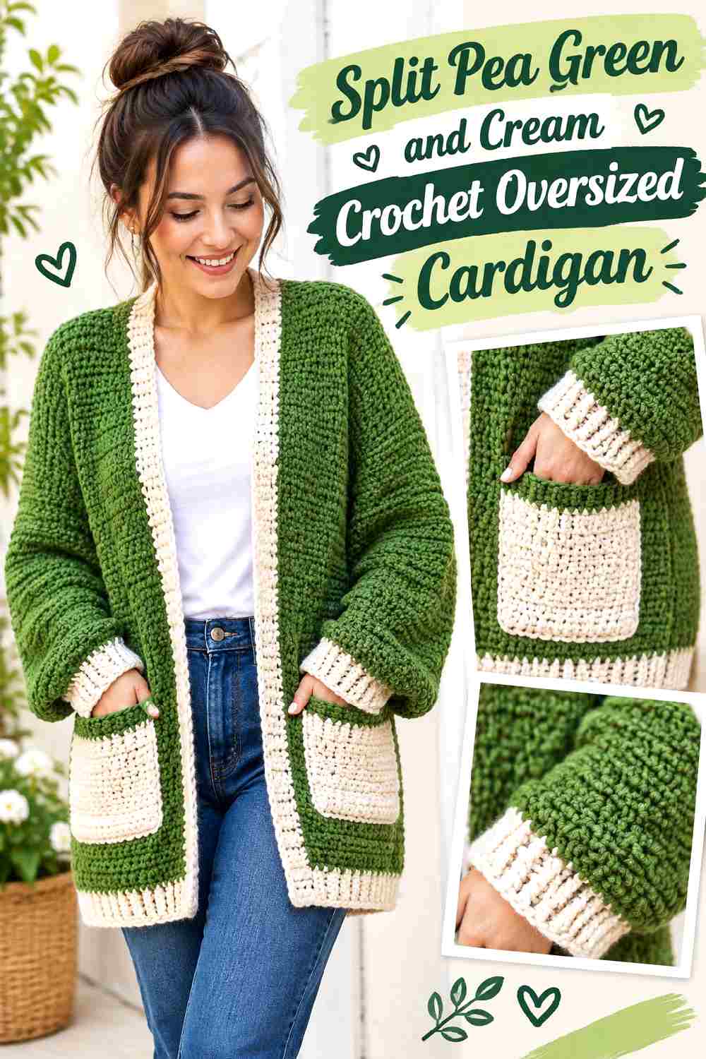
An oversized cardigan gives split pea green enough uninterrupted surface to establish the entire palette. Cream can then provide controlled definition around ribbing, pockets, cuffs, or the front opening. The softer contrast keeps the garment earthy while preventing the large green panels from feeling visually flat.
Let Split Pea Green Cover the Main Crochet Cardigan Panels
Use split pea green across the back, front panels, and most of the sleeves when you want the cardigan to read as one cohesive fall layer. Large uninterrupted areas also allow stitch texture and the oversized silhouette to remain visible without turning every construction line into a color boundary.
If you want more cream, add it to repeated finishing areas rather than placing random cream blocks through the body.
Use Cream to Finish Split Pea Green Crochet Cardigan Edges
Cream works well on cuffs or the front opening because those areas already need visual definition. Repeating cream at two related locations makes the color look intentional without dividing the entire cardigan.
Avoid automatically making every border cream. Keeping the lower hem split pea green, for example, can prevent the garment from looking completely outlined.
Creator Credit: forthefrills
2. Split Pea Green And Espresso Crochet Granny Square Tote
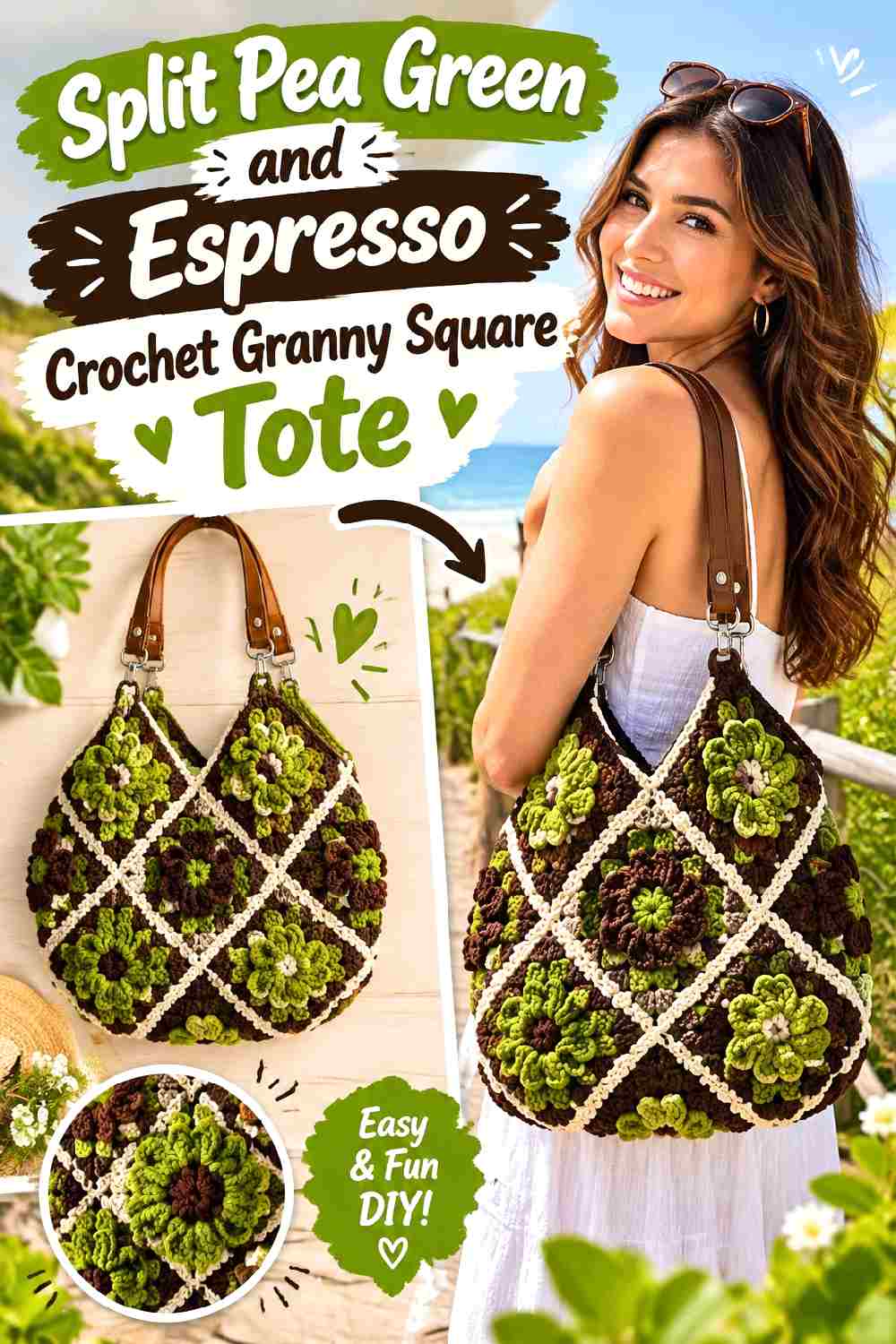
Split pea green and espresso suit a granny square tote because the two colors can have clearly different jobs. Green can dominate the square faces, while espresso defines joins, the upper edge, or handles. That division keeps the motif construction visible without creating a bag full of equally strong colors.
Repeat Split Pea Green Across the Crochet Tote Squares
Keep split pea green in the same visual role from square to square. It might occupy the largest outer section or repeat through the centers, depending on the motif, but consistency matters more than assigning every square a completely different palette.
A repeated main green helps multiple motifs read as one bag instead of a collection of unrelated squares.
Let Espresso Frame Split Pea Green Crochet Tote Structure
Espresso is useful around handles and joins because those are structural parts of the tote. The darker brown can visually ground split pea green while also making the assembly lines part of the finished design.
If the joins are already espresso, consider keeping some upper edging green. Too many dark structural lines can start to overpower the motifs.
Creator Credit: Brunaticality
3. Split Pea Green And Oatmeal Crochet Ribbed Beanie
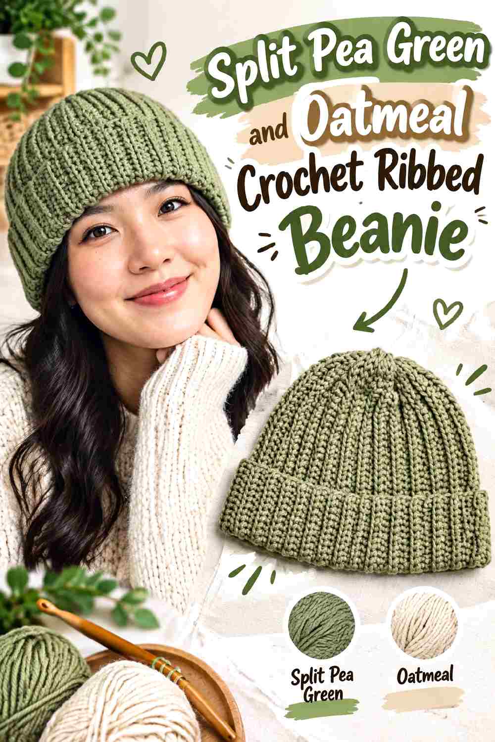
Ribbing already creates substantial visual movement, so this beanie does not need complicated color blocking. Split pea green can cover the crown while oatmeal gives the lower edge a quieter light contrast.
Keep Split Pea Green Continuous Through the Crochet Beanie Ribbing
Long sections of uninterrupted split pea green help the ribbed texture remain the main detail. Frequent color changes can break those vertical lines into smaller pieces and make the beanie look busier than necessary.
If you want a strongly green hat, reserve oatmeal for one concentrated area rather than scattering narrow stripes throughout the crown.
Use Oatmeal to Lighten the Split Pea Green Crochet Beanie Edge
Oatmeal can create a softer boundary than bright white. A controlled lower band introduces contrast near the face while leaving most of the hat split pea green.
Pay attention to proportion. A very deep oatmeal section changes the beanie into an evenly two-tone design, while a narrower band keeps the green dominant.
Creator Credit: VivCrochets
4. Split Pea Green And Charcoal Crochet Textured Cowl
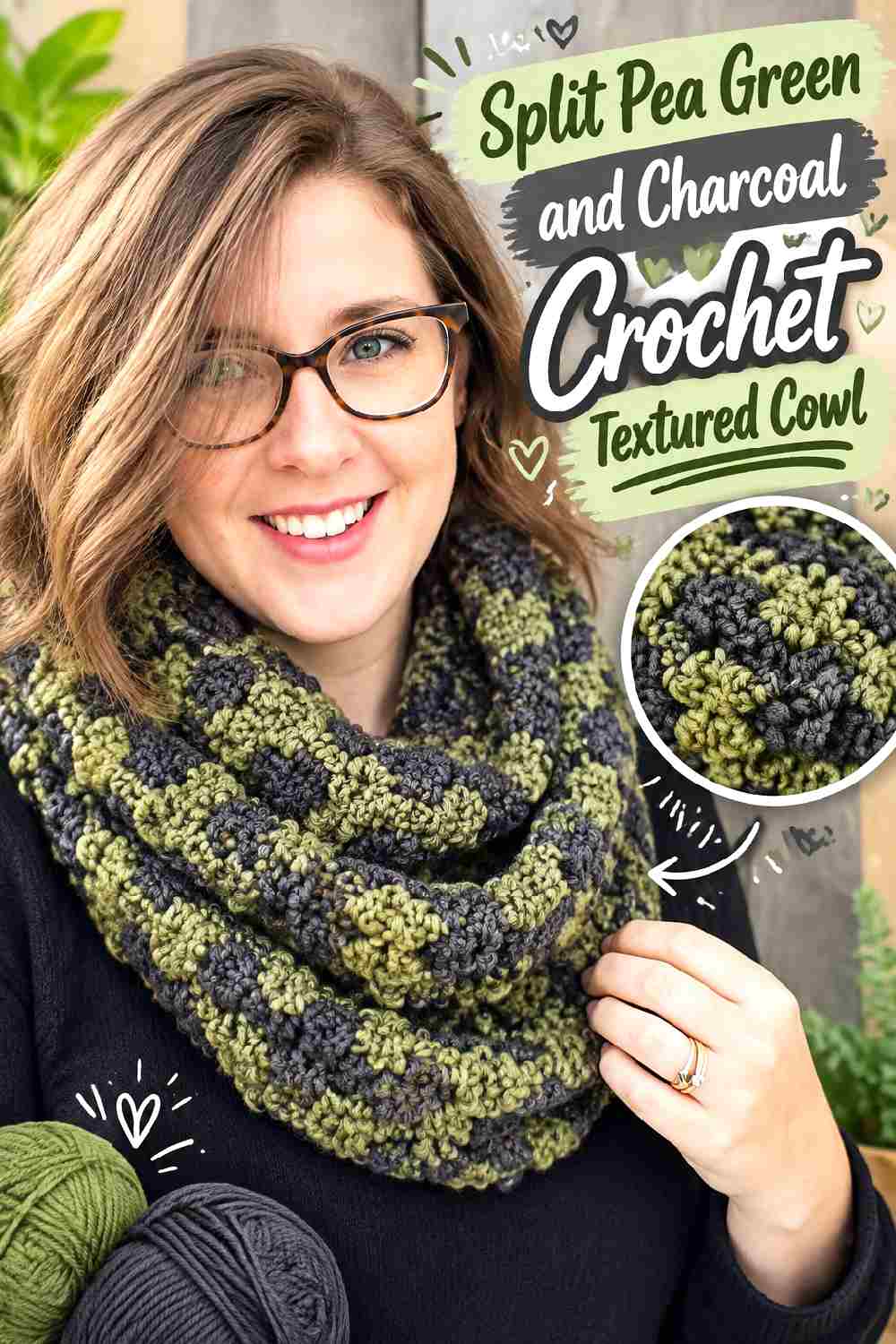
Charcoal makes split pea green appear more muted and earthy without introducing another warm shade. Because a cowl has limited surface area, this palette works best when the green carries most of the texture and charcoal acts as definition.
Let Split Pea Green Show the Main Crochet Cowl Texture
Use split pea green through the broad textured area so raised stitches and shadows stay continuous. Splitting every texture change into another color can make the stitch pattern harder to appreciate as one surface.
A single dominant shade is especially useful when the cowl already contains prominent stitch variation.
Keep Charcoal Narrow Around Split Pea Green Crochet Cowl Edges
Charcoal can define the upper or lower edge without competing with the central green texture. Decide which edge is most visible when the cowl is actually worn before placing the darkest accent.
If both edges receive charcoal, keep their widths controlled so the center remains unmistakably split pea green.
Creator Credit: Rich Textures Crochet
5. Split Pea Green And Camel Crochet Modern Blanket
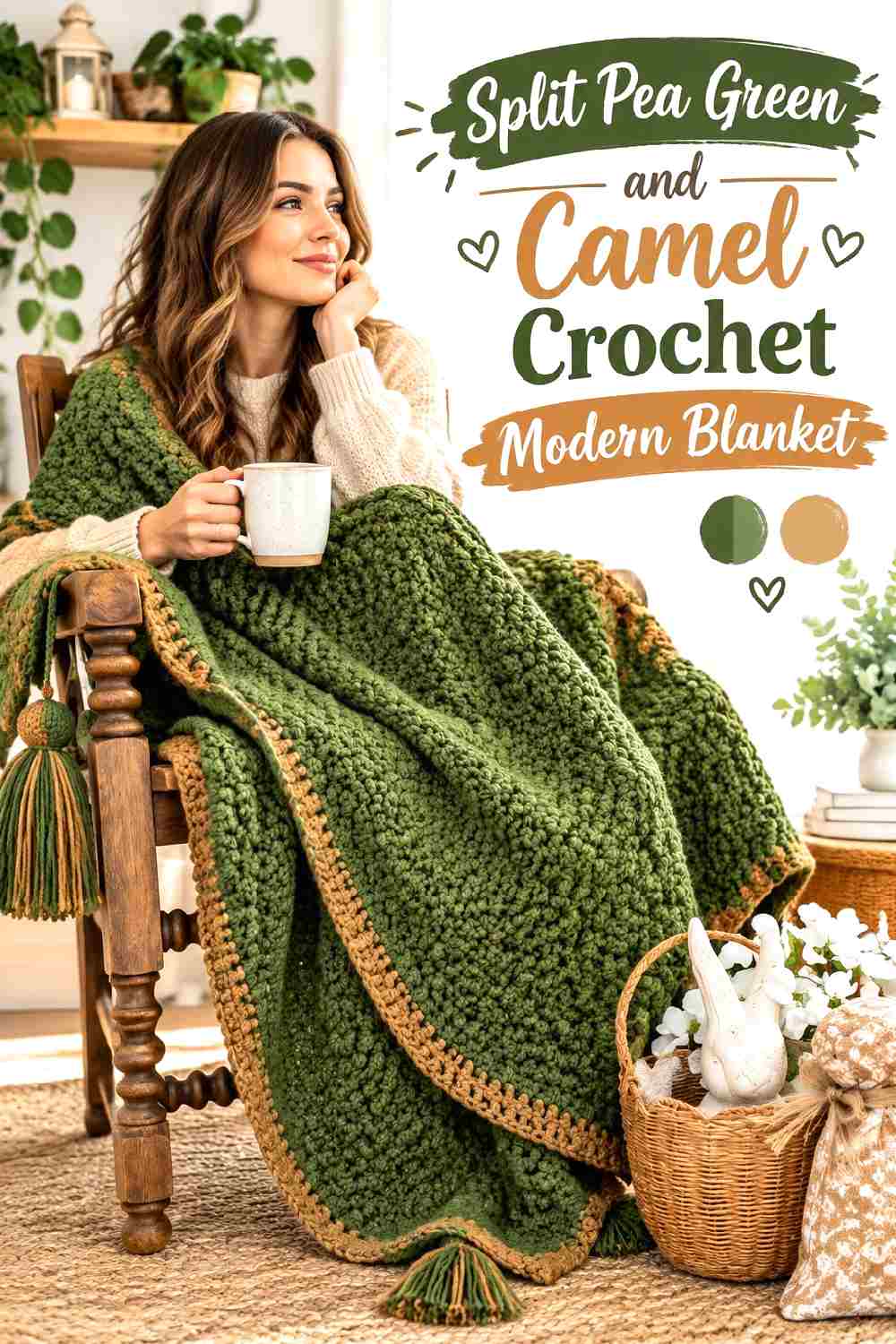
Split pea green and camel create a low-key earthy combination suited to a large blanket surface. Because both shades can sit in the middle of the value range, placement matters if you want borders or sections to remain clearly visible.
Give Split Pea Green Most of the Crochet Blanket Surface
A blanket provides enough area for split pea green to become the visual field rather than a small decorative accent. Keeping much of the center green can also make furniture and surrounding neutral décor feel less visually busy.
Use camel where it has a specific purpose, such as framing the outside or separating major sections.
Check Camel Contrast Against Split Pea Green Crochet Borders
Not every camel yarn will stand out clearly from split pea green. Compare your choices in grayscale if you want a noticeable border.
For a subtler blanket, similar values can work deliberately. In that case, the color change will read more as a tonal transition than a sharply defined frame.
Creator Credit: Redesigned Rose
6. Split Pea Green And Burgundy Crochet Tunisian Scarf
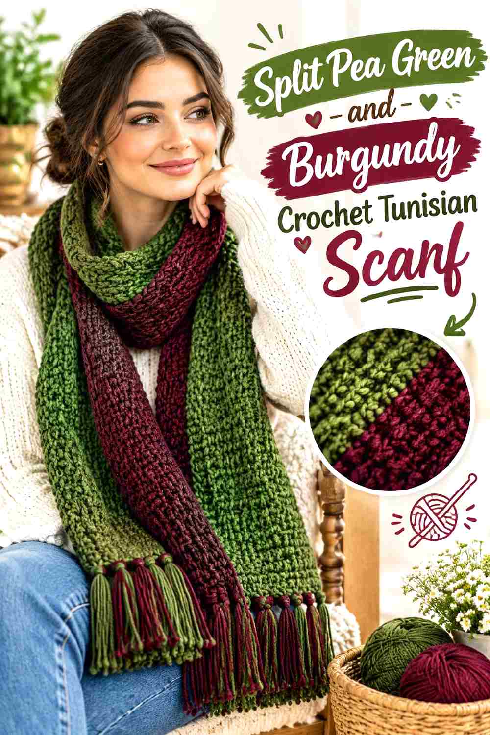
Burgundy adds a deep red contrast that pushes split pea green firmly into an autumn palette. A scarf offers enough length to repeat both colors without giving them equal visual weight.
Let Split Pea Green Build the Main Crochet Scarf Length
Use split pea green across the largest sections so the scarf has a clear dominant color when wrapped or folded.
Long green passages can also make stitch changes easier to notice because the viewer is not constantly switching attention between texture and color.
Repeat Burgundy Carefully Through the Split Pea Green Crochet Scarf
Burgundy can appear near the ends or in selected repeated bands. Repetition matters: one isolated burgundy stripe can feel disconnected, while two or three intentional placements create a recognizable secondary color.
Keep the burgundy sections smaller if split pea green is meant to remain the defining color.
Creator Credit: TL Yarn Crafts
7. Split Pea Green And Chocolate Crochet Bucket Hat
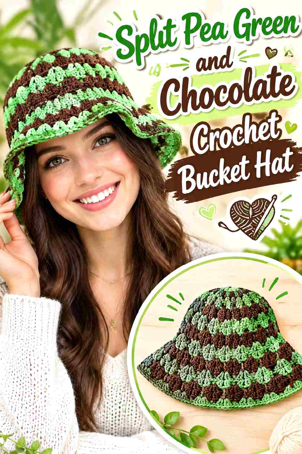
A bucket hat has a strong silhouette, so a restrained two-color scheme is enough. Split pea green can cover the crown, while chocolate creates a darker brim that gives the lower edge more visual weight.
Keep Split Pea Green Across the Crochet Bucket Hat Crown
Using split pea green continuously over the crown makes the shape easier to read and keeps the palette cleaner.
If the hat already has texture, avoid introducing multiple alternating colors through the side section. Let the stitch surface provide detail before adding more contrast.
Ground the Split Pea Green Crochet Brim With Chocolate
Chocolate on the brim can make the brighter yellow-green quality of split pea green look more subdued.
For less contrast, begin the brim in split pea green and introduce chocolate closer to the outside edge. That produces a smaller dark frame rather than dividing the hat into two equally sized color blocks.
Creator Credit: PassioKnit Kelsie
8. Split Pea Green And Ivory Crochet Leg Warmers
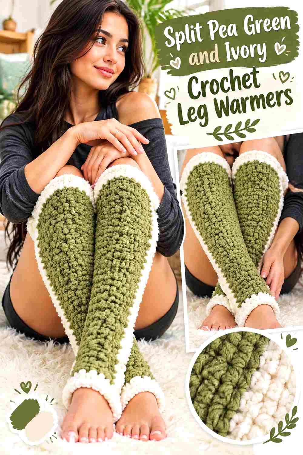
Ivory gives split pea green one of its clearest light contrasts. On leg warmers, that contrast can emphasize the top and bottom bands without interrupting the main vertical surface.
Keep Split Pea Green Through the Main Crochet Leg Warmer Texture
Use split pea green through the primary leg section on both pieces so the pair remains visually consistent.
Because leg warmers are worn together, compare their color distribution side by side before finishing. One noticeably deeper ivory section can make an otherwise matching pair look unbalanced.
Use Ivory to Define Split Pea Green Crochet Leg Warmer Bands
Ivory works well at the top or bottom because a light band creates a clear stopping point against the green body.
You can use ivory at both ends for symmetry or select one location for a more restrained effect. Either way, repeat the same placement on the second leg warmer.
Creator Credit: TCDDIY
9. Split Pea Green And Dusty Rose Crochet Lace Shawl
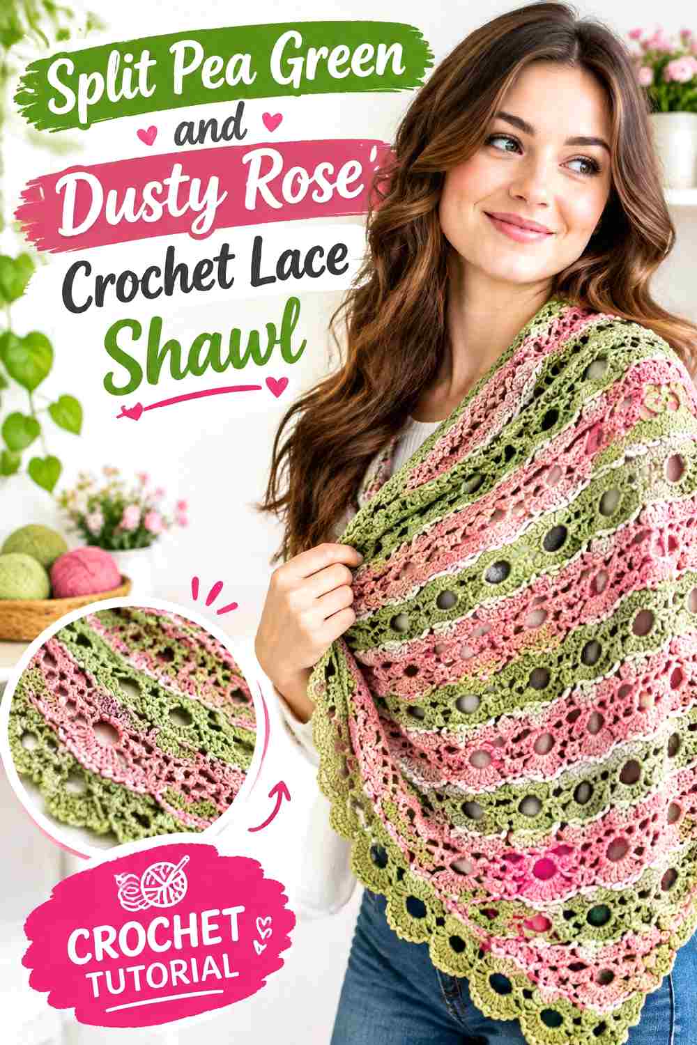
Dusty rose gives split pea green a softer color contrast than burgundy. It is particularly useful on a lace shawl because the two muted shades can transition without making every open section look sharply striped.
Let Split Pea Green Anchor the Crochet Shawl Shape
Keep split pea green through a substantial portion of the shawl so its overall triangular or spreading shape has a visual anchor.
With openwork, color changes already interact with negative space. Large enough green sections prevent the shawl from becoming visually fragmented.
Use Dusty Rose to Soften Split Pea Green Crochet Lace Sections
Dusty rose can create a gentler transition near selected lace sections or around an outer portion of the shawl.
Check the values before using the two colors in small details. If the dusty rose is almost as dark as the split pea green, the color difference may remain subtle even though the hues are clearly different.
Creator Credit: Bella Coco
10. Split Pea Green And Rust Crochet Skirt
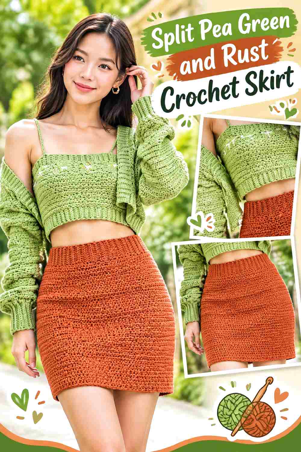
Rust and split pea green create an autumnal two-color palette without relying on a neutral. Because both colors carry visual weight, giving them unequal proportions prevents the skirt from becoming overly blocky.
Make Split Pea Green the Main Crochet Skirt Color
Use split pea green through most of the skirt body if you want the silhouette to remain visually continuous.
Broad uninterrupted green sections are particularly useful on a garment where frequent horizontal color changes can create strong divisions across the body.
Keep Rust Controlled Around Split Pea Green Crochet Skirt Details
Rust can work at the waistband, lower edge, or one intentional section rather than alternating continuously with green.
If rust appears at the waist, repeating a smaller rust detail near the hem can connect the palette. Keep the second appearance modest so split pea green still controls the overall garment.
Creator Credit: Chenda DIY
11. Split Pea Green And Black Crochet Handbag
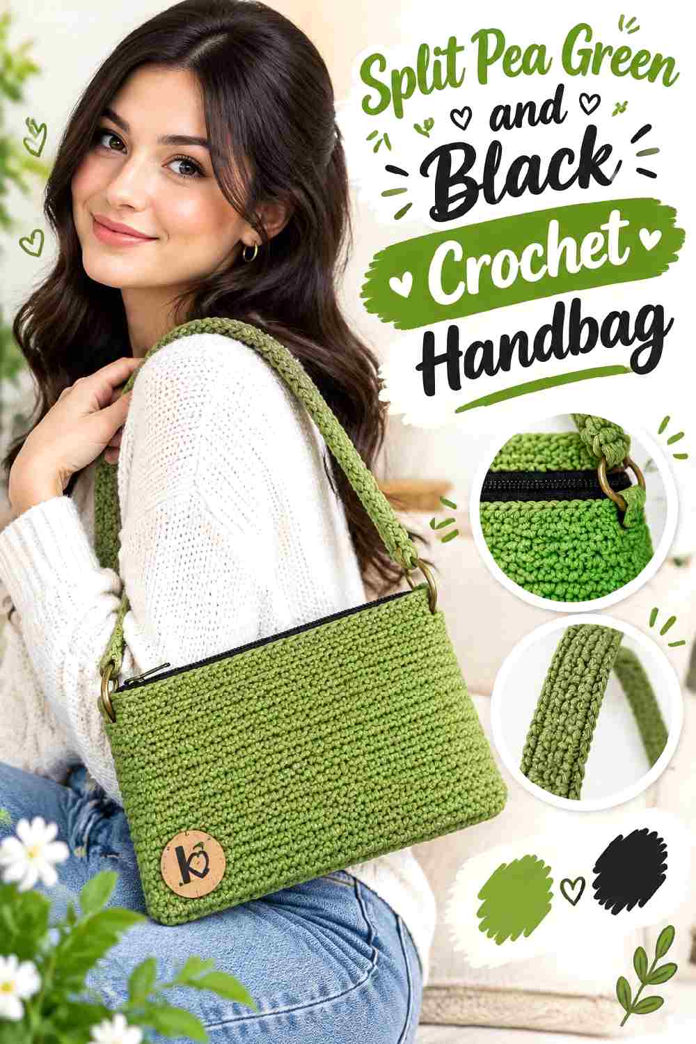
Black gives split pea green its strongest dark contrast in this collection. A handbag can support that contrast particularly well because handles, straps, sides, and the opening provide natural places for the darker color.
Put Split Pea Green Across the Crochet Handbag Face
Use split pea green on the broad front and back areas so the bag remains green-led when carried.
If black occupies both main panels as well as the strap and sides, the green can quickly become a minor accent. Protect the largest visual areas for the color named in the palette.
Use Black to Define Split Pea Green Crochet Handbag Structure
Black can be concentrated around the strap, opening, or selected edge areas. Treating it as a structural color creates a cleaner effect than adding scattered black stripes to the bag face.
If the handbag will include a lining or hardware, compare those visible elements with the palette before finalizing the trim color.
Creator Credit: KnitcroAddict
12. Split Pea Green And Oxblood Crochet Floral Poncho
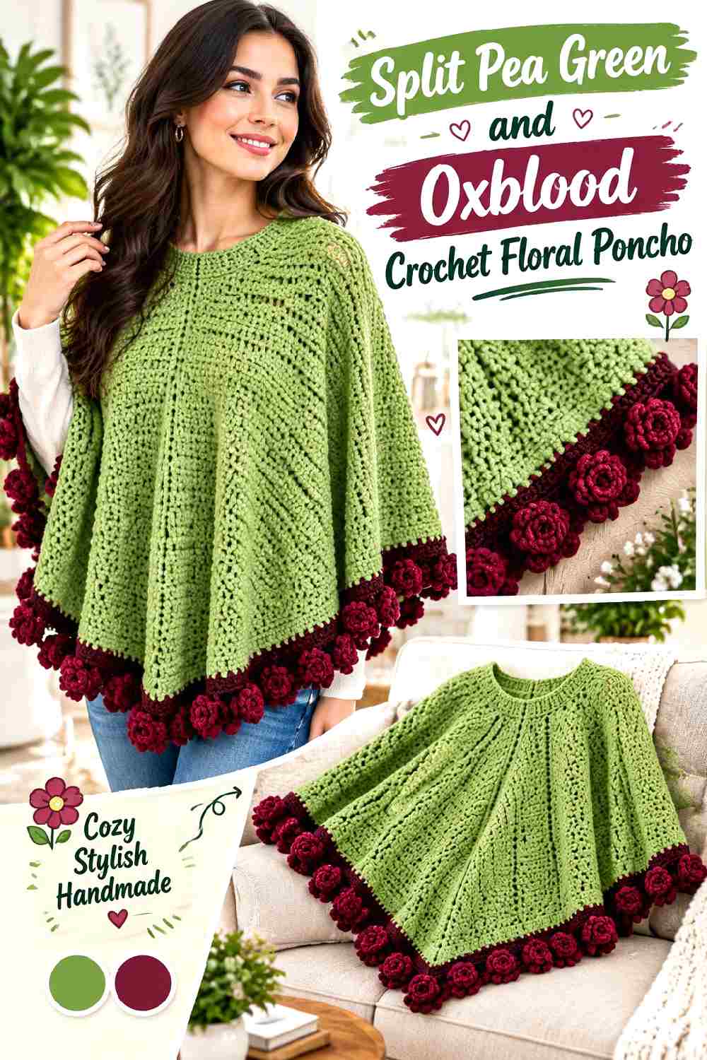
Split pea green gives a floral poncho an earthy base, while oxblood adds a deep red accent that suits fall without relying on bright flower colors. The key is keeping one shade dominant so individual flowers remain part of the garment rather than competing with one another.
Use Split Pea Green to Connect the Crochet Poncho Flowers
Let split pea green appear consistently through connecting areas, motif backgrounds, or substantial sections of the garment.
Repeating the same green around multiple floral areas gives the poncho continuity and prevents separate motifs from looking like unrelated color samples.
Keep Oxblood Smaller Against Split Pea Green Crochet Florals
Oxblood has strong visual weight, so it can define flower centers, selected petals, or repeated details without covering much area.
If every flower becomes heavily oxblood, the red may take over the palette. Compare the motifs together before joining or finishing so the color balance works across the whole poncho.
Creator Credit: Sirin’s Crochet
13. Split Pea Green And Taupe Crochet Balaclava
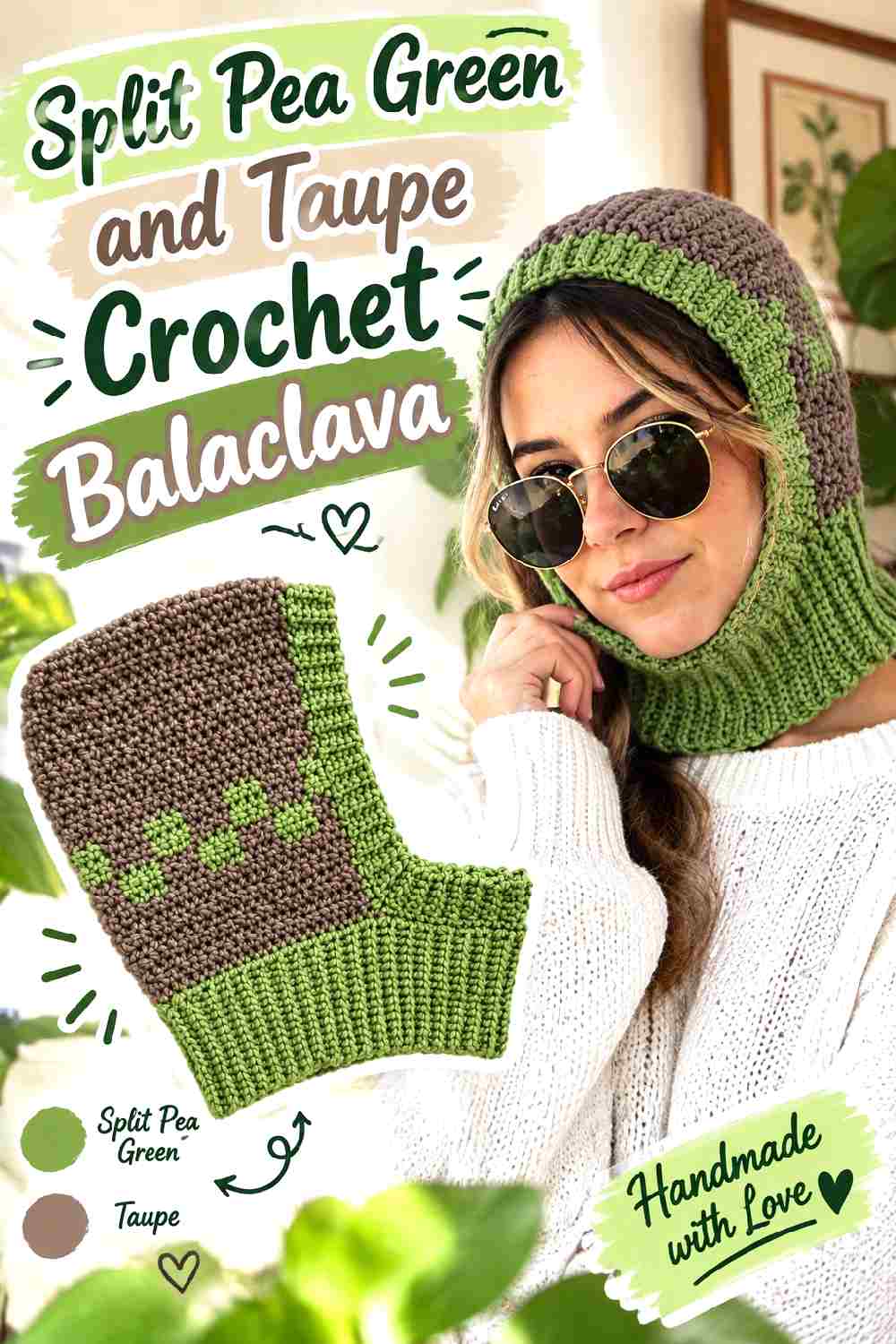
Split pea green and taupe create the most tonal neutral combination in the collection. Because the colors can be fairly close, the balaclava works best when taupe is used deliberately around areas where the shape already creates a boundary.
Keep Split Pea Green Across the Main Crochet Balaclava Hood
Use split pea green through the hood and neck area so the compact accessory does not become overly segmented.
The balaclava already has strong lines around the face opening and crown. One dominant color allows those construction lines to provide the shape.
Place Taupe Around the Split Pea Green Crochet Face Opening
Taupe can define the face opening or lower ribbing without creating the hard contrast of black.
Check that the taupe remains distinguishable from your particular split pea green. If the shades merge too much, choose a lighter or darker taupe while preserving the same muted character.
Creator Credit: made in the moment
Which Split Pea Green Crochet Palette Should You Choose?
For the lightest contrast, start with split pea green and cream, oatmeal, or ivory. Those combinations are especially useful when you want ribbing, granny-square edges, cuffs, or borders to remain easy to see.
Choose camel, taupe, espresso, or chocolate for a more tonal earthy palette. These shades keep the project grounded without pulling attention far away from the green.
Burgundy, oxblood, dusty rose, and rust introduce a second real color. They work particularly well when you want a stronger fall direction, but they benefit from controlled placement because they can compete with split pea green if both occupy the same amount of space.
Black and charcoal create the strongest dark definition. They are especially useful around handbag structure, cowl edges, or other areas where a narrow dark line has a practical visual role.
Conclusion
Split pea green works across fall crochet because it can behave differently depending on its supporting color. Cream and ivory make it lighter and clearer. Camel, taupe, chocolate, and espresso emphasize its earthy quality. Burgundy, rust, dusty rose, and oxblood give it more complex color relationships, while charcoal and black add stronger definition.
The cleanest results usually come from assigning each shade a job before starting. Let split pea green control the largest visual area, then decide whether the second shade should separate motifs, frame an edge, define a strap, highlight ribbing, or repeat through selected sections.
For exact construction, sizing, stitch sequences, and finishing methods, use the original creator tutorials linked with each project and treat these palettes as independent color-planning ideas.
Frequently Asked Questions
What Color Goes Well With Split Pea Green Crochet for Fall?
Cream, oatmeal, camel, taupe, espresso, chocolate, charcoal, black, burgundy, rust, oxblood, and muted pink can all create useful relationships with split pea green.
Choose the supporting color by function. A light neutral creates clearer separation, while brown keeps the palette earthy and a dark red introduces a stronger fall color contrast.
Does Cream or Black Work Better With Split Pea Green Crochet?
They create very different results. Cream produces a lighter break that can help motifs, ribbing, and borders remain visible. Black creates a sharper outline and can give bags, hats, or structured accessories stronger definition.
Neither is automatically better. The appropriate choice depends on whether you want softer separation or a darker frame.
How Can I Tell Whether Split Pea Green and Taupe Have Enough Contrast?
Place the actual yarns next to each other and look at them from several feet away. Taking a grayscale photo can make light-and-dark differences easier to judge.
If the colors almost merge and you need clearly visible trim, replace the taupe with a noticeably lighter or darker version rather than changing the whole palette.
Should Split Pea Green Be the Main Color in These Crochet Projects?
For an article centered on split pea green, keeping it dominant makes the palette easier to recognize. That might mean using it across cardigan panels, the main blanket field, a skirt body, a handbag face, or the majority of a hat.
Supporting colors can still occupy substantial areas when the design benefits from stronger blocking, but decide on that balance intentionally before beginning.
How Can I Substitute Split Pea Green Yarn Without Changing the Whole Palette?
Look for another muted yellow-green with similar lightness and saturation rather than searching only for a yarn carrying the same color name.
Then compare the replacement with the supporting color. If the new green is much lighter or darker, the contrast relationship may change even if the hue remains similar.
Why Can Split Pea Green Crochet Look Different Once It Is Worked Up?
Crochet creates highlights, shadows, gaps, raised stitches, and ribbing that are not visible in a smooth yarn skein. Those changes can make a shade appear lighter, darker, or more varied across the surface.
Working a small swatch with the intended stitch texture lets you judge the actual color relationship before committing to a large garment, blanket, or bag.
How Do I Keep a Split Pea Green Crochet Project From Looking Too Busy?
Limit the number of colors with major visual roles. Let split pea green dominate, assign the second color a clear purpose, and introduce a third shade only when it solves a specific color-placement problem.
On motif projects, repeat colors consistently. On textured projects, remember that the stitches already provide visual detail, so extra striping may not be necessary.