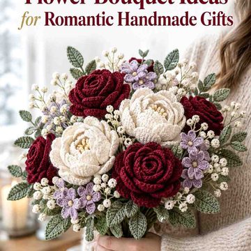
A burgundy crochet rosette can bring rich color to a winter coat without requiring a large accessory. The main challenge is making that deep red remain visible once the corsage sits against charcoal, black, navy, camel, or another substantial coat color. Ribbon tails, outer petals, leaves, and small contrasting details give you useful places to control that contrast.
The ideas below keep burgundy as the main color while changing its supporting palette. Some use pale neutrals to separate the flower from a dark coat, while others pair burgundy with plum, forest green, sage, navy, or charcoal for a deeper winter look. The linked tutorials support crochet flower, rose, brooch, or corsage construction; the burgundy color schemes are adaptations you can apply to the finished concept.
Quick List
- Burgundy and Ivory Crochet Rosette Ribbon Corsage
- Burgundy and Dusty Rose Crochet Rosette Ribbon Corsage
- Burgundy and Charcoal Crochet Rosette Ribbon Corsage
- Burgundy and Soft Gray Crochet Rosette Ribbon Corsage
- Burgundy, Forest Green, and Cream Crochet Rosette Ribbon Corsage
- Burgundy and Blush Pink Crochet Rosette Ribbon Corsage
- Burgundy and Camel Crochet Rosette Ribbon Corsage
- Burgundy and Plum Crochet Rosette Ribbon Corsage
- Burgundy, Midnight Navy, and Oatmeal Crochet Rosette Ribbon Corsage
- Burgundy, Muted Gold, and Cream Crochet Rosette Ribbon Corsage
- Burgundy and Taupe Crochet Rosette Ribbon Corsage
- Burgundy, Black, and Antique Rose Crochet Rosette Ribbon Corsage
- Burgundy and Sage Green Crochet Rosette Ribbon Corsage
- Burgundy, Mauve, and Stone Crochet Rosette Ribbon Corsage
- Burgundy, Winter White, and Deep Teal Crochet Rosette Ribbon Corsage
How to Keep Burgundy Rosette Corsages Visible on Winter Coats
Burgundy is deep enough to lose definition against black, charcoal, dark brown, and some navy coats. Before committing to the whole corsage, place the burgundy yarn against the actual coat and look at it from several feet away. If the flower shape becomes difficult to distinguish, move a lighter supporting color toward the outer petals, ribbon tails, leaves, or another area that creates a visual boundary.
Value matters as much as hue. Two yarns can look like different colors close up but merge when their lightness is similar. A quick grayscale photo can help you check whether burgundy and its supporting shade provide enough separation for the rosette layers to remain readable.
Let Burgundy Lead the Rosette and Use Ribbon Color as Support
For a burgundy-centered corsage, the rosette should usually carry enough burgundy to remain the first color the eye reads. A contrasting ribbon can frame the flower, but giving the ribbon too much visual area can make the accessory feel like a ribbon decoration with a small burgundy flower attached.
Use the supporting shade strategically. Pale colors can define petal edges or ribbon tails, dark colors can deepen the outline, and muted greens can separate floral and foliage areas. Repeating a small amount of burgundy somewhere in the ribbon portion can also connect the lower part of the corsage back to the flower.
Check Burgundy Contrast Against the Coat Before Finalizing the Palette
The coat is effectively another color in the scheme. An ivory accent that looks strong beside burgundy may create especially clear separation on a black coat, while a charcoal accent may be more useful when the coat itself is camel or cream.
Pin or hold the proposed colors against the coat before finishing the accessory. Check the rosette center, outer edge, ribbon tails, and any leaves separately. This makes it easier to notice when a supporting color disappears into the coat or competes too strongly with burgundy.
1. Burgundy and Ivory Crochet Rosette Ribbon Corsage
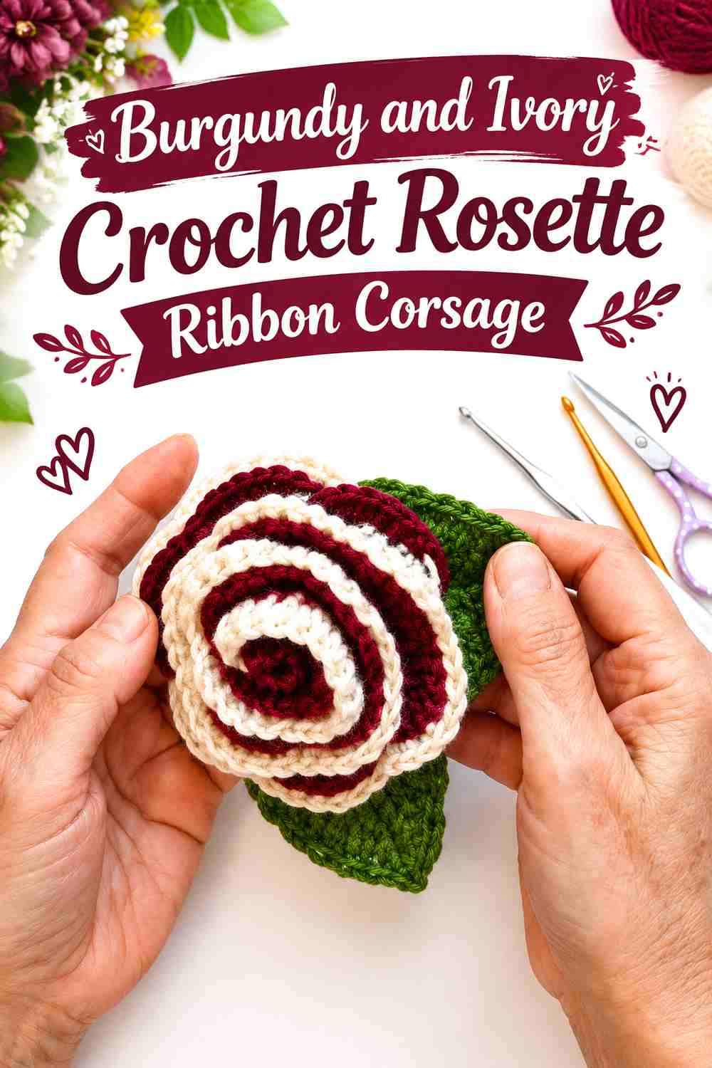
Burgundy and ivory create one of the clearest light-dark combinations in this collection. Keep burgundy across most of the rosette and let ivory appear around selected outer petals or through the ribbon area. The light neutral is particularly useful when the corsage will sit on a black, charcoal, or navy coat because it can create a visible break between the deep flower and deep garment.
Burgundy Should Lead the Rosette While Ivory Frames the Petals
Keep ivory from dividing the flower into equal burgundy-and-ivory halves. Burgundy has more visual weight here when it occupies the center and most of the petal surface, while ivory works as a smaller frame or outer detail. That arrangement preserves the burgundy-flower identity while making layered edges easier to see.
Burgundy and Ivory Ribbon Tails Need Clear Separation From Dark Coats
If the ribbon tails fall directly against a very dark coat, ivory can carry more of that lower section. Bring burgundy back in at the knot, edge, or another small repeated detail so the pale ribbon does not look disconnected from the rosette above it.
Creator Credit: Вязание крючком. MagicMornings.
2. Burgundy and Dusty Rose Crochet Rosette Ribbon Corsage
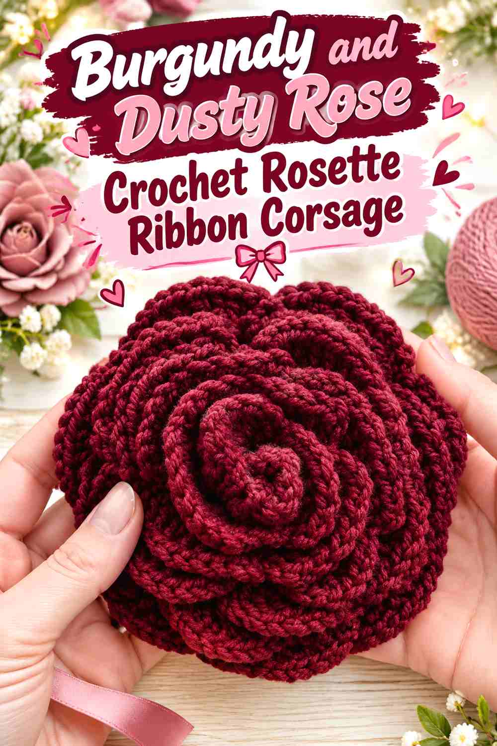
This palette stays within a romantic red-pink family rather than introducing a strong neutral contrast. Burgundy can form the darkest flower layers, with dusty rose used farther from the center or on the ribbon. The effect is softer than burgundy and ivory, so value separation becomes more important.
Burgundy Needs Dusty Rose in Smaller Areas to Keep the Rosette Defined
Use dusty rose where you want the petal structure to lighten rather than letting it cover every alternate section. Keeping burgundy concentrated through the center and major petal areas gives the flower a stronger focal point, while dusty rose can soften the outer layers.
Burgundy and Dusty Rose Work Better When Their Values Stay Distinct
Two muted red-pink yarns can appear different in the skein but merge once crocheted. Place them side by side before starting and check whether dusty rose remains clearly lighter than burgundy. If not, choose a paler pink rather than adding more colors to force separation.
Creator Credit: Frisian Knitting tutorials
3. Burgundy and Charcoal Crochet Rosette Ribbon Corsage
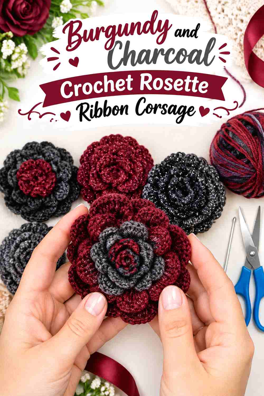
Burgundy with charcoal creates a darker, restrained winter palette. Because both colors can carry considerable visual weight, this combination is more effective when the coat underneath is noticeably lighter, such as camel, oatmeal, cream, or pale gray.
Burgundy Needs Charcoal Away From the Deepest Petal Folds
Avoid surrounding every burgundy petal with charcoal if both yarns are similarly dark. Charcoal is more useful on the ribbon, backing area, or a controlled outer detail where it can sharpen the overall silhouette without hiding the flower’s internal layers.
Burgundy Ribbon Details Can Keep Charcoal From Taking Over
If charcoal dominates the ribbon tails, repeat burgundy at their top or edges. That small repetition keeps the ribbon visually attached to the rosette and prevents the accessory from reading as a dark ribbon with a separate red flower.
Creator Credit: szydełko
4. Burgundy and Soft Gray Crochet Rosette Ribbon Corsage
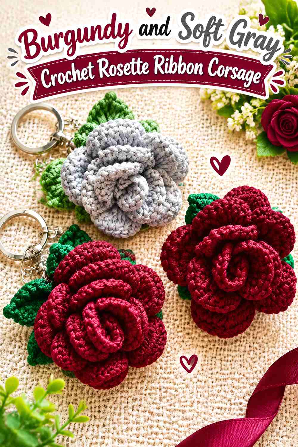
Soft gray introduces a cooler neutral without the strong brightness of ivory. It can be useful for a corsage intended for black or very dark outerwear because gray gives the burgundy flower some breathing room while keeping the overall palette subdued.
Burgundy Gains Cooler Definition Beside Soft Gray
Place soft gray near the outside of the rosette or through the ribbon section rather than mixing it evenly into every petal layer. The gray then functions as a visual boundary, allowing the warmer burgundy center to remain the main feature.
Burgundy Should Repeat at the Ribbon Ends for a Connected Corsage
A mostly gray ribbon can feel separate from a burgundy flower. Repeating burgundy near the ribbon ends, central fold, or another small detail creates a clear visual link between the top and bottom of the corsage.
Creator Credit: mala rajut
5. Burgundy, Forest Green, and Cream Crochet Rosette Ribbon Corsage
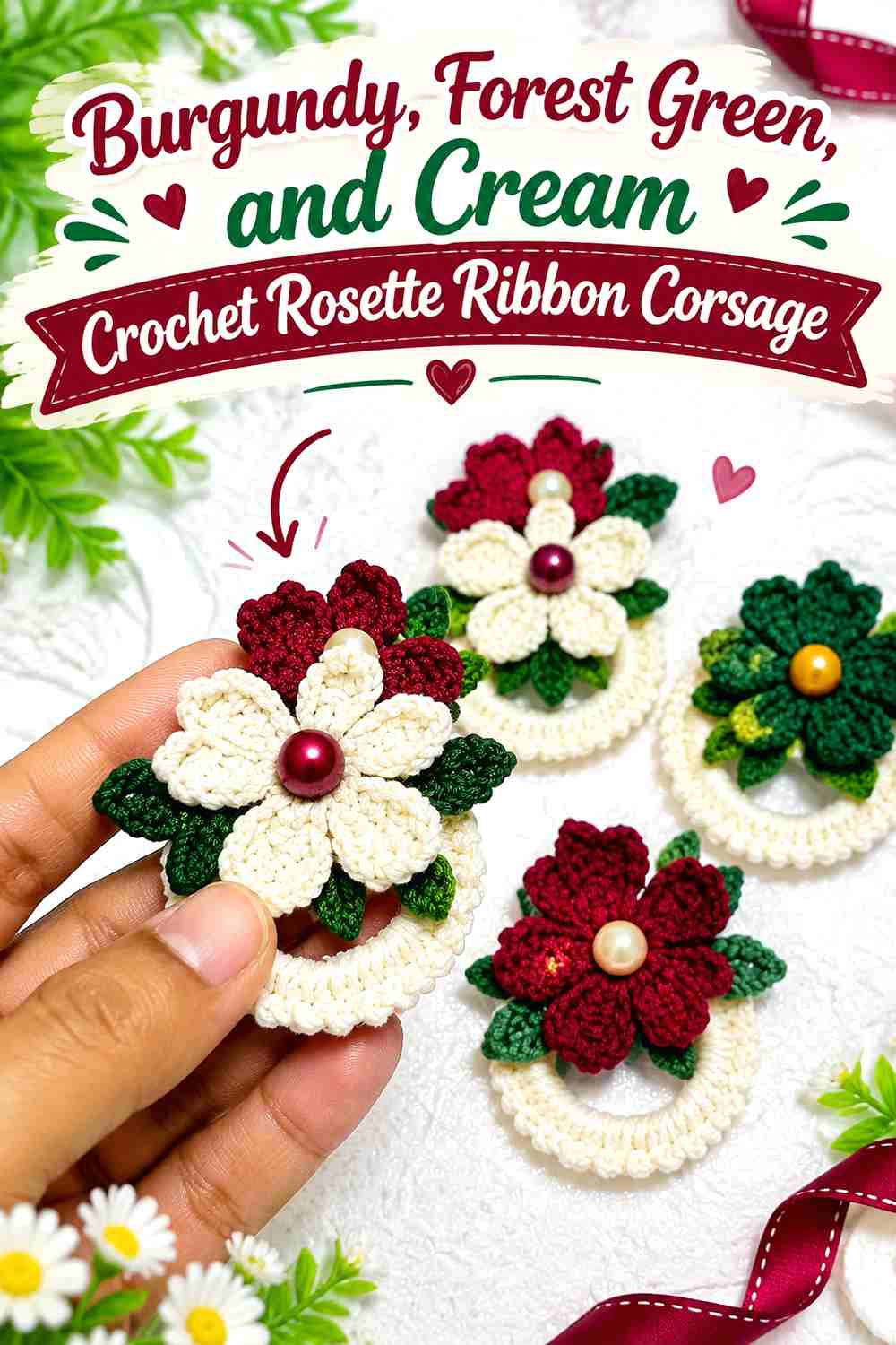
Forest green gives this burgundy corsage a botanical winter direction, while cream prevents the two dark colors from merging. Burgundy should remain the flower color, forest green can occupy leaf-like or narrow supporting areas, and cream can separate those elements where extra visibility is needed.
Burgundy Should Stay Dominant Over Forest Green
Burgundy and forest green can both feel visually heavy when used in equal areas. Keep green secondary, especially around the rosette itself. Concentrating burgundy through the petals makes the flower immediately readable rather than turning the accessory into an evenly divided red-and-green motif.
Burgundy and Cream Can Separate Leaves, Ribbon, and Rosette
Use cream where burgundy meets forest green if the two dark colors look crowded. Even a small light area around the ribbon or between flower and foliage sections can create enough separation to clarify the corsage on a winter coat.
Creator Credit: Mrofah craft
6. Burgundy and Blush Pink Crochet Rosette Ribbon Corsage
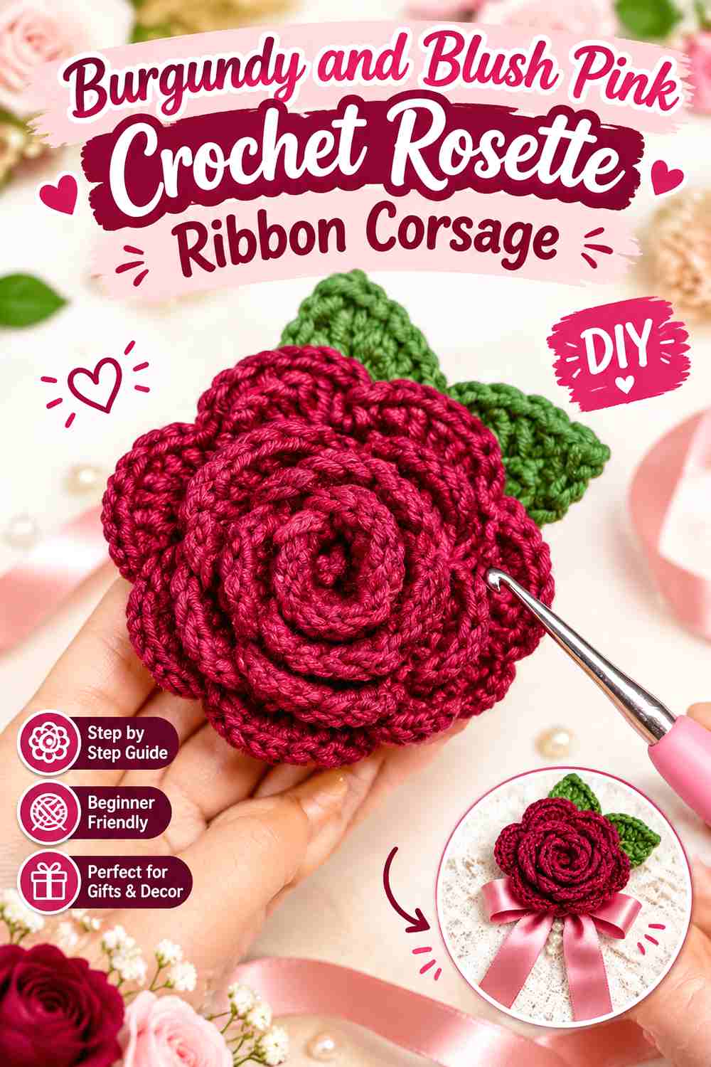
Blush gives burgundy a lighter romantic companion than dusty rose. Because the value difference can be stronger, blush is useful around outer petals and ribbon areas where you want the flower’s silhouette to stay visible against a dark coat.
Burgundy Needs Blush Pink Around the Outer Petal Layer
Keep the center and major petal mass burgundy, then use blush nearer the outside. This creates a gradual move from dark to light while still letting the accessory read primarily as a burgundy rosette.
Burgundy Ribbon Tails Can Stop Blush From Making the Corsage Too Pale
If blush occupies most of the ribbon, repeat burgundy along part of the ribbon or near its upper attachment point. That darker repetition helps keep the lower half visually connected to the burgundy flower rather than letting the pale section dominate.
Creator Credit: Dream-Crochet
7. Burgundy and Camel Crochet Rosette Ribbon Corsage
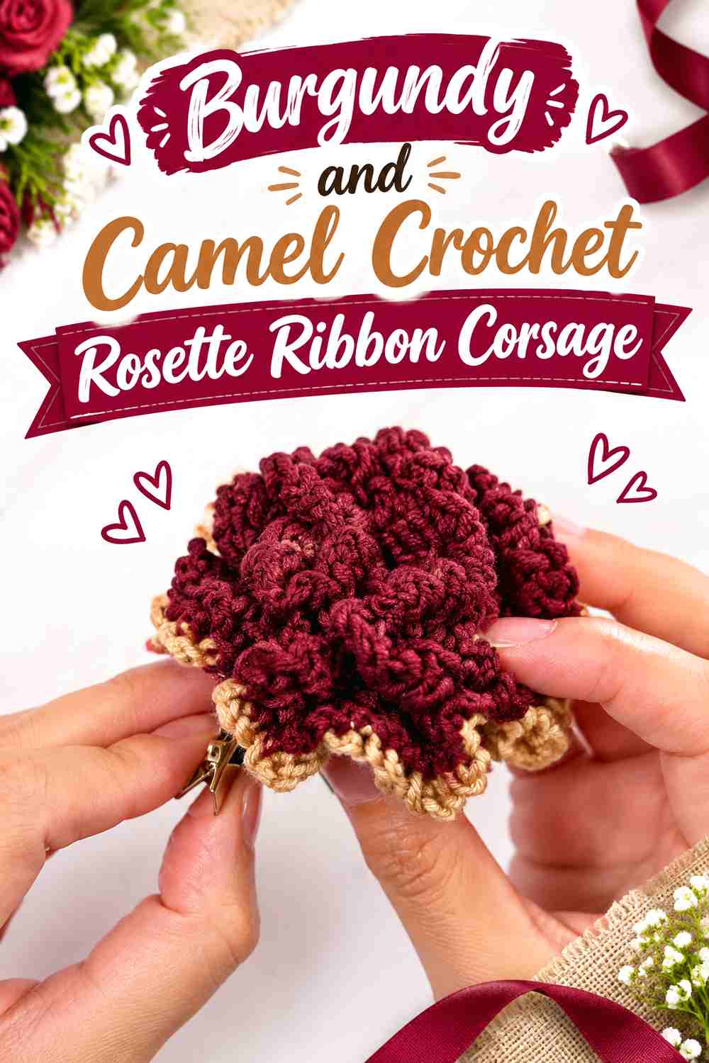
Burgundy and camel stay warm without using a very pale neutral. Camel can soften the transition between the deep rosette and black, brown, or cream outerwear, and it can also echo the color of a camel coat while burgundy supplies the stronger focal contrast.
Burgundy Looks Warmer When Camel Is Limited to the Ribbon
Let camel carry much of the ribbon area while burgundy remains concentrated in the rosette. The division gives each color a clear role and avoids weakening the flower with too many similarly warm sections.
Burgundy Should Remain the Darkest Flower Note on Camel Coats
On a camel coat, burgundy already has strong separation. In that setting, you may not need a pale outline around the entire flower. Let the burgundy silhouette do more of the work and use camel mainly to integrate the ribbon with the garment.
Creator Credit: GomSon Crochet
8. Burgundy and Plum Crochet Rosette Ribbon Corsage
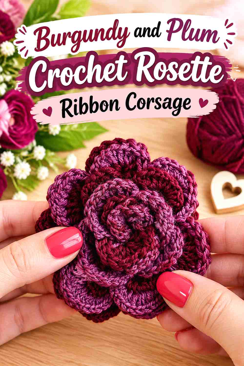
Burgundy and plum create a closely related, deep winter palette with less contrast than most other options here. The combination works best when the two shades have enough difference in value or when the coat provides the lighter background needed to reveal the rosette shape.
Burgundy and Plum Need a Light Checkpoint Before You Crochet the Corsage
Photograph the yarns in grayscale or view them from a distance. If burgundy and plum collapse into almost the same tone, use one color more sparingly rather than alternating them throughout the flower.
Burgundy Works Best at the Rosette Center When Plum Supports the Ribbon
Concentrating burgundy in the center gives the eye a clear focal point. Plum can then move outward or into the ribbon section, creating a dark tonal shift without breaking the romantic winter character of the corsage.
Creator Credit: Bella Coco
9. Burgundy, Midnight Navy, and Oatmeal Crochet Rosette Ribbon Corsage
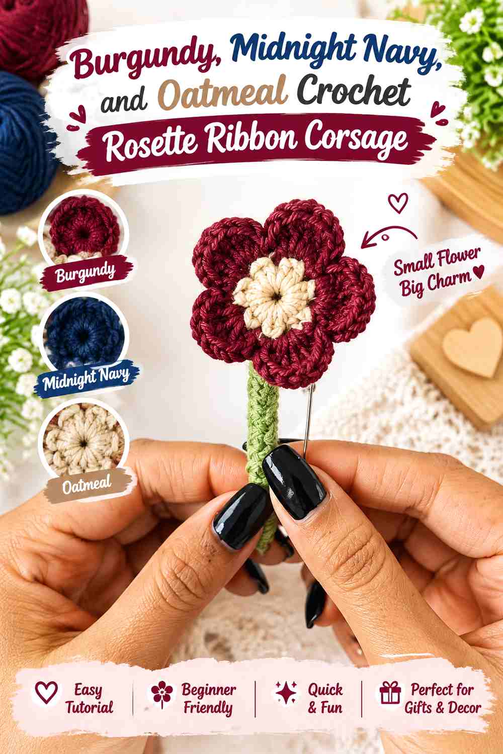
Midnight navy gives burgundy another dark companion, so oatmeal has an important separating role. Keep burgundy in the rosette, navy in smaller supporting sections, and oatmeal where the two deepest colors need a visible break.
Burgundy Needs Oatmeal Between Midnight Navy and the Rosette
If navy sits directly beside burgundy through every part of the accessory, the colors may merge at a distance. Place oatmeal near selected outer petals, ribbon edges, or another boundary area to preserve the shape of the burgundy flower.
Burgundy Should Repeat Along the Ribbon to Balance Navy
A navy-heavy ribbon can draw too much attention downward. Repeating burgundy in a narrow ribbon detail keeps the flower color moving through the whole accessory and makes navy feel supportive rather than dominant.
Creator Credit: Creative Asra
10. Burgundy, Muted Gold, and Cream Crochet Rosette Ribbon Corsage
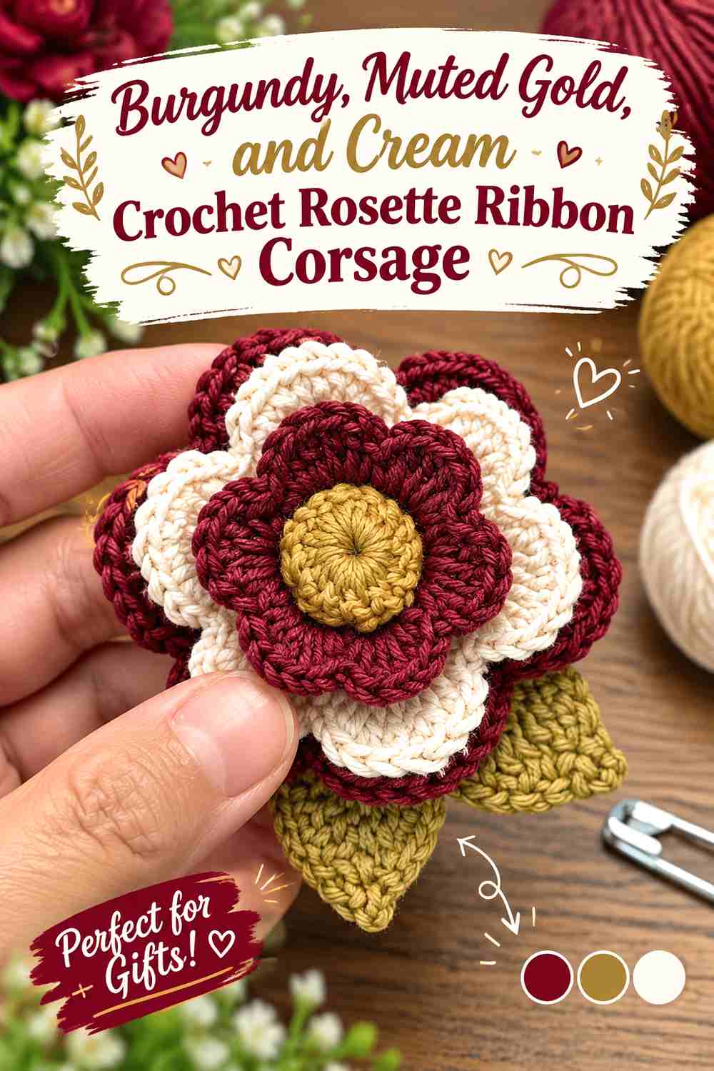
Muted gold adds a warmer decorative note without requiring the entire corsage to become bright. Burgundy should still carry the main flower surface, while cream can buffer the transition between the dark red and the gold-toned accent.
Burgundy Should Carry More Surface Than Muted Gold
Use the gold-colored yarn as an accent rather than giving it equal coverage with burgundy. Small areas on the ribbon, flower center, or outer detail can provide contrast without changing the accessory’s main identity.
Burgundy and Cream Keep Muted Gold From Feeling Too Heavy
If burgundy and muted gold both appear dense or dark in the chosen yarns, cream can create a lighter pause. Use it where the ribbon meets the rosette or around a small section that needs clearer separation.
Creator Credit: Mi’s Handmade Hobbies
11. Burgundy and Taupe Crochet Rosette Ribbon Corsage
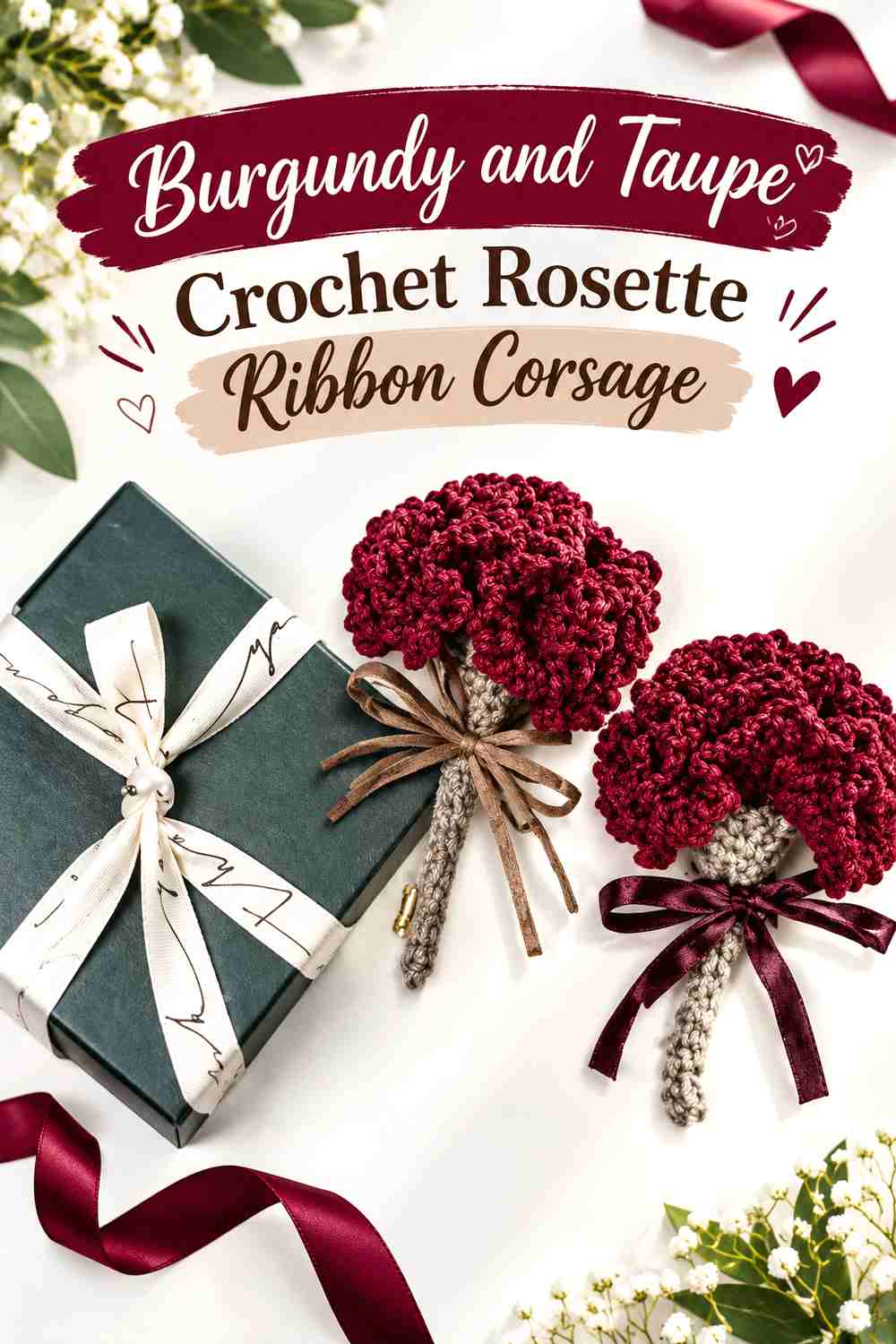
Taupe gives burgundy a quieter neutral partner than ivory or gray. This palette works well when you want the color contrast to come mainly from the burgundy flower rather than from a brightly contrasting ribbon.
Burgundy Gains Softer Contrast When Taupe Frames the Corsage
Let taupe sit around the outer edges or through the ribbon portion instead of dividing the rosette evenly. The neutral then frames the burgundy rather than competing with the flower’s layered structure.
Burgundy Should Repeat at the Ribbon Knot to Avoid a Detached Taupe Tail
If the ribbon is predominantly taupe, bring burgundy into the central ribbon area. This repeated point helps the eye connect the neutral lower section with the flower and keeps the palette deliberate.
Creator Credit: 매일코바늘 – 실로이룸
12. Burgundy, Black, and Antique Rose Crochet Rosette Ribbon Corsage
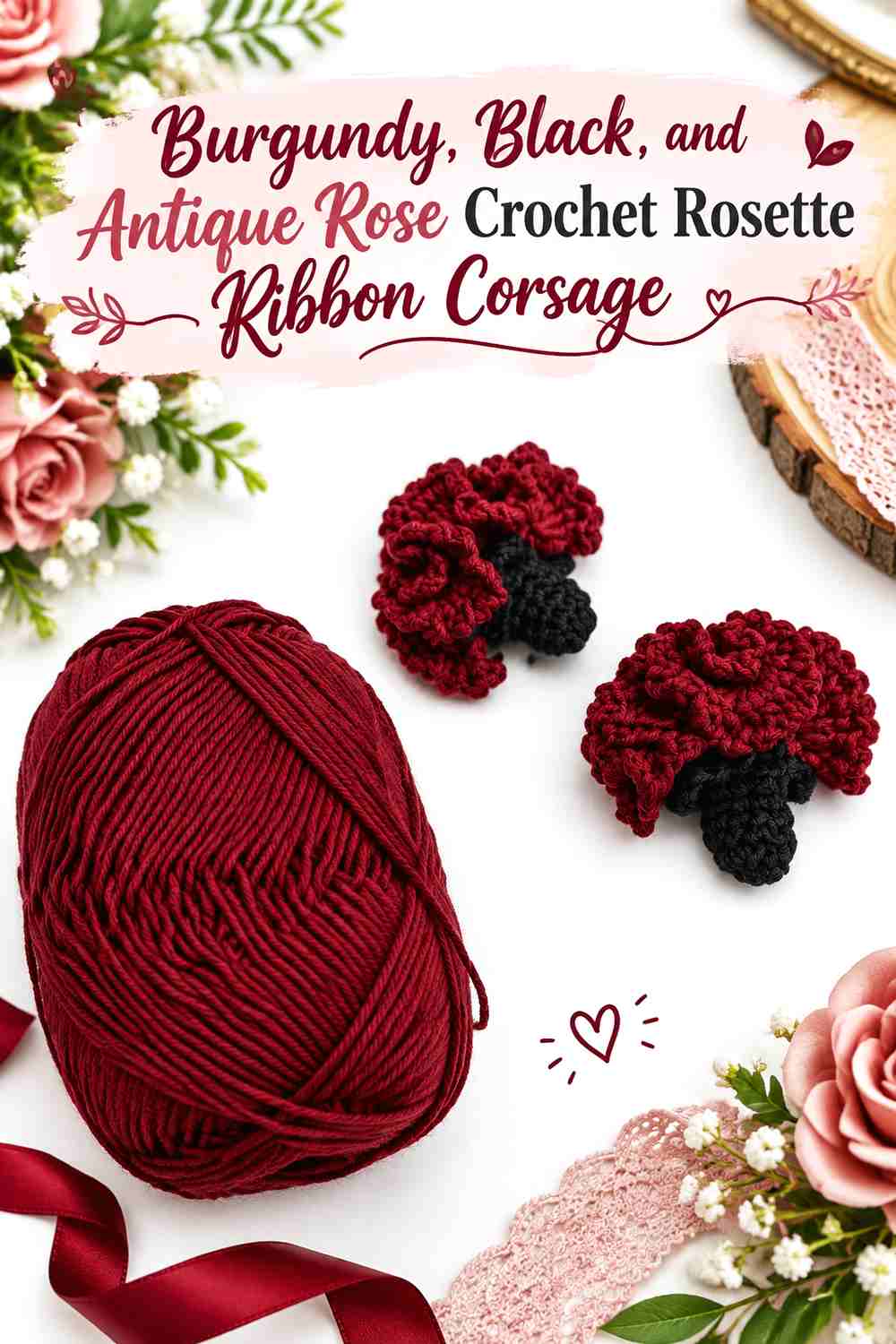
This is one of the more dramatic palettes in the collection. Black can sharpen the outline, burgundy supplies the main flower, and antique rose creates a lighter bridge so the two darkest colors do not swallow the details.
Burgundy Needs Antique Rose Between Black and the Flower
Use antique rose near selected outer petals or between burgundy and black sections. The lighter middle value keeps the flower from becoming a single dark mass while retaining the deeper romantic character of the palette.
Burgundy Should Stay Visible Against a Black Winter Coat
If the finished corsage will be worn on black, avoid allowing black yarn to form the entire outer edge. Move antique rose or another lighter section toward the coat-facing perimeter so the burgundy flower does not disappear into the garment.
Creator Credit: Pembe Düğme
13. Burgundy and Sage Green Crochet Rosette Ribbon Corsage
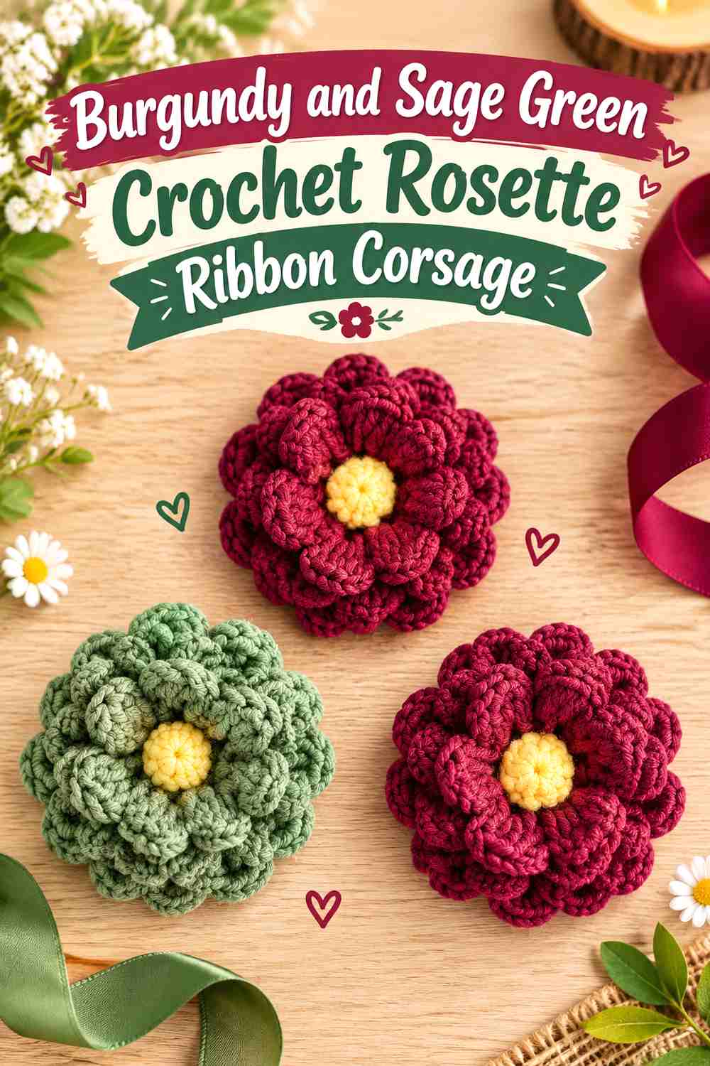
Sage green produces a softer botanical contrast than forest green. It is muted enough to support burgundy without introducing another very dark area, making it useful for ribbon or leaf sections around a deep rosette.
Burgundy Works Best as the Rosette Anchor Beside Sage Green
Keep sage primarily outside the main flower mass. Burgundy can occupy the center and larger petals while sage appears in smaller supporting sections, giving the corsage a floral structure that remains easy to read.
Burgundy Ribbon Edges Can Keep Sage From Spreading Too Widely
When sage carries most of the ribbon, a narrow burgundy repetition can prevent the lower part from feeling unrelated to the flower. This is especially useful when the coat itself is close to sage, gray, or another muted tone.
Creator Credit: AmiaMikancl Crochet
14. Burgundy, Mauve, and Stone Crochet Rosette Ribbon Corsage
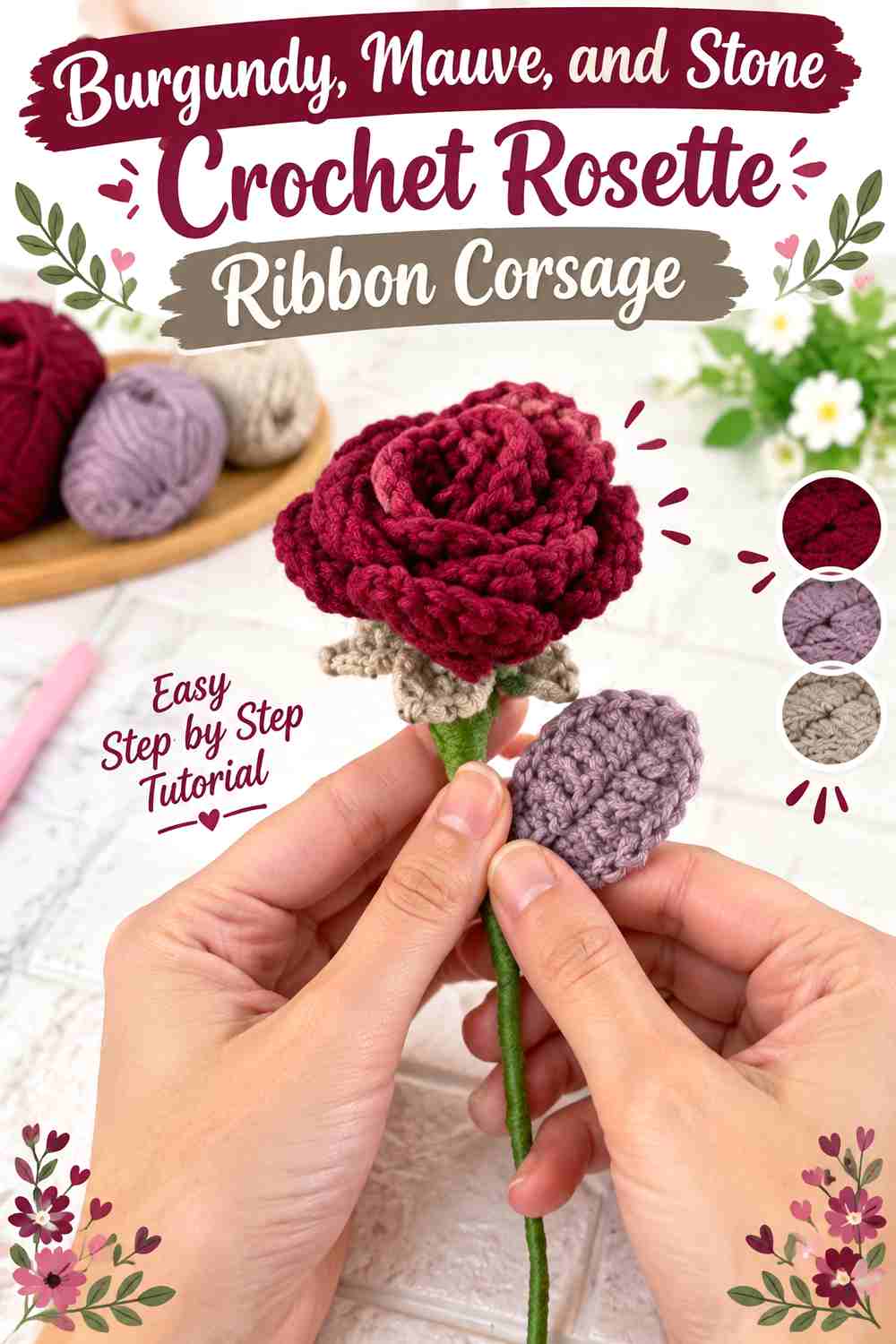
Mauve creates a tonal bridge from burgundy, while stone introduces a light neutral checkpoint. This three-color scheme is useful when you want a layered romantic palette but still need enough value variation for the flower and ribbon to remain distinct.
Burgundy Needs Mauve as a Transition, Not a Competitor
Use mauve between deep burgundy and pale stone rather than giving all three shades equal visual area. Burgundy remains the focal color, mauve softens the change, and stone provides the lightest separation.
Burgundy and Stone Can Clarify the Corsage on Textured Coats
Highly textured coat fabric can visually compete with small crochet details. Place stone near selected outer edges or ribbon sections when burgundy begins to blend into the garment, giving the silhouette a cleaner boundary.
Creator Credit: Plakshi Jain | Crochet
15. Burgundy, Winter White, and Deep Teal Crochet Rosette Ribbon Corsage
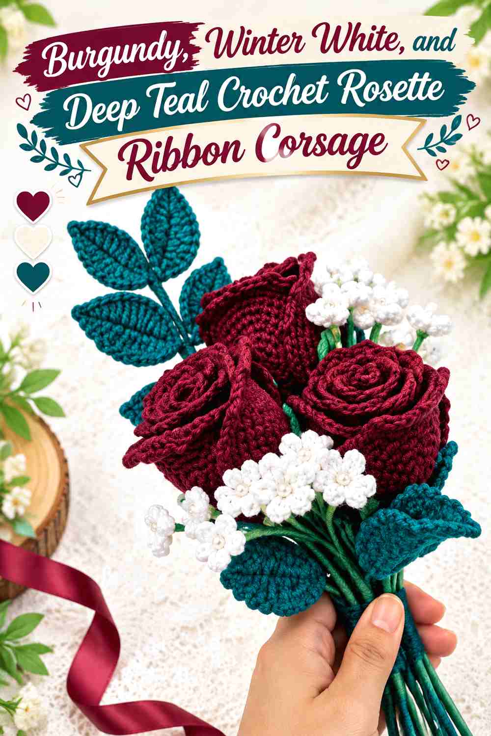
Deep teal introduces the coolest strong accent in the collection, while winter white keeps the two dark colors separated. Burgundy should remain the largest flower color, with teal restricted to smaller ribbon or supporting details.
Burgundy Should Lead While Winter White Opens the Petal Layers
Use winter white where you need the clearest visual break, particularly around outer flower areas. Keeping burgundy concentrated through the center protects the main color while the pale neutral makes the layered form easier to distinguish.
Burgundy Needs Deep Teal in Small Repeated Accents
A large teal section can compete with burgundy for attention. Restrict it to smaller repeated areas, then let winter white separate those accents from the main rosette. This creates a cooler winter palette without losing the burgundy focus.
Creator Credit: Tammy crochet & art
Choosing a Burgundy Corsage Palette for Different Winter Coats
The best palette depends partly on how much contrast you want between the corsage and the coat.
| Visual Goal | Burgundy Palette to Consider | Why It Can Help |
|---|---|---|
| Strong separation on black or charcoal | Burgundy + Ivory | Ivory can outline the dark burgundy flower clearly |
| Soft romantic color | Burgundy + Dusty Rose | Keeps the scheme tonal without removing the burgundy focus |
| Dark, restrained styling | Burgundy + Charcoal | Works when the coat itself provides a lighter background |
| Cool neutral contrast | Burgundy + Soft Gray | Gives burgundy definition without the brightness of white |
| Botanical winter look | Burgundy + Forest Green + Cream | Cream separates the two deeper botanical colors |
| Pale romantic contrast | Burgundy + Blush | Lightens the outer flower and ribbon areas |
| Warm neutral styling | Burgundy + Camel | Keeps the palette warm while burgundy supplies depth |
| Deep tonal color | Burgundy + Plum | Creates a close, low-contrast color relationship |
| Cool dark winter palette | Burgundy + Navy + Oatmeal | Oatmeal prevents the two dark colors from merging |
| Warm decorative accent | Burgundy + Muted Gold + Cream | Keeps the accent controlled with a light neutral |
| Quiet neutral support | Burgundy + Taupe | Lets burgundy remain the strongest visual note |
| Dramatic contrast | Burgundy + Black + Antique Rose | Antique rose separates the two darkest shades |
| Muted botanical contrast | Burgundy + Sage | Gives the flower a softer green companion |
| Layered romantic neutrals | Burgundy + Mauve + Stone | Adds tonal movement with a light checkpoint |
| Cool jewel-toned accent | Burgundy + Winter White + Deep Teal | Uses white to separate two strong dark colors |
Conclusion
For the strongest contrast on dark winter coats, start with burgundy and ivory, burgundy and blush, or burgundy with winter white. These palettes give the rosette a lighter perimeter that can keep the flower visible against black, charcoal, and navy.
For a softer romantic result, burgundy with dusty rose, mauve, taupe, or plum keeps the colors closer together. These combinations need more careful value checking because similar dark or muted shades can merge once they are worked into layered crochet petals.
If you want a stronger seasonal color direction, forest green, sage, navy, camel, or deep teal can move the corsage away from a simple red-and-neutral scheme. In every case, keep burgundy clearly dominant and use the ribbon, outer petals, and supporting details to manage contrast. Follow the credited tutorials for their original construction guidance, then apply the palette that gives your chosen winter coat the amount of separation you want.
Frequently Asked Questions
Can a burgundy crochet rosette disappear against a black winter coat?
Yes, the two may have similar enough values that some of the flower shape becomes difficult to distinguish. Hold the burgundy yarn against the coat before finishing the corsage. Ivory, blush, soft gray, stone, or another lighter supporting shade can be moved toward the outer petals or ribbon to increase separation.
Should the ribbon tails be lighter than the burgundy rosette?
They do not have to be, but lighter ribbon tails can help when both the burgundy flower and coat are dark. On a lighter camel, cream, or gray coat, a darker ribbon can work because the garment already provides background contrast.
How many colors should I use in a burgundy rosette ribbon corsage?
Two colors are enough when they have clear roles, such as burgundy for the rosette and ivory for the ribbon. A third color is most useful when it solves a specific problem, such as adding a botanical green or inserting a light neutral between two dark shades.
How can I tell whether burgundy and another yarn color have enough contrast?
Place the yarns next to each other and look at them from a distance. You can also photograph them and view the image in grayscale. If their tones become almost identical, small petals and ribbon details may blend together even though the hues look different in color.
What can I substitute if I cannot find the exact burgundy shade?
Preserve the role of the color rather than searching for an exact name. Choose another deep, muted red that remains darker than pale accents such as ivory or blush and still has enough separation from any dark supporting shade in the palette.
Should burgundy cover both the rosette and the ribbon?
It can, but repeating burgundy does not require making every part identical. Let burgundy dominate the rosette and repeat a smaller amount through the ribbon knot, edge, or another detail. That usually creates stronger visual hierarchy than giving the flower and ribbon equal burgundy coverage.
Which burgundy palette works when the winter coat has a lot of texture?
A palette with a clearly lighter supporting shade can make the corsage easier to distinguish from textured fabric. Burgundy with ivory, soft gray, blush, stone, or winter white gives you a light color that can be positioned around the flower’s outer edge or ribbon where extra definition is needed.