
A crochet tassel clutch can take on a convincing Art Deco direction through color placement even when the underlying bag construction is simple. Broad dark panels, symmetrical light accents, stepped borders, fan-like divisions, and controlled metallic-looking details can give a small clutch the structured visual rhythm associated with vintage evening accessories.
For winter parties, the clutch also has to work beside coats, velvet-look fabrics, dark dresses, and other substantial seasonal layers. That makes contrast especially important. Black, burgundy, emerald, navy, plum, and teal can provide a strong foundation, while ivory, champagne, pale gray, or metallic-looking accent yarn can define the flap, opening, geometric details, or tassel.
The tutorials credited below support crochet clutch or small-bag construction. The Art Deco color schemes and tassel treatments are independent adaptations unless the creator’s original tutorial happens to use a similar detail.
Quick List
- Black and Antique Gold Crochet Art Deco Tassel Clutch
- Emerald and Champagne Crochet Art Deco Tassel Clutch
- Midnight Navy and Silver Crochet Art Deco Tassel Clutch
- Ivory, Black, and Gold Crochet Art Deco Tassel Clutch
- Deep Teal and Copper Crochet Art Deco Tassel Clutch
- Plum and Rose Gold Crochet Art Deco Tassel Clutch
- Charcoal, Pearl Gray, and Silver Crochet Art Deco Tassel Clutch
- Oxblood, Cream, and Bronze Crochet Art Deco Tassel Clutch
- Forest Green, Black, and Antique Gold Crochet Art Deco Tassel Clutch
- Sapphire, Champagne, and Black Crochet Art Deco Tassel Clutch
- Black Cherry, Dusty Rose, and Gold Crochet Art Deco Tassel Clutch
- Camel, Espresso, and Brass Crochet Art Deco Tassel Clutch
- Aubergine, Ivory, and Silver Crochet Art Deco Tassel Clutch
- Peacock Teal, Black, and Champagne Crochet Art Deco Tassel Clutch
- Ruby, Onyx, and Antique Gold Crochet Art Deco Tassel Clutch
- Winter White, Graphite, and Pale Gold Crochet Art Deco Tassel Clutch
Give an Art Deco Crochet Clutch a Clear Color Hierarchy
Small evening bags have limited surface area, so three equally strong colors can quickly make the front look fragmented. Choose one shade for most of the clutch body, a second for structural areas such as the flap or border, and reserve the smallest share for the strongest accent.
Art Deco-inspired color placement benefits from deliberate repetition. Instead of scattering the accent shade randomly, repeat it around a center line, along paired edges, or at both the closure and tassel. Symmetry can make a relatively simple crochet surface feel more architectural.
Use the Tassel to Repeat the Crochet Clutch Palette
A tassel should look connected to the clutch rather than like an unrelated ornament. One useful approach is to make its main bundle match the dominant body color and use the accent shade around the tassel neck. Another is to reverse the hierarchy and make the tassel the brightest small feature.
Check its visual weight before permanently attaching it. A large high-contrast tassel can compete with a carefully planned geometric flap, while a smaller tonal tassel can extend the palette without becoming a second focal point.
Check Winter Party Colors Against the Whole Outfit
A dark clutch may look clearly defined on a tabletop but merge into a black coat or dark dress once carried. Hold the proposed yarn colors beside the actual outerwear and party layers you expect to wear.
If the dominant clutch color disappears against the clothing, move a lighter shade toward the outer edge, tassel, closure, or flap. The goal is not maximum contrast everywhere; it is enough separation for the clutch silhouette and decorative geometry to remain visible.
1. Black and Antique Gold Crochet Art Deco Tassel Clutch
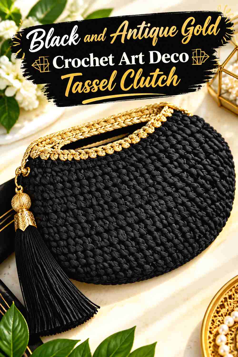
Black creates the strongest visual field in this palette, while antique gold can define the areas that give the clutch its Deco character. Keep most of the body black and use the lighter accent in a centered line, stepped flap detail, narrow border, or tassel wrapping. The limited palette works particularly well when you want geometry and silhouette to matter more than multicolor crochet.
Black Should Cover Most of the Art Deco Crochet Clutch
A broad black surface gives small antique-gold details room to register clearly. Avoid alternating the two colors across every row, which can turn a controlled evening palette into regular striping. Concentrate antique gold near one or two architectural features instead.
Antique Gold Can Connect the Black Tassel to the Clutch Front
If the tassel bundle is black, wrap or edge its upper section with antique gold. Repeating the same accent near the closure gives the tassel a visual reason to belong to the clutch rather than appearing as an added decoration.
Creator Credit: Bobilon
2. Emerald and Champagne Crochet Art Deco Tassel Clutch
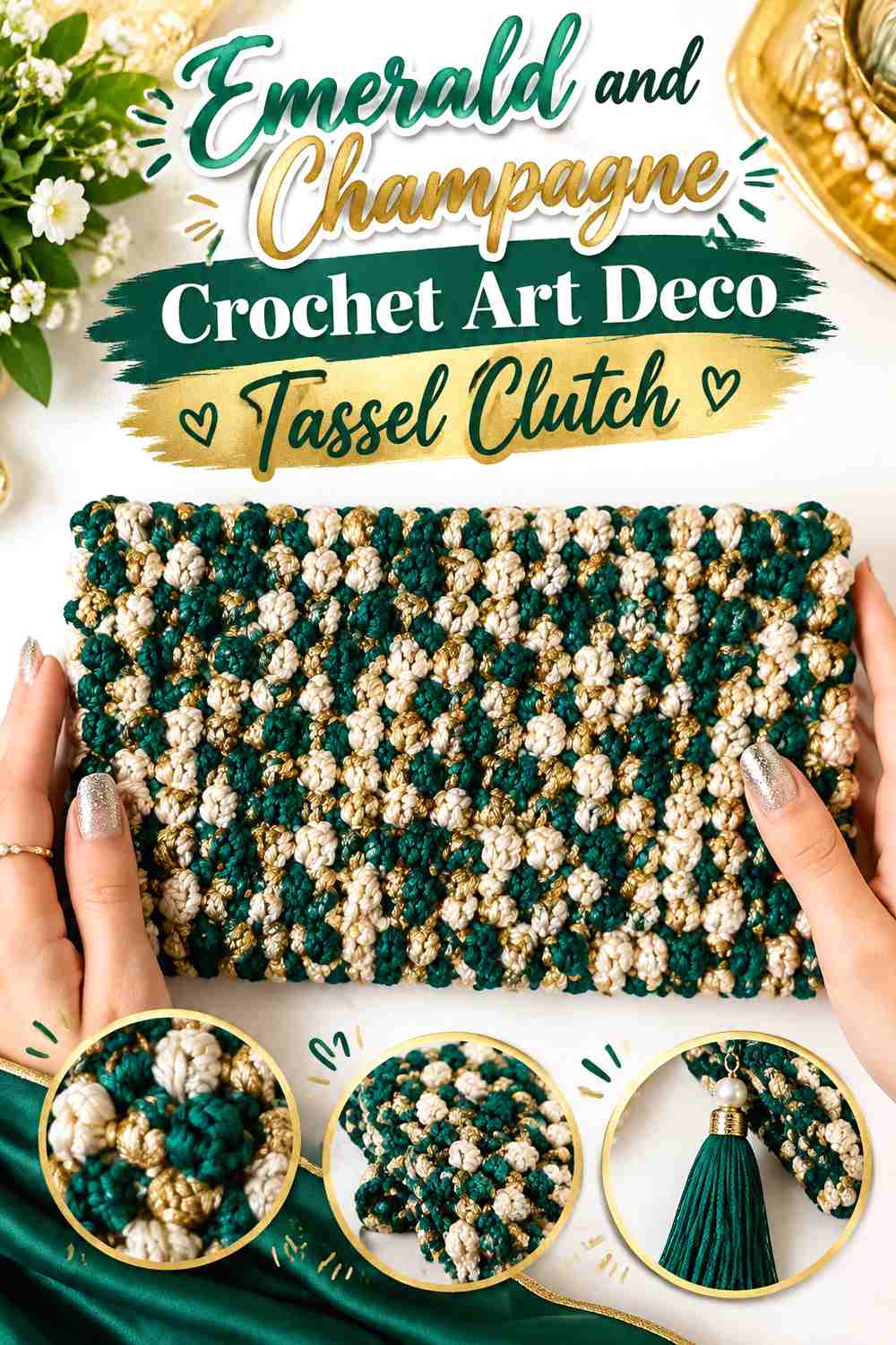
Emerald gives this clutch a jewel-toned winter base, while champagne provides a lighter, warmer counterpoint. Let emerald dominate the broad crochet surface and use champagne around the flap, opening, or a centered fan-like detail. A champagne tassel can work, but keeping some emerald in its top section will connect it to the bag.
Emerald Needs Champagne Around Small Geometric Details
Fine Deco-inspired lines can disappear when they are worked only in closely related dark colors. Champagne gives emerald enough light-dark separation for narrow borders and repeated motifs to remain visible from normal carrying distance.
Champagne Should Stay Secondary to Emerald on the Tassel Clutch
Too much champagne can shift the bag from jewel-toned to pale-neutral. Keep the largest uninterrupted area emerald and treat champagne as framing, trim, or tassel color so the clutch retains its deep winter character.
Creator Credit: Kenikse Crochet
3. Midnight Navy and Silver Crochet Art Deco Tassel Clutch
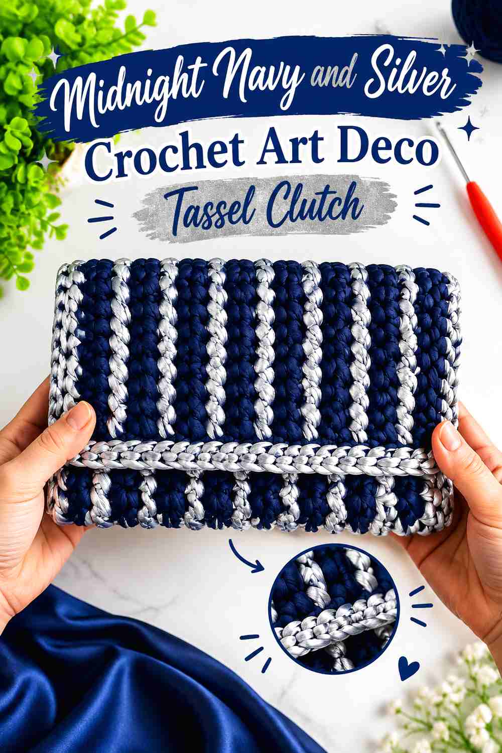
Midnight navy offers nearly the visual depth of black but with a cooler color direction. Silver can trace a flap edge, center stripe, or symmetrical border while remaining clearly distinct from the navy background. This palette is especially useful when black accessories would feel too repetitive with the rest of the outfit.
Midnight Navy Needs Silver Near the Clutch Opening
Placing silver near the opening makes the top edge easy to distinguish and gives the clutch an intentional horizontal anchor. Carry a smaller silver detail elsewhere so the opening does not look like the only decorated section.
Silver Should Define the Midnight Navy Tassel Rather Than Overwhelm It
Use navy for most of the tassel fibers and silver around the top or in a smaller secondary bundle. That keeps the tassel connected to the main body while still repeating the Deco accent.
Creator Credit: Serafima Crochet & Knitting
4. Ivory, Black, and Gold Crochet Art Deco Tassel Clutch
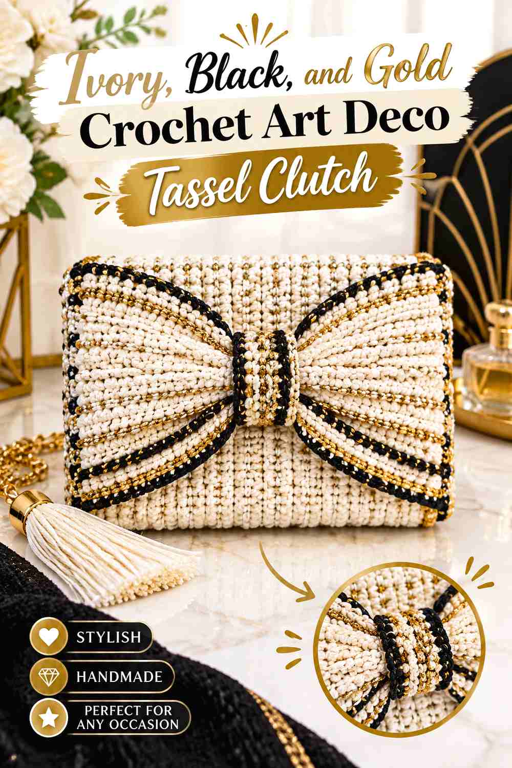
This palette reverses the usual dark-body formula. An ivory clutch can become the light statement piece, with black defining the geometry and gold reserved for the smallest accents. Because the body is pale, each dark line has greater visual impact.
Ivory Gives Black Art Deco Lines More Visibility
Use black in deliberate bands, corners, or symmetrical divisions rather than covering large irregular sections. The high contrast makes inaccuracies more noticeable, so check placement before repeating a geometric element across the front.
Gold Should Be the Smallest Accent on an Ivory and Black Tassel
With ivory and black already creating strong contrast, gold does not need much surface area. Place it at the tassel neck, near a closure, or in one narrow repeated line so it adds warmth without creating a three-way competition.
Creator Credit: Sirin’s Crochet
5. Deep Teal and Copper Crochet Art Deco Tassel Clutch
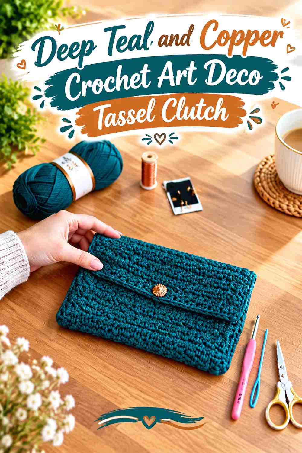
Deep teal and copper create a warmer alternative to teal and silver. The teal should cover most of the crochet body, while copper can mark the outer border, central geometry, or tassel attachment point.
Deep Teal Works Better as the Broad Crochet Clutch Field
Copper gains more visual strength when surrounded by deep teal. If the two colors occupy equal areas, the clutch can lose the clear hierarchy that helps Deco-inspired geometry read cleanly.
Copper Can Emphasize the Deep Teal Tassel Attachment
Repeating copper where the tassel meets the clutch draws attention to that transition without requiring a fully copper tassel. Keep most of the tassel deep teal if you want the body and trim to feel continuous.
Creator Credit: Selina Veronique Crochet
6. Plum and Rose Gold Crochet Art Deco Tassel Clutch
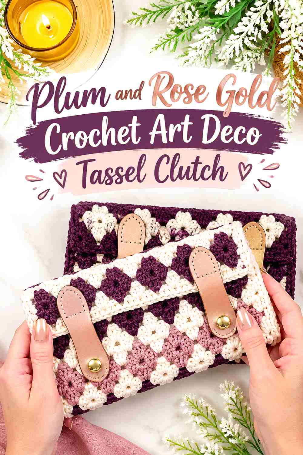
Plum creates a darker purple base, while rose gold adds a warmer pink-metallic-looking accent. Because these colors are closer in warmth than black and silver, their contrast should be checked before committing to small details.
Plum Needs Rose Gold in Ordered Art Deco Lines
Place rose gold along a central axis, paired borders, or repeated stepped shapes. Ordered repetition helps distinguish the accent from random decorative striping and lets the plum remain the visual base.
Rose Gold Can Lighten a Plum Tassel Without Replacing the Main Color
Use plum through most of the tassel and reserve rose gold for the top wrap or a narrower secondary section. This keeps the tassel noticeable without making it look detached from the clutch body.
Creator Credit: Briana K
7. Charcoal, Pearl Gray, and Silver Crochet Art Deco Tassel Clutch
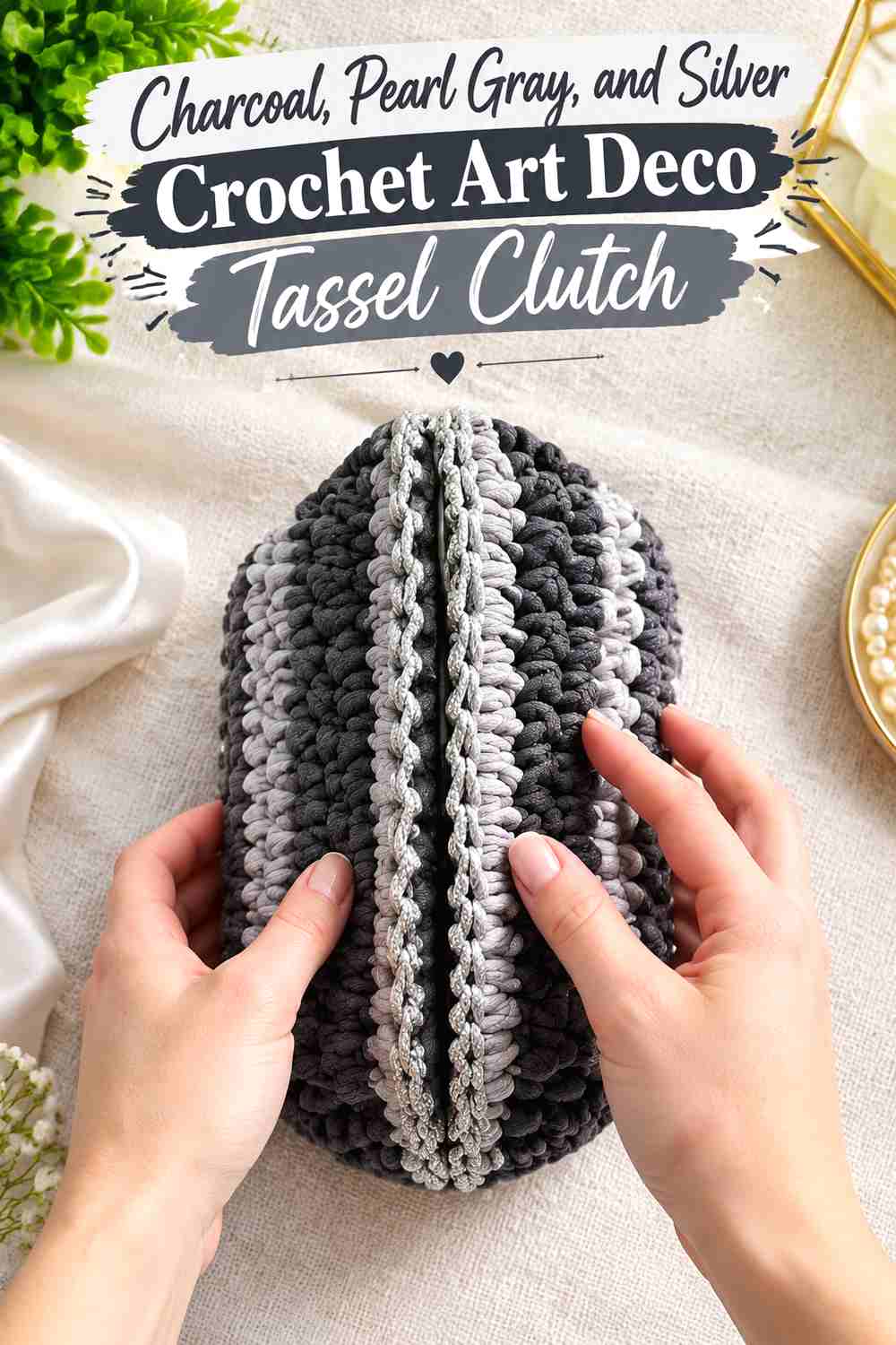
This is a tonal neutral palette with three levels of lightness. Charcoal should anchor the clutch, pearl gray can create larger secondary shapes, and silver can handle the smallest highlights. The difference between charcoal and pearl gray matters more than their names, so compare them directly before starting.
Charcoal Needs Pearl Gray to Separate Large Crochet Sections
Use pearl gray for a flap, broad center panel, or repeated border rather than tiny details. Its larger area gives the eye time to register the tonal shift before silver introduces the brightest accent.
Silver Should Finish the Charcoal and Pearl Gray Tassel Sparingly
A small silver wrap or narrow mixed section can brighten the tassel. Avoid making all of it silver if the body is intentionally subdued; otherwise the tassel may become the only element the eye notices.
Creator Credit: Begincrafts
8. Oxblood, Cream, and Bronze Crochet Art Deco Tassel Clutch
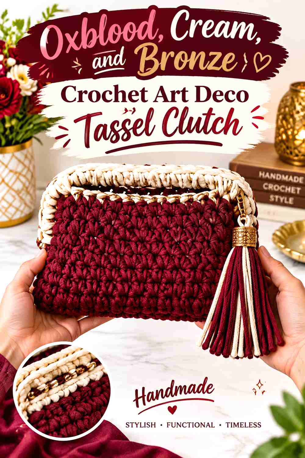
Oxblood gives the clutch a dark red-brown foundation, cream introduces strong light contrast, and bronze keeps the palette warm. This combination can produce a softer vintage direction than burgundy with bright gold.
Oxblood Should Frame Cream Rather Than Alternate With It Everywhere
Use cream for one controlled geometric area—a flap center, narrow fan, or paired border. Oxblood surrounding that section keeps the deep main color dominant and prevents the clutch from becoming broadly two-toned.
Bronze Can Bridge the Oxblood and Cream Tassel Colors
A bronze-colored wrap or narrow accent between an oxblood tassel and cream trim can visually connect the dark and light parts of the palette. Keep the bronze share small so it functions as a bridge rather than a third dominant color.
Creator Credit: vivi e cuci
9. Forest Green, Black, and Antique Gold Crochet Art Deco Tassel Clutch
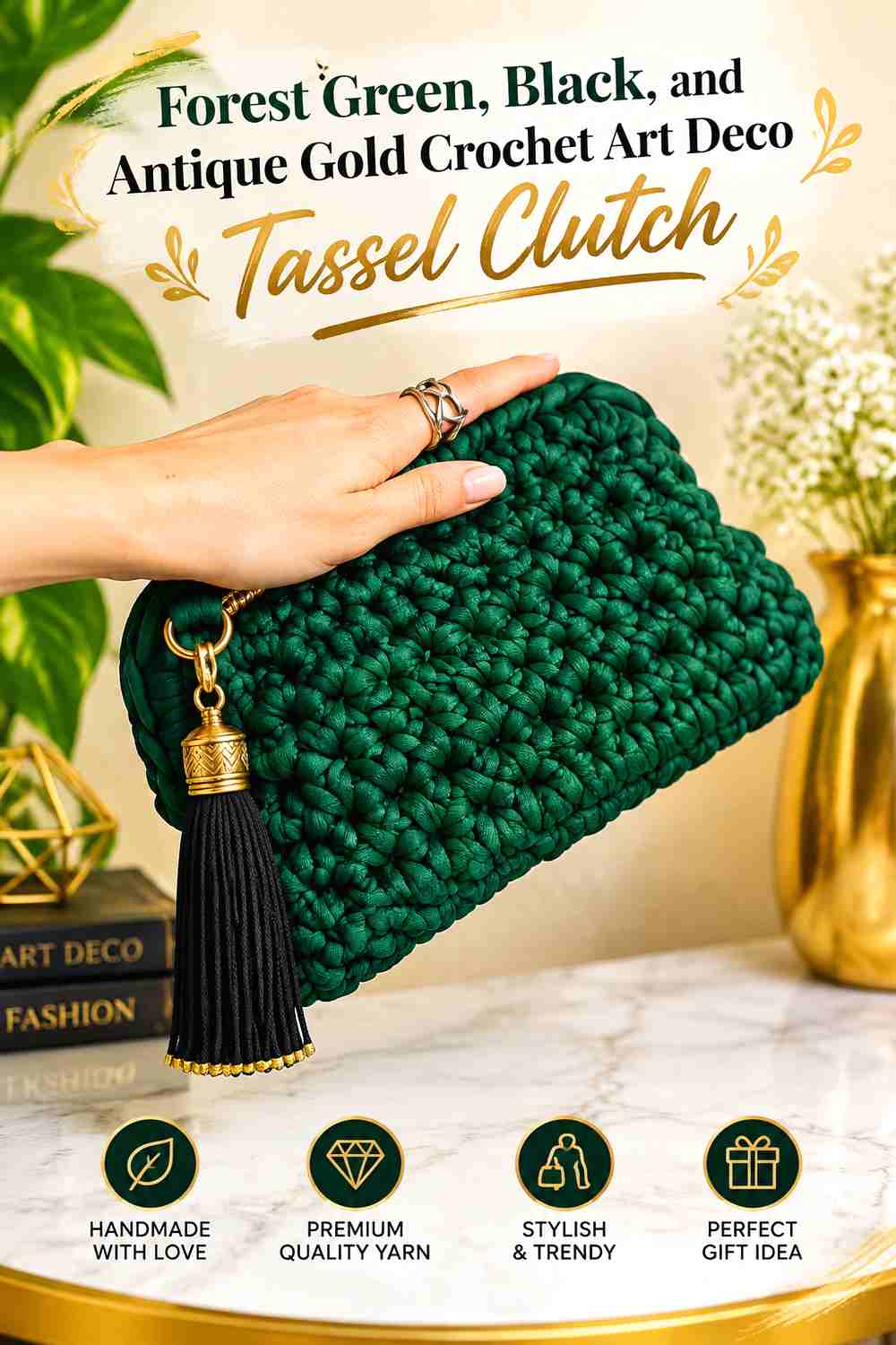
Forest green and black create a deep winter base, so antique gold has the important job of separating them. Use forest green for most of the clutch and black for a flap, border, or strong geometric section rather than mixing the two dark shades evenly.
Forest Green Needs Antique Gold Between Major Black Sections
If forest green sits directly beside black across a small motif, the boundary may disappear in dim party lighting. A narrow antique-gold line can separate them and make the intended geometry easier to read.
Black and Antique Gold Can Define a Forest Green Tassel
Keep the tassel primarily forest green, then use black and antique gold near the top. Repeating both secondary shades there connects the tassel to the body without giving three colors equal coverage.
Creator Credit: Doinaswimwear
10. Sapphire, Champagne, and Black Crochet Art Deco Tassel Clutch
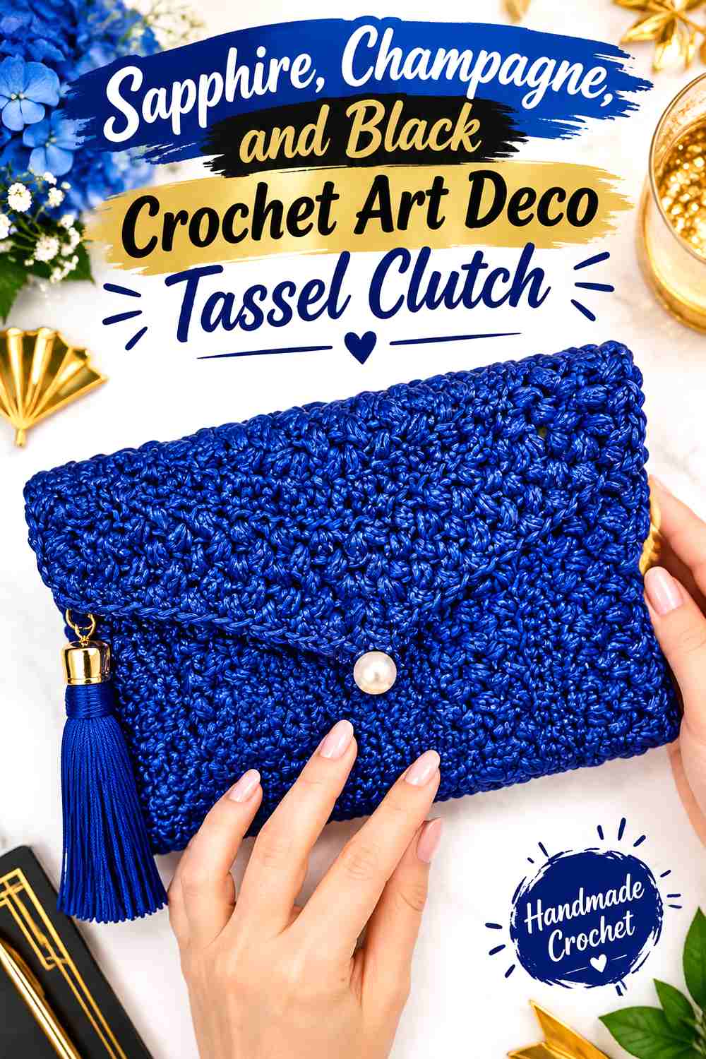
Sapphire gives this clutch the strongest blue direction in the collection. Champagne can provide the light decorative line, while black deepens selected edges and makes the blue look more distinctly separate from the winter outfit.
Sapphire Should Occupy the Largest Art Deco Crochet Panel
Keep sapphire across the main face so the clutch clearly reads as blue rather than black with blue accents. Champagne can then identify the center or flap geometry against that larger field.
Champagne Can Keep Black From Closing In on the Sapphire Tassel
If black is used at the tassel top or side trim, place a small champagne section between black and sapphire where extra separation is needed. The lighter color stops two dark sections from becoming one visual block.
Creator Credit: Lanas y Ovillos in English
11. Black Cherry, Dusty Rose, and Gold Crochet Art Deco Tassel Clutch
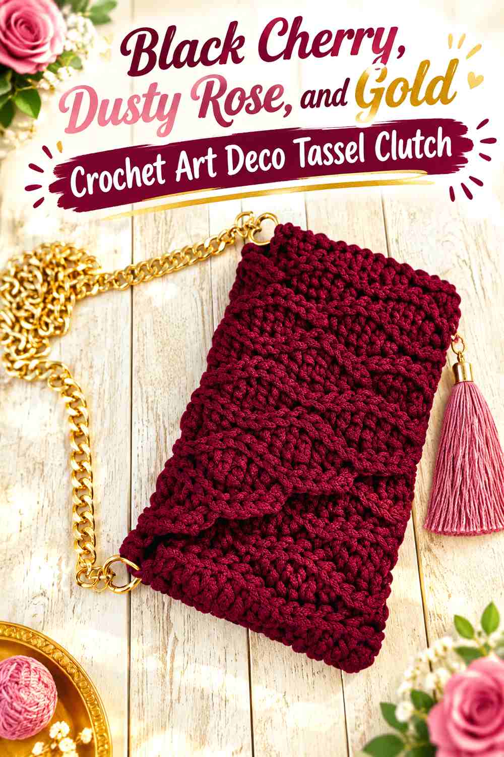
Black cherry creates a very deep red-purple base, dusty rose provides a muted light transition, and gold supplies the smallest decorative highlight. This palette is useful when you want romance without turning the clutch pastel.
Black Cherry Needs Dusty Rose Around Small Crochet Geometry
Dusty rose can outline fan shapes, stepped borders, or a centered flap area where black cherry alone would be too dark. Keep the pink muted and clearly lighter than the body so the distinction survives once both colors are crocheted.
Gold Should Accent the Black Cherry and Dusty Rose Tassel in One Place
A gold-colored wrap near the tassel top is usually enough. Repeating gold throughout the tassel can weaken the softer relationship between black cherry and dusty rose.
Creator Credit: NATESSA | Sacred Crochet Art
12. Camel, Espresso, and Brass Crochet Art Deco Tassel Clutch
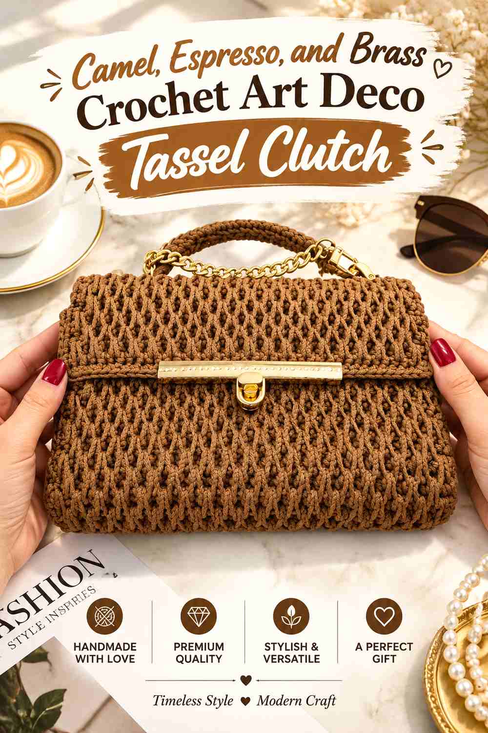
Camel creates a lighter warm body, espresso supplies the strongest lines, and brass can highlight one or two architectural details. This is a useful direction when the party wardrobe already contains a lot of black and you want a clutch with warmer contrast.
Camel Gives Espresso Geometry a Clear Crochet Background
Use espresso to trace the outer edge, flap point, or centered stepped feature. Because camel is lighter, even a narrow espresso section can look prominent, so there is little need for large dark blocks.
Brass Should Stay Close to Espresso on the Camel Tassel Clutch
Placing brass beside espresso creates a concentrated decorative zone while leaving the rest of the camel body quieter. Repeat the pairing at the tassel neck if you want the lower detail to echo the front design.
Creator Credit: Cathérine Crochet
13. Aubergine, Ivory, and Silver Crochet Art Deco Tassel Clutch
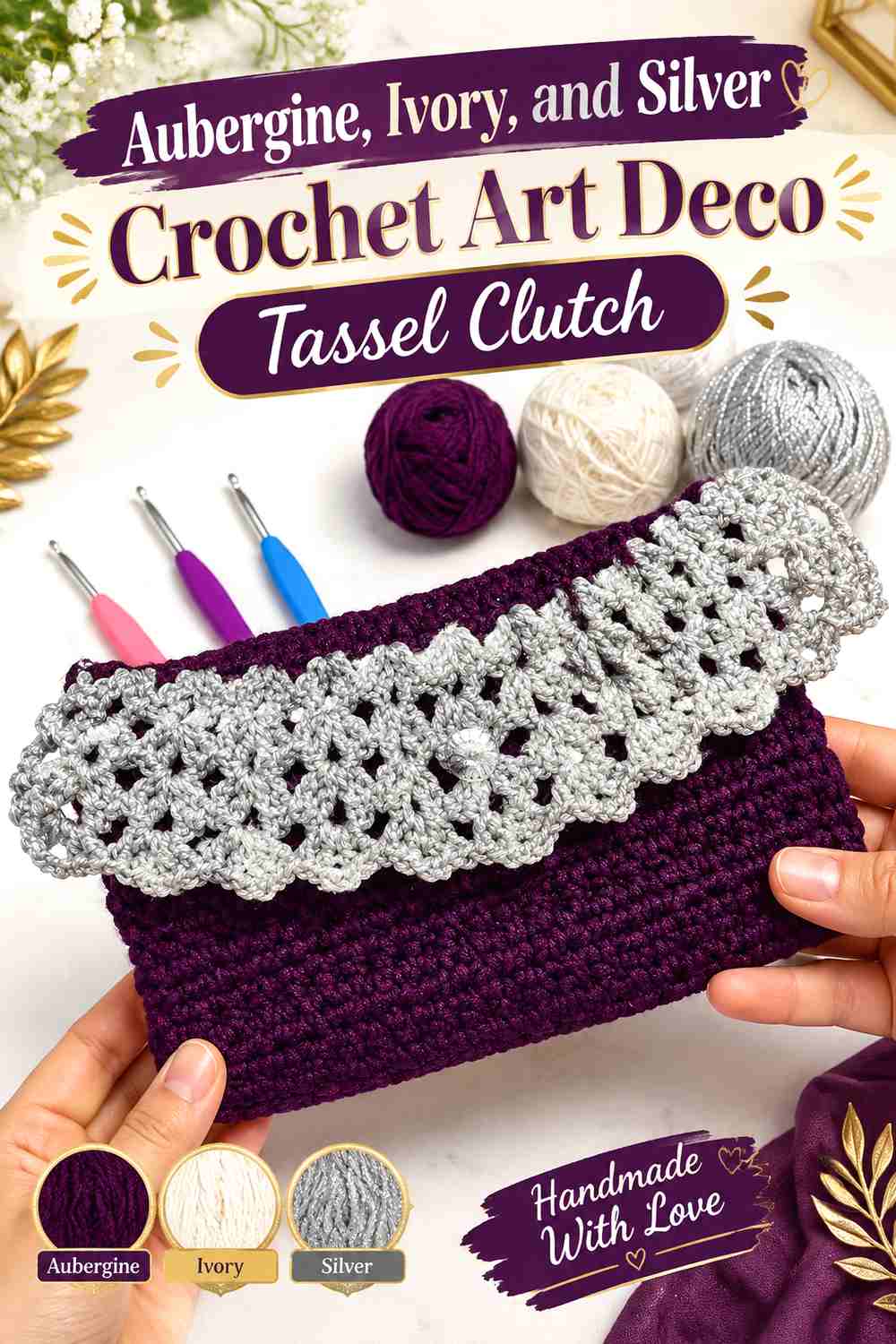
Aubergine supplies a deep purple foundation, ivory creates the strongest value contrast, and silver cools the finished palette. Keep aubergine dominant so the accessory remains dark enough for a winter evening look.
Aubergine Needs Ivory Where the Crochet Pattern Is Most Detailed
Use ivory around narrow geometric motifs or a sharply defined flap edge. The light neutral can preserve the visibility of small shapes that might disappear if silver and aubergine have similar values.
Silver Can Refine an Aubergine and Ivory Tassel Without Adding Another Large Block
A narrow silver wrap or small accent at the tassel attachment is enough to repeat the coolest shade. The tassel itself can remain aubergine or ivory depending on whether you want a dark or light finish.
Creator Credit: Fiber Flux
14. Peacock Teal, Black, and Champagne Crochet Art Deco Tassel Clutch
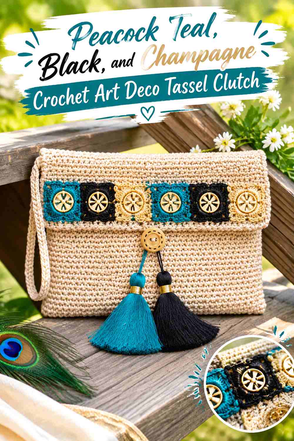
Peacock teal brings more color saturation than the deeper teal option earlier in the list. Black can sharpen the outline, while champagne prevents the two stronger colors from becoming visually heavy.
Peacock Teal Should Remain Visible Between Black Crochet Borders
Do not let black edging become so broad that only a narrow strip of teal remains. The main front panel needs enough teal area for the palette to retain its jewel-toned identity.
Champagne Can Separate Peacock Teal From a Black Tassel
If you want a black tassel, introduce champagne at its top or attachment point. That small lighter interval prevents the tassel from visually merging into a black border or dark coat behind it.
Creator Credit: Naztazia
15. Ruby, Onyx, and Antique Gold Crochet Art Deco Tassel Clutch
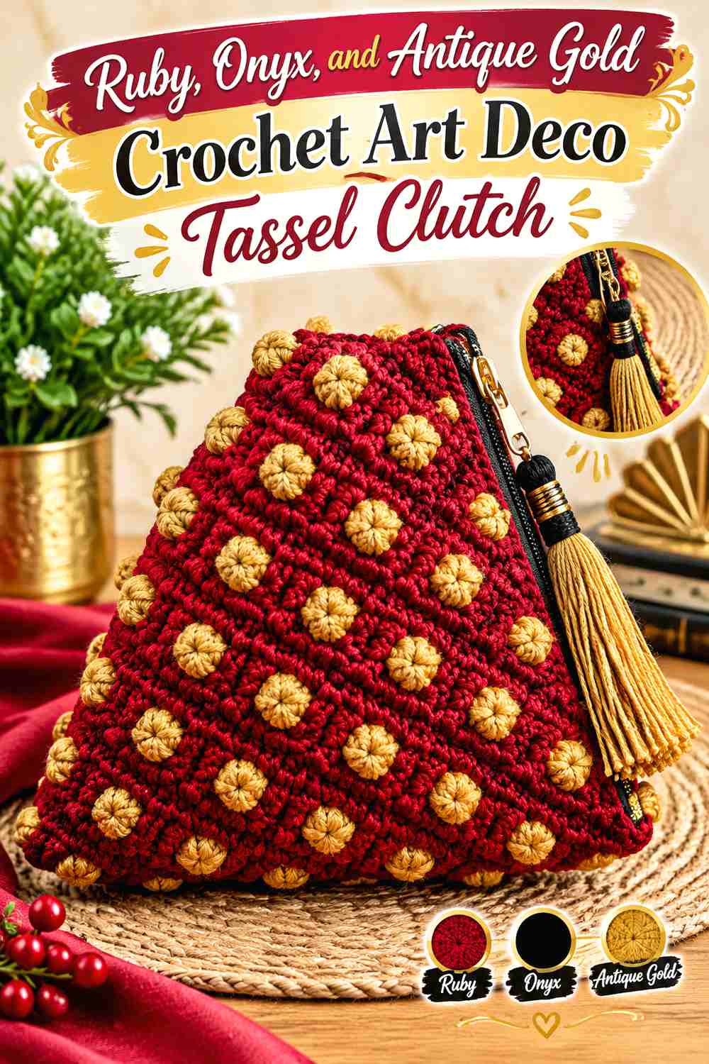
Ruby provides the brightest red direction here, while onyx keeps it grounded and antique gold adds vintage warmth. Because ruby already attracts attention, the gold accent should remain controlled.
Ruby Works Best as the Main Field Beside Onyx Art Deco Lines
Use onyx to create defined side borders, a central step, or another structured division. Large equal areas of ruby and onyx can make the clutch look heavily color-blocked, so preserve more uninterrupted ruby surface.
Antique Gold Should Mark the Ruby and Onyx Tassel Connection
A narrow antique-gold detail where the tassel attaches can connect the brighter body to a dark tassel. Repeat the same accent near the clutch opening to create a balanced top-and-bottom relationship.
Creator Credit: kesar crochet
16. Winter White, Graphite, and Pale Gold Crochet Art Deco Tassel Clutch
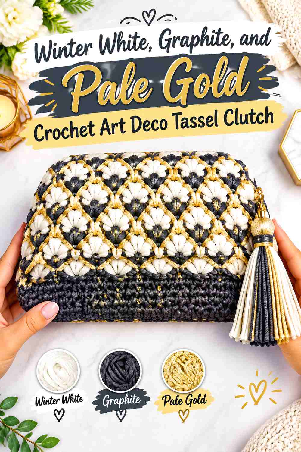
Winter white creates the lightest clutch in the collection. Graphite provides crisp structure without the severity of pure black, while pale gold can warm small details. This palette works particularly well when the clutch itself needs to stand out against a dark winter coat.
Winter White Makes Graphite Art Deco Geometry Highly Visible
Use graphite deliberately because every line will show strongly against the pale background. A centered feature, narrow border, or repeated corner treatment can give the clutch structure without covering too much winter white.
Pale Gold Can Warm a Winter White and Graphite Tassel
Keep the tassel mostly winter white or graphite and use pale gold only near the top. The small warm accent helps the tassel coordinate with closure details while preserving the clean neutral contrast.
Creator Credit: frainodi.crochet
Which Art Deco Tassel Clutch Palette Fits Your Winter Party Look?
For the darkest, most dramatic direction, start with black and antique gold, forest green and black, ruby and onyx, or peacock teal and black. These palettes depend on controlled lighter accents to keep their geometry visible.
Emerald and champagne, burgundy and brass, plum and rose gold, and black cherry with dusty rose have a softer jewel-tone character. They suit a vintage-inspired party look without relying on black as the main color.
If your coat or dress is already very dark, consider one of the lighter combinations. Ivory with black and gold, camel with espresso, or winter white with graphite creates enough contrast for the clutch silhouette to remain visible against darker layers.
Conclusion
The most convincing Art Deco color schemes usually have a clear hierarchy. Give one color most of the clutch surface, let a second color define the architecture, and reserve the brightest or metallic-looking shade for a limited accent.
The tassel gives you one more place to repeat that hierarchy. It can echo the body color, carry a contrasting accent at the neck, or provide a small light detail against a dark clutch. What matters is that its colors connect back to something already visible on the bag.
For a dramatic winter party clutch, black, jewel tones, and antique-gold accents offer strong contrast. For something softer, plum, dusty rose, champagne, ivory, camel, or pearl gray can reduce the visual weight while preserving the structured Deco direction. Use the credited tutorials for their original crochet construction, then adapt the color placement and tassel treatment to suit your own party wardrobe.
Frequently Asked Questions
What colors make a crochet tassel clutch look Art Deco?
High-contrast combinations such as black and antique gold, emerald and champagne, navy and silver, or ivory and black can support an Art Deco direction. The placement matters as much as the colors: symmetry, stepped divisions, centered lines, and controlled borders usually communicate the style more clearly than random color changes.
Should the tassel match the main crochet clutch color?
It can, and that is often the simplest way to keep the design connected. Another option is to make the tassel the supporting color and repeat the dominant clutch shade around its neck or attachment point.
How many colors work well in an Art Deco crochet clutch?
Two colors are enough for a strong geometric design. A third color is most useful when it has a specific role, such as separating two dark shades or adding a small highlight around the closure and tassel.
How can I check whether two dark clutch colors have enough contrast?
Place the yarns beside each other and look at them from several feet away. A grayscale photo can also show whether their light-dark values are too similar. If the colors merge, introduce a lighter boundary shade where important geometric details meet.
Should metallic-looking color cover a large part of an Art Deco tassel clutch?
It does not have to. A small amount around the flap, closure, border, or tassel can provide enough contrast. Using it everywhere can reduce the impact of the geometric details because every part competes for attention.
Which crochet Art Deco clutch colors work with a black winter coat?
Lighter or brighter combinations such as emerald and champagne, ivory and black, burgundy and brass, winter white and graphite, or sapphire and champagne can create useful separation from a black coat. If you choose a mostly black clutch, move a lighter accent toward the outer edge.
Can I substitute different shades without changing the whole Art Deco palette?
Yes. Preserve the relationship between the colors rather than searching for identical names. Replace the dominant shade with something of similar darkness and saturation, and keep the accent noticeably lighter or darker if that contrast is important to the geometric design.