Cool blue crochet accessories offer a crisp alternative to the rust, mustard, and brown palettes usually associated with fall. The “frosted” effect does not require one exact shade of blue. It comes from pairing cool blues with misty grays, winter whites, icy lilacs, pale aqua, or deeper blue anchors that create clear visual layers.
For Fall 2026 styling, the most useful approach is to decide where the blue should carry the accessory and where a lighter or darker shade should define texture, edges, motifs, or openings. A pale accent can make ribbing and dimensional stitches easier to see, while navy, charcoal, or pewter can keep an icy palette from becoming visually washed out.
The 19 ideas below use different blue relationships across beanies, scarves, gloves, warmers, bags, and other crochet accessories. Each palette can be adapted to the linked construction tutorial without assuming that the original creator used these exact colors.
Quick List
- Ice Blue And Soft White Crochet Ribbed Beanie
- Slate Blue And Glacier Gray Crochet Balaclava
- Powder Blue And Mist Gray Crochet Bandana
- Frost Blue And Silver Gray Crochet Scrunchie
- Steel Blue And Pale Ice Crochet Leg Warmers
- Denim Blue And Cloud Gray Crochet Phone Pouch
- Deep Teal Blue And Frosted Aqua Crochet Crossbody Bag
- Arctic Blue And Charcoal Crochet Mittens
- Periwinkle Blue And Icy Lilac Crochet Fingerless Gloves
- Glacier Blue And Navy Crochet Bucket Hat
- Cornflower Blue And Soft Gray Crochet Wrist Warmers
- Fjord Blue And Pale Blue Crochet Twisted Headband
- Storm Blue And Misty Silver Crochet Shawl
- Ice Aqua And Slate Blue Crochet Infinity Scarf
- Blue Gray And Winter White Crochet Hooded Cowl
- Midnight Blue And Frost Blue Crochet Arm Warmer Sweater
- Cobalt Blue And Pewter Crochet Everyday Bag
- Mist Blue And Charcoal Crochet Ear Warmer
- Dusty Blue And Soft White Crochet Scarf
How to Build a Frosted Cool Blue Crochet Palette
A convincing frosted palette usually needs more than several light blues placed together. Start by choosing a blue that will occupy the largest visual area, then decide whether the accessory needs a pale supporting shade, a dark anchor, or both.
Ice blue with white creates stronger lightness than steel blue with gray. Midnight blue paired with frost blue reverses the balance: the dark color dominates while the pale blue supplies the frosted highlight. Those two approaches can both suit fall accessories, but they produce very different visual weight.
For a three-color variation, avoid automatically giving every shade equal space. A dominant blue, a smaller neutral, and a restrained accent are easier to read across compact accessories such as hats, mittens, and pouches.
Keep Cool Blue Crochet Texture Visible With Value Contrast
Two blue yarns can look clearly different in the skein yet merge once they are worked into a textured crochet surface. Light-and-dark value matters as much as hue.
Before committing to a large section, compare the colors next to each other and, if needed, view them in grayscale. If raised stitches, ribbing, flower details, or motif edges disappear, increase the difference between the neighboring shades rather than simply switching to another similar blue.
On small accessories, contrast is especially noticeable around cuffs, openings, borders, ties, and motif centers. These areas are useful places for the palest or darkest color because a relatively small amount can define the whole accessory.
Place Frosted Blue Accents Where Fall Accessories Need Definition
The position of a frosted accent should follow the accessory. A light edge can outline a beanie or bucket hat, while a pale cuff can separate a darker mitten from a coat sleeve. Bags can carry contrast on straps, motif borders, openings, or joining areas.
For scarves and shawls, repeating a secondary blue at intervals can connect a multicolor palette better than placing it only at one end. For compact pieces such as scrunchies or ear warmers, restraint matters more because even a narrow contrasting band occupies a noticeable share of the finished surface.
1. Ice Blue And Soft White Crochet Ribbed Beanie
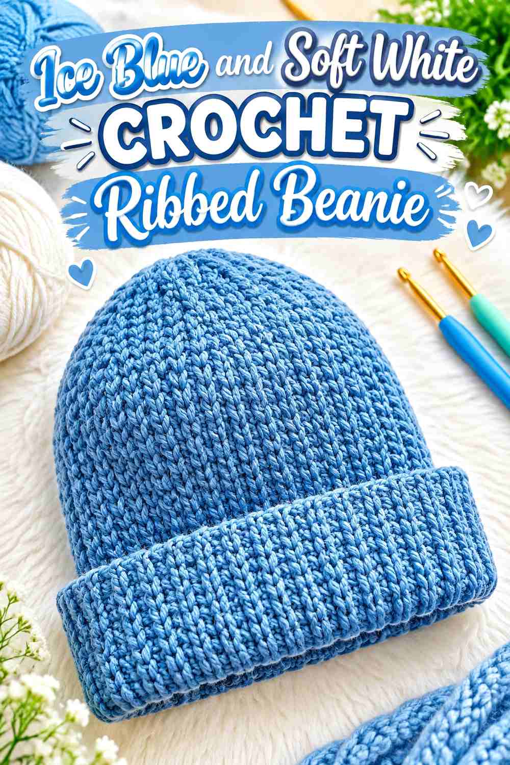
Ice blue can cover most of a ribbed crochet beanie while soft white provides the frosted highlight. Because ribbing already creates strong lines, the palette does not need complicated color changes. A restrained white edge or small finishing area can create separation without breaking the continuous blue surface into too many bands.
Let Ice Blue Lead Across the Crochet Beanie Ribbing
Use ice blue across the largest section if you want the ribbed texture, rather than the color changes, to remain the main visual feature. A continuous cool-blue field also makes it easier to coordinate the beanie with charcoal, denim, navy, or other fall layers without introducing several competing colors.
Soft White Gives Ice Blue Beanie Edges a Cleaner Break
Soft white works best as a supporting color rather than an equal partner here. Consider placing it at an edge or other small finishing area where it can outline the ice blue. If the two shades appear almost identical in value, choose a slightly deeper ice blue instead of adding more white throughout the hat.
Creator Credit: lerugi crochets
2. Slate Blue And Glacier Gray Crochet Balaclava
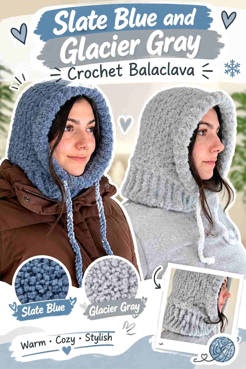
A crochet balaclava gives slate blue enough surface area to act as a substantial fall color while glacier gray keeps the palette cool without making the whole piece pale. The face opening is a natural location for contrast because its outline affects how the color distribution reads from the front.
Slate Blue Gives the Crochet Balaclava Its Main Visual Weight
Keep most of the balaclava in slate blue when you want a darker frosted look. Slate is deep enough to distinguish itself from pale fall neutrals, yet it stays within the cool-blue direction. Avoid scattering glacier gray in many tiny sections if the goal is a calm, continuous outer surface.
Glacier Gray Can Define the Slate Blue Face Opening
A glacier-gray edge around the opening can produce a clear transition between the slate blue crochet and the face. Keep the gray narrow if you want blue to remain dominant. For a more blended version, substitute a medium blue-gray that is lighter than the slate but less contrasting than pale gray.
Creator Credit: Natalie
3. Powder Blue And Mist Gray Crochet Bandana
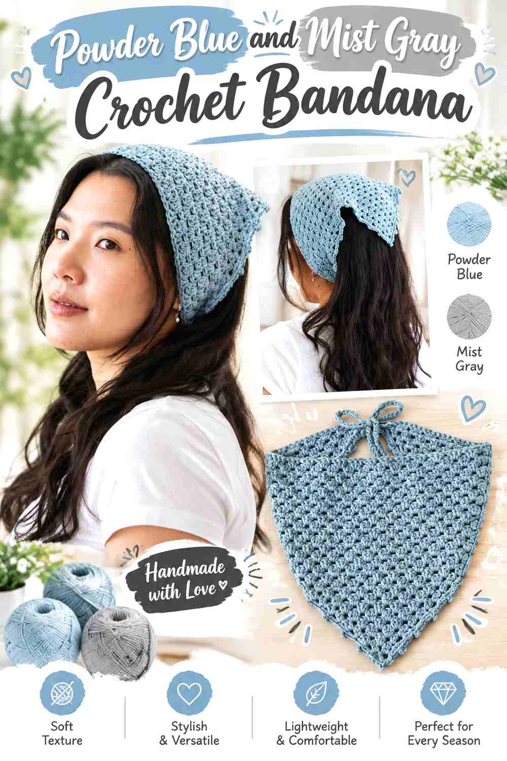
Powder blue gives a crochet bandana a light frosted appearance, while mist gray can keep its edges and ties from looking overly pastel. Since a bandana has less surface area than a scarf or shawl, the secondary color should have a clear role rather than appearing in several unrelated spots.
Powder Blue Works Well Across the Main Crochet Bandana Triangle
Let powder blue cover the central triangular area so its shape stays visually continuous. If the crochet has open spaces or noticeable texture, a single main shade also keeps those details from competing with frequent color changes.
Mist Gray Gives Powder Blue Bandana Edging More Definition
Use mist gray along the outer edge or ties when the powder blue needs a slightly stronger outline. Check the two colors side by side first: a gray that is almost as pale as the powder blue will create a blended result, while a medium mist gray will make the triangular shape easier to distinguish.
Creator Credit: VivCrochets
4. Frost Blue And Silver Gray Crochet Scrunchie
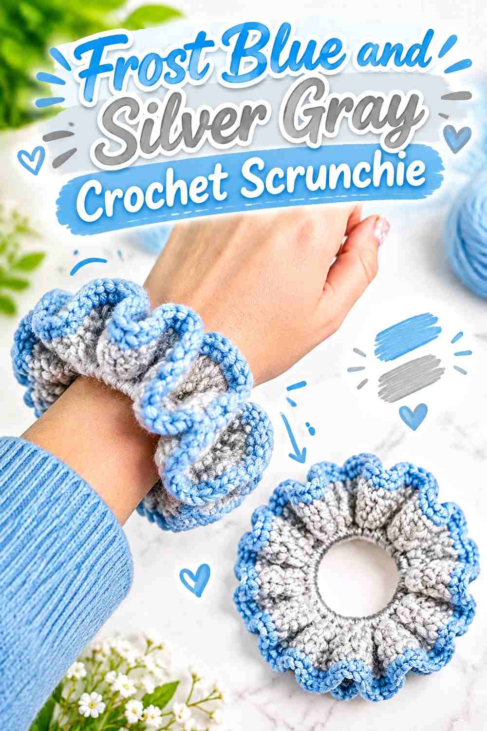
A scrunchie offers very little room for complicated color placement, so frost blue and silver gray work better with a clear dominant-supporting relationship. Frost blue can carry the gathered crochet surface, while a smaller amount of silver gray can emphasize an edge or repeated detail.
Frost Blue Should Dominate the Crochet Scrunchie Surface
Keeping most of the gathered fabric frost blue prevents the small accessory from becoming visually fragmented. The folds already create plenty of shadow and variation, so the blue does not need multiple additional shades to look dimensional.
Silver Gray Can Accent Frost Blue Without Splitting the Scrunchie
If you add silver gray, keep it controlled. A narrow edge or repeated detail will read more intentionally than alternating equally sized blue and gray sections. If stronger definition is wanted, deepen the gray rather than increasing how much of it appears.
Creator Credit: ElyseCrochets 💌
5. Steel Blue And Pale Ice Crochet Leg Warmers
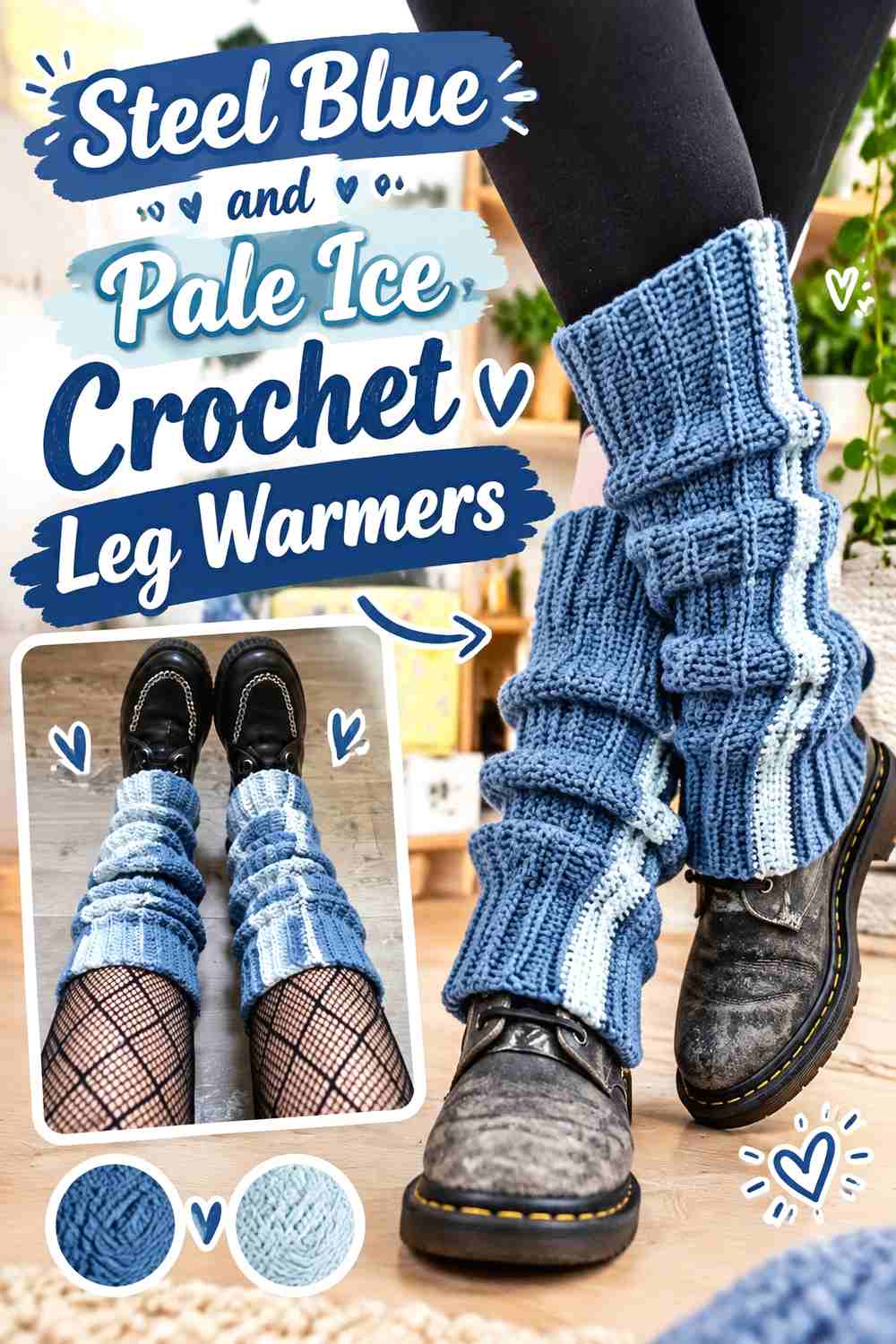
Steel blue gives crochet leg warmers enough visual depth to work with darker fall footwear and layers. Pale ice can then emphasize the upper or lower edge without turning the long vertical surface into a series of high-contrast blocks.
Steel Blue Keeps the Crochet Leg Warmers Visually Grounded
Use steel blue across most of each warmer so the pair reads as one continuous accessory. On a longer shape, too many alternating pale bands can dominate the silhouette. A consistent steel-blue body gives any ribbing or other texture more room to remain visible.
Pale Ice Can Frame Steel Blue at the Leg-Warmer Cuffs
Reserve pale ice for cuffs or another repeated edge if you want a noticeably frosted finish. Repeating it in the same location on both warmers creates stronger visual continuity than placing different accent areas on each leg.
Creator Credit: Bloodimaryart Crochet
6. Denim Blue And Cloud Gray Crochet Phone Pouch
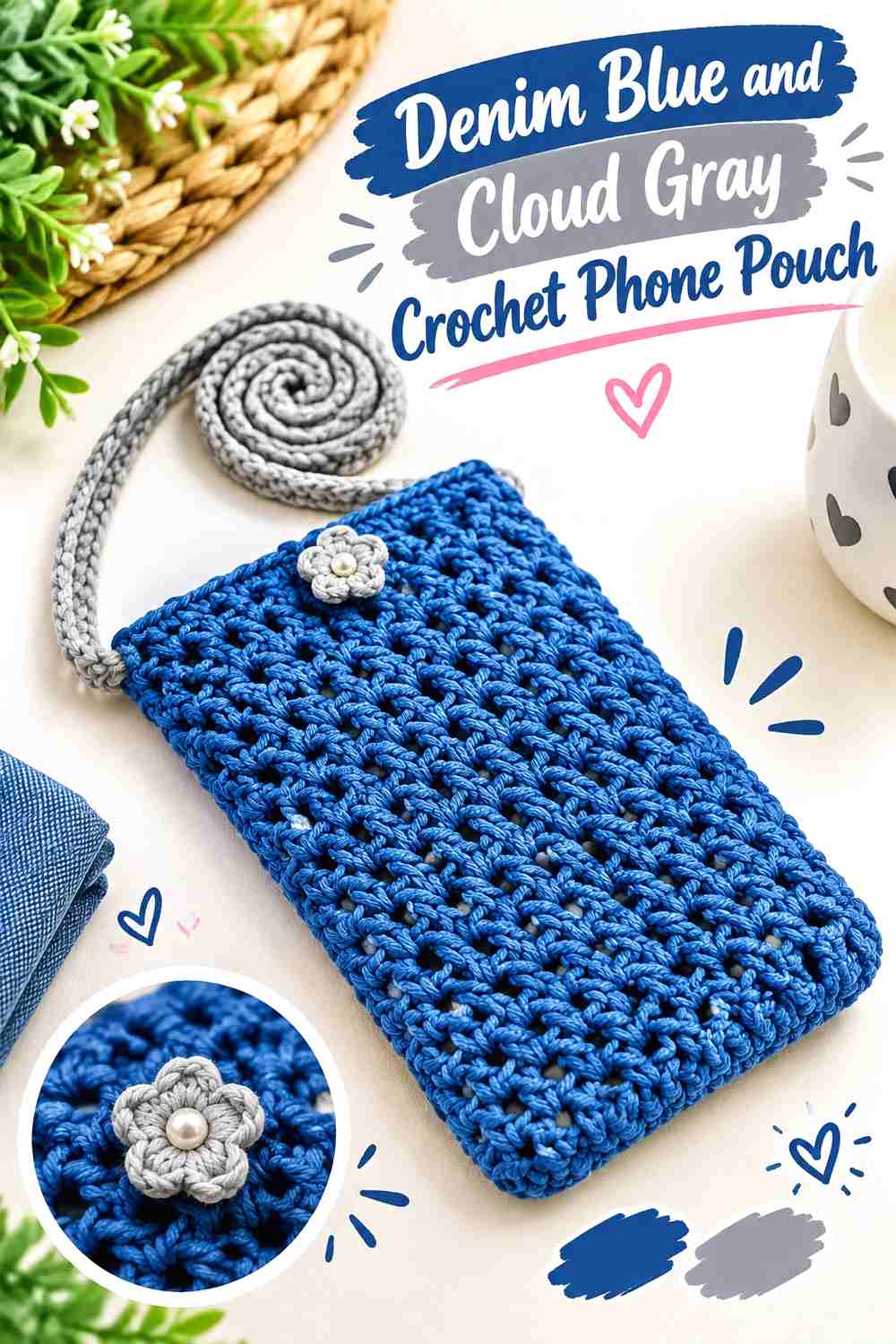
Denim blue makes a practical dominant color for a small crochet phone pouch because it gives the body enough visual weight, while cloud gray can identify the strap, opening, or edging. The compact scale makes color placement especially important: a contrasting strap may occupy almost as much visual attention as the pouch itself.
Denim Blue Gives the Crochet Phone Pouch a Clear Main Body
Keep the pouch body primarily denim blue if you want its shape to read before the details. This is particularly helpful when the surface already has noticeable stitch texture or an open pattern that would become busier with frequent color changes.
Cloud Gray Separates the Denim Blue Strap or Opening
Cloud gray can be useful on the strap or top edge because those elements benefit from being easy to distinguish from the pouch body. If the contrast looks too sharp, replace cloud gray with a medium blue-gray while preserving enough lightness difference to keep the strap visible.
Creator Credit: Hopeful Turns
7. Deep Teal Blue And Frosted Aqua Crochet Crossbody Bag
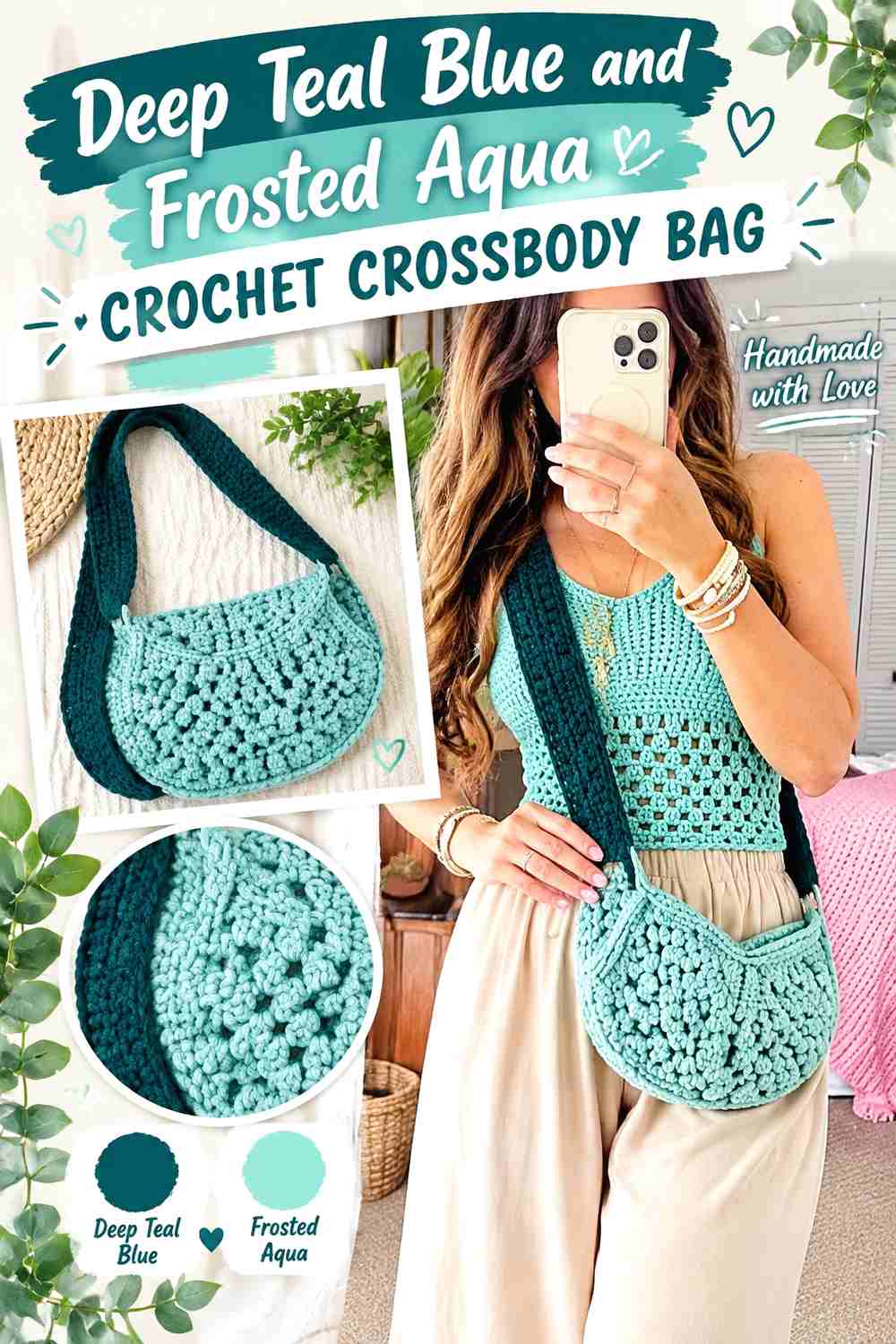
Deep teal blue and frosted aqua create a more saturated take on the cool-blue theme. For a crossbody bag with repeated motifs, deep teal can provide the visual anchor while aqua marks selected centers, borders, or smaller motif areas.
Deep Teal Blue Can Anchor the Crochet Crossbody Bag Motifs
Use deep teal blue in a repeated position across the bag rather than changing its role from motif to motif. Consistent placement helps multiple crochet squares or sections look related and prevents the darker shade from appearing randomly distributed.
Frosted Aqua Keeps Deep Teal Blue Motifs From Becoming Too Heavy
Frosted aqua can lighten motif centers or selected borders where the darker teal needs separation. If aqua is used everywhere in equal proportion, the bag may lose its darker anchor, so preserve a visibly larger share of deep teal or another clearly defined hierarchy.
Creator Credit: MJ’s Off The Hook Designs
8. Arctic Blue And Charcoal Crochet Mittens
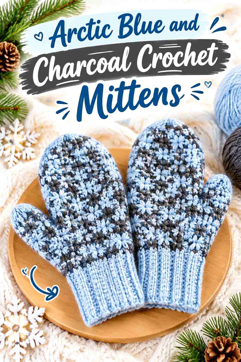
Arctic blue gives crochet mittens the frosted color direction, while charcoal adds the darkest contrast in this collection. Because mittens are compact and usually viewed as a pair, charcoal works especially well when repeated consistently at cuffs or another matching detail.
Arctic Blue Keeps the Crochet Mittens Clearly Frosted
Let arctic blue cover most of the mitten surface if cool color is the priority. A single pale-blue field also helps any raised stitch texture remain uninterrupted rather than divided into short contrasting sections.
Charcoal Gives Arctic Blue Mitten Cuffs a Dark Anchor
A charcoal cuff can create a decisive transition between pale blue mittens and a sleeve. Keep charcoal in a supporting role if you want the mittens to stay visibly blue. For softer contrast, replace it with a deep blue-gray while keeping it noticeably darker than the arctic blue.
Creator Credit: Nora Moon – handmade clothes with love
9. Periwinkle Blue And Icy Lilac Crochet Fingerless Gloves
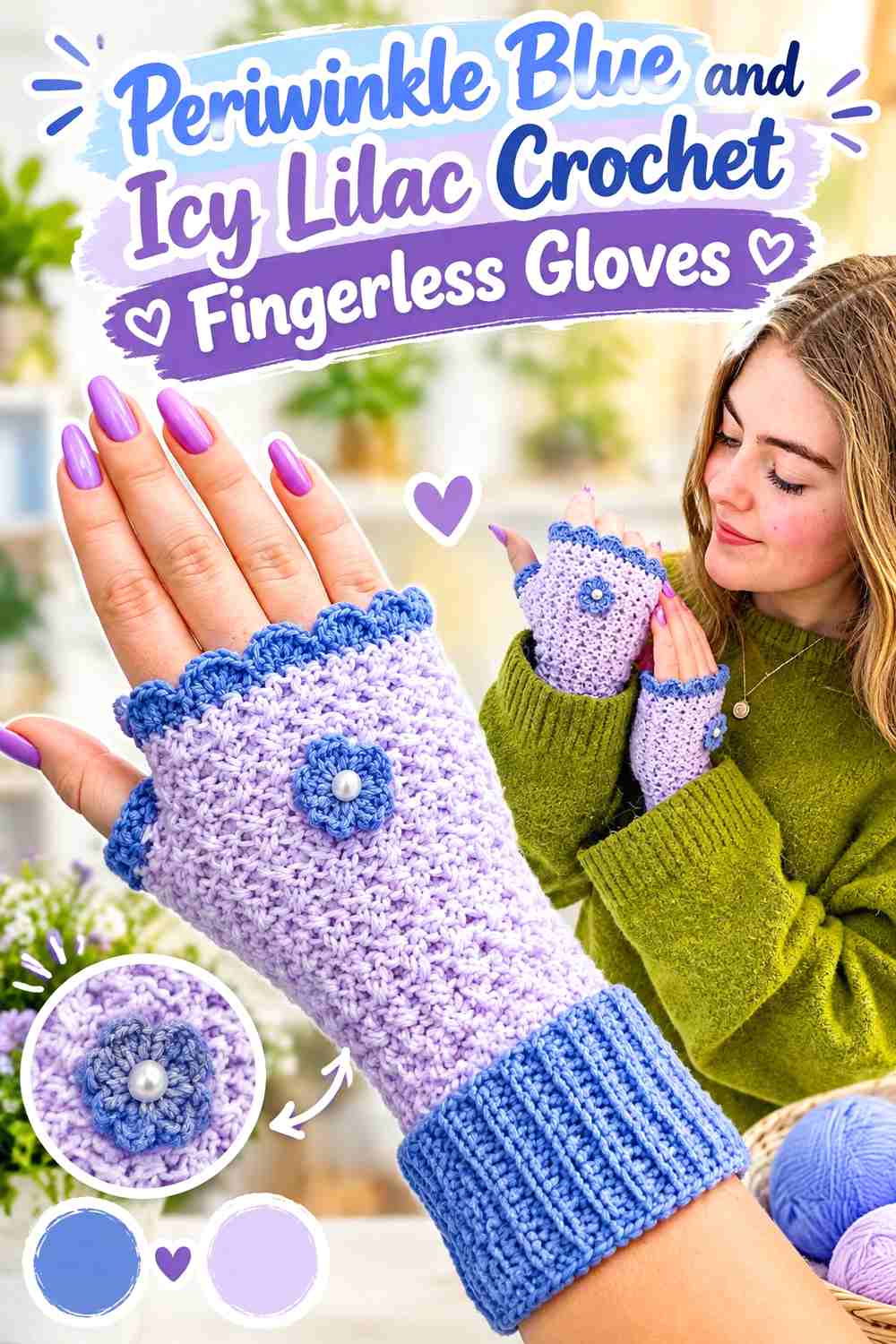
Periwinkle blue and icy lilac create a cooler tonal shift without relying on gray or white. Since fingerless gloves expose several edges around the hand and fingers, the lighter lilac can be used selectively to emphasize a scallop, flower, cuff, or another small decorative area.
Periwinkle Blue Should Carry Most of the Crochet Fingerless Glove
A periwinkle-blue main field provides enough distinction from icy lilac to keep decorative details readable. Before committing, compare the two yarns from a short distance; if they collapse into one value, deepen the periwinkle rather than introducing a third competing accent.
Icy Lilac Can Highlight Periwinkle Blue Flower or Edge Details
Keep icy lilac around smaller decorative areas where its slightly different hue becomes noticeable. This works better than splitting the whole glove evenly between lilac and blue, especially when the crochet already includes scalloped or floral details.
Creator Credit: Crochet with Linni
10. Glacier Blue And Navy Crochet Bucket Hat
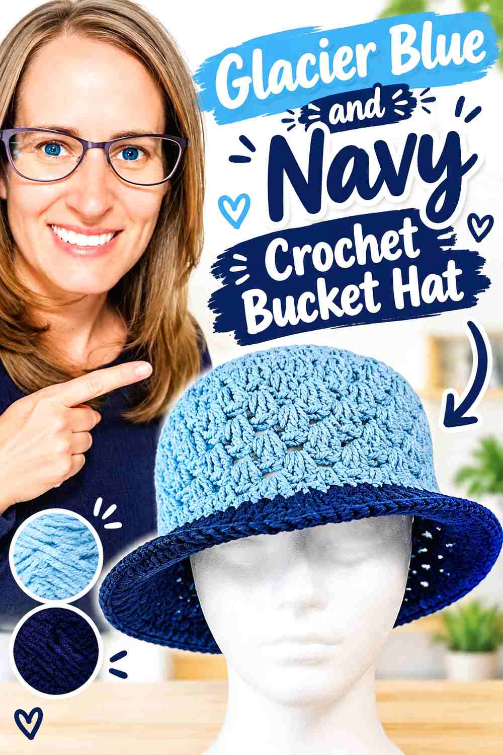
Glacier blue paired with navy creates stronger contrast than the paler palettes above. The hat can remain predominantly glacier blue, with navy concentrating around an edge or repeated band so the darker color visually frames the lighter crown and brim.
Glacier Blue Keeps the Crochet Bucket Hat Light Across the Crown
Use glacier blue over the main crown when you want the hat to keep its frosted character. Maintaining one light field also stops a compact bucket-hat silhouette from becoming divided by several competing color bands.
Navy Can Sharpen the Glacier Blue Crochet Brim
Navy works well where a defined outer edge is useful, especially around the brim. A narrow navy area will look much stronger against glacier blue than the same amount of medium gray, so start with less dark color when you want blue to remain dominant.
Creator Credit: Crochet with Clare
11. Cornflower Blue And Soft Gray Crochet Wrist Warmers
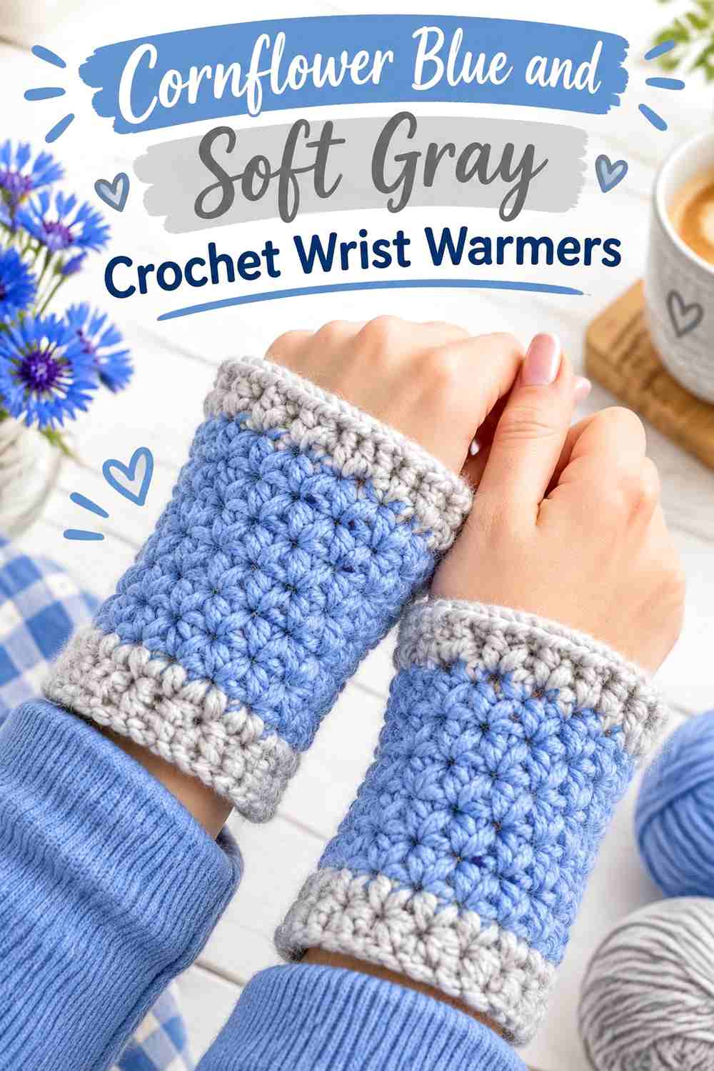
Cornflower blue brings a clearer, moderately saturated blue into the frosted group. Soft gray can mute the transition at the wrist without removing the blue identity of the warmers. Keeping the placement consistent across the pair matters more than introducing additional accent shades.
Cornflower Blue Gives Crochet Wrist Warmers a Clear Color Focus
Use cornflower blue through most of the hand and wrist area if you want the accessory to stand out against darker fall sleeves. The color has enough presence that it does not require several contrasting stripes to establish the design.
Soft Gray Can Quiet the Cornflower Blue Crochet Cuffs
Soft gray makes a useful cuff or narrow trim when a full dark border would feel too heavy. Choose a gray that is visibly lighter or darker than the cornflower blue; very similar values may make the color change look accidental rather than deliberate.
Creator Credit: B.Hooked Crochet
12. Fjord Blue And Pale Blue Crochet Twisted Headband
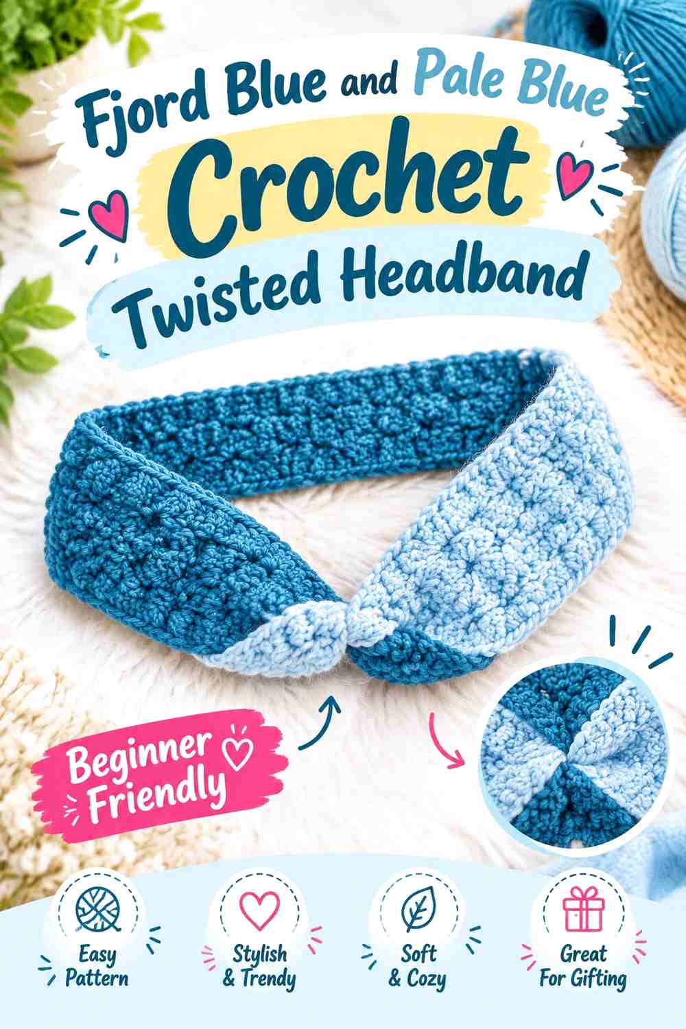
Fjord blue creates a deeper cool base for a twisted crochet headband, while pale blue can make the central twist or edging easier to notice. Since the twist itself is already a focal point, the color arrangement should reinforce it rather than compete with it.
Fjord Blue Keeps the Crochet Headband Visually Continuous
Use fjord blue through most of the band so the eye follows the headband around the head without multiple color interruptions. A darker cool blue also gives the central shaping enough shadow to remain noticeable.
Pale Blue Can Draw Attention to the Fjord Blue Twist
If the construction allows a contrasting detail around the twist or edge, pale blue can provide the frosted highlight. Keep that light shade localized; distributing it evenly across the entire band reduces the emphasis on the twist itself.
Creator Credit: Jess Crafting
13. Storm Blue And Misty Silver Crochet Shawl
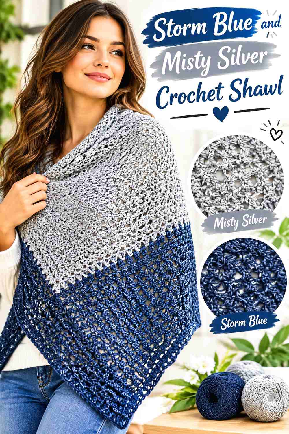
A shawl provides much more surface area than the smaller accessories, so storm blue and misty silver can be repeated without looking crowded. Storm blue can form the broad visual base, while silver can mark selected sections or the outer edge.
Storm Blue Gives the Crochet Shawl Enough Depth for Fall Layers
Let storm blue occupy the larger share of the shawl when you want a cooler alternative to conventional autumn earth tones. Its darker value helps the shawl remain substantial visually over black, gray, denim, or other neutral layers.
Misty Silver Can Separate Storm Blue Shawl Sections
Misty silver can be repeated at intervals or kept primarily around the edge, depending on how much contrast you want. If it is introduced only once in one isolated area, consider repeating a smaller amount elsewhere so the secondary shade feels connected to the overall shawl.
Creator Credit: Bag-O-Day Crochet
14. Ice Aqua And Slate Blue Crochet Infinity Scarf
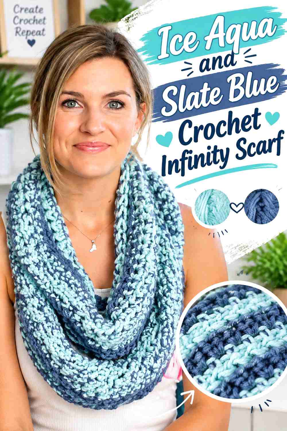
Ice aqua and slate blue reverse the usual pale-accent formula by giving the lighter shade a larger potential role. An infinity scarf can alternate visible areas as it is wrapped, so both colors may appear at once even when one occupies less total surface area.
Ice Aqua Can Lead the Crochet Infinity Scarf Without Looking Flat
Use ice aqua across the broadest section if you want the scarf to read as light and frosted. Because a wrapped infinity scarf creates natural folds and shadows, it can handle a pale dominant color without requiring dark stripes across every section.
Slate Blue Gives Ice Aqua Scarf Folds Stronger Definition
Slate blue can work at an edge or in selected repeated areas where it will appear between lighter folds. Keep the dark shade consistent enough to connect the loop visually rather than concentrating all of it in one section that may disappear when the scarf is wrapped.
Creator Credit: Melanie Ham
15. Blue Gray And Winter White Crochet Hooded Cowl
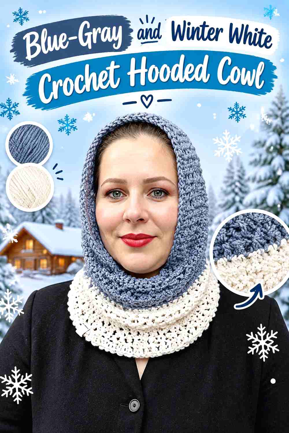
Blue-gray and winter white create a restrained frosted combination suited to a hooded cowl, where the hood and neck area provide two obvious places for color distribution. Blue-gray can remain dominant while winter white defines the face edge or lower cowl border.
Blue-Gray Keeps the Crochet Hooded Cowl Softly Tonal
A medium blue-gray main field offers less contrast than navy or charcoal but still gives the cowl enough depth to distinguish winter-white accents. It is especially useful when you want the hood and neck portion to read as one connected accessory.
Winter White Can Outline the Blue-Gray Crochet Hood
Use winter white where you want the shape of the hood to be easiest to read, such as an outer edge or repeated trim area. Avoid spreading white evenly across every section if the aim is to preserve the quieter blue-gray direction.
Creator Credit: Yanet pupo crochet
16. Midnight Blue And Frost Blue Crochet Arm Warmer Sweater
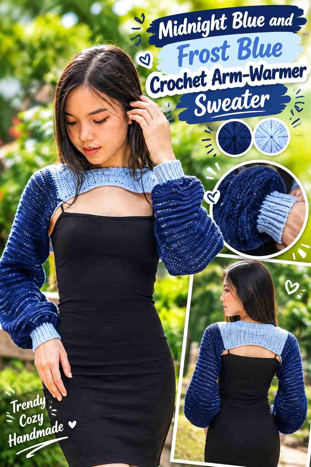
Midnight blue and frost blue create the strongest dark-to-light blue relationship in the collection. For an arm-warmer sweater or detached-sleeve style, the long sleeve area makes it possible to use midnight blue as the anchor and frost blue as a deliberate cuff, neckline, or connecting accent.
Midnight Blue Can Carry the Long Crochet Arm-Warmer Sleeves
Keep most of the sleeve length midnight blue when you want the accessory to coordinate easily with lighter fall tops. A continuous dark sleeve also prevents frequent color changes from shortening the visual line of the arm.
Frost Blue Can Mark the Midnight Blue Crochet Cuffs
Frost blue is most effective where a small amount of light color can define the end of the sleeve. Repeat the pale blue symmetrically at both wrists, and consider whether another small repeated detail is necessary before adding more; the strong value difference already gives the accent considerable emphasis.
Creator Credit: Chenda DIY
17. Cobalt Blue And Pewter Crochet Everyday Bag
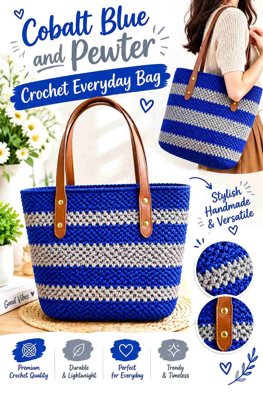
Cobalt blue gives this frosted collection one sharper, more saturated direction. Pewter tempers that intensity and can be placed around an opening, handle area, border, or another structural-looking detail without turning the whole bag neutral.
Cobalt Blue Makes the Crochet Bag Body the Main Color Statement
Use cobalt across the broad bag body rather than scattering small cobalt sections among several pale colors. Concentrating it in one main field gives the accessory a clearer color identity and lets crochet texture remain legible.
Pewter Can Ground the Cobalt Blue Crochet Bag Edges
Pewter works well wherever the bag needs a darker or quieter visual boundary. If the pewter and cobalt appear similar in grayscale, adjust one of them so the change remains visible around the edge or handle. Different hues alone may not provide enough separation.
Creator Credit: Chieko’s Knitting
18. Mist Blue And Charcoal Crochet Ear Warmer
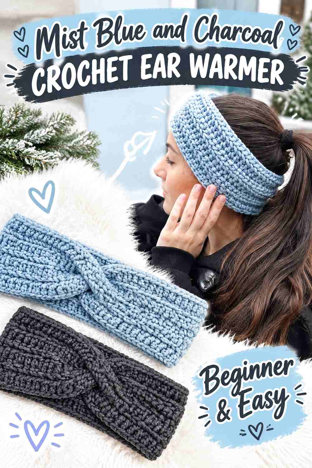
Mist blue paired with charcoal gives a compact ear warmer a strong frosted-versus-dark contrast. Because the accessory occupies a narrow band, charcoal should usually be confined to a smaller area unless you deliberately want the dark shade to dominate.
Mist Blue Works Best Across Most of the Crochet Ear Warmer
Using mist blue across the main band keeps the accessory visibly connected to the cool-blue theme. The continuous light field also allows a twist or other shaping detail to create its own shadows rather than relying entirely on color contrast.
Charcoal Can Define the Mist Blue Crochet Twist or Edge
Use charcoal selectively near an edge or focal detail. On a small headband, even a narrow charcoal section carries considerable visual weight, so compare proportions before repeating it in several places.
Creator Credit: madebymara
19. Dusty Blue And Soft White Crochet Scarf
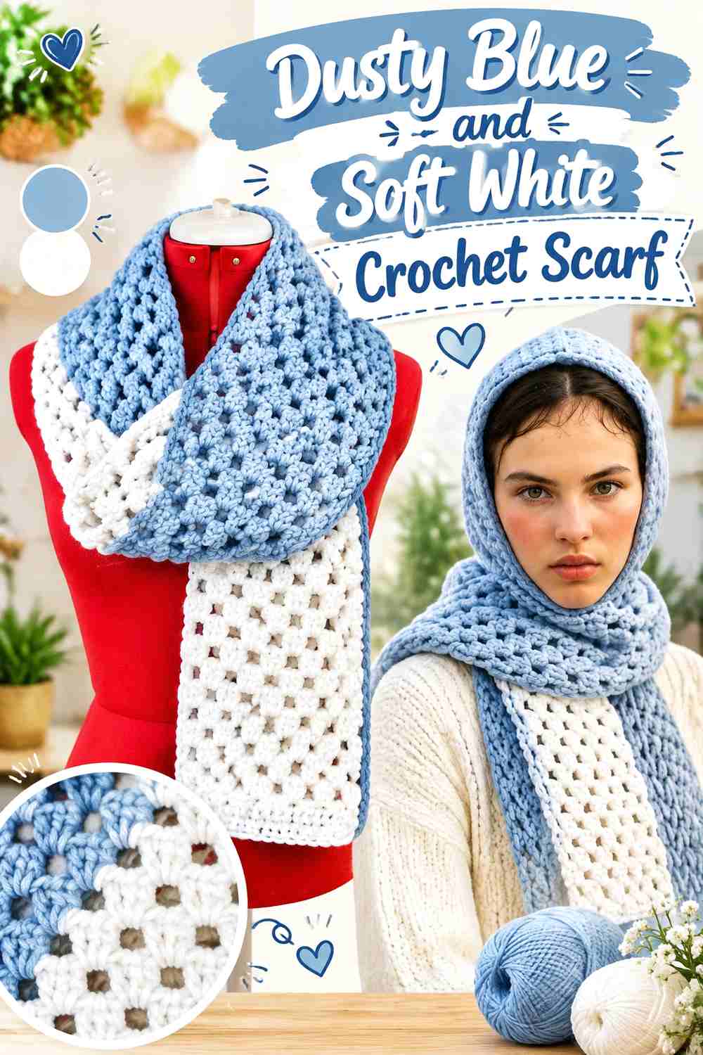
Dusty blue and soft white close the collection with a muted, adaptable palette. A scarf has enough length to accommodate repeated white details, but dusty blue should still lead if the goal is a calm fall accessory rather than a high-contrast striped piece.
Dusty Blue Gives the Crochet Scarf a Muted Fall Base
Let dusty blue cover the largest share of the scarf to keep the palette subdued. Its softened appearance can sit comfortably beside charcoal, dark denim, navy, taupe, or other simple layers without requiring a third color.
Soft White Can Repeat Through the Dusty Blue Scarf Without Taking Over
Use soft white in a border, fringe area, or occasional repeated color section when you want a visible frosted contrast. If the scarf begins to look predominantly white from a distance, reduce the frequency of the accent rather than adding a darker third color solely to restore balance.
Creator Credit: Stitched by Chanté
Choosing Between These Cool Blue Crochet Palettes
For the lightest frosted direction, start with ice blue and soft white, powder blue and mist gray, or mist blue and charcoal with the charcoal kept minimal. These combinations place the pale blue clearly in front.
For more depth, slate blue with glacier gray, steel blue with pale ice, and blue-gray with winter white maintain the frosted theme while giving the accessory greater dark-to-light structure.
If you want stronger contrast, arctic blue with charcoal, glacier blue with navy, or midnight blue with frost blue create the clearest separation. Those palettes are especially useful when cuffs, edges, openings, or borders need to remain distinct.
Periwinkle with icy lilac and deep teal blue with frosted aqua move farther from neutral gray-and-blue combinations. They still stay cool, but use neighboring cool hues to add variation instead of relying mainly on white, gray, or navy.
Conclusion
Cool blue crochet accessories can move in several different fall directions without losing the frosted theme. Pale blues with soft white create the lightest effect, blue-gray combinations feel more restrained, and navy or charcoal accents add stronger definition around cuffs, borders, openings, and trims.
Match the contrast to the accessory rather than choosing colors in isolation. Small pieces such as scrunchies and ear warmers usually need tighter accent control, while shawls, scarves, and leg warmers provide enough surface area for repeated secondary colors. Bags and motif-based accessories benefit from consistent color roles so the construction remains easy to read.
Once you select a palette, compare the yarn colors side by side before committing to the full accessory. The original tutorials can provide the construction framework, while the color placement can be adapted to the cooler Fall 2026 direction you want.
Frequently Asked Questions
What makes a blue crochet accessory look “frosted”?
A frosted look usually comes from the relationship between the blue and its supporting colors rather than from one specific blue shade. Ice blue, powder blue, dusty blue, blue-gray, or deeper cool blues can all work when paired with pale gray, winter white, silver, icy lilac, aqua, or another cool contrasting shade.
The important choice is whether the supporting color creates a lighter highlight, a darker frame, or a subtle tonal transition.
How can I tell whether two cool blue yarn colors have enough contrast?
Place the yarns next to each other and look at them from a short distance. You can also view them in grayscale to compare lightness rather than hue. If the colors become almost indistinguishable, small crochet details may also merge visually.
For borders, flower details, cuffs, or motif centers, increasing light-dark separation can make the placement easier to see.
Should the darkest color go on the border of a cool blue crochet accessory?
Not automatically. A dark navy, charcoal, pewter, or slate border creates a strong frame, which can be useful on a bucket hat, bag, mitten cuff, or similar defined edge. A pale border produces a lighter transition and may suit an accessory where you want the main blue to remain visually soft.
Choose the border according to how strongly you want the outer shape emphasized.
Can I replace ice blue or powder blue with another blue?
Yes. Preserve the color’s role rather than trying to match a name exactly. If the original plan uses a pale blue against charcoal, choose another cool blue that remains noticeably lighter than the charcoal. If the blue is supposed to anchor winter white, keep enough depth for the white to remain distinct.
Lightness and contrast are often more important than finding an exact shade label.
How many colors should I use in a frosted blue crochet accessory?
Two colors are enough for many of these accessories. One can dominate while the second defines an edge, cuff, motif, strap, or other detail.
A third shade can be useful when the project has enough surface area or repeated motifs, but give each color a clear role. Three equally strong colors used in similar amounts can make a small accessory feel busier than intended.
What fall clothing colors can work with cool blue crochet accessories?
Cool blue accessories can be styled beside simple wardrobe neutrals such as charcoal, gray, navy, denim, cream, taupe, or black. The choice depends on how much contrast you want around the accessory.
A pale blue beanie will stand out more against a charcoal layer than against light gray, while a midnight-blue arm warmer can create stronger separation beside a pale top. Use the surrounding clothing as another part of the value contrast rather than judging the crochet palette alone.