
Burgundy and blue create an especially useful fall palette because they bring depth without depending entirely on the expected orange-and-brown seasonal scheme. Burgundy contributes warmth and richness, while navy, denim, slate, and dusty blue can cool the palette enough to keep a room feeling balanced. Crochet adds another layer through visible texture, making even a restrained color combination feel inviting.
For fall 2026, this pairing can work in living rooms, bedrooms, entryways, dining spaces, reading corners, and even covered porches. The key is choosing which color should lead, how much crochet texture the room can comfortably carry, and where each accent will have enough visual weight without creating clutter. The ideas below focus on those decisions, with practical guidance for combining burgundy and blue with neutral upholstery, wood, leather, existing furniture, and smaller spaces.
Some visuals may be digitally created to illustrate decor and styling concepts.
Quick List
- Chunky burgundy throw on a deep blue sofa
- Burgundy and dusty blue cushion mix
- Burgundy basket with blue blanket storage
- Burgundy and navy dining table runner
- Soft blue bed throw with burgundy accents
- Burgundy cushion on a denim-blue reading chair
- Burgundy and slate blue crochet wall accent
- Navy crochet pouf beside a burgundy chair
- Burgundy and blue shelf baskets
- Burgundy throw on a powder-blue window seat
- Blue crochet cushions with a burgundy throw
- Burgundy entry bench with navy cushions
- Navy and burgundy nursery chair accent
- Burgundy and blue mantel accents
- Navy floor basket with burgundy cushions
- Burgundy lumbar cushion on a blue bed
- Burgundy and blue breakfast nook accent
- Burgundy and blue covered porch layers
Color Direction for Burgundy and Blue
The easiest way to keep this palette sophisticated is to avoid giving every shade equal importance. In most rooms, choose either burgundy or blue as the dominant color and let the other work as a smaller accent.
Deep navy makes burgundy feel richer and more traditional, while denim or dusty blue softens the contrast and suits lighter interiors. Slate blue is particularly useful when a room already contains gray, stone, or weathered wood. For a brighter setting, powder blue can keep burgundy from becoming visually heavy.
Warm cream, oatmeal, camel, walnut, oak, and soft beige make useful supporting neutrals. Because crochet already adds noticeable texture, these quieter surrounding colors give the burgundy-and-blue combination room to stand out without making every surface compete.
1. Chunky Burgundy Throw On A Deep Blue Sofa
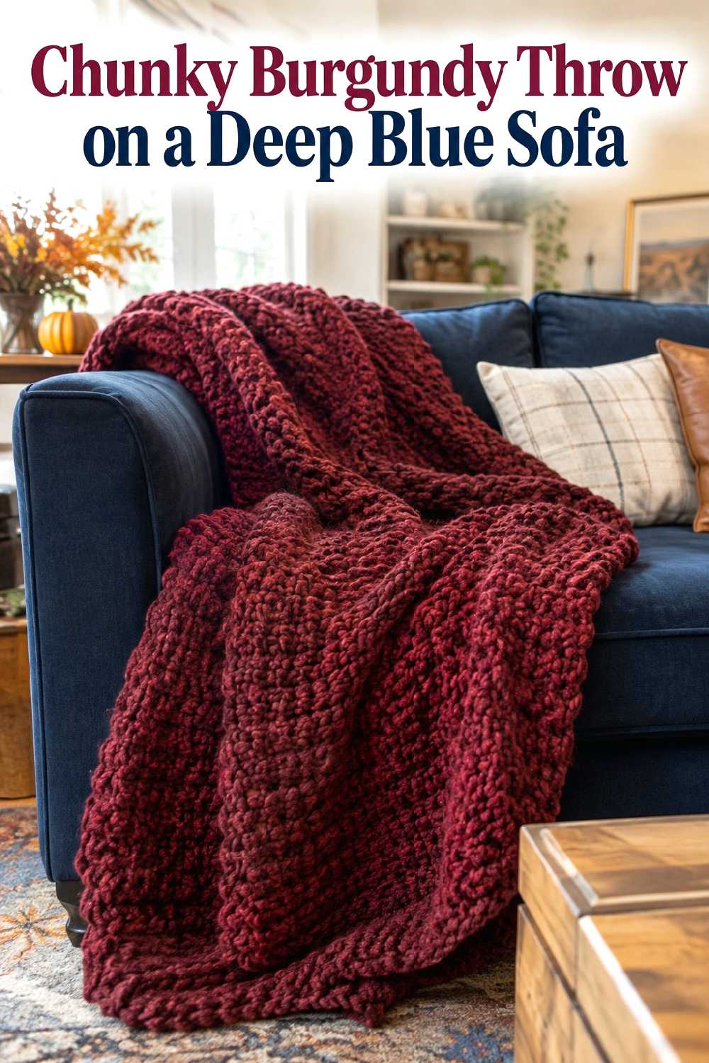
A burgundy crochet throw can become the strongest fall accent in a living room when the sofa is already navy or another deep blue. The colors are close enough in depth to feel cohesive, but burgundy introduces a warmer note that prevents a dark blue sofa from looking cool or flat during autumn.
Placement matters. Rather than covering most of the sofa, drape the throw over one arm or across a portion of the seat so the blue upholstery remains visible. That contrast is what makes the combination effective.
If the sofa is large, a substantial throw can hold its own visually. Keep nearby cushions simpler—cream, tan, or muted blue works well—so the crochet texture remains the main tactile feature instead of becoming one of several competing patterns.
2. Burgundy And Dusty Blue Cushion Mix
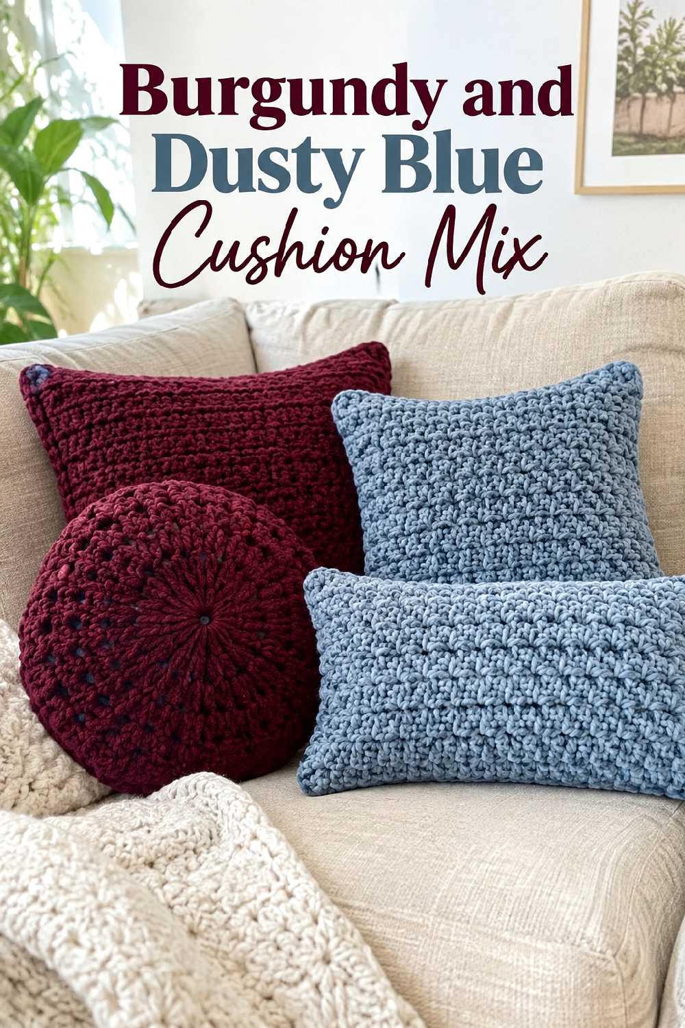
A cushion combination is one of the easiest ways to introduce both colors without committing a large area of the room to either one. Burgundy cushions bring depth, while dusty blue cushions create a softer transition into beige, cream, greige, or light gray upholstery.
For a standard sofa, the arrangement often looks calmer when one color appears more frequently than the other. For example, a pair of muted blue cushions with one burgundy crochet cushion creates a clear hierarchy instead of a strict alternating pattern.
This idea also works well when the sofa itself has noticeable texture. In that case, use fewer crochet cushions and allow some smooth fabric surfaces to remain visible. The goal is to create contrast between materials, not to cover the seating with equally strong textures.
3. Burgundy Basket With Blue Blanket Storage
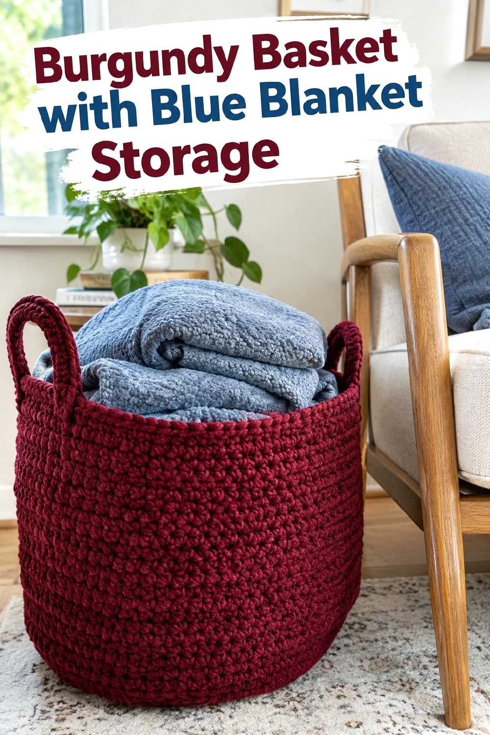
A crochet basket can make the burgundy-and-blue palette practical as well as decorative. A broad burgundy floor basket beside a sofa or armchair creates a strong warm accent while giving folded blue throws or cushions a defined place.
Scale is especially important here. A very small basket can look insignificant beside a sectional, while an oversized basket can interrupt walking space in a narrow room. Choose a visual size that relates to the nearby furniture and leaves the route around the seating area comfortable.
The combination works particularly well with oak, walnut, or neutral upholstery because the basket adds warmth without requiring another piece of furniture. Keeping the visible contents mostly blue also prevents the storage area from looking randomly multicolored.
4. Burgundy And Navy Dining Table Runner
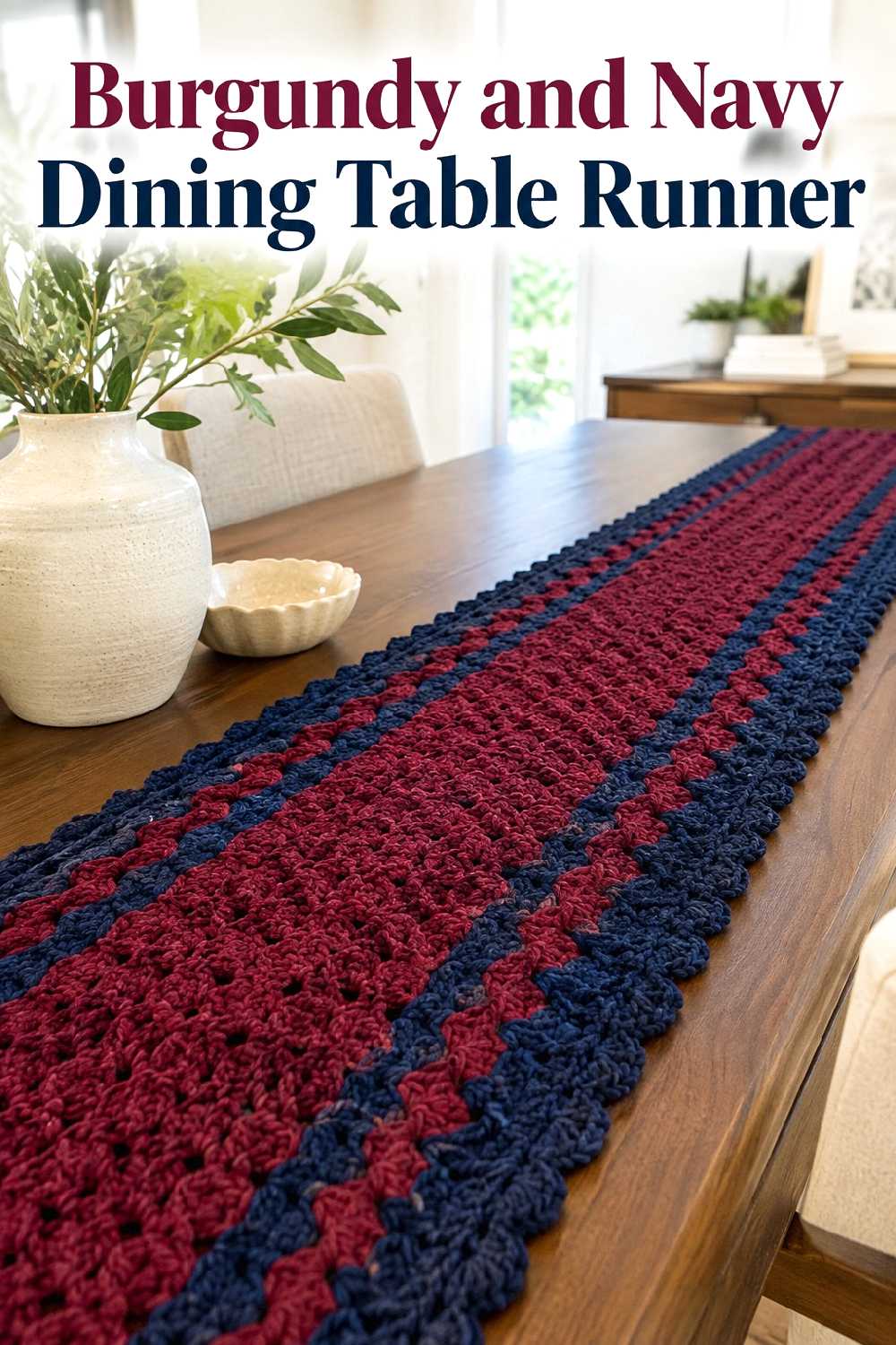
A burgundy-and-navy crochet table accent can bring the palette into a dining room without relying on wall decor or upholstered furniture. The darker colors naturally create a focal line along the table, which can make a simple dining setup feel more intentional for fall.
This works best when the rest of the tabletop is restrained. Cream ceramics, clear glass, warm wood, or matte neutral finishes allow the crochet texture to remain visible without creating a crowded centerpiece.
Consider the table itself when choosing the balance of color. Burgundy stands out beautifully against medium and dark wood, while navy can connect the table to blue dining chairs, a nearby rug, or artwork elsewhere in the room. Leaving some bare tabletop visible keeps the arrangement from feeling overly dressed.
5. Soft Blue Bed Throw With Burgundy Accents
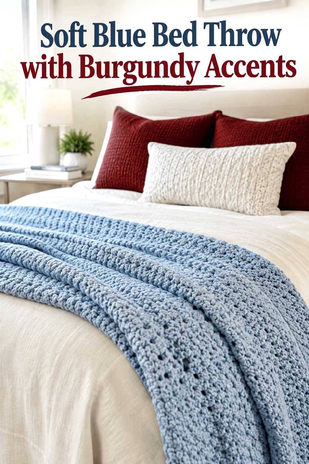
In a bedroom, reversing the color balance can create a quieter version of the palette. A soft blue crochet throw across the foot of the bed can provide the larger area of color, while burgundy appears only in smaller cushions or nearby decorative accents.
This arrangement is useful when you want an autumn atmosphere without making the bed look very dark. Ivory, warm white, oatmeal, or pale beige bedding can separate the two stronger colors and give the eye somewhere to rest.
Keep the blue throw concentrated at the lower portion of the bed rather than layering several textured pieces across the entire mattress. The burgundy accents then have more impact because they are not competing with excessive pattern or texture.
6. Burgundy Cushion On A Denim Blue Reading Chair

A single burgundy crochet cushion can be enough to shift a blue reading chair into a more seasonal direction. Denim blue is especially flexible because it is softer than navy and works easily with warm wood, cream walls, woven baskets, and brass or matte black lighting.
The chair should remain visually dominant. If the cushion is highly textured, avoid adding a second heavy throw, patterned rug, and decorative basket all in the same compact corner. One strong crochet accent usually gives a small reading area enough character.
A walnut or oak side table can help bridge the warm burgundy and cooler blue, making the whole corner feel connected rather than like two unrelated colors placed together.
7. Burgundy And Slate Blue Crochet Wall Accent
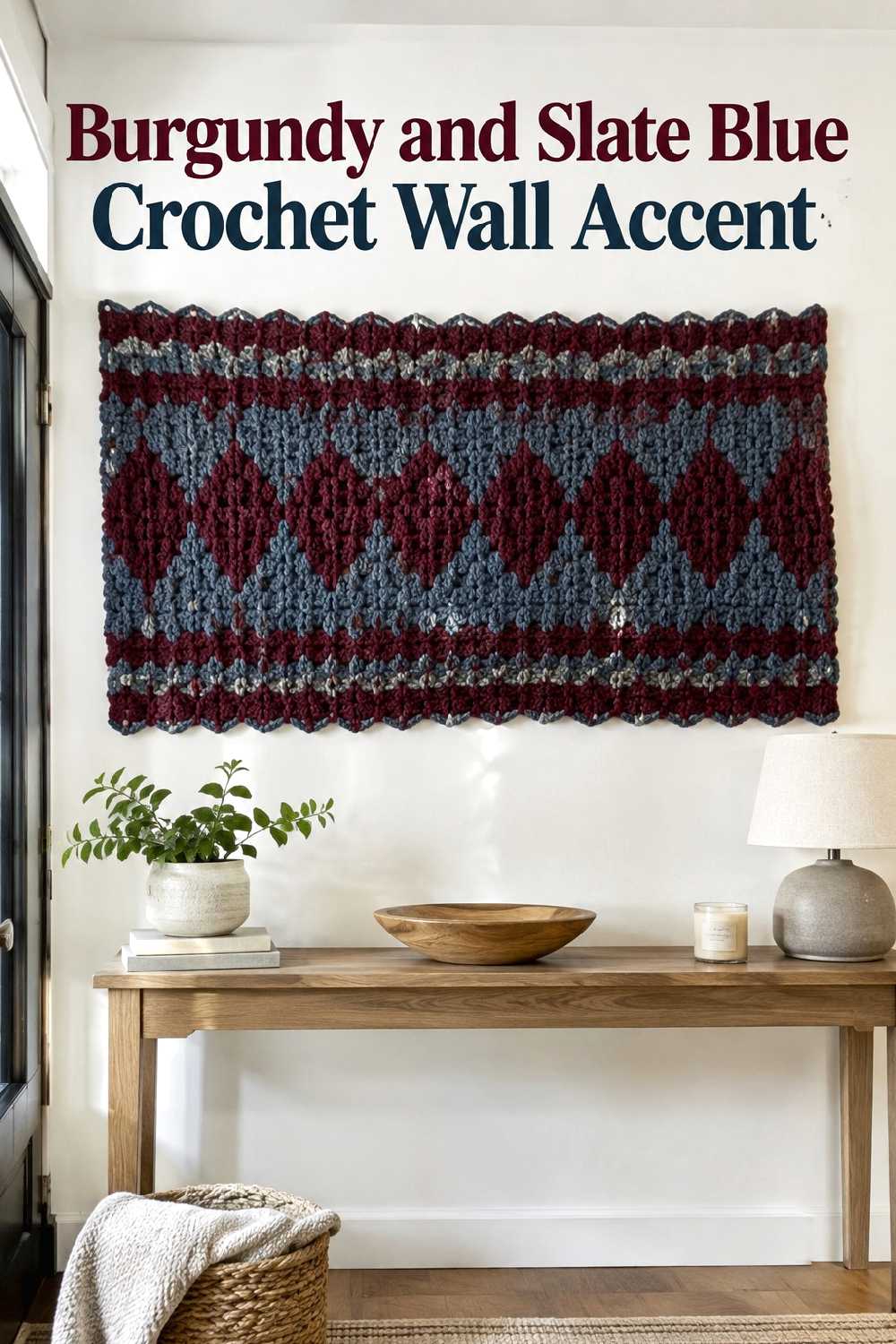
A crochet wall accent introduces the palette vertically, which can be useful when floor and furniture surfaces are already occupied. Muted burgundy combined with slate blue works especially well above a console, narrow bench, or low cabinet.
Proportion matters more than filling the wall. A very small piece may disappear above a wide console, while an oversized piece can make a narrow entryway feel crowded. Aim for enough visual presence to relate to the furniture beneath it while keeping generous blank wall around the piece.
Because wall crochet brings strong texture to eye level, keep the console styling simple. One lamp, a ceramic vessel, or a small stack of books may be enough. Too many textured objects underneath can weaken the wall accent’s focal-point role.
8. Navy Crochet Pouf Beside A Burgundy Chair
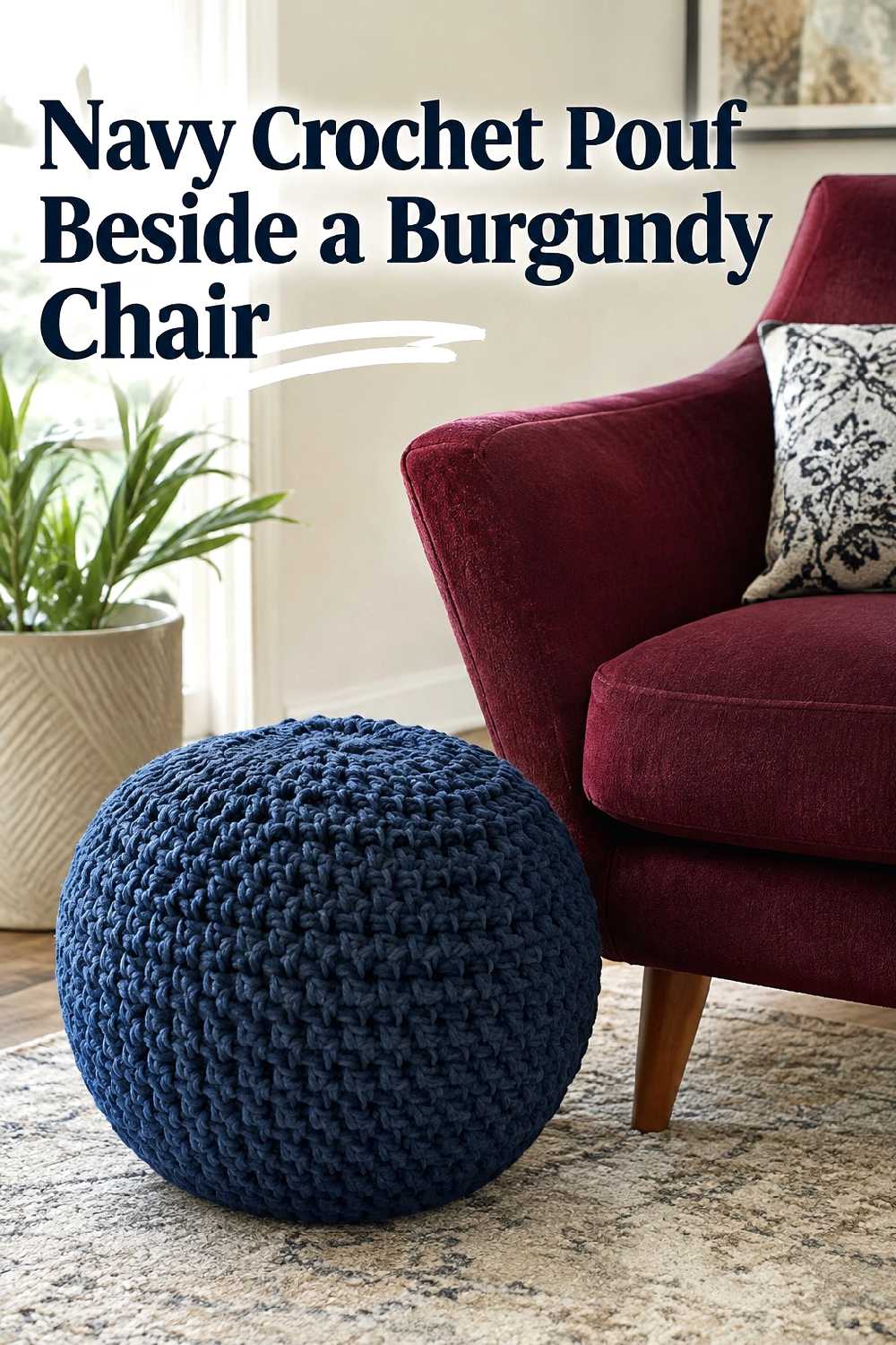
This pairing works by separating the colors across two objects rather than combining both shades on one textile. A navy crochet pouf beside a burgundy chair creates a clear relationship between warm and cool tones while giving each color enough space to read independently.
It is most successful in a room with a neutral rug or flooring, since a strongly patterned floor could compete with both pieces. Cream, taupe, or soft gray nearby upholstery can also help calm the combination.
Pay attention to visual weight. A substantial armchair needs a pouf that does not look tiny beside it, but the pouf should still leave comfortable circulation around the seating area. In compact rooms, keeping it slightly tucked toward the chair can preserve open floor space.
9. Burgundy And Blue Shelf Baskets
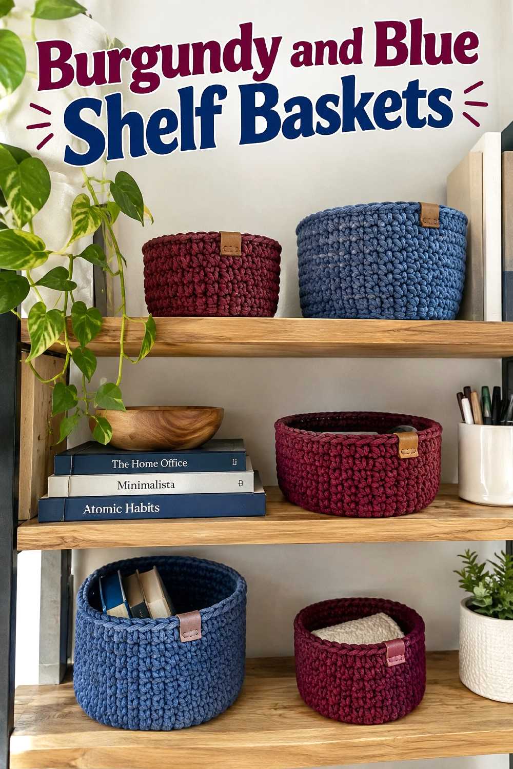
Smaller crochet baskets are a useful way to introduce fall color in a home office, craft room, living room shelving unit, or built-in storage area. Burgundy and blue can be repeated across several shelves while also containing everyday items that would otherwise contribute visual clutter.
The strongest arrangement is usually not perfectly symmetrical. Try repeating one burgundy basket and one or two blue baskets at different heights while leaving some shelves open or minimally styled.
Shelf depth matters. Bulky baskets that project far beyond a shallow shelf can make the storage look awkward, so keep the scale compatible with the furniture. Pairing the baskets with books, smooth ceramics, and wood gives the crochet texture contrast instead of surrounding it with equally busy objects.
10. Burgundy Throw On A Powder Blue Window Seat
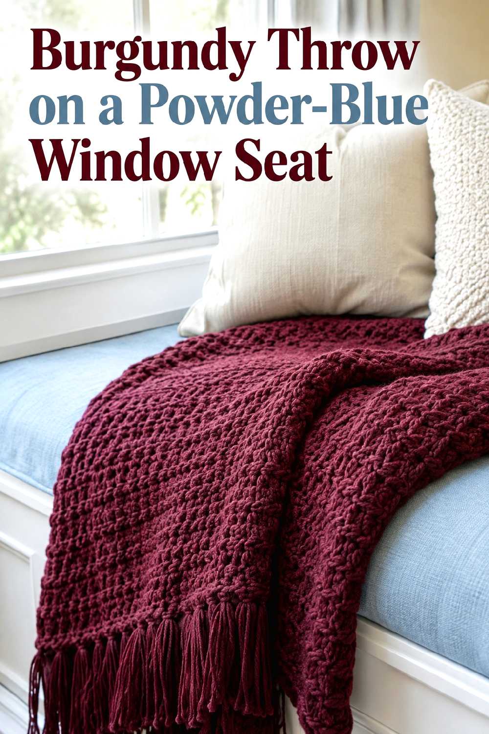
Powder blue gives burgundy a lighter, less formal personality. On a window seat, the contrast can make the burgundy crochet throw feel warm and seasonal while the blue upholstery keeps the area fresh in daylight.
This is especially effective in rooms where the window seat already acts as a visual feature. Fold or loosely drape the throw to one side so the blue remains a meaningful part of the composition rather than simply becoming a background color.
Cream cushions can bridge the contrast without introducing another dominant hue. If the view outside already provides strong autumn color, keeping the interior palette to burgundy, blue, and one neutral can prevent the window area from feeling overly decorated.
11. Blue Crochet Cushions With A Burgundy Throw
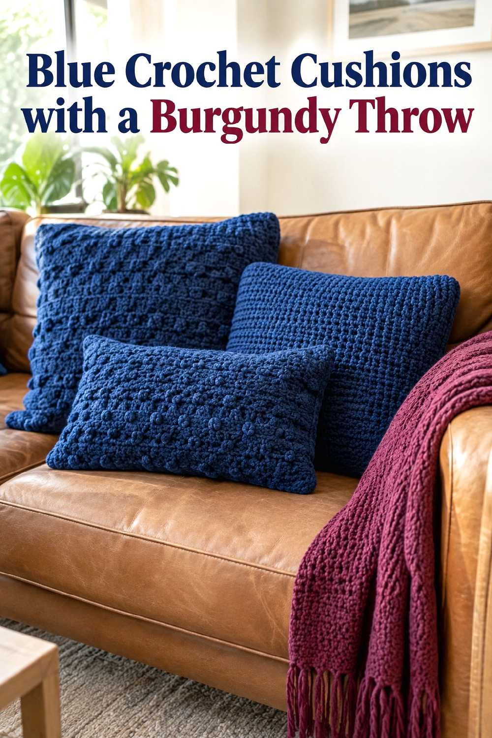
Camel or cognac leather creates an excellent middle ground between blue and burgundy because its warm brown tone supports both. A small group of blue crochet cushions on a leather sofa can cool the warmth slightly, while a burgundy throw restores seasonal richness.
The leather surface also offers useful material contrast: smooth upholstery makes the crochet texture more noticeable without needing a large number of decorative pieces.
Avoid covering too much of the sofa. The leather is part of what makes the combination successful, so leave substantial sections exposed. A cream or faded neutral rug can help keep the seating area from becoming too dark, particularly if both the blue and burgundy accents are deep shades.
12. Burgundy Entry Bench With Navy Cushions
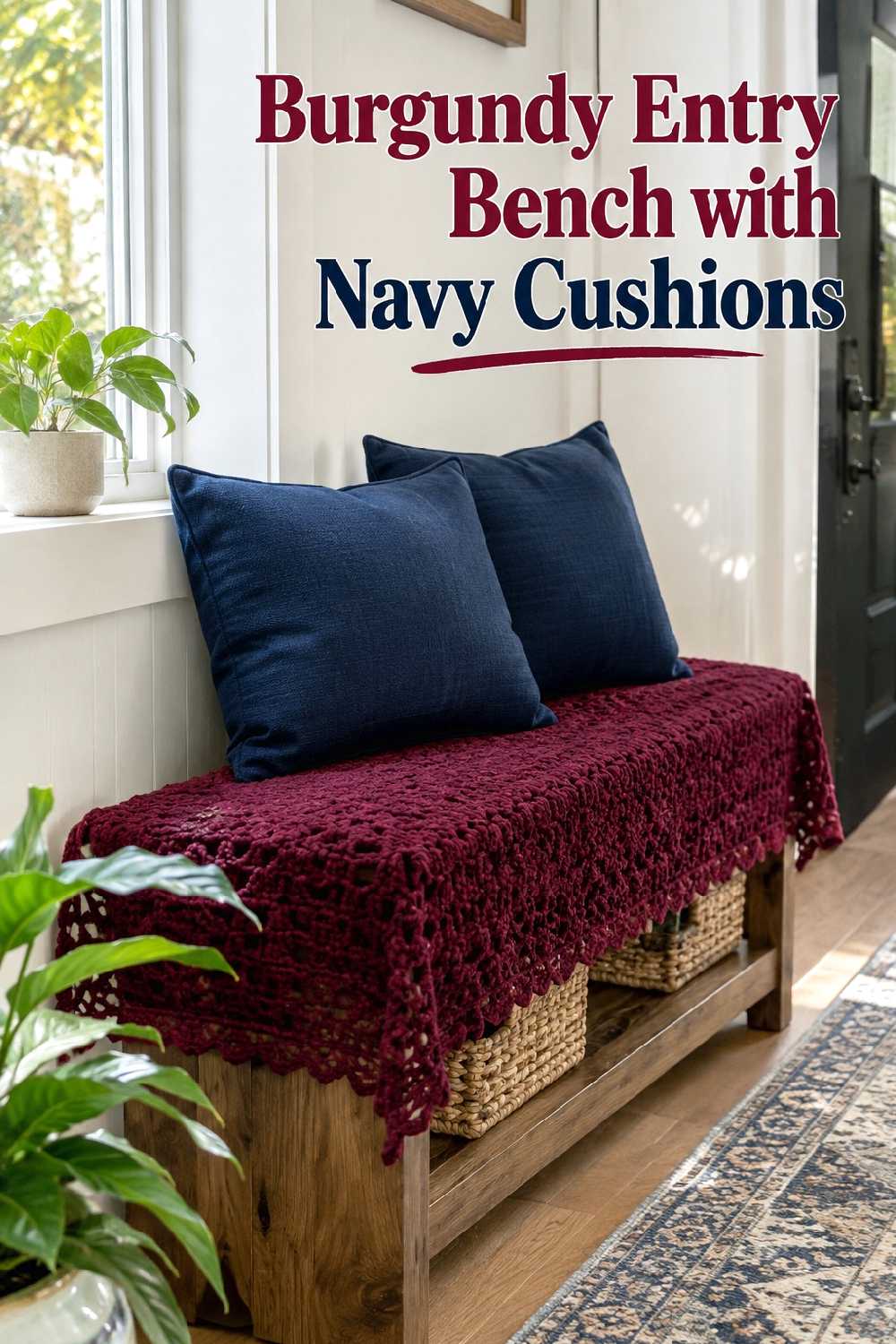
An entryway is a good place to use stronger fall color because the decor is seen in shorter moments than in a main living area. A burgundy crochet accent across a bench combined with navy cushions can establish the seasonal palette immediately inside the home.
Function should still come first. Keep enough of the bench clear for sitting, setting down a bag, or handling shoes rather than covering the entire surface with textiles.
If the entry is narrow, avoid adding a matching floor basket simply to repeat the colors. Instead, echo blue or burgundy in a small wall feature or nearby artwork. Repetition at different heights can connect the palette without sacrificing valuable floor space.
13. Navy And Burgundy Nursery Chair Accent
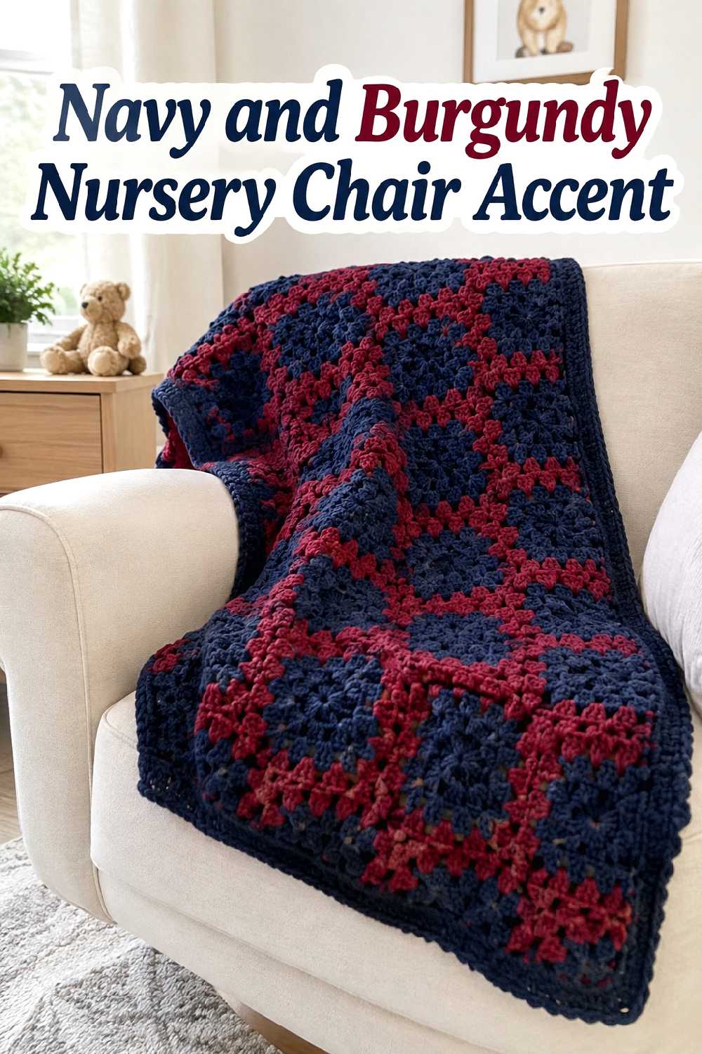
Burgundy and navy can work in a nursery or family room when they are used in small doses against a light background. A cream or beige chair with one navy-and-burgundy crochet accent creates more depth than an entirely pastel palette without making the room feel visually heavy.
For this setting, surrounding color is important. Warm white walls, pale wood, soft beige rugs, and restrained accessories give the deeper shades space to breathe.
Keep the crochet element as a visual accent rather than layering several dark textiles around the chair. One concentrated piece can connect to blue or burgundy elsewhere in the room while preserving the lighter, calmer atmosphere that usually benefits a smaller nursery.
14. Burgundy And Blue Mantel Accents
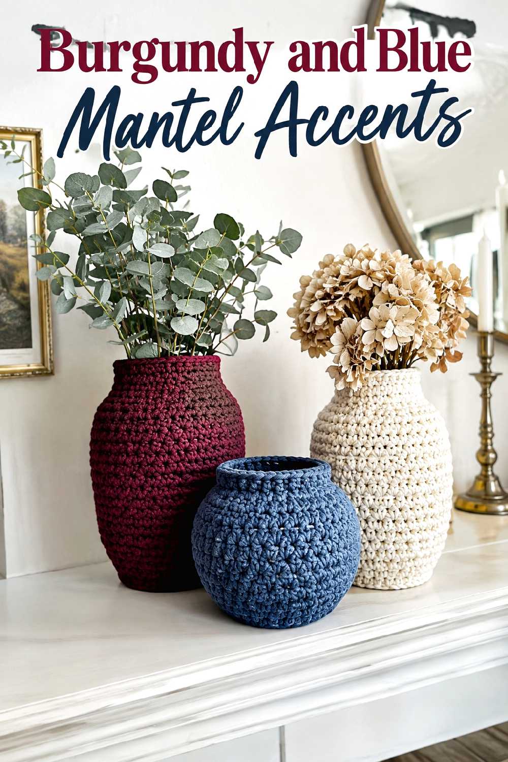
A mantel allows burgundy and blue to appear in smaller decorative doses. Crochet-covered decorative vessels or similarly compact textile accents can create a seasonal focal point without requiring a full room color change.
Vary height rather than filling the entire mantel edge to edge. Three concentrated accents at different levels can feel more intentional than many small pieces spread evenly across the shelf.
The wall above the fireplace also matters. If there is already large artwork or a mirror, keep the mantel colors restrained so the two focal layers do not compete. Cream ceramics, natural branches, or simple wood details can soften the transition between rich burgundy and deep blue while still leaving the crochet texture visible.
15. Navy Floor Basket With Burgundy Cushions
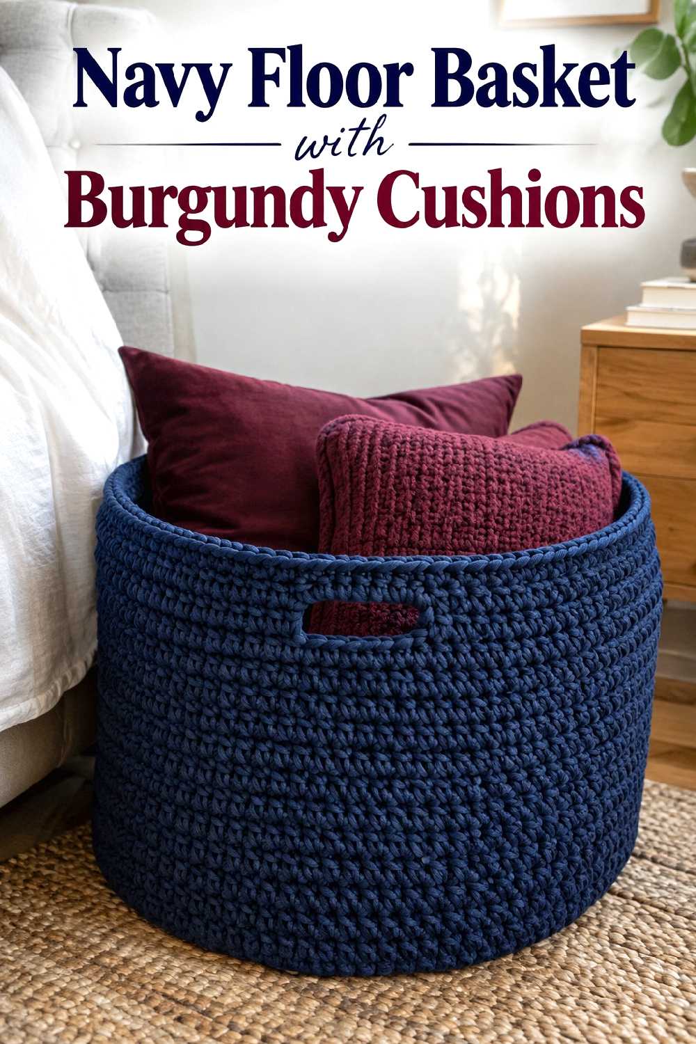
A navy floor basket filled with one or two burgundy cushions makes a useful bedroom or guest-room accent because the strong colors remain contained within one zone. The basket creates the larger block of cool color, while the burgundy contents add warmth and contrast.
This works especially well in an otherwise neutral bedroom where adding both shades directly to the bed might feel excessive. Placing the basket in an open corner, near a bench, or beside a dresser can distribute color around the room without interrupting the main bedding.
Leave some negative space around the basket. A tightly packed corner filled with a floor lamp, plant, side table, and storage can make even attractive crochet decor feel like clutter.
16. Burgundy Lumbar Cushion On A Blue Bed
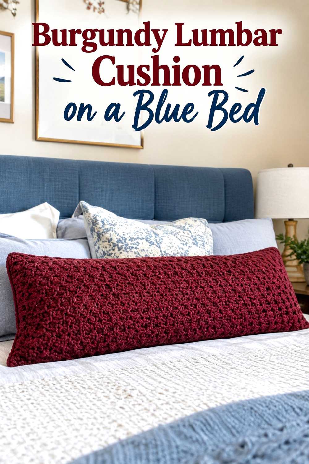
A long burgundy crochet cushion can create a clean focal point on a bed with blue upholstery or a blue headboard. Instead of arranging many small cushions, one elongated accent introduces the fall color in a simpler, more contemporary way.
The idea works particularly well when the headboard already carries substantial visual weight. A large cluster of decorative pillows could compete with it, while one burgundy cushion provides contrast without hiding the blue.
Use lighter bedding between the two colors if the room lacks abundant daylight. Ivory, warm white, or pale beige can prevent the combination from becoming too dense. Repeating burgundy once elsewhere—perhaps in a small bedside object—can make the accent feel intentional without turning the room into a strict two-color scheme.
17. Burgundy And Blue Breakfast Nook Accent
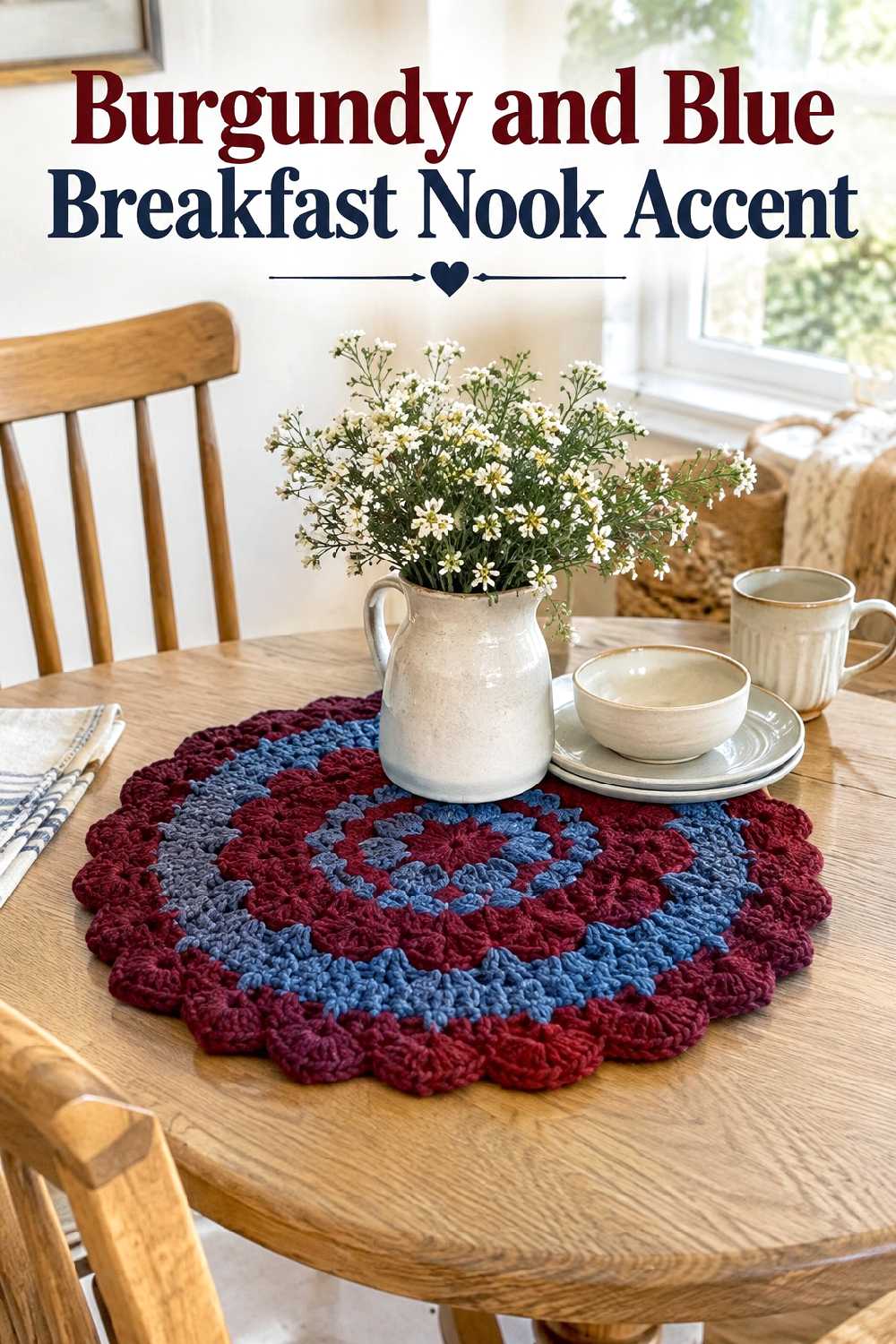
A breakfast nook gives you a smaller surface on which to experiment with the palette. A burgundy-and-muted-blue crochet table accent can introduce seasonal color while preserving the casual character of the space.
Because breakfast tables tend to be used frequently, keep the textile proportionate and easy to work around. A compact central accent often makes more sense than covering most of the tabletop, especially on a small round table.
Oak chairs, cream dishes, and warm white walls can soften both colors. If the nook already contains patterned seat cushions or curtains, choose a quieter crochet color arrangement so the table does not become another competing pattern zone.
18. Burgundy And Blue Covered Porch Layers
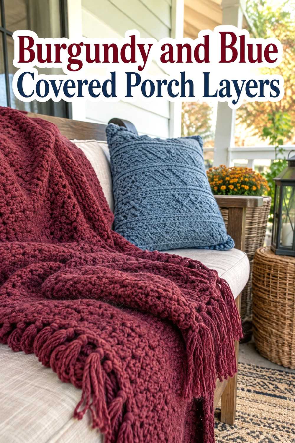
A covered porch or protected seating area can carry richer fall color without changing the main interior. A burgundy crochet blanket paired with a muted blue cushion gives a wood or neutral bench an autumn look that feels less predictable than an all-rust palette.
Natural wood, wicker, stone, and cream upholstery are especially useful around these colors because they connect the cool blue and warm burgundy through earthy neutrals.
Keep the arrangement edited. One blanket and one or two cushions can be enough on a small bench. Larger seating can support more scale, but repeating crochet on every chair may make the porch feel visually busy. Let some of the wood or neutral upholstery remain exposed so the seasonal textiles have a clear role.
Keeping Burgundy and Blue Balanced
When both colors are deep, the room needs lighter or smoother areas around them. Warm white walls, beige upholstery, natural wood, cream bedding, and uncluttered tabletops can prevent burgundy and navy from visually closing in a room.
In a compact room, choose one main crochet accent and one smaller color echo rather than distributing burgundy and blue across every surface. A larger room can support repetition, but the colors still look more intentional when they appear in a few clearly connected zones.
Texture deserves the same restraint as color. If a crochet throw is the main feature, nearby cushions do not all need equally strong texture. Smooth linen, leather, plain cotton, ceramic, wood, and stone can make the crochet elements look more distinctive.
What to Avoid
Avoid using equal amounts of dark burgundy and dark navy everywhere. Without lighter breaks, the room can lose definition, especially when natural light is limited.
Also be careful about combining heavily textured crochet with several patterned rugs, ornate curtains, tufted furniture, and busy wall decor in the same area. Crochet already contributes a strong tactile layer, so simplifying adjacent surfaces often produces a clearer result.
Scale is another common issue. Tiny burgundy accents can disappear beside oversized blue furniture, while large floor baskets or poufs may interrupt movement in narrow rooms. Match the visual weight of each crochet piece to the furniture and available space around it.
Finally, do not feel obligated to repeat both colors in every corner. A burgundy focal point in one zone and a quieter blue reference elsewhere can be enough to connect the room.
FAQs
Do burgundy and blue work together for fall decor?
Yes. Burgundy brings warmth and seasonal depth, while blue introduces a cooler counterpoint. Navy creates a richer, darker combination, while dusty blue, slate blue, or denim can make the palette feel softer and easier to use in lighter rooms.
What neutral colors work best with burgundy and blue crochet decor?
Warm white, cream, oatmeal, beige, camel, and natural wood tones are useful because they give the stronger colors visual breathing room. Soft gray can also work, particularly with slate or denim blue, though warmer neutrals generally help burgundy feel more integrated.
Can I use burgundy and blue in a small room?
Yes, but limit the number of strong accents. One burgundy crochet throw with a smaller blue cushion, or one blue basket containing a burgundy textile, may be enough. Keeping the surrounding surfaces light and relatively simple can help the room feel open.
Should burgundy or blue be the main color?
Either can lead. A navy sofa with a burgundy throw creates a blue-dominant room, while neutral furniture with several burgundy accents and one muted blue piece shifts the balance toward burgundy. Choosing a clear dominant color usually looks calmer than using equal amounts of both everywhere.
Does this color combination work with wood furniture?
It can work especially well with wood. Walnut and darker woods support the richness of burgundy, while oak and lighter woods can soften both shades. Wood also provides a natural visual bridge between warm burgundy and cooler blue.
How many crochet accents should be used in one room?
There is no fixed number, because room size and existing texture matter more. In a small room, one or two purposeful accents may be sufficient. Larger rooms can support several pieces if they are distributed thoughtfully and balanced with smoother materials and open space.
How can I keep burgundy and navy from making a room too dark?
Use them as concentrated accents rather than covering every large surface. Cream bedding, warm white walls, light rugs, natural wood, and open areas of upholstery can break up the darker colors. A lighter blue such as denim, slate, or dusty blue can also reduce the overall visual weight.
Where should I start if I already have a mostly neutral room?
Begin with one useful piece in the area you notice most—a sofa throw, cushion, floor basket, or bed accent. Choose either burgundy or blue as the stronger color, then repeat the second color once nearby. This gives you a chance to judge the balance before adding more texture.
Conclusion
Burgundy and blue work best for fall when one shade leads and the other provides contrast. Start with the room’s largest existing colors and furniture, then choose a crochet accent with enough scale to look intentional. Deep navy and burgundy can create a richer mood, while dusty, denim, or slate blue keeps the combination lighter. Whatever direction you choose, allowing neutral surfaces and simpler textures around the crochet pieces will help the palette feel balanced rather than crowded.