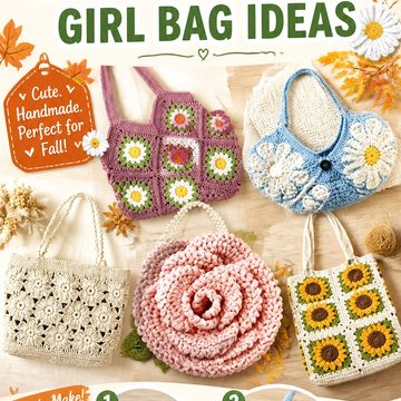
Chartreuse and black make an unusually strong fall pairing. Black can ground a project and sharpen its outline, while chartreuse brings the acidic green-yellow contrast that keeps the combination from feeling like a standard dark autumn palette.
The 23 ideas below cover wearables, bags, cold-weather accessories, home projects, and seasonal decor. The supporting tutorials establish the construction and finished form; they are not all originally shown in chartreuse and black. Treat the two colors as an adaptation plan, and confirm the creator’s yarn, gauge, sizing, and construction details before making substitutions.
For some projects, alternating the two shades is the main design feature. For others, a mostly black or mostly chartreuse fabric with the second color restricted to borders, motifs, cuffs, or trim will produce a clearer finished shape.
Quick List
- Chartreuse-and-Black Basketweave Crochet Scarf
- Chartreuse-and-Black Granny-Stitch Crochet Beanie
- Chartreuse-and-Black Floral Granny Square Crochet Cardigan
- Chartreuse-and-Black Checkered Crochet Sweater Vest
- Chartreuse-and-Black Motif Crochet Vest
- Chartreuse-and-Black Cropped Crochet Sweater
- Chartreuse-and-Black Two-Square Crochet Tote
- Chartreuse-and-Black Crochet Crossbody Bag
- Chartreuse-and-Black Openwork Crochet Market Bag
- Chartreuse-and-Black Crochet Cowl
- Chartreuse-and-Black Crochet Bucket Hat
- Chartreuse-and-Black Full-Finger Crochet Gloves
- Chartreuse-and-Black Cable Crochet Leg Warmers
- Chartreuse-and-Black Crochet Balaclava
- Chartreuse-and-Black Twisted Crochet Ear Warmer
- Chartreuse-and-Black Granny Square Crochet Mug Cozy
- Chartreuse-and-Black Loopy Texture Crochet Pillow
- Chartreuse-and-Black Granny Square Crochet Blanket
- Chartreuse-and-Black Autumn Leaf Crochet Garland
- Chartreuse-and-Black Lace Crochet Table Runner
- Chartreuse-and-Black Crochet Bat Plush
- Chartreuse-and-Black Pumpkin Crochet Coasters
- Chartreuse-and-Black Crochet Bandana
Decide Where the Contrast Should Do the Work
Chartreuse and black have enough contrast that color placement can affect how a project’s shape is perceived. Checkerboards, granny squares, stripes, borders, and repeated motifs make good places to use both colors at similar strength because the construction already breaks the surface into defined sections.
Highly textured projects need a different approach. Basketweave, cables, loops, and other raised surfaces can become visually busy when texture and frequent color changes compete. In those cases, consider making one shade dominant and placing the second along an edge, cuff, brim, stripe, or smaller accent area.
Wearables also need to be considered while they are on the body rather than only while lying flat. A black border can visually frame a chartreuse garment, while chartreuse cuffs or neckline trim can bring the brighter color closer to the face and hands.
Check Yarn Behavior Before Committing to the Palette
Changing color does not automatically mean changing yarn type. For the cleanest adaptation, compare the two yarns for weight, fiber content, thickness, twist, and behavior after washing or blocking. A dense black yarn and a soft, lofty chartreuse yarn can produce uneven motifs even when their labels place them in the same broad weight category.
This matters especially for fitted accessories and garments. Make a useful swatch before replacing the tutorial yarn, and check the blocked fabric rather than relying only on its appearance directly off the hook. For granny-square projects, compare the blocked dimensions of several motifs before producing the full quantity.
Bags and decor have different priorities. A tote may benefit from fabric that resists excessive stretching, while a scarf or sweater normally needs more comfortable drape. Let the finished use guide the substitution rather than assuming the same yarn choice will suit all 23 projects.
Plan Black and Chartreuse Before You Start Repeating Motifs
Two-color projects can still look unbalanced when the color distribution is improvised halfway through. For granny squares, checkerboards, garlands, or blankets, sketch the basic arrangement or place a few completed components together before committing to the full project.
Black makes a useful visual separator. It can surround chartreuse motifs, form joins, outline edges, or create negative space between brighter areas. Chartreuse works well when you want selected motifs or sections to attract attention first.
Also consider yarn tails before planning many rapid color changes. A design that looks simple on paper may create substantial finishing work when every small section switches shades. Larger blocks of color can preserve the same high-contrast effect with less interruption.
1. Chartreuse And Black Granny Stitch Crochet Beanie
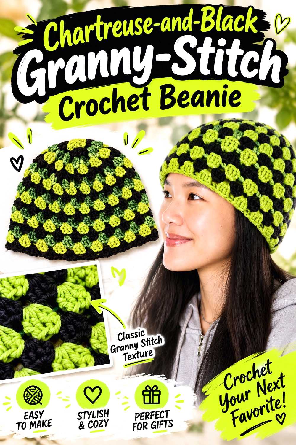
The open spacing and repeating clusters of a granny-stitch beanie give you several natural places to alternate color without needing complicated colorwork. VivCrochets’ 2026 tutorial demonstrates a granny-stitch beanie that can be made in solid or multiple colors and can be finished with or without a brim.
A black crown moving into chartreuse sections is one option, while a black brim around a chartreuse-and-black body gives the bottom edge more visual definition.
The Brim Can Anchor a Bright Crown
Chartreuse near the face is highly noticeable. If you want the color combination to be wearable with more outfits, reserving black for the brim creates a dark frame between the bright yarn and the face.
If you prefer the stronger statement, reverse the arrangement and use chartreuse at the brim. Test the combination against the coats and jackets you expect to wear with it.
Watch the Color Transition Around the Seam
Round-based projects can reveal exactly where a new shade begins. That is especially noticeable with two colors this different.
Before committing to frequent changes, look at the tutorial’s joining area and decide whether you are comfortable making the transition a visible design feature. Fewer, broader color sections can make the shift less dominant.
Creator Credit: VivCrochets
2. Chartreuse And Black Floral Granny Square Crochet Cardigan
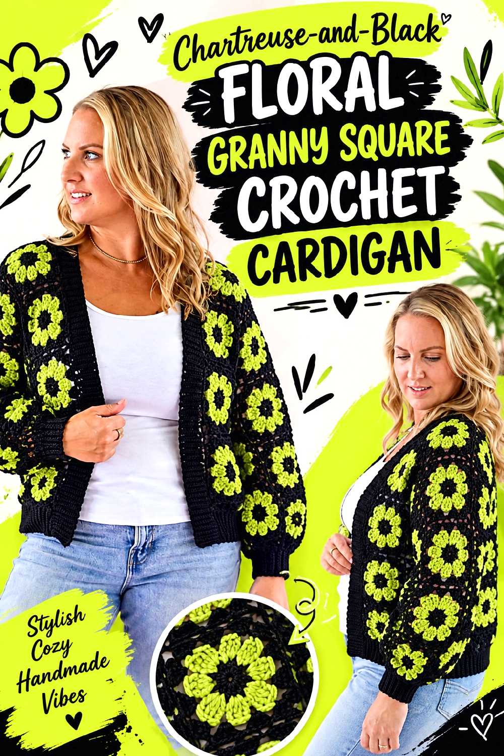
A floral granny-square cardigan gives chartreuse and black much more room for deliberate motif planning. Bella Coco’s cardigan tutorial uses floral granny squares assembled into a full garment, so the motif layout matters alongside ordinary garment fit.
For this palette, black can frame chartreuse-centered flowers, or chartreuse can become the outer motif color with black flowers scattered across the garment.
Decide Which Part of the Flower Should Recede
Black generally recedes visually while chartreuse moves forward. A chartreuse center surrounded by black can make each flower read as a small bright point, whereas chartreuse outer rounds create a much more continuous green surface.
Make at least a few sample squares in different color orders and place them edge to edge. A square that looks balanced alone can feel very different once it is repeated across an entire cardigan.
Fit Depends on More Than the Number of Squares
When adapting a motif garment, do not assume that using the same motif count with different yarn will preserve the fit. The blocked size of each square affects panel dimensions, sleeve width, shoulder placement, and overall garment scale.
Confirm your blocked motif measurements and compare them with the tutorial’s sizing information before producing the full set.
Keep the Join Part of the Color Plan
The joining area can either disappear into the motifs or form a visible grid. Black joins can give a chartreuse-heavy cardigan a stronger graphic framework, while chartreuse joins across darker motifs create a brighter patchwork effect.
Choose this before assembly rather than treating the join as an afterthought.
Creator Credit: Bella Coco
3. Chartreuse And Black Checkered Crochet Sweater Vest
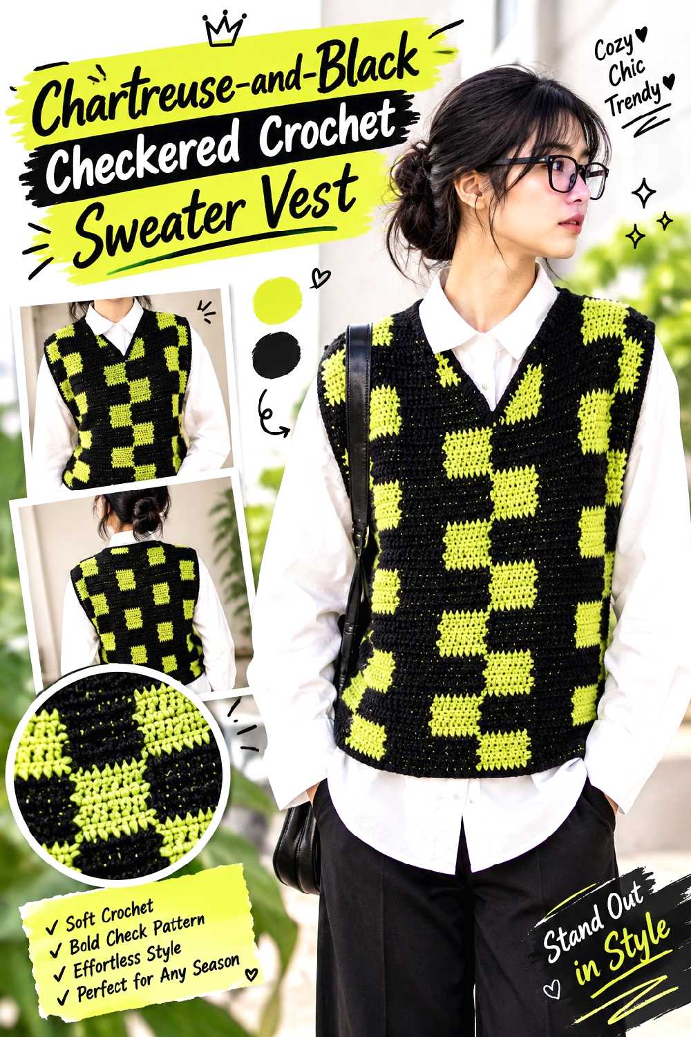
Few constructions suit chartreuse and black as naturally as a checkerboard vest. Crochet by Bev’s tutorial demonstrates a black-and-light checker motif in a sleeveless sweater-vest format, making it particularly straightforward to reinterpret the lighter squares in chartreuse.
The result would be one of the most graphic projects in this collection, so it works well when you want the color combination to remain unmistakable.
Checker Size Controls How Loud the Contrast Feels
Large blocks create a bold, obvious checkerboard. Smaller repeats produce more visual movement and can make the surface feel busier.
Follow the creator’s construction rather than changing the repeat casually, but consider the scale carefully when choosing yarn and size. A yarn substitution that changes gauge can also change how large the checks appear on the body.
Black Ribbing Can Give the Pattern a Boundary
When a checkerboard reaches every edge, the garment can feel visually restless. A dark neckline, armhole edge, or hem can provide separation between the pattern and the clothing underneath.
If you adapt the tutorial this way, check how the finishing sections are constructed before assigning colors so you know how much of each shade needs to remain available.
Creator Credit: Crochet by Bev
4. Chartreuse And Black Motif Crochet Vest
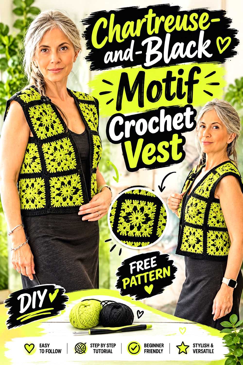
A motif vest gives the palette a more decorative alternative to the strict checkerboard. Goccias’ 2026 tutorial builds a vest around repeated crochet motifs, creating natural opportunities to vary centers, borders, and joins.
This option suits crocheters who like chartreuse and black but want the colors broken into individual decorative units rather than large geometric blocks.
Alternate Motifs Only After Checking Their Visual Weight
Not every chartreuse motif needs a matching black motif. If the chartreuse sections are much brighter, an equal numerical split can still look chartreuse-dominant.
Lay several finished motifs together in the approximate front-panel arrangement. You may prefer mostly black motifs with selected chartreuse highlights rather than a strict one-for-one alternation.
Shoulder Placement Deserves Extra Attention
The most dramatic motif does not automatically belong at the shoulder. Motif direction, seams, and the way the garment sits on the body can change how a shape looks once worn.
Compare the front, back, and shoulder arrangement in the tutorial before deciding which color should occupy the most prominent positions.
Creator Credit: Goccias
5. Chartreuse And Black Cropped Crochet Sweater
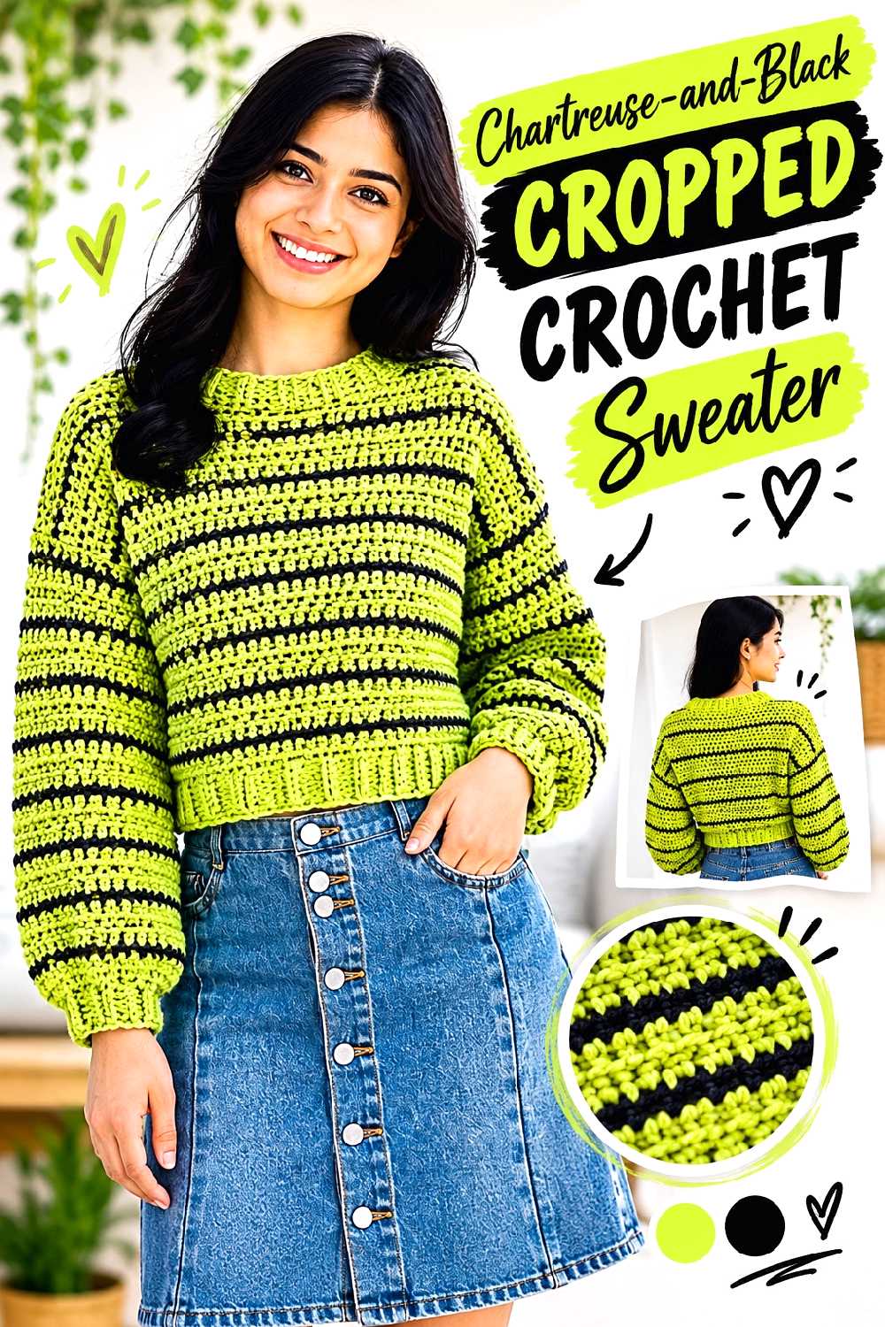
A cropped pullover provides much larger uninterrupted areas of color than the motif garments. For The Frills’ sweater construction uses separate body and sleeve sections with an adjustable-length approach, producing a boxy pullover with defined ribbed finishing.
Instead of striping the entire sweater, consider a chartreuse body with black cuffs, collar, and hem, or a black body with chartreuse sleeves.
Use the Ribbing to Make the Color Scheme Look Deliberate
Garment edges are natural places for the second color because they already mark a structural transition. Black ribbing around a chartreuse sweater can create a crisp frame without interrupting the main body fabric.
A chartreuse collar and cuffs on a black sweater do the opposite: they concentrate the brighter shade at the face and hands.
Swatch for Drape Before Choosing the Dominant Shade
A color substitution sometimes comes with a yarn substitution. That can make a boxy sweater hang very differently even if the gauge initially appears close.
Check both gauge and drape. If the fabric becomes too rigid, the sweater may project away from the body instead of falling as intended.
Check the Cropped Length With Your Actual Wardrobe
Before finishing the body, compare the intended length with the trousers, skirts, dresses, or shirts you expect to layer underneath. The right crop point is a styling decision as much as a pattern measurement.
Use the creator’s adjustment guidance rather than guessing how many rows to remove or add.
Creator Credit: For The Frills
6. Chartreuse And Black Two Square Crochet Tote
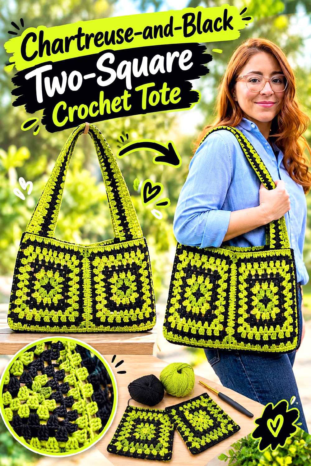
A tote made from large square components turns the two-color palette into broad graphic surfaces. Brunaticality’s tutorial uses a two-square bag construction and includes finishing considerations such as lining and closure details.
You could crochet one square primarily black and the other chartreuse, or use both shades within each panel for a tote that looks different from the front and back.
Decide Whether the Two Panels Should Match
Identical panels make the bag feel more formal and symmetrical. Different front and back color arrangements create more variety without changing the bag construction.
If you choose different designs, make sure the completed squares still match in blocked dimensions before assembly.
Lining Changes How the Crochet Fabric Behaves
A lining can reduce how much the bag body stretches and can also affect how open stitchwork looks. A dark lining behind chartreuse openings produces a very different visual result from a chartreuse or neutral lining.
Check the tutorial’s finishing method before deciding whether lining is part of your version, especially if you intend to carry small items.
Creator Credit: Brunaticality
7. Chartreuse And Black Crochet Crossbody Bag
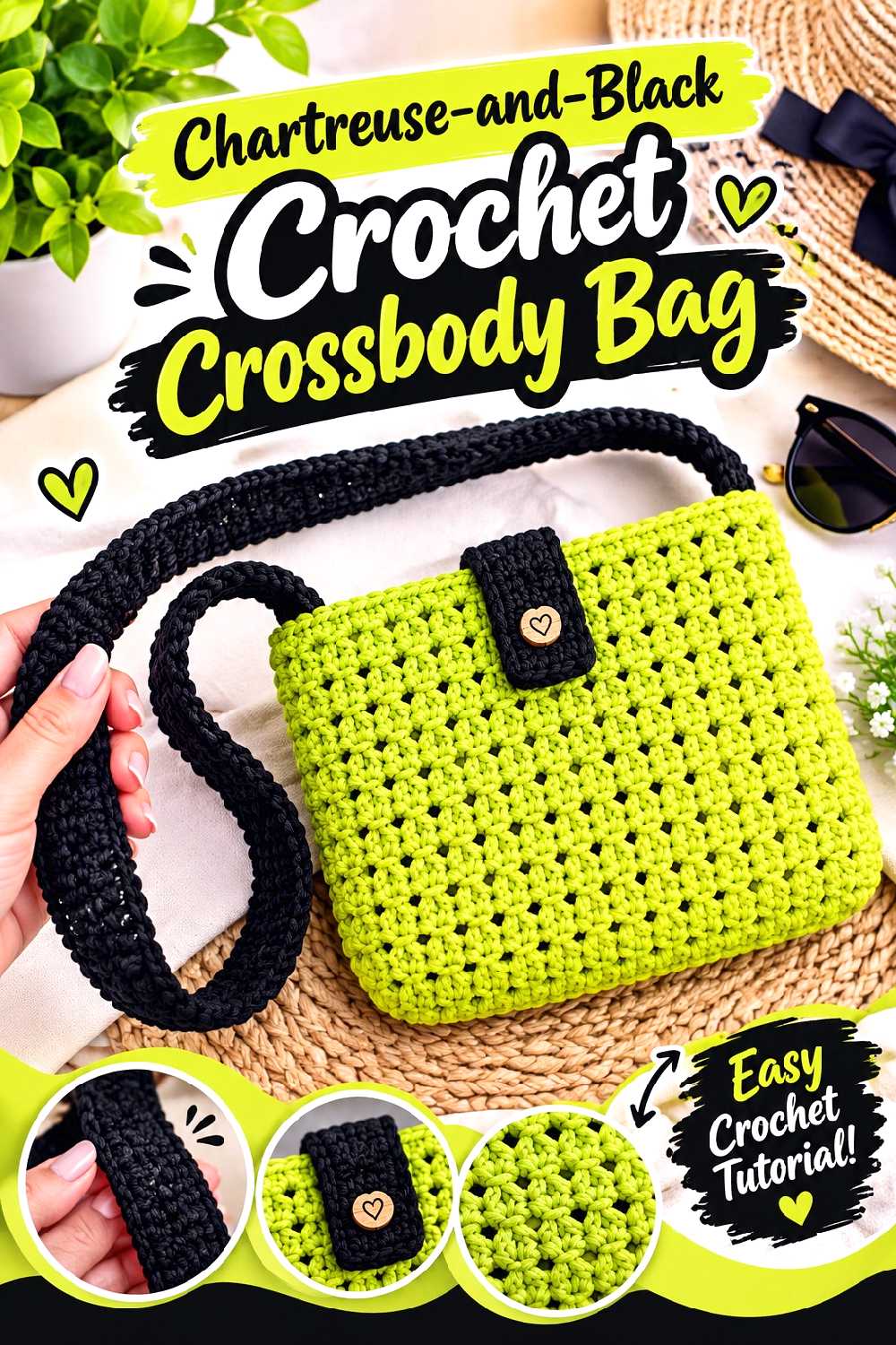
A compact crossbody bag is useful when you want the color combination in a smaller, more controlled dose. ViVi Berry Crochet demonstrates a complete crossbody-bag construction that can serve as the structural base for a black-and-chartreuse adaptation.
Because the bag sits against clothing, its strap and edge colors become nearly as important as the bag body.
Test Strap Length Before Final Attachment
A crossbody bag may sit at the waist, hip, or lower depending on the strap. Those positions change which part of an outfit forms the background behind chartreuse.
Follow the tutorial’s construction, but test the finished strap position on the intended wearer before making permanent finishing decisions when the design allows.
A Dark Strap Can Make the Bag Easier to Style
A black strap visually connects well with dark jackets, denim, and outerwear while leaving chartreuse concentrated on the bag body.
If you make the strap chartreuse instead, it becomes a major vertical line across the outfit. That can be effective, but it makes the bright shade much more prominent.
Creator Credit: ViVi Berry Crochet
8. Chartreuse And Black Openwork Crochet Market Bag
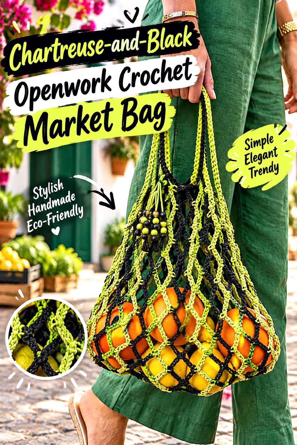
An openwork market bag offers a completely different use for the same palette. Home Handwork Diy’s 2026 tutorial demonstrates an open net-style shopping bag with integrated handles and color changes.
Black and chartreuse can alternate through the open fabric, or black can reinforce the visual outline around a brighter body.
Open Fabric Makes the Contents Part of the Color Story
Unlike a dense tote, a market bag allows whatever is inside to show through. A chartreuse mesh filled with dark items will look much more contrasted than the same bag when empty.
Keep this transparency in mind when judging your swatch. The color effect cannot be assessed accurately against only a white work surface.
Give the Handles Their Own Design Role
Handles experience different visual and practical demands from the body. A black handle can make the top edge feel more grounded and may show everyday discoloration differently from a very bright shade.
Whatever color you choose, follow the tutorial’s handle construction and reinforcement guidance rather than changing its structure only for appearance.
Creator Credit: Home Handwork Diy
9. Chartreuse And Black Crochet Cowl
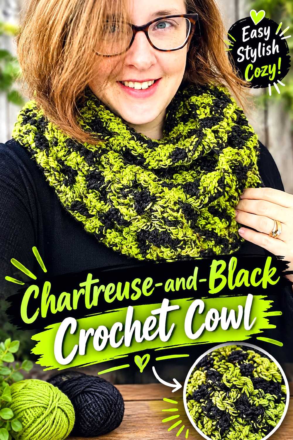
A cowl concentrates the palette close to the face while avoiding the long hanging ends of a scarf. Rich Textures Crochet’s project uses an open, textured cowl construction that can be wrapped for a different look and level of coverage.
This makes it useful for broad horizontal color bands rather than constant alternating stripes.
Think About Which Color Will Sit Closest to the Face
If the cowl wraps more than once, the color sequence will overlap. A chartreuse section placed at one end may become much more visible than expected once the cowl is arranged.
Drape a two-color yarn sample around the neck before committing to a long sequence so you can see which shade dominates in the worn position.
Open Texture Needs Contrast Without Visual Clutter
Open stitches already create dark and light spaces through the fabric. Heavy striping can add another layer of contrast that competes with those openings.
A mostly solid body with a contrast section may make the stitch structure clearer than alternating every small section.
Creator Credit: Rich Textures Crochet
10. Chartreuse And Black Crochet Bucket Hat
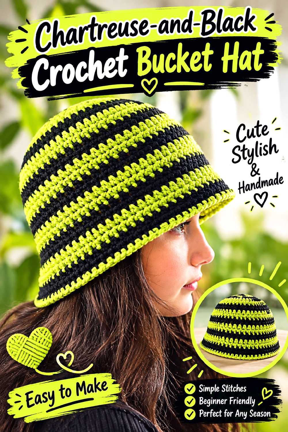
A bucket hat moves the palette away from winter-only styling and works well during the transitional weeks of fall. Sirin’s Crochet demonstrates the complete rounded crown, sides, and brim of a simple crochet bucket-hat form.
A black crown with a chartreuse brim is especially graphic, while narrow chartreuse sections against a mostly black hat feel more restrained.
The Brim Has More Visual Impact Than Its Size Suggests
The brim forms the outer silhouette of the hat, so a color change there can completely alter the finished look. Chartreuse makes the outer edge highly visible; black pulls attention back toward the crown.
Choose the brim color after considering the jacket or hairstyle most likely to be worn with the hat.
Check Fit Before Adding Decorative Color Changes
Color placement should not distract from fit. A hat that is too loose or tight will not be corrected by a strong border.
Follow the creator’s sizing method and test the crown and side depth before treating the brim as the finishing color statement.
Creator Credit: Sirin’s Crochet
11. Chartreuse And Black Full Finger Crochet Gloves
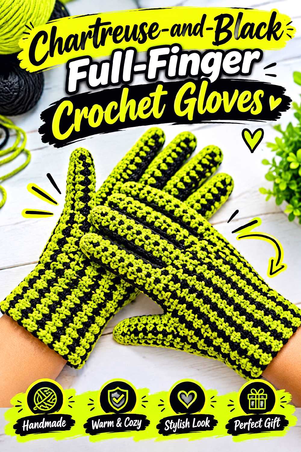
Full-finger gloves are one of the more functional cold-weather projects in the collection. Bag-O-Day Crochet’s tutorial demonstrates full-finger crochet gloves rather than the more common fingerless format.
For chartreuse and black, a dark hand with bright cuffs or bright fingers creates contrast without requiring the entire glove to be neon.
Small Color Changes Become Very Noticeable on Fingers
Because each finger is narrow, frequent striping can look much busier than it would on a scarf. Consider keeping the hand and fingers mostly one shade and using the second at the cuff or selected details.
This also reduces the number of color transitions in small working areas.
Fit Matters at Every Finger
Do not assume that a glove fitting around the palm guarantees that the fingers will feel right. Yarn thickness, tension, and individual hand proportions can affect comfort.
Use the tutorial’s fitting guidance and check the developing glove on the intended hand rather than relying on appearance alone.
Creator Credit: Bag-O-Day Crochet
12. Chartreuse And Black Cable Crochet Leg Warmers
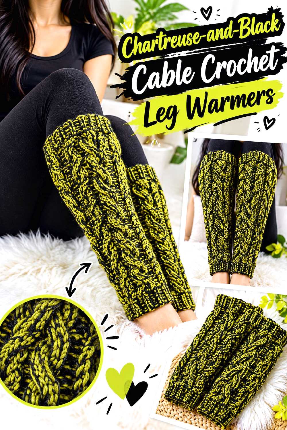
Cable texture gives the palette a heavier autumn feel without needing a full garment. TCDDIY’s 2026 tutorial uses prominent crochet cables across a pair of leg warmers.
Black can emphasize shadow around the cable texture, while chartreuse makes the raised structure much more conspicuous.
Avoid Hiding the Cable Under Excessive Striping
A cable is most effective when the eye can follow its path. Rapid changes from black to chartreuse can interrupt that line.
One approach is to make the cable-dominant area one color and reserve the second shade for the upper and lower sections. Another is to use broad color blocks that do not split the cable too frequently.
Test Stretch Around the Calf
A leg warmer must accommodate movement and the intended layer underneath. A yarn that feels acceptable in a flat swatch may behave differently around the calf.
Before making a second matching piece, check how the first fits with the footwear and clothing you expect to pair with it.
Creator Credit: TCDDIY
13. Chartreuse And Black Crochet Balaclava
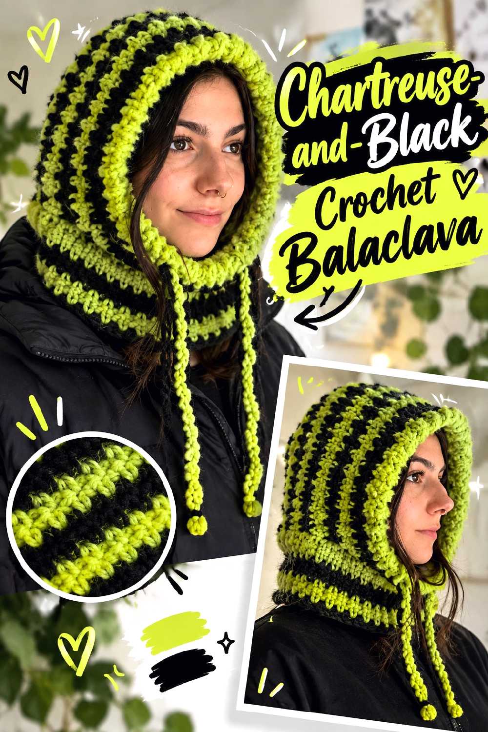
A balaclava gives this palette its strongest cold-weather streetwear option. Natalie’s tutorial uses a made-to-measure approach with face and lower-edge finishing plus a drawstring detail.
Black can keep the main hood neutral while chartreuse highlights the face opening or lower edge; reversing that scheme produces a much brighter statement.
Face-Opening Color Changes Carry Extra Weight
Any bright border around the face becomes a focal point. If that is the effect you want, chartreuse edging is an efficient way to introduce the color without making the entire hood bright.
For a quieter look, use black at the opening and move chartreuse to the drawstring, lower ribbing, or another less central area.
Made-to-Measure Still Requires Checking the Fabric
Personal measurements are only part of the fit equation. Stretch and yarn behavior determine how closely the balaclava conforms to the head and face.
Use the same yarn and tension for your measurement sample that you intend to use in the finished piece, particularly if switching from the tutorial materials.
Creator Credit: Natalie
14. Chartreuse And Black Twisted Crochet Ear Warmer
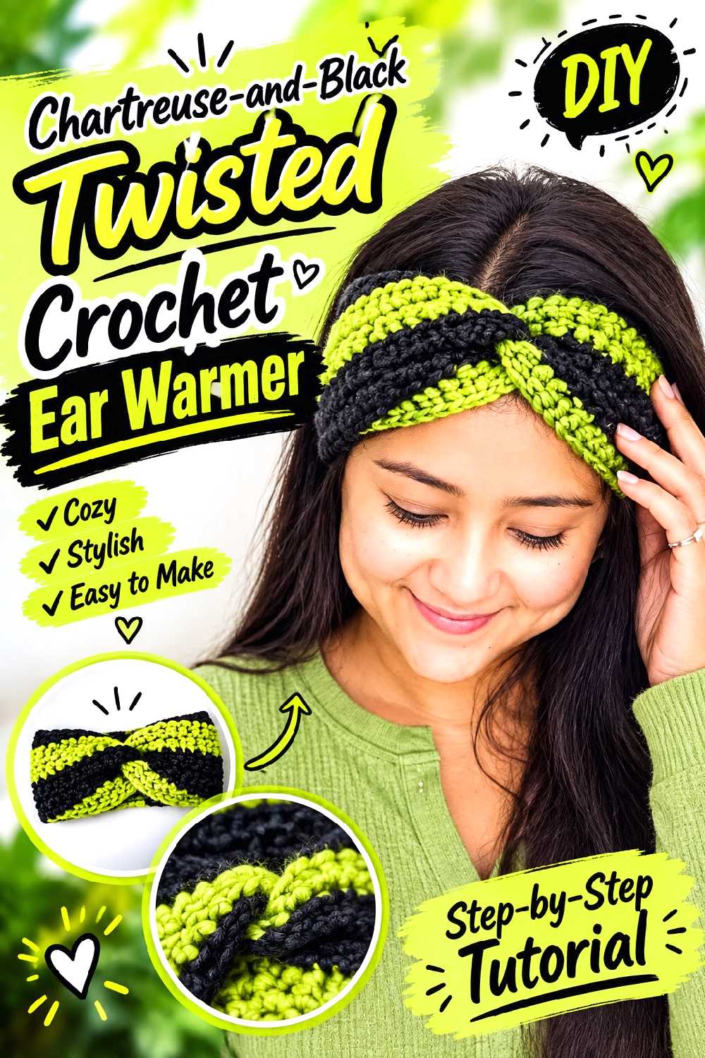
A twisted ear warmer offers cold-weather coverage without committing to a full hat. The Knotty Lace’s tutorial uses a wide band with knit-like texture and a central twist, with sizing guidance for multiple head circumferences.
Because the twist gathers the fabric, a two-color arrangement can produce interesting overlap at the center.
Put the Color Change Where the Twist Will Not Muddle It
If black and chartreuse meet directly inside the twisted join, the center may look more complex than expected. Decide whether you want that intersection to be a focal point or whether the twist should remain one solid shade.
A mostly chartreuse band with black edges is another way to preserve the texture while keeping the contrast controlled.
Stretch Is More Important Than Flat Length Alone
An ear warmer needs enough stretch to sit comfortably without slipping. Changing yarn can alter that even when the starting dimensions appear similar.
Check the intended wearer’s head measurement and test the fabric’s stretch before finishing the twist and seam.
Creator Credit: The Knotty Lace
15. Chartreuse And Black Granny Square Crochet Mug Cozy
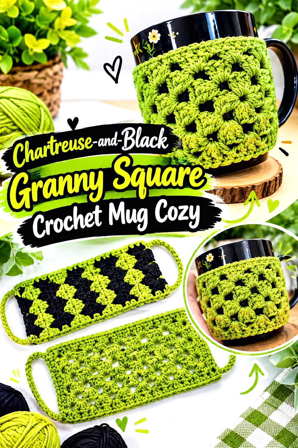
A mug cozy is a small-scale way to test the palette before committing to a garment or blanket. Katia Creates’ tutorial uses a granny-square-based mug cozy with extensions that wrap around the cup.
A black granny-square border with chartreuse inside gives the motif a framed look, while the reverse makes the entire cozy appear brighter.
Check the Cup Instead of Assuming a Universal Fit
Mugs vary greatly in circumference, height, handle shape, and handle placement. A cozy that fits one mug neatly may cover too much of another or interfere with the handle.
Use the tutorial’s construction as intended, but compare the developing piece with the specific mug you plan to use.
Keep Heat-Related Claims Out of the Yarn Choice
A crocheted mug cozy can add grip and decoration, but yarn color does not indicate heat resistance or suitability for contact with very hot surfaces.
Check the yarn manufacturer’s care information and use the project only in a way appropriate to the materials and the creator’s intended design.
Creator Credit: Katia Creates
16. Chartreuse And Black Loopy Texture Crochet Pillow
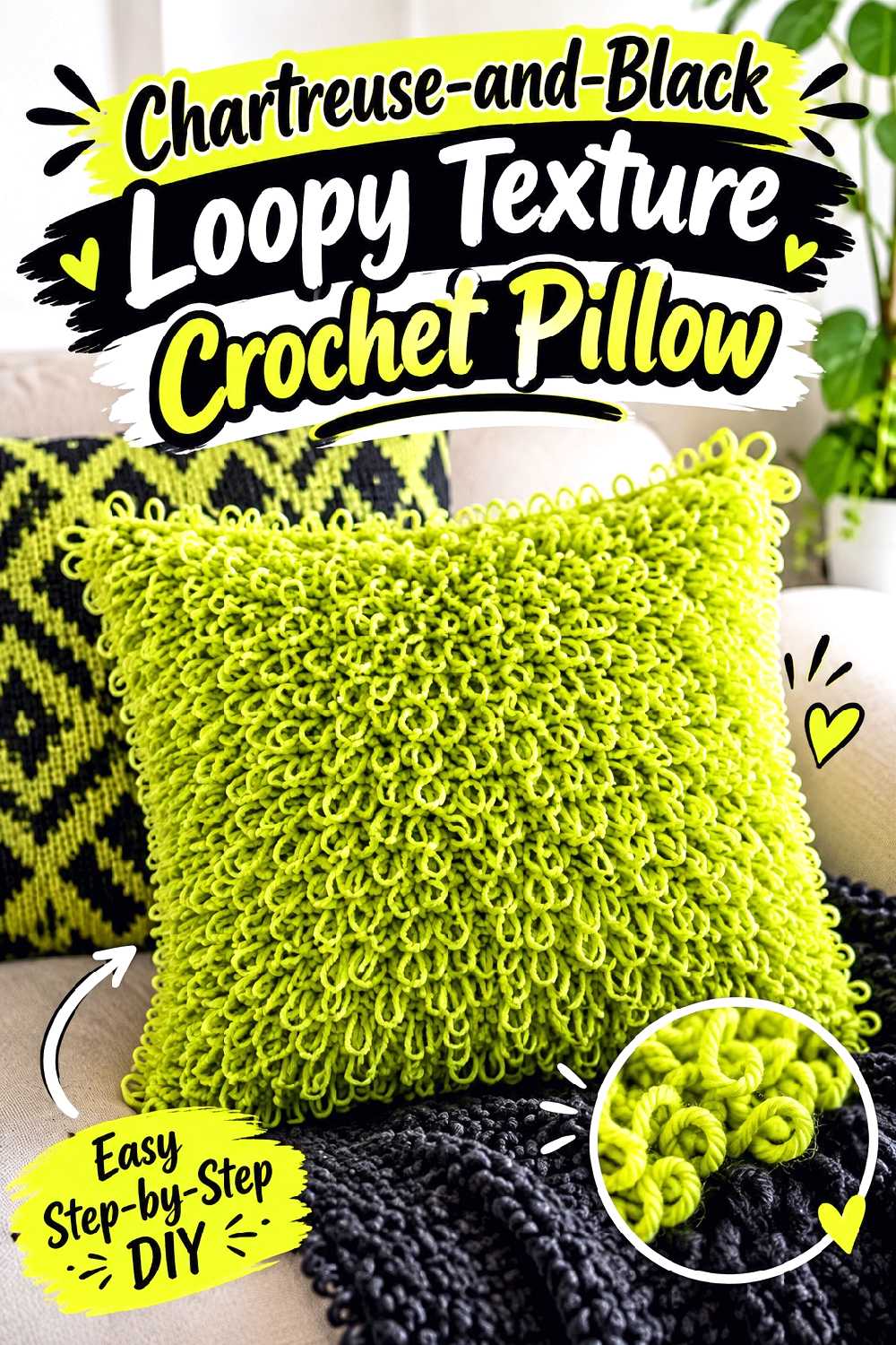
A loopy pillow is an opportunity to make chartreuse and black tactile as well as graphic. MJ’s Off The Hook Designs uses pronounced looped texture in a removable pillow-cover format.
The loops can make a solid color appear more dimensional, so you do not need equal amounts of both shades to create interest.
Use Contrast to Separate Texture Zones
If every loop changes color frequently, the surface may become difficult to read. A chartreuse textured front paired with darker edging or backing keeps the loop work prominent.
You could also create broader black and chartreuse zones, letting the loops soften the transition between them.
Consider the Room Before Choosing the Dominant Shade
A full chartreuse pillow will command attention even in a colorful room. A mostly black pillow with a chartreuse textured panel is easier to mix with existing fall decor.
Place your yarn samples near the sofa, chair, or bedding where the finished cover will be used before deciding the proportion.
Creator Credit: MJ’s Off The Hook Designs
17. Chartreuse And Black Granny Square Crochet Blanket
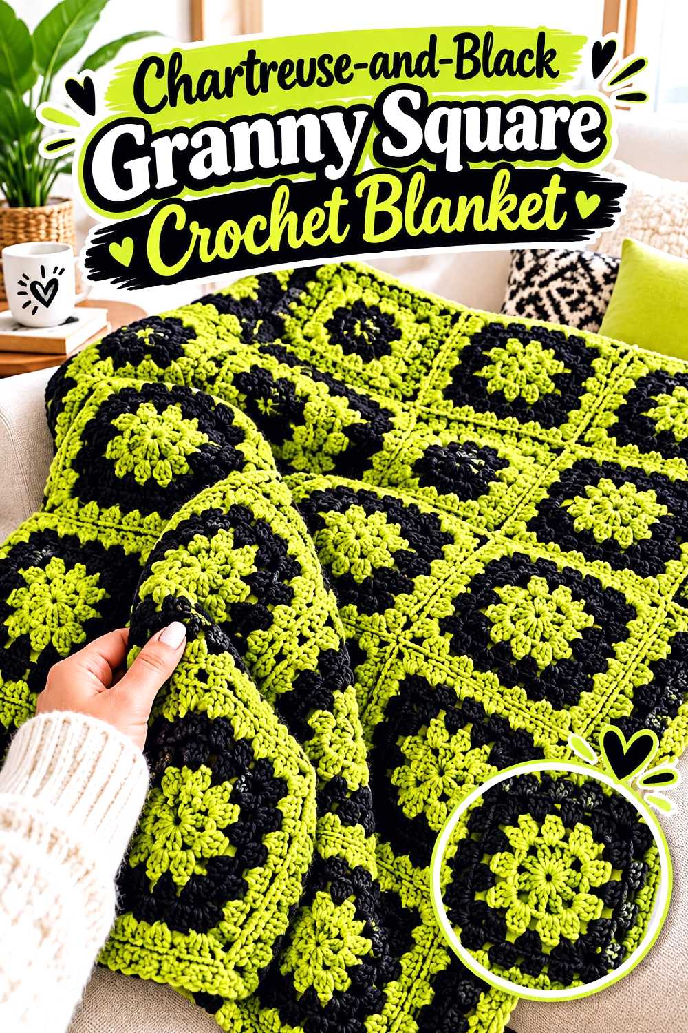
A granny-square blanket turns the palette into a larger repeating system. Danii’s Ways demonstrates the process of making granny-square components, joining them, and finishing the blanket edge in a complete video tutorial.
With only chartreuse and black, the main design decision is not the number of colors but how frequently each one appears.
Avoid Accidental Clusters in the Layout
When many separate squares are assembled, several chartreuse-dominant motifs can accidentally gather in one part of the blanket.
Arrange the entire motif grid before joining. Photograph it from above if possible; the reduced view makes uneven color concentrations easier to notice.
A Consistent Outer Round Can Unify Mixed Squares
If individual squares use chartreuse and black in different proportions, giving each one the same outer color can make the full blanket feel more organized.
Black creates the stronger grid effect. Chartreuse produces a brighter network between the motifs. Decide which role matters more before completing all the outer rounds.
Test the Join Color Before Assembly
The join can become a significant percentage of the visible blanket surface. Place two finished squares together with strands of each possible join color between them and compare.
That small test is easier to reverse than discovering halfway through assembly that the join overwhelms the motifs.
Creator Credit: Danii’s Ways
18. Chartreuse And Black Autumn Leaf Crochet Garland
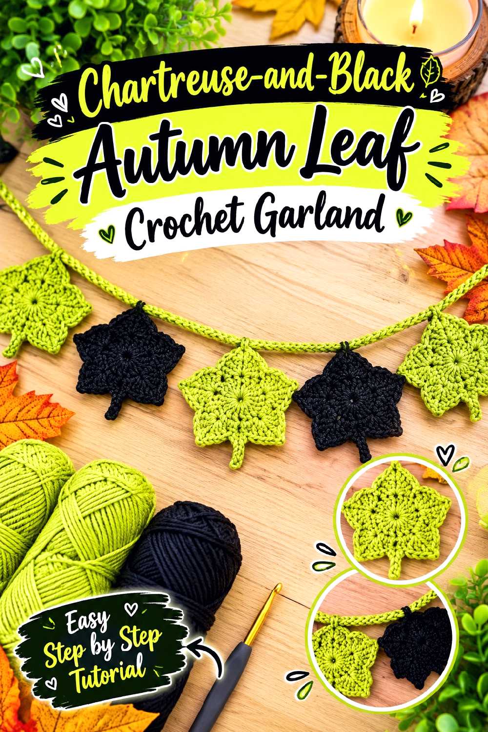
Autumn leaves do not have to stay in orange, rust, and brown. Hibouchoucaillou’s tutorial demonstrates crochet autumn leaves and shows them assembled into a fall garland.
Chartreuse leaves mixed with black ones create a more modern Halloween-adjacent display while preserving the recognizable leaf silhouette.
Alternate Shape and Color, Not Just Color
If every leaf is identical except for shade, the strand can feel highly repetitive. Where the tutorial allows, think about spacing and orientation as part of the visual rhythm.
You can also group several chartreuse leaves between black separators rather than alternating every single motif.
Mock Up the Garland at Its Display Location
A garland designed on a worktable may look too dense or too sparse once stretched across a mantel, shelf, doorway, or wall.
Arrange the finished leaves temporarily at the intended location before securing the final spacing. Black motifs can disappear against a dark background, so the room itself affects the balance.
Creator Credit: hibouchoucaillou
19. Chartreuse And Black Lace Crochet Table Runner
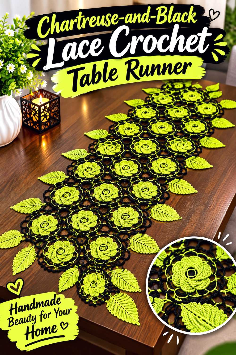
A lace-style table runner lets the table surface show through the crochet, which makes black and chartreuse interact with the furniture underneath. Tutorial Crochet demonstrates a full lace-motif table-runner project in a public video.
This is one of the stronger home-decor choices if you want the palette to look graphic without filling an entire surface with solid crochet.
Consider the Table Color Before Assigning Black
Black lace can nearly disappear on a black or very dark tabletop, while chartreuse will remain highly visible. On a light table, the opposite happens: black outlines the lace sharply.
Place small swatches on the actual surface before deciding which shade should form the central area and which should act as the accent.
Flatness Matters More Than Dramatic Texture
A table runner needs to sit cleanly under decor or table settings. If your yarn substitution changes the fabric enough to create rippling or bulky edges, the color combination will not compensate for the structural issue.
Check tension regularly and use appropriate blocking for the chosen fiber if the project and yarn care instructions support it.
Creator Credit: Tutorial Crochet
20. Chartreuse And Black Crochet Bat Plush
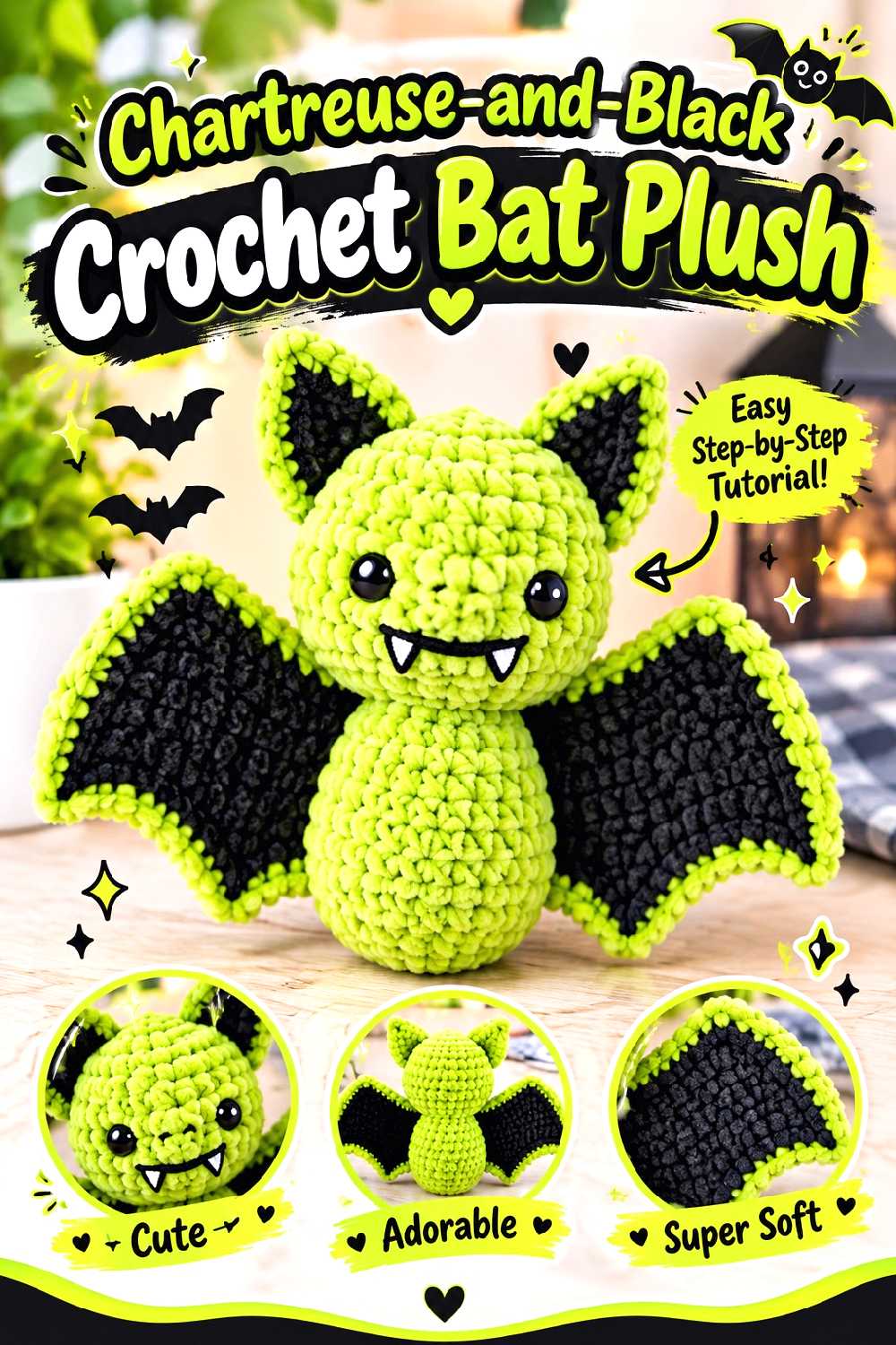
A crochet bat is an obvious place to let black dominate while using chartreuse as an unexpected fall accent. Rose and Lily Amigurumi’s bat design has a stuffed body and double-layered wings that can wrap around the figure.
Chartreuse can appear on the inner wings, ears, embroidered features, or another selected area while the body remains black.
Keep the Silhouette Clear
The wings are the feature that makes the figure immediately recognizable. Too many contrasting sections across them can distract from their shape.
Consider keeping the outer wing profile black and placing chartreuse where it enhances rather than fragments the silhouette.
Adjust Safety Choices to the Recipient
The source project uses safety eyes and specifically notes that they are not recommended for children under three.
If the bat is intended for a young child or another recipient for whom small detachable parts are inappropriate, select a safer finishing approach suitable for that use rather than assuming standard plastic eyes are appropriate.
Creator Credit: Rose and Lily Amigurumi
21. Chartreuse And Black Pumpkin Crochet Coasters
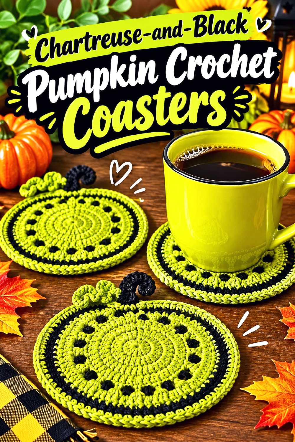
A flat pumpkin coaster keeps the fall theme recognizable while giving the traditional orange pumpkin a completely different color treatment. Crochet Craftsman’s tutorial produces a defined pumpkin-shaped coaster with stem and vine details.
Chartreuse works naturally as the pumpkin body if you want a strange, almost neon harvest look, while black is useful for the border, stem, or secondary motifs.
Shape Has to Do More Work When the Color Is Unexpected
An orange pumpkin is recognizable immediately from color alone. A chartreuse-and-black pumpkin depends more heavily on its silhouette.
Avoid adaptations that obscure the lobed outline or stem. Keeping those features clear helps the finished coaster read as a pumpkin rather than an abstract round motif.
Build a Set With Controlled Variation
A coaster set does not need every piece to match exactly. You could make chartreuse pumpkins with black details, black pumpkins with chartreuse details, and a few split-color versions.
Keep their finished scale and thickness reasonably consistent so the set still functions together on the table.
Creator Credit: Crochet Craftsman
22. Chartreuse And Black Crochet Bandana
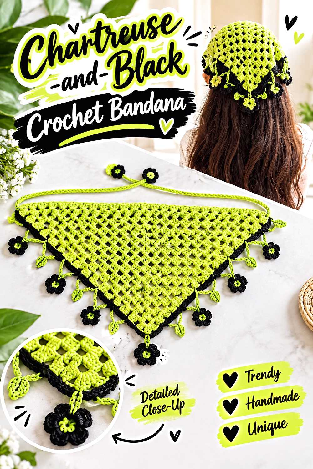
A crochet bandana provides a lighter wearable option for early fall or warmer climates. Plakshi Jain’s 2026 tutorial demonstrates a complete triangular bandana with ties and finishing around the edges.
The triangle creates a natural field for stripes, borders, or a black-to-chartreuse progression without needing garment-level sizing.
A Contrast Border Defines the Triangle
Because the bandana’s identity comes from its triangular outline, a black final border around a chartreuse center makes the shape especially clear.
A chartreuse border around black has more visual energy and draws attention to the outer edge and ties. Either arrangement is stronger than scattering small color changes without a clear plan.
Check the Tie Placement With Your Preferred Styling
Some people wear a bandana low over the hair, while others position it farther back like a headscarf. The amount of fabric visible changes with that placement.
Try the developing piece in the position you intend to wear it before deciding where the final contrast section should appear.
Creator Credit: Plakshi Jain | Crochet
Conclusion
Chartreuse and black can support several very different fall looks, so the most useful starting point is deciding how much contrast you actually want.
For the strongest graphic effect, the checkered vest, granny-square blanket, floral cardigan, motif vest, and two-square tote give the colors defined areas to interact. If you would rather use chartreuse as an accent, the cropped sweater, gloves, balaclava, cowl, leg warmers, and basketweave scarf provide clear edges, cuffs, bands, or finishing areas where the brighter shade can be contained.
For home decor, the loopy pillow and blanket create larger color statements, while the mug cozy, pumpkin coasters, leaf garland, bat, and table runner let you experiment with the palette on a smaller scale.
Whichever project you choose, verify the creator’s original gauge, sizing, materials, and construction before adapting the colors. A successful chartreuse-and-black version depends not only on picking two dramatic shades, but also on preserving the fit, drape, structure, and function that make the original project work.
Frequently Asked Questions
Do the tutorials already use chartreuse and black?
Not necessarily. This collection uses verified tutorials for the underlying finished projects and treats chartreuse and black as an editorial color direction for Fall 2026. Check each video to see the creator’s original materials and color placement before planning your adaptation.
Should black or chartreuse be the dominant crochet color?
That depends on the project and the effect you want. Black generally makes a useful grounding color for garment edges, joins, handles, and backgrounds. Chartreuse attracts more attention, so using it on motifs, cuffs, borders, stripes, or selected panels can create strong contrast without making every part of the project equally bright.
Can I substitute any chartreuse and black yarn as long as both skeins have the same weight number?
The weight category is only one factor. Compare the yarns’ actual thickness, fiber content, twist, stretch, and blocked behavior. This is especially important for garments, hats, gloves, granny squares, and any project where matching dimensions matters.
How can I keep chartreuse-and-black crochet from looking too busy?
Let either texture or color carry most of the visual detail. Checkerboards and granny motifs can handle frequent color changes because the pattern already divides the surface into sections. Cable, basketweave, looped, and heavily textured fabrics often benefit from broader color blocks or a dominant shade with smaller accents.
Should I block motifs before planning a chartreuse-and-black granny-square project?
For a garment or a joined blanket, comparing blocked motifs is useful because the final dimensions affect layout and fit. Make several sample motifs with the yarn and hook you actually plan to use, treat them consistently, and compare their dimensions before producing the entire set.
How can I plan a two-color blanket or cardigan without the chartreuse becoming unevenly concentrated?
Arrange the completed motifs before joining. Step away from the layout or photograph it from above so you can see the overall color balance rather than evaluating one square at a time. If chartreuse appears concentrated in one region, redistribute the motifs while everything is still movable.
Which of these projects gives the quickest way to test the color combination before starting a garment?
A mug cozy, pumpkin coaster, bandana, ear warmer, or individual granny-square sample gives you enough fabric to evaluate the two shades together without committing immediately to a full cardigan, sweater, or blanket. The goal is to assess contrast, texture, yarn compatibility, and finishing before scaling the idea up.