Crochet brooches are a useful place to experiment with fall color because a small accessory can carry a richer or more unusual palette without committing an entire cardigan or coat to it. For modern fall 2026 styling, the most convincing heirloom direction is not simply “vintage colors.” It is a controlled relationship between deep autumn shades, softened neutrals, clear motif contrast, and enough restraint for the crochet itself to remain visible.
A dark flower center, pale animal face, metallic-looking gold tone, or moss-green leaf can completely change how a small brooch reads against outerwear. The ideas below include flowers, leaves, animals, fruit, and woodland motifs, with each palette planned around the actual shape and texture of the brooch.
Quick List
- Antique Gold And Ink Black Crochet Cameo Brooch
- Oxblood And Olive Crochet Poppy Brooch
- Mustard And Espresso Crochet Sunflower Brooch
- Plum And Oatmeal Crochet Daisy Brooch
- Moss Green And Antique Gold Crochet Ginkgo Leaf Brooch
- Oatmeal And Charcoal Crochet Sheep Brooch
- Rust And Cream Crochet 3d Cat Brooch
- Cranberry And Moss Crochet Strawberry Brooch
- Terracotta And Mushroom Brown Crochet Mushroom Brooch
- Fox Red Parchment And Charcoal Crochet Fox Brooch
- Black Cherry And Antique Rose Crochet Rose Brooch
- Burnished Gold And Cocoa Crochet Sunflower Brooch
- Copper Forest Green And Ivory Crochet Toadstool Brooch
Choose Fall Brooch Colors by Size and Wearing Surface
Brooch colors behave differently from colors spread across a large crochet garment. A tiny accent may almost disappear, while a very dark center can occupy much more visual weight than expected. Before finalizing the palette, place the yarns together in roughly the proportions you intend to use rather than judging equal-length strands side by side.
Also consider the garment beneath the brooch. A charcoal coat can absorb dark brown or black edging, while cream, antique gold, rust, or moss may separate clearly from it. On camel or oatmeal outerwear, deeper colors such as oxblood, plum, teal, espresso, and charcoal can provide more definition.
Keep Heirloom Palettes Rich Without Making Small Motifs Muddy
Muted autumn shades can look sophisticated together, but different hues are not automatically different in lightness. Oxblood beside dark olive or rust beside medium brown can merge once worked into a small motif.
When important details need separation, compare the yarns from a distance or view them in grayscale. Reserve the lightest or darkest shade for areas that explain the motif: a flower center, animal face, mushroom stem, leaf edge, wing marking, or cameo border. That small value shift often does more than adding a fourth or fifth color.
1. Antique Gold And Ink Black Crochet Cameo Brooch
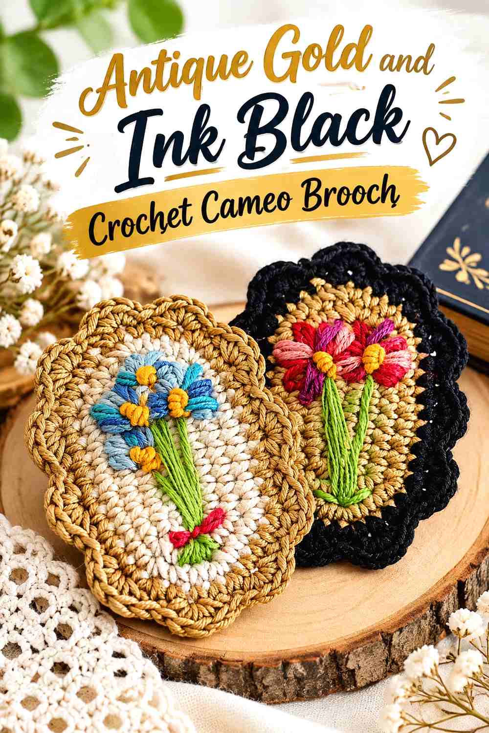
An oval cameo-style brooch gives antique gold a controlled, jewelry-like setting. Let antique gold occupy most of the crochet frame or interior foundation, then use ink black to define the border or selected embroidered details. The contrast is strong enough to keep a small oval readable on camel, gray, cream, or dark outerwear without requiring several competing shades.
Antique Gold Should Remain the Main Crochet Cameo Surface
Keep antique gold across the largest uninterrupted area so the brooch retains a warm textile character instead of becoming a predominantly dark badge. If embroidery is added, leave visible antique-gold background between motifs. That negative space helps the oval function as a frame and prevents small decorative marks from turning the surface into one dense block.
Ink Black Can Sharpen the Antique Gold Crochet Border
Ink black works best where it explains structure: along a narrow outer edge, around a central motif, or in a few deliberate surface details. Avoid dividing the oval into equal black-and-gold sections unless a graphic result is intentional. On a small brooch, a modest amount of black can already provide substantial definition.
Creator Credit: Lanas y ovillos
2. Oxblood And Olive Crochet Poppy Brooch
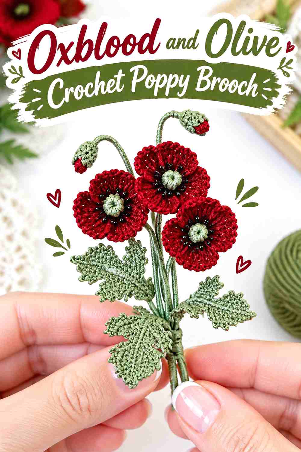
Oxblood gives a crochet poppy a deeper autumn direction than bright scarlet, while olive keeps the foliage quiet enough to support the bloom. Use oxblood across the petals, olive through the leaf or stem elements, and retain a distinctly dark center if the construction includes one. The main checkpoint is keeping the flower center visible against already-dark petals.
Oxblood Needs Enough Contrast Around the Crochet Poppy Center
Because oxblood is deep, a similarly dark center can visually sink into the petals. Compare the two shades before assembly. If they merge, keep the center noticeably darker or introduce a small lighter detail around it rather than lightening the whole flower. The central contrast helps the petal arrangement remain readable from normal wearing distance.
Olive Should Support the Oxblood Crochet Poppy Instead of Competing
Keep olive mainly on foliage and connecting details rather than spreading it across the petals. That gives the brooch a clear hierarchy: oxblood flower first, olive botanical support second. If your olive is unusually bright or yellow-toned, substitute a more muted medium green so the leaf does not become the strongest part of the composition.
Creator Credit: TinyLimeCraft
3. Mustard And Espresso Crochet Sunflower Brooch
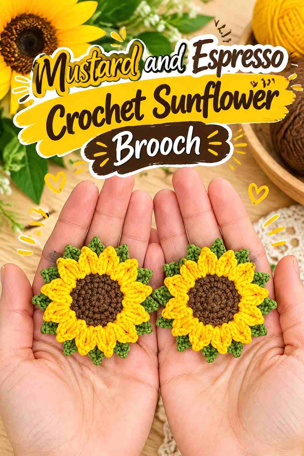
Mustard and espresso preserve the sunflower’s strong center-and-petal structure while shifting the result toward a subdued fall palette. Let mustard lead across the petal ring and reserve espresso for the center. A small olive or brown-green leaf can be added if the source construction includes foliage, but the two-color flower should remain the main visual statement.
Mustard Should Form a Clear Crochet Sunflower Petal Ring
Mustard works well here because the repeated petals create one broad warm shape rather than many unrelated yellow details. Check the flower from a distance once the petal ring is complete. If the mustard is very muted, strong separation from the espresso center becomes even more important for preserving the radial structure.
Espresso Gives Mustard Crochet Petals a Dark Visual Anchor
Use espresso decisively in the center instead of scattering it around every petal edge. Concentrating the darkest shade keeps the eye moving toward the middle of the brooch and makes the repeated mustard shape easier to understand. If espresso and mustard appear too close in value, choose a darker brown rather than introducing extra colors.
Creator Credit: Olga Lukoshkina
4. Plum And Oatmeal Crochet Daisy Brooch
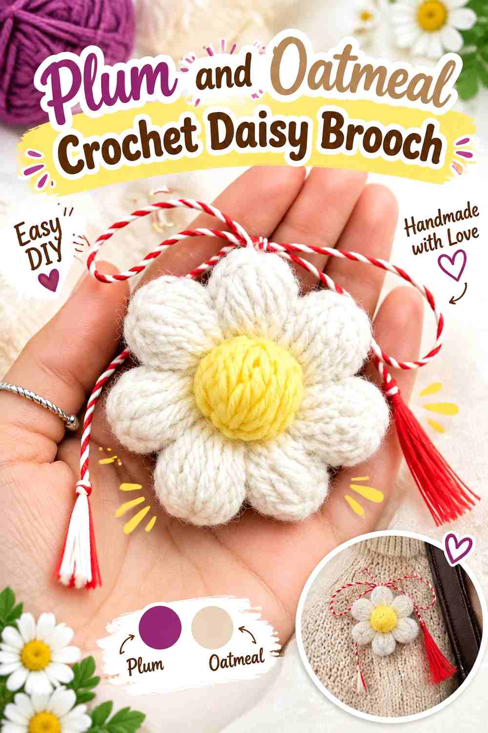
A plum daisy turns a familiar floral silhouette into a richer fall accessory, while oatmeal replaces bright white with a softer neutral. Use plum for the petals and oatmeal in the center for an unusual reversed daisy palette, or keep oatmeal on the petals and place plum in the center when you want a lighter brooch. The value difference matters more than botanical realism.
Plum Can Make the Crochet Daisy Feel More Autumnal Without Adding More Colors
When plum covers the petal ring, keep the shape clean and relatively uninterrupted. Multiple accent colors around every petal can weaken the simple geometry that makes a daisy recognizable. A single deep plum field also gives raised or defined petal edges a chance to show through natural light and shadow.
Oatmeal Softens the Contrast Against Plum Crochet Petals
Oatmeal gives plum enough separation without the stark jump created by a very bright white. Use it where the flower structure benefits most from contrast, usually the center or a restrained inner ring. If your oatmeal is too close in value to the plum, move toward a lighter cream rather than adding a third strong hue.
Creator Credit: Oana Ursy
5. Moss Green And Antique Gold Crochet Ginkgo Leaf Brooch
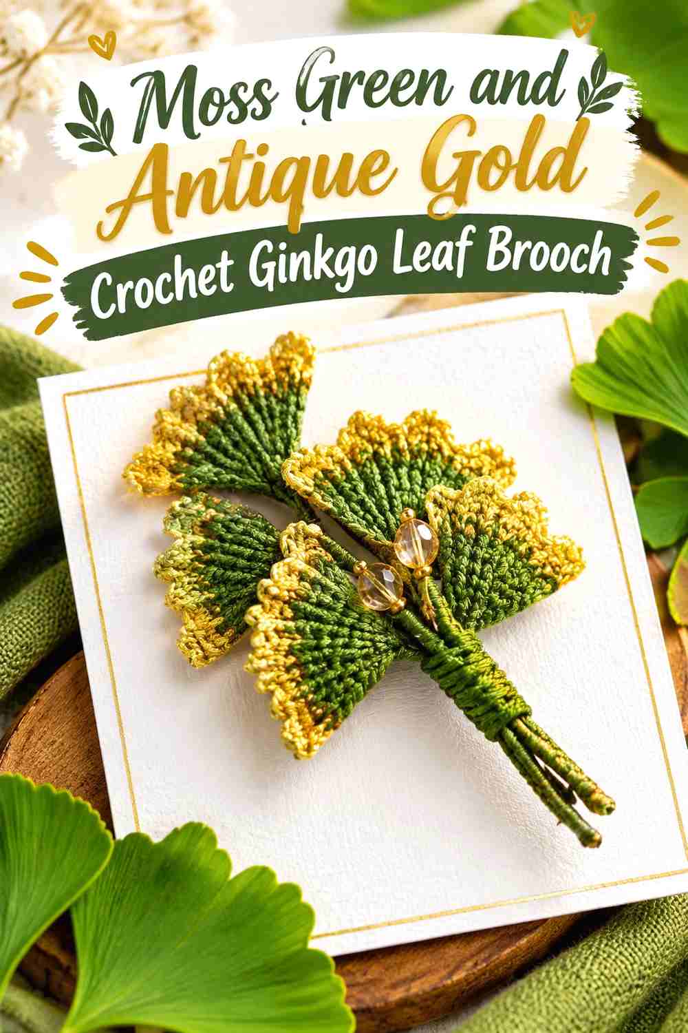
A ginkgo brooch depends heavily on its fan-shaped outline, so this palette stays deliberately restrained. Moss green can cover most of the leaf, while antique gold works along a stem, narrow edge, or small decorative accent. The combination feels autumnal without forcing the entire leaf into bright yellow.
Moss Green Should Preserve the Crochet Ginkgo Leaf Silhouette
Use moss as the uninterrupted main field so the spreading fan remains the first thing the eye sees. Variegated green may look appealing in the skein but can interrupt the outer contour at small scale. A relatively consistent moss tone gives the ginkgo’s unusual edge more visual authority.
Antique Gold Works Best as a Controlled Crochet Ginkgo Accent
A narrow antique-gold detail can create the impression of aged jewelry without overwhelming the botanical form. Place it where it follows existing structure, such as the stem or a restrained edge. If gold occupies half the leaf, the brooch becomes a two-color graphic motif rather than a moss-led heirloom botanical.
Creator Credit: Adishka Crafts
6. Oatmeal And Charcoal Crochet Sheep Brooch
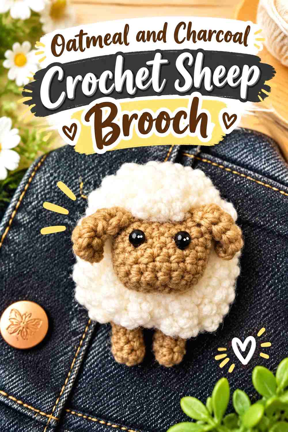
Oatmeal and charcoal give a sheep brooch a restrained folk-art look while making its textured body easy to distinguish from the face and legs. Use oatmeal for most of the fleece and charcoal for smaller defining sections. This is a palette where texture matters as much as hue, because a very fuzzy oatmeal yarn can visually spread into dark facial details.
Oatmeal Lets Crochet Sheep Texture Carry the Main Visual Interest
Keep most of the textured body in oatmeal rather than alternating several fleece colors. One light neutral allows shadows between loops or raised areas to remain visible. If the yarn is very fluffy, check the finished body from a distance to make sure the outer shape still reads clearly instead of dissolving into a soft halo.
Charcoal Should Define the Oatmeal Crochet Sheep Without Taking Over
Use charcoal where recognition depends on contrast: face, ears, feet, or a small structural section. The darker shade needs enough area to remain visible among the oatmeal texture, but large charcoal panels can shift the brooch away from a light, woolly appearance. A clear but limited dark zone usually gives better definition.
Creator Credit: hello stitches
7. Rust And Cream Crochet 3d Cat Brooch
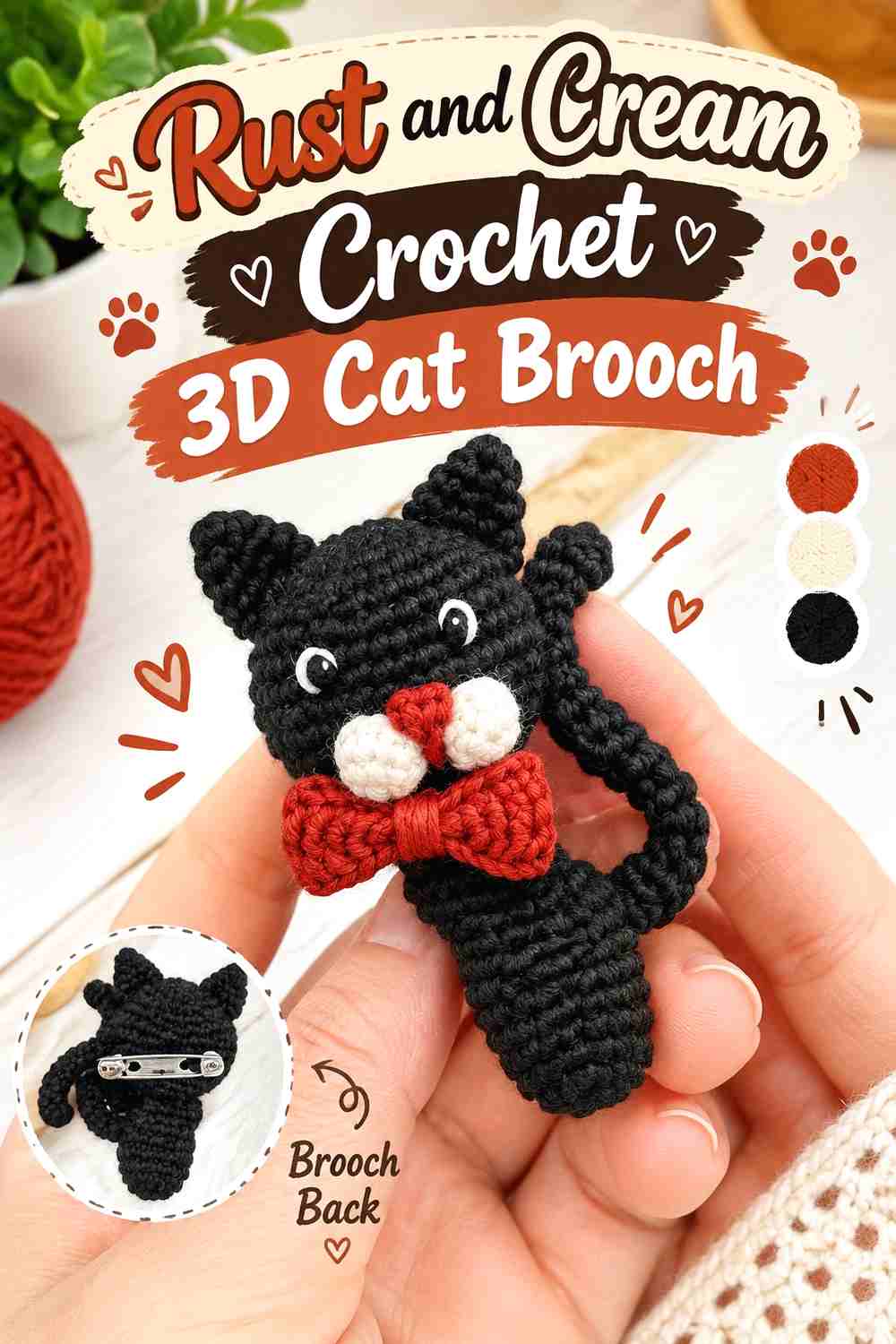
Rust gives a three-dimensional cat brooch a strong autumn base, while cream can clarify ears, muzzle, paws, or another small facial area. Since dimensional crochet already creates shadows, the palette does not need heavy outlining everywhere. Keep rust dominant and let cream explain the expression.
Rust Should Cover Most of the Crochet Cat’s Dimensional Form
Using rust across the main head or body lets the shaping remain visible through natural highlights and shadows. Breaking the figure into too many contrasting panels can make a tiny cat look patchy. If you substitute another orange-brown, preserve a medium-to-deep value so the cream details still have room to stand apart.
Cream Should Clarify Rust Crochet Cat Features
Reserve cream for the parts the viewer needs to read quickly, especially around the face. A cream muzzle or inner-ear area can create more useful definition than a decorative cream border around the whole figure. Check the brooch upright before finishing, because small facial contrasts can look very different when the character is viewed vertically.
Creator Credit: Sure It
8. Cranberry And Moss Crochet Strawberry Brooch
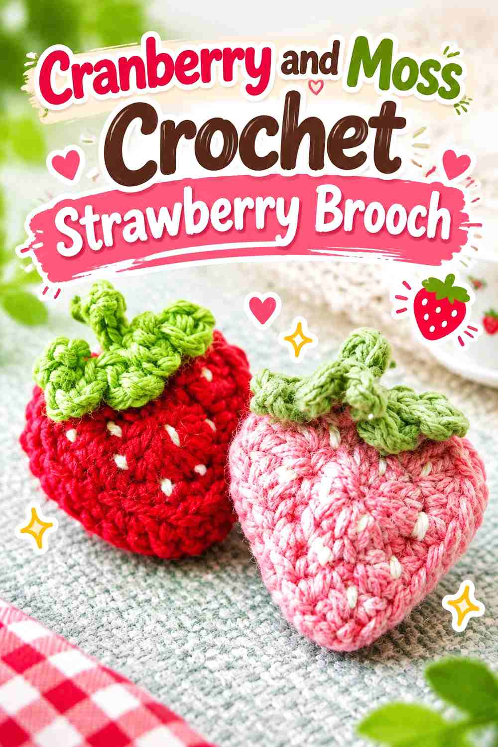
Cranberry keeps the berry recognizable while feeling deeper and less summery than bright red. Moss gives the leafy top a muted autumn character. Keep the cranberry section broad and uninterrupted, then use moss clearly enough that the top does not disappear into the fruit.
Cranberry Should Remain the Largest Crochet Strawberry Color Block
A strawberry’s tapered outline does much of the work, so avoid covering the cranberry body with too many contrasting seed colors. Small surface details can help, but the fruit should still read as one coherent shape from a distance. If embellishment begins to dominate, reduce it rather than adding another accent shade.
Moss Needs Clear Separation From the Cranberry Crochet Berry
Because cranberry and moss can both be medium or dark in value, test them together before finishing the leafy top. If they merge, choose a slightly lighter or more muted green. The boundary between fruit and leaves is structurally important; readers should be able to identify it without relying on tiny stitch details.
Creator Credit: 수수달퐁susuDalfong
9. Terracotta And Mushroom Brown Crochet Mushroom Brooch
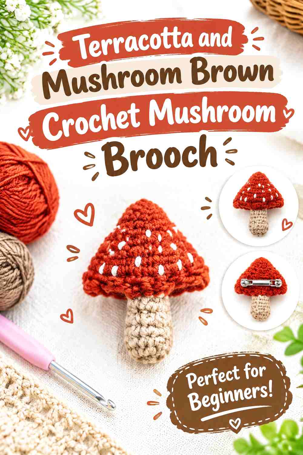
Terracotta makes the mushroom cap the natural focal point, while mushroom brown keeps the stem quiet and earthy. This is a lower-contrast palette than a classic red-and-white toadstool, so shape becomes especially important. Keep cap and stem clearly separated through both color placement and silhouette.
Terracotta Should Control the Crochet Mushroom Cap
Place terracotta across most of the broad upper section rather than reducing it to small spots. The cap carries the visual weight of the motif, so a consistent warm field makes the mushroom recognizable before viewers notice finer details. If the cap includes decorative marks, keep them secondary to its overall shape.
Mushroom Brown Grounds the Terracotta Crochet Mushroom Stem
A medium brown works well beneath terracotta because it continues the earthy direction without competing for attention. Make sure the brown is still distinct enough that the lower stem does not visually attach itself to the cap. If the two yarns are extremely similar in value, lighten the stem before adding more decoration.
Creator Credit: MYBAGZING Crochet Studio
10. Fox Red Parchment And Charcoal Crochet Fox Brooch
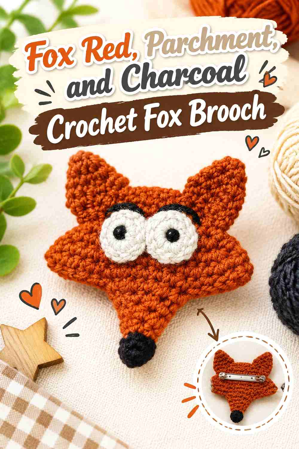
This three-color palette uses fox red as the obvious dominant, parchment for facial contrast, and charcoal as a very small defining accent. Keeping the hierarchy clear is important on a miniature animal. If all three shades occupy similar areas, the fox’s ears and facial structure can become harder to understand.
Fox Red Should Lead the Crochet Fox Silhouette
Use fox red across the largest head or body sections so the pointed ears and outer contour remain connected. Parchment should interrupt only where facial separation is needed. This keeps the character identifiable from the outline before the viewer studies its smaller features.
Parchment Gives Fox Red Crochet Facial Sections Softer Contrast
Parchment is useful when cream or white would feel too sharp against an autumn palette. Apply it around the muzzle, cheeks, chest, or other light sections supported by the design. Keep those areas broad enough to read; tiny parchment stitches surrounded by fox red can disappear from normal viewing distance.
Charcoal Should Be the Smallest Crochet Fox Accent
Charcoal works well for eyes, nose, ear tips, or another compact defining point. Because it is the darkest shade, even a small amount can command attention. Avoid outlining every fox-red section in charcoal unless a graphic effect is wanted, since that can make a soft crochet brooch look visually rigid.
Creator Credit: Lilium Handmade
11. Black Cherry And Antique Rose Crochet Rose Brooch
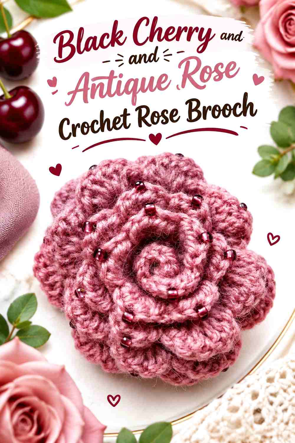
A rolled rose benefits from colors that emphasize its spiral depth. Black cherry can dominate the deeper interior and most petals, while antique rose appears selectively where overlapping edges can still reveal it. The goal is not equal stripes but glimpses of the lighter shade that help separate layers.
Black Cherry Should Give the Crochet Rose Its Deepest Petal Mass
Keep black cherry across most of the flower so the brooch maintains a rich, concentrated center. Because rolled petals naturally cast shadows, an already-dark yarn can become almost solid-looking. View the flower under ordinary indoor light before deciding whether it needs additional contrast.
Antique Rose Should Appear Where Black Cherry Crochet Petals Overlap
Place antique rose where it will remain visible after the rose is shaped rather than burying it entirely inside the roll. A narrow outer edge, inner transition, or selected petal section can be enough. Too much pale outlining can interrupt the spiral movement, so use the lighter shade to reveal depth rather than draw borders.
Creator Credit: szydełko
12. Burnished Gold And Cocoa Crochet Sunflower Brooch
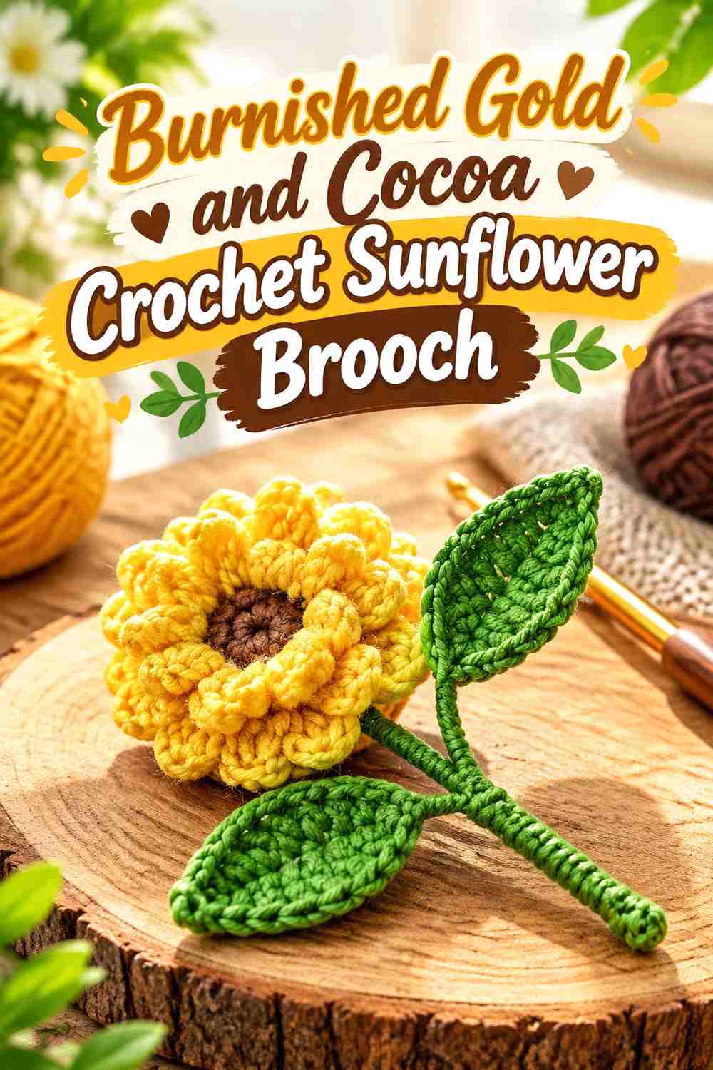
Burnished gold and cocoa create a second sunflower direction that feels more tonal and old-fashioned than mustard and espresso. Let burnished gold fill the petals and cocoa occupy the center. The softer contrast can work particularly well when you want the brooch to blend with camel, olive, chocolate, or oatmeal layers.
Burnished Gold Gives the Crochet Sunflower a Softer Petal Contrast
Because burnished gold is less bright than clear yellow, petal texture becomes more important. Keep the petal field uncomplicated and check whether each outer shape remains distinct against the intended garment. On a camel coat, for example, a darker edge or cocoa center may be needed to prevent the whole flower from blending into the background.
Cocoa Should Define the Burnished Gold Crochet Sunflower Center
Choose cocoa that is clearly darker than the petals, even if both shades are warm. The center needs enough value contrast to preserve the sunflower’s radial construction. If the cocoa feels too soft, deepen it rather than introducing black, which would create a much sharper and less tonal result.
Creator Credit: Lilyrosycrafts
13. Copper Forest Green And Ivory Crochet Toadstool Brooch
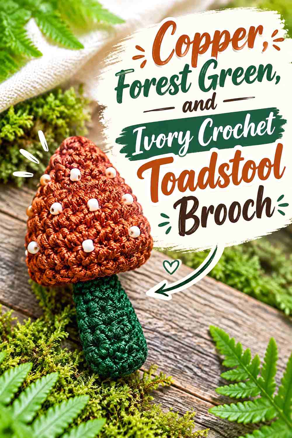
Copper gives a toadstool cap an autumnal metallic-like warmth without requiring actual metallic yarn. Forest green shifts the supporting details toward woodland colors, while ivory provides the lightest points of contrast. If beads or spots are part of the finish, the three-color hierarchy should remain clear after embellishment.
Copper Should Dominate the Crochet Toadstool Cap
Use copper across most of the cap so its broad silhouette remains easy to read. A cap divided equally between several colors can lose the strong top-heavy shape that identifies the mushroom. Copper also pairs naturally with both the darkest forest-green details and the lightest ivory marks.
Ivory Should Stay Small Against the Copper Crochet Cap
Ivory spots or compact highlights can provide considerable contrast, so they do not need to occupy much area. Space them with enough copper showing between them that the cap still reads as the main color field. If ivory becomes too dominant, the surface may feel busier than the actual crochet structure.
Forest Green Can Connect the Copper Crochet Toadstool to Fall Layers
Use forest green on a supporting leaf, lower detail, or another area justified by the construction rather than forcing it onto every section. Its role is to ground the copper-and-ivory contrast and connect the motif visually with olive, moss, brown, or camel clothing.
Creator Credit: DOSSOVA
Which Heirloom Brooch Palette Fits Your Fall Style?
For the darkest, most dramatic direction, start with black cherry and antique rose, oxblood and olive, or deep teal and camel. These palettes work well when you want a small crochet accessory to create a defined focal point against lighter coats and cardigans.
For a softer vintage effect, antique gold and ink black, moss and antique gold, plum and oatmeal, or burnished gold and cocoa keep the colors controlled without relying on bright seasonal orange.
Woodland styling is strongest in terracotta and mushroom brown, fox red with parchment and charcoal, copper with forest green and ivory, or oatmeal and charcoal. These schemes lean on recognizable nature motifs while still giving each brooch enough contrast to remain clear.
Conclusion
An heirloom-style crochet brooch does not need faded colors or elaborate embellishment to feel considered. For fall 2026, a more useful approach is to give every shade a role: one color leads the motif, one supports the structure, and any strongest accent is kept where it improves recognition.
Choose oxblood, black cherry, burgundy, or deep teal when you want a dark focal point. Moss, olive, mushroom brown, cocoa, and charcoal can ground those stronger shades. Antique gold, oatmeal, parchment, cream, ivory, and dusty rose are most useful where a small motif needs separation.
Most importantly, test the finished palette vertically against the coat, cardigan, scarf, hat, or bag where the brooch will actually be worn. A combination that looks balanced on a worktable can change once background color and garment texture enter the picture.
Frequently Asked Questions
What colors make a crochet brooch look heirloom-inspired without looking old-fashioned?
Try combining one deep or muted shade with a quieter neutral rather than using several equally strong vintage-style colors. Black cherry with antique rose, moss with antique gold, rust with cream, or teal with camel can suggest an heirloom direction while keeping the color placement clean and current.
How many colors should I use in a small fall crochet brooch?
Two colors are often enough for flowers and simple leaves because the silhouette already provides visual information. Three colors can be useful for animals or detailed woodland motifs when each shade has a distinct role. If a fourth color does not clarify a feature, border, center, or accent, it may only make the brooch busier.
How can I tell whether two fall yarn colors have enough contrast?
Place the yarns beside each other under normal lighting and view them from several feet away. You can also photograph them in grayscale. If two different hues turn into nearly the same gray value, important borders or facial details may merge when crocheted.
Should the darkest color always go around the crochet brooch edge?
No. A dark outer edge can define an oval, leaf, or graphic motif, but some brooches work better when the darkest shade stays in the center. Sunflowers benefit from dark centers, while a butterfly or animal may need its deepest color through the body or facial details instead.
How do I substitute a named fall color without changing the whole brooch palette?
Preserve its role rather than matching the exact color name. If the article calls for oxblood, another muted deep red can work if it remains darker than the supporting shade. If oatmeal is the light neutral, substitute another warm light neutral that still creates similar separation from the dominant color.
Why can a crochet brooch palette look different after the motif is finished?
Crochet breaks color into loops, shadows, raised edges, and small areas. A dark shade may appear heavier once concentrated in a center, while a light accent may become more noticeable when surrounded by a deep field. Judge the palette again after the main pieces are crocheted and before permanently fixing embellishments or pin hardware.