Charcoal and baby pink make an especially useful fall crochet pairing because the two colors can play very different roles. Charcoal can ground a larger project or emphasize structure, while baby pink can soften edges, highlight motifs, or create a smaller contrasting detail.
The combination also works across very different kinds of crochet. You can use it for a substantial cardigan or throw, but it translates just as well to a beanie, coffee cozy, pumpkin, bag, or pair of fingerless gloves.
The tutorials below provide different project constructions to work from. They are not all originally demonstrated in charcoal and baby pink, so treat the palette as an adaptation rather than assuming the tutorial’s yarn can simply be replaced without checking gauge, fiber, weight, and finished measurements.
Quick List
- Charcoal-and-Pink Patchwork Crochet Cardigan
- Two-Tone Chunky Crochet Scarf
- Baby Pink Ribbed Crochet Beanie with Charcoal Edge
- Charcoal Crochet Fingerless Gloves with Pink Cuffs
- Color-Blocked Charcoal and Pink Crochet Cowl
- Twisted Crochet Ear Warmer with Pink Center
- Soft-Pink and Charcoal Granny Square Crochet Vest
- Striped Charcoal and Baby Pink Crochet Hooded Scarf
- Structured Two-Tone Crochet Tote
- Compact Crochet Crossbody Bag with Pink Accent
- Plush Charcoal Crochet Slippers with Pink Trim
- Baby Pink Crochet Leg Warmers with Charcoal Bands
- Charcoal Crochet Pumpkin with Baby Pink Details
- Two-Color Textured Crochet Throw
- Baby Pink Bow Crochet Pillow on a Charcoal Base
- Charcoal Crochet Storage Basket with Pink Rim
- Draped Charcoal Crochet Poncho with Baby Pink Border
- Waffle-Texture Charcoal and Pink Crochet Coffee Cozy
Decide Where Each Color Will Do the Most Work
You do not need a 50/50 color split to make charcoal and baby pink read as a deliberate pair. On a large garment, charcoal can cover most of the body while baby pink appears at cuffs, borders, motifs, or selected panels. On a smaller accessory, reversing the balance can make the pink more visible without requiring much yarn.
Texture matters too. Very dark yarn can make subtle stitch definition harder to see, particularly in low light. If a project depends on raised texture, openwork, or detailed motifs, placing baby pink in the most textured areas can help those features stand out.
For joined-motif projects, lay out the finished pieces before committing to an alternating sequence. A perfectly regular checkerboard is only one option. Concentrating pink motifs near the neckline, hem, center, or front panels can produce a more controlled focal point.
Match Yarn Behavior to the Fall Project
Color is only one part of a successful substitution. A structured basket, fitted beanie, draped poncho, soft scarf, and heavily used tote all ask different things from the yarn.
Before substituting charcoal and baby pink yarn into a tutorial, compare fiber content, yarn weight, elasticity, and recommended gauge with the original materials. A heavier replacement can change garment dimensions and drape, while a softer or more elastic yarn can make a bag or basket less structured.
For wearables, make a useful measurement check before committing to the full project. For home decor, think about cleaning and shape retention. For bags, consider stretch and strap behavior. The two colors can remain the same while the actual yarn types change from one project to another.
Plan Color Changes Before Starting a One-Color Tutorial
A tutorial made in one shade can still be useful for a two-color project, but decide where changes will happen before crocheting a large section. Borders, ribbing, straps, bands, and individual motifs are usually easier places to introduce contrast than random changes within a shaped section.
Swatch the two yarns together when possible. Two skeins carrying the same weight label can still produce slightly different fabric, especially when their fiber composition or twist differs. That difference matters most when the colors meet repeatedly in fitted pieces or joined motifs.
1. Charcoal And Pink Patchwork Crochet Cardigan
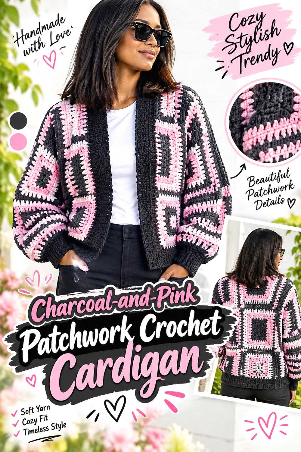
A patchwork-style crochet cardigan gives this palette enough space to feel intentional rather than decorative. Charcoal can form the visual framework, while baby pink panels prevent the finished garment from becoming one uninterrupted dark block.
This is also a useful project if you prefer obvious color placement. Instead of changing shades repeatedly within rows, you can often plan the palette around larger sections and assess the arrangement before the garment is fully assembled.
Test the Panel Arrangement Before Final Assembly
Lay the major sections in approximately their final positions and view them from several feet away. A color arrangement that seems balanced one piece at a time can look much heavier on one side once the cardigan is assembled.
Baby pink does not need to alternate perfectly with charcoal. Concentrating it around the upper body, cuffs, or selected front areas can create a focal point while leaving the cardigan predominantly charcoal.
Keep Fit Decisions Separate From Color Decisions
Changing a panel from charcoal to pink should not change its intended dimensions. If your substitute yarn behaves differently, however, the color change may coincide with an unwanted size change.
Compare gauge and blocked measurements before joining major sections. This matters more than forcing a particular color arrangement to fit pieces that have ended up different sizes.
Consider How the Cardigan Will Be Layered
A charcoal-dominant cardigan will read differently over black than it will over cream, gray, denim, or pink. If you expect to wear it over dark fall basics, using baby pink around the front opening can preserve visible contrast.
For a quieter result, keep most pink toward the sleeves or lower sections instead.
Creator Credit: BRcrochet
2. Two Tone Chunky Crochet Scarf
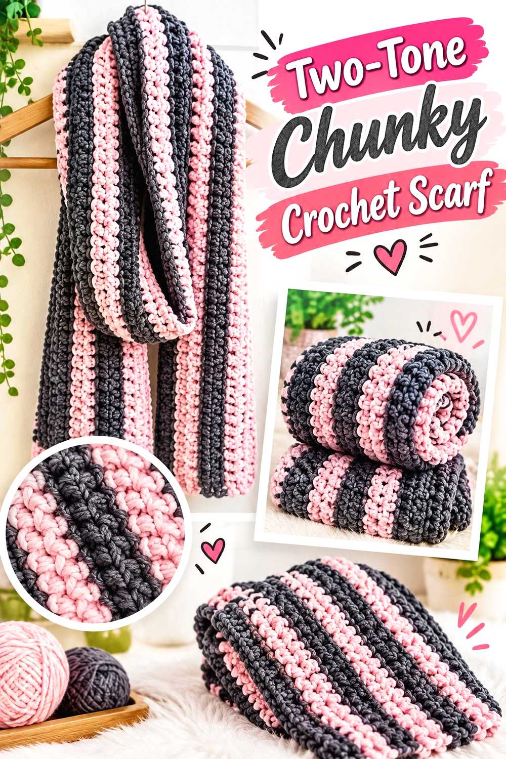
A chunky crochet scarf is one of the simplest places to test this fall palette at a larger scale. Broad charcoal and baby pink sections can show the contrast clearly without requiring the planning involved in a fitted garment.
You can make the scarf primarily charcoal and reserve pink for the ends, or give the colors larger alternating blocks for a stronger two-tone effect.
Wider Color Blocks Keep the Scarf From Looking Busy
Frequent narrow stripes produce many color transitions and more finishing work. Larger blocks give both colors room to register and keep the scarf visually calmer.
Before deciding on the sequence, consider what will actually show when the scarf is wrapped. An accent placed only at one extreme end may spend much of the time hidden inside a coat.
Chunky Yarn Changes More Than the Speed of the Project
A bulky scarf can become heavy if extra length or width is added casually. If you substitute a different yarn for the tutorial’s recommendation, compare the resulting fabric before deciding on final proportions.
Baby pink may also make raised stitch definition easier to see than charcoal, so a pink section can be useful where you especially want the texture to remain visible.
Creator Credit: Just Be Crafty
3. Baby Pink Ribbed Crochet Beanie With Charcoal Edge
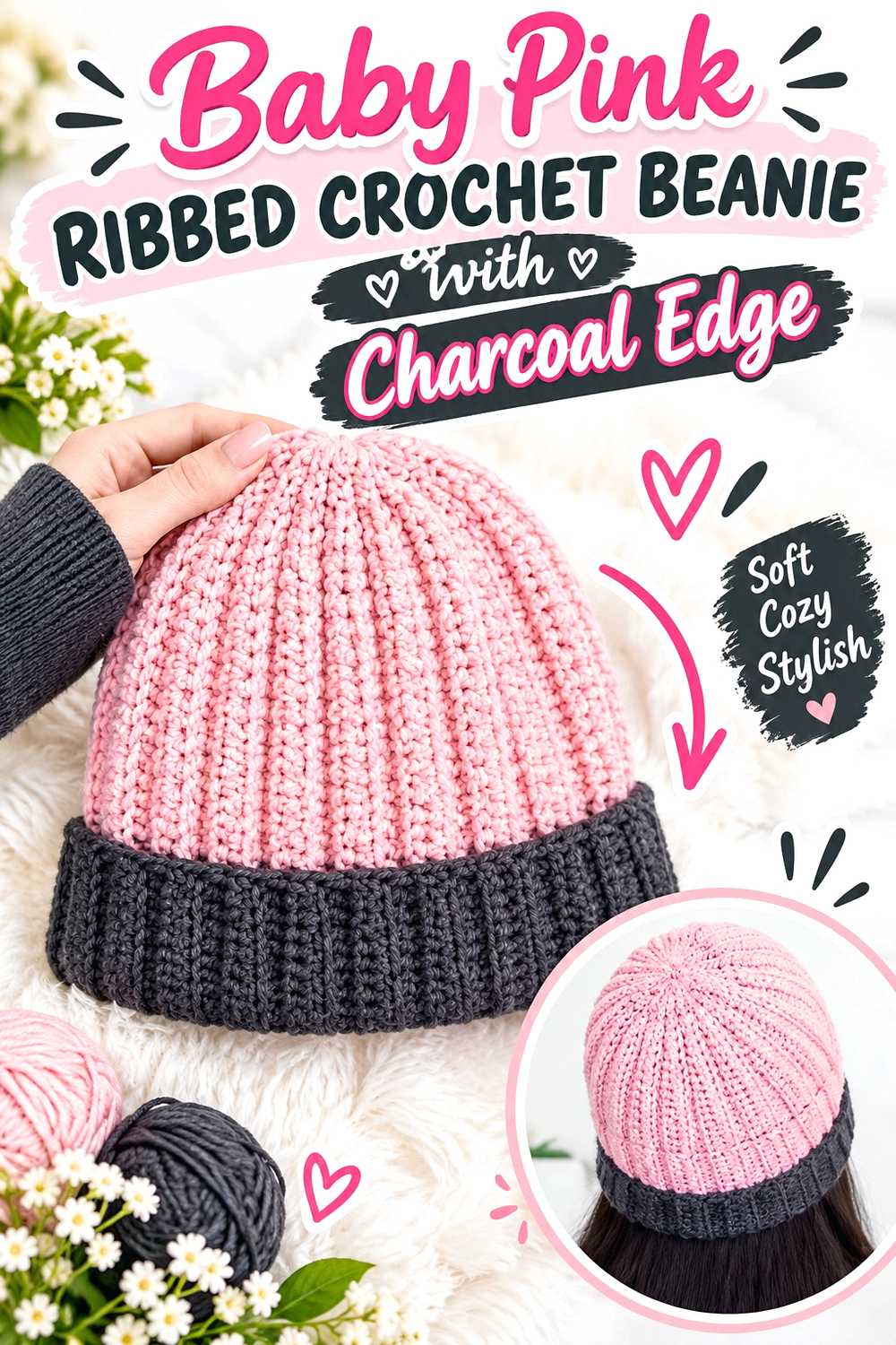
A ribbed beanie is compact enough to let baby pink become the dominant color without overwhelming an entire outfit. Charcoal can then define the lower edge, crown detailing, or another deliberately limited area.
The combination works particularly well when you want the hat to coordinate with a darker fall coat while still adding a lighter accent close to the face.
Check Stretch Before Planning the Color Boundary
Ribbed crochet depends heavily on elasticity and fit. If the charcoal and pink yarns do not recover in the same way, a color change across a high-stretch area can behave differently from the rest of the hat.
Make sure both shades belong to a compatible yarn family or produce similar fabric before treating them as interchangeable.
Place Contrast Where It Will Remain Visible
A charcoal section near the lower edge creates a clear frame even when the beanie is worn with a hood or high collar. A contrast section placed only near the crown can be less visible during normal wear.
If you plan to fold the lower edge, account for which side of the fabric will show after folding.
Creator Credit: ElyseCrochets 💌
4. Charcoal Crochet Fingerless Gloves With Pink Cuffs
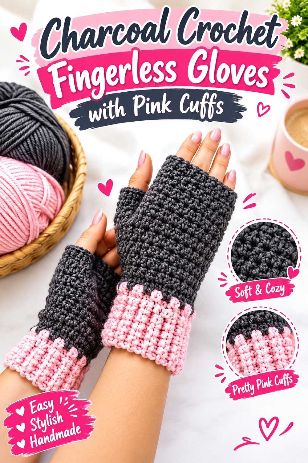
Fingerless gloves let you use charcoal as the practical everyday shade while adding baby pink in a small, noticeable area. Pink cuffs can peek out from beneath dark coat sleeves without dominating the whole accessory.
Because gloves are worn as a pair, they also offer an interesting choice between perfect symmetry and mirrored accent placement.
Keep the Two Gloves Consistent in Fit
Color placement can vary, but the finished dimensions should not. Check both pieces against each other as you work rather than waiting until the second glove is complete.
Small gauge differences are more noticeable on something fitted around the hand and wrist than on a scarf or blanket.
Cuffs Are a Low-Risk Place for Contrast
A defined pink cuff creates a clean color break without interfering much with the visual shape of the hand. It can also make the gloves easier to coordinate with a pink scarf, hat, or bag made from another project in this collection.
If you want less pink, a narrower finishing accent can provide the connection without turning the gloves into an evenly striped design.
Creator Credit: Crochet MC
5. Color Blocked Charcoal And Pink Crochet Cowl
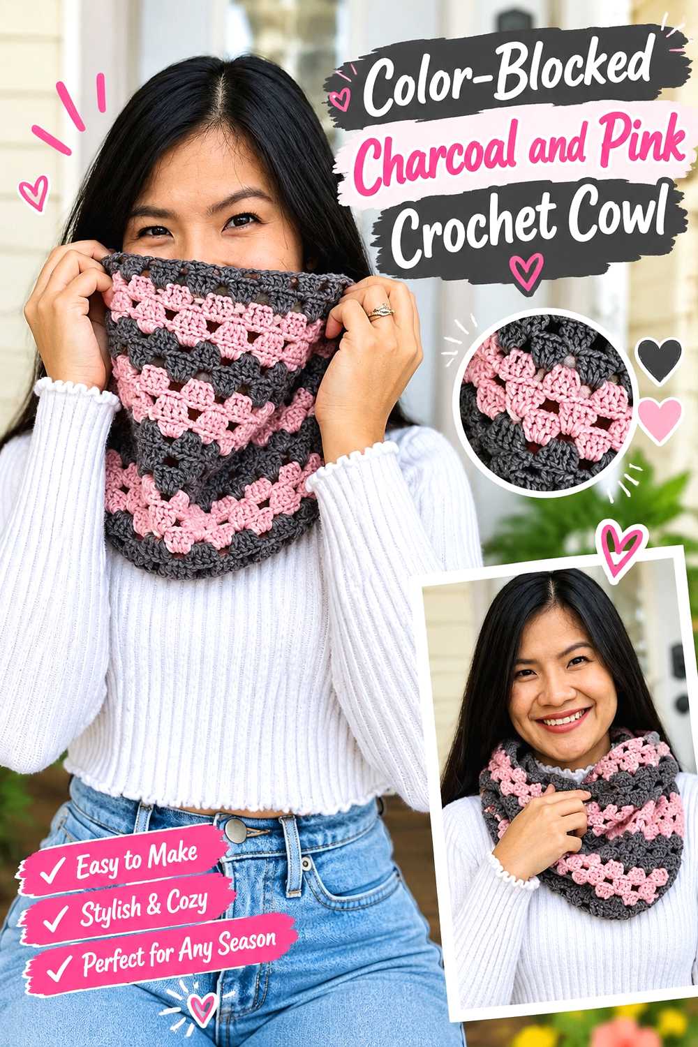
A crochet cowl keeps the palette close to the face while avoiding the loose ends of a traditional scarf. It is also a convenient project for experimenting with a stronger division between charcoal and baby pink.
You could make one broad section in each shade, use a charcoal body with pink edging, or keep the exterior mostly neutral and place the lighter shade where it appears when the cowl folds.
Think About the Folded View, Not Just the Flat Fabric
Cowls bunch, twist, and fold during wear. A perfectly straight color boundary may become much less obvious once the fabric sits around the neck.
Arrange the shades according to the finished worn effect rather than only how the piece looks spread flat.
Drape Determines Whether the Cowl Feels Relaxed or Structured
Substituting a firmer yarn can make a cowl stand farther away from the neck, while a softer fabric may collapse into deeper folds. Decide which effect you prefer before committing to the full circumference.
The yarn should therefore be chosen for more than its exact charcoal or pink shade.
Creator Credit: KnitcroAddict
6. Twisted Crochet Ear Warmer With Pink Center
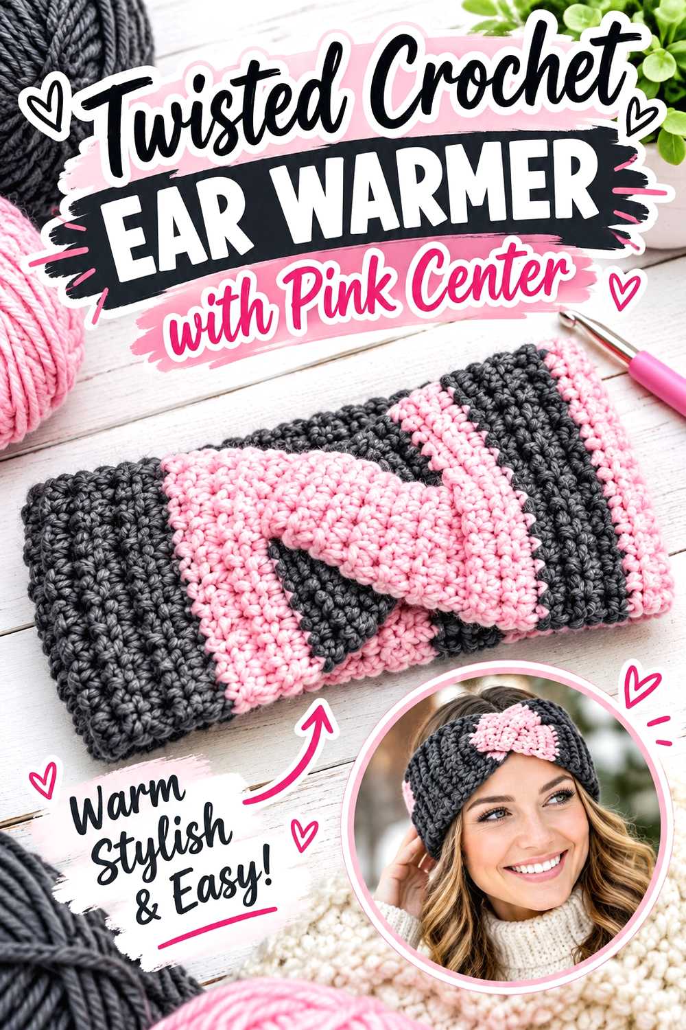
A twisted crochet ear warmer is a smaller fall accessory with a defined focal point at the front. That twist creates a natural location for baby pink, especially if the rest of the band is charcoal.
The opposite arrangement also works: a pink band with a darker center can make the twist appear more pronounced.
Use the Twist as the Main Color Decision
Adding several decorative changes to such a small piece can make the design feel fragmented. Letting the twist or center area carry the contrast keeps the project easy to read visually.
Before joining the band, position the color transition where it will actually sit when the warmer is worn.
Measure for Comfortable Stretch
An ear warmer needs enough negative ease to stay in place without becoming uncomfortable. Because yarn substitutions change stretch, use the tutorial’s sizing method rather than assuming a standard headband length will work with every yarn.
A two-color swatch can also reveal whether one shade stretches or rebounds differently from the other.
Creator Credit: Hope Corner Farm Crochet
7. Soft Pink And Charcoal Granny Square Crochet Vest
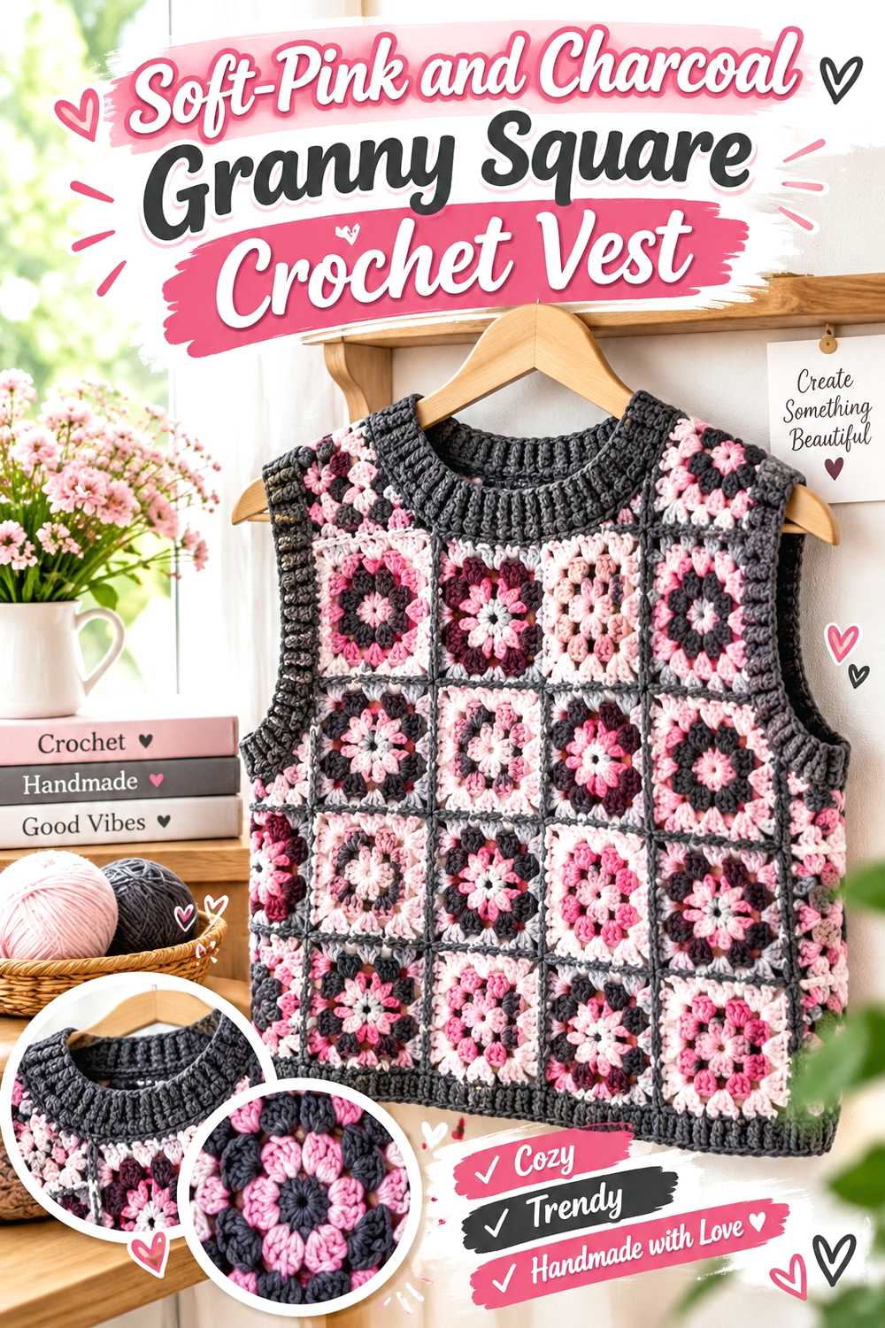
A granny square vest gives you more control over color distribution than a single-piece garment. Each motif can function as its own small composition, or entire squares can be assigned to one color.
Baby pink and charcoal are especially useful when you want the vest to feel graphic without introducing a large multicolor palette.
Block and Measure Motifs Before Planning the Grid
Color placement comes after dimensional compatibility. If pink and charcoal squares do not block to the same size, the problem will become increasingly obvious as more motifs are joined.
Finish and measure representative squares in both shades before committing to the full layout.
Avoid Making Every Square Compete for Attention
A motif does not need equal quantities of both colors. Some squares can be charcoal-heavy, some pink-heavy, and others can act as quieter transition pieces.
Viewing the complete layout before joining lets you redistribute visually heavy motifs rather than discovering an imbalance after assembly.
Check the Shoulder Area for Added Weight
Joined motifs can create a more substantial fabric than an open stitch pattern. If your yarn substitution is heavier than the tutorial’s, consider the total garment weight and shoulder behavior before adding extra length.
Fit should remain the controlling factor even when you want additional motifs for color balance.
Creator Credit: Ariel Madeline
8. Striped Charcoal And Baby Pink Crochet Hooded Scarf
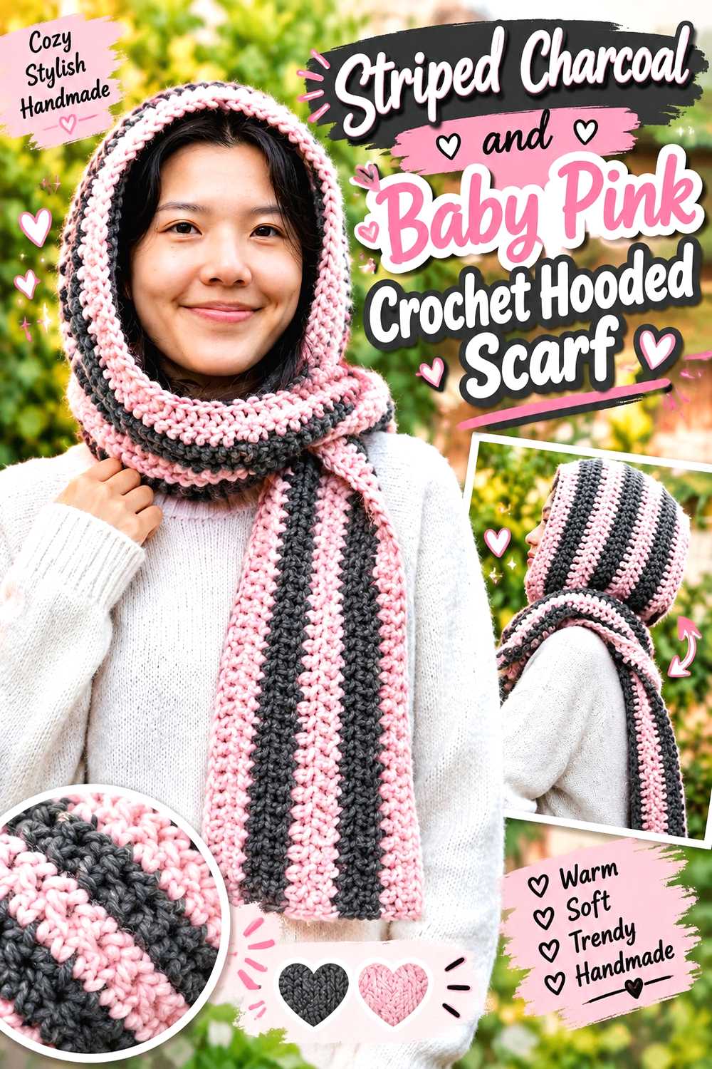
A hooded scarf gives both colors a long, continuous surface while combining head and neck coverage in one piece. Charcoal and baby pink stripes can therefore move through the scarf and hood instead of looking like separate accents.
This is one of the stronger options for anyone who wants both colors to remain clearly visible during wear.
Plan Stripes Around the Hood
A stripe sequence that works on a straight scarf can look different as it moves over a shaped hood. Consider where the most noticeable pink sections will land around the face rather than repeating colors mechanically.
You can also make the hood more charcoal-dominant and allow the scarf ends to carry more baby pink.
Watch the Total Fabric Weight
A hooded scarf uses more fabric around the upper body than either a beanie or ordinary scarf. If you switch to a substantially heavier yarn, the finished piece can pull differently around the head and shoulders.
Make a fabric sample before assuming a thicker yarn will simply make the project warmer.
Creator Credit: VivCrochets
9. Structured Two Tone Crochet Tote
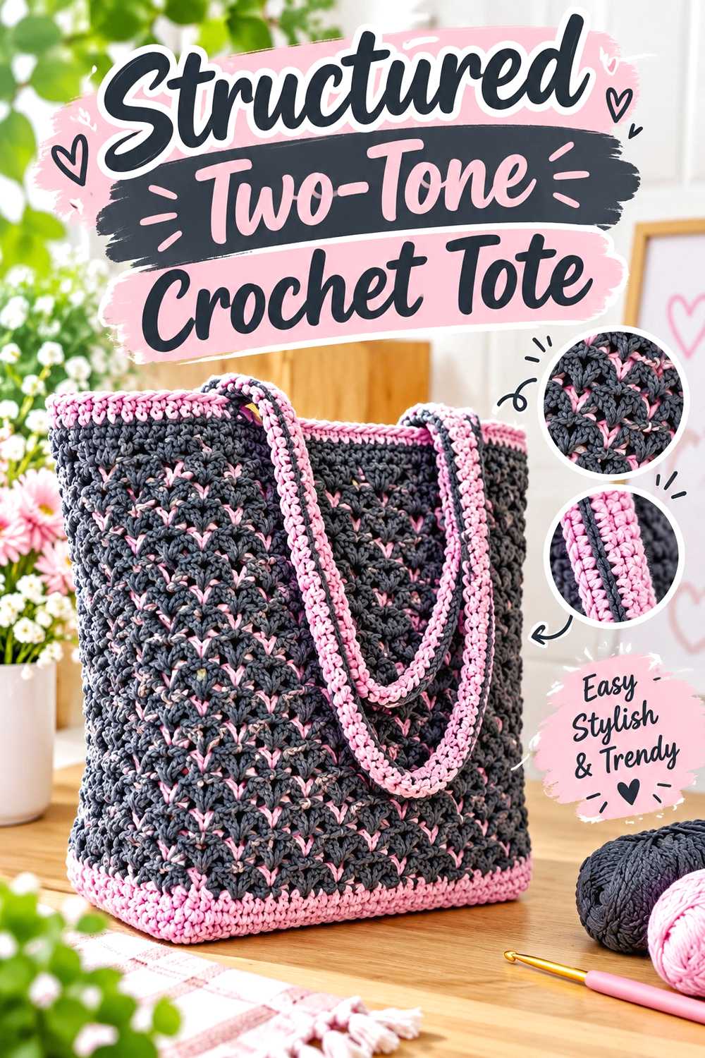
A tote lets charcoal handle the high-contact areas while baby pink provides visible contrast. One practical arrangement is a darker base and handles with a lighter body or central panel.
This project is less about warmth than fall styling, making it useful if you want to carry the palette beyond scarves and garments.
Put Structure Ahead of Color Placement
A beautiful two-color layout will not compensate for a tote that stretches excessively. Compare the tutorial’s recommended yarn with your substitutes and pay particular attention to how firmly the fabric works up.
If your pink yarn is noticeably softer than the charcoal, using it as a smaller accent may preserve the overall structure better than giving it the entire bag body.
Handles Need Their Own Plan
Handle stretch can change how a tote sits against the body. If you alter the handle construction, yarn, or length, evaluate the effect before loading the bag.
For heavier everyday use, consider whether lining or additional reinforcement fits your needs rather than assuming crochet fabric alone has a particular carrying capacity.
Creator Credit: Kristines Crochets
10. Compact Crochet Crossbody Bag With Pink Accent
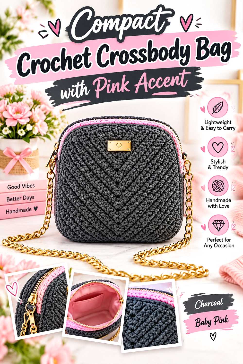
A crossbody bag offers a more concentrated version of the palette. A charcoal bag body can remain versatile for everyday wear, while a baby pink flap, edging detail, or strap accent introduces contrast.
Because this type of bag has a smaller surface than a tote, a little pink can have a surprisingly strong visual effect.
Strap Length Changes the Whole Bag
Before treating the strap as simply another place for color, decide where the bag should sit on the body. The visual balance changes significantly when a contrasting strap runs from shoulder to hip.
If you adjust the tutorial’s strap, confirm the finished drop rather than relying on an arbitrary length.
Think About the Opening and Small-Item Security
A crossbody used for everyday essentials has different requirements from a decorative mini bag. Check the tutorial’s closure and opening arrangement and decide whether it suits what you intend to carry.
If you plan to add a lining or alternate closure, account for those changes before finishing the top edge.
Creator Credit: Amena Crochet Bags
11. Plush Charcoal Crochet Slippers With Pink Trim
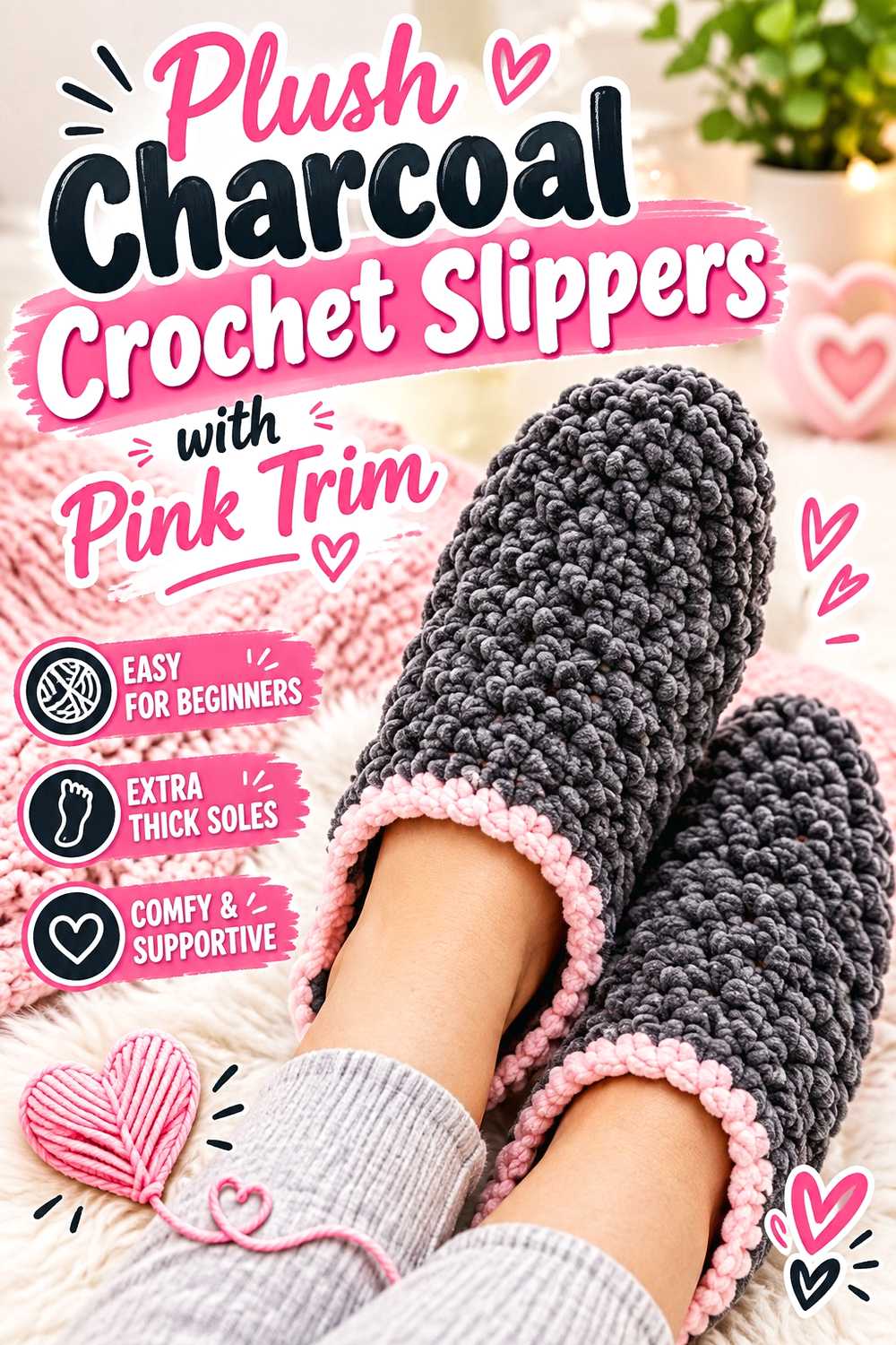
Charcoal slippers fit naturally into a fall home palette, while baby pink around the opening can soften the darker body. Keeping the contrast near the upper edge also reduces the amount of light-colored yarn exposed to floor contact.
This project is a useful reminder that functional placement can guide color placement.
Fit Both Slippers Before Final Finishing
Small changes in tension can produce a noticeable difference between two fitted pieces. Compare the pair during construction rather than treating the first slipper as finished and forgotten.
If the substitute yarn compresses or stretches differently from the original, evaluate that difference before making the second slipper.
Consider Traction on the Intended Floor
Crocheted soles can behave differently on carpet, wood, laminate, or tile. Do not assume the yarn itself provides reliable grip.
Evaluate the finished slippers for the intended wearer and flooring, especially if changing the sole material or thickness from the tutorial.
Creator Credit: DIY FROM HOME CROCHET
12. Baby Pink Crochet Leg Warmers With Charcoal Bands
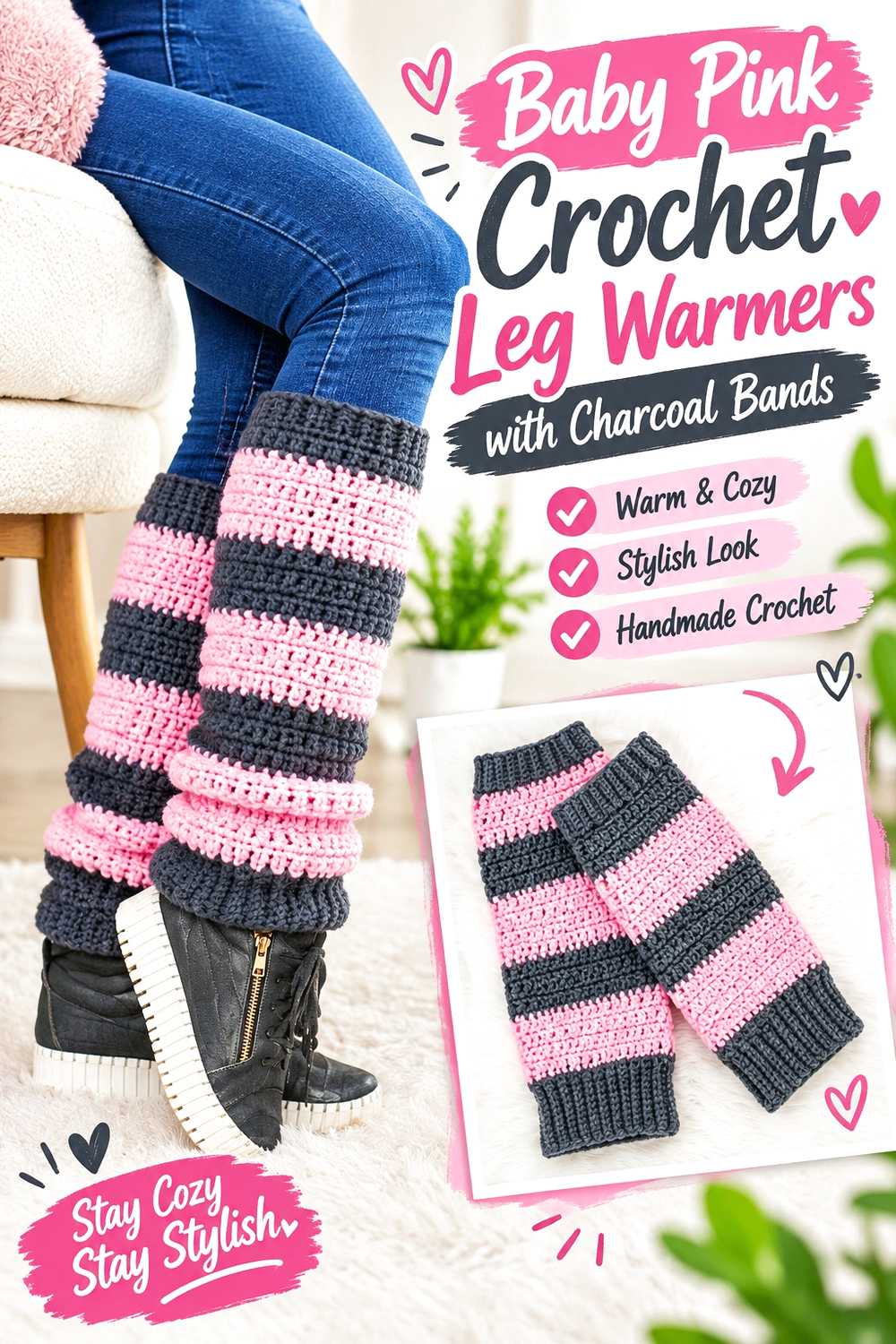
Leg warmers provide enough vertical length for several color arrangements without the fitting complexity of a full sweater. Baby pink can form the main body while charcoal bands visually anchor the top and bottom.
You could also place a broad charcoal section around the lower leg if you want a darker, more practical area near footwear.
Calf Fit Matters More Than a Perfect Stripe Repeat
A stripe sequence should not force you to ignore shaping or sizing. Check the tutorial’s fit guidance and adjust according to the wearer’s measurements.
If the leg warmer is intended to sit over leggings, tights, or jeans, consider that extra layer when assessing circumference.
Use Darker Bands to Frame the Silhouette
Charcoal at the upper and lower edges creates defined boundaries around a lighter center. This is particularly useful if you want the pink to be clearly visible without running the entire length.
Before repeating the same placement on the second leg warmer, compare the first against the intended footwear and hemline.
Creator Credit: Treasurie
13. Charcoal Crochet Pumpkin With Baby Pink Details
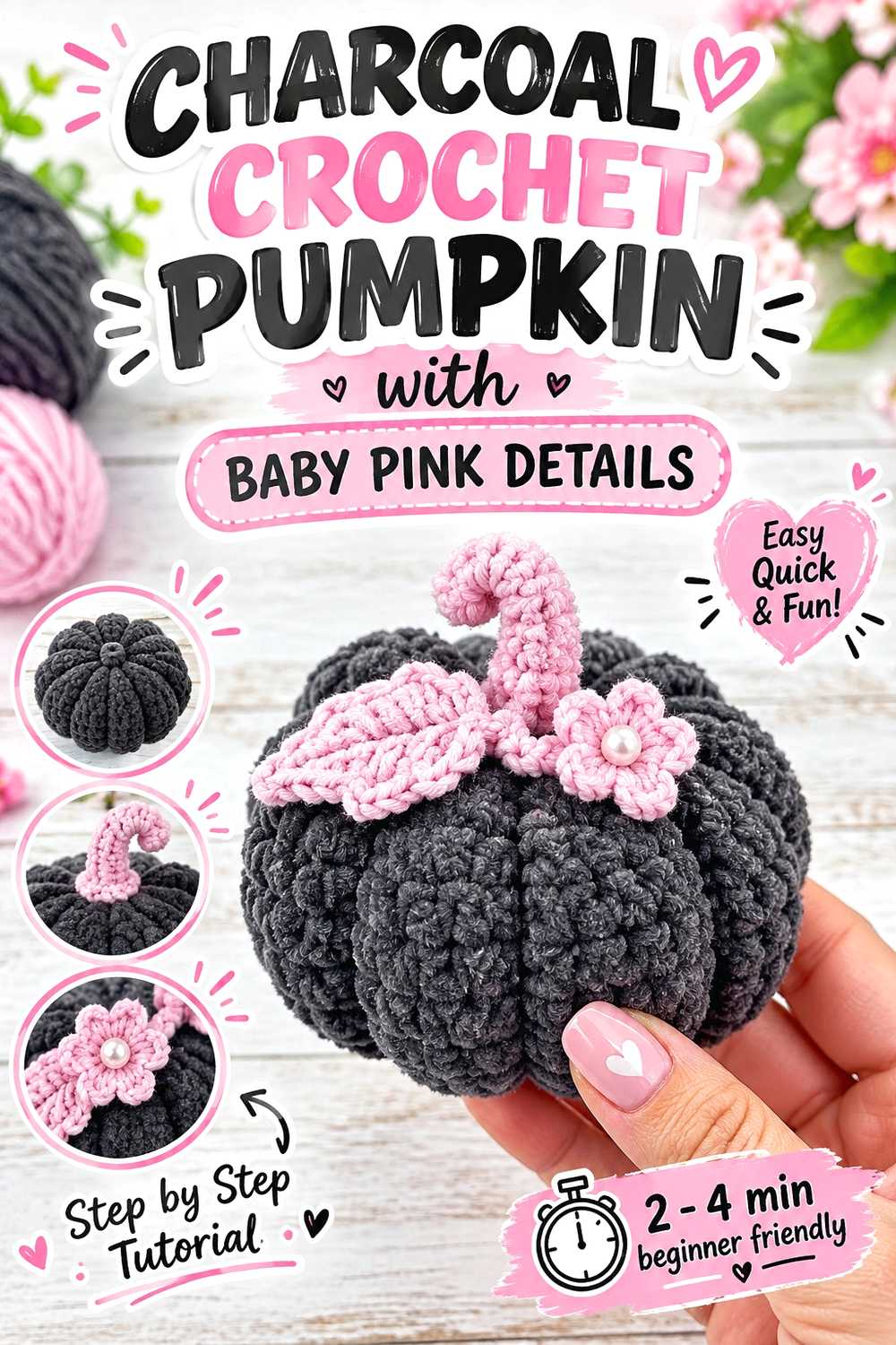
A charcoal crochet pumpkin takes familiar fall decor in a less traditional direction. Baby pink can appear on a stem wrap, leaf, small accent, or selected surface detail while leaving the pumpkin itself dark and neutral.
Because the object is small, this is also a practical project for testing how the palette looks in your home before committing to a blanket or pillow.
Shape Matters More Than Seasonal Color Rules
Orange is not necessary for an object to read as a pumpkin. The segmented silhouette and stem do most of that visual work, which gives you freedom to use charcoal without losing the fall theme.
A small pink detail can then act as an intentional accent rather than attempting to imitate a natural pumpkin color.
Choose Embellishments According to the Display Location
Loose buttons, beads, or other small pieces may be unsuitable where young children or pets can reach the decoration. A simple crocheted or securely attached accent can be the more practical choice for some homes.
If the pumpkin will be stored between seasons, avoid overly fragile additions that are difficult to pack without crushing.
Creator Credit: Crochet Pink Pumpkin
14. Two Color Textured Crochet Throw
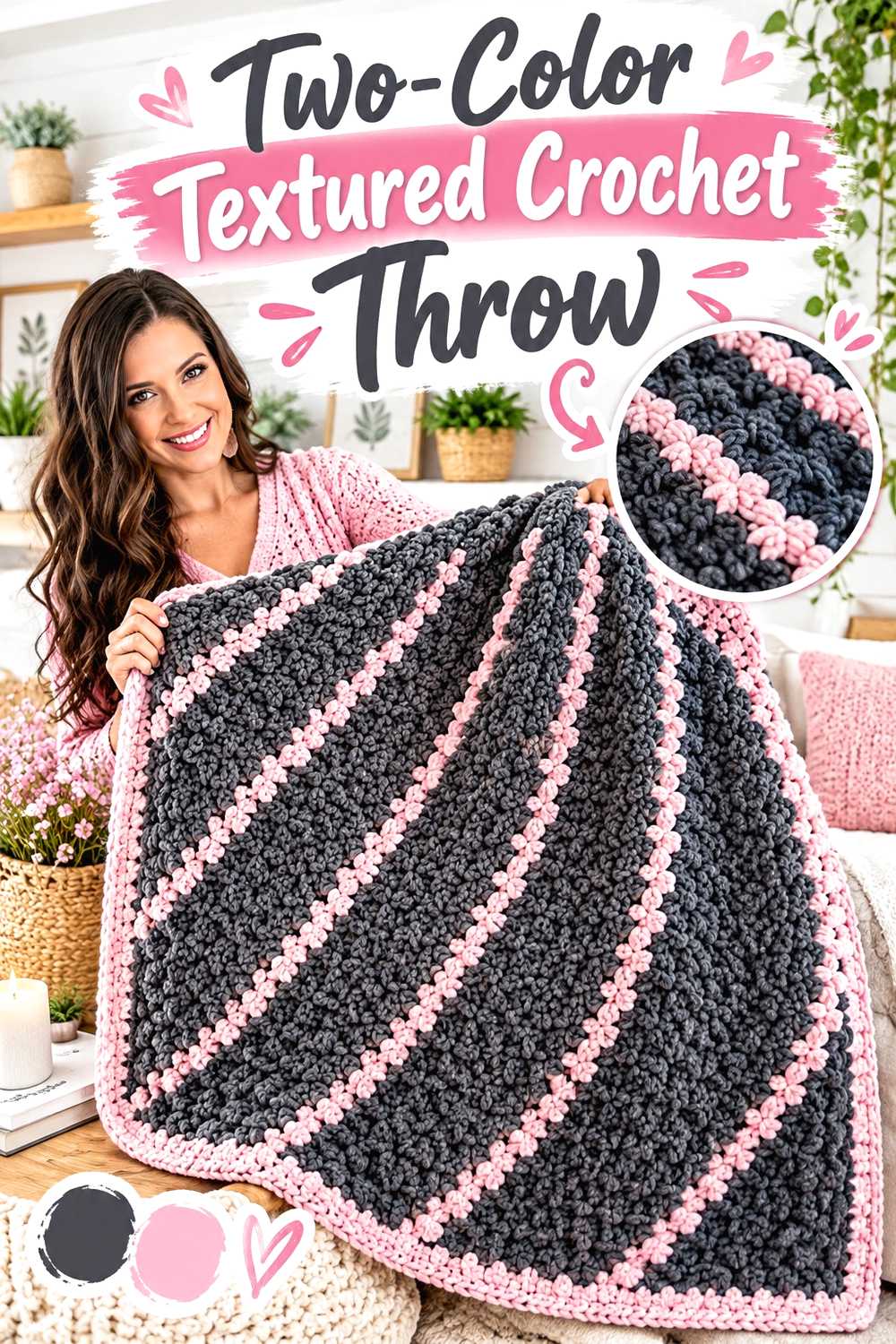
A throw is where charcoal and baby pink can have the strongest impact on a room because of the amount of visible surface. Instead of alternating every row, consider larger areas that let the texture remain the main feature.
Charcoal can ground the blanket while strategically placed pink bands or sections break up the darker field.
Let Texture Influence the Color Plan
If the stitch pattern creates a woven, raised, or dimensional surface, frequent color changes may compete with it. Larger uninterrupted sections allow the texture to remain readable.
Baby pink can be especially effective in a textured portion where shadows and raised stitches are easier to see.
Calculate With the Tutorial’s Actual Construction
Changing a blanket’s width, length, or yarn weight affects material requirements. Do not assume that adding a certain percentage of size requires exactly the same percentage of yarn in all constructions.
Use the creator’s sizing and yardage information as the reference point and recalculate only from measurements you actually know.
Think About the Finished Room, Not Just the Skeins
If the throw will live on a charcoal sofa, a predominantly charcoal blanket may disappear visually. Increasing the pink proportion could create more separation.
On a pale sofa or bedding, a charcoal-dominant throw can instead provide the stronger anchor.
Creator Credit: MJ’s Off The Hook Designs
15. Baby Pink Bow Crochet Pillow On A Charcoal Base
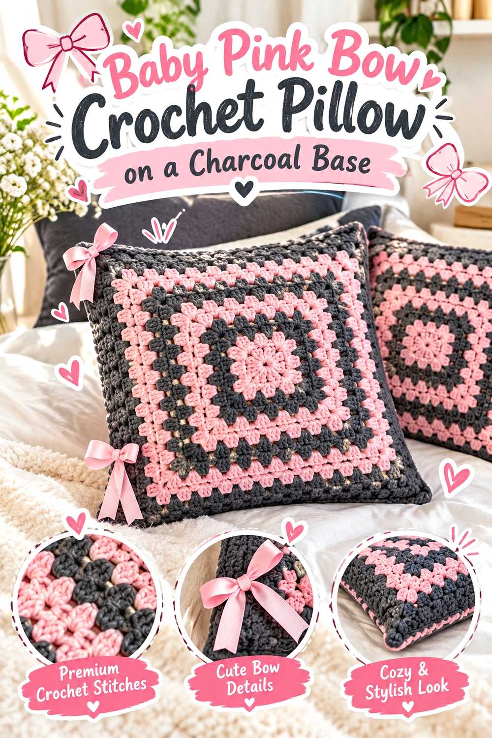
A decorative pillow gives baby pink a natural opportunity to become the focal color. A charcoal background can frame a bow or other dimensional detail without requiring the whole room to use pink.
This project works particularly well alongside the throw because the two pieces can repeat the same colors at different scales.
Dimensional Details Need Enough Contrast
If a raised bow or decorative feature is too close in value to the background, some of its shape can disappear. Baby pink against charcoal creates clear separation, which helps the dimensional element remain visible from across the room.
You can reverse the colors for a quieter effect if the surrounding furniture is already dark.
Confirm the Pillow Size Before Making the Cover
Decorative covers need to correspond to the intended insert. Do not assume that changing yarn while following the same crochet instructions will preserve the original dimensions.
Measure the fabric and intended insert during the project, particularly if your substitute yarn produces a different gauge.
Creator Credit: crochet daniela
16. Charcoal Crochet Storage Basket With Pink Rim
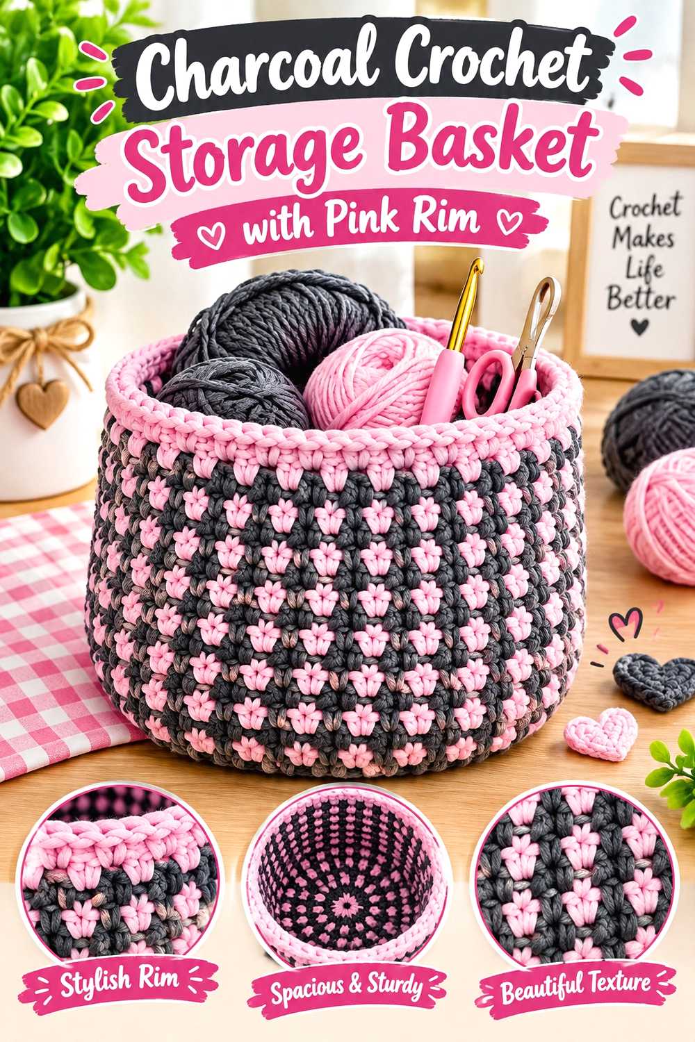
A storage basket benefits from charcoal because the dark shade makes a useful visual base for everyday organization. A baby pink upper rim or handle area can keep the basket connected to the wider fall palette without making every surface light-colored.
It is also one of the clearest examples of why yarn structure matters as much as appearance.
A Basket Needs Fabric That Can Support Its Intended Shape
Soft, drapey yarn that feels wonderful in a scarf may not create the same basket structure as the tutorial. Compare the recommended material and finished fabric before substituting based on color alone.
If a swatch collapses easily, consider whether that softness matches the type of storage basket you actually want.
Put Pink Where It Will Stay Visible
A narrow accent near the base may disappear when the basket sits on a shelf. A contrasting rim remains visible even when the basket is full.
If handles are part of the design, they offer another contained place to repeat baby pink without weakening the charcoal-dominant look.
Creator Credit: Crochet My Hobby
17. Draped Charcoal Crochet Poncho With Baby Pink Border
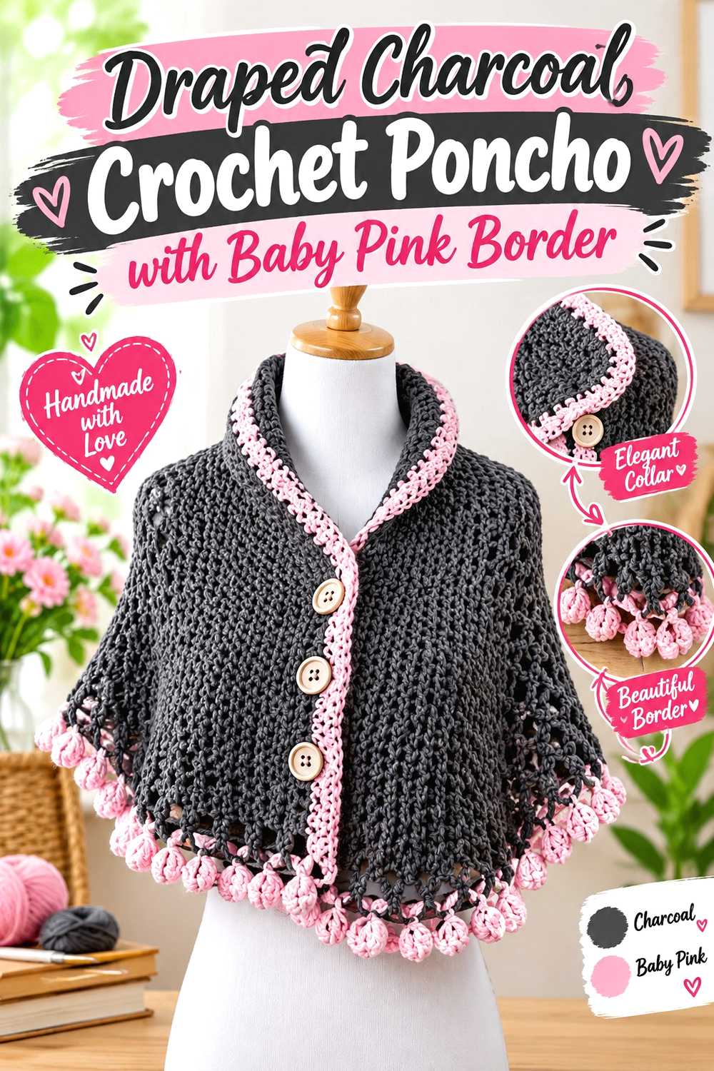
A poncho creates a broad uninterrupted surface, so the ratio of charcoal to baby pink matters more here than on a glove or headband. A mostly charcoal body with a pink border offers an easy way to keep the finished layer versatile while still making the color pairing obvious.
The edge can also visually emphasize the poncho’s shape.
Check Drape Before Expanding the Body
A poncho needs enough movement to fall comfortably over clothing. Replacing the tutorial yarn with something stiffer or substantially heavier can alter that behavior.
Make enough sample fabric to judge drape rather than choosing solely from how soft the yarn feels in the skein.
Borders Can Change the Visual Proportions
A wider baby pink edge will draw attention outward and make the contrast a major design element. A narrow border reads more like finishing.
Decide which role you want the pink to play before reaching the final section so you can reserve enough matching yarn.
Account for Fall Layers When Checking Fit
A poncho worn over a thin shirt does not need exactly the same room as one intended for sweaters. Consider the clothing that will sit underneath when reviewing the tutorial’s size and measurements.
Do not enlarge the piece simply because it is outerwear; use actual measurements and desired ease instead.
Creator Credit: Handwork diy
18. Waffle Texture Charcoal And Pink Crochet Coffee Cozy
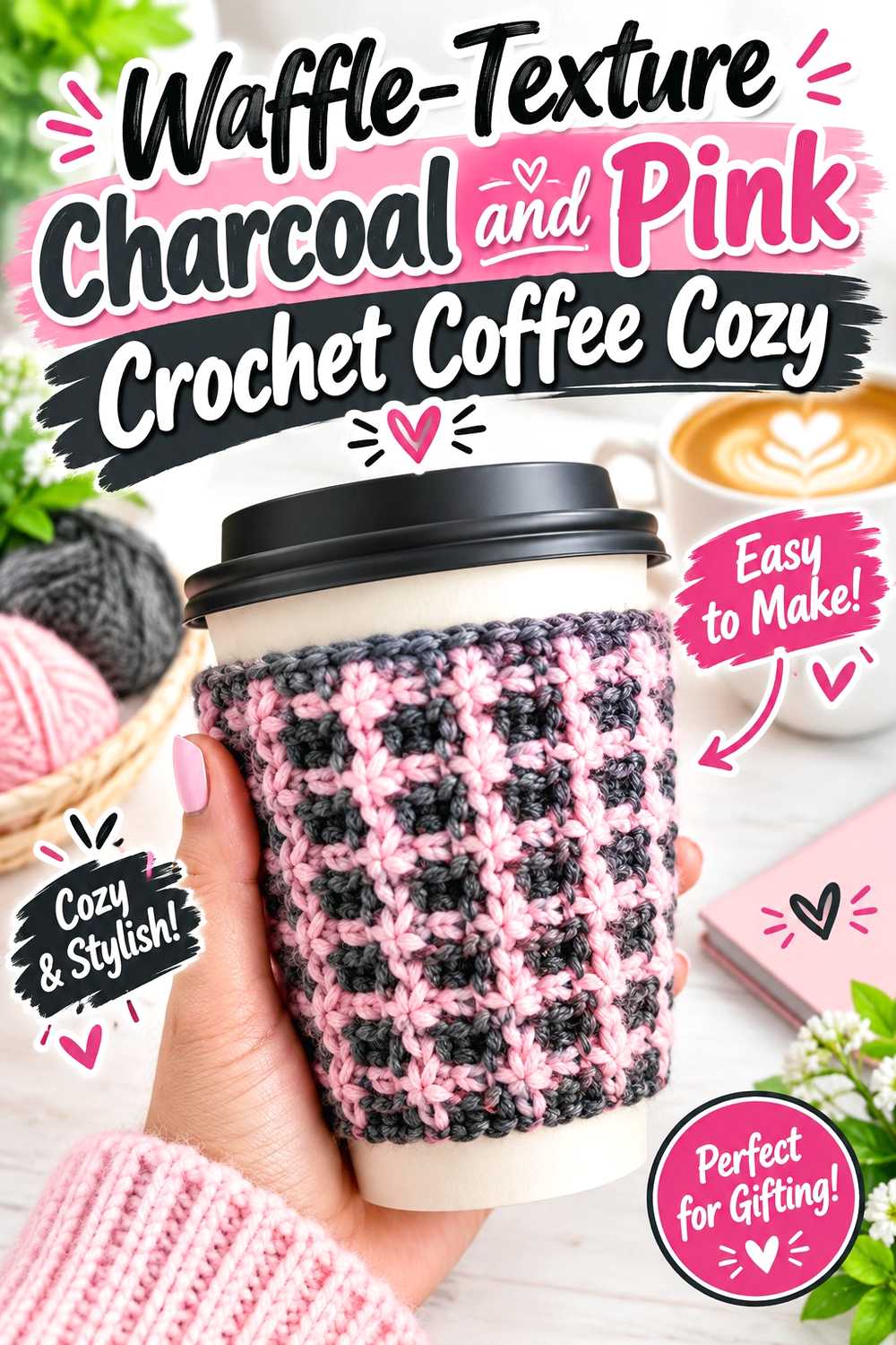
A textured coffee cozy is a small project with enough surface detail to make the color pairing noticeable. Charcoal can form the main sleeve while baby pink appears as edging, or the lighter shade can take over the textured center with dark framing.
It is also a manageable way to use leftovers from a larger charcoal-and-pink project.
Make Sure the Texture Still Fits the Cup
Raised texture can make the fabric thicker without automatically making the finished circumference appropriate for every mug or travel cup.
Use the tutorial’s sizing logic and check the actual vessel you plan to use instead of assuming that one cozy size is universal.
Treat It as an Insulating Accessory, Not a Heat-Safety Guarantee
The appearance or thickness of crochet fabric does not establish a particular heat-resistance rating. Keep the cozy away from open flames and follow appropriate care guidance for the yarn you use.
For a frequently handled item, also consider how easily the chosen fiber can be cleaned.
Creator Credit: Rania Crochet Guide
Which Charcoal and Baby Pink Crochet Project Should You Choose?
For a major wardrobe piece, the cardigan, granny square vest, hooded scarf, and poncho give the palette enough space to become a central part of the finished look. They also require the most attention to gauge, fit, yarn weight, and color placement.
For a smaller experiment, the beanie, fingerless gloves, ear warmer, pumpkin, or coffee cozy let you test the combination without designing an entire outfit or room around it. They are also useful destinations for leftover yarn, provided the remaining yarn is appropriate for the project’s construction.
The throw, pillow, and basket work together particularly well for home decor because each uses the same palette in a different proportion and form. Meanwhile, the tote and crossbody bag allow you to bring the colors into everyday accessories without relying on cold weather.
Conclusion
Charcoal and baby pink can produce very different results depending on where the contrast is placed. A charcoal cardigan with small pink details feels quite different from a baby pink beanie, a two-tone granny square vest, or a dark fall pumpkin with one soft accent.
For Fall 2026, the most useful approach is to choose the construction first and decide what job each color should perform second. Consider fit for wearables, stretch for bags, shape retention for baskets, scale for home decor, and cleaning needs for frequently handled pieces.
When adapting any of these ideas, use the original tutorial for its exact construction details and verify yarn, gauge, measurements, finishing, and sizing before making substitutions. That keeps the charcoal-and-baby-pink palette an intentional design change rather than an accidental change to how the project fits or functions.
Frequently Asked Questions
Do charcoal and baby pink yarn need to be the same brand?
No, but they should behave compatibly for the project. Check yarn weight, fiber content, gauge, elasticity, and resulting fabric rather than relying only on the label category. Differences become especially important in fitted garments and joined motifs.
What is the easiest way to use charcoal and baby pink without making a project look too busy?
Give one color a clear primary role and use the other for defined areas such as borders, cuffs, handles, bands, motifs, or selected panels. Large color blocks generally create a calmer result than frequent small changes.
Does charcoal hide crochet texture?
Very dark yarn can make subtle stitch definition less obvious, particularly in dim lighting. If texture is central to the design, use baby pink in some of the raised or detailed areas, or make a swatch to see whether the charcoal yarn shows the stitch pattern clearly enough.
Should I alternate charcoal and pink in every granny square?
Not necessarily. You can use mostly charcoal squares, mostly pink squares, two-color motifs, or a mixture. What matters is that all motifs intended to join together reach compatible blocked dimensions and that the complete layout looks balanced before joining.
Can I replace the yarn in these tutorials just because I found the right charcoal and pink shades?
Color alone is not enough. Compare the substitute yarn with the tutorial yarn for weight, fiber behavior, gauge, structure, and drape. This is particularly important for garments, hats, slippers, bags, baskets, and other projects where size or structure affects function.
Which projects make the most sense for leftover charcoal and baby pink yarn?
Smaller accessories and decor such as an ear warmer, fingerless gloves, coffee cozy, or pumpkin may suit leftover yarn better than a large garment or blanket. Confirm that you have enough compatible yarn for the specific project rather than relying on an estimated amount.
How can I make several charcoal and baby pink crochet projects coordinate without making them identical?
Repeat the palette but change the proportion. One project might be 80 percent charcoal with a pink edge, while another can make pink dominant and use charcoal only as framing. Repeating the colors while varying texture, shape, and placement creates connection without producing a matching set that feels overly uniform.