Turquoise and red can make a surprisingly flexible fall crochet palette. The combination can feel earthy and vintage when the turquoise leans toward teal and the red is closer to brick, cranberry, or rust. Brighter versions create a stronger graphic effect that works especially well in granny squares, plaid, stripes, and small seasonal accents.
The projects below cover wearables, accessories, home decor, storage, and autumn decorations. The supporting tutorials focus on the construction of each finished item; not every original sample is already turquoise and red. Where the source uses another palette, the color combination here is an adaptation idea rather than a claim about the creator’s original design.
That distinction is useful because color changes do not affect every crochet project in the same way. A granny-square sweater gives both shades plenty of space, while a leaf bookmark or mug cozy may look clearer when one color leads and the second appears only as an accent. Use the ideas below to choose both a project type and a color arrangement that make sense together.
Quick List
- Crochet Turquoise-and-Red Granny Square Cardigan
- Crochet Ribbed Two-Color Beanie
- Crochet Turquoise-and-Red Everyday Tote
- Crochet Color-Block Fall Throw Blanket
- Crochet Structured Two-Tone Storage Basket
- Crochet Red Spiderweb Fingerless Gloves With Turquoise Accents
- Crochet Chunky Granny Square Fall Sweater
- Crochet Red-and-Turquoise Pumpkin Mug Cozy
- Crochet Turquoise Leaf Bookmark With Red Detail
- Crochet Granny Square Waistcoat in Turquoise and Red
- Crochet Mushroom Wall Hanging in Turquoise and Red
- Crochet Turquoise-and-Red Plaid Placemat
- Crochet Red Pumpkin Bucket Hat With Turquoise Detail
- Crochet Two-Tone Pumpkin Pillow
- Crochet Turquoise-and-Red Infinity Scarf
- Crochet Chunky Color-Block Ear Warmer
- Crochet Turquoise-and-Red Autumn Leaf Garland
- Crochet Turquoise Shawl With a Red Contrast Border
How to Make Turquoise and Red Feel Right for Fall
The easiest way to move this combination away from a summery look is to pay attention to value and saturation. A deep teal-turquoise beside brick, cranberry, garnet, or muted tomato red tends to feel more grounded than very pale aqua paired with a candy-bright red.
You do not have to make both colors equally prominent. A roughly dominant-and-accent approach often gives the eye somewhere to rest. For example, a turquoise cardigan can use red around selected granny-square centers, while a red beanie can reserve turquoise for the brim or a single stripe.
A third neutral is also an option when the construction needs more separation. Cream, charcoal, camel, chocolate, or another restrained shade can act as visual space between turquoise and red without changing the main two-color concept.
Match the Color Layout to the Crochet Construction
Joined motifs, plaid, and stripes naturally divide color into sections, so both shades can play major roles. Larger continuous fabrics such as shawls and blankets can become visually louder if turquoise and red alternate too frequently. In those projects, larger color blocks, a contrast border, or widely spaced bands may be easier to balance.
Texture matters too. Raised stitches, ribbing, dimensional motifs, and openwork already create strong surface interest. Adding many small color changes on top of that texture can make the details harder to see. When the stitch pattern is the main feature, consider letting one color dominate and using the other where it defines an edge, cuff, opening, motif, or border.
For functional projects such as totes and baskets, do not let the palette distract from construction. Handle stretch, opening shape, fabric density, and stability are still more important than where the red stripe goes.
Check Both Yarns Before Committing to the Combination
When turquoise and red share the same project, compare more than the labels’ color names. The yarns should behave compatibly enough for the intended construction. A noticeable difference in thickness, elasticity, or surface texture can change the size of motifs or distort a striped fabric even when the colors look perfect together.
For projects that will be washed, check the care information for both yarns. Strongly contrasting colors can also make unexpected dye transfer more noticeable, so a small test swatch can be useful when you are uncertain about how the yarns will behave with laundering.
1. Crochet Turquoise And Red Granny Square Cardigan
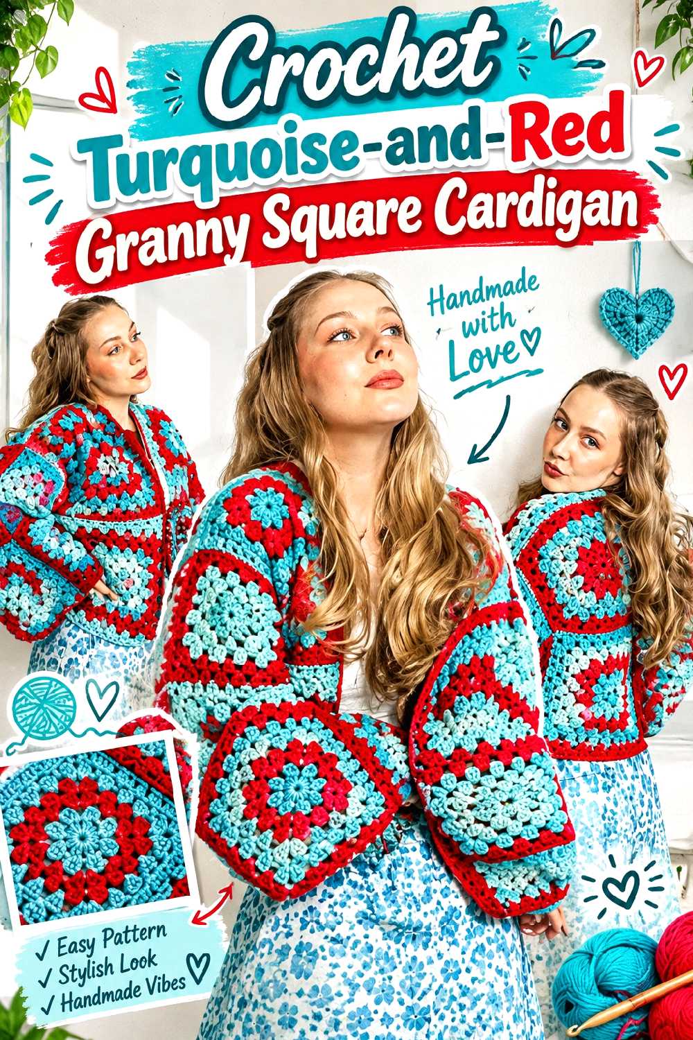
A granny-square cardigan gives both colors enough room to be visible without requiring constant color changes across one large piece of fabric. The supporting tutorial uses joined granny squares to form a cardigan and also addresses finishing areas such as the neckline and ties. For this fall version, turquoise and red can be distributed through the motifs instead of simply adding one contrast stripe at the end.
Let the Granny Squares Carry Both Colors
Try deciding on a repeatable color rule before making a large number of motifs. One option is a turquoise-dominant square with a red center; another is to reverse the colors on selected squares and scatter those through the layout. The second approach produces more movement, but laying the squares out before joining will help prevent accidental color clusters.
Check Blocked Square Size Before Planning the Body
A color substitution is simple only when the replacement yarns behave similarly. If your red square finishes larger or firmer than your turquoise one, the difference can show up at seams and edges. Compare blocked dimensions before committing to the cardigan layout rather than hoping joining will correct mismatched motifs.
Keep the Neckline and Ties Visually Connected
The neckline, border, and ties can either calm the mixed motifs or add another layer of contrast. Repeating the dominant body color around these areas usually creates a clearer frame, while using the accent color makes them stand out. Decide which effect you want before finishing rather than treating the edging as an afterthought.
Creator Credit: DIYGuru
2. Crochet Ribbed Two Color Beanie
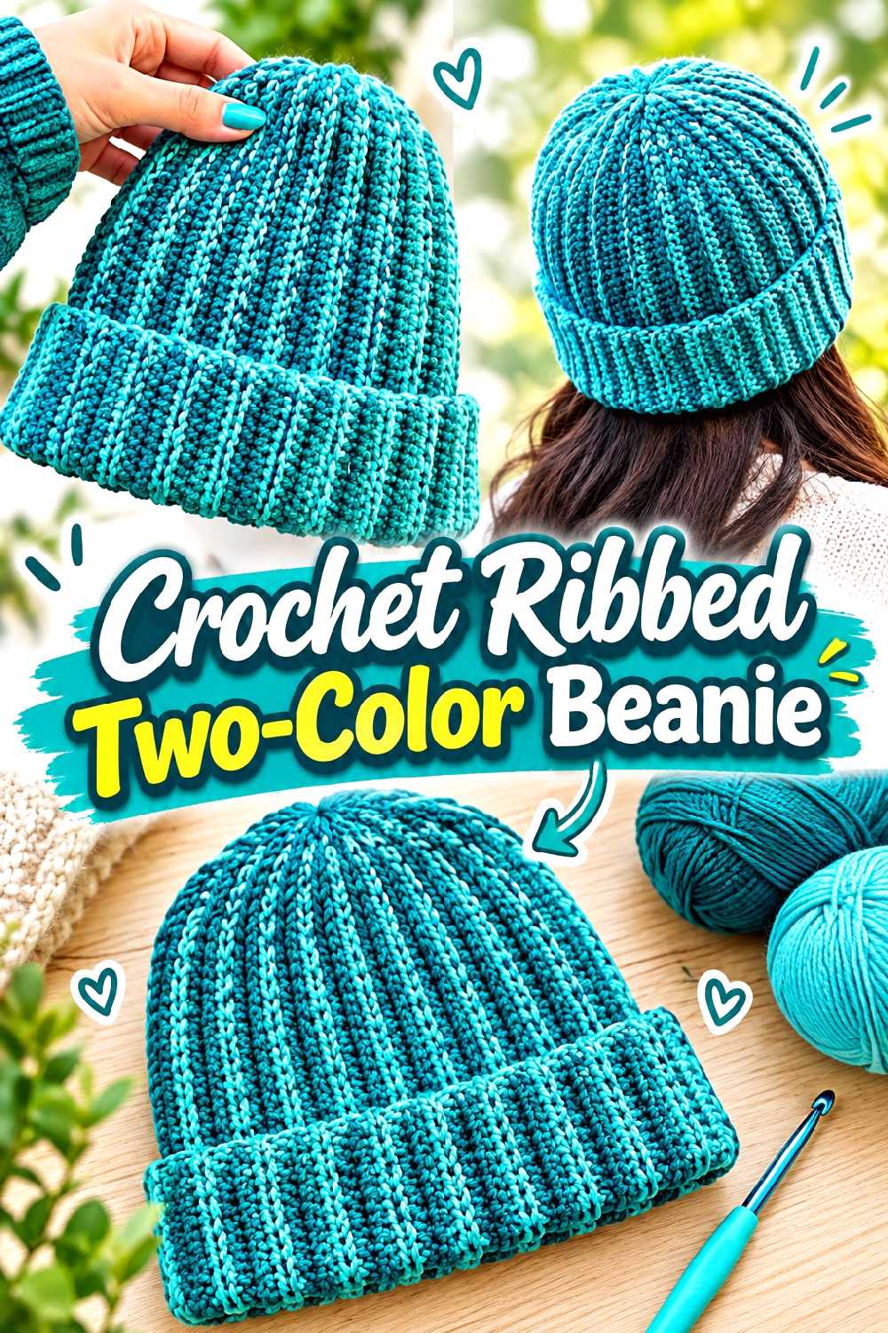
A ribbed crochet beanie is a useful choice when you want the turquoise-and-red palette in a smaller fall accessory rather than a full garment. The tutorial construction creates a ribbed hat and includes shaping and finishing for the crown, leaving the color arrangement open to adaptation.
Ribbing Makes Every Color Boundary More Noticeable
Vertical or folded ribbing creates strong lines, so a poorly placed color change can become more obvious than it would in a flatter fabric. Consider broad sections instead of frequent narrow stripes if you want the rib texture to remain the main feature.
Decide Whether the Folded Brim Should Contrast
A red body with a turquoise brim makes the lower edge a focal point. Reversing that arrangement gives turquoise more presence while still keeping red close to the face. If you plan to fold the brim, preview how the colors overlap in the folded position before finalizing the sequence.
Creator Credit: VivCrochets
3. Crochet Turquoise And Red Everyday Tote
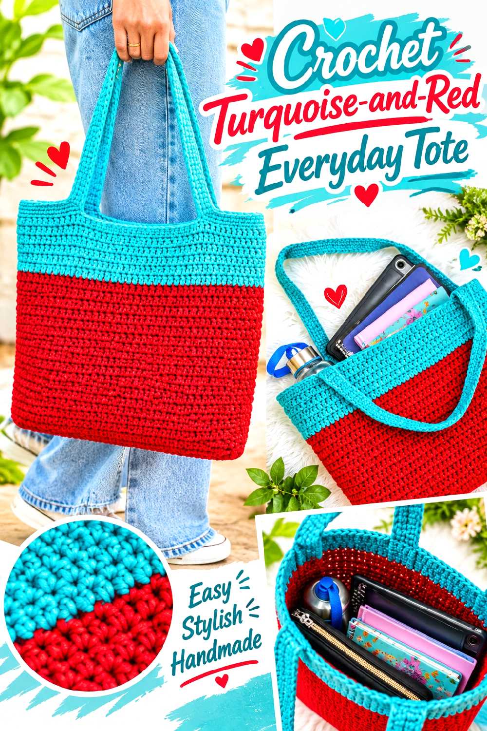
A straightforward crochet tote provides a large, uncomplicated surface for experimenting with two strong colors. The supporting tutorial demonstrates a basic tote form that can be adjusted in overall scale, making the concept suitable for broad color blocking, stripes, or contrasting handles.
Put the Strongest Contrast Where It Helps Define the Shape
A turquoise bag body with red handles immediately emphasizes the upper outline, while a red lower section and turquoise upper section can visually divide the bag into larger blocks. If you prefer a calmer result, keep the body mostly one color and repeat the accent only at the handles or opening.
Check Handle Stretch Before Adding Decorative Colorwork
The handles have a functional job. If your chosen stitch or yarn stretches substantially under load, adding more decorative color changes will not solve the structural issue. Test how the handle fabric behaves and consider reinforcement or lining only when it suits how you intend to use the tote.
Treat Lining as a Function Decision
An open crochet fabric may be perfectly suitable for carrying larger items but less practical for small objects. If that matters to you, check whether you want to add a lining separately. Do not assume a colorful, dense-looking fabric automatically prevents small contents from working through openings.
Creator Credit: Hopeful Turns
4. Crochet Color Block Fall Throw Blanket
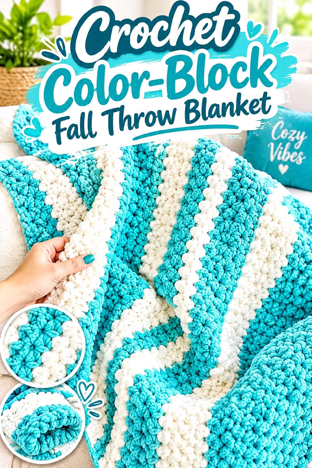
A turquoise-and-red throw can be bold without becoming visually busy if the colors appear in broad sections. The supporting blanket tutorial demonstrates a simple blanket construction and includes color changing, which makes it a practical starting point for a two-color interpretation.
Large Color Blocks Can Calm a Strong Combination
Instead of alternating turquoise and red every few rows, consider wider bands or an asymmetric division. Larger areas allow each color to read independently and can give the blanket a more settled look when it is folded over a sofa or chair.
Preview the Border Before Introducing Another Color Change
A border in the same shade as the first or last major section can visually contain the design. A contrast border creates a stronger frame. Before adding it, spread out the blanket and decide whether the center already has enough color movement; the edge does not need to repeat every shade simply because both are available.
Creator Credit: Bella Coco
5. Crochet Structured Two Tone Storage Basket
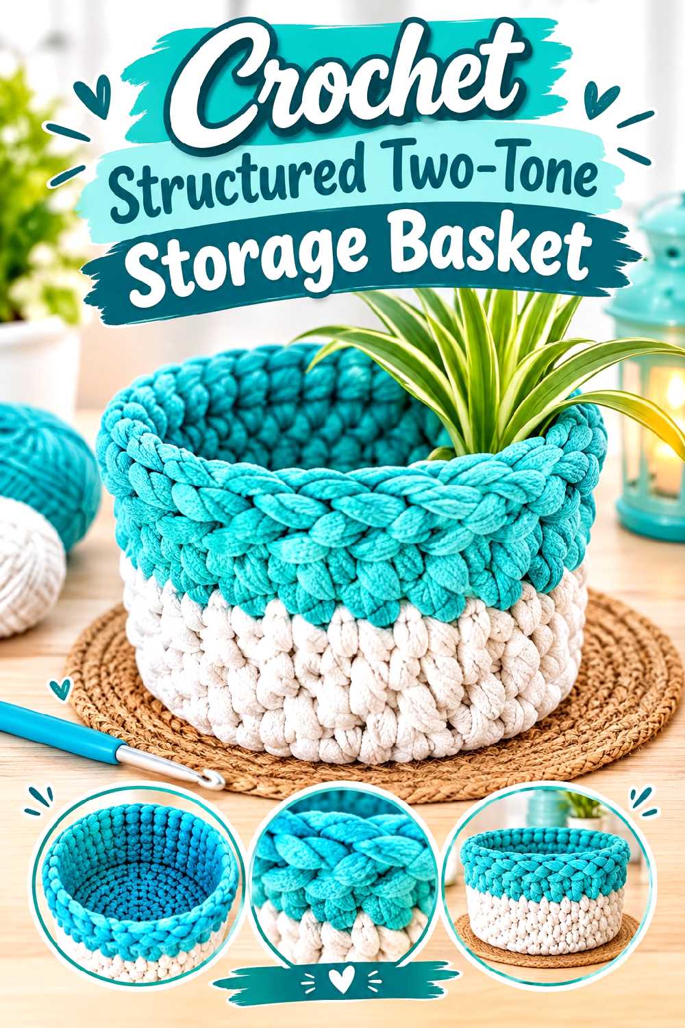
Storage crochet benefits from shape retention, making a basket an interesting counterpoint to the softer wearables in this collection. The supporting tutorial creates a customizable crochet basket and incorporates a decorative ribbon detail, providing several places where turquoise and red can be separated rather than mixed throughout.
Structure Comes Before the Fall Palette
A beautiful color arrangement will not compensate for a basket that collapses when you expected it to stand upright. Pay attention to the tutorial’s fabric construction and compare it with the yarn you plan to substitute. A very soft yarn may produce a different result from a firmer one even when the stated weight category is similar.
A Contrasting Rim Can Define the Opening
Using turquoise through most of the basket and red only at the upper edge creates a clear finish without overwhelming the form. You could also reverse that arrangement or reserve the second shade for a ribbon or handle detail if the basket design includes one.
Creator Credit: Lallaulab
6. Crochet Red Spiderweb Fingerless Gloves With Turquoise Accents

Spiderweb-style fingerless gloves add an autumn and Halloween-adjacent option without turning the whole collection into novelty decor. The source tutorial centers on an open spiderweb motif and includes wrist finishing, so the web and the lower edge can be treated as separate color zones.
Open Webs Need Clear Color Separation
A red web against turquoise wrist sections creates an obvious distinction between the motif and the supporting fabric. If you alternate the colors too frequently inside the web itself, the open structure may become harder to read from a distance.
Keep the Wrist Accent From Competing With the Motif
The spiderweb is already visually active. A simple turquoise wrist area can anchor it, while extra stripes, surface details, and multiple contrast transitions may compete with the shape. Use the second color where it clarifies the structure rather than adding it everywhere.
Creator Credit: The Crochet Nest | Yarn and Hook Studio
7. Crochet Chunky Granny Square Fall Sweater
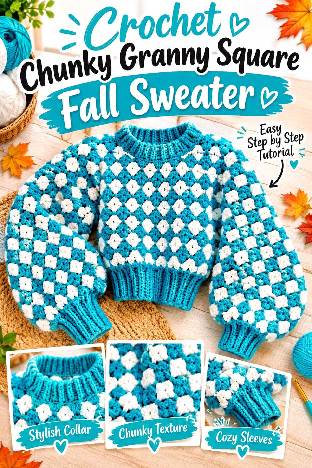
A chunky granny-square sweater makes turquoise and red feel more graphic because every motif occupies more visual space. The supporting tutorial builds the garment from granny-square panels and includes areas such as sleeves, cuffs, and the neckline, giving you several ways to repeat the palette intentionally.
Large Granny Squares Amplify Every Color Choice
On a small motif, a bright red center may read as a detail. On a larger square, that same red can dominate an entire garment section. Make a sample motif in the planned palette and view it from several feet away before repeating the arrangement across the sweater.
Check Panel Weight and Drape Before Finishing the Sleeves
Chunkier motif fabrics can become substantial once several squares are joined. Color does not change that basic construction issue, so assess the assembled body before assuming the sleeve length or cuff treatment should remain exactly as planned.
Let the Cuffs and Collar Repeat a Color on Purpose
Solid-color cuffs and neckline finishing can unify multicolored squares. Turquoise can create a cooler frame around red-heavy motifs, while red finishing gives the garment a stronger warm edge. Repeating one choice consistently is usually clearer than switching finishing colors at random.
Creator Credit: Kenikse Crochet
8. Crochet Red And Turquoise Pumpkin Mug Cozy
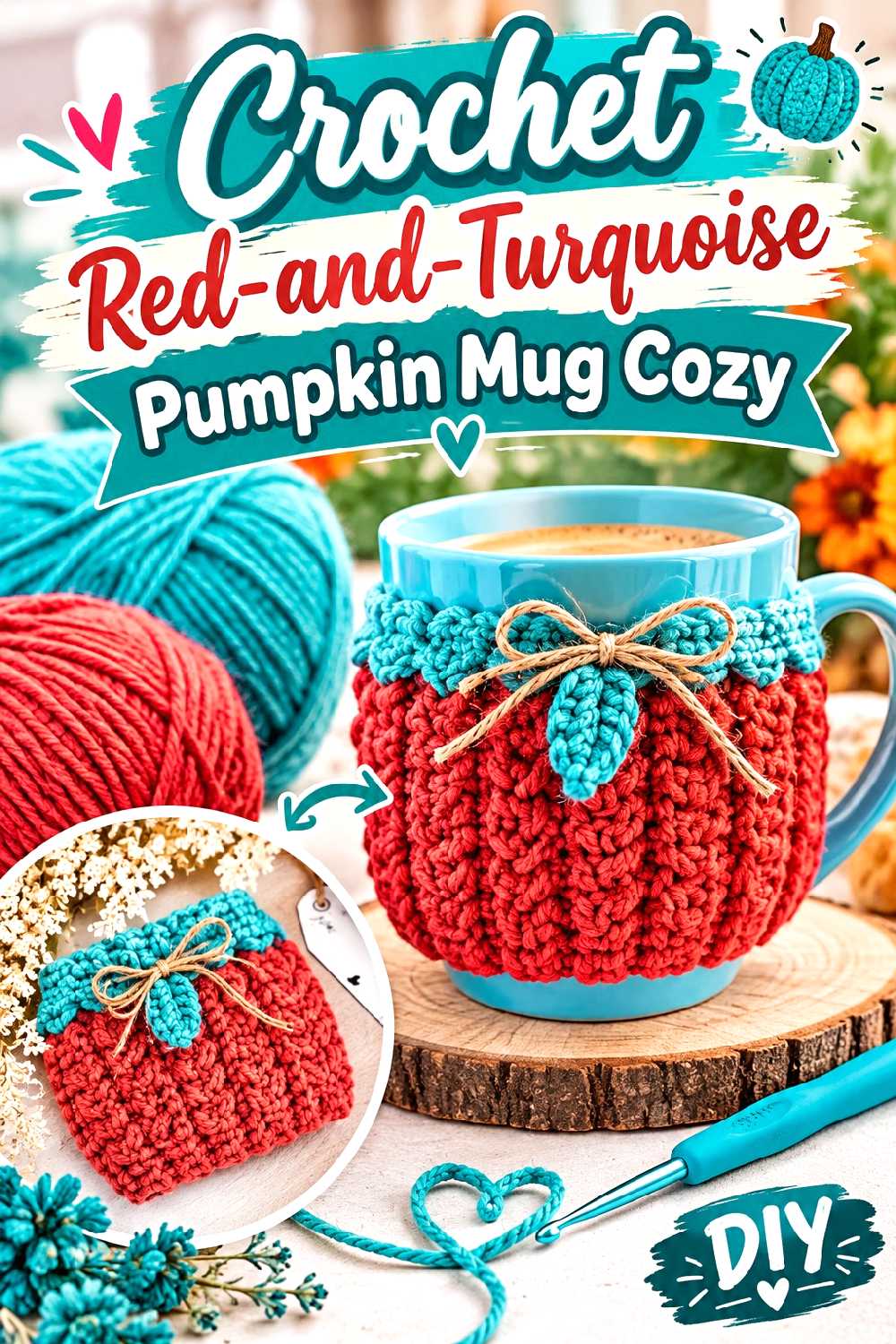
A pumpkin-shaped or pumpkin-inspired mug cozy offers a small project where the fall theme comes from form and texture rather than traditional orange. The supporting tutorial uses a textured pumpkin concept with additional top and leaf details, so red can take over the pumpkin area while turquoise becomes a deliberately unconventional accent.
Red Can Carry the Pumpkin Shape Without Using Orange
The silhouette and surface texture can communicate “pumpkin” even when you move away from the expected orange palette. A deep red body keeps the design connected to fall while making it coordinate with the rest of this collection.
Keep Turquoise Small if You Want the Pumpkin to Read Clearly
Turquoise works well as a leaf, top detail, narrow edging section, or another secondary element. Making every feature half turquoise and half red can weaken the pumpkin impression because the eye has no dominant shape to follow.
Confirm the Cozy Fits the Cup Style You Use
A mug cozy is functional only if its opening, handle clearance, and circumference suit the vessel. Check the tutorial’s fitting method against your actual mug rather than assuming every coffee cup has the same proportions.
Creator Credit: Briana K
9. Crochet Turquoise Leaf Bookmark With Red Detail
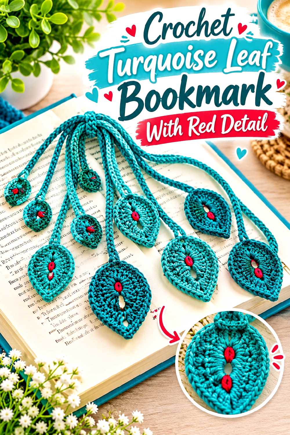
A leaf bookmark brings the fall theme into a much smaller scale. The tutorial produces a slim crochet leaf intended for use as a bookmark, so this project is better suited to restrained color placement than the larger garments and blankets.
Thin Projects Need Smaller Color Decisions
A whole leaf in turquoise with a narrow red stem or edge detail may read more clearly than multiple tiny stripes. Because the object is narrow, every added color boundary consumes a noticeable portion of the design.
Avoid Bulky Contrast at the Stem
A bookmark needs to sit comfortably inside a book. Decorative knots, thick joins, or bulky yarn changes can create unnecessary thickness at the very point that may lie between pages. Keep the color transition tidy and prioritize the finished object’s function.
Creator Credit: Olga Poltava
10. Crochet Granny Square Waistcoat In Turquoise And Red
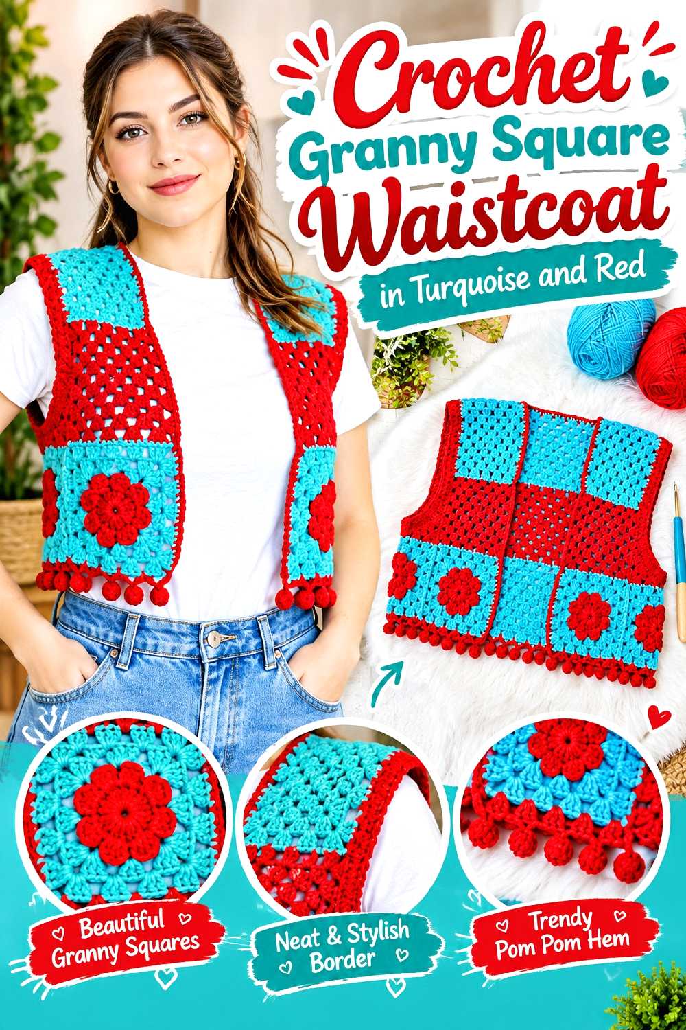
A waistcoat gives you the visual impact of a granny-square garment without the additional color decisions that come with full sleeves. The supporting tutorial uses granny squares for a waistcoat-style vest and includes layout, joining, underarm shaping, and border details.
Lay Out Every Square Before Joining
Turquoise-and-red motifs can look balanced individually but form unintended bands or clusters once arranged as a garment. Photographing or viewing the full unjoined layout can make those concentrations easier to notice before the seams become permanent.
Underarm Shaping Needs More Attention Than the Color Plan
Motif garments are not just grids of squares. Shaping around the armhole and underarm can determine whether the vest sits comfortably, so do not alter motif scale or substitute dramatically different yarns without considering how that affects the planned geometry.
Treat the Border as Its Own Design Decision
A textured or bobbled border already has strong visual presence. Making it the accent color will emphasize that texture; using the dominant body shade will integrate it more quietly. Either can work, but the choice changes where the eye lands.
Creator Credit: Brunaticality
11. Crochet Mushroom Wall Hanging In Turquoise And Red
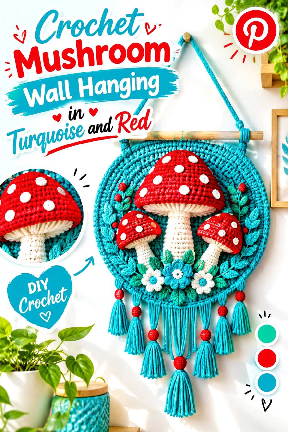
Mushrooms are an easy fit for fall decor, and colorwork gives turquoise and red clearly separated jobs. The supporting tutorial creates a mushroom wall hanging through crochet colorwork and finishes the piece for hanging, making it suitable for a red mushroom motif on a turquoise field or the reverse.
Turquoise Makes a Strong Ground for a Red Mushroom
Using turquoise as the larger background allows the mushroom to remain the warm focal point. A red cap can be visible immediately without requiring additional fall colors, especially if the remaining details stay restrained.
Test Contrast in the Room Where It Will Hang
Colorwork that looks obvious in your hands may blend when viewed from across a room. Place a small yarn sample or unfinished section against the intended wall and view it under the lighting where the hanging will normally be displayed.
Include the Hanging Finish in the Color Plan
The dowel, fringe, loops, or other finishing elements affect the overall composition. Repeating turquoise or a quiet neutral there can frame the red motif, while red fringe will extend the warm color beyond the image area.
Creator Credit: SugareeCo Crochet
12. Crochet Turquoise And Red Plaid Placemat
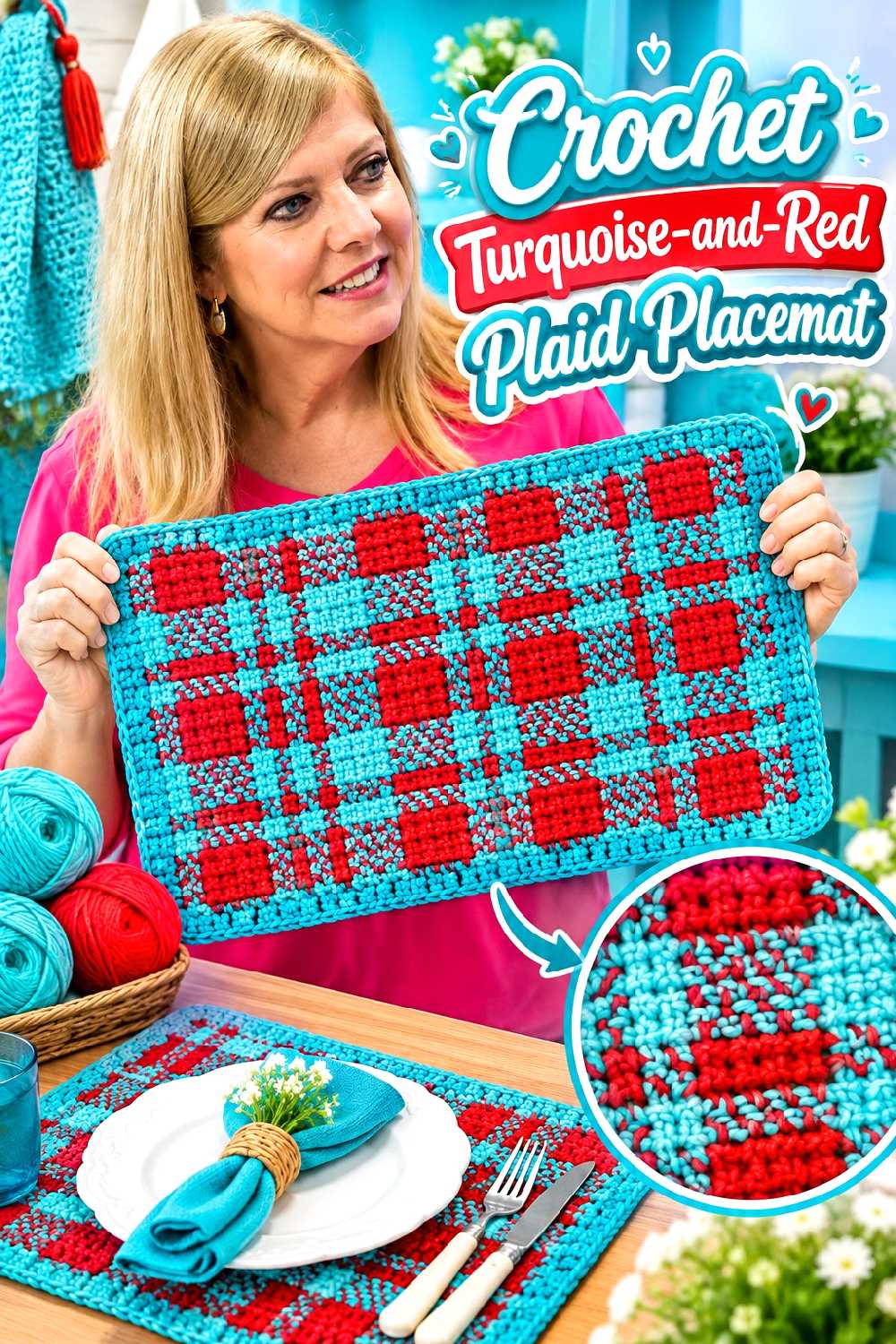
Plaid naturally gives two contrasting colors repeated visual roles, making it one of the clearest ways to combine turquoise and red. The supporting tutorial demonstrates a crochet plaid placemat with planned color changes and an emphasis on maintaining an even finished fabric.
Plaid Works When the Colors Stay Visually Distinct
If your turquoise and red are extremely similar in value, the check effect may be less obvious than expected. Put the skeins next to each other and, if possible, make a small swatch before committing to a full set of placemats.
Watch the Edges During Repeated Color Changes
A plaid layout can involve more yarn management than a solid placemat. Changes in carrying or tension can pull sections differently, so pause occasionally and lay the piece flat rather than waiting until the end to discover that the sides have drawn inward.
Consider What Will Sit on Top of the Placemat
A beautiful center motif can disappear under a dinner plate. If the red-and-turquoise contrast is the main decorative feature, think about whether you want it concentrated toward the edges, distributed evenly, or visible mainly when the table is not fully set.
Creator Credit: Vitrine do Artesanato
13. Crochet Red Pumpkin Bucket Hat With Turquoise Detail
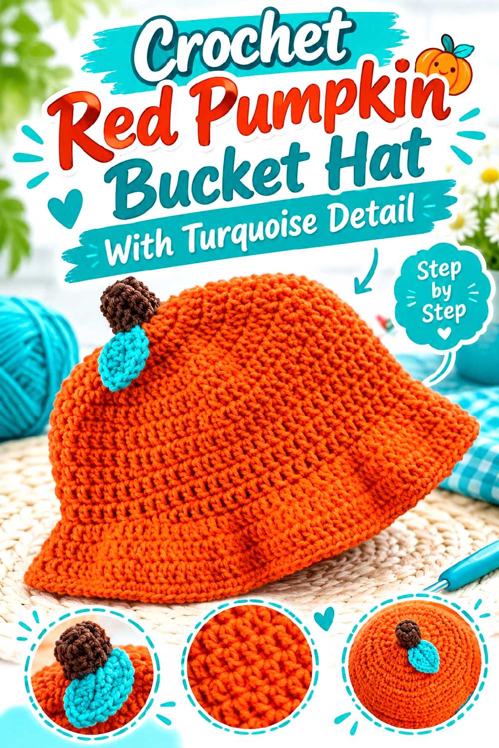
A pumpkin bucket hat turns a familiar fall shape into a wearable accessory. The supporting tutorial focuses on a crochet pumpkin bucket hat, while this version shifts the traditional palette toward red and turquoise for a less expected interpretation.
A Red Pumpkin Can Still Read as Autumnal
Using red for the main hat keeps the warm seasonal feeling without relying on orange. The pumpkin construction and surface details do more of the thematic work than the exact hue.
Use Turquoise as a Stem, Band, or Small Accent
A restrained turquoise feature creates the requested two-color connection without obscuring the pumpkin idea. If you want more turquoise, consider a defined band rather than scattering small accents around the entire hat.
Check the Brim Before Adding More Decoration
A bucket-hat brim affects both fit and silhouette. Before attaching extra leaves, vines, or dimensional accents, make sure the finished brim behaves the way you want and that added decoration will not pull it unevenly.
Creator Credit: PassioKnit Kelsie
14. Crochet Two Tone Pumpkin Pillow
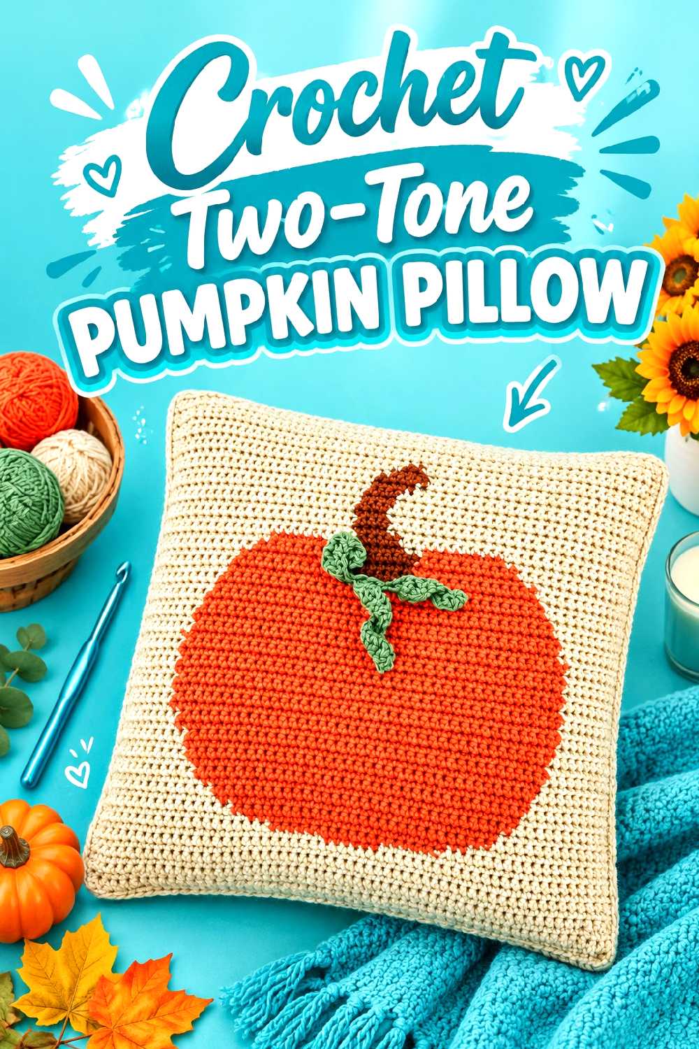
A pumpkin pillow gives the palette more room than a small ornament or mug cozy. The supporting tutorial covers the front, decorative leaf details, back, and assembly of a pumpkin-themed pillow, so turquoise and red can be assigned to large areas rather than limited to narrow stripes.
A Pillow Can Handle Larger Areas of Both Colors
Try a red pumpkin front with turquoise leaves or edging if you want the silhouette to remain obvious. A turquoise pumpkin with red details is more unconventional but can work well when the shape itself is clearly defined.
Keep the Pumpkin Silhouette Readable From Across the Room
Home decor is usually seen from farther away than a bookmark or glove. Small color changes that look intricate up close may disappear on a sofa. Larger sections and clear outlines generally communicate the idea more effectively.
Plan the Back as Carefully as the Front
The back may be less visible, but its yarn, opening, closure, and color still influence the finished pillow. Decide whether you want the reverse side to continue the two-color palette or serve as a quieter solid background.
Creator Credit: Jo to the World Creations
15. Crochet Turquoise And Red Infinity Scarf
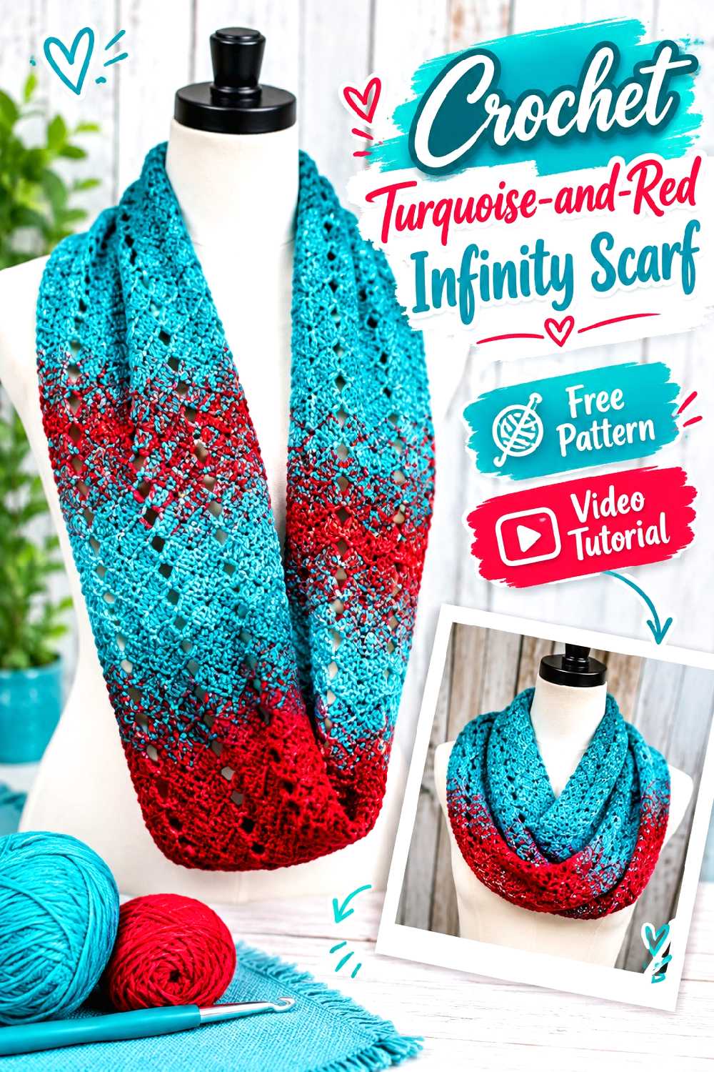
An infinity scarf repeatedly wraps the same fabric around the neck, which changes how a two-color layout is perceived. The supporting tutorial provides an infinity-scarf construction that can be reinterpreted with turquoise and red without requiring the colors to alternate at equal intervals.
Repetition Changes How the Colors Mix Around the Neck
A neat sequence on a flat scarf can overlap unpredictably once the scarf is looped. If you want distinct turquoise and red areas, broader sections may survive the wrapping effect better than narrow alternating bands.
Preview the Loop Before Finalizing the Sequence
Before completing the final join or finishing, drape the scarf in the way you expect to wear it. This can reveal whether one color disappears underneath the loops or whether a contrast section repeatedly lands in an awkward place.
Creator Credit: Knit and Crochet Ever After
16. Crochet Chunky Color Block Ear Warmer
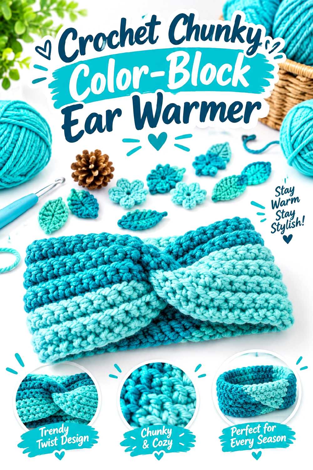
An ear warmer is a compact way to use a strong fall palette and can be easier to coordinate with existing outerwear than a multicolored hat. The supporting tutorial creates a chunky crochet ear-warmer/headband construction that leaves a narrow surface where color placement needs to be deliberate.
A Narrow Accessory Benefits From One Clear Focal Area
Because the band is not very tall, numerous thin stripes can quickly dominate it. A broad turquoise body with one red central section, or the reverse, gives both colors a role without chopping the piece into many small bands.
Fit Matters More Than Extra Colorwork
An ear warmer needs to sit securely without becoming uncomfortable. If changing yarns alters the thickness or stretch of the fabric, reassess the fit before adding additional decorative rows or edging.
Creator Credit: HappyBerry Crochet
17. Crochet Turquoise And Red Autumn Leaf Garland
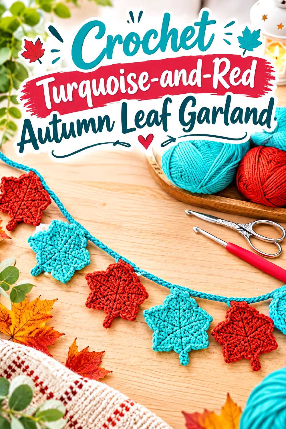
A leaf garland lets you repeat the fall palette across several small motifs rather than forcing both colors into every leaf. The supporting tutorial demonstrates individual crochet autumn leaves and joins them into a garland, making the arrangement easy to personalize for a mantel, shelf, wall, or seasonal display.
Alternate Whole Leaves Instead of Splitting Every Motif
One turquoise leaf followed by one red leaf creates a cleaner rhythm than changing colors repeatedly inside each small shape. You can vary the sequence without changing the underlying leaf construction.
Measure the Display Space Before Making the Full Strand
Garlands can look too sparse when stretched over a large area or too crowded when compressed into a short one. Decide where the piece will hang and use that space to guide the number and spacing of motifs rather than making leaves indefinitely.
Let the Joining Cord Control the Overall Mood
A turquoise cord visually connects the cooler leaves, while red creates a warmer line through the display. A neutral joining strand can reduce the intensity of the two-color combination if the leaves already provide enough contrast.
Creator Credit: hibouchoucaillou
18. Crochet Turquoise Shawl With A Red Contrast Border
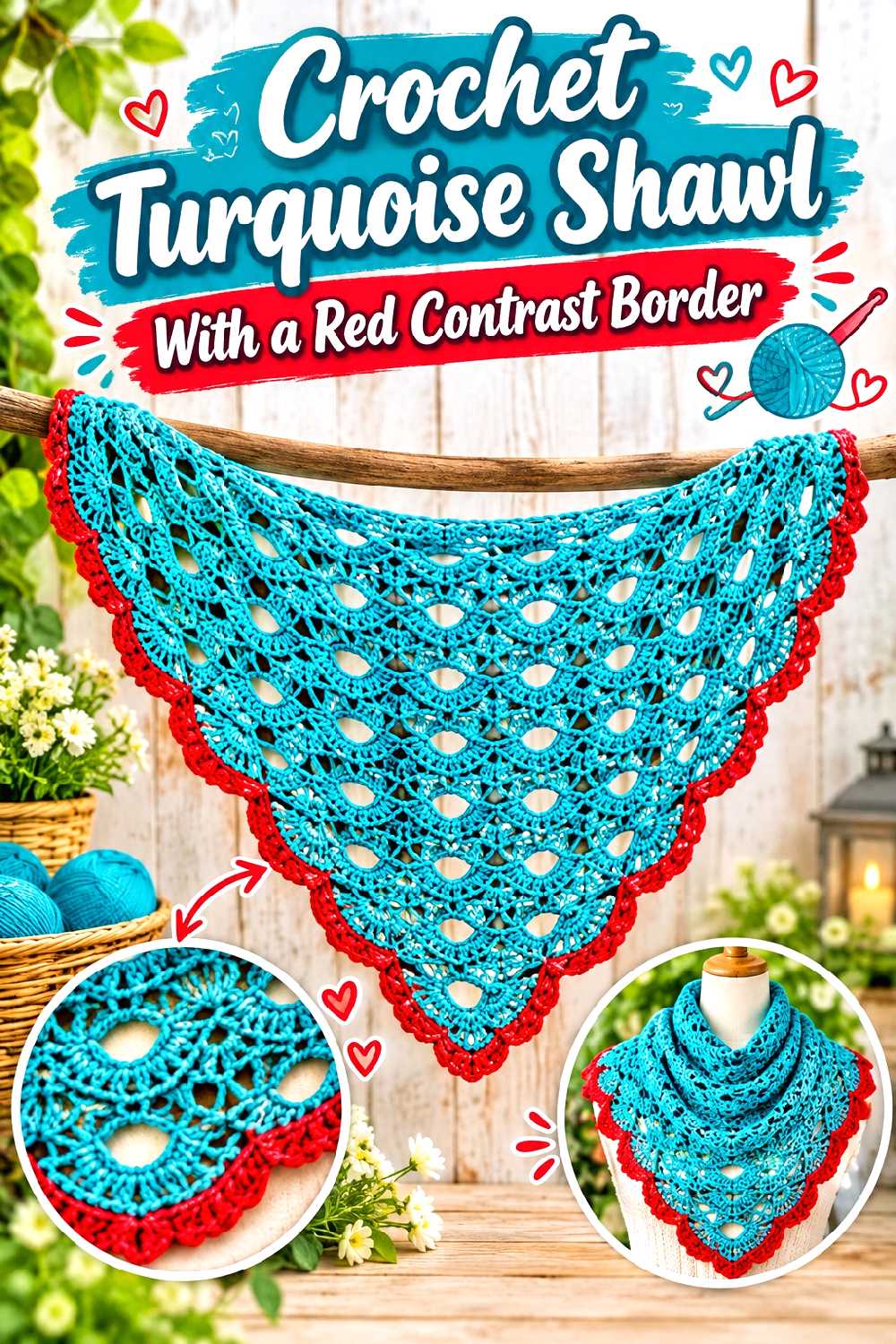
A shawl offers the largest uninterrupted wearable surface in this collection, which makes color proportion especially important. The supporting tutorial provides a crochet shawl construction that can be adapted by keeping turquoise dominant and introducing red more selectively.
Let One Color Dominate the Large Fabric Area
On a shawl, an equal number of narrow turquoise and red stripes can create far more visual movement than the same arrangement on a small accessory. A mostly turquoise body with spaced red sections or a defined border keeps the shape easier to read.
Put Red Where It Frames the Finished Piece
A red outer edge can outline the shawl when it is worn, while red bands closer to the upper edge bring the warm shade nearer the face. Think about the worn position rather than choosing stripe placement only while the project is lying flat.
Check Drape Before Making the Border Too Heavy
A dense or elaborate border can alter how the lower edge hangs. Make sure the body fabric has the drape you want before adding significant extra weight or texture around the perimeter.
Creator Credit: Bag-O-Day Crochet
Comparing the Turquoise-and-Red Color Strategy by Project Type
| Project type | When turquoise can lead | When red can lead | Main checkpoint |
|---|---|---|---|
| Granny-square wearables | When you want a cooler overall garment with warm motif accents | When the garment should read warmer and more autumnal | Check blocked motif dimensions and full layout before joining |
| Hats and small accessories | When the piece needs to coordinate with neutral outerwear | When you want the accessory itself to become the focal point | Keep the limited surface from becoming over-segmented |
| Bags and baskets | When you want a calmer main body | When you want the structure or handles to stand out strongly | Prioritize stretch, density, and shape over color placement |
| Blankets and shawls | When you want a broad cool field with selective contrast | When a warmer outer edge or major block suits the room or outfit | Preview large areas rather than judging from the skeins alone |
| Fall decor | When turquoise works as a background or supporting element | When pumpkins, mushrooms, leaves, or other motifs need a warm focal color | Make sure the seasonal silhouette remains readable |
| Table decor | When the turquoise coordinates with dishes or linens | When you want stronger warmth around the place setting | Check contrast and edge tension after repeated color changes |
Conclusion
Turquoise and red are most effective in fall crochet when the colors have distinct jobs rather than competing for attention everywhere. Granny-square projects such as the cardigan, sweater, and waistcoat can distribute both shades repeatedly, while the tote, basket, blanket, shawl, and scarf give you more control through larger blocks of color.
For a smaller experiment, the bookmark, ear warmer, mug cozy, or fingerless gloves let you test the combination without committing to a large amount of fabric. The mushroom hanging, pumpkin pieces, plaid placemat, and leaf garland are useful when you want the palette to become part of your seasonal decor.
Before substituting colors, compare the yarns, make a sample where fit or motif size matters, and look at the finished color arrangement from the distance at which the item will normally be seen. Use the linked creator tutorials for their exact construction details, then make the turquoise-and-red decisions around that structure rather than trying to redesign both construction and color at the same time.
Frequently Asked Questions
Do turquoise and red actually work together for fall crochet?
Yes, they can. The character of the combination depends heavily on the exact shades and their proportions. Deeper teal-turquoise with brick, cranberry, garnet, or muted red generally creates a more grounded fall impression than very pale aqua paired with a highly saturated bright red.
Which color should dominate a turquoise-and-red wearable?
That depends on the effect you want. Turquoise as the main shade can make a cardigan, shawl, or scarf feel cooler and allows red to act as a strong accent. A red-dominant garment feels warmer and makes turquoise more unexpected. Large projects are worth previewing with a swatch or motif layout before choosing the final ratio.
Can I use turquoise and red when the original tutorial uses different colors?
Usually, color substitution is possible when the yarn you choose is otherwise appropriate for the construction, but it should not be treated as an automatic one-for-one change. Compare yarn thickness, fiber behavior, elasticity, and the tutorial’s gauge or sizing information where relevant. Motif projects need particular care because small size differences can accumulate across a joined layout.
How can I keep red and turquoise granny squares from looking too busy?
Use a repeatable color rule. For example, keep one color in the outer round across most motifs and vary the centers, or alternate two clearly defined square arrangements. Laying all blocked squares out before joining is much easier than correcting an unbalanced distribution afterward.
Can I add a neutral third color?
Yes. Cream, charcoal, camel, brown, or another restrained neutral can separate turquoise from red and reduce the intensity of the contrast. A third color is especially useful in granny squares, plaid, stripes, and borders where the two main colors would otherwise touch repeatedly.
What should I check before washing a turquoise-and-red crochet project?
Follow the care information for the specific yarns you used rather than assuming both colors have identical requirements. If you are concerned about strongly contrasting dyes, testing a small swatch first can show how the yarn behaves when washed and dried according to the recommended method.
Is turquoise better as an accent or a main color in fall decor?
Either approach can work. Turquoise makes an effective background for a red mushroom, pumpkin detail, or other warm motif, but it can also become the main color when the seasonal identity comes primarily from the object’s shape. A turquoise pumpkin, for example, is unconventional, yet the silhouette can still make the fall reference clear.