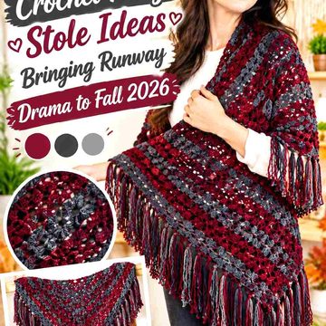
A crochet witch cape does not need novelty Halloween colors to feel magical. For fall 2026, the darker romantic direction comes from controlled palettes: near-black shades softened by wine, faded botanical greens, smoky purples, antique neutrals, and restrained warm accents.
Color placement matters especially on a cape because the garment creates one broad field around the shoulders. A single dark shade can look dramatic, but it can also hide texture. A lighter border can reveal lace while changing the mood completely, and a small accent around the hood or neckline can have more impact than adding a third color across the entire body.
The 14 ideas below use cape, capelet, hooded-cape, and poncho constructions as starting points. The credited tutorials support the crochet garment concept; the color schemes are independent palette ideas you can adapt to the construction that suits you.
Quick List
- Black And Oxblood Crochet Witch Cape
- Charcoal And Moss Crochet Hooded Witch Cape
- Aubergine And Smoke Gray Crochet Victorian Witch Cape
- Espresso And Antique Cream Crochet Witch Capelet
- Black Cherry And Charcoal Crochet Scalloped Witch Cape
- Ink Black And Burgundy Crochet Mesh Witch Cape
- Midnight Blue And Iron Gray Crochet Cabled Witch Cape
- Deep Olive And Blackened Brown Crochet Textured Witch Cape
- Mulberry And Charcoal Crochet Ribbed Witch Cape
- Burgundy Black And Moss Crochet Granny Witch Cape
- Dried Plum And Espresso Crochet Draped Witch Cape
- Deep Berry And Fir Green Crochet Storybook Witch Cape
- Blackened Violet And Soot Gray Crochet Hooded Witch Cape
- Forest Green And Near Black Crochet Fall Witch Cape
Choose a Dark Crochet Witch Cape Color That Still Shows Texture
Black is an obvious witch-cape color, but it is not automatically the strongest choice for every crochet surface. Cables, ribbing, shells, raised stitches, and decorative borders can lose definition when both the yarn and surrounding outfit are extremely dark.
If texture is important, compare black with charcoal, blackened plum, espresso, midnight blue, or very deep green. These shades can preserve the dark-romantic direction while giving shadows and raised areas slightly more separation.
For a two-color cape, decide which shade deserves the large body area before crocheting the smaller details. The dominant color establishes the silhouette; the supporting color is usually more effective around the hood, neckline, edging, ties, or repeated motifs.
Use Light and Dark Contrast Carefully on a Romantic Witch Cape
High contrast can make crochet details clearer, but it also changes the character of the cape. Black beside bright white creates a sharper graphic division than black beside oatmeal, smoke gray, dusty rose, or antique cream.
For dark romance, softened contrasts often keep the piece from looking too stark. Place the lighter shade where you actually need separation—around lace, scallops, hood framing, or motif centers—rather than automatically dividing the cape equally between light and dark colors.
If two yarns look different in hue but their details keep disappearing, photograph them in grayscale. Similar lightness values may be causing the colors to merge even though one is purple and the other is green.
1. Black And Oxblood Crochet Witch Cape
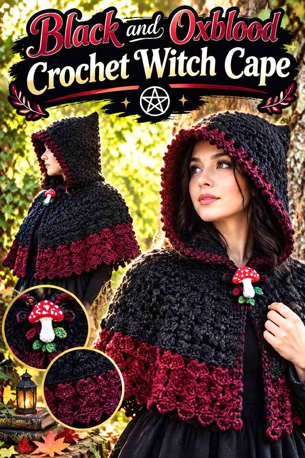
Black makes the cape silhouette unmistakably dark, while oxblood introduces warmth without turning the garment bright. Keep black across most of the cape body and use oxblood where the eye naturally pauses: along the hood opening, front edges, neckline, or a restrained lower border. This distribution gives the red family a romantic role instead of letting it become a competing main color.
Let Black Control the Main Crochet Witch Cape Silhouette
Use black for the largest uninterrupted areas when you want the cape to read as dark before individual details become noticeable. This works particularly well across broad shoulder coverage and a substantial hood.
Before committing to pure black, check whether the crochet surface still shows enough definition in ordinary indoor and outdoor light. If the fabric looks visually flat, a slightly softened near-black can preserve the same role.
Keep Oxblood Around Black Hood and Edge Details
Oxblood has more impact when it appears in deliberate locations instead of being scattered randomly. A narrow hood frame, tie, neckline treatment, or lower edge can connect the warm accent without dividing the entire cape into stripes.
If you substitute oxblood, preserve its relationship with black by choosing a deep muted red rather than a bright primary red.
Creator Credit: Lizfaerie Crafts
2. Charcoal And Moss Crochet Hooded Witch Cape
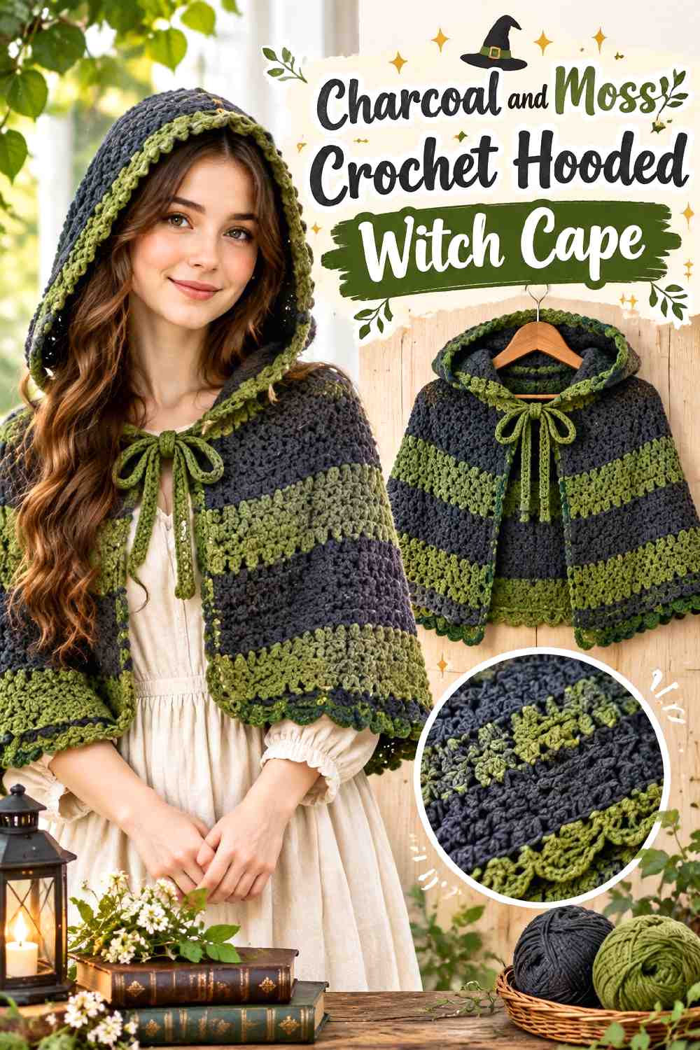
Charcoal gives a hooded cape a softer dark base than absolute black, while moss green pushes the palette toward woodland witch styling. Let charcoal cover most of the shoulder area and use moss where texture is already prominent, particularly around the hood or selected edging. The two shades should remain clearly different enough that the moss does not disappear into the charcoal.
Charcoal Keeps Moss Crochet Texture From Becoming Too Bright
A muted charcoal base lets moss read as earthy instead of vivid. If the cape includes raised or broken surface texture, placing moss on selected textured sections can help those areas become visible without introducing a pale color.
Avoid choosing a moss so dark that it has almost the same value as the charcoal unless a deliberately blended effect is your goal.
Repeat Moss Around the Charcoal Crochet Hood
When moss appears only once, it can look disconnected from the rest of the cape. Repeating a small amount at the neckline, lower edge, or fastening area helps the accent feel intentional.
Keep charcoal dominant so the hood retains its shadowy silhouette while moss supplies the woodland direction.
Creator Credit: Selina Veronique Crochet
3. Aubergine And Smoke Gray Crochet Victorian Witch Cape
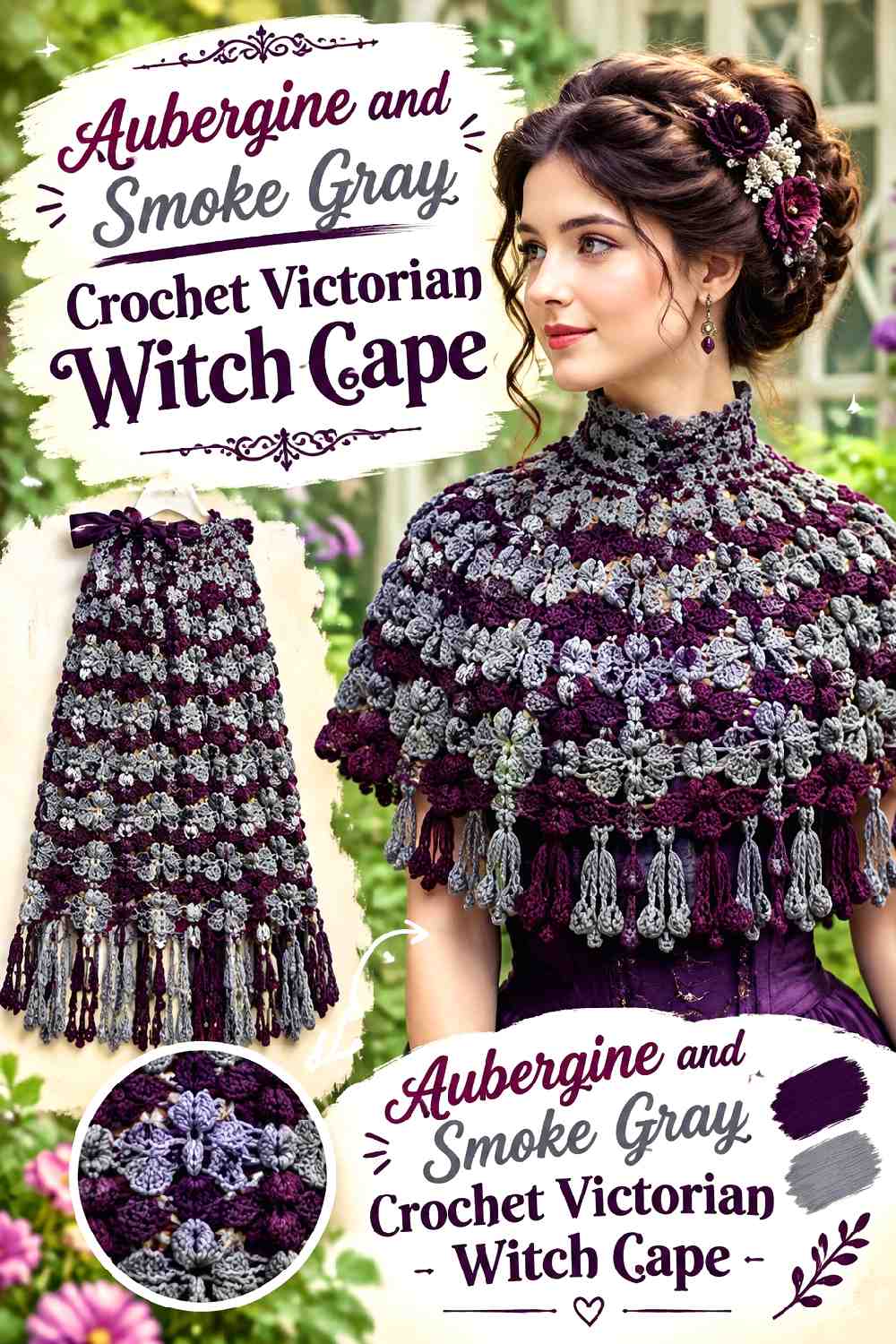
Aubergine gives a Victorian-style crochet cape depth without relying on black, while smoke gray offers restrained contrast around decorative details. This palette works especially well when the cape has a shaped neckline or noticeable border because the gray can separate those elements from the dark purple body.
Aubergine Gives the Crochet Witch Cape a Rich Dark Base
Let aubergine occupy most of the body so the garment reads as purple only after the overall dark silhouette is established. A muted eggplant direction generally feels more autumnal here than a clear, bright violet.
Use the deepest aubergine around broad panels where uninterrupted color helps the historical shape remain recognizable.
Smoke Gray Can Define Aubergine Crochet Edging
Smoke gray is useful around a decorative lower edge because it reveals shape without creating the abrupt division of bright white.
If the border already has complex texture, keep the gray placement simple. Too many alternating color changes can compete with the border construction itself.
Creator Credit: Just Vintage Crochet
4. Espresso And Antique Cream Crochet Witch Capelet
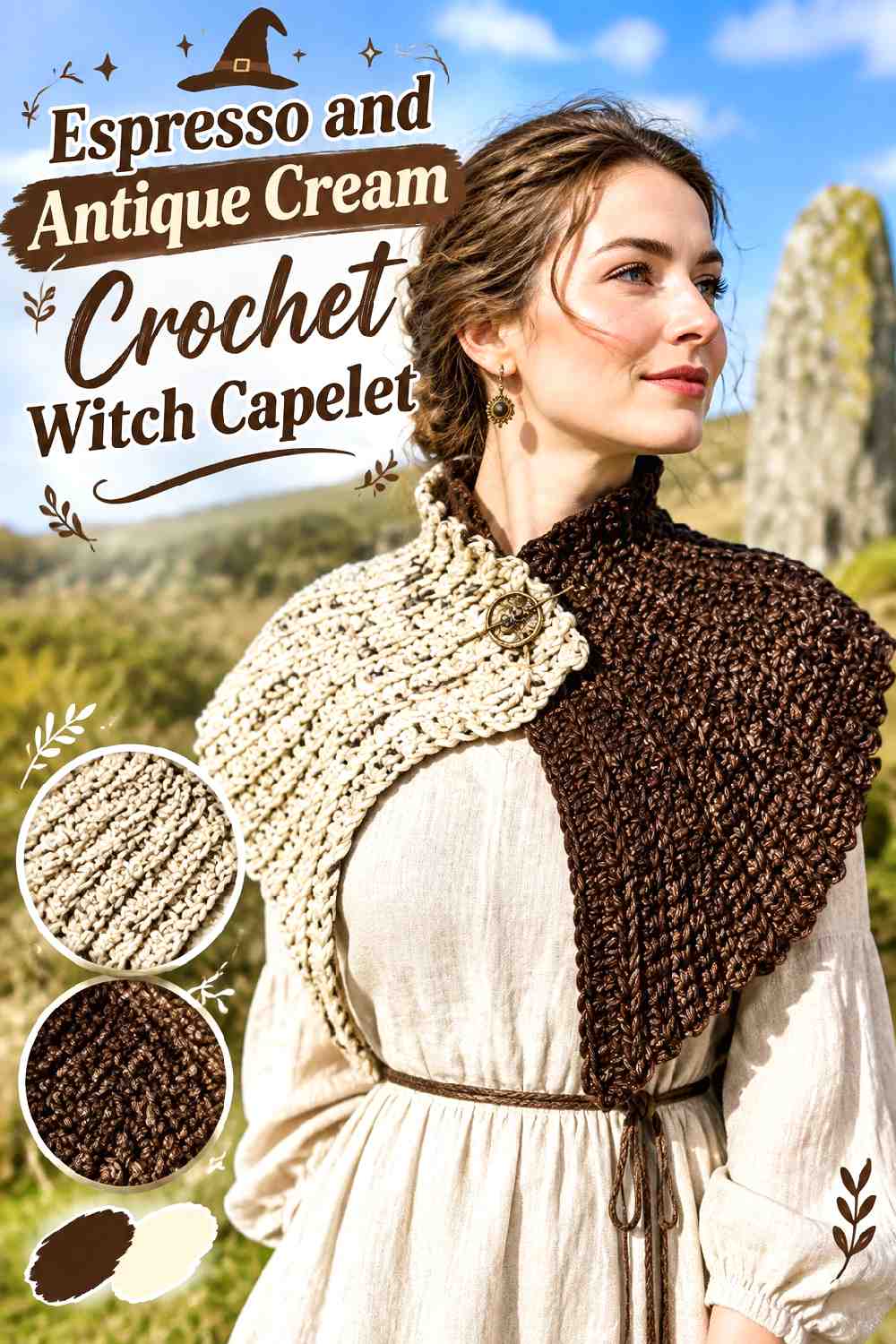
Espresso brown produces a softer antique darkness than black, and antique cream adds enough value contrast to reveal the neckline and small border details. Keep cream secondary; too much of it will move the capelet away from the shadowy fall direction and toward a lighter vintage palette.
Espresso Should Lead the Crochet Capelet Body
Use espresso across the main shoulder area so the compact capelet still carries visual weight. Brown also gives you room to coordinate the garment with other dark autumn shades without forcing every layer to be black.
If your chosen espresso is very warm, keep the supporting cream softened rather than icy so the contrast does not become unnecessarily sharp.
Antique Cream Can Separate Espresso Crochet Neckline Details
A small amount of antique cream can clarify ties, an edge, or another detail near the neckline. This is particularly useful on a short capelet because details near the neck represent a noticeable part of the entire design.
Repeat cream once more in a restrained lower detail if the neckline accent otherwise feels isolated.
Creator Credit: Ophelia Talks Crochet
5. Black Cherry And Charcoal Crochet Scalloped Witch Cape
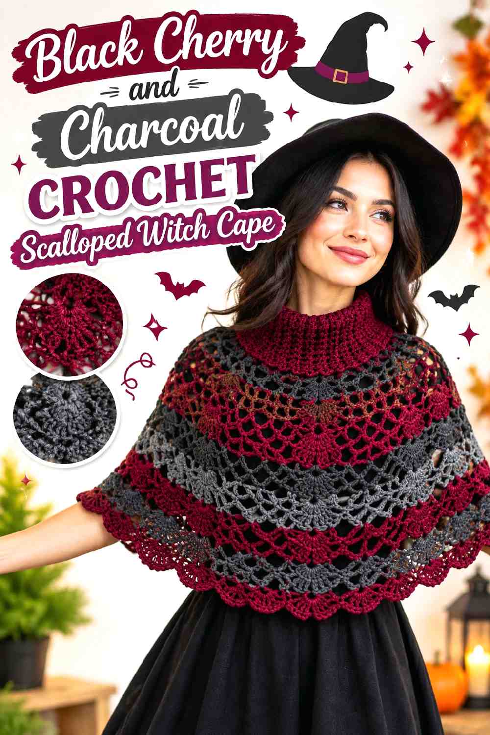
Black cherry sits between deep red and dark plum, making it useful for a romantic cape where you want warmth without obvious bright red. Charcoal works as a grounding shade around scallops or another decorative edge. Let black cherry dominate so the cape remains color-rich rather than becoming another mostly gray project.
Black Cherry Gives Crochet Scallops More Romantic Weight
Decorative edges already attract attention, so repeating black cherry through the body and selected scallops creates continuity. If every scallop alternates strongly between colors, the border may become more graphic than romantic.
Instead, allow black cherry to remain the main visual field and use charcoal selectively to deepen the edge.
Charcoal Can Frame Black Cherry Without Flattening the Cape
A charcoal border is darkest enough to contain the warmer main color while still remaining distinguishable from it in many yarn combinations.
Check the two colors side by side before starting. If both become nearly identical at a distance, move either the charcoal darker or the black cherry slightly lighter.
Creator Credit: Crafting Shed
6. Ink Black And Burgundy Crochet Mesh Witch Cape
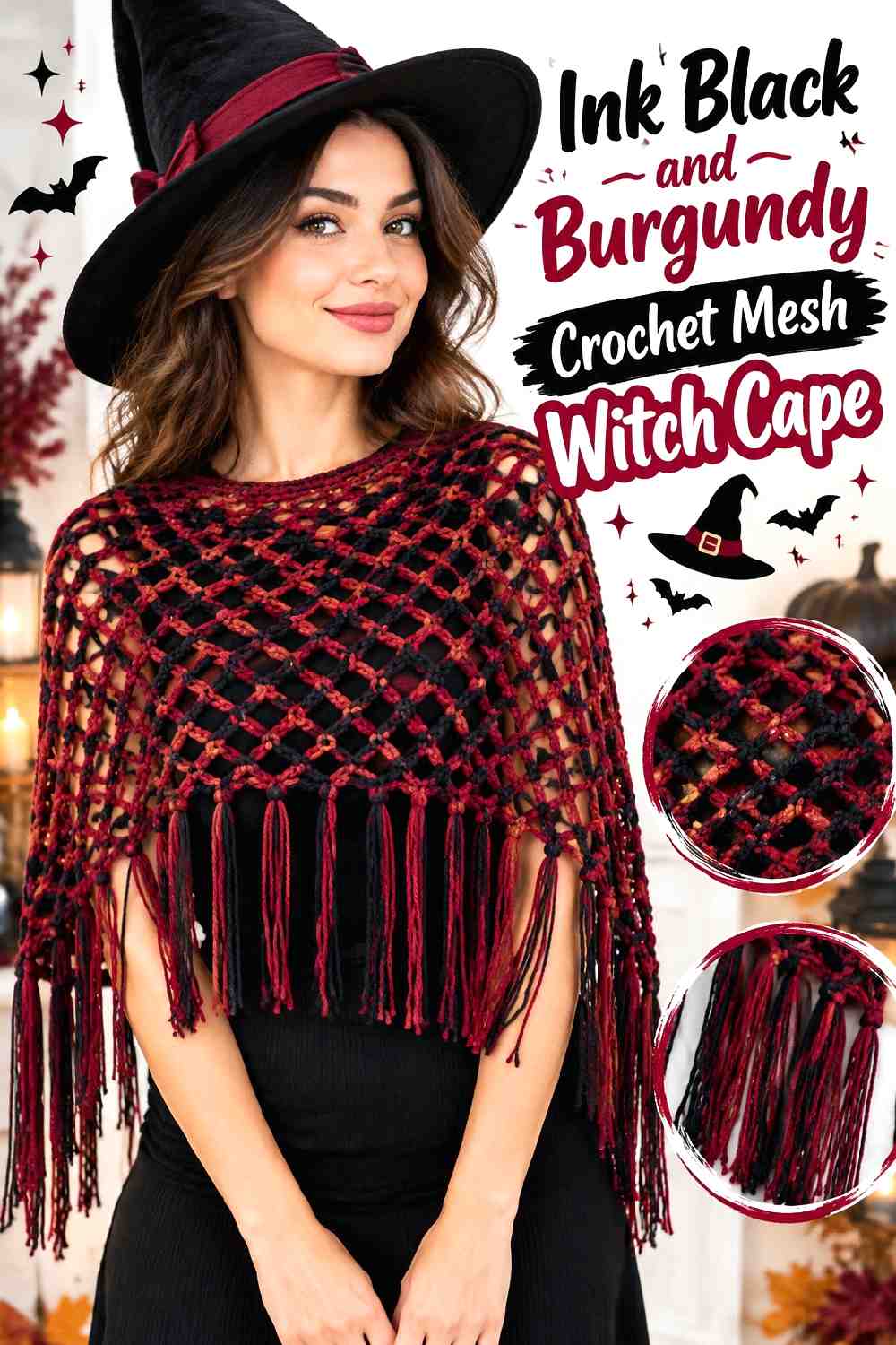
Mesh gives the clothing underneath an unusually important color role. An ink-black crochet cape worn over burgundy creates two layers of color without requiring the crochet itself to alternate constantly between shades. Small burgundy crochet details can then connect the cape with the underlayer.
Ink Black Lets the Crochet Mesh Reveal Burgundy Underneath
Keep most of the openwork black if you want the underlayer to provide the color change. Burgundy showing through the openings adds depth while preserving one continuous crochet surface.
This approach is useful when frequent yarn changes would interrupt a lace or filet pattern.
Burgundy Accents Should Stay Controlled Against Ink Black
If you add burgundy directly to the crochet, place it where the mesh construction can still be read clearly—such as an outer edge or selected trim.
Avoid filling every open area with a competing accent. The interaction between the ink-black crochet and burgundy clothing underneath is already doing much of the visual work.
Creator Credit: Crazy Cool Crochet
7. Midnight Blue And Iron Gray Crochet Cabled Witch Cape
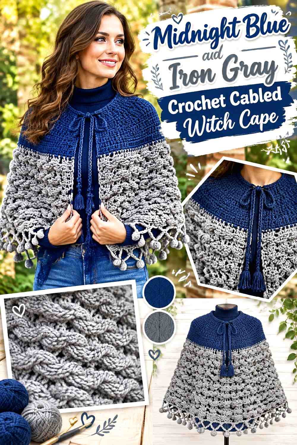
Midnight blue can appear nearly black in low light but reveals more color across raised cable texture. Iron gray adds cool separation without making the cape look pale. This makes the palette particularly useful when the crochet surface itself deserves more attention than contrasting motifs.
Midnight Blue Helps Crochet Cables Stay Visible
Use midnight blue over the main cabled field. The small difference from flat black can make shadows around raised texture easier to notice while keeping the overall garment dark.
Avoid strongly variegated blues across intricate cables if your priority is reading the cable lines clearly.
Iron Gray Can Define Midnight Blue Crochet Borders
Use iron gray around a restrained edge when the midnight body needs a clearer outer frame. Because both colors are cool and subdued, the border can define the cape without creating a bright outline.
If iron gray becomes too pale beside the midnight blue, move toward a darker steel-like gray.
Creator Credit: Stitches n Scraps
8. Deep Olive And Blackened Brown Crochet Textured Witch Cape
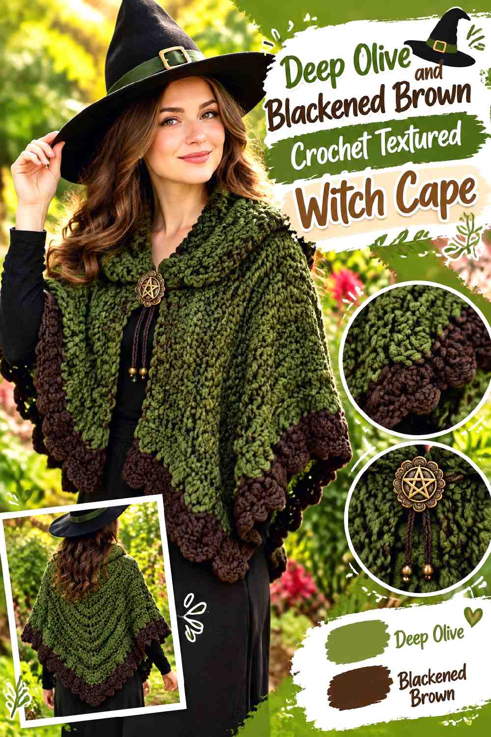
Deep olive and blackened brown create an earthy palette that feels different from brighter woodland green. Olive should cover enough of the cape for its color to register, while brown can anchor the neckline, outer edge, or darker sections of a textured repeat.
Deep Olive Needs Enough Crochet Surface to Read Clearly
Do not reduce olive to a tiny accent if the goal is a recognizable green witch cape. Give it the main body or another substantial visual area.
Muted olive works especially well when the crochet already contains open-and-solid texture because the color adds interest without requiring frequent changes.
Blackened Brown Grounds Deep Olive Crochet Openwork
Use blackened brown around outer edges or denser bands to create definition beside olive. The brown should be dark enough to act as an anchor while remaining warmer than charcoal or black.
If the two yarns merge completely from a distance, increase their light-dark separation before crocheting the full cape.
Creator Credit: Secret Yarnery
9. Mulberry And Charcoal Crochet Ribbed Witch Cape
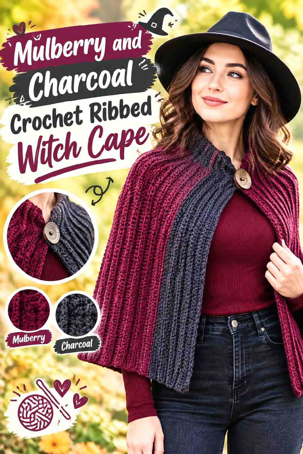
Mulberry introduces a softened purple-red note that suits ribbing because long raised lines allow subtle color to remain visible. Charcoal can handle the edge, fastening area, or smaller bands without overpowering the main shade.
Mulberry Gives Crochet Ribbing More Visible Direction
Let mulberry cover the larger ribbed sections. The shadows between ridges naturally deepen the color, so a dark mulberry can create substantial depth without needing black across the entire cape.
Avoid a highly mottled yarn if it makes the rib direction difficult to follow visually.
Charcoal Keeps Mulberry Crochet Details From Becoming Too Sweet
Charcoal removes some of the softness associated with purple-red shades and brings the palette back toward dark fall styling.
Place it around the outer edge or a controlled structural detail rather than alternating every rib, which could turn the surface into strong striping.
Creator Credit: Nana’s Crafty Home | Tonya Bush
10. Burgundy Black And Moss Crochet Granny Witch Cape
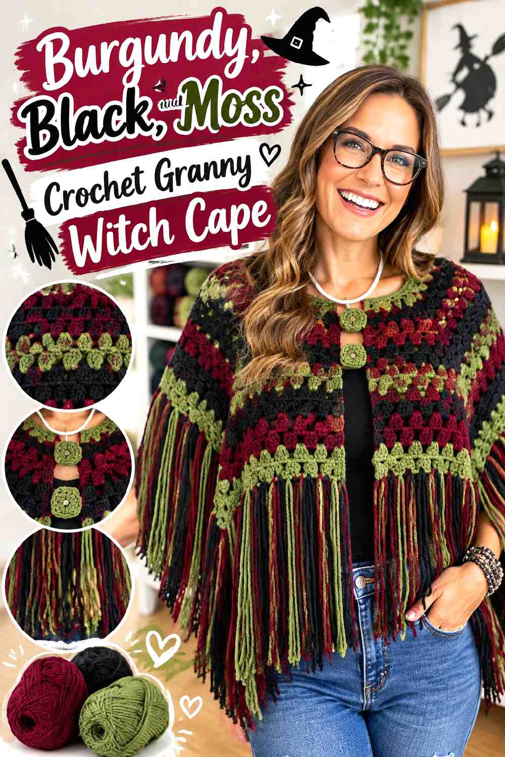
Granny-style crochet gives each color a visible place, so this three-color palette needs a clear hierarchy. Burgundy can lead, black can separate repeated sections, and moss should remain the smallest accent. That structure prevents three dark colors from competing equally.
Burgundy Should Dominate the Crochet Granny Cape
Use burgundy through the largest share of the repeated crochet sections. This keeps the cape romantic rather than making it look like a collection of unrelated dark leftovers.
Black can break up burgundy areas where you want stronger definition, but avoid letting every color occupy the same amount of space.
Black Gives Burgundy and Moss Crochet Motifs Separation
Black is useful between burgundy and moss because the green and red families can otherwise become visually busy when repeatedly placed side by side.
Use black as a separator, join, edge, or repeated band so the two colored shades have breathing room.
Moss Works Best as the Small Accent Beside Burgundy
Reserve moss for selected motif centers, narrow bands, or occasional repeated details. A little green shifts the whole cape toward a woodland fall direction.
If you substitute moss, choose a muted green that does not suddenly become the brightest or most saturated element in the palette.
Creator Credit: Whirledpeas00 Knits
11. Dried Plum And Espresso Crochet Draped Witch Cape
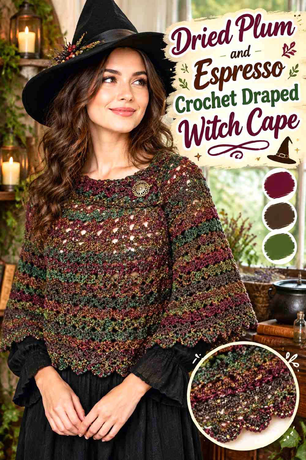
Dried plum gives a wide draped cape muted romance, while espresso creates a warm dark anchor. Because a broader cape already contains a lot of visual area, keeping the palette limited to two related dark shades prevents the garment from becoming overly busy.
Dried Plum Can Carry the Broad Crochet Cape Surface
Use dried plum for most of the draped body so the large garment does not become visually heavy from edge to edge.
The muted purple-red direction adds enough color to separate the cape from black clothing underneath while staying within a dark fall wardrobe.
Espresso Defines Dried Plum Crochet Edges Without Harsh Contrast
Place espresso around the neckline, outer edge, or restrained finishing details. Brown creates a softer boundary than black and reinforces the autumn direction.
If your dried plum already leans strongly brown, choose an espresso dark enough that the two shades remain distinguishable.
Creator Credit: Bag-O-Day Crochet
12. Deep Berry And Fir Green Crochet Storybook Witch Cape

Deep berry and fir green create a more colorful dark-romantic cape without using a traditional black base. Berry should remain dominant so the two strong hues do not divide the garment evenly. Fir works better as a framing color around the hood, ties, or edge.
Deep Berry Should Lead the Crochet Storybook Cape
Use deep berry across the main body for a warmer storybook interpretation of witch styling. The shade is especially useful when you want a cape that still looks seasonal away from Halloween.
Keep the berry dark and muted enough that the garment retains fall depth rather than moving toward a bright jewel-tone combination.
Fir Green Can Frame the Deep Berry Crochet Hood
The hood is a natural location for fir because the color can outline the face or create a darker boundary around the berry body.
Repeat a small amount of fir near the lower edge or ties so the hood color belongs to the whole cape rather than appearing only at the top.
Creator Credit: Jennyandteddy crochet.
13. Blackened Violet And Soot Gray Crochet Hooded Witch Cape
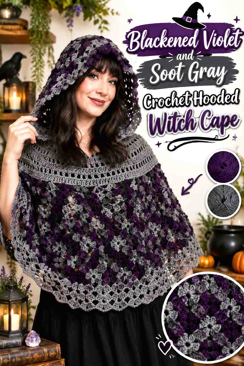
Blackened violet offers the darkness of a near-black shade with slightly more visible color across a substantial hood. Soot gray gives the edge enough separation to prevent the silhouette from becoming one uninterrupted dark mass.
Blackened Violet Makes the Crochet Hood the Main Color Feature
Keep violet through the main cape and hood so the hood feels connected rather than added as a separate accent piece.
When selecting a substitute, look for a purple dark enough to sit comfortably with black clothing but still identifiable as violet in daylight.
Soot Gray Can Outline Blackened Violet Crochet Without Looking Pale
Use soot gray around the hood opening, front edge, or lower finishing line. The contrast should be noticeable but restrained.
Avoid moving too far toward silver if your goal is dark romance; a medium-dark gray generally keeps the transition quieter.
Creator Credit: Mariie Crochet
14. Forest Green And Near Black Crochet Fall Witch Cape
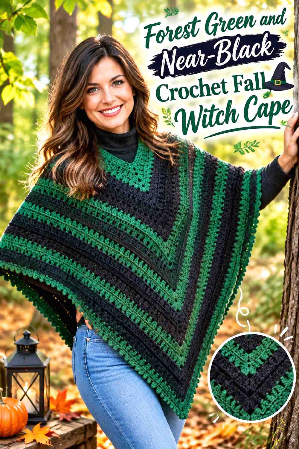
Forest green creates one of the clearest fall-witch directions in the collection, while near-black keeps it grounded. Give forest green the main surface so the final idea does not simply become another black cape with colored trim.
Forest Green Should Cover Most of the Crochet Witch Cape
A broad green field lets the cape read as botanical and autumnal from a distance. This is especially useful on a larger cape or poncho silhouette, where a tiny green accent could disappear.
Choose a forest shade with enough depth to coordinate with dark clothing while remaining visibly greener than the trim.
Near-Black Gives Forest Green Crochet Edging a Strong Finish
Near-black can define the lower edge, neckline, or selected textured sections without pulling attention away from the green body.
If the green is extremely dark, compare the two yarns in grayscale before starting. You may need a slightly lighter forest shade to keep the intended border visible.
Creator Credit: The Crochet Crowd
Which Dark-Romantic Crochet Witch Cape Palette Fits Your Fall Look?
For the darkest direction, Black and Oxblood or Blackened Violet and Soot Gray keep most of the garment close to black while allowing selected details to emerge.
For woodland styling, Charcoal and Moss, Deep Olive and Blackened Brown, or Forest Green and Near-Black put muted greens at different levels of prominence.
Aubergine and Smoke Gray, Black Cherry and Charcoal, and Dried Plum with Espresso work well when you want the cape to remain unmistakably dark but prefer purple, wine, and berry shades over green.
For the most visibly multicolor option, Burgundy, Black, and Moss gives repeated crochet sections three roles: a dominant shade, a separator, and a controlled accent. That hierarchy is more important than simply choosing three colors that look appealing together.
Conclusion
The strongest crochet witch cape palette starts with deciding what deserves attention. If the hood is the statement, concentrate a secondary shade around the face. If cables, ribbing, lace, or scallops are the feature, choose colors with enough value separation to keep that texture visible. For granny construction, establish a dominant color before distributing the smaller accents.
Black can certainly lead a dark-romantic cape, but charcoal, aubergine, midnight blue, espresso, mulberry, forest green, and dried plum create equally useful fall directions while often revealing more of the crochet surface.
Use the credited tutorials for their exact construction details, then treat the palettes here as a planning layer. Swatch the actual yarn colors together before committing, because the important relationship is not just the color names—it is how light, dark, muted, and saturated those particular yarns look beside one another.
Frequently Asked Questions
What colors can replace black in a crochet witch cape?
Charcoal, espresso, midnight blue, aubergine, blackened violet, forest green, and very dark brown can all take the dominant role. Choose according to the amount of stitch definition you want and the supporting colors you plan to use.
How can I tell whether two dark crochet cape colors have enough contrast?
Place the yarns beside each other and view them from several feet away. A grayscale phone photo can also help reveal whether their light-dark values are almost identical. If borders or motifs disappear, increase the value difference rather than simply switching to another hue at the same darkness.
Should the darkest color go on the crochet witch cape border?
Not necessarily. A dark border can create a strong outer frame, but a slightly lighter border may be more useful when the body is already near-black. Choose the edge according to whether you want definition, blending, or stronger texture visibility.
How many colors should a dark-romantic crochet witch cape use?
Two colors are enough for most of these palettes: one dominant shade and one supporting color. Three colors work well when each has a clear role, such as burgundy for the main surface, black for separation, and moss for small accents. Using more colors is possible, but repeated equal-strength accents can make a large cape feel busy.
How do I substitute a color without changing the entire witch-cape palette?
Preserve the role of the original shade. If you replace moss, choose another muted green with similar darkness. If you replace smoke gray, keep a softened neutral that remains lighter than the main aubergine. Maintaining the dominant/supporting relationship usually matters more than matching the exact color name.
Why does a very dark crochet witch cape sometimes hide the stitch pattern?
Dark yarn reduces visible light-dark variation across small shadows in the fabric. This can make cables, ribbing, shells, or lace edges less obvious, particularly in low light. Moving from pure black to charcoal, midnight blue, espresso, or another near-black shade can preserve the dark effect while giving the surface more definition.