Barn jackets have a practical visual language that translates naturally into crochet cardigans: straightforward body panels, strong front edges, useful pockets, defined cuffs, and collar-like finishing. For Fall 2026, color can push those familiar cardigan shapes further toward workwear without requiring a literal copy of a woven barn coat.
The most convincing palettes give each color a job. One shade can cover most of the cardigan, another can define the front band or collar area, and a smaller accent can repeat around cuffs, pockets, motifs, or edging. That hierarchy matters because distributing every shade equally can make a useful-looking jacket feel more like an unrelated patchwork project.
The tutorials linked throughout this article support the cardigan construction concepts. The barn-jacket palettes and color placements are independent adaptations, so the creators should not be assumed to have used these exact colors.
Quick List
- Olive Green And Saddle Brown Crochet Barn Jacket Inspired Cardigan
- Tobacco Brown And Cream Crochet Barn Jacket Inspired Cardigan
- Faded Navy And Camel Crochet Barn Jacket Inspired Cardigan
- Rust And Charcoal Crochet Barn Jacket Inspired Cardigan
- Chocolate Brown And Oatmeal Crochet Barn Jacket Inspired Cardigan
- Forest Green Burgundy And Oatmeal Crochet Barn Jacket Inspired Cardigan
- Oxblood And Sand Crochet Barn Jacket Inspired Cardigan
- Black And Khaki Crochet Barn Jacket Inspired Cardigan
- Clay And Sage Crochet Barn Jacket Inspired Cardigan
- Mustard And Walnut Brown Crochet Barn Jacket Inspired Cardigan
- Denim Blue And Caramel Crochet Barn Jacket Inspired Cardigan
- Moss Green And Maroon Crochet Barn Jacket Inspired Cardigan
- Mushroom Taupe And Espresso Crochet Barn Jacket Inspired Cardigan
- Slate Gray And Cream Crochet Patchwork Barn Jacket Inspired Cardigan
- Terracotta And Indigo Crochet Patchwork Barn Jacket Inspired Cardigan
- Aubergine And Camel Crochet Barn Jacket Inspired Cardigan
- Dark Teal And Tobacco Brown Crochet Barn Jacket Inspired Cardigan
- Barn Red And Stone Crochet Granny Barn Jacket Inspired Cardigan
- Charcoal Olive And Cream Crochet Barn Jacket Inspired Cardigan
Build the Barn-Jacket Look With Color Placement
A barn-jacket-inspired crochet cardigan does not need five or six colors to look distinctive. A restrained two-color scheme can be more effective when the contrast follows the garment structure. Let the main shade cover the large body and sleeve areas, then use the supporting shade where a woven jacket might have stronger visual definition: front edging, collar-like bands, cuffs, pocket tops, hems, or selected motif borders.
This approach also keeps crochet texture from competing with color. If the stitch surface already has strong ribs, clusters, or raised details, limiting the contrast to strategic areas can make those textures easier to read.
Use Light-Dark Contrast Around Cardigan Details
Two colors can be noticeably different in hue while remaining close in lightness. On a cardigan, that can make contrasting cuffs or pockets disappear from a distance. Compare the yarns side by side and, when useful, look at them in grayscale before committing to a full garment.
Strong value contrast is particularly useful when you want a pocket edge, front opening, collar, motif border, or cuff to look deliberately separate. Softer value contrast works when the goal is a quieter, worn-in workwear effect.
Keep Fall 2026 Crochet Palettes Cohesive Through Repetition
A contrast color usually looks more intentional when it appears in more than one isolated spot. If camel defines the collar, for example, repeating camel at the cuffs or front edge can connect the upper and lower parts of the cardigan.
That does not mean every detail needs contrast. Repeating a secondary color two or three times can be enough, while leaving the largest areas in one dominant shade keeps the cardigan from becoming visually fragmented.
1. Olive Green And Saddle Brown Crochet Barn Jacket Inspired Cardigan
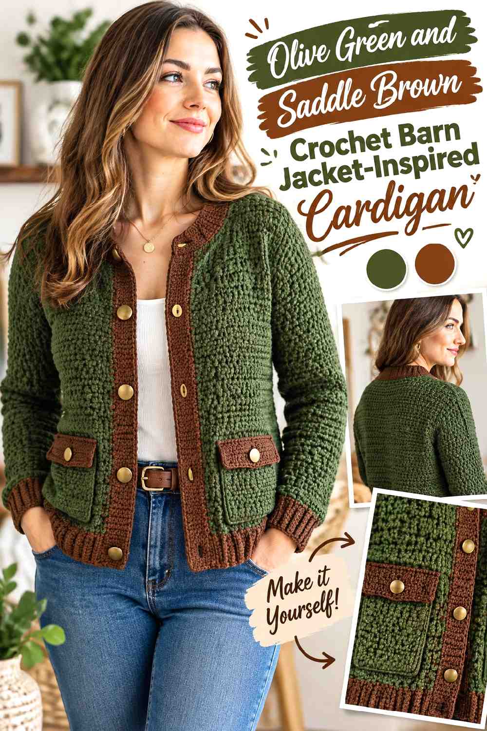
Olive green gives the cardigan an earthy main field, while saddle brown can supply the darker, warmer definition associated with classic utility outerwear. Keep olive across most body panels and sleeves, then consider saddle brown for the front edging, collar-like finish, cuffs, or pocket tops. The difference works best when olive clearly remains dominant rather than splitting the garment into equal green and brown sections.
Let Olive Green Carry the Main Crochet Cardigan Panels
Using olive green across the broad front, back, and sleeve areas establishes one continuous visual base. That matters on a cardigan with several seams or separate pieces because a consistent body color can make the overall silhouette feel calmer.
If the olive is muted, check the finished stitch texture in normal room light before deciding that it needs additional contrast. Raised or ribbed areas may already provide enough surface definition.
Saddle Brown Gives Olive Green Edges Stronger Workwear Definition
Saddle brown can be concentrated around structural details rather than scattered randomly. A brown front band and cuffs can frame the olive body, while a small repeat at the hem or pocket edge connects the contrast across the cardigan.
If the two yarns look similar in value, choose a saddle brown that is visibly darker or lighter when you want those details to remain obvious.
Creator Credit: Cat Kemble
2. Tobacco Brown And Cream Crochet Barn Jacket Inspired Cardigan
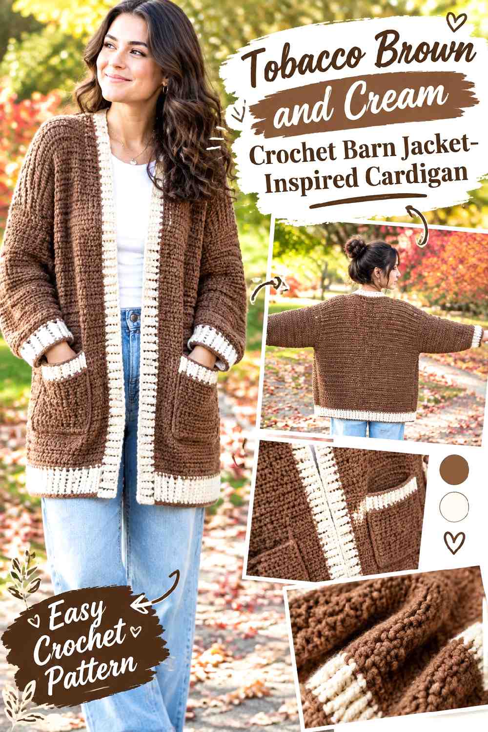
Tobacco brown creates a warm, grounded cardigan, while cream introduces a much lighter break. Because the value difference can be substantial, cream needs less surface area to have an effect. Keeping tobacco brown on the main rectangles or panels and using cream around front edges, cuffs, or selected pockets gives the cardigan definition without turning it into a half-brown, half-cream garment.
Tobacco Brown Keeps the Crochet Cardigan Body Visually Continuous
A large tobacco-brown field suits simple cardigan construction because the warm color can travel uninterrupted across broad pieces. If the fabric has noticeable crochet texture, the single dominant shade also prevents every stitch change from competing with a color change.
For a more understated result, keep the sleeves tobacco brown too rather than automatically making them contrasting pieces.
Cream Should Frame Tobacco Brown Instead of Competing With It
Cream attracts attention quickly against a darker brown. Use that contrast where you actually want the eye to stop—perhaps the front opening, cuff edge, neckline, or pocket border.
If a full cream band feels too bright, narrowing the cream area can preserve the same light-dark separation while allowing tobacco brown to remain unmistakably dominant.
Creator Credit: Delia Creates
3. Faded Navy And Camel Crochet Barn Jacket Inspired Cardigan
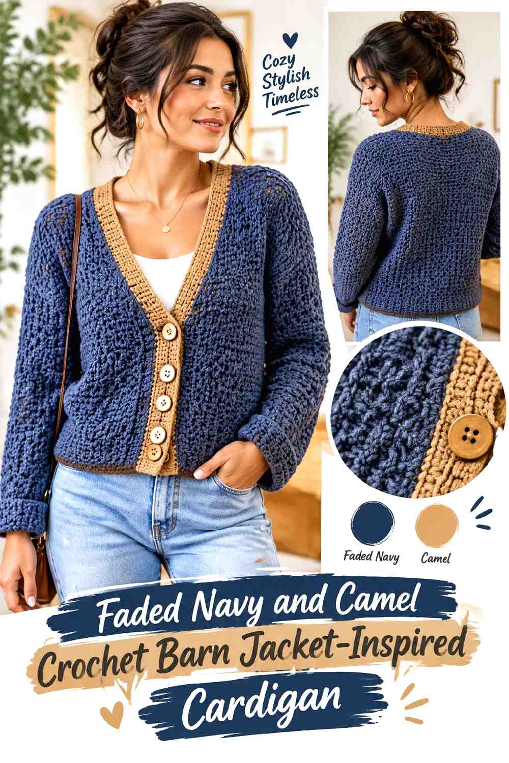
Faded navy provides a cooler alternative to the many brown and green barn-jacket palettes, while camel adds a dry, warm contrast. This combination works especially well when navy occupies the body and camel appears on finishing details. The temperature difference is noticeable without requiring an extremely bright accent.
Faded Navy Gives the Crochet Cardigan a Softer Dark Base
Choose a navy that feels softened rather than extremely vivid if you want a worn-in workwear direction. On large body and sleeve sections, faded navy can still provide enough darkness to anchor cuffs, ribbing, and seams without looking as stark as black.
Check the navy next to the intended underlayers you actually wear, especially if your wardrobe already contains a lot of dark denim.
Camel Can Separate Faded Navy Cuffs and Front Bands
Camel is useful where the cardigan needs visual structure. Applying it to a front band, collar-like edge, or rolled cuff creates a warmer outline against navy.
Keep the camel placement consistent. A camel cuff with no repetition elsewhere may look detached, while a small repeat near the neckline or hem makes the color feel deliberately integrated.
Creator Credit: TL Yarn Crafts
4. Rust And Charcoal Crochet Barn Jacket Inspired Cardigan
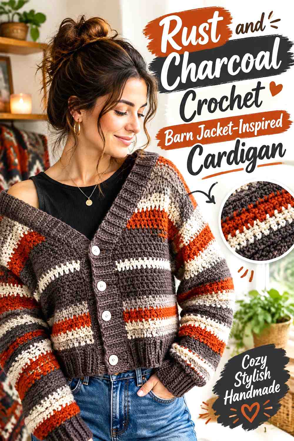
Rust brings the strongest autumn warmth in this group, while charcoal keeps it from becoming an all-orange statement. On a striped or segmented cardigan, charcoal can act as the visual pause between larger rust areas. On a mostly solid cardigan, it can instead define cuffs, edges, and pockets.
Rust Works Better When the Crochet Cardigan Has Breathing Room
Let rust occupy enough of the garment to read as the main color rather than reducing it to narrow, disconnected accents. Broad rust panels or repeated substantial stripes allow the warm shade to feel purposeful.
If the crochet texture is already busy, avoid introducing too many additional accent colors. Rust and charcoal can provide plenty of separation on their own.
Charcoal Can Control the Visual Weight of Rust Stripes
Charcoal is dark enough to break up warm rust effectively. In a striped cardigan, changing stripe widths rather than alternating every color in identical proportions can prevent the surface from looking overly mechanical.
For a less striped adaptation, repeat charcoal at the cuffs and opening so the dark color still frames the rust body.
Creator Credit: Bloodimaryart Crochet
5. Chocolate Brown And Oatmeal Crochet Barn Jacket Inspired Cardigan
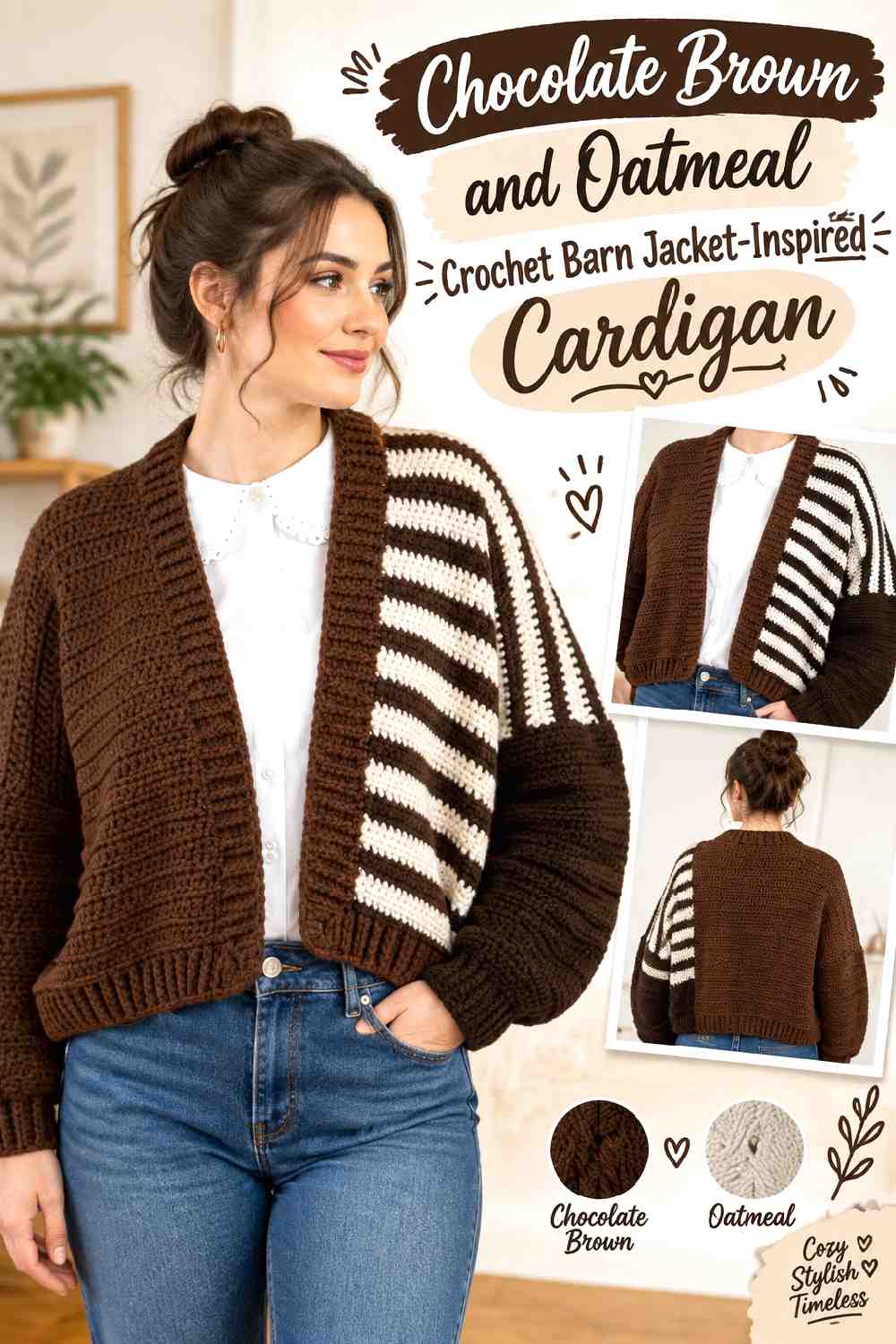
Chocolate brown gives an oversized cardigan substantial visual weight, while oatmeal is softer than a stark white contrast. This palette suits a relaxed barn-jacket direction when chocolate covers the broad body and oatmeal defines only selected finishing areas.
Chocolate Brown Grounds an Oversized Crochet Cardigan
Large cardigan shapes can handle a deep dominant color because there is enough uninterrupted surface for chocolate brown to establish itself clearly. Using it on both body and sleeves also keeps an oversized silhouette from being broken into too many separate visual blocks.
Look at the cardigan vertically as well as laid flat; a dark color can feel heavier once the full garment is hanging.
Oatmeal Keeps Chocolate Brown Crochet Details Visible Without Stark Contrast
Oatmeal can outline ribbing, cuffs, or front edging while maintaining a relatively earthy palette. It is especially useful when you want detail separation without the sharper effect of bright white.
If your oatmeal substitute is nearly as dark as the chocolate brown, however, the contrast may disappear. Preserve the lighter supporting role rather than matching the exact color name.
Creator Credit: Sirin’s Crochet
6. Forest Green Burgundy And Oatmeal Crochet Barn Jacket Inspired Cardigan
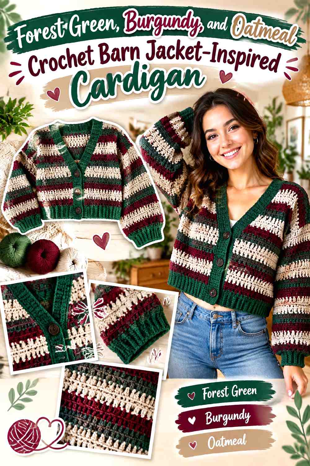
Forest green and burgundy create a dark, heritage-leaning fall combination, while oatmeal prevents the two deep colors from merging into one heavy surface. Forest green can dominate the main cardigan, burgundy can mark selected bands or panels, and oatmeal works best in the smallest but strategically visible role.
Forest Green Should Lead the Crochet Cardigan Body
Give forest green the largest share of the front, back, and sleeves so the three-color scheme retains a clear hierarchy. This prevents the garment from becoming a series of equally strong color blocks.
A continuous green body also makes it easier to decide later whether burgundy belongs on cuffs, edging, or just a few repeated areas.
Burgundy Adds Depth Without Replacing Forest Green
Burgundy is most useful when it appears in deliberate secondary zones. Cuffs and a lower band can provide enough repetition, or burgundy can frame selected cardigan details if the construction supports them.
Avoid distributing burgundy in small, isolated patches across every panel unless a deliberately patchworked surface is the goal.
Oatmeal Separates Burgundy From Forest Green
Because burgundy and forest green can both be quite dark, oatmeal can provide the value break the palette needs. A narrow oatmeal line between those colors can make a border or band easier to distinguish.
Keep oatmeal controlled: it does not need to occupy a large area to separate two deeper shades.
Creator Credit: by Kristine
7. Oxblood And Sand Crochet Barn Jacket Inspired Cardigan
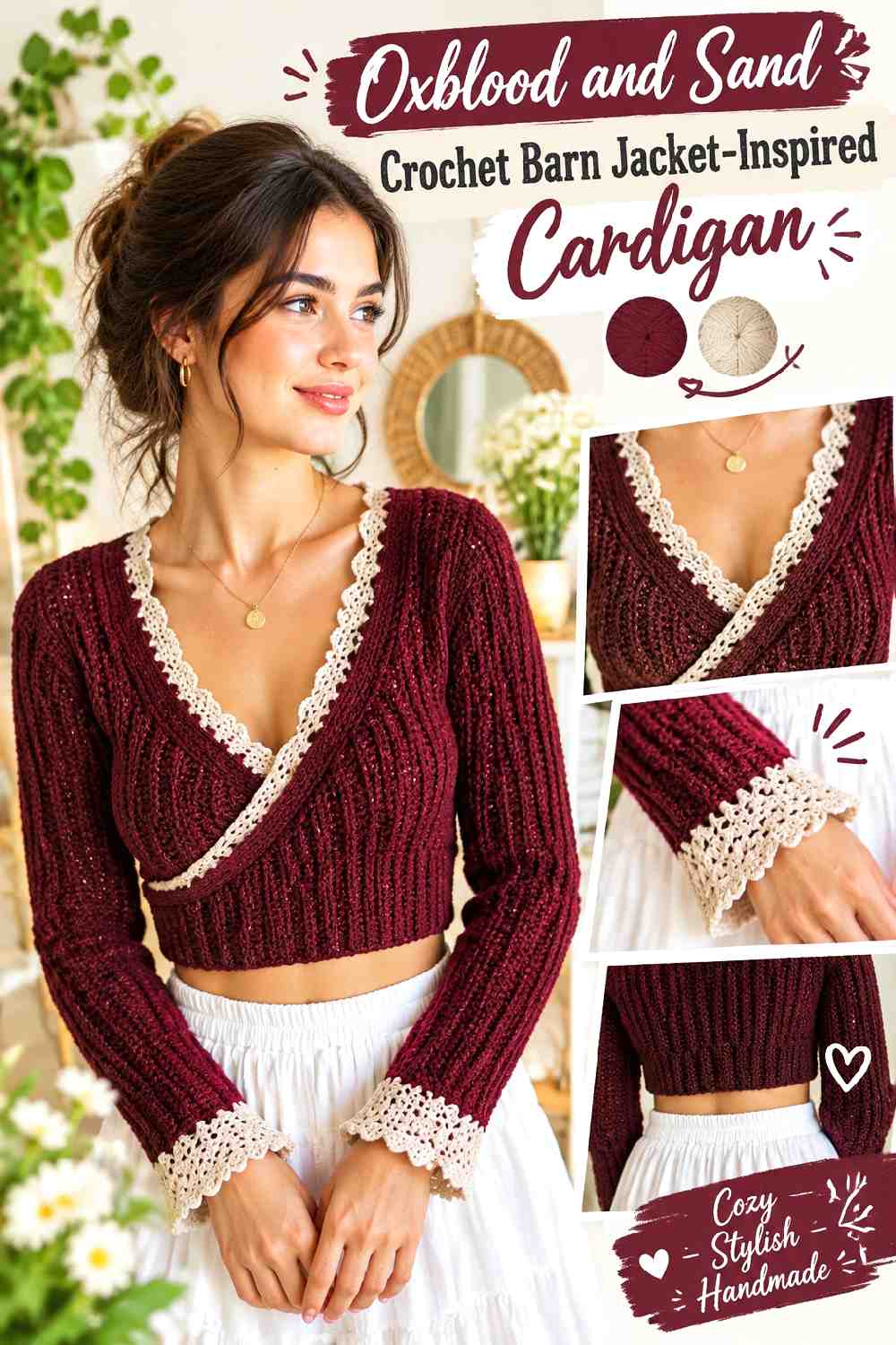
Oxblood brings a dark red direction that feels richer than classic bright red, while sand keeps the cardigan from becoming uniformly deep. On a ribbed or wrap-style cardigan, sand can emphasize the edges and ties or define cuffs without overpowering the larger oxblood surface.
Oxblood Can Carry Broad Crochet Cardigan Sections
Use oxblood wherever you want continuity: broad fronts, back sections, and sleeves are natural places for the darker color. Keeping these large areas consistent also allows ribbing and other crochet texture to show without additional color changes.
If substituting another dark red, preserve the depth relative to sand rather than chasing one precise red hue.
Sand Makes Oxblood Crochet Edges Easier to Read
Sand can turn an otherwise subtle edge into a visible design feature. Consider it around the neckline, front opening, cuff, or another repeated boundary.
Because sand is much lighter, check the amount before extending it across large panels. Too much can reverse the intended hierarchy and make oxblood feel like the accent.
Creator Credit: Chenda DIY
8. Black And Khaki Crochet Barn Jacket Inspired Cardigan
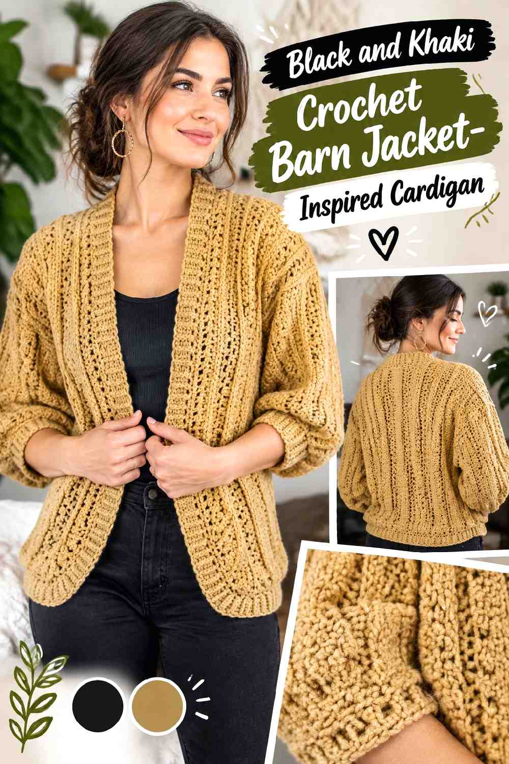
Black and khaki create one of the clearest utility-style contrasts in the collection. Black can sharpen the cardigan’s boundaries while khaki carries the larger fabric areas, or the roles can be reversed for a darker garment. A khaki-dominant version usually keeps the workwear connection more visible.
Khaki Gives the Crochet Cardigan a Practical Neutral Main Field
Using khaki across the body creates enough lightness for crochet stitch definition to remain visible without introducing a bright color. It also gives black finishing a clear surface to frame.
If the khaki yarn looks very yellow or very gray beside black, judge the combination as a pair before committing; the undertone can change the overall direction significantly.
Black Should Define Khaki Crochet Details Selectively
Black cuffs, front bands, or pocket edging can create crisp boundaries. Because black is visually strong, a little can carry more weight than the same area in khaki.
Avoid outlining every seam automatically. Choose the parts you want emphasized so the black remains structural rather than turning the cardigan into a heavily traced graphic.
Creator Credit: TCDDIY
9. Clay And Sage Crochet Barn Jacket Inspired Cardigan
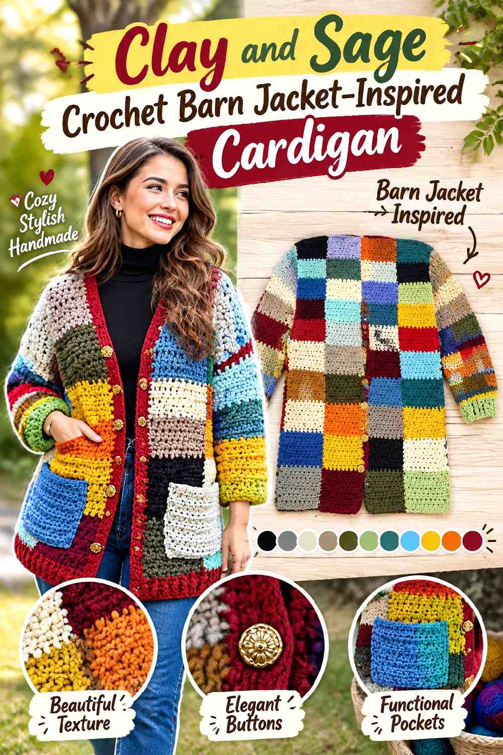
Clay and sage create a quieter warm-and-cool balance. Neither shade has to become extremely dark, so this palette is useful when you want a barn-jacket-inspired cardigan without a heavy brown, black, or navy base. Let clay cover the main body and use sage to distinguish the practical details.
Clay Keeps a Chunky Crochet Cardigan Warm Without Going Very Dark
Chunkier surfaces already have substantial visual texture, so clay can remain fairly simple across the body. A solid clay front and back allow the scale of the stitches to do part of the visual work.
If the clay is particularly saturated, keeping the sleeves in the same color can produce a cleaner result than alternating colors across every major piece.
Sage Can Mark Clay Crochet Pockets and Cuffs
Sage offers a gentle contrast for pocket tops, cuffs, or a front finish. These smaller placements help the cool green appear intentional rather than randomly inserted.
If clay and sage are similar in lightness, the palette will blend more softly. Choose a lighter or darker sage when clearer pocket definition is important.
Creator Credit: Brunaticality
10. Mustard And Walnut Brown Crochet Barn Jacket Inspired Cardigan
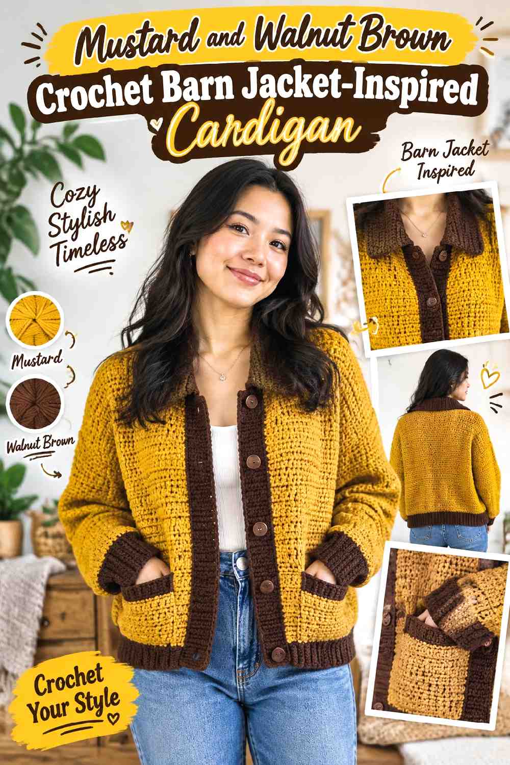
Mustard brings a retro autumn accent, while walnut brown gives it enough darkness to stay grounded. Rather than dividing the cardigan equally, use walnut on the broad body and give mustard a purposeful supporting role around finishing details.
Walnut Brown Gives the Crochet Cardigan a Stable Background
A walnut-dominant body makes the brighter mustard easier to control. It is particularly effective on simple cardigan shapes where uninterrupted panels allow the brown to establish a calm base.
If your substitute brown becomes almost black, check whether the contrast feels sharper than intended. A medium-to-dark brown keeps the palette warmer.
Mustard Should Repeat Across Walnut Brown Crochet Details
Mustard can appear at cuffs, a front band, and one other small area such as pocket edging. Repetition connects those details without requiring mustard sleeves or large mustard panels.
If one mustard section begins to dominate, reduce its width before adding more mustard elsewhere.
Creator Credit: VivCrochets
11. Denim Blue And Caramel Crochet Barn Jacket Inspired Cardigan
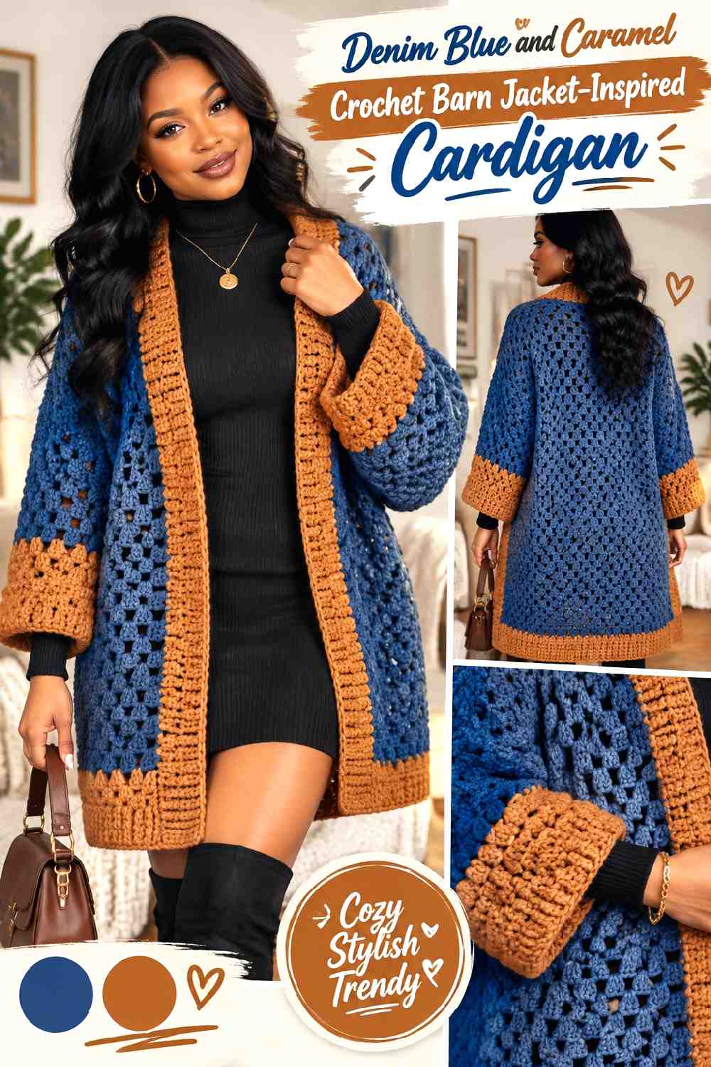
Denim blue and caramel balance a familiar cool blue with a warmer brown-orange neutral. On a granny-stitch or motif-heavy cardigan, denim blue can serve as the repeating background color while caramel marks selected borders or repeated motif rounds.
Denim Blue Can Unify a Textured Crochet Cardigan
When a cardigan has an open or clustered stitch surface, one repeated denim blue keeps the garment from becoming too fragmented. Use it consistently across the largest areas or as the recurring color in motifs.
A softened blue rather than a highly saturated one will make caramel feel less abrupt if a subdued workwear direction is the goal.
Caramel Helps Denim Blue Crochet Motifs Feel Connected
Instead of putting caramel into one isolated square or panel, repeat it at measured intervals. That could mean selected motif borders, cuffs, or a front edge depending on the construction.
Repeating caramel gives the eye a route through the cardigan and avoids the appearance of one accidental brown section.
Creator Credit: AC Crochets
12. Moss Green And Maroon Crochet Barn Jacket Inspired Cardigan
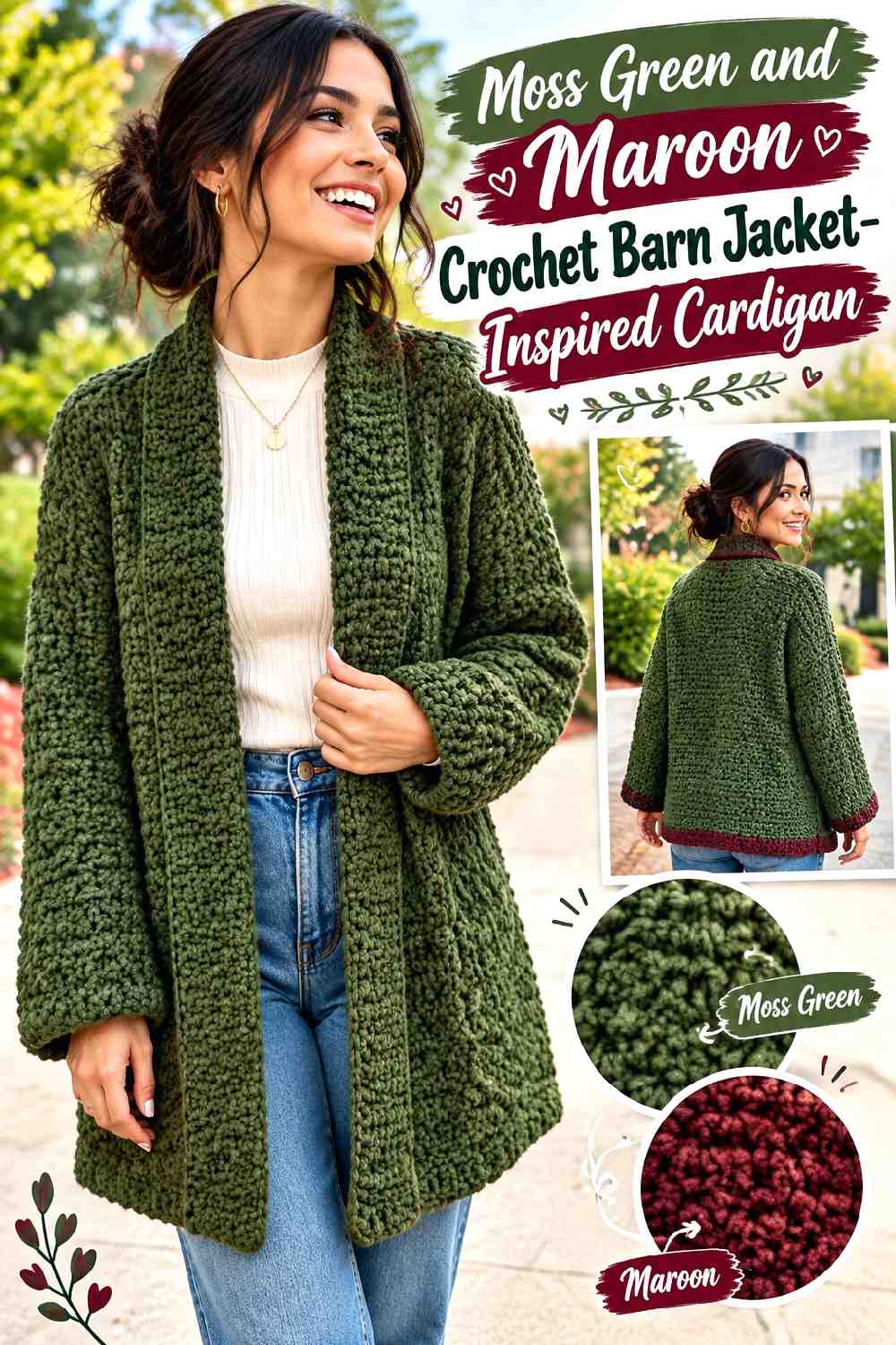
Moss green is softer and browner than many forest greens, while maroon adds a deep red counterpoint. Together they create a low-key fall palette that can support a more defined collar or front treatment without needing a light neutral.
Moss Green Keeps the Crochet Cardigan Earthy and Muted
Use moss across the main cardigan pieces when you want the surface to feel subdued. A muted green can also make strong stitch texture easier to notice because the color itself does not demand all the attention.
If your chosen moss becomes very dark, compare it directly with maroon before starting; two dark colors with similar value may merge.
Maroon Needs Clear Placement Against Moss Green
Give maroon a recognizable job such as collar-like edging, cuffs, or a lower border. This is more effective than dropping small maroon areas randomly across moss panels.
When stronger separation is wanted, choose a maroon that remains visibly darker or warmer than the green at normal viewing distance.
Creator Credit: KnitcroAddict
13. Mushroom Taupe And Espresso Crochet Barn Jacket Inspired Cardigan
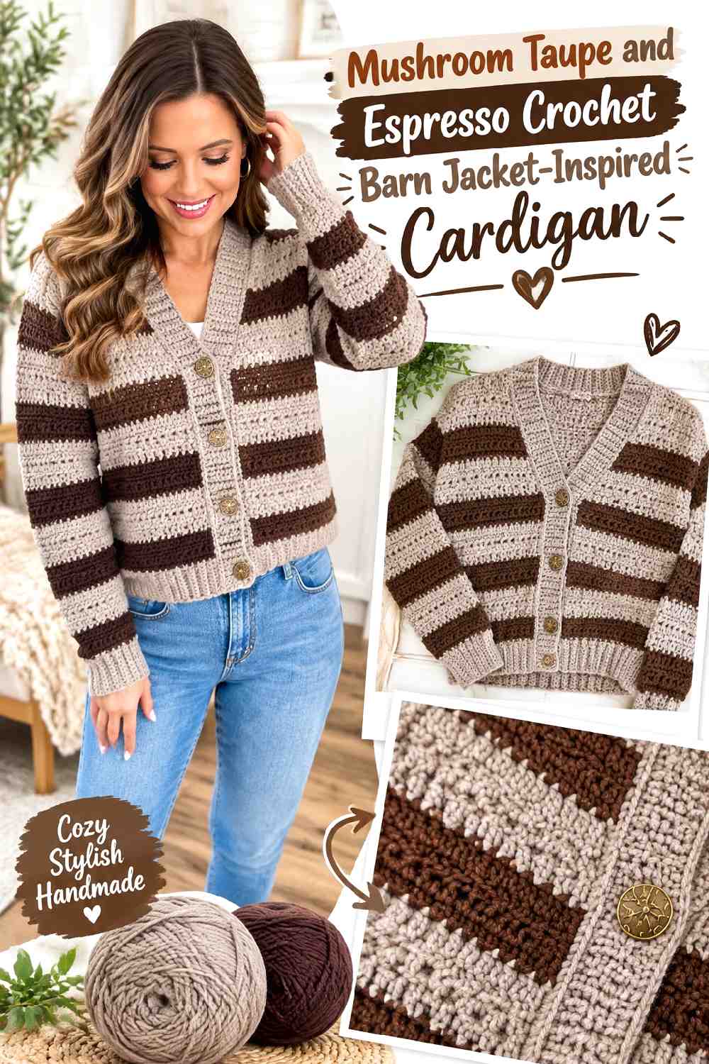
Mushroom taupe and espresso create a mostly neutral cardigan with contrast based on value rather than competing hues. Mushroom can lead the body while dark espresso frames it. This is a useful direction when the crochet construction or stripe arrangement already supplies plenty of visual activity.
Mushroom Taupe Lets Crochet Cardigan Texture Do More of the Work
A mid-light mushroom shade makes ribs, clusters, and panel transitions visible without turning color into the main event. It can cover the body and sleeves while maintaining a soft neutral appearance.
When substituting taupe, compare it with espresso first. A replacement that becomes too brown and dark can erase the intended separation.
Espresso Gives Mushroom Taupe a Defined Crochet Frame
Use espresso where a barn jacket would benefit from a firmer outline: cuffs, front bands, hem details, or selected stripe sections. The darkest color naturally draws attention to those areas.
Keep espresso from surrounding every small feature. A few repeated structural placements are enough to frame the lighter mushroom body.
Creator Credit: MJ’s Off The Hook Designs
14. Slate Gray And Cream Crochet Patchwork Barn Jacket Inspired Cardigan
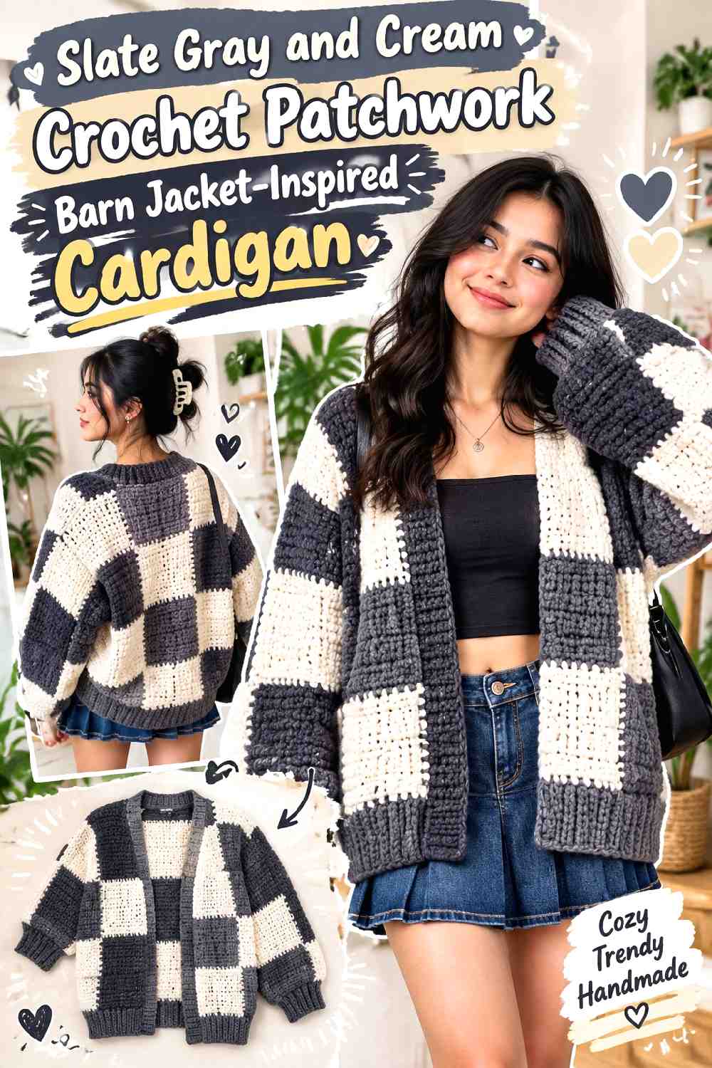
Slate gray and cream simplify patchwork into a controlled two-color composition. Instead of treating every block as an opportunity for another shade, alternate or group gray and cream so the patchwork construction remains visible without becoming highly multicolored.
Slate Gray Should Anchor the Crochet Patchwork Cardigan
Give slate gray either the larger number of blocks or the visually important zones around the body. A dominant dark neutral prevents cream from making the entire patchwork surface feel equally light.
Before joining pieces, view the full layout from a distance. Patchwork balance is easier to judge as a garment-shaped arrangement than square by square.
Cream Can Separate Slate Gray Crochet Blocks Without Taking Over
Cream provides strong value contrast, making it useful around selected blocks or as a repeated secondary field. You do not need a strict checkerboard unless that is the intended graphic effect.
Leaving some slate sections adjacent to one another can create larger calm areas and keep the patchwork from feeling excessively busy.
Creator Credit: ikoxun
15. Terracotta And Indigo Crochet Patchwork Barn Jacket Inspired Cardigan
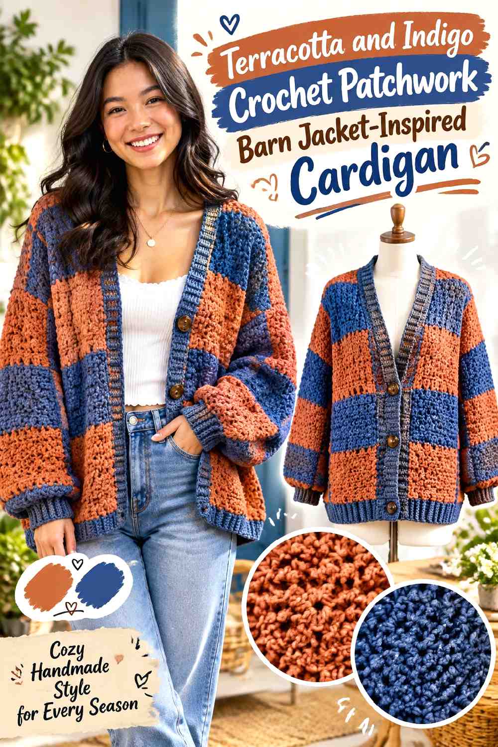
Terracotta and indigo create one of the strongest warm-cool combinations here. Patchwork gives both shades enough surface to read clearly, but equal alternation can become visually loud. A better approach is to let one lead and use the other to build strategic blocks of contrast.
Terracotta Can Warm the Main Crochet Patchwork Areas
Use terracotta on a larger share of the torso blocks if you want the cardigan to retain an autumn-first direction. Repeating it across both front and back prevents the warm color from becoming concentrated on only one side.
Keep the sleeve layout connected to the body rather than designing two unrelated color arrangements.
Indigo Gives Terracotta Crochet Blocks Stronger Boundaries
Deep indigo can anchor shoulders, cuffs, outer blocks, or other areas where a darker color helps define the silhouette. Its value contrast with terracotta may also make the block structure more apparent.
Lay the colors out before joining. If one indigo section becomes visually much heavier than the rest, repeat a smaller indigo area elsewhere for balance.
Creator Credit: Shyler crochets
16. Aubergine And Camel Crochet Barn Jacket Inspired Cardigan
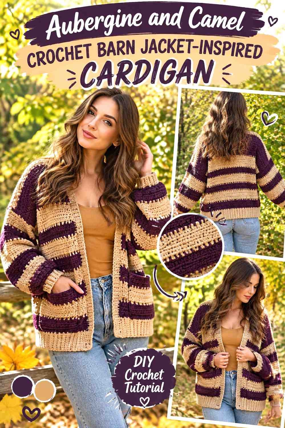
Aubergine gives the cardigan a dark purple base without moving completely into brown, gray, or navy. Camel warms the combination and can emphasize cuffs, stripe sections, or front finishing. The palette feels richest when aubergine remains the clear foundation.
Aubergine Gives the Crochet Cardigan a Deep Alternative to Brown
Covering most of the torso and sleeves in aubergine produces a dark garment while retaining more color than charcoal or black. This can be especially useful when the cardigan has visible texture that would otherwise disappear into an extremely dark neutral.
Check the yarn under more than one lighting condition, since very deep purples can visually approach brown or black.
Camel Keeps Aubergine Crochet Stripes From Becoming Too Dark
Camel can break up darker areas with a warmer, lighter band. On a striped cardigan, use it selectively rather than matching every aubergine stripe one-for-one.
Repeating camel at a cuff or edge can also connect the stripe treatment to the cardigan’s finishing.
Creator Credit: Evelyn And Peter Crochet
17. Dark Teal And Tobacco Brown Crochet Barn Jacket Inspired Cardigan
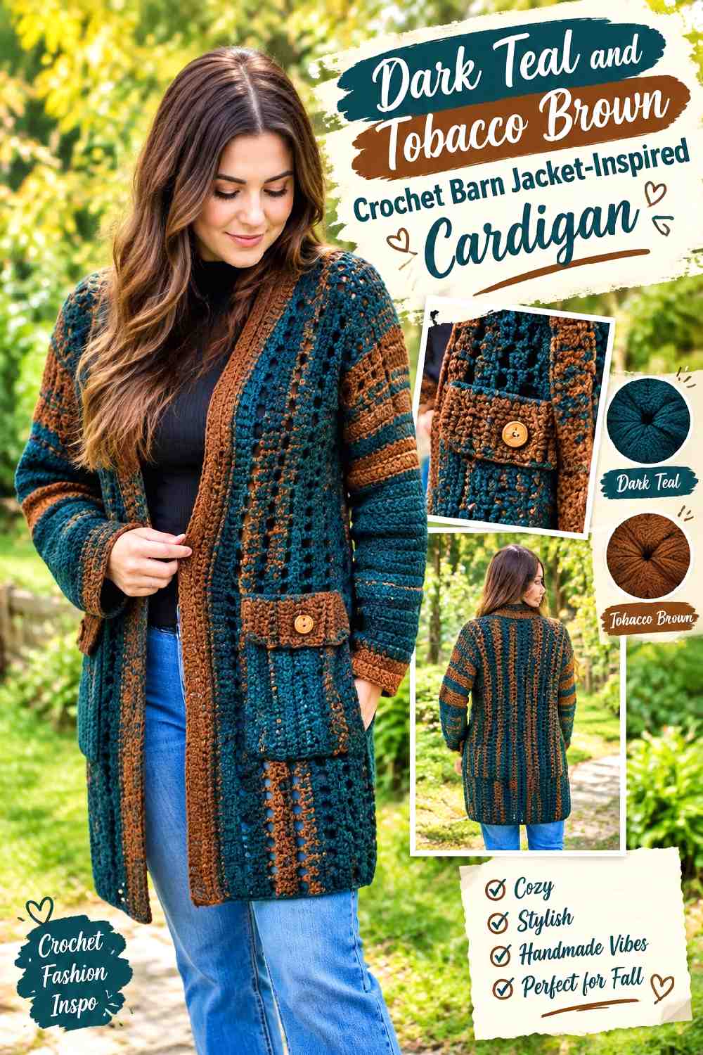
Dark teal gives the barn-jacket concept a cooler, more saturated direction, while tobacco brown restores the earthy workwear connection. This pair works particularly well when teal covers most of the garment and tobacco appears on practical details such as pockets and edging.
Dark Teal Should Remain the Crochet Cardigan’s Main Color
Use teal continuously across the body and sleeves to keep the strong color organized. Breaking a saturated shade into many tiny pieces can make it feel busier than using the same amount in one coherent field.
If substituting another blue-green, preserve a sufficiently dark value so tobacco remains a warm contrast rather than blending into it.
Tobacco Brown Can Highlight Dark Teal Crochet Pockets
Pockets are natural places to introduce the warm supporting color because they already create a separate surface on the cardigan. Tobacco edging can define a teal pocket, or the pocket itself can carry brown if you want a larger contrast area.
Repeating tobacco near the cuffs or front opening prevents the pocket color from appearing isolated.
Creator Credit: Bag-O-Day Crochet
18. Barn Red And Stone Crochet Granny Barn Jacket Inspired Cardigan
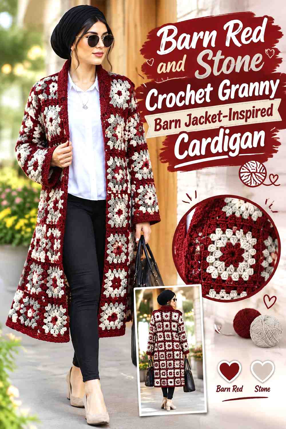
Barn red makes the workwear reference explicit, while stone tempers the red with a lighter neutral. On a granny-square cardigan, stone can serve as the repeating connector that prevents the red motifs or blocks from overwhelming the whole garment.
Barn Red Needs Repetition Across the Crochet Cardigan
Distribute barn red across the front, back, and sleeves rather than concentrating every red motif in one region. Repetition helps the cardigan read as one planned palette even when individual squares vary.
For a quieter finish, let red occupy the motif centers or selected fields instead of every round of every square.
Stone Gives Barn Red Crochet Motifs More Separation
Stone can act as the breathing space between red areas. Using it around motif borders, joins, or selected neutral squares gives the darker red a clearer outline.
If the stone substitute is very close to white, the contrast will become crisper. A warmer gray-beige keeps the palette softer and more weathered.
Creator Credit: Fuad Azmat / YARNutopia by Nadia
19. Charcoal Olive And Cream Crochet Barn Jacket Inspired Cardigan
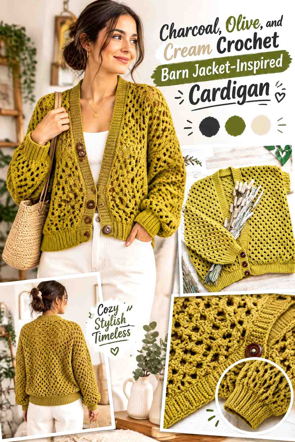
Charcoal, olive, and cream create a three-color scheme with clearly different jobs. Charcoal can anchor the main body, olive can carry the strongest workwear accent, and cream can provide a narrow light break around texture or finishing. Keeping those roles unequal prevents the three shades from competing.
Charcoal Gives the Crochet Cardigan Its Darkest Visual Anchor
Use charcoal on the largest uninterrupted areas when you want a dark outer layer. A charcoal torso also gives textured stitches a quieter background and allows olive details to become more noticeable.
If the chosen charcoal is nearly black, check whether the stitch pattern still reads clearly before extending it across every part of the garment.
Olive Adds Workwear Color to Charcoal Crochet Details
Olive works well on a meaningful secondary area such as cuffs, front edging, pockets, or selected sleeve sections. Give it enough repetition to feel intentional but not enough to challenge charcoal for dominance.
If the olive is also very dark, cream can help separate the two where they meet.
Cream Should Be the Smallest Accent With Charcoal and Olive
Cream can outline a narrow edge, divide an olive area from charcoal, or appear in a limited repeated detail. Its high lightness means it does not require much surface area.
Using cream sparingly also preserves the practical, darker character of the palette instead of shifting the whole cardigan toward a high-contrast three-color design.
Creator Credit: Hey Carrie
Which Fall 2026 Barn-Jacket Color Direction Fits Your Cardigan?
For the most traditional workwear direction, olive green with saddle brown, faded navy with camel, black with khaki, denim blue with caramel, and barn red with stone keep the relationship between a practical base color and a contrasting trim easy to see.
For a darker fall layer, chocolate with oatmeal, oxblood with sand, aubergine with camel, dark teal with tobacco, or charcoal with olive and cream provide more visual weight. Oatmeal, sand, camel, or cream can then be used strategically so cuffs, edges, and texture do not disappear into the darker body.
If you want color to become part of the surface design, the slate-and-cream and terracotta-and-indigo patchwork directions make the arrangement of blocks important. Forest green, burgundy, and oatmeal also offers three-color complexity without requiring full patchwork.
The quieter choices are clay with sage and mushroom with espresso. Those palettes rely more on controlled contrast and crochet texture than on dramatically different hues.
Conclusion
The strongest crochet barn jacket-inspired cardigan palette is the one that has a clear hierarchy before the first large panel or motif layout is committed. Olive and brown emphasize classic utility styling, navy and camel introduce cooler contrast, rust and charcoal push the cardigan toward stronger autumn color, and mushroom with espresso offers a more neutral approach.
For multicolor versions, decide which shade owns the body, which one identifies the structural details, and which—if there is a third color—needs only a small repeated role. That decision will usually do more for cohesion than adding another accent later.
Use the linked creator tutorials for their original construction guidance, then plan the editorial palette around the actual front, back, sleeve, cuff, edging, pocket, or motif areas available in that design.
Frequently Asked Questions
What makes a crochet cardigan look barn jacket-inspired?
Color placement can establish much of the look even when the underlying project is a cardigan rather than a literal barn-coat pattern. A substantial dominant color combined with defined cuffs, front edges, pocket areas, hems, or collar-like finishing gives the garment a more workwear-oriented visual structure. Earthy and utility-influenced colors can reinforce that direction, but the placement is more important than simply choosing brown or green yarn.
Should a crochet barn jacket-inspired cardigan use two or three colors?
Two colors are enough for a strong result when one covers the body and the other defines selected details. A third color is useful when it has a distinct purpose, such as separating two dark shades or adding a small repeated accent. If all three occupy similar amounts of the cardigan, the hierarchy can become harder to see.
Does the crochet cardigan collar need to contrast with the body?
No. A matching collar or neckline produces a quieter surface and lets pockets, cuffs, or other details carry the contrast instead. When you do use a contrasting collar, repeat that color somewhere else—such as a cuff or front edge—if you want it to feel integrated with the rest of the cardigan.
How can I check whether two cardigan colors have enough contrast?
Place the yarns side by side and look at them from a little distance. A grayscale photo can also help reveal whether two different hues are actually similar in light-dark value. If a pocket, motif, or edging needs to stay visible, greater value separation may help. If you prefer a blended, weathered appearance, closer values may be intentional.
Can I substitute different yarn colors without losing the barn-jacket palette?
Yes. Preserve the role of each shade rather than trying to find an identical color name. For an olive-and-saddle combination, for example, another muted medium green and a noticeably warmer or darker brown can maintain the same relationship. Also preserve which color dominates, which supports it, and how much light-dark separation the original scheme relies on.
How do I keep a patchwork barn jacket-inspired cardigan from looking too busy?
Limit the palette first, then plan the entire front, back, and sleeve arrangement before joining. Repeating one dominant shade across multiple neighboring blocks creates larger resting areas. A second shade can form the main contrast, while any third color should have a smaller and clearly repeated role rather than appearing once in an isolated square.