A crochet half-zip pullover gives fall color schemes several natural places to work. The body can carry the dominant shade, while the standing collar, zipper placket, cuffs, hem, or sleeves introduce a supporting color without covering the sweater in narrow stripes.
The center-front zipper is especially useful when planning contrast. A lighter or darker placket can emphasize the half-zip shape, while a matching placket lets texture and construction stay more prominent. For fall layering, it also helps to consider how the pullover will look over simple shirts and under jackets rather than judging the colors only as a flat crochet piece.
The palettes below are independent color directions that can be adapted to compatible crochet pullover constructions. The credited tutorials provide useful garment inspiration; the suggested color placements do not imply that the creators used these exact palettes.
Quick List
- Olive Green And Cream Crochet Half Zip Pullover
- Rust And Oatmeal Crochet Half Zip Pullover
- Burgundy And Dusty Rose Crochet Half Zip Pullover
- Mustard And Chocolate Brown Crochet Half Zip Pullover
- Forest Green And Camel Crochet Half Zip Pullover
- Navy And Heather Gray Crochet Half Zip Pullover
- Terracotta And Sage Crochet Half Zip Pullover
- Charcoal And Burnt Orange Crochet Half Zip Pullover
- Plum And Taupe Crochet Half Zip Pullover
- Deep Teal And Cream Crochet Half Zip Pullover
- Moss Green And Espresso Crochet Half Zip Pullover
- Cranberry And Camel Crochet Half Zip Pullover
- Denim Blue And Rust Crochet Half Zip Pullover
- Aubergine And Oatmeal Crochet Half Zip Pullover
- Brick Red And Ivory Crochet Half Zip Pullover
Plan Fall Colors Around the Half-Zip Collar
The collar and zipper opening already form a strong vertical feature, so they are useful places for a supporting color. When the body is dark, a lighter collar can make the neckline easier to distinguish. When the body is light or medium in value, a darker placket can give the front more definition.
You do not have to make the entire collar contrasting. A narrower color change along the zipper edges, a different collar facing, or repeated contrast at the cuffs can be enough. Keeping the secondary color attached to recognizable garment sections usually looks more deliberate than scattering small blocks across unrelated areas.
Check Light and Dark Contrast Before Crocheting Large Panels
Two fall colors can look different in the skein but still have similar lightness once worked together. That can be useful for a quiet tonal sweater, but it may make a small placket, textured panel, or narrow cuff difficult to distinguish.
Place the yarns beside each other before committing to large panels. A quick grayscale photo can also help reveal whether the shades have meaningful value separation. Strong contrast is not always necessary, but it should be intentional.
Coordinate Fall Pullover Colors With Your Layers
A half-zip pullover often sits over another layer, so consider the shirt or turtleneck that may show through the open neckline. A cream collar over a cream base layer produces a more continuous look, while a dark or contrasting layer makes the zipper opening more obvious.
The same idea applies to outerwear. If the pullover will usually sit under brown, denim, charcoal, or olive jackets, decide whether you want the crochet piece to blend into those neutrals or supply the stronger autumn color.
1. Olive Green And Cream Crochet Half Zip Pullover
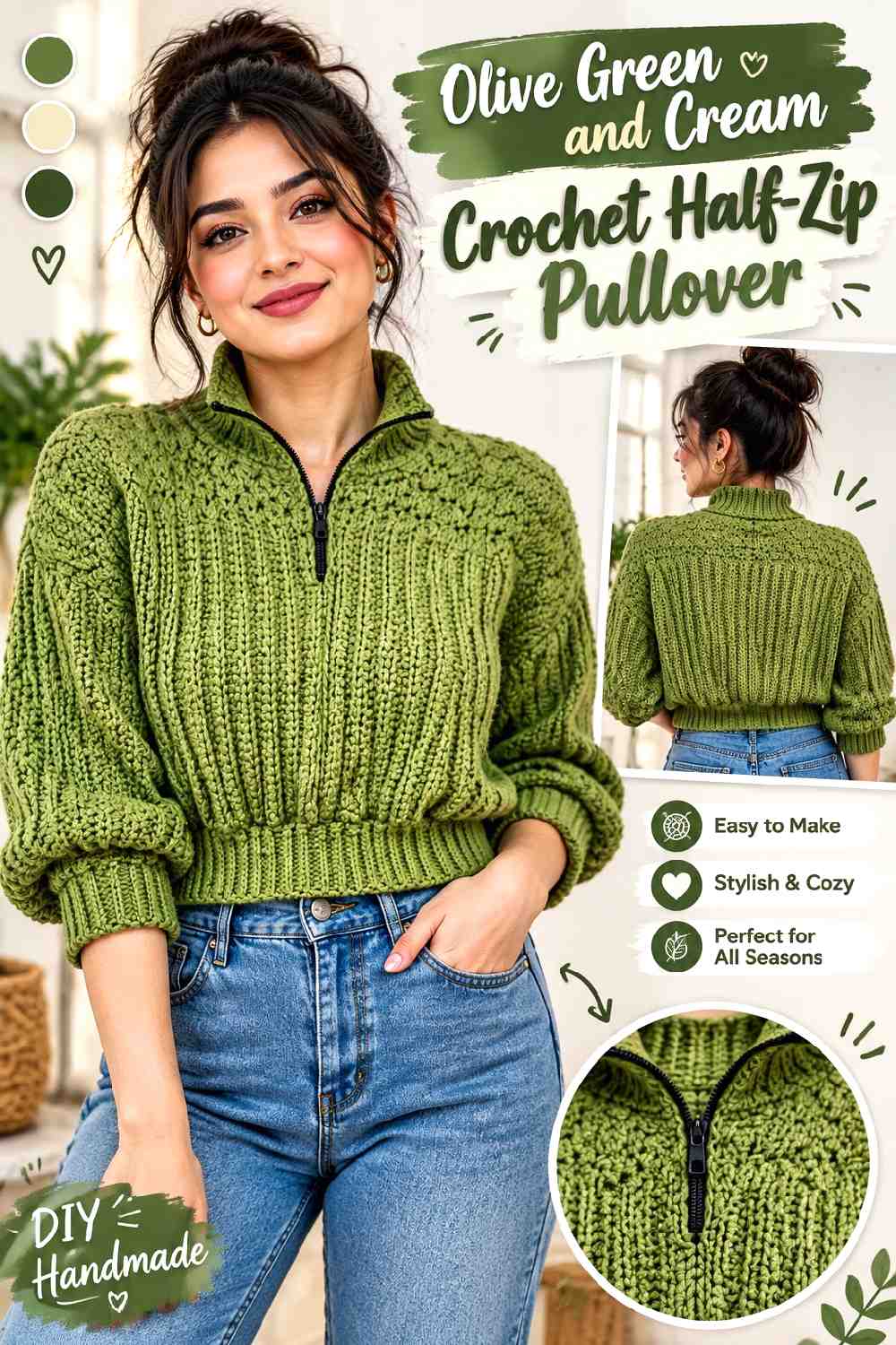
Olive Green works well as the main body color because it gives the pullover an earthy fall base without requiring several additional shades. Cream can be concentrated around the raised collar and zipper opening, where the lighter value separates the center-front structure from the Olive Green chest. Repeating Cream at the cuffs can connect the neckline to the sleeves without turning the sweater into a heavily striped design.
Cream Can Define the Olive Green Half-Zip Collar
Use Cream along the collar or zipper edges when you want the half-zip construction to remain obvious against a broad Olive Green body. A narrow light frame is often enough; extending Cream too far across the chest can shift the design from contrast trim into a full color-blocked yoke.
Olive Green Should Remain Broad Across the Pullover Panels
Keep Olive Green uninterrupted through substantial areas of the front, back, and sleeves if it is meant to lead the palette. This also gives crochet texture room to show without multiple color changes competing with the stitch surface.
Creator Credit: TCDDIY
2. Rust And Oatmeal Crochet Half Zip Pullover
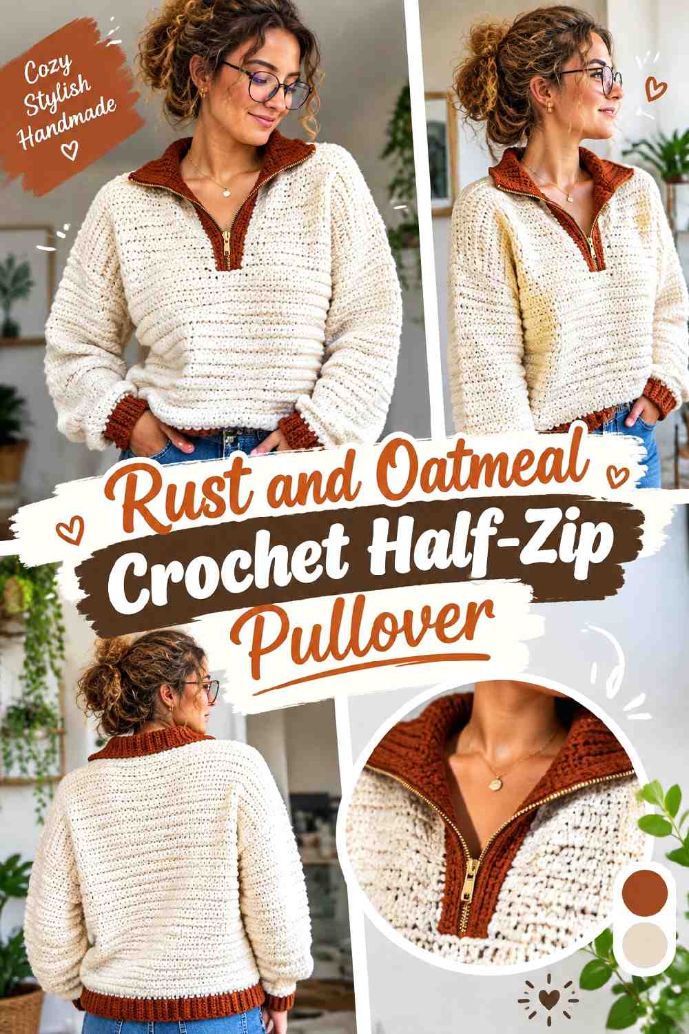
Rust gives this pullover a warm autumn direction, while Oatmeal provides a softer contrast than a very bright light neutral. Let Rust cover most of the torso and sleeves, then use Oatmeal around the collar, lower hem, or cuffs. The difference in value can make ribbed finishing easier to distinguish from the main crochet fabric.
Oatmeal Can Soften the Rust Crochet Collar
An Oatmeal collar keeps the upper sweater lighter without taking attention away from the Rust body. If the zipper is surrounded by Oatmeal as well, keep the placket relatively controlled so the light area still reads as neckline finishing rather than a large chest panel.
Rust Can Carry the Main Half-Zip Pullover Texture
Rust is most effective here when it has enough uninterrupted surface to establish the sweater’s identity. If the crochet fabric contains noticeable ridges or other raised texture, avoiding frequent Oatmeal interruptions allows color and texture to perform separate jobs.
Creator Credit: JeggoCrochet
3. Burgundy And Dusty Rose Crochet Half Zip Pullover
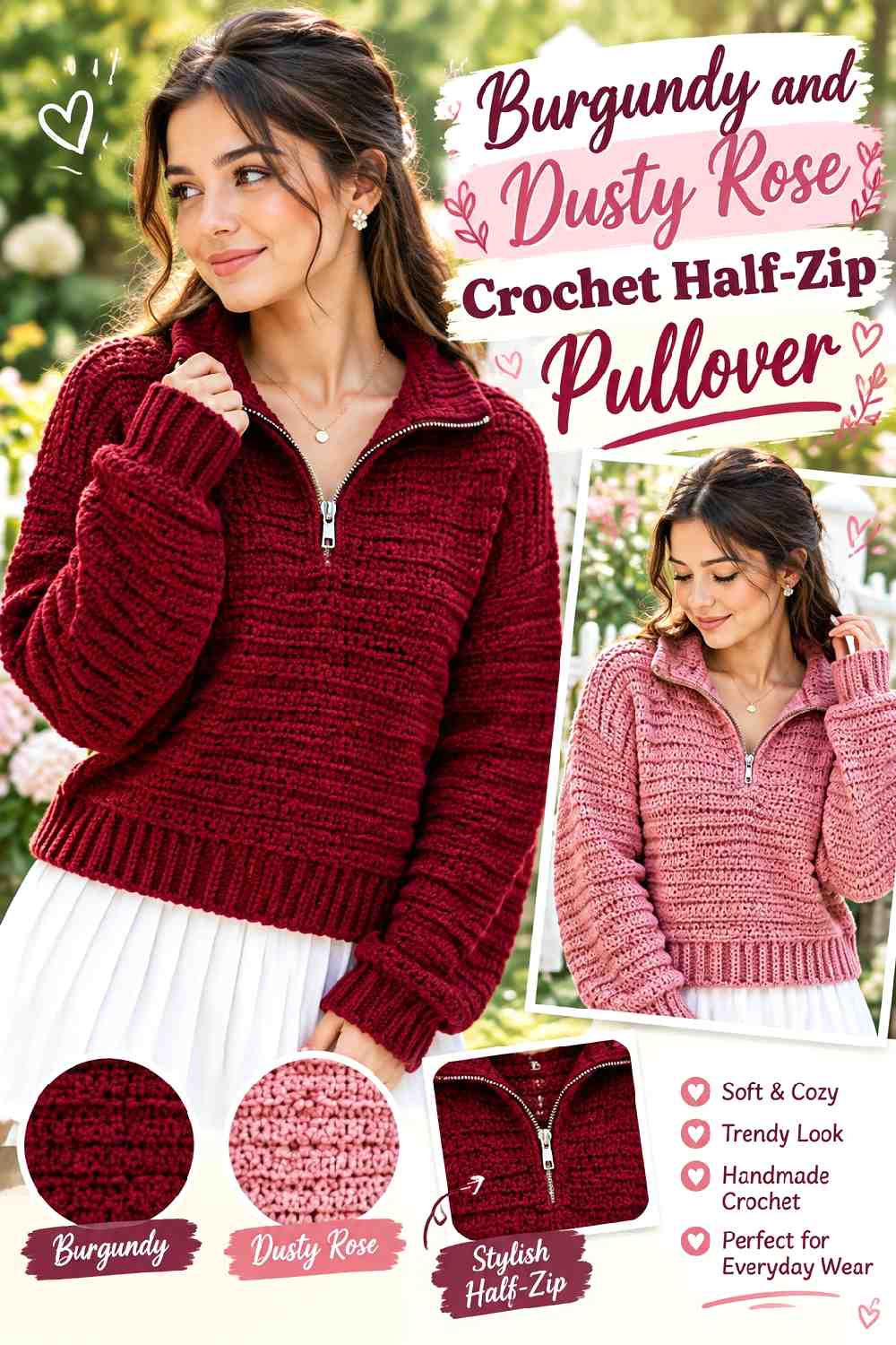
Burgundy and Dusty Rose create a tonal red-pink direction rather than a sharp neutral contrast. Burgundy can lead across the torso while Dusty Rose lightens the collar, upper sleeve sections, or selected ribbing. Because the colors belong to a related family, value difference matters more than simply noticing that the hues are different.
Dusty Rose Should Stay Lighter Than Burgundy Around the Collar
Choose a Dusty Rose that remains visibly lighter than Burgundy if the collar is meant to stand apart. When both yarns are similarly dark, the color change may become much more subtle once the neckline is folded or viewed from a distance.
Burgundy Can Ground Dusty Rose Cuffs and Pullover Edges
Using Burgundy through the main sleeves gives Dusty Rose cuffs a clear background. You can also return to Burgundy at the lower hem if you want the sweater’s darkest shade to frame both the center and bottom of the garment.
Creator Credit: Chenda DIY
4. Mustard And Chocolate Brown Crochet Half Zip Pullover
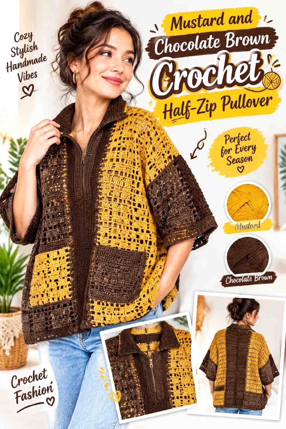
Mustard brings the stronger color to this scheme, while Chocolate Brown supplies a deep fall neutral. One useful arrangement is a Mustard torso with Chocolate Brown sleeves, collar, and zipper placket. That keeps Mustard visible across the central garment while Brown creates a darker framework around it.
Chocolate Brown Can Anchor a Mustard Half-Zip Opening
Use Chocolate Brown around the zipper when you want the center-front opening to have clearer definition. Repeating the Brown on the collar makes the placket look connected to the neckline rather than like an isolated vertical stripe.
Mustard Needs Enough Pullover Surface to Stay Dominant
If Chocolate Brown appears on the sleeves, collar, hem, and cuffs, it can quickly outweigh Mustard. Preserve a large Mustard front and back panel or return Mustard at selected sleeve areas so the original color hierarchy remains clear.
Creator Credit: FTK Crochet
5. Forest Green And Camel Crochet Half Zip Pullover
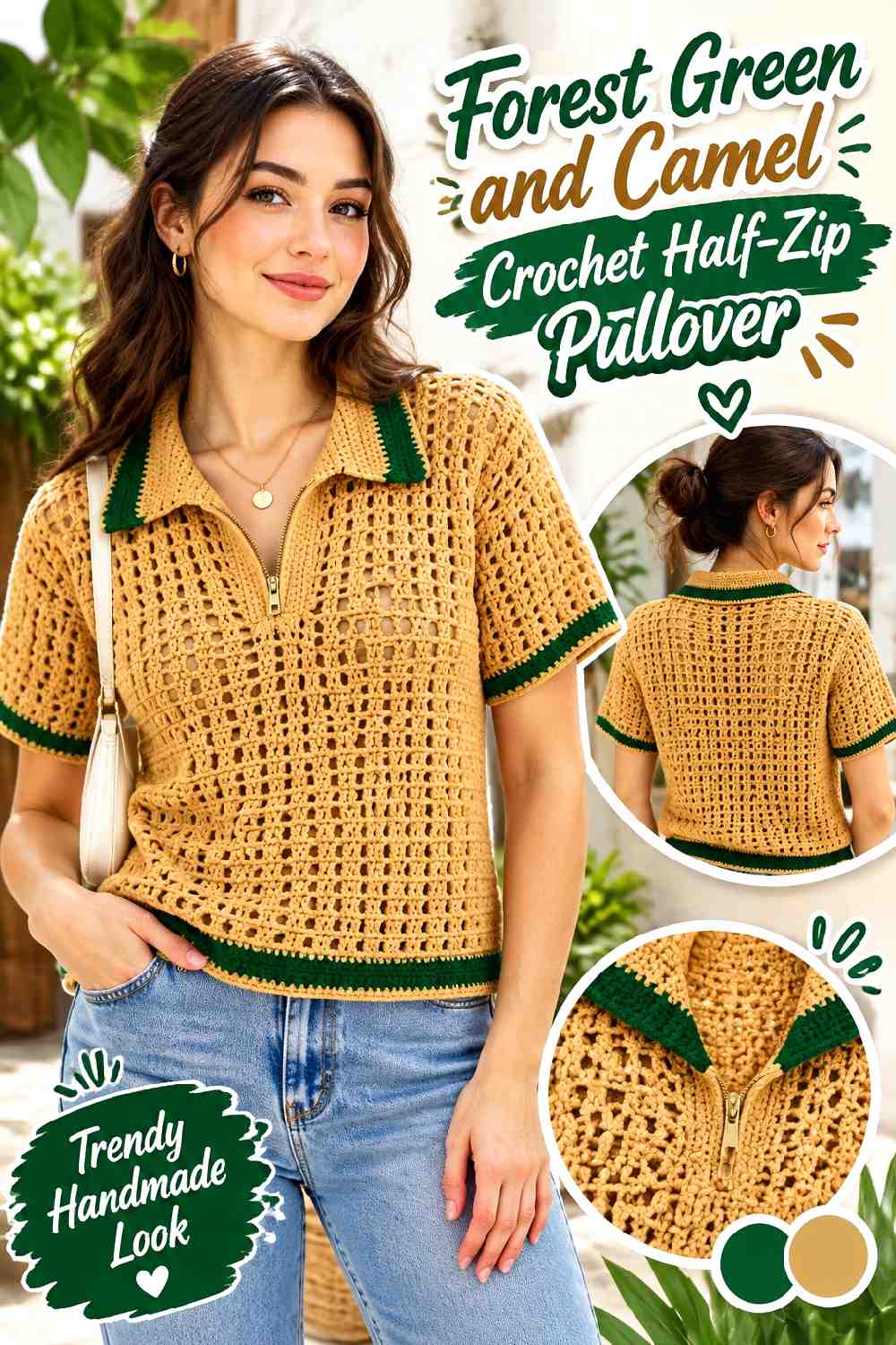
Forest Green gives this sweater one of the darkest body colors in the collection. Camel works well as a warmer medium-value support around the collar and ribbed finishing. Rather than splitting the garment evenly, use Camel to highlight structural areas while Forest Green remains continuous through the larger crochet panels.
Camel Can Warm Up a Forest Green Crochet Collar
A Camel standing collar provides visible separation from Forest Green without creating the stark contrast of a very pale neutral. Continuing Camel narrowly along the zipper edges can connect the collar to the chest while preserving the dark green body.
Forest Green Can Keep Camel Trim From Looking Fragmented
Repeat Forest Green between Camel finishing areas rather than filling the sweater with alternating bands. Broad Green sleeves and body panels provide enough visual continuity for Camel cuffs and collar details to feel intentional.
Creator Credit: Ascarcrochets
6. Navy And Heather Gray Crochet Half Zip Pullover
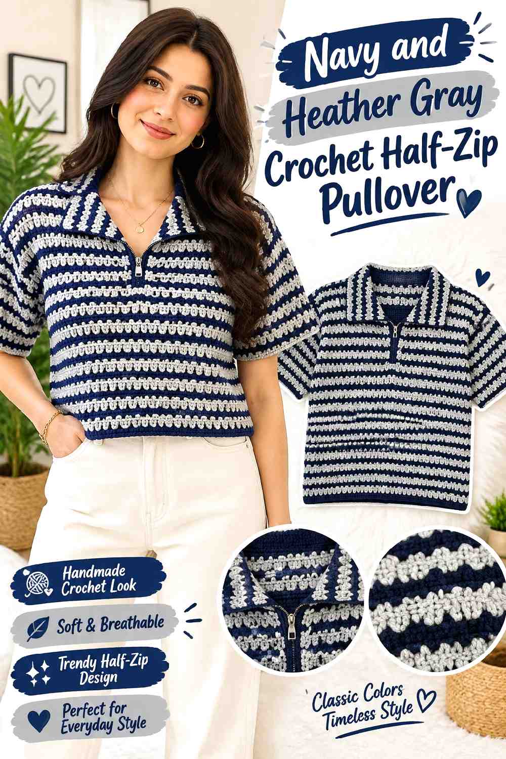
Navy and Heather Gray move away from the warmer autumn palettes while still working naturally for cool-weather layering. Navy can cover the body and sleeves, with Heather Gray reserved for the zipper placket, collar, and cuffs. The lighter Gray is particularly useful when the Navy crochet texture is dense enough that a dark-on-dark neckline would otherwise look understated.
Heather Gray Can Clarify the Navy Half-Zip Placket
Run Heather Gray along both sides of the zipper when the center opening needs more definition. Keep the two sides visually balanced so the contrast does not make the zipper appear shifted away from the middle.
Navy Can Give Heather Gray Ribbing a Dark Background
Navy sleeves help Heather Gray cuffs read clearly without requiring wide bands. If Gray also appears at the hem, use similar finishing proportions so the lower sweater and wrists look related rather than independently color blocked.
Creator Credit: İlmekle Nimet
7. Terracotta And Sage Crochet Half Zip Pullover
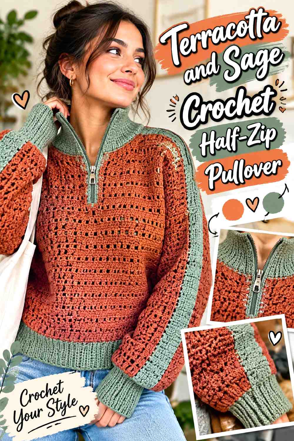
Terracotta and Sage combine two muted colors instead of pairing one strong shade with a neutral. Terracotta can remain dominant through the torso, while Sage covers the collar and selected upper-sleeve areas. Because both colors may sit near the middle of the value range, check their separation before using Sage for very narrow details.
Sage Can Create a Broader Contrast Above Terracotta
Instead of limiting Sage to a thin zipper edge, let it cover the collar and a controlled upper-chest section if the colors are too similar in value for narrow trim. A larger Sage area makes the contrast easier to read while preserving Terracotta below.
Terracotta Should Stay Continuous Beneath a Sage Yoke
Once the Sage upper section ends, let Terracotta run through a substantial lower body area. Extra Sage stripes immediately beneath the yoke can weaken the clean two-zone arrangement and make the sweater look busier than necessary.
Creator Credit: HookedByJessica
8. Charcoal And Burnt Orange Crochet Half Zip Pullover
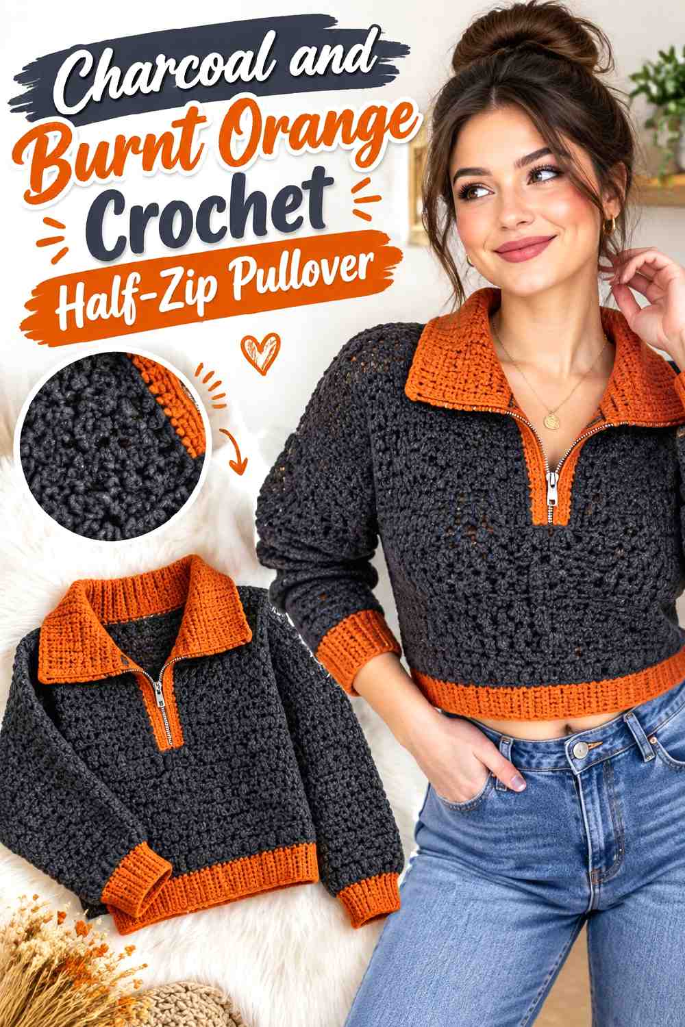
Charcoal gives this pullover a dark neutral base, allowing Burnt Orange to become a concentrated fall accent. Use Charcoal for most of the body and sleeves, then place Burnt Orange around the collar, zipper opening, and possibly a narrow cuff. This keeps the stronger orange close to the sweater’s main structural focal point.
Burnt Orange Can Make a Charcoal Half-Zip the Main Feature
A Burnt Orange collar and placket create a visible vertical break in a Charcoal torso. If that neckline already has strong contrast, additional Orange chest stripes may be unnecessary and can compete with the zipper.
Charcoal Can Control Burnt Orange Across the Sleeves
Keep most of each sleeve Charcoal and repeat Burnt Orange only at the cuff or a restrained upper-sleeve detail. This distributes the accent beyond the neckline without allowing Orange to overtake the darker fall palette.
Creator Credit: CJ Crochet
9. Plum And Taupe Crochet Half Zip Pullover
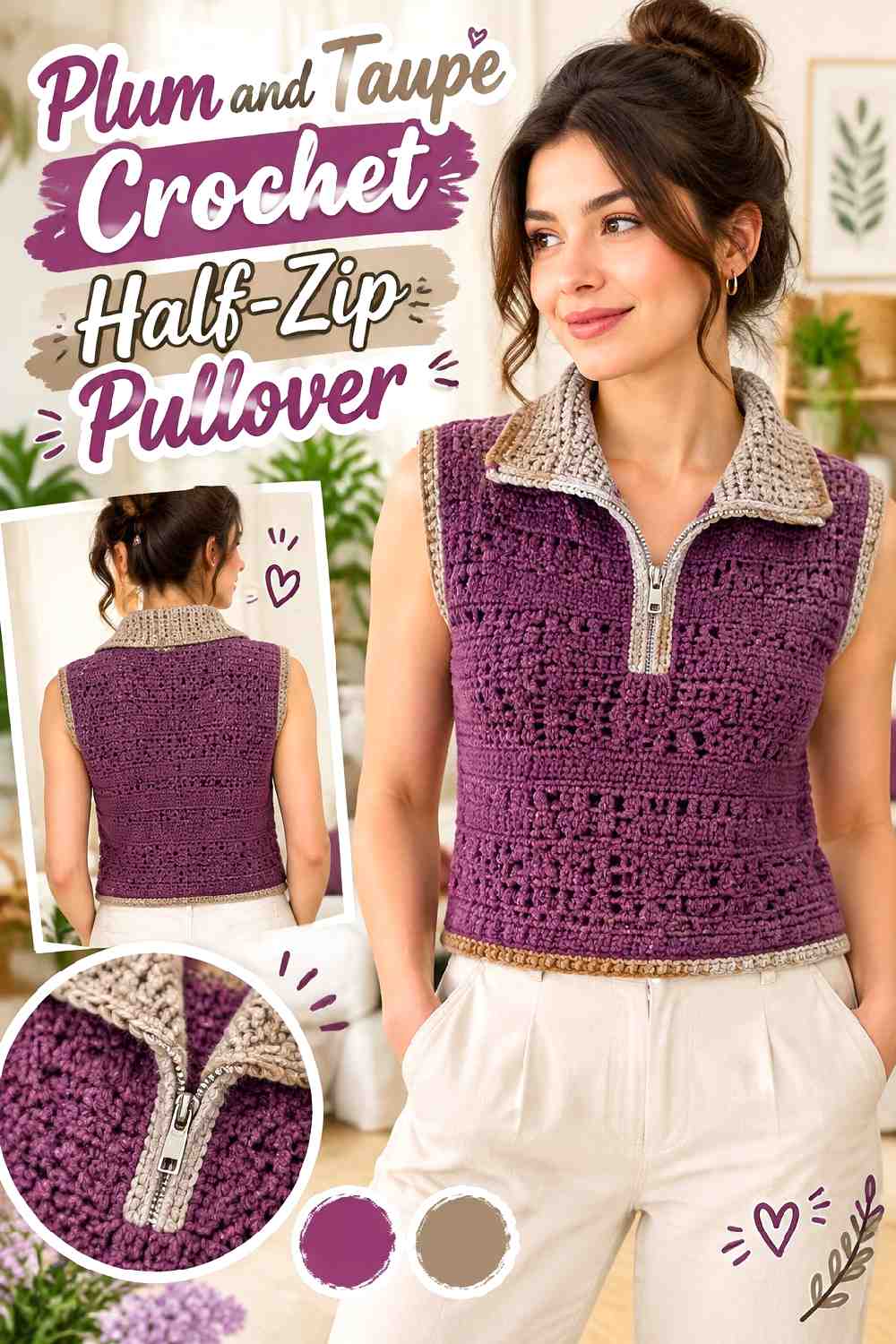
Plum offers a deep alternative to more expected autumn reds, while Taupe keeps the supporting color subdued. A Plum body with Taupe collar, cuffs, and hem works especially well when you want noticeable structure without a high-contrast two-color effect.
Taupe Can Give a Plum Crochet Collar Quiet Separation
Use Taupe when Cream would feel too bright against Plum. The medium neutral can distinguish the collar and placket while keeping the overall sweater relatively low contrast.
Plum Should Remain the Strongest Color Around Taupe Trim
If Taupe expands across broad sleeves or a large chest panel, the garment can become neutral-led. Keep Plum through the major front and back panels when the deep purple direction is the main reason for choosing this palette.
Creator Credit: Ler Crochet
10. Deep Teal And Cream Crochet Half Zip Pullover
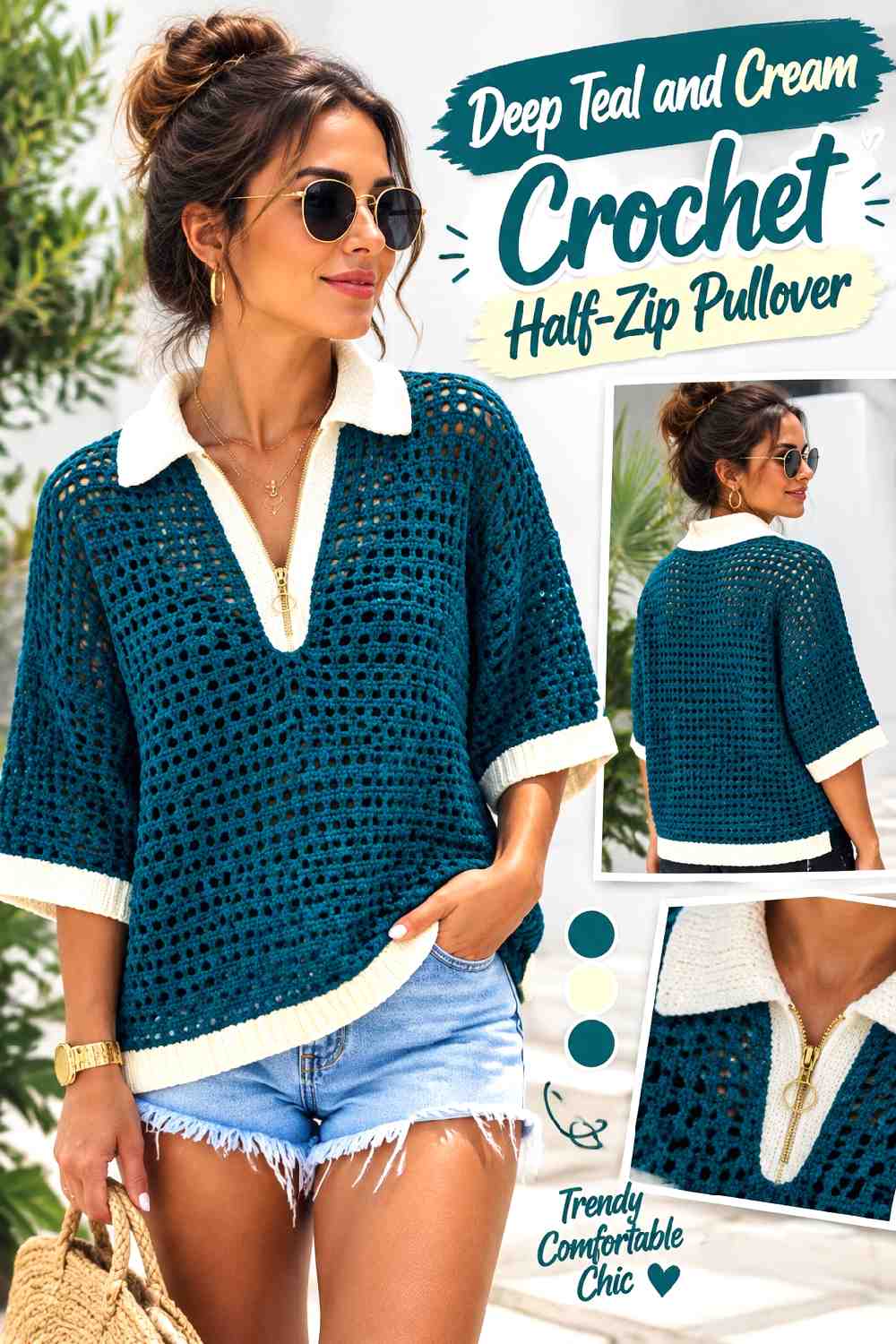
Deep Teal creates a saturated but cool main field, while Cream supplies a clear light contrast. This combination is useful when you want the standing collar and center zipper treatment to remain highly visible. Cream can also repeat at the cuffs to frame the darker sleeves.
Cream Can Sharpen the Deep Teal Half-Zip Neckline
Keep Cream close to the functional neckline areas: collar, zipper edges, and perhaps a narrow inner facing. Because the value difference is strong, even a relatively small Cream section can have a noticeable effect.
Deep Teal Needs Broad Panels Beside Cream
Give Deep Teal enough uninterrupted torso and sleeve space to prevent Cream from becoming visually dominant. This is particularly important when Cream appears at several finishing points, since repeated light details can attract more attention than their physical area suggests.
Creator Credit: Honey Loop Stitches
11. Moss Green And Espresso Crochet Half Zip Pullover

Moss Green and Espresso create a darker, woodland-oriented fall palette with less contrast than Cream-based combinations. Moss can cover the torso, while Espresso defines the collar, cuffs, lower band, and zipper edges. The result depends on subtle depth rather than a bright accent.
Espresso Can Frame a Moss Green Crochet Pullover
Use Espresso consistently on structural finishing areas when you want the darker neutral to form an outer frame. Collar, cuffs, and hem can relate naturally when they share the same Brown treatment.
Moss Green and Espresso Need a Contrast Check at the Zipper
Because both shades can be relatively dark, inspect them together before making Espresso placket details very narrow. If the colors visually merge, increase the width of the Espresso area or let the zipper and texture provide the main distinction instead.
Creator Credit: LoopsWithMagic
12. Cranberry And Camel Crochet Half Zip Pullover
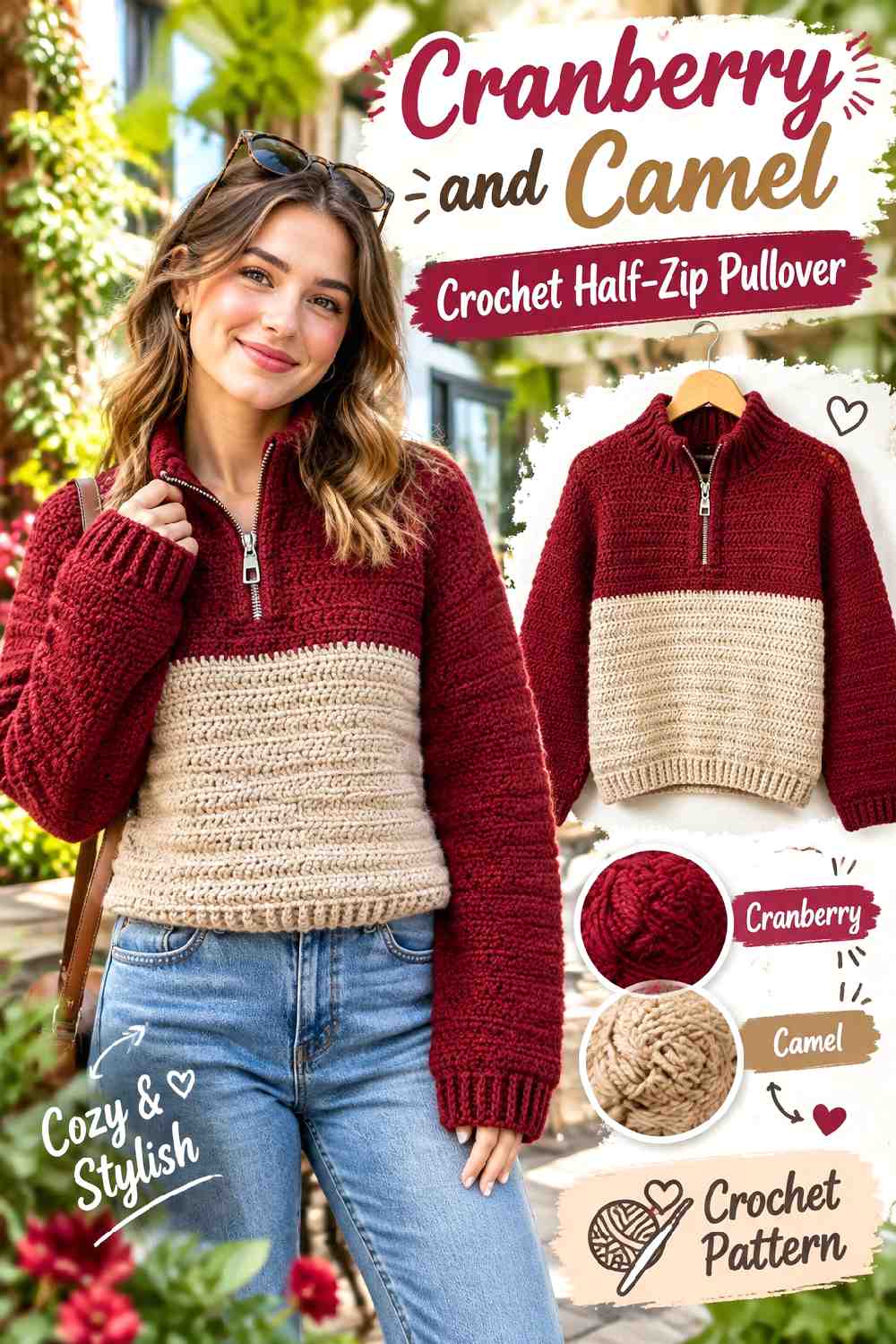
Cranberry creates a rich red focal color without relying on the very darkest Burgundy direction. Camel can warm the collar and cuffs while remaining more substantial than a pale Cream accent. Keeping Cranberry across the body makes this a useful choice when you want the fall color itself, rather than the trim, to lead.
Camel Can Break Up a Cranberry Half-Zip Collar
Use Camel where the zipper meets the standing collar to create a clear visual break in the red surface. Repeating Camel at the wrist can tie the neckline to the sleeves without introducing another shade.
Cranberry Can Continue Through the Hem for a Stronger Main Color
A Cranberry lower band keeps the sweater visually centered on the main shade. If both the hem and cuffs become Camel, the neutral begins to form a heavy border around the whole garment rather than remaining a supporting accent.
Creator Credit: VivCrochets
13. Denim Blue And Rust Crochet Half Zip Pullover
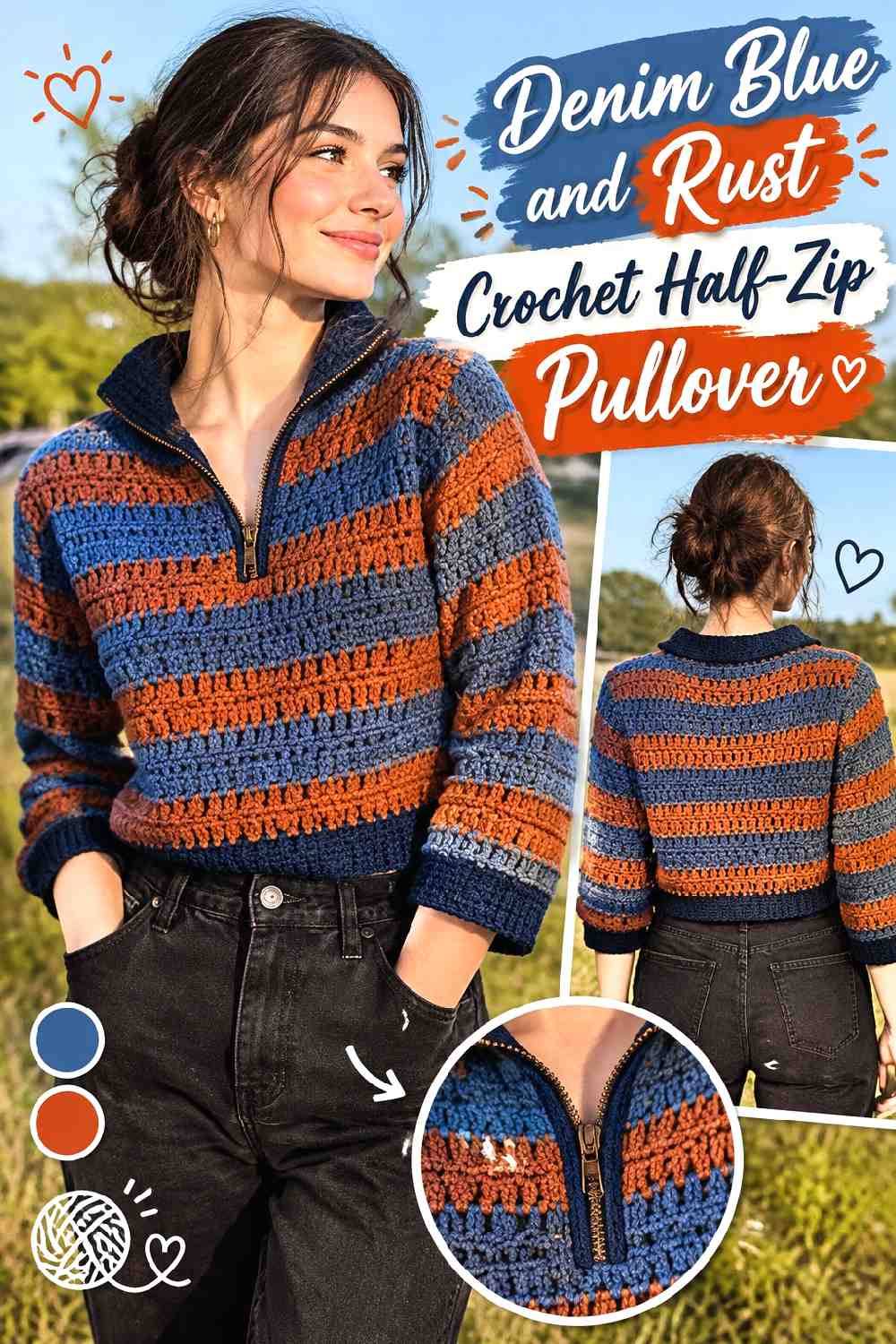
Denim Blue gives the body a familiar cool base, while Rust introduces a concentrated warm fall contrast. One useful layout is a Blue torso and sleeves with Rust reserved for the collar, placket, and selected ribbed details. The temperature difference makes the neckline noticeable even without using an extremely light accent.
Rust Can Warm the Center of a Denim Blue Pullover
Place Rust around the half-zip opening so the warmer color sits at the visual center of the garment. A restrained placket is usually enough because the Blue-to-Rust shift already creates a noticeable change.
Denim Blue Can Keep Rust Cuffs From Competing With the Collar
If Rust appears at the wrists, keep those bands narrower than the Rust collar when the neckline is intended to remain the focal point. The larger Blue sleeve surface provides separation between the two warm accents.
Creator Credit: Cherilyn Q
14. Aubergine And Oatmeal Crochet Half Zip Pullover

Aubergine gives the pullover a dark purple-brown direction that works well with a soft Oatmeal contrast. Using Oatmeal on the raised collar and cuffs makes the darkest parts of the sweater easier to break up, while the Aubergine torso remains substantial enough for fall layering.
Oatmeal Can Open Up an Aubergine Crochet Neckline
A light Oatmeal collar can prevent the upper sweater from becoming one uninterrupted dark block. Continue the neutral slightly down the zipper edges if you want the half-zip line to stay visible when the collar is partly open.
Aubergine Should Separate Repeated Oatmeal Details
Leave plenty of Aubergine between Oatmeal cuffs, collar, and hem details. Too many connected light areas can reduce the dramatic dark-body effect that makes this palette different from softer schemes.
Creator Credit: it’s erin b.
15. Brick Red And Ivory Crochet Half Zip Pullover
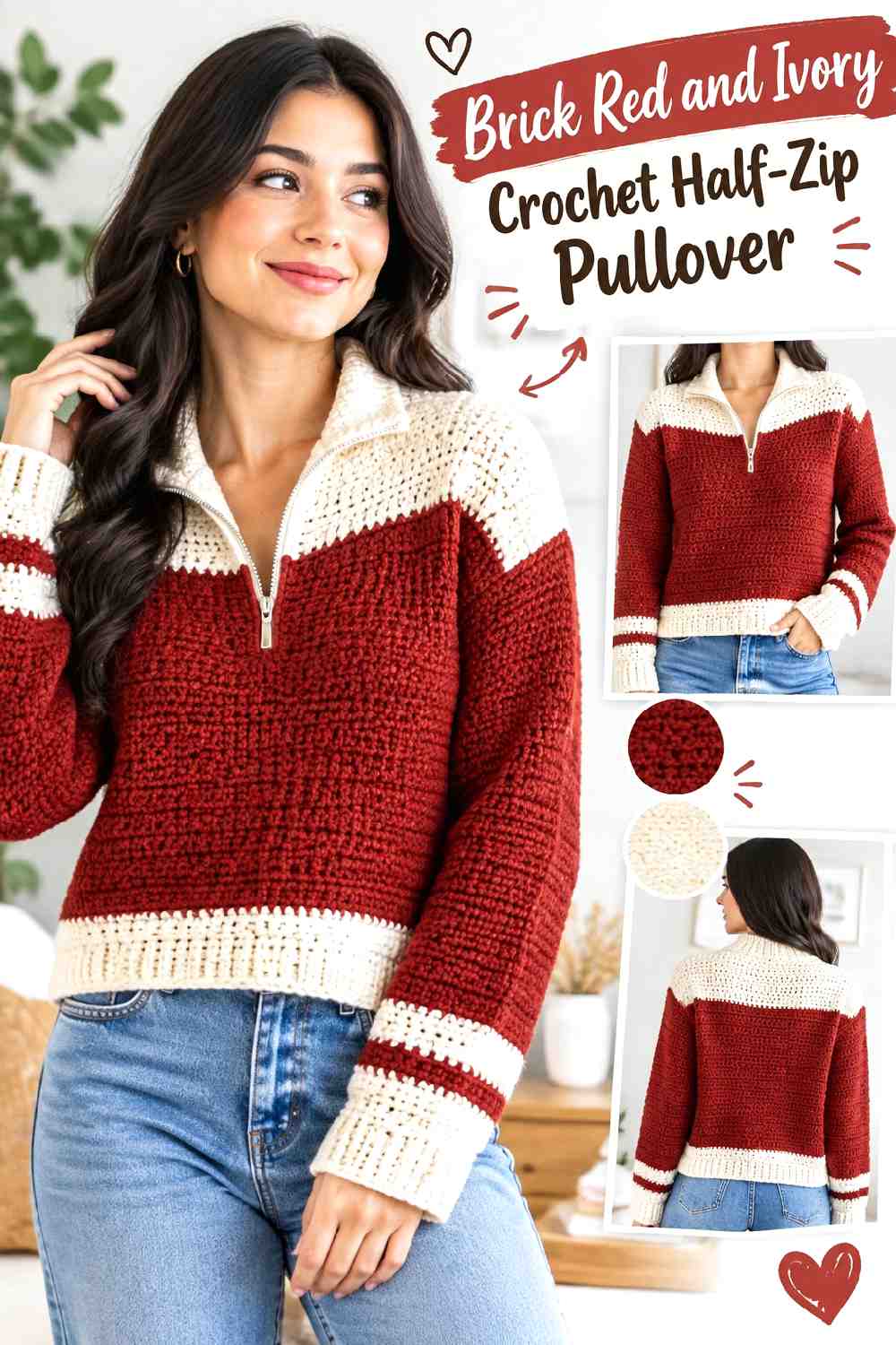
Brick Red creates a muted red-orange body, while Ivory offers the clearest light accent in this collection. Use Brick Red across the main panels and sleeves, then concentrate Ivory around the collar and zipper area. The strong value contrast can make even relatively simple crochet construction look more defined around the neckline.
Ivory Can Outline a Brick Red Half-Zip Without Taking Over
A narrow Ivory zipper frame and collar can provide enough contrast on their own. If Ivory also covers a wide yoke, broad cuffs, and the full hem, the palette may become far more evenly divided than intended.
Brick Red Can Repeat Between Ivory Pullover Finishes
Keep Brick Red visible immediately below the collar and above any Ivory hem detail. These uninterrupted red areas prevent the lighter finishing pieces from visually joining into one large frame around the entire sweater.
Creator Credit: forthefrills
Comparing the Fall Crochet Half-Zip Pullover Color Ideas
For the strongest light-and-dark contrast, Olive Green and Cream, Deep Teal and Cream, Aubergine and Oatmeal, and Brick Red and Ivory make the collar or zipper area especially easy to emphasize.
If you prefer a quieter two-color effect, Plum and Taupe, Forest Green and Camel, or Moss Green and Espresso keep the palette closer in visual weight. These combinations can let crochet texture and garment shape play a larger role.
Rust and Oatmeal, Mustard and Chocolate Brown, Charcoal and Burnt Orange, and Cranberry and Camel lean more heavily into warm autumn color. Denim Blue and Rust or Terracotta and Sage are useful when you want warm and cool shades to share the garment instead of relying primarily on neutrals.
The important choice is not simply which two colors you like. Decide which color should occupy most of the pullover, then give the second shade a specific role at the collar, placket, cuffs, sleeves, or hem.
Conclusion
For a half-zip pullover with a clearly framed neckline, start with one of the palettes that pairs a dark body with Cream, Ivory, Oatmeal, or another noticeably lighter support. If you want a more understated sweater, Forest Green and Camel, Plum and Taupe, or Moss Green and Espresso create gentler transitions.
For stronger fall color, Rust, Mustard, Burnt Orange, Cranberry, Brick Red, and Terracotta can take the dominant or accent role depending on how much warmth you want across the garment. Whatever palette you choose, check the body color and collar color together before committing to large panels. The half-zip opening is already a focal point, so a small, deliberate contrast often does more than several unrelated color changes.
Use the credited tutorials for their exact construction guidance, then adapt the color hierarchy only where it works with that pullover’s actual panels, collar, sleeves, and finishing.
Frequently Asked Questions
Which color should dominate a crochet half-zip pullover?
Usually, give one color the largest uninterrupted areas across the front, back, or sleeves, then assign the second color a clear supporting job. The collar, zipper placket, cuffs, hem, or selected sleeve sections are natural places for a secondary shade.
Should the half-zip collar be lighter or darker than the pullover body?
Either can work. A lighter collar on a dark body creates stronger value separation, while a dark collar on a lighter body can visually anchor the neckline. A similar-value collar produces a quieter result when you want the crochet texture to matter more than the color break.
How can I tell whether two fall yarn colors have enough contrast?
Place them directly beside one another rather than judging them separately. If the difference is difficult to see, a grayscale photo can help show whether their light and dark values are close. Similar values are not automatically a problem, but very narrow contrasting details may disappear.
Where should I repeat the collar color on a crochet half-zip pullover?
Cuffs are an effective place to repeat the collar shade because they distribute the accent across the garment without cutting through the main body. A narrow hem can also work, but using the secondary color on every border may give it more visual weight than expected.
Can I use three colors in a fall crochet half-zip pullover?
Yes, but give each shade a clear role. One color can lead across the body, a second can define the collar and zipper, and a third can appear sparingly at cuffs, edging, or a controlled panel. Using three similarly strong colors in equal amounts can make the center-front design harder to read.
How do I substitute a color without changing the whole fall palette?
Replace it according to its role rather than searching for an exact named shade. If you are replacing a light supporting color, preserve its lightness relative to the main shade. If you are replacing a muted dominant color, choose another shade with a similarly softened character so the balance does not become unexpectedly bright.
What colors work well with a crochet half-zip pullover for fall layering?
Earthy greens, browns, rusts, muted reds, deep blues, charcoal, plum, and softened neutrals all provide useful fall directions. More important than the individual names is how the colors are distributed: keep the body, collar, zipper area, and visible layering pieces working as one planned palette.