Red crochet can look dramatic without becoming loud when the color placement has a clear hierarchy. For fall 2026, the most polished direction is not simply using more red. It is deciding which red should dominate, where a neutral should interrupt it, and whether the darkest shade belongs in borders, cuffs, straps, joins, or smaller details.
Scarlet, cranberry, wine, garnet, brick, ruby, and oxblood can all create very different results. Cream can sharpen a red granny square, camel can soften a bright red garment, charcoal can make crimson feel more graphic, and chocolate brown can give warm reds a deeper fall frame.
The 19 ideas below use YouTube tutorials as construction references. The suggested red color schemes are independent palette adaptations, so the linked creators do not necessarily use these exact colors in their original projects.
Quick List
- Scarlet Red And Cream Crochet Granny Square Cardigan
- Cherry Red And Camel Crochet Cardigan
- Deep Red And Oatmeal Crochet Sweater
- Garnet Red And Charcoal Crochet Vest
- True Red And Black Crochet Scarf
- Cranberry Red And Espresso Crochet Tote Bag
- Brick Red And Warm Ivory Crochet Blanket
- Wine Red And Taupe Crochet Ribbed Beanie
- Ruby Red And Chocolate Crochet Cowl
- Merlot Red And Dusty Rose Crochet Shawl
- Tomato Red And Camel Crochet Skirt
- Crimson Red And Charcoal Crochet Balaclava
- Oxblood Red And Cream Crochet Cable Leg Warmers
- Burgundy Red And Olive Crochet Stitch Sampler Leg Warmers
- Mulberry Red And Beige Crochet Floral Poncho
- Rust Red And Camel Crochet Fingerless Gloves
- Poppy Red And Chocolate Crochet Bucket Hat
- Dark Cherry Red And Black Crochet Handbag
- Burnished Red And Taupe Crochet Tree Pillow
How to Make Vibrant Red Crochet Look More Refined
Red attracts attention quickly, so the rest of the palette does not need to compete with it. A useful starting point is to let red cover the largest visual area, give one neutral a supporting role, and reserve the darkest shade for definition.
On garments, that definition can appear around cuffs, necklines, hems, or joins. On bags, it can move to straps and edges. On pillows and blankets, borders offer a controlled place for contrast without breaking up the main red surface.
Limiting where the secondary color appears is often more effective than alternating colors everywhere. Repetition should feel intentional rather than evenly distributed simply because two yarns are available.
Use Light and Dark Contrast to Keep Red Crochet Texture Visible
Two yarn colors can look different in the skein yet merge once they are crocheted. This matters around granny-square centers, cables, raised stitches, ribbing, and small borders.
Place the yarns beside each other and look at them from a distance before committing. A grayscale photo can also help reveal whether the shades have enough light-and-dark separation.
When detailed crochet disappears against red, increasing value contrast is usually more useful than simply choosing a completely different hue. Cream beside cranberry, for example, creates clearer separation than two similarly dark jewel tones.
1. Scarlet Red And Cream Crochet Granny Square Cardigan
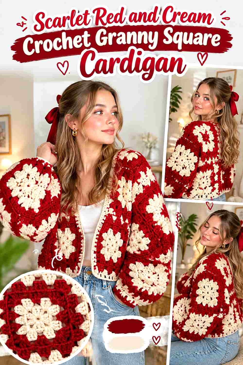
Scarlet red gives a granny square cardigan immediate visual presence, while cream can keep the individual squares and joining lines from becoming one uninterrupted red field. Let scarlet occupy most motif centers or outer rounds, then use cream consistently enough that the layout looks planned across the front, back, and sleeves.
Keep Scarlet Red Dominant Across the Crochet Cardigan
Use scarlet red on the areas that should visually connect the cardigan, rather than scattering equal amounts of several colors through every square. Repeating the same red across the body and sleeves gives separate motifs a common anchor.
If the cardigan starts looking checkerboard-like, reduce the number of cream-dominant squares rather than introducing another accent. A strong two-color hierarchy can make a heavily pieced garment feel calmer.
Use Cream to Give Scarlet Red Crochet Squares Cleaner Separation
Cream works particularly well around joins, selected motif rounds, or edging because the lighter value separates neighboring areas of scarlet red.
Pay attention to cuffs and the neckline. If both are already cream, adding a wide cream hem may shift the garment from red-led to evenly two-tone. Keep the amount of cream proportional to the effect you want.
Creator Credit: DIYGuru YouTube tutorial
2. Cherry Red And Camel Crochet Cardigan
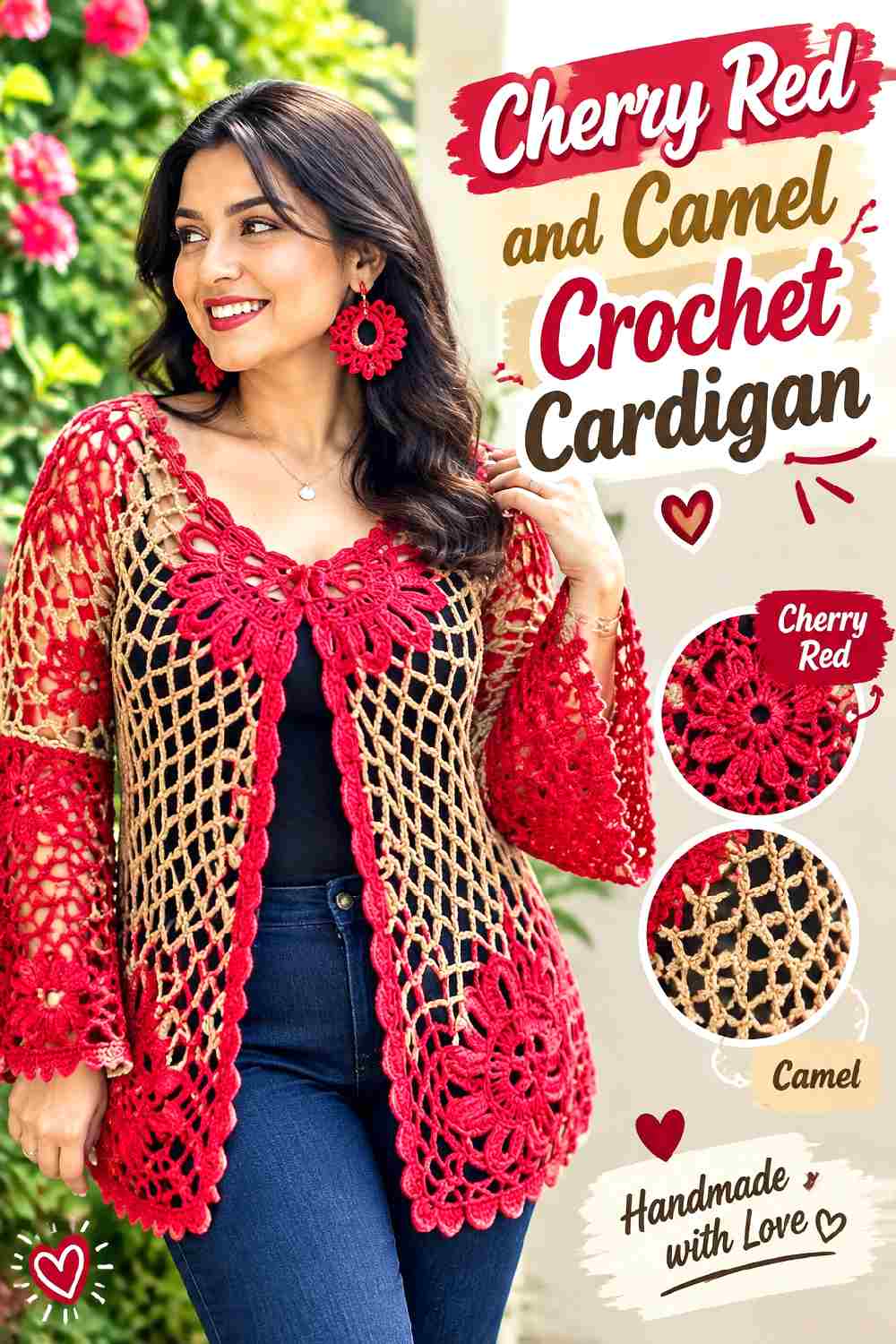
Cherry red has enough brightness to become the obvious focal color of a solid crochet cardigan. Camel brings in a quieter, warmer supporting shade that suits fall layering without creating the hard jump that white or black would produce.
Let Cherry Red Cover the Main Crochet Cardigan Panels
Keep cherry red across the larger front, back, and sleeve areas when you want the cardigan to remain unmistakably red. The uninterrupted surface also gives crochet texture more room to register instead of turning every construction line into a color break.
Camel can then be concentrated around the finishing rather than competing across the body.
Frame Cherry Red Crochet Edges With Controlled Camel Accents
Camel can work around cuffs, the lower edge, neckline, or front opening, but it does not need to appear in all four places.
Choose the edges you want emphasized. A camel front band makes the opening more visible, while camel cuffs put more emphasis on the sleeves. Keeping some edges cherry red prevents the contrast from looking overoutlined.
Creator Credit: Laura Cepeda English YouTube tutorial
3. Deep Red And Oatmeal Crochet Sweater
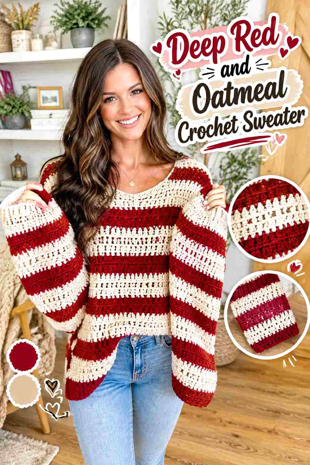
Deep red can make a simple sweater silhouette feel substantial, while oatmeal creates a softer fall contrast than bright white. Because the sweater has broad panels, this palette works especially well when red remains uninterrupted over most of the torso.
Keep Deep Red Continuous Across the Crochet Sweater Body
Large areas of deep red let shoulder shaping, seams, and stitch texture provide the visual interest. Breaking the torso into many small color sections can weaken that cleaner effect.
If you want oatmeal on the body, consider one controlled area instead of frequent stripes so deep red continues to set the overall direction.
Use Oatmeal to Lighten Deep Red Crochet Cuffs and Necklines
Oatmeal can lift the areas around the face and hands without demanding as much attention as a high-contrast white.
For a more restrained sweater, use oatmeal on either the neckline or cuffs and keep the remaining finishing deep red. For stronger color blocking, repeat oatmeal in both places so the light accents feel connected.
Creator Credit: MJ’s Off The Hook Designs YouTube tutorial
4. Garnet Red And Charcoal Crochet Vest

Garnet red and charcoal create one of the darker palettes in this collection. That makes the vest useful when you want red to feel saturated and autumnal rather than bright.
Let Garnet Red Lead the Crochet Vest Panels
Because a vest has less surface area than a long-sleeved garment, letting garnet red dominate the panels preserves the color impact.
Using charcoal too widely can make the vest read primarily dark gray with red accents. Keep garnet red through the main body if red is meant to remain the identifying color.
Use Charcoal to Define Garnet Red Crochet Armholes and Edges
Charcoal works well for narrower finishing areas because its dark value gives the outline of the vest definition.
Check the armholes, neckline, and lower edge together before adding charcoal everywhere. Two emphasized edges may be enough. Too much dark outlining can visually divide a compact garment into several separate sections.
Creator Credit: Handwork diy YouTube tutorial
5. True Red And Black Crochet Scarf
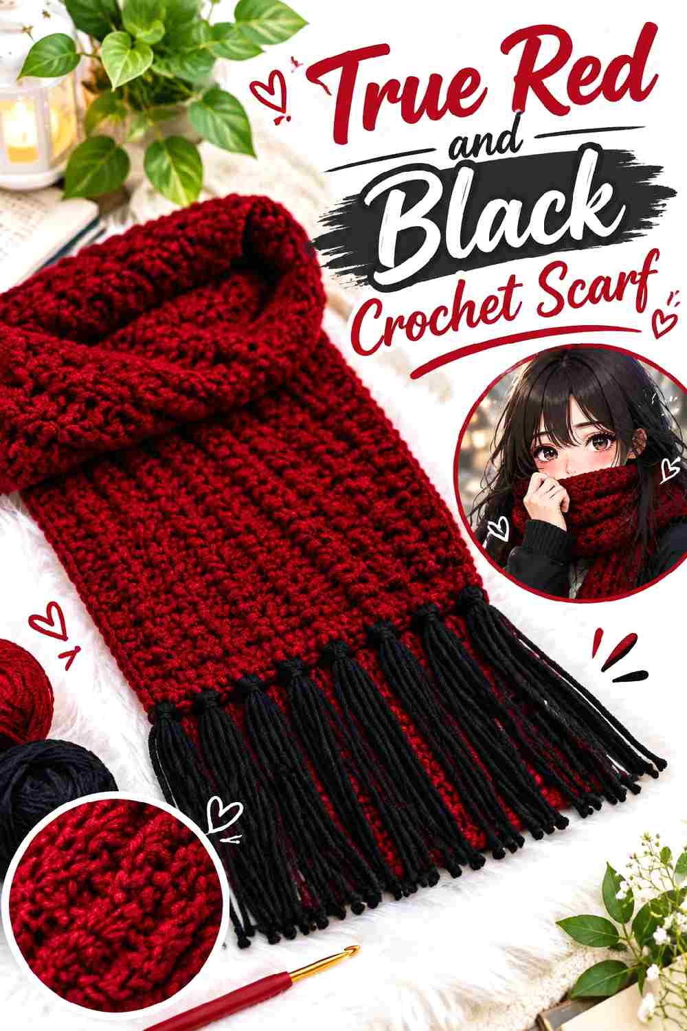
A long scarf can handle strong contrast because the palette repeats over a simple shape. True red keeps the piece vivid, while black provides a sharp fall counterpoint without requiring a third color.
Keep True Red as the Main Crochet Scarf Color
For the most red-forward result, use true red through most of the scarf length. This gives stitch texture continuity and avoids turning a narrow accessory into a sequence of competing blocks.
Black works better as a controlled interruption when the goal is a streamlined scarf rather than a highly striped one.
Use Black Sparingly to Sharpen True Red Crochet Ends
Black at the ends, border, or a small number of repeated sections can make the red look more defined.
If both ends use black, compare their visual weight before finishing. A very deep border at one end and a tiny accent at the other can make the scarf appear unintentionally unbalanced when worn.
Creator Credit: Weam Crochet YouTube tutorial
6. Cranberry Red And Espresso Crochet Tote Bag
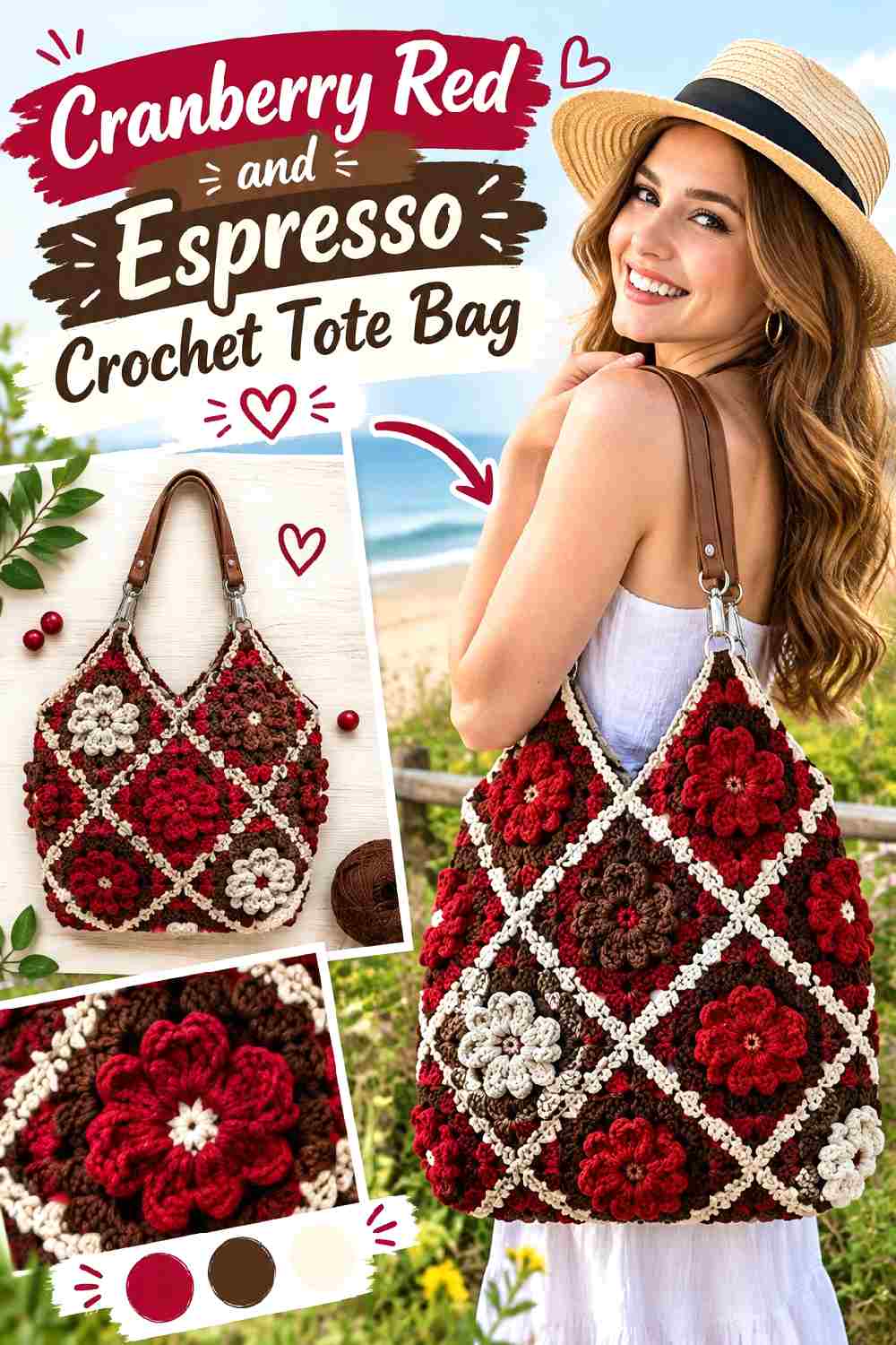
Cranberry red has enough depth for a fall bag without losing the stronger red identity. Espresso brown can make the handles, joining areas, and outer edges look more deliberate.
Put Cranberry Red Across the Crochet Tote Squares
Let cranberry red carry most of the bag body so separate squares still read as one accessory. If every square has a different dominant color, the construction becomes more visually important than the red palette.
A repeated cranberry field also gives you more freedom to use espresso selectively.
Use Espresso to Ground Cranberry Red Crochet Handles and Joins
Handles naturally receive visual attention because they extend beyond the bag body. Using espresso there can create a strong frame around cranberry red without covering much surface area.
If the joins are also espresso, consider keeping the top edging cranberry red. That prevents every structural line from becoming dark at once.
Creator Credit: Brunaticality YouTube tutorial
7. Brick Red And Warm Ivory Crochet Blanket
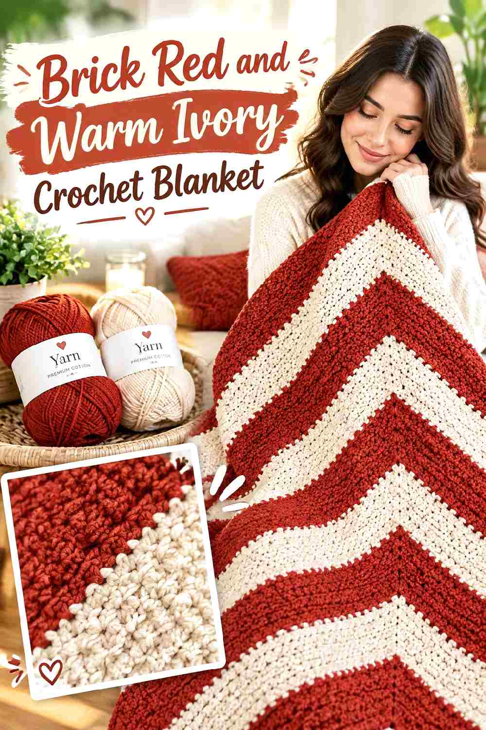
Brick red creates a warmer and more muted direction than scarlet. Warm ivory gives a blanket enough light contrast to reveal corners, borders, and stitch changes without making the palette feel stark.
Let Brick Red Fill the Main Crochet Blanket Surface
A large blanket can absorb a substantial amount of color, so brick red works well across the main field rather than only as a small accent.
Keeping the body predominantly red also prevents the blanket from becoming visually fragmented across a sofa or bed. Use the lighter shade where it contributes structure.
Use Warm Ivory to Open Up Brick Red Crochet Borders
Warm ivory around the perimeter can separate a brick red blanket from surrounding brown, beige, or similarly warm décor.
If the blanket already contains ivory within its main field, repeat the same ivory in the border instead of introducing another cream. Repetition keeps the palette cohesive.
Creator Credit: TL Yarn Crafts YouTube tutorial
8. Wine Red And Taupe Crochet Ribbed Beanie
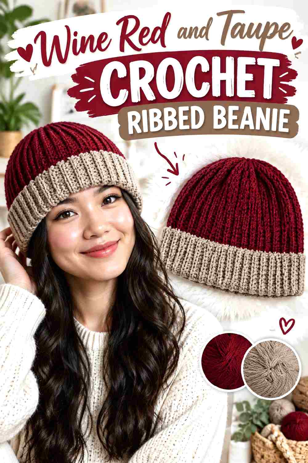
Wine red works especially well with strong ribbing because the darker color lets shadows remain visible without introducing multiple competing shades. Taupe can soften the lower edge while staying within a restrained fall palette.
Keep Wine Red Across the Crochet Beanie Crown
The continuous rib lines are already a design feature, so a solid wine red crown gives that texture room to show.
Avoid frequent color changes through the vertical ribbing unless stripes are the main goal. Breaking the ribs into short blocks can weaken the long, clean lines.
Add Taupe at the Wine Red Crochet Beanie Edge
A taupe lower edge can visually separate the hat from a dark coat while keeping wine red dominant above it.
Keep the taupe band relatively controlled if you want the hat to remain red-led. A very deep contrasting section may make the beanie look half taupe rather than wine red with a finishing accent.
Creator Credit: VivCrochets YouTube tutorial
9. Ruby Red And Chocolate Crochet Cowl
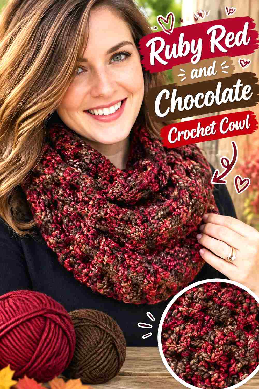
Ruby red gives a cowl strong color near the face, while chocolate brown lowers the contrast compared with black. This is useful when you want definition without a graphic two-color effect.
Let Ruby Red Control the Crochet Cowl Surface
A cowl is compact, so large uninterrupted areas tend to look more considered than several equally strong color blocks.
Keep ruby red over most of the visible surface, especially if the stitch pattern already creates significant texture. The yarn color and stitch work should not fight for attention.
Use Chocolate to Frame Ruby Red Crochet Texture
Chocolate can sit along the upper or lower edge to give the cowl a darker boundary.
If the cowl folds while worn, think about which edge will actually remain visible. Put the stronger chocolate accent where it is least likely to disappear inside the fold.
Creator Credit: Rich Textures Crochet YouTube tutorial
10. Merlot Red And Dusty Rose Crochet Shawl

Merlot and dusty rose create a tonal red-family palette rather than a neutral contrast. The result can feel softer because the two colors are related, but they still need enough value separation for the shawl’s openwork to remain readable.
Keep Merlot Red Around the Strongest Crochet Shawl Areas
Use the deeper merlot red where you want the eye to settle, such as the upper portion or outer edge. A darker boundary can give an open shawl more visual definition.
Do not assume dusty rose will automatically contrast just because it is pink. Compare the actual yarns in grayscale before starting.
Let Dusty Rose Lighten Merlot Red Crochet Openwork
Dusty rose can make open sections easier to see by introducing a lighter passage between deeper red areas.
Repeat it in more than one place if you are using it as a secondary color. A single isolated dusty rose section can look accidental in a larger shawl.
Creator Credit: Bella Coco YouTube tutorial
11. Tomato Red And Camel Crochet Skirt

Tomato red has a brighter, warmer appearance than wine or burgundy, which makes it useful for a fall skirt that should remain clearly saturated. Camel can calm the overall palette and define the waist or lower edge.
Keep Tomato Red Through the Main Crochet Skirt Body
The skirt body is the largest uninterrupted area, so it is the logical place to let tomato red dominate.
Using too many alternating colors can create horizontal visual breaks that change how the skirt proportions read. A mostly red body keeps the silhouette clearer.
Use Camel to Finish Tomato Red Crochet Waist and Hem Areas
Camel at the waistband or hem introduces a quieter warm shade without competing strongly with tomato red.
You do not have to use camel in both places. A camel waistband creates emphasis near the top, while a camel lower edge gives the skirt a stronger visual finish near the hem.
Creator Credit: Chenda DIY YouTube tutorial
12. Crimson Red And Charcoal Crochet Balaclava
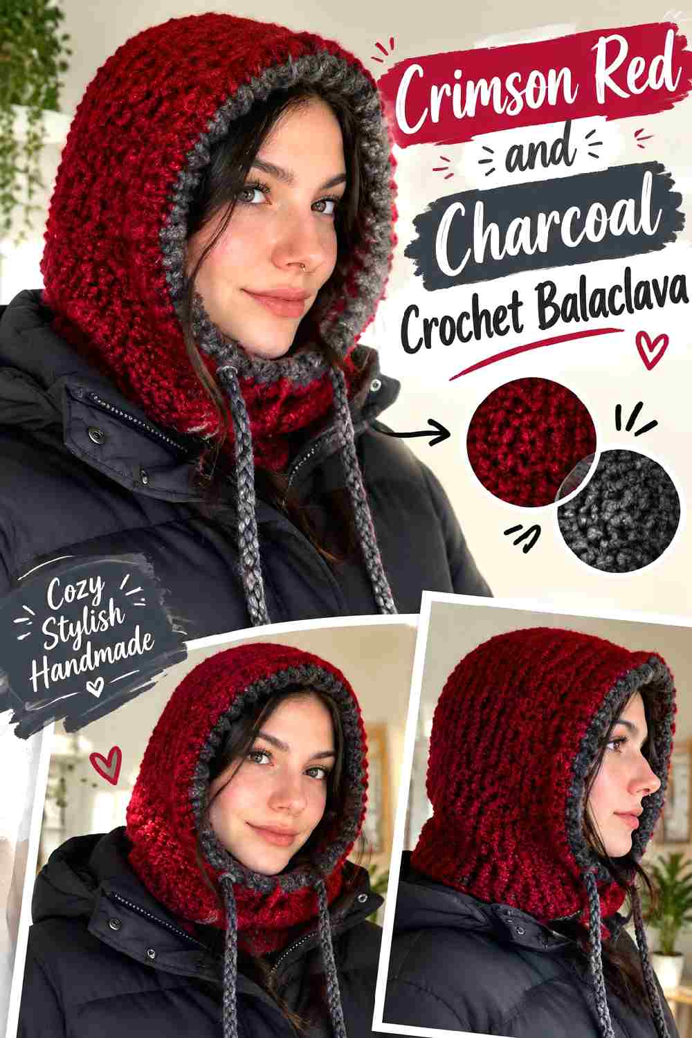
Crimson red makes a balaclava a strong outfit accessory, while charcoal can define the face opening and lower ribbing. Because the piece surrounds the face, even a narrow contrasting line has considerable visual impact.
Keep Crimson Red Across the Crochet Balaclava Hood
Use crimson red through the main hood when you want one continuous statement color rather than several competing sections.
The hood shape already creates strong lines around the head and neck, so the palette does not need complicated blocking to remain noticeable.
Frame Crimson Red Crochet Openings With Charcoal Carefully
Charcoal around the face opening creates immediate contrast. That means the width of the dark section matters.
A narrow charcoal finish gives definition while preserving the crimson red surface. A much wider dark frame changes the whole balance and can make charcoal appear almost as important as the red.
Creator Credit: Natalie YouTube tutorial
13. Oxblood Red And Cream Crochet Cable Leg Warmers
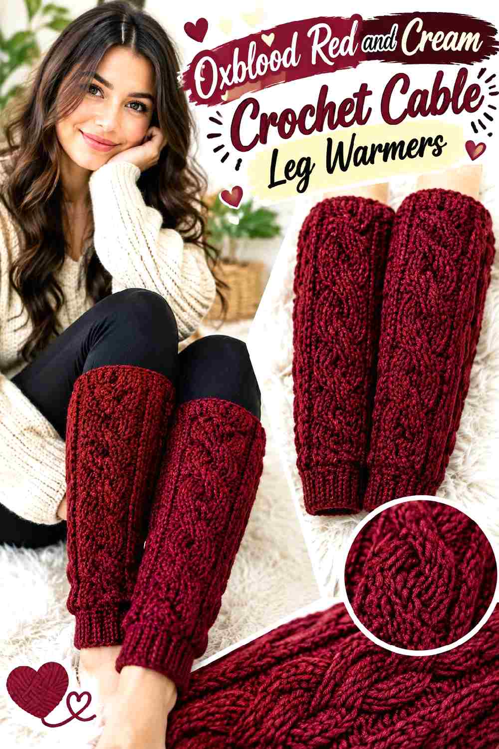
Oxblood red suits raised cable texture because its depth creates visible shadow while still reading as red. Cream can be reserved for the upper or lower bands so the cables stay the main feature.
Let Oxblood Red Show Off the Crochet Cable Texture
Keep oxblood red across the cable-heavy section instead of switching colors inside every raised detail. The relief already creates visual variation.
If the exact oxblood shade is unavailable, preserve the role by choosing another deep red that is still clearly darker than your cream.
Keep Cream Away From the Busiest Oxblood Red Crochet Cables
Cream is useful around cuffs or cleaner structural sections where it can form a clear boundary.
Placing cream directly through small cable details can shift attention from the texture to the color changes. Use it where it clarifies the silhouette rather than interrupting the strongest stitch work.
Creator Credit: TCDDIY YouTube tutorial
14. Burgundy Red And Olive Crochet Stitch Sampler Leg Warmers

Burgundy red and muted olive create a darker fall palette with less contrast than red and cream. Because a stitch-sampler design already contains multiple textures, color repetition becomes particularly important.
Repeat Burgundy Red Across the Crochet Stitch Changes
Use burgundy red in several separate stitch sections so the different textures remain visually connected.
If every stitch section receives a different color, the leg warmer can begin to resemble a sampler chart rather than one finished accessory. Repeating burgundy creates continuity.
Keep Olive Secondary to Burgundy Red Crochet Texture
Muted olive can separate selected bands, cuffs, or stitch transitions without taking over the project.
Check the two yarns in grayscale. Dark burgundy red and dark olive can be surprisingly close in value, so choose an olive that remains distinguishable if clear section changes matter to you.
Creator Credit: The Crochet Crowd YouTube tutorial
15. Mulberry Red And Beige Crochet Floral Poncho
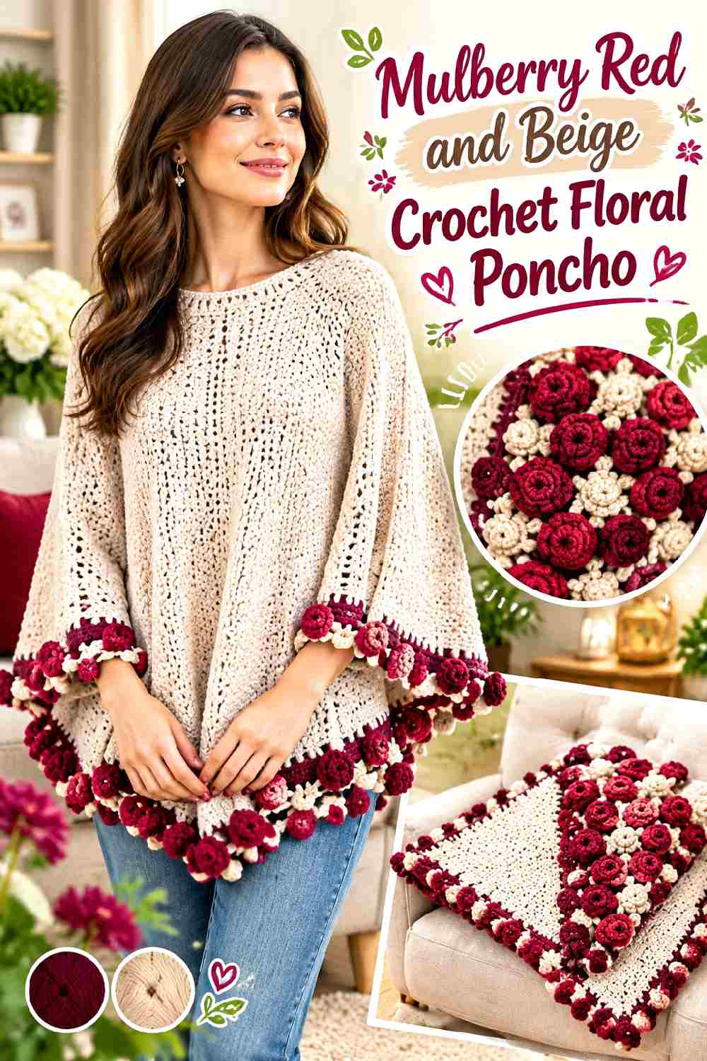
Mulberry red gives a floral poncho a deeper fall direction than a pastel palette. Beige can keep floral detail visible while stopping the garment from becoming an uninterrupted dark field.
Let Mulberry Red Anchor the Crochet Poncho Body
Keep mulberry red through the largest connecting areas so the floral construction feels unified.
If the flowers already contain multiple shapes or textures, avoid adding several unrelated accent colors. One beige support color gives the motifs breathing room without creating another competing theme.
Use Beige to Separate Mulberry Red Crochet Flowers
Beige can be especially useful around flower edges or connecting areas because the lighter value helps individual shapes remain distinguishable.
If beige begins occupying nearly as much space as mulberry red, reduce it to selected motif areas or edging. The poncho should still read as a red-led fall piece.
Creator Credit: Sirin’s Crochet YouTube tutorial
16. Rust Red And Camel Crochet Fingerless Gloves
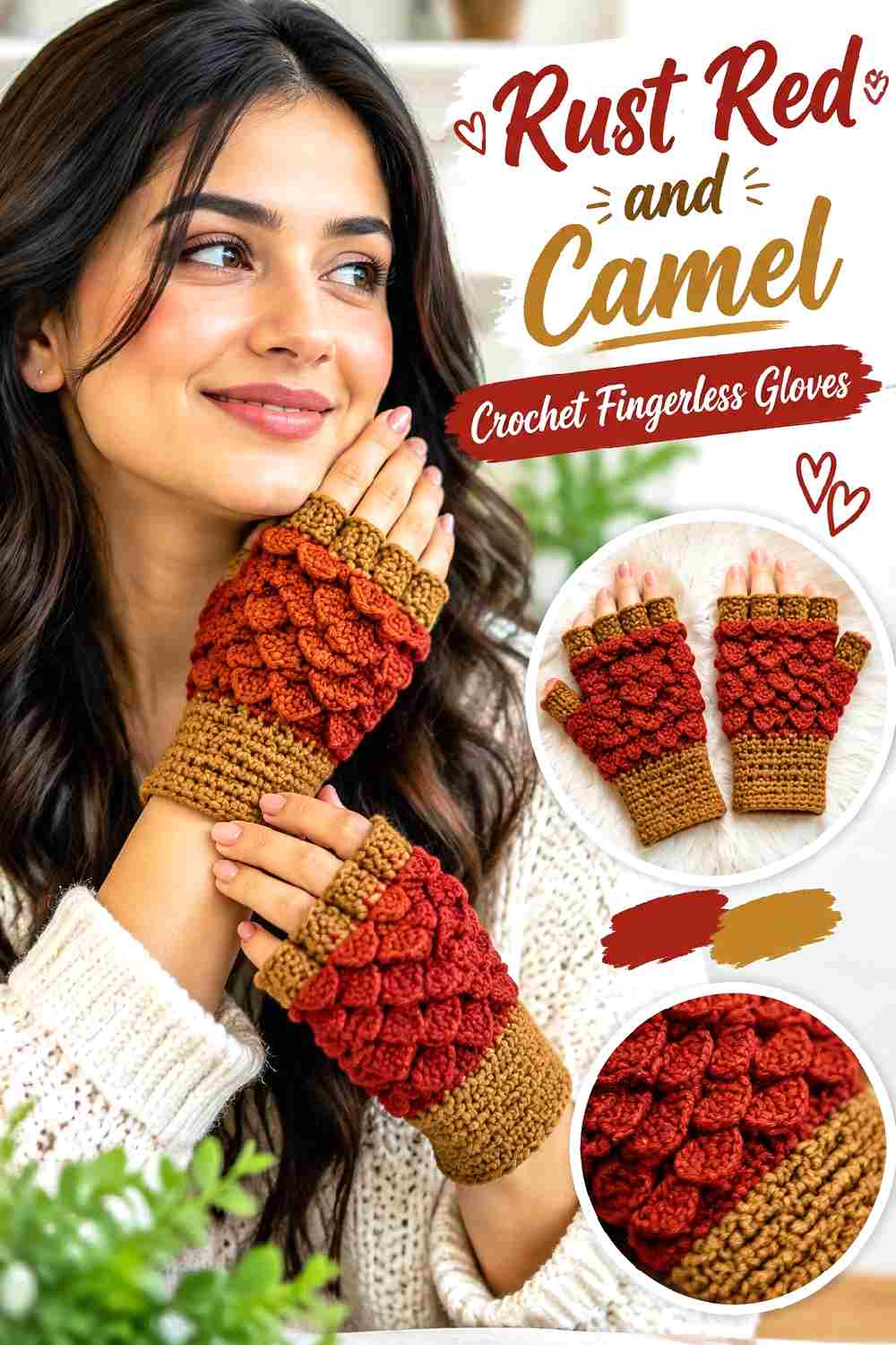
Rust red gives autumn-inspired fingerless gloves warmth without the brightness of a primary red. Camel can emphasize edges and decorative details while keeping the palette close in temperature.
Keep Rust Red Around the Crochet Glove Texture
Use rust red across the main hand and wrist area so decorative stitchwork remains continuous.
Fingerless gloves have limited surface area, which means several equal color blocks can quickly look busy. One dominant red is usually easier to coordinate with coats and sweaters.
Use Camel to Clarify Rust Red Crochet Leaf Details
Camel can create useful separation around selected decorative areas, but avoid tracing every raised line with contrast.
On a compact glove, small amounts of camel are highly visible. Repeat the placement consistently on both gloves so the pair looks intentionally matched.
Creator Credit: Bag-O-Day Crochet YouTube tutorial
17. Poppy Red And Chocolate Crochet Bucket Hat
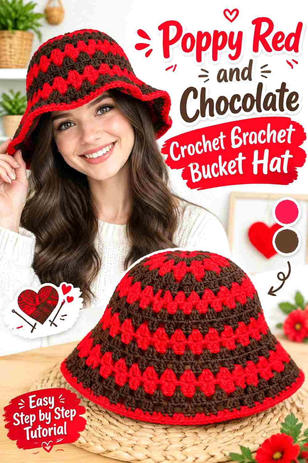
Poppy red gives a bucket hat a brighter direction than burgundy or oxblood. Chocolate brown can bring the color back toward fall and make the brim look more defined.
Keep Poppy Red Across the Crochet Bucket Hat Crown
Let the crown remain predominantly poppy red so the hat has one strong focal color.
Frequent striping around a small crown can make the shape appear busier, particularly when the brim also changes color. Keep most contrast toward the lower portion if you want a cleaner silhouette.
Use Chocolate to Ground the Poppy Red Crochet Brim
A chocolate brim creates a dark horizontal frame around the brighter poppy red crown.
If that contrast feels too strong, work only the outer part of the brim in chocolate and allow poppy red to continue downward first. This creates a more gradual visual transition.
Creator Credit: PassioKnit Kelsie YouTube tutorial
18. Dark Cherry Red And Black Crochet Handbag
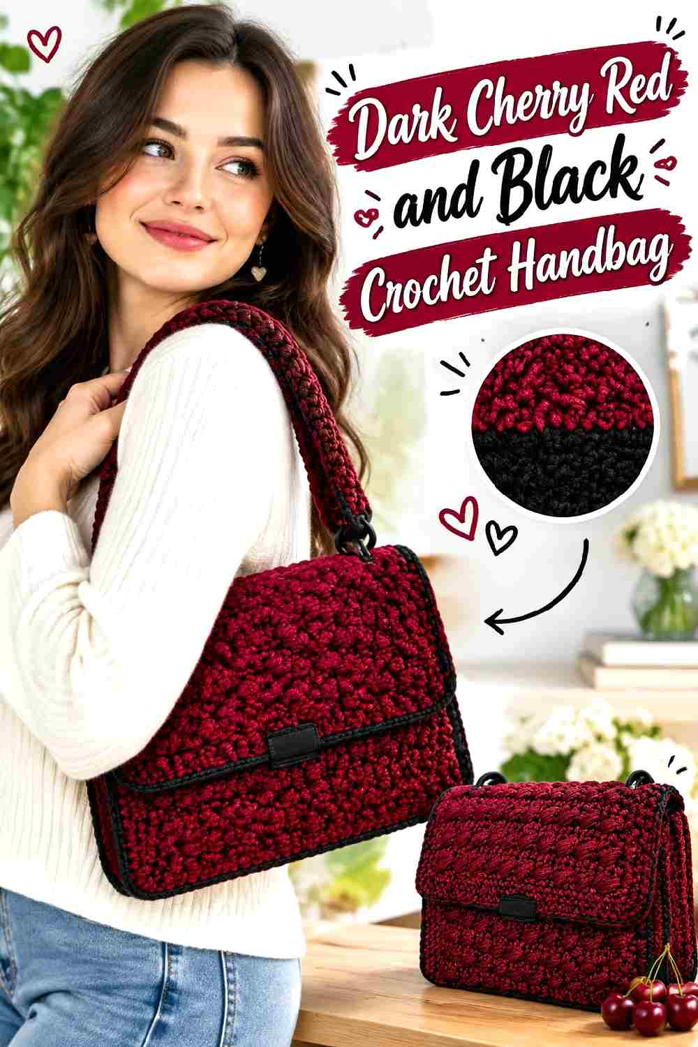
Dark cherry red and black create one of the sharpest palettes here. The combination is especially useful on a structured handbag because black can be confined to hardware-adjacent areas, sides, handles, or edging.
Keep Dark Cherry Red Across the Crochet Handbag Face
Use dark cherry red on the broad front and back surfaces so the color has enough room to read clearly.
If black covers the main panels as well as the sides and straps, the red can become only a minor detail. Preserve the larger visual share for cherry red.
Put Black Around Dark Cherry Red Crochet Structure
Black can emphasize side panels, handles, or the opening without requiring decorative striping.
Think of black as a structural color rather than an equal partner. Repeating it in two or three functional areas can make the bag look coordinated while keeping dark cherry red in control.
Creator Credit: KnitcroAddict YouTube tutorial
19. Burnished Red And Taupe Crochet Tree Pillow
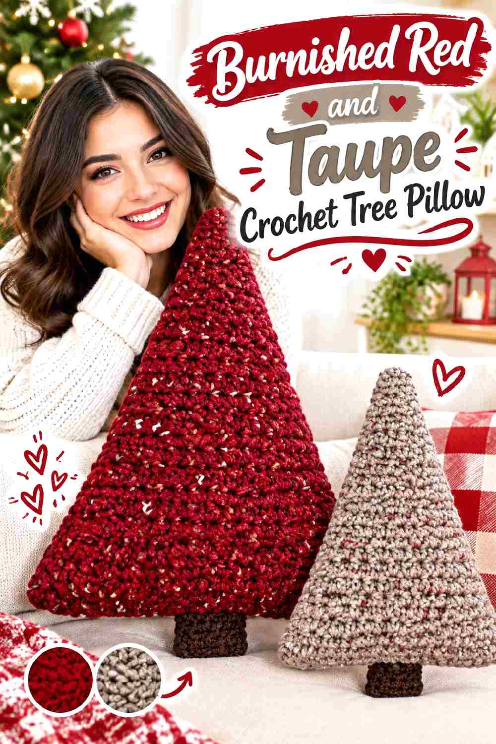
A sculptural tree pillow does not have to use traditional holiday green. Burnished red gives the shape an autumn direction, while taupe can highlight selected edges or details without pushing the palette toward Christmas.
Let Burnished Red Cover the Crochet Tree Pillow Shape
Keep most of the tree form burnished red so its silhouette remains easy to read from across the room.
Because the pillow already has an unusual outline, the surface does not need many competing colors. A concentrated red field lets shape and crochet texture do more of the work.
Use Taupe to Define Burnished Red Crochet Pillow Details
Taupe can work around small decorative areas, the outer edge, or selected textural sections where you need more separation.
Avoid outlining every change in the tree shape. Too much contrasting trim can make a sculptural pillow look segmented. A few repeated taupe details give burnished red enough definition without breaking up the silhouette.
Creator Credit: Jayda InStitches YouTube tutorial
Which Red Crochet Palette Fits Your Fall Style?
Choose scarlet, cherry, tomato, or poppy red when you want the color itself to be the strongest visual feature. Cream, oatmeal, and warm ivory give those brighter reds clear contrast and help textured stitches or motif boundaries stay visible.
For a darker fall direction, look toward garnet, wine, merlot, oxblood, burgundy, or dark cherry. Those shades pair naturally with charcoal, espresso, chocolate, olive, camel, and taupe when you want a quieter supporting color.
Tonal combinations such as merlot with dusty rose create a softer transition, while red with black creates the sharpest contrast. The important decision is not simply which colors you like individually, but which color should control the finished crochet piece and where the secondary shade actually adds definition.
Conclusion
Vibrant red crochet looks most intentional when the palette has a clear job for every color. Let red cover enough of the project to establish the main direction, then use cream or oatmeal for light separation, camel or taupe for softer fall balance, and charcoal, espresso, chocolate, or black where the item needs stronger definition.
For motif-heavy projects such as the granny square cardigan or floral poncho, protect the visibility of individual shapes. For textured pieces such as cable leg warmers, ribbed beanies, cowls, and gloves, avoid color changes that compete with the stitches. Bags and structured garments can handle darker contrast particularly well when that contrast stays around practical edges, straps, cuffs, or openings.
Use the linked creator tutorials for the exact construction of each project, then adapt the palette according to the visual role you want red to play.
Frequently Asked Questions
Which Red Works Well for Fall Crochet?
There is no single required fall red. Brick, cranberry, garnet, wine, oxblood, rust, and dark cherry create deeper directions, while scarlet, tomato, true red, and poppy keep the finished piece brighter.
Choose by the relationship to the supporting color. A bright red with camel can still feel seasonally grounded, while a deep burgundy with cream can appear much lighter because of the stronger value contrast.
How Can I Make Red Crochet Look More Polished?
Start with a clear hierarchy. Give red the dominant role, choose one supporting neutral or neighboring shade, and decide exactly where contrast belongs before crocheting large sections.
Cuffs, borders, handles, motif edges, joins, and hems are useful locations because they already have a structural purpose. Randomly inserting the secondary shade usually looks less controlled than repeating it in selected functional areas.
What Colors Give Red Crochet the Strongest Contrast?
Cream, warm ivory, and other light neutrals can create strong light-and-dark separation with deeper reds. Black and charcoal can produce similarly strong contrast against brighter reds from the opposite direction.
Actual yarn value matters more than the color names. Compare the specific yarns side by side or photograph them in grayscale before assuming they will remain distinct after crocheting.
How Do I Replace a Red Yarn Without Ruining the Palette?
Preserve the role of the original red rather than trying to match its name exactly. If the project calls for a deep dominant red, substitute another red with similar darkness and saturation.
Then compare it with the supporting yarn. A replacement that becomes too close to cream, brown, pink, or charcoal in value may change how borders, motifs, or texture read.
Should Red Be Used for Crochet Borders Too?
It depends on what the border needs to do. A red border keeps the piece visually continuous, while a contrasting border creates a stronger frame.
On a red blanket or pillow, a cream border can make the outline more obvious. On a multicolor cardigan, repeating the dominant red around the edge can instead pull separate motifs back together.
Why Does Red Crochet Sometimes Hide Stitch Texture?
Dark or highly saturated yarn can make small shadows and stitch changes less obvious, particularly when lighting is low. Using a smoother yarn, choosing a slightly lighter red, or placing a lighter supporting shade near detailed areas can improve separation.
The solution does not always require more colors. Sometimes keeping one red but simplifying the surrounding palette gives the texture more room to show.